10,000 search results
(0.11 seconds)
- Illustrissims by Typephases,
$-76 illustrations of vintage-inspired characters, most of them drawn from imagination, in the tradition of metal stock cuts or woodtype vignettes. Illustrissims is offered as a free sampler of our illustration style. Its themes are futher developed in the Absurdies, Bizarries, Genteta, Ombres and Whimsies series, also available from MyFonts! These illustrations are ready to use at any size and in any application (their vectorial format ensures they can be scaled to any size with no loss of sharpness). They can be used out of the box, or easily customized in any graphics program, adding colour or texture, resizing, combining... The variety of suggested uses is huge, from small spot illustrations to full-page layouts. Use them to great effect in magazine spreads, advertisements, stationery, packaging, bulletins or poster creative designs. Illustrissims combines three formerly separate dingbats (the Illustries 1-2-3 series), which have been unavailable for quite a few years. - Rafaella by Lián Types,
$37.00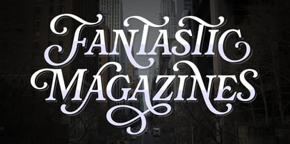 To Rafaella, a menina dos cachos. We, designers, have grown accustomed to seeing that lowercase letters—not only in calligraphy but also in typography (1)—may be very playful and decorative. Almost every part of them can become a potential swash, ligature or decorative accolade (2) if the designer has some expertise regarding this matter. However, since we are living in an era that elevates the status of handcrafts, lettering has gained a lot of ground in different kinds of mediums, and with it there’s a sort of overuse of capitals. This may be due to the reason that lettering pieces need a high impact to convey their messages and many times why big capitals are the only solution. With this in mind, I started Rafaella: A font consisting entirely of capitals which go from unadorned to very decorative. Rafaella has ductus and forms vaguely based on the 1970s Bookman-like styled fonts. The presence and behaviour of serifs and ball terminals in this style were the perfect excuse to make really attractive aternates which the user can choose from the glyphs panel. The result is a font full of life. Able to be both very playful and formal due to its roman style which can be combined with (and between) a wide range of other styles of expressive scripts or geometric fonts with nice results (3). Also try Rafaella Shade Solo combined with Rafaella or Rafaella Bold for a layer effect to emphasize any given word or phrase. NOTES (1) See my fonts Erotica from 2013 or Dream from 2014. (2) Accolades is a wonderful word that refers to the ornaments made around the words in the spencerian style of calligraphy (3) Combinations often seen in different pieces of lettering were usually a contrast of style is wanted.
 - Blog Script by Sudtipos,
$39.00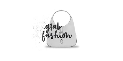 Technology is making it so that we’re all connected without the need for the physical-presence kind of being connected. That is strange, fascinating, and has a certain magnetism that is very difficult to resist. What’s at stake is no less than the transformation of centuries of human behaviour, and that’s part of the fascination. But while our existence morphs and we rush headlong into our socially minimalist future, we use our present culture to helplessly signal our nostalgia about our past. We know what our future will be missing, and we’re already full of nostalgia about it, but we know that what little we can do about isn’t going to affect the outcome that much. So, almost in full hindsight now, the DIY implosion of the past few years must have really been a reaction to our technological dis/connection. In typography, the minimalist future is already here, with something as austere as the sans serif having become the preferred expression of progress and fortune, both part of the connected isolation we are undergoing. But when physical interaction must take place, like coffee shops and gin joints, our organic alphabets ride high and mighty. That sense of human heritage — elegance and exuberance in our writing, the use of flaws to charmingly brand our own individualism — keeps turning up in all kinds of places, most unexpected of which is the digital world. The overall message seems to be that we’re still creative, imaginative, and unique. In the digital world, on blogs where we write about our puny music and fashion preferences, we’re just articulating this individualism of ours, this third domain of existence our future seems eager to dismiss. These were the thoughts behind Blog Script, the second collaboration between Carolina Marando and Alejandro Paul, after their successful stint with the Distillery set of fonts. This typeface comes in two weights, alternates for most letters, and a strong aesthetic rooted in individuality and freedom of spirit. Use it to be alone together, to tell the world that we’re still human, for now.
 - Macarons by Latinotype,
$35.00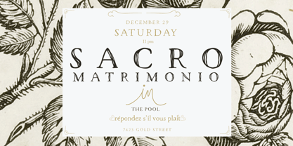 The Macarons font family consists of a monoline version, regular and bold weights, and a set of gestural catchwords, which reflects the use of the ruling pen as a freestyle tool. Ornaments and dingbats are also included. Macarons is a display type based on the classic Garamond typeface. It’s inspired by the foodie culture and the slow food movement, which began as a rebellion against fast food and has now grown to a global scale. Every day, thousands of people around the world take pictures of their food, look for new recipes to try and recover old ones, enjoy wine-pairing, and value locally produced food. Macarons is a fresh and spontaneous looking typeface that has been designed by Coto Mendoza, who also has developed a hand-made product line (Ride my Bike, Ride my Bike Serif, Four Seasons, D.I.Y. Time, Dans le Cuisine and In a Jar). This font is not constructed out of modules: each character is drawn by hand. Macarons is ideal for cookbooks, menus, liquor bottle labels, food packaging, wedding invitations, greeting cards, tea boxes, food blogs, small shops, cupcake bakeries and so on. Try! A freshly-baked homemade macaron!
 - Tractatus by Kaer,
$24.00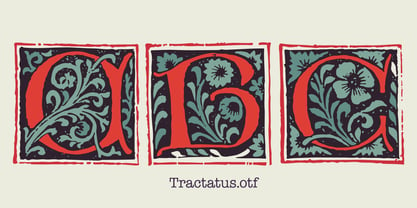 These initials set I collected from “Tractatus sacerdotalis de sacramentis”, published in the city of Lugrun, printed by Arnaldum Guillermum de Brocario in 1503. Tractatus font family has Regular and Colored styles. It's all you need to precisely imitate medieval style text. Use this font as a decorative element at the beginning of a paragraph or section, other part of the paragraph should be in regular black letter font. You’ll get Drop Caps & Numbers set. --- *You can use color fonts in PS CC 2017+, AI CC 2018+, ID CC 2019+, macOS 10.14 Mojave+ * *Please note that the Canva & Corel & Affinity doesn't support color fonts!* *Please download this test file with only A letter ( https://www.dropbox.com/s/1lr7fify0n520ms/Tractatus-Test.otf?dl=0 ) to check your app & system.* --- Best, Roman. Thank you!
 - Confitería by Sudtipos,
$39.00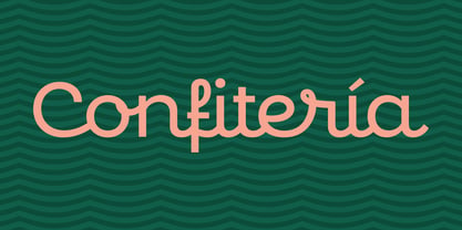 Confitería is the Spanish word for a shop where sweets and chocolates are made and sold, which sometimes has a tea room. And now Confitería is also a font that brings to mind lettering piped on delicate cakes ... sweet but never sickly. This font captures something of that simple and innocent beauty of traditional confiterías, where good manners will never go out of fashion, menus are elegant and time comes to a standstill to make way for life’s little pleasures. A confitería is a perfect place to share sweet tidbits with a friend or date, eavesdrop on the conversation at the next table, read a book, or just people-watch from the window. I celebrated my last birthday at one. There is one iconic confitería in Buenos Aires that I love more than the rest because, some 60 years ago, it put up its marvellous sign and never took it down. Walking by it is sure to bring a smile to your face. It’s big. Very big. And the lettering in its name is written in a timelessly beautiful vertical script – the most attractive I have ever seen. I joined forces with Sol Matas – who worked with me to update the Montserrat font –to design this geometrical connected font with pleasant, even strokes. It is elegant and saccharine-free. And to top it off, it comes in several flavors. Welcome! What can we get you?
 - Bold Pen Lettering JNL by Jeff Levine,
$29.00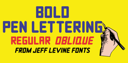 The title on the cover of Street & Smith’s “Wild West Weekly” for Jan. 27, 1934 made for an interesting contrast in terms. Here was a pulp magazine dedicated to stories of the Old West, but its title was hand lettered in an extra bold, squared shape style using a round pen nib – not exactly an alphabet that represented cowboys and desperados… This aside, this type style made for a good digital font revival, and it is now available as Bold Pen Lettering JNL in both regular and oblique versions.
 - Monkton by Club Type,
$36.99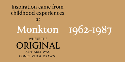 The inspiration for this typeface family came from my childhood experiences at West Monkton, amidst an historic part of the South West of England. Studies of the original incised capitals of the Trajan column in Rome were analysed and polished for this modern version. The lower case letterforms and numerals were then created in sympathy, taking their proportions from the incised letters of local gravestones. Its name honours not only the area where the original alphabet was conceived and drawn, but also the people responsible for fostering my initial interest in letters.
 - Alter Aves by Glen Jan,
$30.00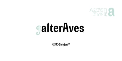 Alter Aves type is the first part of AlterType project – the serie of small display typefaces based on letterings, left-off types and altered foundry typefaces. Alter Aves is display condensed sans-serif typeface with couple of geometric-round letters, serif-styled elements and flat brush strokes. It supports Latin Extended-A (Western, Central Europe, Baltic, Turkish) and Cyrillic encoding languages and minimal opentype features – oldstyle digits, case sensitive punctuation, small-numeric forms and scripted fractions. Fully functional Demo style is distributed free for non-commercial using.
 - Paradroid by The Northern Block,
$25.99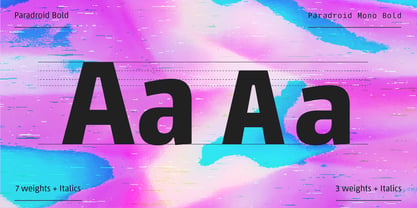 A pragmatic sans-serif which sits in the centre on the grotesque to geometric style spectrum. Equal measures of both letterforms create a neutral type family that is modern, functional, and easy to read without being too distracting. Details include seven proportionally spaced weights and four monospaced weights, both with matching italics, 750 characters with an alternative lowercase a and g, twelve variations of numerals with stylistic zero’s, Opentype features inferiors, superiors, fractions, case-sensitive punctuation, and language support covering Western, South and Central Europe.
 - Queenica by Artisticandunique,
$55.00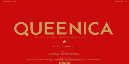 Queenica - Sans serif font family - Multilingual supports, 12 Style If you're looking for a stylized sans serif font, Queenica might be the font you're looking for with its unique structure. Queenica is a distinctive modern sans serif font. It offers rich solutions to your creative projects with its alternative versions. You can easily use the sans serif font feature in many areas. You can create your text with normal characters and highlight bold characters and titles. This font offers a wide variety of styles to help you discover the best mood for your projects, from body text to large headlines, from classic to modern and bold styles. Well suited for books and magazines, magazine covers, editorials, headlines, websites, logos, invitations, branding, advertising and more. CHARACTER RANGES : Basic Latin, Latin-1 Supplement, Latin Extended-A, Latin Extended-B, General Punctuation, Currency Symbols, CJK Symbols And Punctuation, Private Use Area (plane 0), Alphabetic Presentation Forms -Uppercase typeface -Lowercase typeface -Numbers -Symbols With this font you can create your unique designs. If you have a question, please contact me. Have a good time.
 - Nusara by Locomotype,
$19.00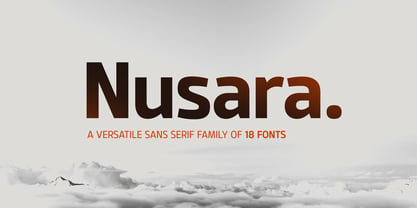 Introducing Nusara, the contemporary sans serif font that's taking the design world by storm. With its classic typography and modern twist, Nusara is the perfect font for designers who want to make an impact. Whether you're creating text or display materials, Nusara is versatile enough to handle it all. Nusara is also incredibly easy to read. Its clean lines and well-designed characters make it a breeze for your audience to read your message. And because it comes in nine weights—from Thin to Black—with matching italics, you have plenty of options when it comes to customizing your design. Whether you're creating a website, a brochure, or a social media post, Nusara is the perfect font for the job. With its contemporary look and feel, and its classic typography roots, it's a font that's sure to make an impact. So why not add Nusara to your design toolkit today? With its versatility, readability, and nine weights to choose from, it's the perfect font for all your design needs.
 - Moviemania by Artisticandunique,
$40.00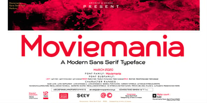 Moviemania - Sans Serif font Family - Multilingual - 12 STYLE Moviemania font family is a modern sans serif typeface with its sharp lines and soft turns that form its characteristic structure. It offers you two alternative concepts in your preferences with its sharp lines in upper cases and soft lines in lower cases. It has an ideal modern structure in your preferences for branding and identity creation in today's modern world. Absolutely perfect for movie titles, magazines, branding, branding identity, posters, logo designs, packaging designs, websites - all digital platforms and more! This font can meet your needs in all modern and classic creative projects. CHARACTER RANGES : Basic Latin, Latin-1 Supplement, Latin Extended-A, Latin Extended-B, General Punctuation, Currency Symbols, Letter like Symbols,Arrows, Mathematical Operators, Miscellaneous Technical, Geometric Shapes, Miscellaneous Symbols, CJK Symbols And Punctuation, Private Use Area (plane 0), Alphabetic Presentation Forms GLYPH COUNT : (543) Uppercase typeface Lowercase typeface Numbers Symbols Multilingual With this font you can create your unique designs. If you have a question, please contact me. Have a good time.
 - Baedar by Craft Supply Co,
$20.00 Introducing Baedar – Bold Rounded Sans Serif Font Baedar – Bold Rounded Sans Serif, a font designed to captivate your attention, is both inviting and approachable. Its rounded corners create a warm and friendly vibe that instantly draws in readers. Eye-Catching Appeal Baedar’s boldness immediately grabs your eye, making it perfect for headlines and attention-grabbing text. Whether it’s a poster, website, or marketing material, this font ensures your message unequivocally stands out. Versatile Usage Furthermore, with its rounded edges, Baedar exudes friendliness. Consequently, it suits a wide range of projects, from branding to social media posts, adding a touch of approachability to your content. Readability and Impact Moreover, Baedar combines readability with visual impact, making it ideal for conveying important messages with flair. Its boldness ensures crystal-clear clarity, while the rounded corners gently soften the overall look. In Conclusion Baedar – Bold Rounded Sans Serif Font strikes the perfect balance between eye-catching design and friendliness, making it an excellent choice for various creative endeavors. Therefore, seize your audience’s attention and convey your message effectively with this versatile font.
 - Sippin Midweek by Clevus,
$16.00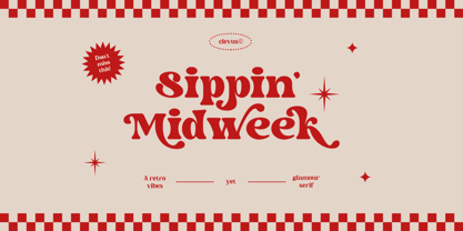 Proudly present Sippin' Midweek a retro vibes yet glamour serif. In "Sippin' Midweek," we blend retro charm with unmatched elegance. Its serif style provides a classic touch that speaks of the luxury of yesteryears. This font is suitable for poster designs, labels, and branding materials that require a classic and radiant ambiance. Add an elegant retro touch to your project with Sippin' Midweek. Font Features : Lettres, numbers, symbols, and punctuation 55+ alternates and ligatures No special software required they may be used even in canva, any basic program /website apps that allows standard fonts That's it folks! Multilingual Support Language Support: Danish, English, Estonian, Filipino, Finnish, French, Friulian, Galician, German, Gusii, Indonesian, Irish, Italian, Luxembourgish, Norwegian Bokmål, Norwegian Nynorsk, Nyankole, Oromo, Portuguese, Romansh, Rombo, Spanish, Swedish, Swiss-German, Uzbek (Latin) Follow My Shop For Upcoming Updates Including Additional Glyphs And Language Support. And Please Message Me If You Want Your Language Included or If There Are Any Features or Glyph Requests, Feel Free to Send me A Message. Have a Good Day !
 - Picture this: The Psiphoon BB font, a creation sprung from the whimsical mind at Blambot Fonts - a place where typefaces come to life with personality and pizzazz. Imagine if a comic book, a late-nig...
- Reach Story by Sronstudio,
$18.00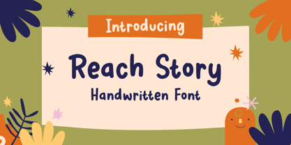 Reach Story is a Handwritten Font, this font Is perfect for product packaging, product designs, label, photography, watermark, special events, or anything. Reach Story comes with uppercase and lowercase letters, multilingual symbols, numerals, punctuation. If you have any questions please don't hesitate to drop me a message :) Thank You, Sronstudio
 - Fresh Cocktails by Sronstudio,
$12.00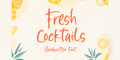 Fresh Cocktails is a handwritten font, this font Is perfect for lproduct packaging, product designs, label, photography, watermark, special events or anything. Fresh Cocktails comes with uppercase and lowercase letters, multilingual symbols, numerals, punctuation. If you have any questions please don't hesitate to drop me a message :) Thank You, Sronstudio
 - Magical Snow by Sronstudio,
$15.00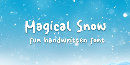 Magical Snow is a Handwritten Font, this font Is perfect for product packaging, product designs, label, photography, watermark, special events, or anything. The Snowday comes with uppercase and lowercase letters, multilingual symbols, numerals, punctuation. If you have any questions please don't hesitate to drop me a message :) Thank You, Sronstudio
 - Spring Plum by Sronstudio,
$18.00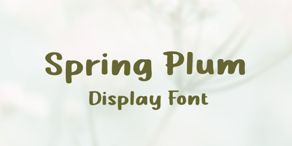 Spring Plum is a Handwritten Font, this font Is perfect for product packaging, product designs, label, photography, watermark, special events, or anything. Spring Plum comes with uppercase and lowercase letters, multilingual symbols, numerals, punctuation. If you have any questions please don't hesitate to drop me a message :) Thank You, Sronstudio
 - The Snowday by Sronstudio,
$15.00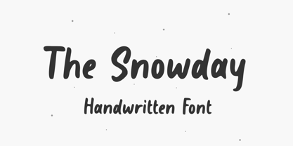 The Snowday is a Handwritten Font, this font Is perfect for product packaging, product designs, label, photography, watermark, special events, or anything. The Snowday comes with uppercase and lowercase letters, multilingual symbols, numerals, punctuation. If you have any questions please don't hesitate to drop me a message :) Thank You, Sronstudio
 - Always Lovely by Sronstudio,
$15.00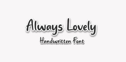 Always Lovely is a Handwritten Font, this font Is perfect for product packaging, product designs, label, photography, watermark, special events, or anything. Always Lovely comes with uppercase and lowercase letters, multilingual symbols, numerals, punctuation. If you have any questions please don't hesitate to drop me a message :) Thank You, Sronstudio
 - Sunday Snow by Sronstudio,
$15.00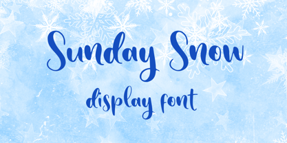 Sunday Snow is a fun Handwritten Font, this font Is perfect for product packaging, product designs, label, photography, watermark, special events, or anything. Sunday Snow comes with uppercase and lowercase letters, multilingual symbols, numerals, punctuation. If you have any questions please don't hesitate to drop me a message :) Thank You, Sronstudio
 - Naluka by Arterfak Project,
$20.00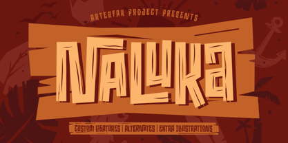 Introducing our brand new ethnic font "Naluka". Funny, joyful, and unique! The new exploration of the ancient-style font, inspired by the geometric tribal ornaments and wood texture applied to the font as the special effect to gives this font looks more fun and friendly! Naluka is created especially for specific themes such as summer, holiday, tropical, ethnic, cartoon, beach, cultural, children, and many more! This font is suitable for displays, packed with OpenType features that you can combine to express your concept! Font featured: Uppercase Lowercase Numbers & Punctuation Stylistic alternates Stylistic set Custom ligatures Multilingual characters Dingbats font Thank you so much for watching. Good luck and happy designing!
 - 1546 Poliphile by GLC,
$38.00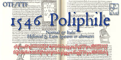 This family was inspired from the French edition of Hypnerotomachie de Poliphile ("The Strife of Love in a Dream") attributed to Francesco Colonna, 1467 printed in 1546 in Paris by Jacques Kerver. He was using a Garamond set (look at our 1592 GLC Garamond), including two styles: Normal and Italic (Normal carved by Claude Garamond, Italic we don't know; it was an Italic pattern very often in use in Paris at that time). We have modified the slant angle of the Capitals used with Italics because the Normal capitals were used in both styles in the original. The present font includes all of the specific latin abbreviations and ligatures used in this edition (with a few differences between the two styles). Added are the accented characters and a few others not in use in this early period of printing. Decorated letters such as 1512 Initials, 1550 Arabesques, 1565 Venetian, or 1584 Rinceau can be used with this family without anachronism.
 - Scorpio by Fine Fonts,
$25.00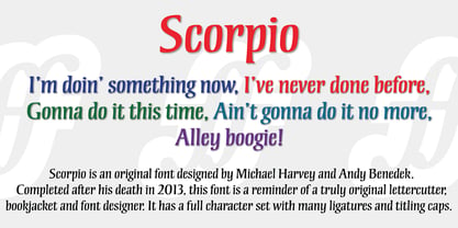 Scorpio is a font based on lettering Michael Harvey drew for the card “The Sign of The Nudge” which was designed in collaboration with the concrete poet, Ian Hamilton Finlay. The purpose of the card was to prompt those owing monies to IHF, into paying promptly. Michael also used it on some of the many book jackets he designed. As such, it is a condensed design necessary to enable a lot of text to be fitted with a restricted space. Scorpio has both style and verve. It was designed to attract the attention of potential purchasers browsing the shelfs in bookshops. In fulfilling this rôle, it succeeded admirably. In all these respects, it is unquestionably a unique Michael Harvey design. When Michael died in 2013, this font existed as a drawing of the basic upper and lower case letterforms plus numerals. Andy Benedek’s contribution to Scorpio was to digitise the existing letterforms and then create the remaining characters necessary for a modern font.
 - Arco Web by Okaycat,
$29.95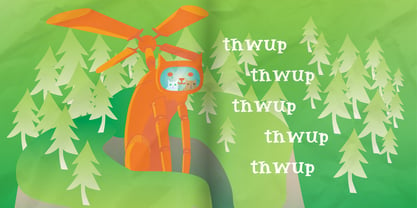 The Arco Web font sets a friendly mood with casual artistic flair. Arco Web features extended characters, and contains West European diacritics & ligatures. Highly suitable for international environments & publications.
 - Sabor by Intellecta Design,
$59.90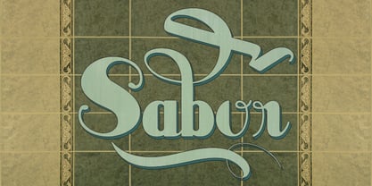 Sabor is a voluptuous upright connected display font with mixed taste of script fonts. There were many inspirations for Sabor, but all started with a book from the 1950s about the battles of World War II. To that first sketches of a naive dense display typeface we, day by day, start to create a mixed style evolving some lettering concepts from 1950s, some calligraphy notions and the first display ideas. The feeling of this font is good to be used in many artworks, like logos, packaging, party invitations, layouts for t-shirts, magazine headings, and much more, since websites to and all kind of printed jobs. That font is not really a script, but, like the scripts we strongly recommends to use the caps only in the beginning of words and sentences, to contrast with the lower cases : it’s not designed for all-caps settings, so avoid that kind of use. This font has almost 700 glyphs and supports the most important Latin-based languages. We works hard in a tour-de-force kerning: over 12.000 kerning pairs soft adjusted handily. Its OpenType features include final forms, initial forms, special sets (upper and lowercase's), hundreds of contextual alternates ligatures providing letter-form variations and connections that make your designs really special, and ornaments (tails). Because of its high number of alternate letters and combination's, we suggest the use of the glyph palette to find ideal solutions to specific designs. The sample illustrations will give you an idea of the possibilities. You have full access to this amazing stuff using InDesign, Illustrator, QuarkXpress and similar software. However, we still recommend exploring what this font has to offer using the glyphs palette: principally to get all the power of the Contextual Alternates feature. You can get an idea of the power of this font looking at the “Sabor User Guide”, a pdf brochure in the Gallery section. Also available two sister fonts easy to use : SaborWords and SaborRasgosEscritura Sabor has original letters designed by Iza W and overall creative direction plus core programming by Paulo W.
 - Dashie by Muksal Creatives,
$17.00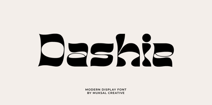 The "Dashie" font is a captivating modern display typeface with a strong feminine touch. Designed with a blend of retro and vintage elements, this font carries an elegant and alluring vibe. Dashie boasts smooth lines while still exuding gracefulness. Each letter possesses a unique form, with soft contours and slightly curved angles, delivering a sense of sophistication and timelessness. This font is exceptionally fitting for creating feminine branding logos due to its gentle yet powerful characteristics. When integrated into designs, Dashie has the ability to infuse a classic touch of retro or vintage, emanating an aura reminiscent of the past yet maintaining a fresh and modern feel. Dashie is the perfect choice for crafting a visually captivating and memorable identity for brands seeking to stand out with an elegant, feminine style, while incorporating retro or vintage nuances into their brand.
 - Oops by Posterizer KG,
$22.00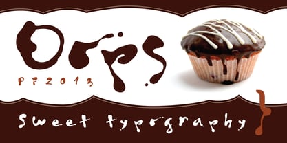 The initial idea for the Oops font, was to create graphemes, and by using them it could imitate a mark of a spilled liquid-stain. In an attempt to make the most convincing effect, those graphemes were written on glass. The final appearance of the graphemes, mostly remain in their basic form, and have the characteristic of a liquid, like fluidity in motion. This manuscript is expressive, but that does not affect the readability of the letters. The generated font was created by using Photoshop, Illustrator and a little bit of interventions in Font Lab. Font Oops is updated and edited version of an old version of the Art decor font, which had just basic letters. Today, Oops font contains Latin and Cyrillic letters, and it can be ideal for use in subjects like a paintball, art, expression, ink, water...
 - Huerto by Stiggy & Sands,
$24.00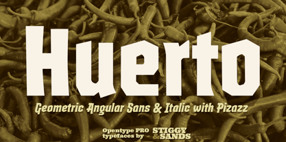 A Geometric Angular Sans & Italic with Pizazz The Huerto Family began as a digitization of a film typeface from LetterGraphics known simply as "Horino Bold". The original specimen included standard Capitals and Lowercase, Numerals and limited punctuation. We've fleshed out the original style and added a true italic with swash alternates to the family. Where the original had a feeling of rugged permanence to it, the italic with swashes adds a fleeting dynamic appeal. Opentype features include: - Full set of Inferiors and Superiors for limitless fractions. - A small collection of Standard Ligatures. - A small set of Stylistic Alternates - Swash Capitals for the Italic style only. Approx. 423 Character Glyph Set: Each style of Huerto comes with a glyphset that includes standard & punctuation, international language support, and additional features. Huerto Italic has a 565 character glyphset due to additional swash and alternates.
 - Double Back by Comicraft,
$19.00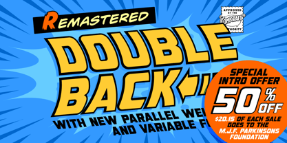 Great Scott, Marty! This font is your density, charged up to 1.21 gigawatts through the Power of Love! Originally created by Comicraft for the official BACK TO THE FUTURE fan club, Remastered DOUBLEBACK has been rebuilt from the ground up, with a new vertical “Curve” weight, six new “Parallel” weights, stylistic alternate letters AMNUWY, and language support for Western & Central Europe and Vietnamese. And if that weren't enough, we've traveled into the future and brought back Solid & Open Variable Fonts which provide precise control of Time and Warp! We cannot be held responsible for any ruptures in the space-time continuum due to use of these fonts. SPECIAL INTRO SALE: from October 21 through November 12, get DoubleBack at half price and we will donate $20.15 of each sale to the Michael J. Fox Foundation for Parkinson's Research. We love ya, Mike.
 - Mamute by PintassilgoPrints,
$18.00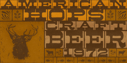 Mamute is a block rockin' family with a cool letterpress look. Its upper- and lower-case slots hold glyphs with slightly different textures for a natural look. Numbers and punctuation marks also have alternate versions. Just trigger the Contextual Alternates feature to easily cycle the alternate glyphs, preventing double letters from displaying the same texture. Mamute is a highly decorative typeface available in 2 widths, regular and condensed, each also offered as a layered font, a handy and playful way for adding shades to your composition. There’s also a generous ornaments font and a catchwords one to spice up your designs. Mamute is based on Aldine wood type spirit (as there were many incarnations of it!), from circa 1870. Please note that this family has a limited character set and doesn't bring diacritics nor accented characters. But yet it does rock, you bet!
 - Bredagh by Tony Fahy Font Foundry,
$25.00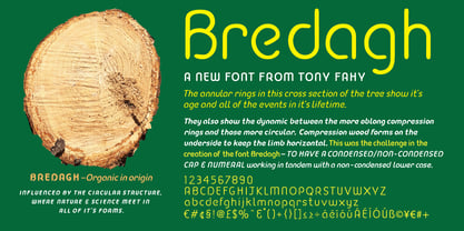 Bredagh (pronounced Braid-ah) is a happy font! It can bring a smile to your face, yet is at one with science and mathematics and the Arts. The first presentation is in a Poetry book. Overall, it is a strong and capable font. The organic nature of the font Breadgh is in Nature itself, with the roundels as found in the cross-section of a tree, for example, both circular and rounded oblong shapes, influencing. Accordingly, some of the characters are of a condensed nature and some are not. The lower case does not have the condensed aspects but the numerals do. In the creation of Bredagh, it was the dynamic between all of these that was part of the challenge. And to make them all work together subtly to be in overall harmony—was the ultimate challenge.
 - Kelsy Fantastic by Great Studio,
$13.00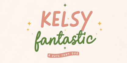 Kelsy Fantastic is a charming and cute new hand-lettered font duo - perfect for casual type in greeting cards, illustrations, quotes, quaint branding, book covers, children's books, packaging and so much more. Suitable for short and sweet quotes, as well as longer meaningful paragraphs. Designed and kerned with care and love to make using it a breeze. Please don't hesitate to contact me if you have any questions! Happy creating!
 - Giselle Dolicia by Luhop Creative,
$12.00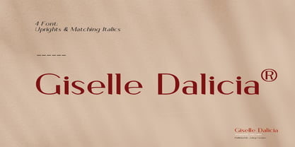 Giselle Dolicia is an elegant and assertive serif font. Fall for its ravishing style and use it to create gorgeous wedding invitations, beautiful stationary art, eye-catching social media posts, and much more! Giselle Dolicia is also included full set of: uppercase and lowercase letters multilingual symbols numerals punctuation standard ligatures Wish you enjoy our font and if you have a question, don't hesitate to drop message & I'm happy to help :)
 - Eastside by TypeArt Foundry,
$45.00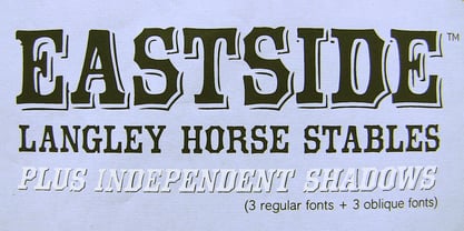 Printed text from the Old West.
 - Brush Stroke by Letters&Numbers,
$21.00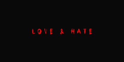 Use of a thick brush and expressive strokes make Brush Stroke a raw, bold typeface. It is suitable for headings and short paragraphs. Brush Stroke is extended, containing West European diacritics making it suitable for multilingual environments and publications.
 - Typist Slab Mono by VanderKeur,
$25.00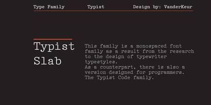 The typeface Typist originated during an extensive research on the origin and development of typewriter typestyles. The first commercially manufactured typewriter came on the market in 1878 by Remington. The typestyles on these machines were only possible in capitals, the combination of capitals and lowercase came available around the end of the nineteenth century. Apart from a few exceptions, most typestyles had a fixed letter width and a more or less unambiguous design that resembled a thread-like structure. A lot of this mechanical structure was due to the method the typestyles were produced. Looking at type-specimens for print before the first typewriters were good enough to came on the market we can see that in 1853 and in 1882 Bruce’s Type Foundry already had printing type that had a structure of the typewriter typestyles. Of course printing types were proportional designed as typewriter typestyles had a fixed width. So it is possible that except from the method of production for typewriter typestyles, the design of printing types were copied. In the design of the Typist, the purpose was – next to the monospace feature – to include some of the features of the early typewriter typestyles. Features such as the ball terminals and the remarkable design of the letter Q. This new typeface lacks the mechanical and cold look of the early typewriter typestyles. The Typist comes in six weights with matching italics in two versions. One that resembled the early typewriter typestyles (Typist Slab) and a version designed with coding programmers in mind (Typist Code).
 - Typist Code Mono by VanderKeur,
$25.00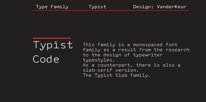 The typeface Typist originated during an extensive research on the origin and development of typewriter typestyles. The first commercially manufactured typewriter came on the market in 1878 by Remington. The typestyles on these machines were only possible in capitals, the combination of capitals and lowercase came available around the end of the nineteenth century. Apart from a few exceptions, most typestyles had a fixed letter width and a more or less unambiguous design that resembled a thread-like structure. A lot of this mechanical structure was due to the method the typestyles were produced. Looking at type-specimens for print before the first typewriters were good enough to came on the market we can see that in 1853 and in 1882 Bruce’s Type Foundry already had printing type that had a structure of the typewriter typestyles. Of course printing types were proportional designed as typewriter typestyles had a fixed width. So it is possible that except from the method of production for typewriter typestyles, the design of printing types were copied. In the design of the Typist, the purpose was – next to the monospace feature – to include some of the features of the early typewriter typestyles. Features such as the ball terminals and the remarkable design of the letter Q. This new typeface laks the mechanical and cold look of the early typewriter typestyles. The Typist comes in six weights with matching italics in two versions. One that resembled the early typewriter typestyles (Typist Slab) and a version designed with coding programmers in mind (Typist Code).