10,000 search results
(0.076 seconds)
- Sevigne by Reserves,
$39.99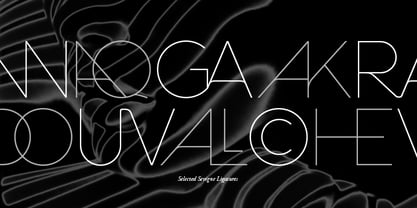 Sevigne [sey-vee-nyey] is a highly refined, contemporary geometric sans, inspired by the ambience of high-end fashion and luxury. The inclusion of over 130 unique ligatures expand its sensibility of alluring, well-balanced letterforms and distinctive style. Stylistically, as an all-caps typeface, Sevigne exudes a greater sense of harmony and polish due to its unicase form where the interplay of a limited amount of characters is the focus. Subtle, considered details are found within individual letters, contrasted by the complex, intersecting forms that make up the various ligatures. With multiple stylistic sets added to the expanded ligatures, individual letters and ligature pairs can be carefully exchanged to fine-tune text settings for a unique custom type solution. Features include: Precision kerning- Expanded set of over 130 Ligatures, including alternates (ae, oe, fi, fl, ffi, ffl, ffj, ff, fh, fj, ft, tt, th, ct, st, oo, og, go, ogo, gog, la, ea, ev, ew, fy, ez, et, oc, ga, do, uv, vu, yu, uy, nn, mm, xy, yx, ao, oa, ac, da, aq, nt, aa, ll, ss, ut, tu, ka, ca, ag, of, off, co, ne, nr, nl, nd, nk, hn, mn, me, mp, al, an, af, ar, ak, ah, ad, ab, and, gg, all, co, ço, he, the, tl, tn, tf, tr, tk, td, tb, te, am, ame, amb, tm, ap, tp, wu, uw, kt, tz, ra, za, mk, xx, yy, vv, ww, ky, fu, oq, cc, cq) Alternate characters (A, G, R, Q, Z, _, $, ®, •, ¶) Slashed zero Full set of numerators/denominators Automatic fraction feature (supports any fraction combination) Extended language support (Latin-1 and Latin Extended-A) *Requires an application with OpenType and/or Unicode support.
 - Fontleroy NF Pro by CheapProFonts,
$10.00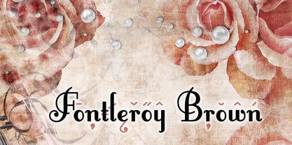 I have completely redone the spacing in this font, making the sidebearings more conventional. And after replacing the kerning with fresh pairs working together with the new spacing the font looks like a real gem. I love it! The inline version has a wider spacing after the letters CEK = no connecting words. Otherwise just as lovely and retro! Nick Curtis says: "Here’s a strange hybrid: I took the lower case from the formal script font Stuyvesant, straightened out its rather extreme 22° slant, and combined them with caps from the font Bellevue, again making them upright, and adding an inline effect. The result is a font that flows very nicely, with a nice balance between clean lowercase characters and swashy caps. Thanks to Deb Dunbar for naming this font. Fontleroy Brown is the solid version, produced at the request of the King of Ding, Jeff Levine." ALL fonts from CheapProFonts have very extensive language support: They contain some unusual diacritic letters (some of which are contained in the Latin Extended-B Unicode block) supporting: Cornish, Filipino (Tagalog), Guarani, Luxembourgian, Malagasy, Romanian, Ulithian and Welsh. They also contain all glyphs in the Latin Extended-A Unicode block (which among others cover the Central European and Baltic areas) supporting: Afrikaans, Belarusian (Lacinka), Bosnian, Catalan, Chichewa, Croatian, Czech, Dutch, Esperanto, Greenlandic, Hungarian, Kashubian, Kurdish (Kurmanji), Latvian, Lithuanian, Maltese, Maori, Polish, Saami (Inari), Saami (North), Serbian (latin), Slovak(ian), Slovene, Sorbian (Lower), Sorbian (Upper), Turkish and Turkmen. And they of course contain all the usual “western” glyphs supporting: Albanian, Basque, Breton, Chamorro, Danish, Estonian, Faroese, Finnish, French, Frisian, Galican, German, Icelandic, Indonesian, Irish (Gaelic), Italian, Northern Sotho, Norwegian, Occitan, Portuguese, Rhaeto-Romance, Sami (Lule), Sami (South), Scots (Gaelic), Spanish, Swedish, Tswana, Walloon and Yapese.
 - Aerle by Hackberry Font Foundry,
$24.95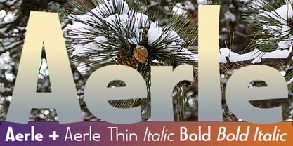 My first font for 2009 was Aerle. It is a new dark sans serif font in my continuing objective of designing book fonts that I can really use. It made a little ripple in the industry, but more than that I found that I loved it with Aramus and Artimas — my latest book font family with the same proportions. In many ways, Aerle is a very different direction for me built on what I have learned on Aramus and other recent developments in my style. The concept came to me while using Bitstream's Mister Earl on a site online—though there is no direct reference. I wanted a more playful heavy sans with a much smaller x-height than I have been using lately, plus taller ascenders. As I was using Aerle, I constantly needed a light and bold version. The new direction I am taking is a result of a decision that my fonts, though I loved the character shapes, produced an even type color that is too dark or a little dense. Aerle was an attempt to get away from that look even though the letterspacing is quite tight. For Aerle Thin I pushed a little further in that direction and increased the letterspacing. The hand-drawn shapes vary a lot, many pushing the boundaries of the normal character. This gives a little looseness and helps the lightness in feel I am looking for. It will be interesting to see where this all goes. Most new type around the world is far too perfect for my taste. While the shapes are exquisite, the feel is not human but digital mechanical. I find myself wanting to draw fonts that feel human — as if a person crafted them. In most ways this is a normal font for me in that it has caps, lowercase, small caps with the appropriate figures for each case. These small caps were very small (x-height as is proper). So Aerle's small caps are a little oversize because they plugged up too bad at x-height size. The bold is halfway between. These size variations seem important and work well in the text. This font has all the OpenType features in the set for 2009. There are several ligatures for your fun and enjoyment: bb gg sh sp st ch ck ff fi fl ffi ffl ffy fj ft tt ty Wh Th and more. Like all of my fonts, there are: caps, lowercase, & small caps; proportional lining figures, proportional oldstyle figures, & small cap figures; plus numerators, denominators, superiors, inferiors, and a complete set of ordinals 1st through infinity. Enjoy!
 - Busan Garden by Ditatype,
$29.00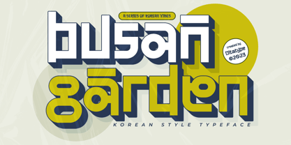 Busan Garden is a bold display font that brings the spirit of Busan to life. Inspired by the vibrancy of Korean aesthetics, this font exudes strength and cultural richness, making it a captivating choice for designs that demand a powerful and impactful presence. The characters in Busan Garden stand tall with a robust and thick weight, portraying a sense of confidence and solidity. The sturdy letterforms, characterized by sharp angles, create a visually striking appearance that captures the dynamic energy found in Korean design. Busan Garden is not just a font; it's a visual journey through the streets of Busan. In addition, enjoy the features here. Features: Alternates Ligature Multilingual Supports PUA Encoded Numerals and Punctuations Busan Garden fits in headlines, logos, posters, flyers, branding materials, greeting cards, print media, editorial layouts, and many more designs. Find out more ways to use this font by taking a look at the font preview. Thanks for purchasing our fonts. Hopefully, you have a great time using our font. Feel free to contact us anytime for further information or when you have trouble with the font. Thanks a lot and happy designing.
 - FormPattern Color Two by Tarallo Design,
$14.99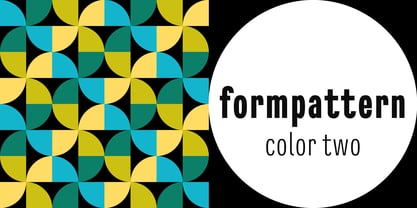 FormPattern Color Two is a dingbat font for creating borders, frames, lines, and patterns. It is made up of a versatile set of interconnectable shapes that can flow together to make lines, borders, and patterns. Try different letter spacing to connect the forms into a continuous pattern or to space them apart. Explore leading (line spacing) to create large areas of pattern. Work with layering and opacity to discover the color-mixing potential of this font. Web designers can use FormPattern to make unique horizontal rules. How does FormPattern work? Install is as a regular font and as you type you will get forms instead of letters. Most design software, such as Illustrator, InDesign, and Photoshop provide a glyphs palette where you can choose the precise form you want. Color fonts are supported by Photoshop 2017, Illustrator 2018, and QuarkXPress 2018 (and later versions). A solid uncolored font comes with every purchase and can be used in applications that do not support color fonts. It will appear black and can be colored in the usual ways. FormPattern Color Two is compatible with all other FormPattern fonts from Tarallo Design.
 - High Tide AT by Arctype,
$12.00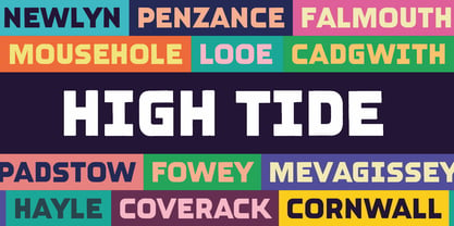 High Tide is inspired by the lettering made by the fisherman of Cornwall. Shapes made by hand that are created to be functional with a geometric precision, yet appear hand-drawn and human for an honest and sincere quality.
 - Povetarac Sans by Tour De Force,
$25.00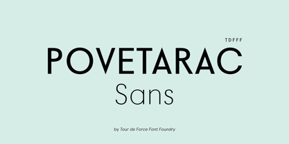 Povetarac Sans font family is part of Povetarac Superfamily together with Povetarac Didone and Povetarac Didone. Available in 6 weights with matching italics, Povetarac Sans relays on lively uppercase proportions that took inspiration from vintage typefaces. It is well balanced, elegant and fully recognizable sans serif family. With sharp overhang, Povetarac Sans works pretty well in all situations – from editorial use to branding, websites or just titles. Comes with Fractions and extended Latin character map.
 - ITC Stoclet by ITC,
$29.99ITC Stoclet is the work of British designer Phill Grimshaw, an offshoot of the research and experimentation which led to the development of ITC Rennie Mackintosh. It is a condensed, angular typeface, and its sharp angles, swooping curves and long forms are reminiscent of Art Nouveau. The font includes a number of alternative characters which enhance its flexibility. ITC Stoclet is ideal for large, ornamental designs as well as short blocks of text. - Los Muertos by Just My Type,
$25.00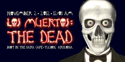 Happy Halloween (and All Souls Day and Day of the Dead)! I’ve seen other fonts made up of bones of various kinds, but none with this variety. Henry Gray’s Anatomy of the Human Body (the book, not Grey’s Anatomy, the TV series) was heavily scoured to find more unusual bones shaped like letters. You’ll find Los Muertos both fun and appropriate for the up-coming holidays. (Uppercase is Solid, lowercase is Outline).
 - Mozziano by Mostardesign,
$15.00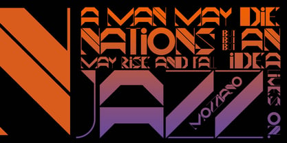 Created in 2010 by Olivier Gourvat, Mozziano is an elegant cross between geometric and round shapes. Its post-retro style opposes also fine and thick lines. This font can be used for very short texts however it is particularly effective for headlines in larger point sizes so that its details are emphasized. Mozziano best used in experimental designs. Mozziano contain an extensive character set that includes support for Central and Eastern European languages.
 - Axial cut by deFharo,
$21.00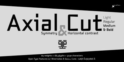 Axial Cut is a sans serif typeface (Latin Extended-A), a contemporary and rounded evolution of geometric fonts for screen, but this time the letters are built on an axial axis that results in trapezoidal counter-shapes, joints with reduced antlers and rounded corners that correct optical effects in small sizes to make the typography more legible, and at the same time, in large sizes it shows its original shapes. The Axial Cut typeface family is made up of four weights: Light, Regular, Medium and Bold, each with 785 characters. I have taken particular care with the metrics and dimensions of each letter or sign, with a very careful and precise kerning configuration to achieve the For maximum readability, these are fonts with slightly higher ascenders than capitals and short descenders to make it more compact. The editing possibilities and unique designs with these complex typefaces are very wide, the fonts have a complete set of uppercase letters and a lowercase set with alternative characters as well as lowercase letters and numbers in different positions (lowercase, denominators, numerals, and uppercase) that They also work as automatic fractions, they also incorporate small capital letters and three sets of alternative numbers (Normal, Old style numbers, Square numbers), etc. Discover other alternative signs, characters and Open Type functions in the PDF: Specimen & The Cheat Sheet.
 - Plinc Bubble Gum by House Industries,
$33.00 Bubble Gum is a juicy multi-dimensional gob of goodness that’s bursting at the seams with loads of alphabetic appeal. Its well-padded figure transforms the ample letterforms found in classic comic strip word balloons into a warm and casual display font with a little extra kick. Cooked up by Dave West for Photo-Lettering, Inc. between the late 1960s and early 70s, Bubble Gum was finally digitized by Jess Collins in 2011. Please note that the shaded version of the typeface is composed by layering the Regular font and a separate Drop Shadow font. Some assembly required. Like all good subversives, House Industries hides in plain sight while amplifying the look, feel and style of the world’s most interesting brands, products and people. Based in Delaware, visually influencing the world. Featured in: Best Fonts for Logos
 - Aldo Pro by Sacha Rein,
$21.17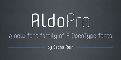 Aldo Pro is a contemporary sans serif OpenType font family designed by Sacha Rein. With 8 weights from hairline to black and an extended latin character set of 690 glyphs it is suitable for all typesetting needs, from advertising and branding to web and screen. Aldo Pro is the evolution of the free Aldo semi-bold font published on dafont.com in 2007, and which has been downloaded over 700.000 times. « I have gotten quite a lot of feedback on the original Aldo over the years and tried to integrate most of it into Aldo Pro. The x-height has been reduced to make for a less condensed, more legible font, which makes it more useful for body text than before. By popular demand the X glyphs have been changed to a more ‘classic’ shape. The font also contains some useful ligatures now. »
 - Isonorm by Linotype,
$29.99Isonorm was created in 1980 by the International Standards Organization (ISO). The font's design is simple, clean, and geometric, with strokes that all have rounded ends. Isonorm is a font whose forms are very legible by both the human eye and machine readers. The font is also a good choice for drafting and architectural purposes, as well as for technical charts and graphics. - Saint Bartogenia by Mans Greback,
$79.00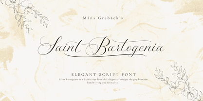 Saint Bartogenia is a handscript font that elegantly bridges the gap between handwriting and formality. Exuding a beautiful and lovely aura, this font is a perfect choice for wedding invitations and other elegant stationery. Its script form is both classy and fine, mirroring the artistry of traditional calligraphy with a modern twist. The thin, delicate lines of Saint Bartogenia create a sense of sophistication and grace, making each character swirl across the page like a light wind. Use underscore _ anywhere in a word to make a swash. Example: Ele_gant Use multiple underscores to make longer underlines. Example: Wonder___world The font is built with advanced OpenType functionality and guaranteed top-notch quality, containing stylistic and contextual alternates, ligatures and more automatic and manual features; all to give you full control and customizability. It has extensive lingual support, covering all Latin-based languages, from North Europa to South Africa, from America to South-East Asia. It contains all characters and symbols you'll ever need, including all punctuation and numbers. Saint Bartogenia is a manifestation of Mans Greback's commitment to combining aesthetic beauty with practical usability, making it a go-to choice for designers seeking to infuse their projects with a touch of finesse.
 - Allegroost by 38-lineart,
$14.00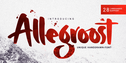 Allegroost is a handwritten font that uses a large brush in a horizontal position, so that the brush strokes vertically make the size large, opposite the horizontal strokes the size becomes small. To add to the natural impression, we complete many ligatures that adjust handwriting such as: ob, oc, od, og, oh, oi, oj, ok, ol, om, on, oo, op, oq, or, os, ot, ou , ov, ow, ox, oy, oz, bo, bd, bg, bi, br, bu, by, ee, ii, ll, tt, th, tl, lt, it, ti, iti, ld, ts, st , mm, nn This unique handwriting is perfect for logos, quotes, posters, fun letters, for clothing, or any design project. Equipped with 28 language support makes your brand can appear in various parts of the world
 - Briller by Kostic,
$40.00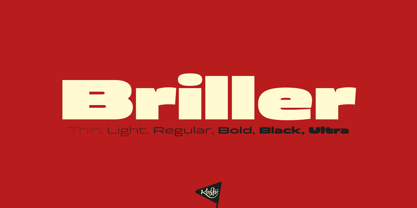 Briller is a super-wide display sans that covers 6 weights, from delicate Thin on one side to chunky Ultra on the other end. Briller tabular figures (via the OT feature) and most of figure related glyphs (such as monetary symbols) are the same width throughout the weights, leaving fun possibilities in pairing them up in contrast while retaining that sense of tabular order. Briller has a character set to support Western and Central European languages. Each weight includes ligatures, proportional lining and tabular figures, fractions and scientific superior/inferior figures.
 - Bryce Pro by SoftMaker,
$15.99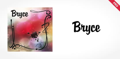 While most script typefaces are slanted, Bryce is an upright script. Bryce can be used everywhere where an informal, handwritten style is desired, for example in signage and on posters. SoftMaker’s Bryce Pro typeface comes with a huge character set that covers not only Western European languages, but also includes Central European, Baltic, Croatian, Slovene, Romanian, and Turkish characters. Case-sensitive punctuation signs for all-caps titles are included as well as many fractions, an extensive set of ligatures, and separate sets of tabular and proportional digits.
 - Sina Nova by Hoftype,
$-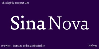 Sina Nova is the slimmer sister of Sina. It has a slightly vertical tendency, a higher x-height which makes it more open in small text sizes. Its economical proportions allow an even more universal application. Sina comes in 12 styles and in OpenType format. All styles contain standard and discretional ligatures, small caps, proportional lining figures, tabular lining figures, proportional old style figures, lining old style figures, matching currency symbols, fraction- and scientific numerals. Sina supports Western European, Central and Eastern European languages.
 - Bazar by Linotype,
$29.99German Designer Klaus Sutter digitized Bazar, a brush script typeface from the 1950s originally drawn by Imre Reiner (1900-1987) and published in 1956 by D. Stempel AG. Bazar is a calligraphic brush type free from accurate horizontal and vertical strokes and a contrast to the objective body type. It has a more static character and could be perfectly applied in headlines or as a figurative word mark. Like tradional chinese calligraphers, Imre Reiner was also a painter; this is reflected in the glyphs of Bazar. - Reflex by Sudtipos,
$29.00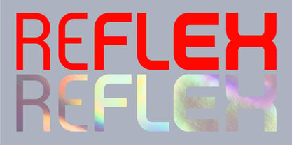 Reflex update: Now in 18 styles and variable version. Reflex was designed as an alternative to many overused types found on the packaging of pop culture products. Taking its inspiration from Bauhaus design roots, even in its heavy weights it maintains a soft aesthetic that can transparently convey a message of newness and understanding, as well as clarity and evenness. The Reflex set comes with a wide range of linguistic support, at no extra charge, including characters for Central European, Cyrillic, Greek, Turkish and Baltic regions.
 - Rossika by ParaType,
$25.00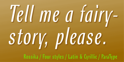 Rossika is a four-style typeface designed by Oleg Karpinsky in 2002-2004 for the ParaType company. The general design and some letterforms were borrowed from antique Russian typefaces of XV-XVIII centuries. For example, the upper Cyrillic N has a diagonal stem, a tail of Ц character is attached in the center unlike major contemporary designs. Some characters have alternatives. There are several Latin and Cyrillic ligatures. Rossika is intended for logos, headlines and short text blocks: posters, calendars, post cards, diplomas, certificates and the like.
 - Northeast Railway by Fabio Ares,
$9.99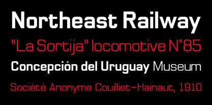 Northeast Railway is a product of argentine typographic archeology project called "Tipografía Histórica Ferroviaria" (Fabio Ares & Octavio Osores, since 2012). Is about the signboards of the stations of the line of the Argentine North Eastern Railway Company Limited (1987-1948). The letter of this signboards can be described as display type, with elementary geometric shapes and without line modulation. The principal font of the resultant family is the bold. The family is completed with complementary fonts of different styles. The proceeds from the sale of the fonts will be used to finance the project.
 - Outbacker by Rook Supply,
$14.00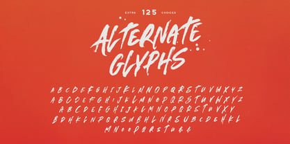 With Outbacker you're not just getting a typical a-z font. You're getting a font that has over 100 alternate glyphs, so that you can use the font to write phrases a ton of different ways. So, if you're looking for the perfect 'R', you have 6 additional options to choose from in addition to what's programmed for the default uppercase and lowercase characters. Choose more sharp characters if you're going for something more aggressive, or more rounded characters if you want something with more of a laid back flow.
 - Cadora Woods by Hanoded,
$15.00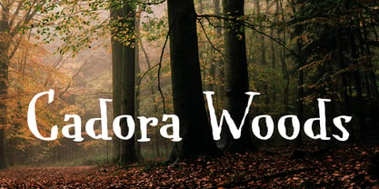 Last year I walked half of Offa’s Dyke path, a long distance trail on the Welsh/English border. Walking the trail, I came across a beautiful stretch of forest with a lovely name: Cadora Woods. Cadora Woods font was made with a Japanese brush pen. It sort of looks medieval and a friend of mine suggested it would be the font of choice for maps of ‘The Shire’. I guess that is true, but I am convinced you can come up with some innovative uses for this font!
 - Brillian by Fontex,
$29.00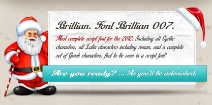 A lot of time and effort has been put into the process of creating the Brillian Font. A careful analysis of the current font market and overly increasing customer needs have shaped Brillian’s final appearance and content. We don't have a precise target audience for Brillian, since the amazing amount and structure of the chosen characters enables a very wide utilization. Its look and feel came from a different designing approach, so that it can successfully satisfy the needs of even the neediest. Shining with calm and dignity, while in the roots being aggressive, it has successfully connected classic and modern styles - representing its largest value. A most complete set of Cyrillic, Greek and Latin characters included.
 - Black Donshine by Letterhend,
$17.00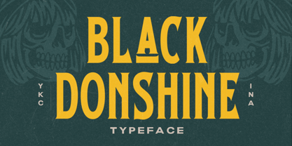 Black Donshine is a display typeface that demands attention with its bold in vintage looks. The sharp hooks and strong lines create a sense of toughness. This font is perfect for designs that require a bold and modern look, such as logos, posters, and advertisements such as invitations, labels, logos, magazines, books, greeting / wedding cards, packaging, fashion, make up, stationery, novels, labels or any type of advertising purpose. Features : - Uppercase & lowercase - Numbers and punctuation - Alternates & Ligatures - Multilingual - PUA encoded We highly recommend using a program that supports OpenType features and Glyphs panels like many of Adobe apps and Corel Draw, so you can see and access all Glyph variations.
 - Delator by FedeBiagioli TypeFoundry,
$30.00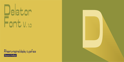 Delator font is a display typeface, inverted contrast, and condensed. Inspired by the personal experience of the designer who, with resilience and daily struggle, managed to get ahead. Its name is linked to the song of an Argentine rock artist called "Corazón delator", this means that it is a typeface that does not go unnoticed, it attracts attention for its shapes and its way of being and above all, when it is present, it automatically "gives itself away".
 - Sandigan by Lurinzu Studios,
$12.25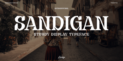 “Sandigan" is an rustic, organic, sturdy and expressive display typeface that is inspired by the characteristic and vibes of male filipinos. Sandigan also means foundation in english. This typeface is developed with the intention to be used in display medias to maximize the stylized shapes of each character. This typeface is best used when you want to express elegance, class and sophistication in your designs. *This font includes letters, numbers, multi-language, and all essential marks needed.
 - Salacious by PizzaDude.dk,
$18.00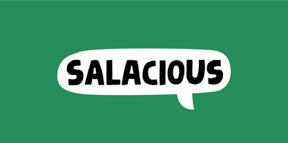 Salacious is my soft/rough all-caps font, inspired by both comics and grafitti. The weight and width of the letters varies a bit. Not in a disturbing way, but more in a lively and organic way. I've added 5 (slightly) different versions of each letter (which automatically cycles as you type!) The letter shapes are a bit rough, due to the fact that they are handmade, and all corners are rounded, which gives a nice soft look!
 - Bronzier by Arterfak Project,
$13.00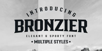 Bronzier is a strong serif display family with 8 different styles. Bronzier was designed with a strong and sharp serif which gives it a more manly look. Sporty, vintage and modern taste at the same time which mean you can use this font family for many design styles. Inspired by old-school typography and modern style. Create a perfect design with Bronzier! Because Bronzier is suitable for logos, logotypes, apparel, jersey, tags, labels, posters, stickers, branding and more.
 - Barley by KA Designs,
$12.00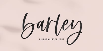 Barley is a fantastic choice when you are looking for a script font with a modern touch. This font is hand-lettered, which gives it an authentic style. It will add a luxurious touch to any design project that you wish to create! This font is perfect for creating wedding decor and invitations, branding, logos, signatures, product packaging and much more!
 - Folio by Bitstream,
$29.99Designed by Konrad Bauer and Walter Baum in 1956, Folio was the first popular Swiss Sanserif; the positive black shapes of the letters appear to be locked inevitably into the correct position by the firm and positive white shapes that surround them. - Glarestha by Mevstory Studio,
$25.00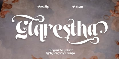 Glarestha is a modern high-contrast display font with bright positive character. Clean forms and a bit curly letter ends creates a friendly mood in any designs. It comes with Regular version, Opentype features (stylistic alternates and standard ligatures). The easiest way to get alternate is to add number after character (for example A2, A3) or add Underscore after end character (for example a r). The full set of alternates you can find in font presentation. Faery Dream font is perfect for headlines, magazines, logotypes, food package, advertising and many others. Multilingual Support
 - Maister by Dora Typefoundry,
$19.00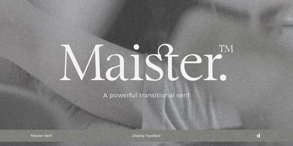 Maister is a contemporary look serif typeface with sharp and dynamic strokes, strong contrasts that are subtle. Giving traditional serif design elements a modern feel, this is a graceful and confident set of timeless simple, easy-to-read typefaces that can easily become a staple in your font library perfect for branding, logos, invitations, magazines, product packaging, and more. Features: All Caps Font with different uppercase and lowercase Number & Symbol Supported Languages Alternates and Ligatures PUA Encoded We highly recommend using a program that supports OpenType features and Glyphs panels like Adobe apps and Corel Draw, so you can see and access all Glyph variations. This type of family has become the work of true love, making it as easy and fun as possible.I really hope you enjoy it! Thank you Enjoy the font and go get creative :)
 - Lavamora by Mchcrafter,
$16.00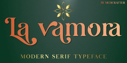 La Vamora is a Modern Stylistic Serif typeface A new serif that we created specially for branding needs, with extra ligatures and alternates in a unique shape just to add value to your brand. It so nice to leverage designer or product owner that need solutions to make their design look more stylish and modern. And specially for La Vamora font, We prepared all the ligatures, and the alternates characters to help you create unlimited variations for your creative needs. La Vamora includes: All uppercase & lowercase letters All numbers 0-9 & Punctuation Ligatures & Alternates Symbols Multiligual Letters
 - Boudoir by Juraj Chrastina,
$29.00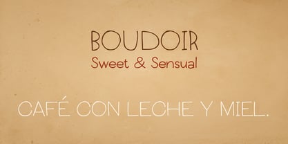 Come into the boudoir. This simple hand-drawn sans tries to invoke the same feelings as its name - and not to be overluscious. Boudoir is sweet and sensual like women, but it’s at the same time uncluttered and masculinely straightforward. The font borrows some playful capital shapes from the all caps Baronessa and draws inspiration for others from old classics. Thanks to the bolder weights, it can also be used in smaller sizes, you can combine different weights for different sizes to obtain a more balanced look, or you can just give emphasis using different weights.
 - Bakira by Mchcrafter,
$18.00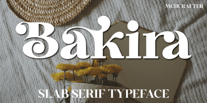 Bakira font is a Modern Stylistic Slab Serif typeface A new slab serif that we created specially for branding needs, with extra ligatures and alternates in a unique shape just to add value to your brand. It so nice to leverage designer or product owner that need solutions to make their design look more stylish and modern. And specially for Bakira, We prepared all the ligatures, and the alternates characters to help you create unlimited variations for your creative needs. Bakira includes: All uppercase & lowercase letters All numbers 0-9 & Punctuation Ligatures & Alternates Symbols Multiligual Letters
 - Corsair PE by Rosetta,
$70.00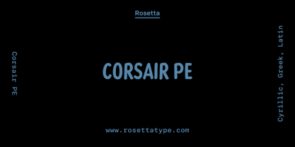 Corsair is a rugged font with a handcrafted touch. Familiar and easy to work with, it has a worn-in feel that slots right into your typographic toolkit like you’ve known it all along. Originally commissioned by Best Made Co., its functional beauty was shaped to mimic the idiosyncrasies of handwriting. Naturally randomised letterforms lend it authenticity, while weathered edges and subtle variations add a hospitable charm. The effect is an honest, approachable, and organic look that’s careful, but that doesn’t overthink it. Goes well with packaging, branding, and product lookbooks alike. Like a writer’s favorite pen, it gets even better with age.
 - Air Circus JNL by Jeff Levine,
$29.00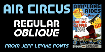 A 1930s advertising poster for the Inman Brothers Flying Circus offered up an interesting hand lettered Art Deco design that’s a cross between both squared and rounded character shapes. Because of it's 'futuristic look', the resulting type style can also lend itself to 1970s and 1980s retro projects as well as those from the 1930s and 1940s. Now a digital font, Air Circus JNL is available in both regular and oblique versions. A “Flying Circus” is a troupe of ‘barnstormers’ (stunt pilots) who performed aerial tricks either individually or as a team along with selling airplane rides to the general public.