10,000 search results
(0.097 seconds)
- Roaster SS by Sensatype Studio,
$15.00 Roaster is a Stylish Elegant Font In a new generations, we analyze that any designer or brand owner need to make their brand standout. As our focus that analyze any typeface that helps to leverage any logo design to look more modern and unique. We prepared this font with any unique characters to help you create unlimited variations for your creative needs. Roaster font ready with: Any options to get creative variations with unique letters 5 Styles Font (Black,Bold,Reguler,Thin,Light) Preview as a inspirations that you can do with Roaster font Ready with Lowercase and Uppercase characters Wish you enjoy our font. :)
 - Vintage Signature by Nathatype,
$29.00 Looking for a font that will make your branding stand out? Do you want to make a touch of elegance and retro for your designs? This font was created for you! Vintage Signature- A Script Font Vintage Signature is a fabulous signature font, carefully handcrafted combined with a little bit retro style to become a classic favorite. Its casual charm makes it appear wonderfully down-to-earth, readable and, ultimately, incredibly versatile. Vintage Signature will look outstanding in any context, whether it’s being used on busy backgrounds or as a standalone headline! Well suited to titles, poster designs, branding, logos, and many more. Our font always includes Multilingual Support to make your branding reach a global audience. Features: Ligatures Stylistic Set PUA Encoded Numerals and Punctuation Thank you for downloading premium fonts from Natha Studio
 - Lavone by Nathatype,
$29.00 Ready to enhance your branding? Looking for that “something” that’ll make your audience go WOW and clients get on board immediately? Maybe you’re looking for the perfect font to use on your wedding invitations or branding? Whatever you need - we’ve got JUST the thing for you! Lavone-A Serif Font Lavone is a elegant serif typeface. Designed primarily as a captivating handcrafted with style. This typeface that is easy on the eyes font that excels at captivating headlines, or large branding text, the font oozes that cute aesthetic that just makes you go “aww!” Our font always includes Multilingual Support to make your branding reach a global audience. Features: Alternates Ligatures Stylistic Sets Swashes PUA Encoded Numerals and Punctuation Thank you for downloading premium fonts from Natha Studio
 - Corner Deli by Fenotype,
$25.00 Corner Deli is a layered script & sans pack inspired by American commercial sign culture. Corner Deli has three base fonts and four layer options for each + there is a set of extra end swashes for Corner Deli script and layers for them too. Corner Deli is easy to use, just write the same text with different layer-fonts and colors and stack them on top of each other: check the gallery for more detailed instructions. Corner Deli is a great family for any display use, especially for branding, packaging, menus & posters from print to online and it works stunning even without the layers.
 - Core Sans AR by S-Core,
$19.00 Core Sans AR Family is a rounded version of Core Sans A that is clean, simple and highly readable. It is a part of the Core Sans Series such as Core Sans N, Core Sans M, Core Sans E, Core Sans A, Core Sans D, Core Sans G, Core Sans R and Core Sans B. Letters in this type family are designed with genuine neo-grotesque and neutral shapes without any decorative distractions. The spaces between individual letter forms are precisely adjusted to create the perfect typesetting. Core Sans AR family consists of 8 weights (Thin, Extra Light, Light, Regular, Medium, Bold, Extra Bold, Heavy) with their corresponding italics. Core Sans AR contains complete Basic Latin, Cyrillic, Central European, Turkish, Baltic character sets. Each font includes proportional figures, tabular figures, numerators, denominators, superscript, scientific inferiors, subscript, fractions and case features. We highly recommend it for use in books, web pages, screen displays, and so on.
 - Converon by Maulana Creative,
$14.00 Converon is a decorative cubical display font. With bold sharp edges stroke, fun character with a bit of ligatures. To give you an extra creative work. Converon font support multilingual more than 100+ language. This font is good for logo design, Social media, Movie Titles, Books Titles, a short text even a long text letter and good for your secondary text font with sans or serif. Make a stunning work with Converon font. Cheers, MaulanaCreative
 - Loskatos by Maulana Creative,
$15.00 Loskatos is a Fun Display font. With Bold sharp stroke, fun character with a bit of ligatures and alternates. To give you an extra creative work. Loskatos font support multilingual more than 100+ language. This font is good for logo design, Social media, Movie Titles, Books Titles, a short text even a long text letter and good for your secondary text font with script or signature. Make a stunning work with Loskatos font. Cheers, MaulanaCreative
 - Ray Harts by Maulana Creative,
$12.00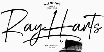 Converon is a decorative cubical display font. With bold sharp edges stroke, fun character with a bit of ligatures. To give you an extra creative work. Converon font support multilingual more than 100+ language. This font is good for logo design, Social media, Movie Titles, Books Titles, a short text even a long text letter and good for your secondary text font with sans or serif. Make a stunning work with Converon font. Cheers, MaulanaCreative
 - Cogney by Maulana Creative,
$13.00 Cogney is an all caps modern sans serif font. With sharp bold stroke, fun character. To give you an extra creative work. Cogney font support multilingual more than 100+ language. This font is good for logo design, Social media, Movie Titles, Books Titles, a short text even a long text letter and good for your secondary text font with sans or serif. Make a stunning work with Cogney font. Cheers, Maulana Creative
 - Monstafaller by Maulana Creative,
$11.00 Monstafaller is a Horror Vibe Decorative display font. With Bold Sharp stroke, Upright and fun character with a bit of ligatures. To give you an extra creative work. Monstafaller font support multilingual more than 100+ language. This font is good for logo design, Social media, Movie Titles, Books Titles, a short text even a long text letter and good for your secondary text font with Script. Make a stunning work with Monstafaller font. Cheers, MaulanaCreative
 - Cardust by Rometheme,
$25.00 Cardust is a bold display font, this font looks funny, cute, kids, cartoon, playful, catchy and easy to use. Cardust Font is the best choice for your professional design projects, including : logo, poster design, t-shirt, headline, flyer, cd cover album, quotes, business card, branding, magazines, social media, advertisements, product designs, or something that need playful or cartoon looks. Highlights: - Fonts are provided in OTF formats. - Standard license - create as use as many of these fonts as you'd like on your own personal projects as well as any commercial ones for clients. - No special software is required, The fonts can be opened and used in almost any program/software that can read standard fonts - even MS Word. What's included: - Cardust OTF
 - Birtgoche by Ilhamtaro,
$14.00 BIRTGOCHE is a serif font with long, thin hooks, it's beautiful because it's quite formal and manly. Attractive fonts to support elegant art designs. A fairly standard serif font because there are not many changes from the basics of the previous serif fonts, only the modifications to the hooks are not too significant and some letters have their body part below the baseline. For media, it will also be very suitable for the headline of a magazine or poster because this font has a strong character supported by this font, which is an all caps font. To enable the OpenType Stylistic alternates, you need a program that supports OpenType features such as Adobe Illustrator CS, Adobe Indesign & CorelDraw X6-X7. Cheers!
 - Gart Sans by Vitaliy Gotsanyuk,
$25.00 Gart Sans is a grotesque font that preserves the characteristics of early 20th-century grotesques, primarily used in advertising. The main features of this font include a pronounced contrast, narrow proportions, and light, smooth forms combined with modern design solutions. Compared to geometric or neo-grotesque fonts, Gart Sans distinguishes itself with its attention to detail. As the font weight increases, it acquires a more pronounced character, expanding its usability from headlines to extensive text settings. Gart Sans consists of 5 styles, 630 glyphs, encompassing an extended Latin character set, basic Cyrillic characters, ligatures, numeral sets, and much more.
 - Neufile Grotesk by Halbfett,
$30.00 Neufile Grotesk has its roots in some of the earliest commercially available sans-serif typefaces. This highly legible sans-serif design is well-suited for many display and text-based typographic uses. Users can apply the fonts effortlessly to a large number of messages and media, from advertising to book design. The typeface family ships in two different formats. Depending on your preference, you can install the typeface as a single Variable Font or use the family’s eight static OpenType font files instead. Those weights run from Extralight through Black. While the static-format fonts offer a good intermediary-step selection, users who install the Variable Font have vastly greater control over their text’s stroke width. The Neufile Grotesk Variable Font’s weight axis allows users to differentiate between almost 1,000 possible font weights. That enables you to fine-tune your text’s exact appearance on-screen or in print. But even the eight static fonts satisfy the need for flexibility, creating harmonious variations of texture and emphasis. Whichever format you choose, the Neufile Grotesk fonts include several sophisticated OpenType features. In addition to standard ligatures, there are a few discretionary ligatures and a stylistic set replacing “a”, “g”, and “R” with geometric-sans-style forms. Other features include numeral variants – there are proportional and tabular versions of lining figures and oldstyle figures – as well as fractions and numbers in circles. The fonts have arrows and a feature for setting case-sensitive forms, too.
 - Gardena Quanto by UICreative,
$23.00 Introducing our new product the name is Gardena Quanto Serif Display Font Family comes with 9 different weights. Modern Serif font that feels beautiful classy, elegant, and modern. This font is perfectly suited for a wide variety of projects, such as signature, stationery, logo, wedding, typography quotes, magazine or book cover, website header, clothing, branding, packaging design, and more. Also for fashion-related branding or editorial design and displays both masculine and feminine qualities. Gardena Quanto Serif Display Font Family is a general-purpose, utilitarian design incorporating an abundance of OpenType features: small caps, ordinals, numerous figure options plus a few bonus goodies. Supports 66 languages using extended Latin character sets.
 - Walkie Valkyrie by UICreative,
$23.00 Introducing our new product the name is Walkie Valkyrie Serif Font Family comes with 9 different weights. Modern Serif font that feels beautiful classy, elegant, and modern. This font is perfectly suited for a wide variety of projects, such as signature, stationery, logo, wedding, typography quotes, magazine or book cover, website header, clothing, branding, packaging design, and more. Also for fashion-related branding or editorial design and displays both masculine and feminine qualities. Walkie Valkyrie Serif Font Family is a general-purpose, utilitarian design incorporating an abundance of OpenType features: small caps, ordinals, numerous figure options plus a few bonus goodies. Mackinac supports 66 languages using extended Latin character sets.
 - Artemis Sans by SIAS,
$44.90 Artemis Sans is the beautiful Greek sister of Arthur Sans. Enjoy the unique grace of the eternal Greek capitals alphabet in a new fashion! For any mixed-language setting, Artemis Sans matches the proportions of Arthus Sans Semibold or Arthur Cabinet Tabac, it harmonizes perfectly with any other font of the Arthur series. Artemis Sans gives a wonderful breeze of elegance to book covers, title pages, headlines, business cards, posters, menus or labels. Both fonts contain the OY-ligature, the Kai-sign in two forms, and a small range of ornaments. For more embellishments please have a look at the stunning Arthur Ornaments. • Please note that Artemis Sans is a CAPITALS-only product! The basic English alphabet is also included in both fonts.
 - Fat Pleasure by JAF 34,
$9.90 Fat Pleasure is extremely wide serif typeface inspired by the modern consume society and is suitable for posters, magazines, massive headlines (also for a web presentation) and so on. For dynamic of ultra hairy and massive fat strokes is not suitable for comprehensive text. Fat Pleasure is also inspired and constructed in the sense of modern type design. Even though Fat Pleasure is pure and clean serif font is very catchy a fresh.
 - Antique Slabserif JNL by Jeff Levine,
$29.00 Antique Slabserif JNL is a reinterpretation of Monotype's Modern Antique 26, released in 1909. The name of the typeface is an oxymoron because Modern conflicts with Antique. Despite many critics of the "mechanical" look of the font's design, it has developed a bit of charm with age and the passing of time. Available in both regular and oblique versions, Antique Slabserif JNL can be used as both a text and headline font.
 - Air Superfamily by Positype,
$29.00 In B-movie awesomeness, Air began as Grotesk vs. Grotesque. I was trying to unify the prevailing traits of German and English Grotes(que/k)s in order to make something different but familiar. I am NOT trying to reinvent Helvetica (snore), so get that out of your system. From the onset, I intended this typeface to be a true workhorse that offers infinite options and flexibility for the user. At its core, it is the maturation of the Aaux Next skeleton I developed years ago. I worked out Aaux Next to settle my issues and love for Akzidenz. With Aaux Next, I strove to be mechanical, cold and unforgiving with it. I was single, young, cocky and it fit. Now I'm married, kids, dog and have found that I've turned into a big softy. When I look at Aaux Next (and have for the past few years) I see another typeface trying to eek out. I wanted it to avoid the trappings of robotic sans, quick tricks and compromises. The typeface’s DNA needed to be drawn and not just generated on a screen — so I set aside a year. I love type. I love working with type. I hate when my options for a slanted complement is only oblique or italic. I set out to produce both to balance usage — there are more than enough reasons to prepare both and I want the user to feel free to consciously choose (and have the option to choose) the appropriate typeface for print, web, etc. That flexibility was central to my decision-making process. The Oblique is immediate and aggressive. The Italic was redrawn at a less severe angle with far more movement and, as a result, is far more congenial when paired with the Uprights. Condensed and Compressed. Yep, why not? I know I would use them. There are nine weights currently available. The logical progression of weights and the intended flexibility demanded I explore a number of light weights and their potential uses — this has produced a number of ‘light without being too light’ options that really work based on the size. The result is a robust 81-font superfamily that is functional, professional, and highly legible without compromising its personality. Pair that with over 900 characters per font that includes ligatures, discretionary ligatures, stylistic alternates, fractions, proportional/tabular lining and proportional/tabular oldstyle figures, numerators, denominators, ordinals, superiors, inferiors, small caps, case-sensitive functionality and extensive language support and you have a versatile superfamily well-suited for any project.
 - Galindo Pro by Stiggy & Sands,
$29.00 Our Galindo Pro was inspired by the heavy-weight animated fonts such as Ad Lib, Nightclub, and Bear Club, blending geometric cuts with light-hearted contours. The festive letterforms intrigue and draw in the reader, while the SmallCaps and extensive figure sets open the font up to a wider range of uses. Opentype features include: - SmallCaps. - Full set of Inferiors and Superiors for limitless fractions. - Tabular, Proportional, and Oldstyle figure sets (along with SmallCaps versions of the figures). - Stylistic Alternates for Caps to SmallCaps conversion.
 - Gumdrop by PintassilgoPrints,
$22.00 Gumdrop is a soft sans. Stylish, original and a little bit retro, it’s an all caps font with two options for each letter and number for added spontaneity. Contextual alternates feature is included and manage the instant cycling of these alternates with the click of a button. The regular cut itself is already quite a versatile one, and the family counts yet with a cool halftone cut and a pencil-like outlined version. Is this just another damn handsome font? Hell, yes. Keep it handy!
 - Pumpkin Boy by PizzaDude.dk,
$14.00 October is the season for pumpkins - some of them are meant for soups, salad or other kinds of food. Others are cut into creepy looking pumpkinheads...and then there are the ones that are used for fun and games only! And that is exactly what this font is about! Pumpkin Boy is my laid back comic font with a jumpy x-height and crunchy lines. If you choose to write in uppercase only, the letters are a bit less funky, but still crunchy and great for headlines. I've added ligatures for double letters substitution for the most common letter combinations.
 - Thermal by TipoType,
$35.00 Thermal is an exploration of balance and contrast. Combining the elegance of classical typography with the sharpness of contemporary design. It was conceived to be a variable font with two axes: weight & optical size, providing a wide range of options for texts & display applications. The regular and italic text weights breathe a warm atmosphere, their design inspiration is a relaxed interpretation of the work of 16th-century French type designer Robert Granjon, evoking a comforting rhythm and a sense of familiarity that makes reading enjoyable. On the other end of Thermal's design spectrum lie the extreme weights – thin and heavy –, specifically designed for larger sizes. These weights borrow stylistic cues from several distinct influences: the characteristic woodtype from the 19th century, the sharp lettering styles from the 70s, and the bold work of Oscar Ogg. One of Thermal's disctint features is its italic's 20° inclination, an significant inclination by all standards, this design choice finds its roots in the "Ascendonica Cursive" of 1571, but is a contemporary interpretation that generates a captivating contrast with the regular version. Thermal studies the past and analyzes the present to create a unique blend, bringing a dictint dichotomic identity.
 - Joyscript by Jonahfonts,
$25.00 Inspired by many hand-lettered European package designs. This script face is suitable for logos, casual headlines and designs calling for attention.
 - VLNL Bint by VetteLetters,
$35.00 Kornelis de Vries, a headmaster from the Dutch province of Friesland, cultivated new potato breeds that he named after pupils in his school. In the early 1900s he came up with the tasty Bintje (a Frisian girl’s name) and it became a big success – in Belgium and France it has remained the most popular potato for french fries to this day, more than a century since its introduction. Donald Roos took 10 kilos of fresh Bintje potatoes and cut the Bint typeface by hand with a short, sharp knife. He then inked each character once and printed it twice; the second, lighter printing is accommodated in the lower case alphabet. The Bint family offers a script to make the letters bounce up and down the baseline; with OpenType functionality the font randomly chooses each character from the upper- or lowercase alphabet. ‘Tabular lining figures’ will activate a series of negative numerals in boxes; ‘Discretionary ligatures’ activates specially designed letter combinations like ‘www’ as well as arrows and stars. Bint has a distinct, slightly rough handmade appearance, making it useful for a wide range of designs.
 - Salty Cracker by RA Studio,
$14.00 Salty Cracker is a display font with Black Letter elements. The symbols have a nice shape and long ascenders and descenders. Display font Latin
 - Pukupuku by yamayama,
$20.00 Pukupuku is a cute round font. This font is designed based on the shape of clouds and beans, which looks somewhat like handwritten letters.
 - Wedding by HiH,
$10.00 Wedding Regular was originally designed by Morris Fuller Benton for ATF and released as Wedding Text in 1901. It is a lighter version of his ENGRAVER'S OLD ENGLISH of the same period. Wedding Regular is based on the Textura style of blackletter that continued in popularity in England into the 16th century, long after the Dutch, French and Italians had moved to a Roman model that expressed the Renaissance humanism of the period. Wedding Headline is a still lighter version of the regular text face, suitable for setting larger sizes while still preserving the delicacy of the decorative hairlines. Textura continues in use in England and the United States for newspaper mastheads, gift shop signs, wedding invitations and programs and other applications where a feeling of tradition is desired. I recently saw an 1980ish photo of a “Tubby Isaac” sign in London using textura. I believe Benton’s design captures that feeling without being heavy-handed and still remaining quite readable for eyes accustomed to Roman lettering. Both Wedding Regular and Wedding Headline convey a comfortable familiarity. These two fonts may be purchased together at an attractive discount or they may be purchased separately. The full character set may be found in the pdf file that you can download from the gallery section. The two monks (alt-0172 and alt-0177) are from a set of sixteenth century decorative initial letters by Gering and Renbolt. Please note that there are two different eszetts, the blackletter style at alt-0126 and the antiqua style at the alt-0223.
 - Vanitas by Reserves,
$49.00Vanitas is an elegant high contrast contemporary sans. It is rooted in the style of a classic didone, excluding the typical serifs and ball terminals as well as being designed with a cleaner, more reductionist appearance. Strict attention was given to the cohesiveness and balance between letterforms as well as the careful refinement of all curves. Stylistically, Vanitas’ alluring, sophisticated sensibility is directly inspired by high fashion. The upright styles are complimented by a pairing of optically adjusted true italics, which were purposefully adapted to retain the sharpness of their counterparts. Abandoning traditionally executed cursive italic letterforms retains Vanitas’ sharp characteristic through each style. Features include: Precision kerning Standard Ligatures set including ‘f’ ligatures (fb, ff, fh, fi, fj, fk, fl ffb, ffh, ffi, ffj, ffk, ffl, ffy, ae, oe, AE, OE) Discretionary Ligatures set including (st, ct, No) Alternate characters (H, A, AE, Q, $, h circumflex, ¶ and numero sign) Case forms (shifts various punctuation marks up to a position that works better with all-capital sequences) Capital Spacing (globally adjusts inter-glyph spacing for all-capital text) Slashed zero Full set of numerators/denominators Tabular Lining, Proportional Lining, Tabular Oldstyle and Proportional Oldstyle Figures Automatic fraction feature (supports any fraction combination) Extended language support (Latin-1 and Latin Extended-A) *Requires an application with OpenType and/or Unicode support. - Schwager by Latinotype,
$25.00 Schwager is a steampunk slab serif typeface with an industrial accent in a contemporary tone. Its strong structure and male, makes it ideal for titles, headlines and brands of male lifestyle, technology and trend. This typeface contains alternate glyphs that help to emphasize text or headlines. Photography by Damien Vignaux (www.elroy.fr)
 - Over the Sunday Slant by Josstype,
$12.00 Over the Sunday Signature Font is signature style font with stunning characters, including Regular and Slant. This font is casual and pretty with swashes. Can used for various purposes. such as logo, product packaging, wedding invitations, branding, headlines, signage, labels, signature, book covers, posters, quotes and more. Over the Sunday Signature Font features OpenType stylistic alternates, ligatures and International support for most Western Languages is included. To enable the OpenType Stylistic alternates, you need a program that supports OpenType features such as Adobe Illustrator CS, Adobe Indesign & CorelDraw X6-X7, Microsoft Word 2010 or later versions.How to access all alternative characters using Adobe Illustrator:
 - FT Aessthetique by Foxys Forest Foundry,
$24.00 FT Aessthetique is a modern classic serif font that effortlessly combines delicate lines with bold strokes. Its aesthetic captures a beautifully romantic style, blending vintage elements with nostalgia. FT Aessthetique goes beyond being a font; it's a crucial brand element that seamlessly complements other fonts, imparting a sophisticated appearance to any project. Its professional characteristics make it appealing for expressing individuality across various endeavors. The font is perfect for large headlines and titles. FT Aessthetique features 65 ligatures and 35 alternative letters, expanding its versatility and providing creative possibilities. It supports most Latin-based languages and includes an extended set of symbols, punctuation, and diacritical marks.
 - Neue School by Daniel Brokstad,
$29.00 Neue School is a modern sans serif font with extra tight tracking & deep ink traps. Designed to maximize the available space, make impactful headlines. Inspired by old school narrow poster fonts, presented in a “neue”-way. The font consists of 8 weights, across 2 widths, plus italics. Symbols are fixed weight throughout, as a contrast to the font weights. There are 2 additional OpenType stylistic sets. Stylistic Set 1 adds more rounded edges to specific characters for a softer look. Stylistic Set 2 makes lowercase ascenders and symbol height equal to capital height, making it ideal for stacking type more easily with all same height.
 - Grenale #2 by insigne,
$24.00 Grenale #2 shapes the new standard of elegance within the Grenale family. Not your typical sans, this pure, geometric structure with its glamorous sensitivity draws much inspiration still from Grenale's didone sans and the haute couture influence. Independently attractive, though, the form abandons the original's high contrast for its own minimal stroke variation, achieving proper balance through its graceful strokes. Grenale's thin weights are simple but vibrant--elegant forms that naturally lend themselves to designer journals and high-end branding along with upscale applications. With added energy and power, the thicker weights give your work a firmer, statlier look. Grenale #2's upright versions are also matched by optically adjusted italics. While unique in appearance, any of #2's weight also provide a well-matched companion to its original counterpart. The fashionable typeface includes a multitude of alternates that may be accessed in any OpenType-enabled application. The stylish features include a large group of alternates, swashes, and meticulously refined details with ball terminals and alternate titling caps to accessorize the font. Also included are capital swash alternates, old style figures, and small caps. Peruse the PDF brochure to see these features in action. OpenType enabled applications such as the Adobe suite or Quark can take full advantage of the automatic replacing ligatures and alternates. This family also offers the glyphs to support a wide range of languages. It's time to think high-class. Graceful and assured, the carefully crafted forms of Grenale #2 step pleasantly onto each page with elegant charm. Include its range of alternate glyphs, and this chic font is a superb choice for bringing a far more refined look to your projects.
 - Super Puff MX by Xuveki,
$12.00 Super Puff MX is a Y2K inspired variable display typeface that takes from early 2000's futurism, pop, and cartoon aesthetics. Due to its heavy weight and alternates it offers, it's perfect for a variety of logos, 3D, and motion graphics. SPMX was designed specifically for those use cases, and its wide range of styles and alternates gives you lots of freedom for creating unique graphics that still capture the same fun, futuristic, and playful early 2000's aesthetic. Features & What's Included: Variable font file that allows you to choose any slant degree from Regular to Full Tilt. OTF font files in 4 styles or slants, from Regular to Full Tilt. This is included because many young, talented designers around the world don't have access to programs that can take advantage of a variable font. I want them to have the option of using properly slanted and kerned oblique instances of Super Puff. Robust OpenType features including a vast pool of alternates and stylistic sets giving you lots of choices when choosing letters, numbers, and punctuation. Two stylistic sets for letters and numbers One stylistic set for punctuation and symbols One stylistic set that replaces punctuation with Y2K style icons Extensive Latin language support covering almost all of Europe and South America. All multilingual glyphs have access to alternates as well. Super Puff MX was designed and developed by Abe Zeinali/Xuveki.
 - Roma by Canada Type,
$29.95 Tom Lincoln's award-winning type design work since the 1960s has been one way or another of expressing his fascination for the Roman majuscules inscribed at the base of the Trajan Column in Rome. This time he has really outdone himself by bringing us Roma, a definitive, contemporary, mature sans serif expression of those majuscules. With Roma, Lincoln is not satisfied with simply creating a proper "Trajan Sans". He goes on to make it a family of four weights, with built-in small caps and oldstyle figures, then he really goes to town with the options he makes available for shading and multi-color settings. Precise renderings of the Roma capitals are provided in different fonts that can function individually or be layered atop each other for two- or three-color treatments. The Roma family comes with extended language support that spans the majority of Latin-based languages. For more information on the design, complete character sets, technological features, and print tests, consult the accompanying PDF.
 - YT Deal Latin by Yangtype,
$9.00The concept of this letter is calmness. I created a variety of sans-serif fonts, and when I listed the fonts I had created, I was surprised that their shapes were not very different from each other. Among them, this font calmly caught my eye. The power of quiet progress is felt in this unremarkable form. - Keswick by Hanoded,
$15.00 Keswick is a beautiful small town in the English Lake District. It is a good place to hang out for a while and explore the surrounding National Park. During your stay you could visit the Keswick Pencil Factory - which brings us to this nice font… Keswick font was created using a 6B pencil (the crumbly, soft kind) and a lot of patience. I have to admit, the pencil used was not made in Keswick. Sorry 'bout that…
 - Anne's Hand by National Eating Disorders Assn,
$10.00 Anne's Hand is a custom handwriting font of Anne Hubbard, who tragically lost her battle with anorexia nervosa this past January. Anne loved to write, so her brother Richard designed a custom font of her handwriting as a tribute to her memory. All proceeds from its sale will go to the National Eating Disorders Association to support programs and services like the NEDA Navigators and Loss Support Network, programs that many families count on for support.