10,000 search results
(0.193 seconds)
- Luxart by Fontiko,
$14.00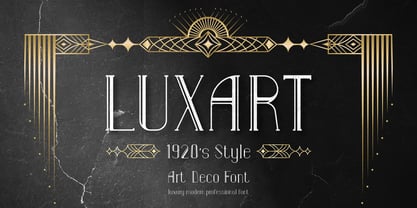 Luxart is a modern Serif Decorative font inspired by the 1920's, Art Deco and Gatsby styles. This font looks luxury, stylish, elegant and neat. This font is great for logo branding & invitations, photography, quotes, wedding design, business cards, posters, watermark, holiday cards, special events and much more.
 - Ansley by ErlosDesign,
$17.00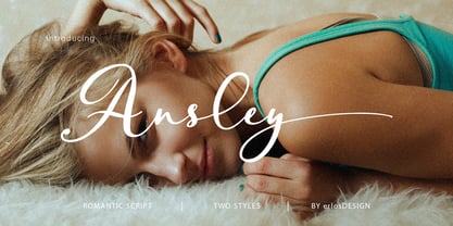 Ansley - A Lovely Script Font by erlosDESIGN Ansley is a romantic, elegant and flowing modern calligraphy font. It has beautiful and well balanced characters and as a result, it matches a wide pool of designs. This font is perfect for invitation, wedding decoration, signs, logos, quotes and more!
 - Oceanwide Pro by California Type Foundry,
$47.00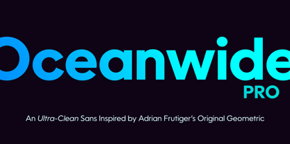 A font perfect for not just one, but many projects! Introducing Oceanwide Pro, a sans that loves to be used in just about any situation! Designed with ultra clean lines and versatility in mind, Oceanwide wants to be your new favorite sans! Oceanwide’s ultra clean letters work anywhere you want to communicate orderliness and competence, and designed to build trust and rapport with your audience. Its wide proportions make it ideal for display and logo use. Oceanwide especially shines for white/bright letters on black/dark backgrounds! That’s because the inside shapes are nearly perfect circles in many weights. Here's a quick video tour of Oceanwide Pro by Dave Lawrence, including all the great things Oceanwide can be used for! We've tested Oceanwide for these industries, with stunning results!: Tech Arts Fashion & Style Business & Branding Corporations Logistics Architecture Food and many more... Oceanwide can be used for: Headers Subheadlines Logos Even body text, if tracked. Print & Screen The styles it can take are also many. It's great for: Modern/minimalist design Flat design Cut out design User Interface (UI) Technical designs In combination with text effects, even for grunge and other situations. And many others... DESIGN FEATURES Simplicity Tall x-height Hand-sloped obliques (italics) Narrow spacing Semi-wide proportions Expert kerning Well proportioned, usable lights & extra lights Large caps Great ALL CAPS MODE Uppercase punctuation Uppercase spacing with California Type Foundry’s Smart Tracking™ Advanced fraction support Proportional lining figures Thick joins Smooth curves Sturdy—great for textures and effects Variable font available Latin Pro character set for Central European languages. That's the writing for over 782 languages and transliterations worldwide! DESIGN STORY—THE FORGOTTEN SANS by Dave Lawrence, Lead Designer, California Type Foundry Adrian Frutiger was the 20th century master of sans, but I didn't realize he had made—not one—but TWO geometric sans! It wasn't until I had purchased the book “Adrian Frutiger: Typefaces”. I had hoped to someday meet Adrian Frutiger, but he passed away that very same year. Here is the story of Frutiger's forgotten sans. Back in 1968, Frutiger was approached by Pentagram to make a design for British Petroleum. They wanted a "new version of Futura". However, they wanted him to make a couple adjustments. First, they felt that Futura was "too fiddly." By this, they meant that it narrowed too much at the joins. (Joins are for example where the round and straight parts of the 'd' meet.) This is something that is necessary for small print text (to prevent ink clogging), but is not necessary at large sizes. Second, they wanted it to be entirely geometric, using the circular shape with minimal optical corrections. Unfortunately this font was not even used very consistently in the BP brand. A haphazard mix of Futura and Frutiger's BP font ensued. It was then replaced by another font design very soon after. My design is different in several ways. First, the commas and quotes are a more modern style. I tried his original commas, but these just didn’t work to 21st century eyes. Second, in his drawings, Frutiger went for a more standard u with a downstroke on the right. However, Oceanwide has a simpler u. Third, I made more optical adjustments. At the direction of his employer, Frutiger reluctantly put no font optical corrections into the letters. So I think my optical adjustments are similar to what Frutiger would have wanted. Fourth, I extended the weight into the light and extra light ranges. Fifth, the rest of the font I created according to the principles of Adrian Frutiger, but with no sources for inspiration. Here is Frutiger’s design philosophy, in his own words: “If you remember the shape of your spoon at lunch, it has to be the wrong shape. The spoon and the letter are tools; one to take food from the bowl, the other to take information off the page... When it is a good design, the reader has to feel comfortable because the letter is both banal and beautiful.” The words about the spoon were the ones I kept in my mind as I tried to make the curves ultra smooth, and the shapes ultra simple. Hopefully this font is a worthy successor to the font that inspired it. Released on the 93rd birthday of Adrian Frutiger, to celebrate the life and achievements of this amazing designer. ——————— Simplicity. Versatility. Oceanwide.
 - Kalmiza Script by Nowlystudios,
$12.00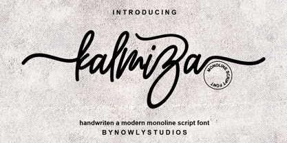 Kalmiza is a monoline script font with a cursive style, as many characters are smoothly connected. This lovely typeface is great for designers who are seeking a natural and authentic style in their creations! This gorgeous font includes all lowercase and uppercase characters, numbers, punctuation, alternate, an array of standard ligatures, and a selection of international characters as well. This font is PUA encoded which means you can access all of the amazing glyphs and ligatures with ease
 - Amarissa by Manlogs Studio,
$30.00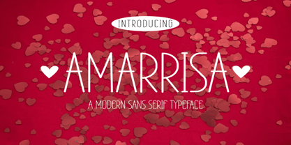 Amarissa is a friendly and cute sans serif font. Highly versatile, this font is suitable for a wide spectrum of applications and it is modern and nostalgic and perfect for Valentine’s Day, Christmas products, social media, weddings, and more. Perfect for those who need a touch of elegance, style and modernity to your designs.
 - Green Brooks by Asenbayu,
$14.00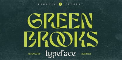 Green Brooks is a semi serif decorative display font. A mix of abstract and curves inspired by flowing rivers in nature, this font has beautiful flowing shapes. This font also has a modern feel with a sans serif outline. You can use this font in both modern and vintage designs. This font is suitable for attractive packaging label designs, unique desired logos, poster designs, fashion and many more. Green Brooks font features: standard glyph, kerning, stylistic alternates, stylistic ligatures, symbol, punctuation and multi languages supported.
 - Afrika Borders by CastleType,
$49.00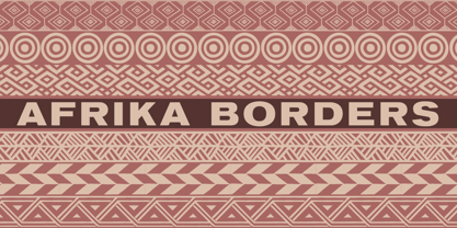 A collection of over 50 border patterns based on geometric motifs from various African tribes, including the Ashanti, Bushongo, and Zulu. Use for stationery, greeting cards, etc.
 - Printing Press Extras JNL by Jeff Levine,
$29.00Printing Press Extras JNL is another collection of classic printing embellishments and stock cuts from Jeff Levine, with a few new ones thrown in for good measure. - Sunbursts JNL by Jeff Levine,
$29.00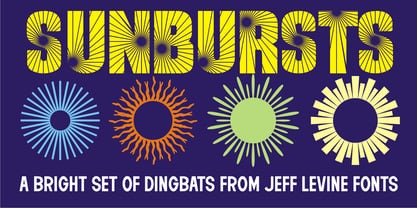 Sunbursts JNL is a simple little collection of sun dingbats for all types of creative embellishment. Make sure to use them with the recommended SPF-rated sunblock!
 - Theo Stevanie by Mazkicibe,
$10.00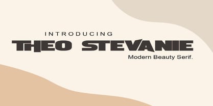 Theo Stevanie Font is Beautyful Sans Serif and modern font combined with a sweet touch and beautifully curved each letter. using a touch of soft curves so that it is pleasing to the eye designs. Theo Stevanie Font is great for: Wedding invitations, fashion magazines, logos, signatures, and suitable for watermark photography. Included with Theo Stevanie is a full set of Uppercase and ending lowercase Special Character, Ligature, to create a realistic look for your designs.
 - Red Border Labels JNL by Jeff Levine,
$29.00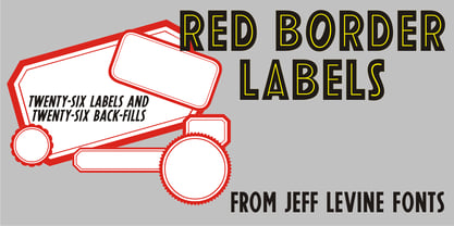 In the pre-computer, pre self-adhesive label era of office supplies a number of companies (including Dennison, Maco and Denny-Reyburn) manufactured a wide variety of gummed labels for just about any use or purpose. Blank labels, specialty labels and decorative holiday seals were just a part of this line. One popular style was that of labels with parallel thick-and-thin borders of red lines and corners chamfered, rounded or straight cut. Occasionally, one could find similar labels with blue, green or gold borders but red was the mainstay, hence naming this typeface Red Border Labels JNL. Presented in this font is a collection of twenty-six standard and specialty shape label borders on the capital (A-Z keys) and twenty-six solid panel versions on the lower case (a-z) keys which can be used as backfills for the borders or as stand-alone labels.
 - Apex Brush by Hanoded,
$15.00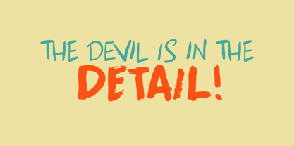 I like playing around with brushes and Chinese ink. I always have some kind of idea of what the final design should look like, but once it’s done, it never ever looks like what I had in mind. Apex Brush is one of those designs: it started off as a few brush strokes, but before I knew it, I had a really nice set of matching brush fonts! Use it for any design that needs a bit of rough, a splash of ink and a pinch of rebel.
 - Paneuropa Inline by ROHH,
$19.00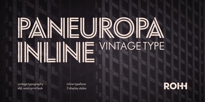 Paneuropa Inline is a retro display typeface inspired by a classic modernist design from Poland. It has a retro mood, but is reworked from the original to achieve a better consistency in letterforms and spacing. The set includes 3 versions of the font, each one featuring different worn/grunge effects to fit various sizes and design scenarios. Paneuropa Inline is designed for all kinds of retro, vintage, grunge, eco, bio, organic projects in mind and nicely fits to industries and purposes such as food & beverage, gardening, travel & hospitality, vintage-styled apparel, restaurants and pubs.
 - Daybird Script by Letterhend,
$14.00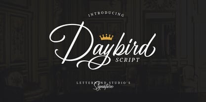 Daybird is an elegant signature that contain lowercase, uppercase, symbol, and also support multi-language. There's a lot of alternates in this font. You can use this font to make a logo for branding, beautiful fashion designs, it's suitable for wedding invitations and authentic signatures. Daybird is also PUA Encoded.
 - Brooklyn Samuels by Samuelstype,
$30.00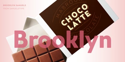 Brooklyn Samuels is a sans-serif family of fonts designed by Hans Samuelson. Based on geometrical shapes it is primarily intended for headline use but also offers excellent legibility in small sizes. Stylistic sets offer a more text-friendly alternative for some letters.
 - Sada by Arabetics,
$45.00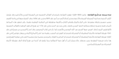 Sada is a text font designed with hand held devices and ebooks in mind. Glyphs are designed to be larger than usual and very clear with soft visual characteristics and many traditional Arabic calligraphic transitional features incorporated to improve legibility. The word “sada” means “echo” in Arabic. Even though Sada is a cursive style font it offers clearly distinguished and visually unified letter shapes in every position of a word. Sada supports all Arabetic scripts covered by Unicode 6.1, and the latest Arabic Supplement and Extended-A Unicode blocks, including support for Quranic texts. It comes with three weights, regular, bold, and ultra-light. Each weight has normal and left-slanted “italic” styles. The script design of this font family follows the Arabetics Mutamathil Taqlidi style and utilizes varying x-heights. The Mutamathil Taqlidi type style uses one glyph per every basic Arabic Unicode character or letter, as defined by the Unicode Standards, and one additional final form glyph, for each freely-connecting letter in an Arabic text. Sada includes the required Lam-Alif ligatures in addition to all vowel diacritic ligatures. Sada’s soft-vowel diacritic marks (harakat) are only selectively positioned with most of them appearing on similar lower or upper positions to emphasize they are not part of letters. Kashida is zero width glyph.
 - Farao by Storm Type Foundry,
$21.00Originally designed in 1998 as a 3-font family, updated in 2016 by new italics, small caps and many OpenType functions, resulting in a set of highly visible poster typefaces. If a text is set in a good Egyptienne, we can observe a kind of sparkle in the lines. Slab-serifs are cheerful typefaces, possibly due to the fact that they developed simultaneously with Grotesque typefaces. The design principle originating from the first half of the 19th century does not have such firm and long-established roots as for example, the Venetian Roman typefaces, hence it’s much more prone to a “decline”. We know of Egyptiennes with uneven color, with letters falling backwards (this often happens in the case of “S”), and especially with slightly bizarre modeling of details. In the course of time, however, it was realized that such things could be quite pleasant and tempting. After a century and a half, we find that such Egyptiennes could refresh uniform computer typography. The forms of many twisted letters resemble the gestures of a juggler: others, rectangularly static ones, reflect the profile of a rail or a steel girder – things which, in their times, were new and were observed by the first creators of Egyptiennes. These typefaces are ideal for circus posters and programs for theatre performances, just as for printing on cement sacks. - Rewalt by NicolassFonts,
$25.00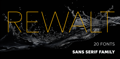 Rewalt family is perfectly suited to headlines, logotypes, books, magazines, motion graphics, and use on the web and TV. Rewalt is an OpenType font family that converts any text – including the most complex layouts – into an expressive design. This font is a modern rounded sans serif typeface that can be used as a headline or as a body copy typeface.
 - Bulgattie by Alcode,
$20.00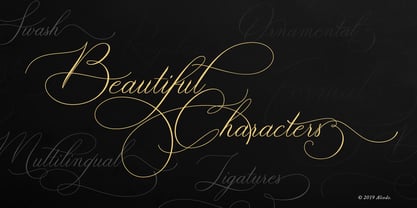 Bulgattie is actually a unique font, I build it with the spontaneity of my relaxed hands. designing a formal font but having a classic element, which makes it particularly suitable for wedding media, book covers, greeting cards, logos, branding, business cards and certificates, in fact for any design work that requires a clasik, formal or luxury look. Try Bulgattie, enjoy its wealth of OpenType features and let its vigorous yet elegant exuberance delight you and enhance your creativity! You can use this font very easily.
 - Karmila Script by Alcode,
$18.00 Karmila Script is a decorative signature font, where you can achieve the feeling of handwritten letters. So that this font is perfect for your modern graphic design needs, such as social media content, wedding invitations, book covers, greeting cards, logos, branding, business cards and certificates, actually for any design work that requires a formal or luxurious impression. Try Karmila Script, enjoy the richness of OpenType features and let her fun and elegant excitement make you happy and enhance your creativity! You can use this font very easily.
 - Rhetoric by Monotype,
$25.00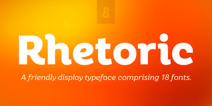 Rhetoric is a friendly display typeface that’s full of personality. The fonts are defined by their roman characters which could be described as “upright italic” – the style traditionally associated with a cursive character set has been applied to the roman glyphs. Rhetoric embraces its curves –exemplified by the voluptuous caps for /A/M/U/V/W/X/Y/ which further enhance this typeface’s quirky nature. This 18-font type family has weights from Hairline to Ultra in both roman and italic. Western European languages are covered in its basic character set, but there are a number of alternates and discretionary ligatures that allow you to embellish your typographic designs. Designed for branding purposes, headlines and short runs of text, Rhetoric will be a worthy addition to your type collection.
 - ATTACK OS by OS CORP,
$25.00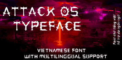 ATTACK OS font version: 1.0 is the first version, including 340 characters, there are 4 types of handwriting that are: Regular; Italic; Bold; Bold Italic. We work with agencies and brands on visual identities and custom type design. Do you need a new font? Or an adjustment of the existing one? We can handle it on a best technological and creative level. New font design We create a concept and drawing of a completely new font to emphasise the character of your brand or project. Modifications to our fonts We adjust one of our retail fonts to your needs. It usually means a small change in design, an extension of the language set or icons. Let’s discuss how we can work together
 - Bumble OS by OS CORP,
$3.00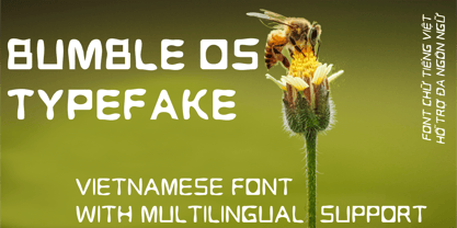 BUMBLE OS font version: 1.0 is the first version, including 340 characters, there are 3 types of handwriting that are: Regular (Regular); Italic (Italic); Bold (Bold). We work with agencies and brands on visual identities and custom type design. Do you need a new font? Or an adjustment of the existing one? We can handle it on a best technological and creative level. New font design We create a concept and drawing of a completely new font to emphasise the character of your brand or project. Modifications to our fonts We adjust one of our retail fonts to your needs. It usually means a small change in design, an extension of the language set or icons. Let’s discuss how we can work together
 - Open TECH Neue by TypoGraphicDesign,
$9.00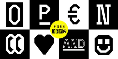 The typeface Open TECH Neue is designed from 2018—2021 for the font foundry Typo Graphic Design by Manuel Viergutz. 6 font-styles (Sans Serif, Invert, Outline, Slab Serif, Stretch, Box Puzzle) + 1 icon-style with 1097 glyphs (Adobe Latin 3) incl. 400+ decorative extras like icons, arrows, dingbats, emojis, symbols, geometric shapes, catchwords, decorative ligatures (type the word #LOVE for ♥︎ or #SMILE for ☺ as OpenType-Feature dlig) and stylistic alternates (6 stylistic sets). For use in logos, magazines, posters, advertisement plus as webfont for decorative headlines. The font works best for display size. Have fun with this font & use the DEMO-FONT (with reduced glyph-set) FOR FREE! ■ Font Name: Open TECH Neue ■ Font Styles: 6 (Sans Serif, Invert, Outline, Slab Serif, Stretch, Box Puzzle) + Icons + DEMO (with reduced glyph-set) ■ Font Category: Display for headline size ■ Glyph Set: 1097 glyphs (Adobe Latin 3) incl. 400+ icons (decorative extras like arrows, catch words, dingbats, emojis, symbols) ■ Design Date: 2018—2021
 - Fan Script by Sudtipos,
$99.00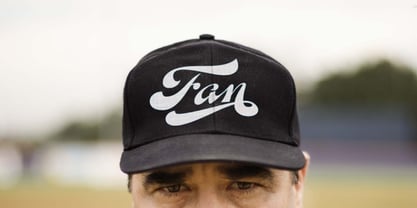 A friend of mine says that sports are the ultimate popular drug. One of his favorite things to say is, “The sun’s always shining on a game somewhere.” It’s hard to argue with that. But that perspective is now the privilege of a society where technology is so high and mighty that it all but shapes such perspectives. These days I can, if I so choose, subscribe to nothing but sports on over a hundred TV channels and a thousand browser bookmarks. But it wasn't always like that. When I was growing up, long before the super-commercialization of the sport, I and other kids spent more than every spare minute of our time memorizing the names and positions of players, collecting team shirts and paraphernalia, making up game scenarios, and just being our generation’s entirely devoted fans. Argentina is one of the nations most obsessed with sports, especially "fútbol" (or soccer to North Americans). The running American joke was that we're all born with a football. When the national team is playing a game, stores actually close their doors, and Buenos Aires looks like a ghost town. Even on the local level, River Plate, my favorite team where I grew up, didn't normally have to worry about empty seats in its home stadium, even though attendance is charged at a high premium. There are things our senses absorb when we are children, yet we don't notice them until much later on in life. A sport’s collage of aesthetics is one of those things. When I was a kid I loved the teams and players that I loved, but I never really stopped to think what solidified them in my memory and made them instantly recognizable to me. Now, thirty-some years later, and after having had the fortune to experience many cultures other than my own, I can safely deduce that a sport’s aesthetic depends on the local or national culture as much as it depends on the sport itself. And the way all that gets molded in a single team’s identity becomes so intricate it is difficult to see where each part comes from to shape the whole. Although “futbol” is still in my blood as an Argentinean, I'm old enough to afford a little cynicism about how extremely corporate most popular sports are. Of course, nothing can now take away the joy I got from football in my childhood and early teens. But over the past few years I've been trying to perceive the sport itself in a global context, even alongside other popular sports in different areas of the world. Being a type designer, I naturally focus in my comparisons on the alphabets used in designing different sports experiences. And from that I've come to a few conclusions about my own taste in sports aesthetic, some of which surprised me. I think I like the baseball and basketball aesthetic better than football, hockey, volleyball, tennis, golf, cricket, rugby, and other sports. This of course is a biased opinion. I'm a lettering guy, and hand lettering is seen much more in baseball and basketball. But there’s a bit more to it than that. Even though all sports can be reduced to a bare-bones series of purposes and goals to reach, the rules and arrangements of baseball and basketball, in spite of their obvious tempo differences, are more suited for overall artistic motion than other sports. So when an application of swashed handlettering is used as part of a team’s identity in baseball or basketball, it becomes a natural fit. The swashes can almost be visual representation of a basketball curving in the air on its way to the hoop, or a baseball on its way out of the park. This expression is invariably backed by and connected to bold, sleak lettering, representing the driving force and precision (arms, bat) behind the artistic motion. It’s a simple and natural connective analysis to a designer, but the normal naked eye still marvels inexplicably at the beauty of such logos and wordmarks. That analytical simplicity was the divining rod behind Fan Script. My own ambitious brief was to build a readable yet very artistic sports script that can be a perfect fit for baseball or basketball identities, but which can also be implemented for other sports. The result turned out to be quite beautiful to my eyes, and I hope you find it satisfactory in your own work. Sports scripts like this one are rooted in showcard lettering models from the late 19th and early 20th century, like Detroit’s lettering teacher C. Strong’s — the same models that continue to influence book designers and sign painters for more than a century now. So as you can see, American turn-of-the-century calligraphy and its long-term influences still remain a subject of fascination to me. This fascination has been the engine of most of my work, and it shows clearly in Fan Script. Fan Script is a lively heavy brush face suitable for sports identities. It includes a variety of swashes of different shapes, both connective and non-connective, and contains a whole range of letter alternates. Users of this font will find a lot of casual freedom in playing with different combinations - a freedom backed by a solid technological undercurrent, where OpenType features provide immediate and logical solutions to problems common to this kind of script. One final thing bears mentioning: After the font design and production were completed, it was surprisingly delightful for me to notice, in the testing stage, that my background as a packaging designer seems to have left a mark on the way the font works overall. The modern improvements I applied to the letter forms have managed to induce a somewhat retro packaging appearance to the totality of the typeface. So I expect Fan Script will be just as useful in packaging as it would be in sports identity, logotype and merchandizing. Ale Paul
 - Rafigen by Surotype,
$20.00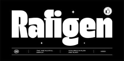 Rafigen is a thick and playful typeface . It comes in two different styles, plain and slant. Really great font to make it easier for you creative work such as — branding, film titles, packaging, advertising, posters, and web or app. Enjoy:)
 - Rangly by Mans Greback,
$59.00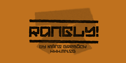 Rangly is a square-based and rough typeface. It has graffiti inspired shapes built with wide paint rolls. The font is designed and created by Måns Grebäck in 2017, and has support for hundreds of languages.
 - Celari Titling by insigne,
$-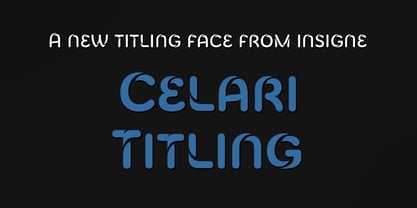 Need for speed? Satisfy it with insigne’s Celari. Take it for a drive and watch how its simple curves, easy lines, and sturdy shapes handle the edges and corners of your projects with smooth and rapid execution. The negative space cuts through the rounded sans serif letterforms of Celari, giving this all-caps typeface a strong impression of dimension and speed. Celari’s organic stroke direction allows you to ease through its gentle turns, too, causing the font to hum around the lines of your project like a V8 engine on an open Nevada highway. The speed and agility of Celari is built for nothing less than a headline. Use the larger-than-life power of this face for any number of oversized applications--mastheads, posters, web headlines, flyers. It provides excellent performance for service-oriented ads where efficiency and quick buyer service are priorities. Customize your ride, too. The OpenType version of Celari includes some serious add-ons to make it your design. The font incorporates discretionary ligatures for some funky combinations and adds in stylistic and contextual alternates for virtually endless possibilities with the characters, ligatures, and composites. Make sure your setup allows for OpenType fonts (Adobe CS suite or Quark) before unleashing the fun of Celari, though. Be confident with your design. Be quick with your message. Again, take Celari for a drive and unleash the strength and velocity of its character in your design. You've been holding back long enough.
 - Kaolin Style by Sensatype Studio,
$15.00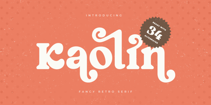 Kaolin is a Fancy Retro Serif Font A New Fancy Retro font that we created special for Unique branding needs, . It's so nice to leverage designer or product owner that need solutions to make their design look more unique and vintage. Kaolin Modern Vintage Display font ready with: Lowercase and Uppercase characters Numbers and Punctuations Preview as a inspirations that you can do with Kaolin font Available for PC and Mac Wish you enjoy our font.
 - Aerogate by Wacaksara co,
$20.00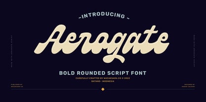 Aerogate is a bold rounded script font inspired by our best selling font called aerokids. Aerogate is a bold rounded script font with a bold vintage style inspired by beautiful classic handwriting. made with care and fun without eliminate characteristics of our font. Aerogate created with a tons of opentype features, contextual alternates, ligatures, and stylistic sets. Make forms at the beginning / end of a word are set automatically. It is smart an it is working in adobe software. This font is perfect for your creative projects such as Logotype, printed quotes, invitations, business cards, product packaging, headers, Letterhead, Apparel , Web design, Magazine, Book, Stickers, Labels etc. Thanks
 - Dealova by HKL Studio,
$19.00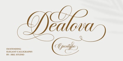 Dealova Script is the font of choice for writing things beyond words. This typeface is designed with great detail to convey stylish elegance. So, it can be said, the character of the transformation is very beautiful, a kind of classic ornamental copper script. Dealova Script provides alternative variants of most fonts, binders and many calligraphy tips, ideal for elegant labels, high-end packaging, stationery and composition for specific brands, beautiful titles, paragraphs, fonts and short text intended for read only with the eye or intended to be whispered into someone's ear. Dealova Script has 691+ glyphs and 440 alternate characters, including multiple language support. It features OpenType with alternate styles and elegant binding. The OpenType features don't work automatically, but you can access them manually and for best results your creativity will be required in combining variations of these Glyphs. And also a touch of ornament makes this font look elegant. To enable the OpenType Stylistic alternative, you need a program that supports OpenType features such as Adobe Illustrator CS, Adobe Indesign & CorelDraw X6-X7, Microsoft Word 2010 or later. (Windows), Font Book (Mac) or a software program such as PopChar (for Windows and Mac).
 - Haboro Soft by insigne,
$-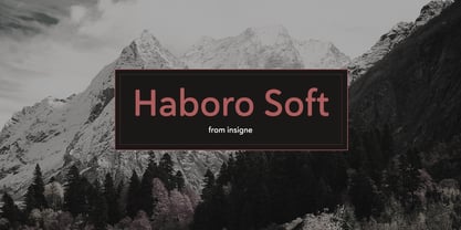 Stop trekking through the thick, wintery font forest, and step lightly into the fresh life of the Haboro hyperfamily. Though simple in nature, the Haboro hyperfamily provides you with a variety of options. Take, for instance, Haboro Soft, the latest member. Soft features a clean, geometric shape based off Haboro Sans. Unlike Sans, however, Soft’s blunted terminals give your work a more contemporary appearance. It’s a gentle touch for those times you prefer subtilty over pounding your message home. Take Haboro Soft even farther with its OpenType features. The typeface contains specially shaped small caps and old-fashioned figures--just enough to give your work a unique touch. Of course, for more options, use the entire Haboro hyperfamily to expand your abilities. Enjoy the comfort in knowing you’re choosing a font family equipped with tools for most anything: packaging, branding, web pages, iPhone apps and more. Its simplicity lends itself to achieve perfect results. And yes, your work will even thank you.
 - Architype Bayer by The Foundry,
$99.00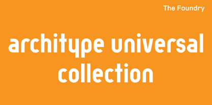 Architype Universal is a collection of avant-garde typefaces deriving mainly from the work of artists/designers of the inter-war years, whose ideals underpin the design philosophies of the modernist movement in Europe. Their ‘universal’, ‘single alphabet’ theory limits the character sets. Architype Bayer was drawn from Bauhaus Archiv sketches for a minimal sans typeface that was created in 1925 by Herbert Bayer, based on his single-alphabet student thesis. This ‘universal’ alphabet was designed for exclusive Bauhaus use, but never cut as a typeface.
 - Fontoddler by CozyFonts,
$20.00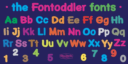 Fontoddler Font Family, This font was created with the personality, in mind, of my two-and-a-half-year-old granddaughter Chloe Bella. I believe strongly that fonts have personalities that’s why we refer to their members as ‘characters’ or to be more accurate, ‘glyphs’. This font is playful, bold, colorful in form and design, a bit irregular, a bit informal, a bit irreverent, a bit humorous, a bit sassy, and a bit independent just like my little one. When used in color Fontoddler sings. She’ll be writing and creating visual words in just the nick of time. At 2 she started recognizing many colors and identifying people, places, animals, and objects and now she’s recognizing letters. I can’t wait for her to understand that this font was designed and named after her. Fontoddler currently exists in 3 styles, Medium, Heavy, and Heavy Outline. Naturally Heavy and Heavy Outline are congruous, ie. They are fitting together. I hope you enjoy and use this 24th font family from Cozyfonts Foundry. It will fit well with greeting cards, signage, birthday parties, holiday occasions, invites, stationary, headlines, logos, posters, cartoons, animation titles, movie titles and even sports events and sports logos. Have fun with this one. Tom Nikosey
 - Naturallus by MJB Letters,
$17.00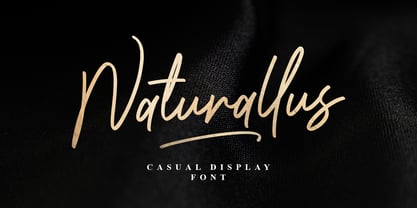 Naturallus is a Casual display font which is very perfect for branding, signature, wedding designs, social media ads, logos and others Naturallus includes full set of uppercase and lowercase letters, numeral, punctuations and ligatures. Included in this set: Works on PC & Mac Simple installations Accessible in the Adobe Illustrator, Adobe Photoshop, Adobe InDesign, even work on Microsoft Word. PUA Encoded Characters Fully accessible without additional design software
 - Fanny by Hatftype,
$15.00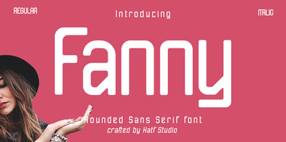 Rounded Sans Serif Font is a font with 2 STYLE FONT, perfect for branding projects, logos, wedding designs, media posts, advertisements, product packaging, product designs, labels, photography, watermarks, invitations, stationery, and any project who need handwritten dishes. Features : 1. Uppercase & Lowercase 2. Multilingual support 3. Number 4. Symbol 5. Punctuation 6. Support in Mac and Windows OS -Support in design application (photoshop, illustrator, and more) I really hope you enjoy it.
 - Madjestic Comfort Script by Fauzistudio,
$40.00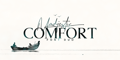 Introducing Madjestic Comfort font duo, a contemporary pair of scripts and serif fonts. The term Madjestic is not a mistake, but it was an accent game of an area in asian, by adding "d" before "j". With a didot style serif font and flowing script companion, Madjestic Comfort offers beautiful typographic harmony for a variety of design projects, including logos & branding, wedding design, social posting media, advertising & product design.
 - DIN Next Decorative by Monotype,
$40.99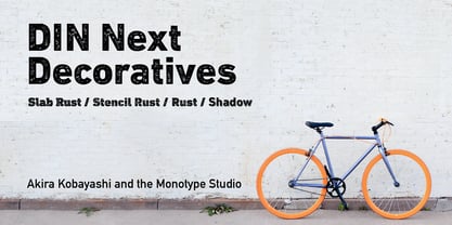 This four-piece family is the DIN design, but not as you know it. The famously, crisp, clean and precise typeface has been given a textured update that's reminiscent of rusted metal, or rubber stamps. Underneath this lies the same sturdy, geometric shapes that have allowed DIN to stand the test of time, but with a new sense of tangibility. “This kind of treatment is more about creating a feeling or a mood that goes beyond the communication of the words themselves,” explains Monotype Studio director Tom Rickner. “I think it expands the repertoire of what DIN Next can express.” Designed for display, these four typefaces – DIN Next Rust, DIN Next Shadow, DIN Next Slab Rust and DIN Next Stencil Rust – show a new side of DIN Next's personality, as if the surface of each letterform has been gradually worn away over the years.
 - Adorn Smooth by Laura Worthington,
$29.00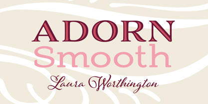 What can be more lovely than a wedding, an invitation or a gift from the heart? One whose presentation uses the warm and welcoming family of typefaces, Adorn. With a modern and sometimes quirky twist on the staid, almost corporate look of formal invitations, this family of hand lettered typefaces arms designers with a breathtakingly large number of fonts that work harmoniously, despite the distinctiveness of each. Adorn offers seven display fonts, four script designs, monograms, ornaments, illustrations, banners, frames, and catchwords. See what’s included! http://bit.ly/2jcakXO These fonts have been specially coded for access of all the swashes, alternates and ornaments without the need for professional design software! Info and instructions here: http://lauraworthingtontype.com/faqs/
 - 1420 Gothic Script by GLC,
$38.00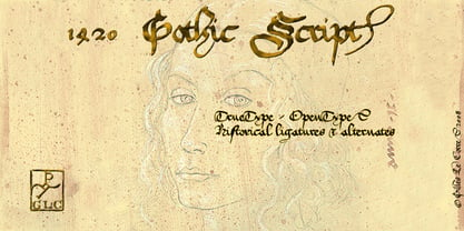 This script font was inspired by the type most commonly used during the period 1300s to 1500s. It is a compromise between historic truth and contemporary use. We particularly thank very much the Paris Sorbonne University professor who gave us freely and patiently numerous and valuable advice and criticism for this work. This font includes “long s”, naturally, as typically medieval, a lot of ligatures as “ff, ffi, fi, ft, sd, pp...”, some special glyphs frequently used as abbreviation in Latin texts during the medieval era for replacing letter groups such as “qui, qua, que, quia, quam, per, pri, pre...”, but also a few final and initial characters and final addable loops. Instructions for use, added, helps to identify them on keyboard. It can be used for web-site titles, posters and fliers design, editing ancient texts or greeting cards, all various sorts of presentations, as a very decorative, elegant and luxurious font... This font remains clear and easy to read over a wide range of sizes. Its original medieval size is about 18/24 points.