10,000 search results
(0.049 seconds)
- Latte by Font Kitchen,
$9.99Cozy up with a warm cup of Latte! This friendly typeface uses the highest quality hand-roasted glyphs blended with some wonderful rounded serifs and ball terminals to create a bold, earthy flavor that can't be beat. Available in 14 robust styles, including true italics, Latte is a great way to give your next project a warm, friendly, and natural feel. You’ll pick up on subtle notes of OpenType features like stylistic alternates (on 41/52 Latin characters+diacritics), fractions, ligatures, oldstyle and lining figures, and more. Latte is the perfect ingredient to bring a kind, peaceful feeling to your next project. - Gramma by CAST,
$45.00 Gramma is a compact sans with big x-height, a robust and balanced typeface that work well both for headlines and main bodies of text. The initial constructions, assembled from a few well-defined geometric modules, were later polished into more organic forms; the letters’ arches are quite squared, and the counters and other internal negative spaces push outward, creating a tension that balances the forms’ compression. Gramma’s most evident characteristic is its “bird-beak” terminals (present in many letters, including the c, e, f, s...) that replicate the unconnected junctures between stem and curve, visible in the a,b,d,g,h.
 - ITC Jiggery Pokery by ITC,
$29.99ITC Jiggery Pokery is the work of British freelance designer Carol Kemp. ITC Jiggery Pokery evolved from lettering for a project which needed to be quirky, wacky and fun," says Kemp. "The name came to me as the letters appear to jig along - it just seemed to fit. 'Jiggery Pokery' is London Cockney slang which has a variety of meanings. It's used to describe behavior such as 'ducking and diving', trickery, juggling (especially of financial matters!), or 'hanky panky'. My grandparents were Cockneys, and my uncle would use colourful rhyming slang which I loved to hear as a child."" - Blue Island by Adobe,
$29.00British designer Jeremy Tankard began Blue Island in 1996 with the idea of creating a completely ligature-based roman typeface, an original but complex task that took years to realize. Individually, Blue Island's letters can appear a bit dismembered, but when set together, they are clearly transformed into words which fall in waves down the page. Successfully balancing readability with intriguing decorative forms, Blue Island is especially effective for titling. As for its romantic name, Blue Island is the title of a poem, also by Tankard, which evokes notions of freedom, escape, intrigue, and the undulating beauty of the sea. - Club Type by Club Type,
$37.00 Perhaps the greatest tragedy in all English history began in 1642 when, for five years, families and friends were divided by violent struggle. Respect for the monarchy was as great then as it is today; but it was squandered by Charles I and Civil War ensued. Out of Cromwell's eventual victory came a period of absolute rule just as arbitrary. In communicating the affairs of Court, Mercurius Aulicus can claim to be England's first regular newspaper, printed at Oxford and reprinted in London almost throughout the entire war. This typeface family echoes the calligraphic scripts of newspaper cartoons of the time.
 - Karol by Type-Ø-Tones,
$60.00 Karol was designed in 2011 as a project in the MA in Advanced Typography from EINA/UAB, in Barcelona. It was born as text typeface inspired by the work of East European type designers. Two years later, Karol is ready for public release, in a collection of eight styles (four weights and matching italics) with high readability, strength and character. A few days before its publication, we received the news that Karol had been awarded the Certificate of Typographic Excellence (Judges’ Choice) of the Type Directors Club. Please check the ‘Read me’ file located in the gallery for more specifications.
 - Eixample Glaces by Type-Ø-Tones,
$55.00 The Eixample project is inspired by modernist signage of various examples found in the Eixample neighbourhood in Barcelona. The name of each subfamily is related to its location or to specific elements of the original sign. In 2003 we photographed a sign with the word GLACES painted on a refrigerator, on which, over the years, we have speculated on how to manage the concept of double vertical modulation. This model has been expanded and the original idea has been developed in three variants that oscillate between monolinear and high contrast. In order to increase its versatility, the character set includes small caps.
 - Lovemy by Almarkha Type,
$35.00 Lovemy is a script font with a natural handwritten feel. It has lovely ligatures and alternates that are perfect for any creative design. This handmade font will make your design has a beautiful natural touch for each details. It is perfect for any design project as Invitation, logo, book cover, craft or any design purposes. This font is PUA encoded which means you can access all of the magical glyphs and swashes with ease! It also features a wealth of special features including alternate glyphs and ligatures. Simple installationsAccessible in the Adobe Illustrator, Adobe Photoshop, Adobe InDesign, even work on Microsoft Word. PUA Encoded Characters – Fully accessible without additional design software. Fonts include multilingual support Cheers! Thank You
 - Starkido by Forberas Club,
$16.00 Introducing Starkido by Forberas Club Starkido is a handwritten script font that will make your designs look classic, Farmhouse, and Boho. It is a great font for events, wedding invitations, fashion, apparel, signature, album covers, logos, branding, magazines, social media posts, advertisements, but will also work great with any other project. Add it to your fonts’ library to enhance your creativity! Starkido is best for: - logos, branding & signatures - Flyers, album cover, magazine & advertisement - Website design, design blogs & fashion - Quote graphics for social media - Also works great with any other project Whats included : - Font provided in OTF format - Numerals and Punctuation - Accents (Multilingual characters) If you have any questions, before or after purchase, please feel free to get in touch.
 - Super School by Putracetol,
$16.00 Super School - Funny Kids 10 Various Font is a delightful and quirky display font with a school and kids' theme. This font embodies a playful and fun spirit with its rounded and bold letterforms, making it perfect for designs aimed at children and school-related projects. It features 10 alternative font versions, each inspired by various school-related motifs, including dots, stitches, rulers, math symbols, balls, books, graduation caps, paper planes, apples, and pencils. Crafted with a specific focus on the school theme, Super School is the go-to choice for designs revolving around education, kids, and toddlers. Whether you're creating educational materials, posters for school events, or any project targeting young audiences, this font adds a whimsical and child-friendly touch to your work. With its crafty and playful style, Super School helps you infuse a sense of joy and learning into your creative endeavors, making them engaging and delightful.
 - Squide by Invasi Studio,
$19.00 Introducing Squide Font, the experimental liquid urban display font that brings a bold and modern touch to any design project. With its fluid lines and urban edge, Squide Font is perfect for creating eye-catching headlines, logos, posters, and more. Whether you're designing for print or digital media, this font will add a unique and distinctive style to your work. The font's liquid quality gives it a sense of movement and energy, making it ideal for projects that require a dynamic and futuristic feel. With its versatile design and exceptional readability, Squide Font is a must-have for any graphic designer, art director, or marketer looking to take their work to the next level. Get your hands on Squide Font today and elevate your designs to the next level!
 - Official by Corradine Fonts,
$25.00 Official is a very clear and legible font family of 14 fonts. Its simplicity makes Official an ideal style to use in any project you could imagine.
 - Gastino by Ronin Design,
$15.00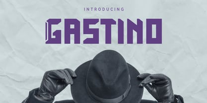 Gastino is an casual and unique display font. Gastino is designed for any project, this font is perfect for poster design, logotype design, advertising and many more.
 - Ghula Vista by Rockboys Studio,
$17.00 Southeast is a chic, paint brushed script font that emanates sophistication and elegance. Its stylish alternates and ligatures make this font the perfect match for any project.
 - Golden Bloom by Ardian Nuvianto,
$18.00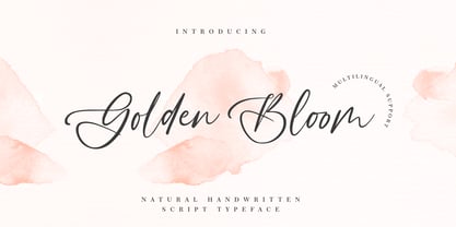 Golden Bloom is a chic, refined script font that emanates sophistication and elegance. Its stylish alternates and ligatures make this font the perfect match for any project.
 - Emery by Deeezy,
$14.00 Trendy, unique & modern style slab serif font for your fancy projects. Elegant, funny and artitsic style on Emery font will be great for any branding project. Enjoy :)
 - Coomeec by Linotype,
$29.99 Although Andi AW. Masry designed his Coomeec typeface with one eye on comic books, this is more than just another cartoon font. Even in our short profile of the font below, we're sure you'll find enough to be surprised by the calligraphic aesthetic and the wide range of potential uses of Coomeec. Typography had been one of Andy AW. Masry's hobbies before he turned professional in 2008 and formed his own agency in Jakarta in Indonesia. The former construction engineer had already spent many hours of his leisure time in following his pastimes of designing, photography and Latin typography. Fascinated by the close interaction between text and image in comic books, one of his first projects was the development of his font Coomeec™. The condensed letters of Coomeec seem to have more in common with a calligraphic brush typeface than a more conventional cartoon font. With the characteristic line forms of a brush font, the not unextensive variations in line thickness and numerous small embellishments to the glyphs, Coomeec can be used to enhance your projects with animated effects. You can achieve this not just in the larger font sizes; the font is also very legible in small sizes thanks to its large x-height. There are certain unusual letter forms, such as that of lowercase 'g', 's' and uppercase 'Y', that provide Coomeec with a touch of the exotic. As Coomeec has numerous character alternatives, you can use it not only to create diverse designs but also to ring the changes with the character of the text itself. There are variants for most lowercase letters, some of which exhibit only minor differences, such as the lack of a curlicue on the 'b', a modified downstroke on the 'h' and an elongated base for the 'k'. In the case of other letters, such as the 'q' and the 'r', there are significant disparities between variants. The uppercase characters are also available in a lively swash style with significantly extended terminals. Among the range of characters of Coomeec are oldstyle and lining figures designed for proportional and tabular setting. All alternatives are available in the form of the corresponding OpenType versions. Coomeec comes in two weights; Regular and Bold, each with its Italic version. The form of the slightly inclined Italic characters is identical to that of their upright counterparts with the exception of the lowercase 'f', which has an ascender in its Italic version. As an OpenType Pro font, the glyphs available for Coomeec ensure that it can be used to set not only western European but also central European texts. Coomeec is not just at home when used to set headlines. The excellent legibility of this individual and vibrant typeface means that it's also ideal for setting shorter texts. The various alternative letters provide the designer with the opportunity to vary the textual appearance, and to choose between creating a more formal or more light-hearted effect. Coomeec is not only available in an OpenType version but is also obtainable as a web font, so that you can employ its exotic features to good effect when creating internet pages.
 - Danube, crafted by the talented Levi Halmos, is a font that refuses to just sit quietly in the corner of your document, sipping tea and discussing the weather. No, Danube is the life of the party, th...
- LeopardSkin by Scholtz Fonts,
$19.00 LeopardSkin is an exciting, contemporary display font, incorporating the distinctive markings of one of Africa’s most famous “big cats”. Two versions are available: LeopardSkin Aarde, based on the Aarde Black font, is best used in conjunction with Aarde Black or Aarde Outline. LeopardSkin Umkhonto is based on the best-selling Umkhonto font, and may be used in conjunction with the Umkhonto font collection. The popularity of the “animal skin” look in contmporary clothing and soft furnishing design make LeopardSkin a must for artists on the creative edge of contemporary design.
 - Ecatherina by BlessedPrint,
$23.00 Hi! It took me almost a year to design Ecatherina script. Finally it is available to purchase! Ecatherina script is an opentype font-family (15 fonts: 5 styles for 3 line thickness) with a bonus (editable wedding invitations, menu, quotes, letters, and more) HOW TO GET ACCESS TO ALTERNATES? Absolutely easy, just type a number after any letter: a1, a2, a3 etc Capital letters have 3-4 options and more. So just type E1, E2, E3 etc and find your favourite one! I found this method the most useful when you need to experiment with design very fast. All characters are available through Glyph panel as well, even more each of the alternate letter has it’s own unicode (PUA) so you can copy/paste from Apple Font Book or Windows Character Map. Total amount of glyphs 1436. Compatible with SILHOUETTE & CRICUT DESIGN SPACE WHAT IS INCLUDED BP-Ecatherina OTF & TTF It goes with 5 weights: Thin, Medium, Regular, Bold, UltraBold BP-Ecatherina-Ex1 The only difference between previous font is that thin line is a bit thicker. BP-Ecatherina-Ex2 Even more thicker line. Help.pdf Help file with most common questions. Bonus - Ecatherina.fig with editable wedding invitations (10+ designs 5x7 inches), menu, quotes, letters. Important! You need to install Figma application (it is free) to access files. With Figma application you can import bonus files and edit the text, export as png, pdf, svg and print it. Bonus - help.pdf file with general information how to work with Figma if you are new. It is very easy application and I recommend it to you! It works with MS Word, I included example.docx file so you can understand how to work.
 - Basilio by Canada Type,
$29.95 In the late 1930s, old Egyptiennes (or Italiennes) returned to the collective consciousness of European printers and type houses — perhaps because political news were front a centre, especially in France where Le Figaro newspaper was seeing record circulation numbers. In 1939 both Monotype and Lettergieterij Amsterdam thought of the same idea: Make a new typeface similar to the reverse stress slab shapes that make up the titles of newspapers like Le Figaro and Le Frondeur. Both foundries intended to call their new type Figaro. Monotype finished theirs first, so they ended up with the name, and their type was already published when Stefan Schlesinger finished his take for the Amsterdam foundry. Schlesinger’s type was renamed Hidalgo (Spanish for a lower nobleman, ‘son of something’) and published in 1940 as ‘a very happy variation on an old motif’. Although it wasn’t a commercial success at the time, it was well received and considered subtler and more refined than the similar types available, Figaro and Playbill. In the Second World War, the Germans banned the use of the type, and Hidalgo never really recovered. Upon closer inspection, Schlesinger’s work on Hidalgo was much more Euro-sophisticated and ahead of its time than the too-wooden cut of Figaro and the thick tightness of Playbill. It has a modern high contrast, a squarer skeleton, contour cuts that work similarly outside and inside, and airy and minimal solutions to the more complicated shapes like G, K, M, N, Q and W. It is also much more aware of, and more accommodating to, the picket-fence effect the thick top slabs create in setting. Basilio (named after the signing teacher in Mozart’s Figaro) is the digital revival and major expansion of Hidalgo. With nearly 600 glyphs, it boasts Pan-European language support (most Latin languages, as well as Cyrillic and Greek), and a few OpenType tricks that gel it all together to make a very useful design tool. Stefan Schlesigner was born in Vienna in 1896. He moved to the Netherlands in 1925, where he worked for Van Houten’s chocolate, Metz department store, printing firm Trio and many other clients. He died in the gas chambers of Auschwitz in 1944. Digital revivals and expansions of two of his other designs, Minuet and Serena, have also been published by Canada Type.
 - Liveria by Subectype,
$17.00 Liveria is an urban font with natural hand-painted style. Suitable for any design needs, branding, urban design, modern advertising design, Book/Cover Title, special events, adventures, headlines, any brush lettering needs and more. Liveria comes with upper and lowercase Standard Characters, Punctuation, Numerals. And some glyphs variation of the OpenType features such as Standard Ligatures and Stylistic Set. Includes a range of multilingual support WHATS INCLUDED : Multilingual Support Ligatures and alternates font If you have any questions please don't hesitate to drop me a message :) Thank You, Subectype Studio
 - Le Havre Hand by insigne,
$- Le Havre. It's a family with no lack of characters diverse, yet none are as deep or tested in their appearance as the weathered, hand-drawn texture of Le Havre Hand. Tall and lean, the well-aged face carries with it the stories of a thousand miles. Starting with a sans as its origin, this handwritten font's layered structure has been shaped through time and trial, ultimately capturing the simple beauty of a wise, experienced character. This layer-based font family includes style variations and new layering solutions. Le Havre Hand includes 21 font files. It also includes an outline, crosshatched versions and five inline variations, several extruded variants including a unique wireframe options. There are two extruded fonts and two drop shadow fonts. For users that have Opentype programs, such as Adobe Illustrator, Photoshop, InDesign, Microsoft Publisher and Quark, each font also comes with an established set of art deco alternatives. Le Havre Hand's alternate characters come together to exhibit a clear sensitivity to the art deco style. Use them on their own or increase your options by using them with any of the other members of the Le Havre family. Take time to look deep into the soul of Le Havre Hand. It's often the tested, weathered hand that is most reliable to guide you to success.
 - MTT Roma by MTT Type Firm,
$39.99 MTT Roma is designed to re-create the atmosphere of the city of Rome of the 21st century. The studio for the letterform evolved from the Trajan Column alphabet. Suitable for both display and body-text usage, stylistically MTT Roma aims to distance itself from the proliferation of geometric sans-serif families of its time. The result is a sharp, subtly humanist typeface inspired by modern day Rome, the city of contrasts and eternal beauty. Featuring an extended character set to support Central and Eastern European as well as Western European languages, the typeface comes with six weights – from thin to black — with matching italics.
 - Arp by W Type Foundry,
$35.00 Arp is a neo-grotesk type system exploring the relations between contrast, functionality, and graphic character in one family. This typography comes in 5 different weights including fine strokes with inverted contrast (20), a sharp sans serif (80), and a high contrast heavyweight (240). Moreover, its design is formed by short ascenders and descenders aiming higher legibility, ink traps for display-functional purposes, and includes a wide range of icons, arrows, and symbols which allow creating consistent compositions in digital and print designs. All styles of 640 characters include a display weight with geometric and glyphic style alternates, which expand the proprieties and versatility of the system.
 - Eurostile Candy by Linotype,
$40.99Eurostile Candy is a fun spinoff from Akira Kobayashi's Eurostile Next family. As the name implies, it is based on Eurostile but with many striking new features. Most obviously, the corners and joints have been rounded off to give it a more friendly and softer feel. On top of those changes, the main skeleton of many characters have been modified. Any extra strokes have been removed - such as in the a, s, or t - and joints have been simplified to create even more square shapes - like in the n and r. With these contemporary and futuristic-styled alterations, Eurostile Candy is a cool new design great for many display projects. - Sigillium by ave,
$9.00 Sigillium is a flare serif typefaces, which inspired by early XX centuries sign painting advertising. It has strong historical nature. Letters proportions are very closed to the Roman Capital Letters. Sharp flare serifs endings give special medieval style to the typeface. Sigillium includes: 4 types in Upper- and Lowercases Each style contains more than 250 glyphs which support Latin, Western European, Central European languages (Cyrillic is also included) Files description: regular, carved empty, - not filled 2 styles carved with shadow, - different "light" directions Hope you are enjoying using Sigillium. Please do not hesitate to ask me any questions about the product. (c) Photo credit - Unsplash
 - Matryo by Typogama,
$29.00 Matryo is a narrow, sans serif typeface family of fourteen typefaces, ranging from Thin to Black with accompanying Italics. With a soft, rounded form stroke and open shapes, it aims to remain clear and legible at all point sizes and can be set either in longer passages or for headlines and logos. Conceived as a multilingual family, its large character set covers most latin, cyrillic and greek based languages with a particular attention given to covering the historical forms for added functionality. Through Opentype features, Matryo equally offers a choice of numeral styles and some ligatures or alternative letters to add further choices for end users.
 - Palmona Plus by Ingo,
$46.00 A rustic black letter from the 1930ies — with stylistic alternates. The high degree of abstraction of this typeface allows it to appear modern, even though its shapes clearly show an origin from Fraktur and Gothic. The letters present the effect of woodcarving or silhouette cuttings as they are defined exclusively with straight lines and sharp corners. By doing without any bowls, the typeface becomes a stylistic entity with a decorative effect. Palmona is especially appealing in combination with bold illustrations. Some of the characters of Palmona are available in one or more alternate forms which can be accessed manually or automatically. Use of these alternates is most easily operated with OpenType-Functions Standard-Ligatures and Discretional Ligatures in the user program. With Standard Ligatures activated, problematic letter compositions are substituted with appropriate ligatures. Likewise, in certain letter combinations the alternates are inserted. The Discretional Ligatures include additional alternatives. Configuration of the characters of the Palmona font is according to Unicode ISO 8859-1 (Latin1). Consequently all characters for all European languages with Latin type are covered — including Turkish, the Baltic languages, East European and Scandinavian languages. Congruent with the time of its origin and typical for black letter typefaces, Palmona also includes a long s as well as — uncommon but definitely reasonable — a capital ß. Both characters are automatically applied with the activation of Discretional Ligatures, and the associated ligatures appear automatically as well. When using ”long s,“ you must ensure the correct use of the rules for the Fraktur font: ”round s“ is always at the end of the word, also in compound words. For those of you who want to be even more correct, read the corresponding >> article in Wikipedia.
 - Obligation by Seemly Fonts,
$14.00 Obligation is a cute and casual display font. No matter the topic, this font will be an incredible asset to your fonts’ library, as it has the potential to elevate any creation.
 - Black Wolves by Letterafandi Studio,
$14.00 Black Wolves is an all caps handwritten font. No matter the topic, this font will be an incredible asset to your fonts’ library, as it has the potential to elevate any creation.
 - Usefully by Beary,
$15.00 Usefully is a quirky and laid-back handwritten font. Whatever the topic, this font will be a wonderful asset to your font library, as it has the potential to enhance any creation.
 - Boldscope by ahweproject,
$9.00 Boldscope is a fun, retro-psychedelic display font. No matter the topic, this font will be an incredible asset to your fonts’ library, as it has the potential to elevate any creation.
 - Noah SS by Sensatype Studio,
$15.00 Noah - Elegant Ligature Font A new font that we created special for branding needs, with extra ligature in unique characters add value of your brand to look more elegant. It's so nice to leverage designer or product owner that need solutions to make their design look more stylish and modern. And specially for Noah font, We prepared any ligatures, and any alternate characters to help you create unlimited variations for your creative needs. Noah Elegant Ligature Font ready with: Any options to get creative variations (combination of Alternate and Ligatures) Preview as a inspirations that you can do with Noah font Ready with Lowercase and Uppercase characters Wish you enjoy our font and if you have a question, Please don't hesitate to drop message & I'm happy to help :)
 - Linex Sans by Monotype,
$29.99Linex Sweet was designed by Albert Boton in the late 1990s. It's a smallish family of three weights; the middle weight has an italic companion face. With its soft corners and slightly quirky head-serifs, Linex Sweet is a friendly design that sees much use. Several years later, Boton began sketching a new design, based on the original Linex Sweet but with a little more authority and grace. Linex Sans is the result. A mix of crisp angles and soft shapes, this new addition to the extended Linex family is both inviting and elegant. The subtle calligraphic overtones distinguish the design from more traditional sans serif designs. A three-weight family with a complementary italic for the Regular weight, Linex Sans is a versatile communications tool in both text and display sizes. It offers that mix of sophistication and joie de vivre that characterizes the designs of Albert Boton. Boton began his professional career as a carpenter. Fortunately for designers and typographers, he quickly turned from pounding nails to hammering out graphic design and constructing great letterforms as a profession. In his long career, he has created hundreds of distinctive, highly useful and award-winning designs. And even though he is now retired from active business, Boton continues to create fresh, new typeface designs. Add Linex Sans to the list. - Jannon Pro by Storm Type Foundry,
$55.00 The engraver Jean Jannon ranks among the significant representatives of French typography of the first half of the 17th century. From 1610 he worked in the printing office of the Calvinist Academy in Sedan, where he was awarded the title "Imprimeur de son Excellence et de l'Academie Sédanoise". He began working on his own alphabet in 1615, so that he would not have to order type for his printing office from Paris, Holland and Germany, which at that time was rather difficult. The other reason was that not only the existing type faces, but also the respective punches were rapidly wearing out. Their restoration was extremely painstaking, not to mention the fact that the result would have been just a poor shadow of the original elegance. Thus a new type face came into existence, standing on a traditional basis, but with a life-giving sparkle from its creator. In 1621 Jannon published a Roman type face and italics, derived from the shapes of Garamond's type faces. As late as the start of the 20th century Jannon's type face was mistakenly called Garamond, because it looked like that type face at first sight. Jannon's Early Baroque Roman type face, however, differs from Garamond in contrast and in having grander forms. Jannon's italics rank among the most successful italics of all time – they are brilliantly cut and elegant.
 - Lehmann by ParaType,
$30.00 PT Lehmann™ was designed for ParaType in 2002 by Tagir Safayev. Inspired by letterforms of Shiroky (Wide) Renaissance typeface and other fonts of Ossip Lehmann foundry, St.-Petersburg, c. 1874. A face of the so-called Elzevir type has thin triangular serifs and sharp spiral-like terminals. For use in advertising and display typography.
 - Hyperwave by Set Sail Studios,
$14.00 Crank up the intensity with HYPERWAVE! An energetic set of brush fonts with a sharp attitude. With THREE sets of each letter, each equipped with distinctive fast brush strokes, HYPERWAVE is ready and raring to make a big statement on your logo designs, brand imagery, handwritten quotes, product packaging, merchandise, music projects & social media posts.
 - Wiggly Wavy by Mvmet,
$14.00 Wiggly Wavy is a whimsical display font that took inspiration from french fries shapes. You can use it for anything ranging from t-shirts, kids’ book designs, restaurant menu, greeting cards, stickers, and posters, or anything that needs a casual touch. Try it to create lovely designs and feel the good vibes with it!
 - Kwadrat by Malgorzata Bartosik,
$19.00 Kwadrat is a modern unusual typeface. Some of the letters have surprising shapes, so it can be used mainly for display purposes, but also as body text. It's available in 4 weights: Light, Regular, Medium, Bold and as a variable font. It's multilingual - contains Latin alphabet with Western, Central and South Eastern European diacritics. Enjoy!