10,000 search results
(0.306 seconds)
- ITC Handel Gothic by ITC,
$40.99 The Handel Gothic? typeface has been a mainstay of graphic communication for over 40 years - all the while looking as current as tomorrow. Designed by Don Handel in the mid-1960s, and used in the 1973 United Airlines logo developed by Saul Bass, Handel Gothic was an instant success when released to the graphic design community. Its generous lowercase x-height, full-bodied counters and square proportions make the design highly readable at a wide range of sizes. Handel Gothic's slightly idiosyncratic character shapes gave the face a futuristic look 40 years ago that retains its power today. In addition, its Uncial-like lowercase is instantly identifiable - and unique among sans serif typestyles. Award-winning type designer Rod McDonald was attracted to the simple, decisive forms of the original, but he felt the design needed to be refined and updated. ?One of my goals was to bring a modern typographic discipline to what was really an old phototypesetting font.? To achieve his goal, McDonald re-proportioned every character and balanced the delicate relationship between the curves and the straight strokes. He also added a number of alternate characters to extend the range of the design. ?I wanted to give designers a large enough character set so they wouldn't feel constrained in what they could do. I want them to be able to play with the fonts, not just set words.? McDonald enlarged the family from the single-weight original to five weights, each with a full suite of alternate characters.In 2015 Nadine Chahine designed matching arabic weights to this family.
 - Hyldemoer by Hanoded,
$15.00 Hyldemoer (in Nordic folklore) is a tree spirit, or nymph, who lives in elder trees. H.C. Andersen also wrote a story about Hyldemoer (‘The Little Elder-Tree Mother’ in English). Hyldemoer font is based on my Mysterious font and the first letters of the Beowulf manuscript (Hwæt! We Gardena…). Hyldemoer is a jumpy fairytale font, which comes with some interesting alternate glyphs and ligatures, plus a harvest of diacritics. Use it for your book covers, product packaging, posters and art work.
 - Tanamera by Jolicia Type,
$19.00 Introducing Tanamera: Your Portal to Psychedelic Nostalgia Product Description: Unleash the vibrant energy of the '60s and '70s with Tanamera, the ultimate psychedelic type display font that channels the essence of retro vintage style. Whether you're designing a groovy poster, an album cover, or revamping your branding, Tanamera is your ticket to a kaleidoscopic journey through time. Key Features: 1. Psychedelic Vibes: Tanamera captures the essence of a bygone era, where peace, love, and creativity reigned. Its mesmerizing swirls and curves will transport you to the heart of the psychedelic revolution. 2. Vintage Aesthetic: With carefully crafted glyphs that pay homage to the fonts of the past, Tanamera adds an authentic touch of nostalgia to your projects, effortlessly embodying the essence of the retro era. 3. Endless Customization: Tanamera comes with a variety of alternates and ligatures, providing you with endless possibilities to create unique and eye-catching typography that stands out from the crowd. 4. Versatile Usage: Whether you're designing for print or digital media, Tanamera adapts seamlessly to various applications, from posters, branding, and advertising, to websites and social media. 5. High-Quality Craftsmanship: Crafted with precision and attention to detail, Tanamera is a high-quality font that ensures crisp, sharp lines and smooth curves, making it perfect for both small and large-scale projects. 6. Easy to Use: Tanamera is user-friendly and compatible with popular design software, ensuring a smooth and hassle-free integration into your creative process. Why Choose Tanamera? Tanamera is not just a font; it's a portal to the past, a gateway to a world of vibrant colors, free-spirited expression, and boundless creativity. It's your chance to infuse your designs with the unmistakable energy and style of the psychedelic era, creating a visual experience that captivates and enchants your audience. Let Tanamera be your guide to reviving the past while embracing the future. Elevate your design projects with this captivating font, and watch as your creations come to life with the magic of retro vintage style. Get Tanamera today and embark on a journey through time that will leave a lasting impression on anyone who sees your work.
 - Rinzler AOE by Astigmatic,
$19.00 Rinzler AOE is a revival of a LetterGraphics film type called Caren. A modular, mechanical, sans-serif stencil all rolled up into one retro typeface. It's not an all-purpose typeface, it's not an everyday typeface, but it is a cool typeface for the right design projects. Rinzler AOE carries itself with a bold weighted style, and stencil cutouts that don't follow standard stencil formatting. It might be considered more of a techno stencil (if there is such a thing). It reminded me in a vague way of TRON, hence the main poster graphic styling, although it looks NOTHING like the Tron titling typeface. Nevertheless, it's a fun typeface that needed to be preserved and used again. WHAT'S INCLUDED: Extensive language support. Rinzler has accented and special characters that support the following languages: Afrikaans, Albanian, Basque, Bosnian, Breton, Catalan Cornish, Corsican, Croatian, Czech, Danish, Dutch, Embu, English, Esperanto, Estonian, Faroese, Filipino, Finnish, French, Galician, German, Hungarian, Icelandic, Irish, Indonesian, Italian, Kurdish, Leonese, Luxenbourgish, Malay, Maltese, Manx, Maori, Meru, Morisyen, North Ndebele, Norwegian Bokmål, Norwegian Nynorsk, Nyankole, Occitan, Oromo, Polish, Portuguese, Rhaeto-Romanic, Romanian, Scottish Gaelic, Scots, Serbian (Latin), Slovak, Slovenian, Spanish, Swahili, Swedish, Tagalog, Turkish, Walloon, & Welsh. One of my guilty pleasures is in taking the time to recreate historical typefaces as digital fonts, but a lot of incredible historical typestyles created as wood or metal or film type usually have bare bones character sets and have been lost or only exist as limited specimen proofs in old books. These typefaces may have more niché uses than modern typefaces, but I believe it is important nonetheless to preserve these typefaces for future generations. These typefaces, if nothing else, can often inspire new creations.
 - Fashion Experiment by PeachCreme,
$21.00 "Fashion Experiment" is an all-caps handwritten display font featuring a funky and expressive gel pen-style that is perfect for creating impactful header text, poster designs, album covers, product designs, and merchandise. The font's unique and playful appearance is crafted to maintain an authentic look, with alternative letters and ligatures adding to its creative potential. The font includes alternative letters and ligatures coded for uppercase letters. The font also features more than 100k kerning pairs, ensuring optimal precision and readability. To maintain the authentic appearance of ligatures, this font was crafted from the handwritten text. However, as ligatures that complement one combination of letters may not work for another, it is essential to have the option of switching to alternate letters or avoiding the use of ligatures altogether. The frequency of use for certain letters varies, resulting in some letters having more alternates than others. For example, letters such as A, E, L, M, S, and T are more commonly used than letters like X, Z, and Q, which explains the difference in alternate options. We recommend using programs that support OpenType features to fully access the font's features. This will allow you to access glyphs directly on the same panel without copying/pasting each glyph. Additionally, the OpenType panel allows you to turn on standard ligatures, which can automatically change letters for available ligatures. Even if you are using a program that does not support OpenType, you can still access the alternates and ligatures of this font through Fontbook or Character Map, as the glyphs are PUA-encoded. However, please note that you will have to copy and paste each ligature or alternate individually, which can be time-consuming and require extra effort. Happy designing, Gulya
 - Logo Sans by Emily Lime,
$16.00 Logo Sans is a clean, geometric sans-serif created with an obvious use in mind - logos (although quite suitable for longer texts as well). It is a clear, easy to read font that comes in a variety of weights & italics ...allowing for pleasing logo design combination and marketing pieces. Its wide characters and linear lines have a very modern, luxurious appeal. The family includes 5 weights...plus italics - for a total of 10 fonts.
 - Retjeh by MuSan,
$18.00 Retjeh is a handcrafted vintage font, comes in Six styles there are Pressed, Linned, Dotted, Rough, Regular, and Sans. That makes Retjeh perfect for any Vintage styles as you needed. This font come with only All Caps, Number, and also Multilingual characters. If you purchase the complete family package, I'll send you a bonus of 10 Editable Badges. Please email me at wellhellomusan@gmail.com with your MyFonts order number to get the bonus!
 - Nimbus Sans Novus by URW Type Foundry,
$89.99 The first versions of Nimbus Sans have been designed and digitized in the 1980s for the URW SIGNUS sign-making system. Highest precision of all characters (1/100 mm accuracy) as well as spacing and kerning were required because the fonts should be cut in any size in vinyl or other material used for sign-making. During this period three size ranges were created for text (T), the display (D) and poster (P) for small, medium and very large font sizes. In addition, we produced a so-called L-version that was compatible to Adobe’s PostScript version of Helvetica. Nimbus was also the product name of a URW-proprietary renderer for high quality and fast rasterization of outline fonts, a software provided to the developers of PostScript clone RIPs (Hyphen, Harlequin, etc.) back then. Also in the 80s, a new, improved version of the Nimbus Sans, namely Nimbus Sans Novus was designed. Nimbus Sans Novus was conceptually developed entirely with URW’s IKARUS system, i.e. all styles harmonize perfectly with each other in terms of line width, weight, proportions, etc. On top of that, Nimbus Sans Novus contains more styles than Nimbus Sans.
 - Brathers SS by Sensatype Studio,
$15.00 BRATHERS is a Minimalist Elegant Sans Serif Font. An extraordinary style with minimalist and elegant in sans serif, we analyze what any designer or brand owner needs to make their brand stand out. As our focus that analyzes any typeface that helps to leverage any logo design to look more modern and unique. We prepared this font with any unique characters to help you create unlimited variations for your creative needs. BRATHERS Minimalist Elegant Sans Serif Font ready with: Regular & Bold Ready Better style of characters with a minimalist elegant curve Preview as an inspiration that you can do with BRATHER font All Uppercase characters Wish you enjoy our font. :)
 - Gadimon by Kotak Kuning Studio,
$12.00 Introducing Gadimon Layered Bold Script. This font is used with layers method, so it can generate interesting fonts to see, you no longer need to worry about how to make effects on the text. Use the Gadimon Basic style for purposes without shadow effect and when spacing is important for a project. Gadimon is suitable to use as a logotype, product designs, labels, watermark, social media posts, apparel, invitations, signboards, sports club, motor/car, special events or anything that need handwriting taste. What you get: - Gadimon includes capital and lowercase letters, Alternates, and Ligatures - Numbers + punctuation - Foreign language support I highly recommend using a program that supports OpenType features and Glyphs panels such as Adobe Illustrator, Adobe Photoshop CC, Adobe InDesign, or CorelDraw, so you can see and access all Glyph variations. This font is encoded with Unicode PUA, which allows full access to all additional characters without having special design software. Mac users can use Font Book, and Windows users can use Character Map to view and copy one of the extra characters to paste into your favorite text editor/application. We hope you enjoy the font, please feel free to comment if you have any thoughts or feedback. Or simply send me a PM or email me at kotakkuningstudio@gmail.com. Thanks for purchasing and have fun!
 - 112 Hours by Device,
$9.00 Rian Hughes’ 15th collection of fonts, “112 Hours”, is entirely dedicated to numbers. Culled from a myriad of sources – clock faces, tickets, watches house numbers – it is an eclectic and wide-ranging set. Each font contains only numerals and related punctuation – no letters. A new book has been designed by Hughes to show the collection, and includes sample settings, complete character sets, source material and an introduction. This is available print-to-order on Blurb in paperback and hardback: http://www.blurb.com/b/5539073-112-hours-hardback http://www.blurb.com/b/5539045-112-hours-paperback From the introduction: The idea for this, the fifteenth Device Fonts collection, began when I came across an online auction site dedicated to antique clocks. I was mesmerized by the inventive and bizarre numerals on their faces. Shorn of the need to extend the internal logic of a typeface through the entire alphabet, the designers of these treasures were free to explore interesting forms and shapes that would otherwise be denied them. Given this horological starting point, I decided to produce 12 fonts, each featuring just the numbers from 1 to 12 and, where appropriate, a small set of supporting characters — in most cases, the international currency symbols, a colon, full stop, hyphen, slash and the number sign. 10, 11 and 12 I opted to place in the capital A, B and C slots. Each font is shown in its entirety here. I soon passed 12, so the next logical finish line was 24. Like a typographic Jack Bauer, I soon passed that too -— the more I researched, the more I came across interesting and unique examples that insisted on digitization, or that inspired me to explore some new design direction. The sources broadened to include tickets, numbering machines, ecclesiastical brass plates and more. Though not derived from clock faces, I opted to keep the 1-12 conceit for consistency, which allowed me to design what are effectively numerical ligatures. I finally concluded one hundred fonts over my original estimate at 112. Even though it’s not strictly divisible by 12, the number has a certain symmetry, I reasoned, and was as good a place as any to round off the project. An overview reveals a broad range that nonetheless fall into several loose categories. There are fairly faithful revivals, only diverging from their source material to even out inconsistencies and regularize weighting or shape to make them more functional in a modern context; designs taken directly from the source material, preserving all the inky grit and character of the original; designs that are loosely based on a couple of numbers from the source material but diverge dramatically for reasons of improved aesthetics or mere whim; and entirely new designs with no historical precedent. As projects like this evolve (and, to be frank, get out of hand), they can take you in directions and to places you didn’t envisage when you first set out. Along the way, I corresponded with experts in railway livery, and now know about the history of cab side and smokebox plates; I travelled to the Musée de l’imprimerie in Nantes, France, to examine their numbering machines; I photographed house numbers in Paris, Florence, Venice, Amsterdam and here in the UK; I delved into my collection of tickets, passes and printed ephemera; I visited the Science Museum in London, the Royal Signals Museum in Dorset, and the Museum of London to source early adding machines, war-time telegraphs and post-war ration books. I photographed watches at Worthing Museum, weighing scales large enough to stand on in a Brick Lane pub, and digital station clocks at Baker Street tube station. I went to the London Under-ground archive at Acton Depot, where you can see all manner of vintage enamel signs and woodblock type; I photographed grocer’s stalls in East End street markets; I dug out old clocks I recalled from childhood at my parents’ place, examined old manual typewriters and cash tills, and crouched down with a torch to look at my electricity meter. I found out that Jane Fonda kicked a policeman, and unusually for someone with a lifelong aversion to sport, picked up some horse-racing jargon. I share some of that research here. In many cases I have not been slavish about staying close to the source material if I didn’t think it warranted it, so a close comparison will reveal differences. These changes could be made for aesthetic reasons, functional reasons (the originals didn’t need to be set in any combination, for example), or just reasons of personal taste. Where reference for the additional characters were not available — which was always the case with fonts derived from clock faces — I have endeavored to design them in a sympathetic style. I may even extend some of these to the full alphabet in the future. If I do, these number-only fonts could be considered as experimental design exercises: forays into form to probe interesting new graphic possibilities.
 - TT Ricordi Greto by TypeType,
$29.00TT Ricordi Greto useful links: Specimen | Graphic presentation | Customization options TT Ricordi Greto is the 5th project from the TT Ricordi collection of fonts, the main task of which is to find gems in old tablets and on stones and bring these inscriptions back to life in the form of contemporary fonts under the general name TT Ricordi. TT Ricordi Greto is Kseniya Karataeva’s original experimental project, inspired by a floor plaque dating from 1423 found in the Basilica di Santa Croce, Florence. When working on the typeface, we wanted to do something new and modern, but at the same time find details or artifacts in the source that could be exaggerated to the maximum. TT Ricordi Greto is a non-contrasting Florentine sans-serif with dynamic proportions and a hint on what would be serifs. The main features of the typeface are the closed aperture, dynamic proportions, and the combination of historical forms with modern visual solutions, flowing terminals with curling dash ends and flared ends, and subtle serifs that hint at the historical material. Another feature of the typeface is a large set of graphic icons (characters and objects), margin markers (flowers, stars and drops) and thirteen catchwords. All icons and spacing have been carefully selected and rendered in order to best match the visual plasticity of the font and interact well with it. The TT Ricordi Greto font family consists of 4 styles: Regular, Medium, Demibold + the Variable font. Each style includes 678 glyphs and 14 OpenType features. In addition to wide language support (extended Latin and basic Cyrillic), each style has two sets of figures and currencies (proportional and tabular), a set of arrows alternative versions of the letter M (flared and straight versions) and the letter Ф (round and oval) and the same a set of icons, margin markers and catchwords. TT Ricordi Greto OpenType features list: aalt, ccmp, locl, numr, ordn, tnum, pnum, case, ss01, ss02, ss03, ss04, ss05, calt. TT Ricordi Greto language support: Acehnese, Afar, Albanian+, Aleut (lat), Alsatian, Aragonese, Arumanian+, Asu, Aymara, Azerbaijani +, Banjar, Basque +, Belarusian (lat), Bemba, Bena, Betawi, Bislama+, Boholano+, Bosnian (lat), Breton +, Catalan+, Cebuano+, Chamorro+, Chichewa, Chiga, Colognian+, Cornish, Corsican +, Cree, Croatian, Czech+, Danish, Dutch+, Embu, English+, Esperanto, Estonian+, Faroese+, Fijian, Filipino+, Finnish, French, Frisian, Friulian+, Gaelic, Gagauz (lat), Galician+, Ganda, German+, Gikuyu, Guarani, Gusii, Haitian Creole, Hawaiian, Hiri Motu, Hungarian+, Icelandic+, Ilocano, Indonesian+, Innu-aimun, Interlingua, Irish, Italian+, Javanese, Jola-Fonyi, Judaeo-Spanish, Kabuverdianu, Kalenjin, Kamba, Karachay-Balkar (lat), Karaim (lat), Karakalpak (lat), Karelian, Kashubian, Kazakh (lat), Khasi, Kikuyu, Kinyarwanda, Kirundi, Kongo, Kurdish (lat), Ladin, Latvian, Leonese, Lithuanian+, Livvi-Karelian, Luba-Kasai, Ludic, Luganda+, Luo, Luxembourgish+, Luyia, Machame, Makhuwa-Meetto, Makonde, Malagasy, Malay+, Maltese, Manx, Maori, Marshallese, Mauritian Creole, Meru, Minangkabau+, Moldavian (lat), Montenegrin (lat), Morisyen, Nahuatl, Nauruan, Ndebele, Nias, Norwegian, Nyankole, Occitan, Oromo, Palauan, Polish+, Portuguese+, Quechua+, Rheto-Romance, Rohingya, Romanian +, Romansh+, Rombo, Rundi, Rwa, Salar, Samburu, Samoan, Sango, Sangu, Sasak, Scots, Sena, Serbian (lat)+, Seychellois Creole, Shambala, Shona, Silesian, Slovak+, Slovenian+, Soga, Somali, Sorbian, Sotho+, Spanish+, Sundanese, Swahili, Swazi, Swedish+, Swiss, German +, Tagalog+, Tahitian, Taita, Talysh (lat), Tatar+, Teso, Tetum, Tok Pisin, Tongan+, Tsakhur (Azerbaijan), Tsonga, Tswana +, Turkish+, Turkmen (lat), Uyghur, Valencian+, Vastese, Vepsian, Volapük, Võro, Vunjo, Walloon, Walser+, Welsh+, Wolof, Xhosa, Zaza, Zulu+, Belarusian (cyr), Bosnian (cyr), Bulgarian (cyr), Erzya, Karachay-Balkar (cyr), Khvarshi, Kumyk, Macedonian+, Montenegrin (cyr), Mordvin-moksha, Nogai, Russian+, Rusyn, Serbian (cyr)+, Ukrainian. - Himalia Callisto by Dora Typefoundry,
$18.00 Introducing a cool unique display font named Himalia Callisto experimental typeface Embracing the classic era combined with a modern twist. ready to logos, titles, branding, magazines, album covers, book covers, films, clothing designs, quotes, invitations, flyers, posters, greeting cards, product packaging, printed quotes for any project you can think of. Himalia Callisto is equipped with uppercase, lowercase, numbers and full punctuation + Multi language support and PUA-encode. To activate the OpenType Stylistic alternative, you need a program that supports OpenType features such as Adobe Illustrator CS, Adobe Indesign & CorelDraw X6-X7, Microsoft Word 2010 or a later version. Features: • Uppercase & Lowercase letters • Numbers & Punctuation • Characters with accents • Supports Multiple Languages This type of family has become a work of true love, making it as easy and enjoyable as possible. I really hope you enjoy it! I can't wait to see what you do with Himalia Callisto! Feel free to use the #Dora Typefoundry tag and # Himalia Callisto font to show what you've done visit my Instagram : https://www.instagram.com/doratypefoundry/
 - Machete Pro by Sudtipos,
$39.00 Machete is the hulky, overfed distant cousin of Bayoneta. Enthusiastically in your face and full of humour, Machete is exactly the kind of big alphabet that takes a skinny actress camping at the top of a really tall building downtown. If you don't think this sort of date is interesting enough, try cramming these letters on your next tub of comfort food, road trip comedy, or assault rifle packaging and see. Machete don't text. Machete roars!
 - Resty by Twinletter,
$12.00 Resty is a bold script font that is characterized, unique and bold. This font is designed with a natural touch of handwriting refined to create portions and compositions that suit your needs. Of course, this font designed with natural hand touch has alternative features, ligatures and also supports multi-language, So this font is suitable for crafts, logotypes, posters, titles, banners, wedding invitations, product packaging logos, quotes, social media page covers, book covers, and more. what are you waiting for start creating special projects with this font!
 - Sabre by Alias,
$60.00 I generally refer to our typefaces as ‘graphic’ rather than typographic. By that I mean their starting points are usually ways of constructing shapes and systems of shapes. As with other Alias typefaces, Sabre has stone and wood cut letterforms as a starting point. What is interesting about lettercutting is the connection between shape and material. These beautifully crafted letterforms have a particular sharpness which reflects, of course, how they were made. The idea of constructing letters from a kit of parts we first explored in early fonts Elephant and Factory. These are different in that they were very much grid-based, with a geometric structure. For Sabre I also had Fred Smeijers’ stencil construction drawings in mind. These show how a set of components can be the basis for a crafted, elegant typeface. Sabre is quite a loose interpretation of this idea. Sabre’s graphic shape means it works well at large sizes, with a dramatic, angular impact. Its aim is to be typographic enough to function for blocks of small-size text too.
 - Drafbink by Twinletter,
$17.00 Say hello to classic elegance with the Draftbink font. With a compelling classic serif theme, this font is the perfect choice for creating projects with an elegant touch of classic modernism. Draftbink brings powerful features to give you unlimited flexibility and creativity. The ligature and alternate features allow you to combine interesting characters and create unique and attractive typography compositions. Not only that, Draftbink also supports multilingualism, so you can easily adapt this font to various languages. This opens up the opportunity to reach a wider audience and increase the attractiveness of your project. With its distinctive classic serif characteristics, Draftbink gives your design an elegant and bold impression. Each letter is carefully designed to display stunning beauty and sharpness. Make Draftbink your best choice to present an unforgettable classic modernism feel. Get this font now and show elegance in every detail of your project. What’s Included : File font All glyphs Iso Latin 1 Alternate, Ligature Simple installations We highly recommend using a program that supports OpenType features and Glyphs panels like many Adobe apps and Corel Draw so that you can see and access all Glyph variations. PUA Encoded Characters – Fully accessible without additional design software. Fonts include Multilingual support
 - Dracolas by Nathatype,
$29.00 Ready to make your branding spark? If you need to create a big, bold logo for your business, work on a poster for an event, or whatever your project may be-then this is the perfect font for you. Dracolas-A Vintage Font Dracolas is a captive font designed with strong outlines and fat strokes to bring your branding to life and add a touch of retro vibes. This font features thick letters all in uppercase that easy on the eyes and nice to look while it’s also easy to read. Dracolas becomes more special with best bonus. Perfect to create amazing headings, logos, menus, social media graphics, and many more. Our font always includes Multilingual Support to make your branding reach a global audience. Features: Ligatures Alternates Bonus Ornament PUA Encoded Numerals and Punctuation Thank you for downloading premium fonts from Nathatype
 - Envelove by Sudtipos,
$39.00 «Envelove» is the brand new typographic challenge handwritten by Yani Arabena and designed along with Guille Vizzari and Ale Paul, for Sudtipos. It all started as a game for Yani. A carefree and spontaneous calligraphy, making use of the pointed nib with black ink, exploring its expressive possibilities pressing against paper. With time that nib turned into her dearest tool to flow through her writing, breeding this particular style of hers that let her trespass the barrier that kept personal and professional passions apart. All that inspiration is present in «Envelove», a play on words that reflects the love of letters. An expressive free-and-easy typeface that follows no formal calligraphic model and lets itself go with the meaning of words, rhythm and sensations. «Envelove» successfully joins three different fonts, «Envelove Script»—free, spontaneous and unique of its kind—going together with «Envelove Caps»—an uppercase style that builds controlled but dynamic words thanks to its alternates and ligatures, and to its own true Small Caps set as well—and «Envelove Icons», ideal to decorate and bring to life any written message. «Envelove» encourages you to write as if you have a nib, ink and an envelope. It invites you to take part in other worlds like a magic cocktail, a summer night, a long-awaited reunion, a first dance, a dish cooked with your own hands. The fashion world, gourmet, stationery, scrapbooking and everyone where a Handmade or Handcrafted feel is craved for, save a special place for «Envelove». (The illustration series that are shown with «Envelove» were made by the incredible Argentine illustrator Eugenia Mello.)
 - Pianaforma - 100% free

- Rough Print JNL by Jeff Levine,
$29.00 The Superior Marking Equipment Company was originally located in Chicago, Illinois and over the years produced a line of both commercial and toy rubber stamp printing sets which were used for making signs, posters, tickets and other printed items. Rough Print JNL reproduces the scanned images printed from one of the toy rubber stamp sets. The sample characters were smaller than one half inch in height and were further reduced during scanning. This gives the end result of a typeface which looks like rubber stamp imprints at small sizes, and very angular, distorted, somewhat grunge type when printed at larger sizes. There is a limited character set consisting of alphabet, numerals, some punctuation and currency symbols. No kerning was added to keep the hand-made appeal. Rough Print JNL is an all caps font with the letters and numbers jogged randomly on both the caps and lower case keystrokes. For a similar design with lower case, Amateur Printer JNL is recommended.
 - Omega Pixel by João Henrique Lopes,
$- OmegaPixel Font Description I created this font for the game Hyper Ninja Blast (but made it useful to all kinds of games!). While creating the game, I searched for pixel fonts, but could not find a suitable one. The fonts were generally ugly and lacking the basic variations (italic and bold). So I decided to create my own pixel font. Just as pixel art can be better than a high-resolution painting, so pixel fonts don’t need to be always worse than traditional fonts. In OmegaPixel I tried to achieve elegance, readability and flexibility within the limitations of a 6 pixel x-height. With 4 versions (regular, italic, bold and bold italic), and a neutral feel, OmegaPixel can be used in any genre of games. Considering the general lack of money among indie game devs, I’m giving the regular version for free! For inspiration, I often remebered Minion’s lowercase ‘a’, Galliard italic lowercase ‘g’, and the calligraphy of Chinese emperor Huizong.
 - Frescito by Mans Greback,
$49.00 Frescito is a modern sans-serif typeface that embodies a fresh, cool, and street-smart aesthetic. Designed to be both balanced and versatile, its clear and legible monoline style is designed for branding and advertising in editorial and digital design. The Frescito font family comes in the five classic weights: Thin, Light, Medium, Bold, and Black, along with a Variable font for ultimate flexibility and customization, as well as Italics. Inspired by the energetic spirit of the city and its vibration, Mans Greback set out to create a typeface that would stand out against vivid moment; a type that would work in a traditional café just as well as for contemporary merchandise. The result is a font that combines the best of both worlds: an air of freshness and modernity with an unpretentious, timeless and classy appeal. The font is built with advanced OpenType functionality and has a guaranteed top-notch quality, containing stylistic and contextual alternates, ligatures, and more features; all to give you full control and customizability. It has extensive lingual support, covering all Latin-based languages, from Northern Europe to South Africa, from America to South-East Asia. It contains all characters and symbols you'll ever need, including all punctuation and numbers.
 - Oishigo by GlyphStyle,
$16.00 Oishigo is a freeform handwritten font, it has a tail that goes up and down randomly which makes this font look different and beautiful. This font has many different ligatures, more than 50 ligatures and additional alternates and swashes Font feature Uppercase, Lowercase, Numerals & Punctuations, Stylistic alternate, Ss01, Ss02 50+ igature, Swashes, Multilanguage
 - Spectral Bridge by Namara Creative Studio,
$15.00 Spectral Bridge is a strong serif inspired by timeless elegance and luxurious appeals. Feel free to mix & match with style, alternates, and also ligatures. Combined sharp and soft appeals, make a versatile typeface that will fit any project such as branding, lettering, quotes, print design, and much more.
 - Stalshine by Qwrtype Foundry,
$14.00 Proudly Present, Stalshine Stalshine is a Handwritten Font Stalshine is perfect for product packaging, branding project, megazine, social media, wedding, or just used to express words above the background. Stalshine also has multilingual support. Enjoy the font, feel free to comment or feedback, send me PM or email.
 - Farmshed by Essentials Studio,
$16.00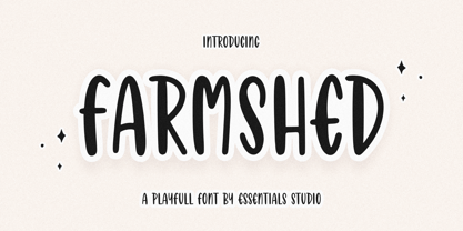 ntroducing by Essentials Studio Proudly Present, FARMSHED FARMSHED Is a A Handwriting Playfull Fonts FARMSHED is perfect for product packaging, branding project, megazine, social media, wedding, or just used to express words above the background. Enjoy the font, feel free to comment or feedback, send me PM or email.
 - Silvertone by Balpirick,
$15.00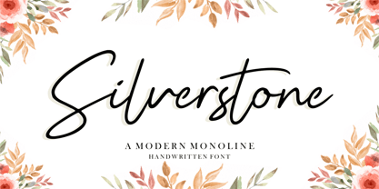 Silvertone is a Modern Monoline Handwritten Font. Silvertone is perfect for product packaging, branding project, magazine, social media, wedding, or just used to express words above the background. Silvertone also support multilingual. Enjoy the font, feel free to comment or feedback, send me PM or email. Thank you!
 - Abdo Logo by Abdo Fonts,
$30.00 Abdo Logo is an Arabic display and text typeface. It is useful for headlines, books covers, logos design, slogans, advertisement and other graphic projects. The font is based on the simple lines of free style calligraphy. The font supports Arabic language and I may extended to cover additional scripts.
 - Icebold by Balpirick,
$15.00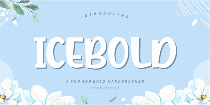 ICEBOLD is a Fun and Bold Hand brushed Font. ICEBOLD is perfect for product packaging, branding project, magazine, social media, wedding, or just used to express words above the background. It support multilingual. Enjoy the font, feel free to comment or feedback, send me PM or email. Thank you!
 - Hellophiy by Qwrtype Foundry,
$14.00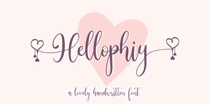 Hellophiy is a Lovely Handwritten Font Hellophiy perfect for product packaging, branding project, magazine, social media, wedding, or just used to express words above the background. Hellophiy also come with Multi-Lingual Support. Enjoy the font, feel free to comment or feedback, send me PM or email. Thank you!
 - Filmgraph by Essentials Studio,
$16.00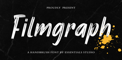 Introducing by Essentials Studio Proudly Present, Filmgraph Filmgraph Is a Modern Handbrush Fonts Filmgraph is perfect for product packaging, branding project, megazine, social media, wedding, or just used to express words above the background. Enjoy the font, feel free to comment or feedback, send me PM or email
 - Grealish by Essentials Studio,
$16.00 Introducing by Essentials Studio Proudly Present, Filmgraph Grealis Is a Modern Handbrush Fonts Grealis is perfect for product packaging, branding project, megazine, social media, wedding, or just used to express words above the background. Enjoy the font, feel free to comment or feedback, send me PM or email
 - Cristalake by Essentials Studio,
$16.00 Introducing by Essentials Studio Proudly Present, Mysthiqa cristalake Is a Modern Script Font cristalake is perfect for product packaging, branding project, megazine, social media, wedding, or just used to express words above the background. Enjoy the font, feel free to comment or feedback, send me PM or email
 - Stickywild by Essentials Studio,
$16.00 Introducing by Essentials Studio Proudly Present, Filmgraph Stickywild Is a Modern Handbrush Fonts Stickywild is perfect for product packaging, branding project, megazine, social media, wedding, or just used to express words above the background. Enjoy the font, feel free to comment or feedback, send me PM or email
 - Bebas Neue - 100% free

- Space Time by Lauren Ashpole,
$15.00 What can I say? I like fonts with stars. Space Time is a hand drawn font with a lot of variety. I started designing the regular version with the characters slightly touching but it wasn't quite what I had in my head. I’d imagined tightly spaced letters with overlapping shadows and the only way to get that effect was to create a second version with stackable layers. That means this download includes regular, base, outline, shadow, and stars files. Plus, the base and outline can be used for stacking or work fine as standalone fonts. This font is all caps but the lowercase letters feature alternative styles.
 - Byte 205 by Talbot Type,
$15.00 Byte 205 is a modular font, resulting from experiments in creating a practical, legible font from a minimum set of geometric components on a uniform grid. It has full upper and lower case character sets and includes all accented characters for Western and Central European languages. It's available in three styles – 105, 205 and 305. Each style has different corners, 105 is square, 205 is bevelled and 305 is round. Each style is available in three weights, Light, Medium and Bold.
 - Byte 305 by Talbot Type,
$15.00 Byte 305 is a modular font, resulting from experiments in creating a practical, legible font from a minimum set of geometric components on a uniform grid. It has full upper and lower case character sets and includes all accented characters for Western and Central European languages. It's available in three styles – 105, 205 and 305. Each style has different corners, 105 is square, 205 is bevelled and 305 is round. Each style is available in three weights, Light, Medium and Bold.
 - Feeling by Haksen,
$16.00 For the long time I tried all new something related with handwritten. Something that can't be calculated, can't be estimated, can't be make sure the finished. Feeling is an elegant script that designed many character of each font and ligature that will show elegant taste when You use this font. Feeling can be use in many function for your requirement brands, for logo, blog, website, and all everything that related with letters.With more than 50 glyps of ligatures in this font, I’m sure You will more love with this font. How Feeling will show You like handwritten and looks natural but elegant in taste. Feeling also complete with language support for your requirement.

