10,000 search results
(0.105 seconds)
- Sterling Park by Olivetype,
$18.00 Meet Sterling Park, this font is perfect for adding a little love and warmth to your writing--in a way that feels authentic and personal. Whether you're writing love notes or cards or designing a tshirt, this hand-drawn font will add a friendly and authentic touch to your creations. So what’s included : Basic Latin Uppercase and Lowercase Numbers, symbols, and punctuations Multilingual Support. Simple Installations works on PC & Mac Thank You.
 - Gritten by Beary,
$5.00 Introducing the elegant new Gritten Font! For those of you who are needing a touch of elegance and modernity for your designs, this font was created for you! Gritten has the added bonus of having 'multiple personalities'! It has 3 sets of extra alternate lowercase letters, which allow you to create different feels for different projects. Features: Uppercase Lowercase Number & Symbol Alternates for each characters Multilingual 277 Glyps More than 70 Alternate Happy Creating!
 - Adget Sans by wearecolt,
$14.00 Adget Sans is a modern, strong statement typeface with clean lines and big curves. Inspired by classic geometric grotesque typefaces, this sans serif typeface is perfect for adding a striking title to your portfolio or website. This set includes ten individual weight fonts plus a variable weight font, Adget Sans consists of 328 glyphs across upper and lowercase, numerals, all European characters, linked letters and ligatures plus some bouns stylistic alternative characters.
 - Almond Buttery by Nurrontype,
$17.00 Introducing "Almond Buttery" - A Playful and Retro Bold Font with Curvy Elegance and Stylistic Flair Get ready to infuse your designs with a touch of whimsy and nostalgia with "Almond Buttery," a dynamic and bold font that pays homage to the retro aesthetic while adding a modern twist. With its curvaceous letterforms and an array of stylistic alternates, "Almond Buttery" is a versatile typeface that's ready to add character and charm to your projects.
 - Brachetto by Roland Hüse Design,
$34.00 Brachetto is a calligraphy script, influenced by traditional script style with an added touch of modernity and flourished elegance. This font is delicately crafted and well thought out with every little detail in mind, to ensure its ease and versatility when used. Being elegant yet bold in its visual presence. Brachetto is a collaboration between lettering artist and calligrapher, Leah Chong and typeface designer, Roland Hüse. Introduction video of this font here https://youtu.be/h9AvlgUDxUc
 - Abdo Strips by Abdo Fonts,
$29.00 Abdo Strips is a set of 4 strips style fonts . This is an OpenType Font supporting Arabic, Persian and Urdu to and compatible with the various operation systems and modern software. The combination of square Kufi and modern styles made it a beautiful typeface appropriate to the titles, and able to meet the desire of the user in the design of ads and modern designs of various types of audio and visual.
 - Ollives by Olivetype,
$18.00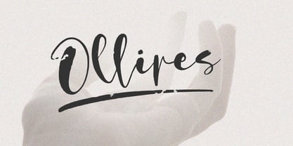 Introducing Ollives, a stylish modern calligraphy-styled script font. This beautiful font is perfect for adding a touch of elegance to any project. With its flowing lines, cool textures and graceful curves, Ollives is sure to add a touch of class to your work. So what’s included : Basic Latin Uppercase and Lowercase Numbers, symbols, and punctuations Multilingual Support. PUA Encoded and fully accessible without additional design software Simple Installations works on PC & Mac Thank You.
 - Moirt by Nathatype,
$29.00 Prepare to make a bold statement with Moirt, an uppercase serif display font that commands attention. Each uppercase letter stands tall and robust, making a commanding presence on any canvas. The spacious layout enhances legibility and gives the font a contemporary, open feel. Delicate lines run parallel to the edges of the letters, adding a unique and captivating visual element. Moirt fits in headlines, logos, branding materials, print media, editorial layouts, and many more.
 - Orange Energy by PizzaDude.dk,
$18.00 A powerful handmade font with a crunchy outline and a lot of attitude. It’s slightly based upon my own handwriting, when I really really concentrate on making each letter both legible and related to the other letters. Otherwise my handwriting is really garbage! :) I’ve added ligatures of repeating letters, such as bb, cc, dd, ee… and more - a great way to sparkle a little more energy in the font and the design it’s used for.
 - Bertham by Ascender,
$29.99 Bertham Pro Family (4 fonts) is a revival of Frederic W. Goudy’s Bertham typeface. Steve Matteson produced this unique typeface and added bold, italic and openface styles. The fonts include a variety of OpenType features including swash capitals, small capitals and old style figures. It is unmistakably American in appearance recalling a day of quality craftsmanship and hard work. Publishing, branding and packaging materials will draw inspired attention due to its grace and distinctive appearance.
 - Heyho Miguelo by Arterfak Project,
$17.00 Meet Heyho Miguelo! This distinctive handwriting font effortlessly captures the natural flow of handwriting with a playful design and a subtle rough touch on the letterforms, adding a unique and cheerful vibe to your typography. Versatile and perfect for posters, flyers, quotes, merchandise, decals, and more, Heyho Miguelo! ensures your designs stand out with charm and individuality. Elevate your creative projects with this font, designed to leave a lasting impression across various applications.
 - Stupid Questions by Bogstav,
$15.00 First of all: there is no such thing as a stupid question! But now there is a font called Stupid Questions! :) A classic handmade sans font - super legible and somewhat clean. Use your favourite of the 5 different versions, mix them in layers with your favourite colours. I've added 4 different versions of each lowercase letter, and they automatically cycle as you type - a great way to make your text look more natural and organic!
 - Troia by Ahmet Altun,
$10.00 Troia Font Family comes in three weights; normal and italic. In addition, with rounded corners, each weight has its own smoother version. Thanks to its large letters and added spaces between the letters, this font can be used to get perfect results and create great works such as web typography, banners, logos, texts, t-shirts and printings, and also presentations. Troia's eye-pleasing and nice-looking style makes writing much more pleasant.
 - Friday Freak PB by Pink Broccoli,
$16.00 Friday Freak PB is a playful font inspired by the titling of the 1976 Disney film, "Freaky Friday". This font has a slightly clumsy stumble to it, adding to its personality and appeal. From slightly weird weighting to a ligatures feature that will auto-shuffle all-caps and all-lowercase settings to have a mix of both, keeps typesetting lively. Stir things up and get a little crazy with Friday Freak today!
 - Pixel Promise by PizzaDude.dk,
$18.00 Pixel Promise is my wannabe pixel font. Yes, it is not a pixel font…but it is handmade and the “pixels” are deliberately off here and there. Nevertheless, when typing with Pixel Promise, you get that retro gaming feeling, and before you know it, you feel like you just want to insert another coin, press 1 or 2 players and complete that level! :) I have added 5 different versions of each letter and multilingual support
 - Eskapade by TypeTogether,
$53.50 The Eskapade font family is the result of Alisa Nowak’s research into Roman and German blackletter forms, mainly Fraktur letters. The idea was to adapt these broken forms into a contemporary family instead of creating a faithful revival of a historical typeface. On one hand, the ten normal Eskapade styles are conceived for continuous text in books and magazines with good legibility in smaller sizes. On the other hand, the six angled Eskapade Fraktur styles capture the reader’s attention in headlines with its mixture of round and straight forms as seen in ‘e’, ‘g’, and ‘o’. Eskapade works exceptionally well for branding, logotypes, and visual identities, for editorials like magazines, fanzines, or posters, and for packaging. Eskapade roman adopts a humanist structure, but is more condensed than other oldstyle serifs. The reason behind this stems from the goal of closely resembling the Fraktur style to create harmony in mixed text settings. Legibility is enhanced by its low contrast between thick and thin strokes and its tall x-height. Eskapade offers an airy and light typographic colour with its smooth design. Eskapade italic is based on the Cancellaresca script and shows some particularities in its condensed and round forms. This structure also provided the base for Eskapade Fraktur italic. Eskapade Fraktur is more contrasted and slightly bolder than the usual darkness of a regular weight. The innovative Eskapade Fraktur italic, equally based on the Cancellaresca script previously mentioned, is secondarily influenced by the Sütterlin forms — an unique script practiced in Germany in the vanishingly short period between 1915 and 1941. The new ornaments are also hybrid Sütterlin forms to fit with the smooth roman styles. Although there are many Fraktur-style typefaces available today, they usually lack italics, and their italics are usually slanted uprights rather than proper italics. This motivated extensive experimentation with the italic Fraktur shapes and resulted in Eskapade Fraktur’s unusual and interesting solutions. In addition to standard capitals, it offers a second set of more decorative capitals with double-stroke lines to intensify creative application and encourage experimental use. The Thin and Black Fraktur styles are meant for display sizes (headlines, posters, branding, and signage). A typeface with this much tension needs to keep a good harmony between strokes and counters, so Eskapade Black has amplified inktraps and a more dynamic structure seen in the contrast between straight and round forms. These qualities make the family bolder and more enticing, especially with the included uppercase alternates. The Fraktur’s black weights are strident, refusing to let the white of the paper win the tug-of-war. It also won’t give away its secrets: Is it modern or historic, edgy or amicable, beguiling ornamentation or brutish presentation? That all depends on how the radically expanded Eskapade family is used, but its 16 fonts certainly aren’t tame.
 - Leegione by Almarkha Type,
$35.00 Introducing The Neon Sci-fi Futuristic Font called Leegione A unique font with a futuristic style can make your futuristic logotype more interesting. Inspired by real world neon light signs, this font is perfect for adding your own glowing light effects or can be used to actually design real world neon signs. Leegione fonts with 9 unique ligatures are ideal for your project and will allow you to create beautiful designs, headlines, posters, logos, badges, and much more. It is also best used for posts, logos, posters, labels, and more.
 - SF Droob7 by Sultan Fonts,
$19.99 Droob7 is An Arabic typeface for desktop applications, for websites and for digital ads. Currently prepared by the weight one has the alignment between the Arabic and Latin letters to serve the articles sites without resorting to other fonts in the page or article each. Droob7 font family contains two weights: normal and bold. This font supports Arabic and Latin, Persian and Urdu. The font (Droob7) is characterized by clarity and readability and ease of being a promising line very carefully to be used in Web sites (best size is 12-bit).
 - Relliale by Letterena Studios,
$10.00 This font is inspired by a library we visited. Neat and elegant books make it our inspiration. Introducing Relliale - A Display Serif Font This gorgeous, stylish and modern font can be used for a host of different content needs and projects. Ideal for social media banners; posts, and ads, printed quotes, t-shirt designs, packaging, or even as a modern text overlay to any background image. Our font always includes Multilingual option to make your branding globally accepted. Features: Ligatures Alternate Multilingual Support PUA Encoded Numerals and Punctuation
 - Raquel by RagamKata,
$16.00 Raquel | modern elegant serif font Raquel is a modern serif font that exudes elegance and sophistication, with thin strokes that create a delicate appearance. The font also features unique swashes on some of the uppercase letters, adding an artistic touch to your designs. With support for various languages and punctuation marks, Raquel offers flexibility for use in a variety of design projects, from logos to book layouts. Crafted with care and attention to detail, Raquel delivers exceptional quality to enhance the appearance of your designs. Create stunning and refined designs with the Raquel font!
 - Ossuary by Wundes,
$13.00Ossuary is a font in which each letter is formed using a uniquely arranged pile of skulls. The font was originally designed to be caps only, but small caps were added for convenience. There is now a character for each typeable letter of the American English keyboard. The font was inspired by images from the Kostnice ossuary in Sedlec, Kutna Hora near Prague. (Google it.) Whether you are fascinated or repulsed, such images have a mystery about them. They demand your attention. That is the feel this font was intended to capture. - Harmony Embrace by Letterhend,
$14.00 Harmony Embrace is a font duo that seamlessly blends a signature script and chic serif font to create a modern and elegant look.The script font is perfect for creating a personal touch and adding a bit of flair to your designs, while the serif font adds a sense of professionalism and sophistication. Features : Uppercase & lowercase Numbers and punctuation Alternates & Ligatures Multilingual PUA encoded We highly recommend using a program that supports OpenType features and Glyphs panels like many of Adobe apps and Corel Draw, so you can see and access all Glyph variations.
 - Karope by Nian Keun Studio,
$12.00 Karepo is a remarkably cool and dynamic serif font designed to elevate the visual appeal of your display. This font brings a sense of modernity and vitality to your designs, making them more captivating and engaging. Ideal for graphic design, social media, and branding projects, Karepo seamlessly integrates into the contemporary design landscape, adding a touch of sophistication and charm. Elevate your visual communication with this versatile serif font, perfect for creating a lasting impact across various platforms. Thank you for coming to my shop and enjoying other fonts.
 - Veto Sans by Monotype,
$50.99 Veto® Sans is both highly legible and handsomely distinctive – a rare blend in a typeface. It’s a design that stands out and fits in. Veto Sans is equally competent on screen and in print. It’s four carefully determined weights in both normal and condensed proportions, each with an italic complement, give the family an exceptionally deep range of applications. All the designs in the family are valuable design tools. None are superfluous. Advertising, brand, corporate, editorial and interactive design are all in Veto Sans’ wheelhouse. It also shines in wayfinding and other signage projects. And to all these, it brings a warmth and personality. An ample x-height, open counters, vertical stroke endings and subtly condensed capital letters enable Veto Sans fonts to perform with grace in print and digital environments while being space efficient. An added benefit is that all-capital typography set in Veto Sans is not only space saving, it’s also easy to read. Drawn as a complete reimaging of his earlier Veto design, Swiss designer Marco Ganz worked to create character shapes distilled to their purest forms while maintaining a relaxed and natural demeanor. Ganz, who is also a three-dimensional artist, is acutely aware that the negative space between letters and the internal space within letters is as important as the positive shape of the letters themselves. This dynamic balance between the negative and positive aspects of character forms gives Veto Sans a sense of immediacy without looking hurried. Ganz also took great care to draw a suite of italic designs that not only complement the roman weights perfectly, but also give the family a dynamic verve. A large international character set also ensures ease of localization. “Veto Sans,” says Ganz, “is a typeface for designers that search for a new and different solution to age-old typographic challenges.”
 - LeDrôle Lettering Pro by Ingo,
$40.00 The Comic-Script by ingoFonts In the past cartoons used to be lettered by hand. Hardly anyone does this today. The reason is, because hardly anyone has nice handwriting these days, so there are practical advantages in having a special font. However the font should still look like it’s been written by hand. Well, most script fonts don’t meet this requirement. The LeDrôle Lettering is a computer font, but closely resembles genuine handwriting. The model for the LeDrôle Lettering is my personal handwriting, as can be seen on the example of the Biró Script, which is also an ingoFont. The habit of capitalization comes from the Romanic and Anglo-Saxon countries. Depending on the purpose they are designed in three significantly bolder weights. In order for the typeface to actually look handwritten, it needs to have clearly visible irregularities. These are not found only in the shapes of the individual letters. Even though LeDrôle Lettering is all in capital letters, the characters of uppercase and lowercase letters are clearly different. Additionally, many alternative shapes are used, which are automatically applied when the OpenType “Ligatures” feature is activated. Thus, there are no identical double letters or numerals, and many character combinations are defined as ligatures with alternative forms.
 - Ringtail by Din Studio,
$25.00 Every font designer has their own favorite font type, which you do not need to find as it takes too much time to figure it out for you until you can match it with a perfect font. Ringtail has the best answer to your needs. Ringtail is a font containing two font types to use together or separately: sans serif and script fonts. Sans serif font has firm, modern, simple looking lines without curvy edges. Meanwhile, the script font has curvy lines in water paint or ink textures. The textures are extra lines added to each letter and to the background letter patterns. A textured script font looks more artistic and more detailed than the other ordinary script fonts to show elegant, romantic impressions in your designs. Additionally, script font can be applied for adding extra visual contrasts to designs with sans serif font. Features: Stylistic Sets Ligatures Multilingual Supports PUA Encoded Numerals and Punctuations Ringtail fits best for various design projects, such as brandings, posters, banners, logos, magazine covers, quotes, headings, printed products, invitations, name cards, merchandise, social media, etc. Find out more ways to use this font by taking a look at the font preview. Thanks for purchasing our fonts. Hopefully, you have a great time using our font. Feel free to contact us anytime for further information or when you have trouble with the font. Thanks a lot and happy designing.
 - Acuta by Anatoletype,
$27.00 Acuta is a new all-purpose text serif with a good readability and a contemporary, robust look thanks to its low-medium contrast. The differences between thicks and thins are less strongly marked than in oldstyle text faces; yet the diagonal stress needed to facilitate reading is partly provided by the letter shape itself: sharp angles and italic construction give the right dynamism to the text. Acuta becomes very distinctive as a headline, while its big x-height makes it suitable for texts at rather small sizes too. The family consists of seven weights & correspondent italics, with a large character set. The Book and Medium weights, relatively close to each other, can both be used as “plain” weight depending on the size of the text, background color or backlighting. Small caps, oldstyle and tabular figure alternates, superiors and inferiors and ligatures are available in all styles through OpenType features. The real italics include unobtrusive swash alternates to emphasise the written feeling. Please find a specimen of Acuta (PDF) in the Gallery section.
 - Neo Tech by Monotype,
$29.00 Neo Sans began as an intriguing assignment from a branding agency. The agency’s client wanted an “ultra modern” type family that was "futuristic without being gimmicky or ephemeral.” When a bureaucratic decision cancelled the project, Monotype staff designer Sebastian Lester decided to finish the design on his own. “I was left with a sketchbook full of ideas,” he said, “and thought it would be a shame not to see what came of them.” Lester decided that the principal ingredient of an "ultra modern" typeface was simplicity of character structure: a carefully drawn, monoline form, open letter shapes and smooth, strong curves. By further amplifying these qualities, he crossed the line from modern to futuristic. Two highly functional and versatile typefaces emerged. These are Neo Sans and Neo Tech, designs Lester describes as "legible without being neutral, nuanced without being fussy, and expressive without being distracting." Both the Neo Sans and the more minimalist Neo Tech families are available in six weights, ranging from Light to Ultra, with companion italics. Neo Tech offers a suite of alternate characters.
 - Debacle by Reserves,
$39.99 Debacle is a super bold contrastive display face built upon pure geometric shapes. Sharp, angular lines are countered against obtuse rounded forms creating a striking visual discord. Select inner corners are rounded, giving characters dual attributes, while linear round-end counters simultaneously contrast and compliment the square-ended punctuation and symbols. Stylistically, Debacle’s prominent letterforms effortlessly create type-as-image text settings. Its style relates to the lush display typefaces from the seventies, yet is highly contemporary in its refinement and finish. Features include: Precision kerning Basic Ligature set including ‘f’ ligatures (ae, oe, fi, fl, ffi, ffl, ff, fh, fj, ft, tt, th, ct, st, la, aj, fa, ls, es, ev, ew, tz, lv, lw, ti, it, ea, kv, ka, ky, yx, xy, yy, km, yw, wy, yv, vy, kw) Alternate characters (O, Q, _, $, ®, •) Slashed zero Full set of numerators/denominators Automatic fraction feature (supports any fraction combination) Extended language support (Latin-1 and Latin Extended-A) *Requires an application with OpenType and/or Unicode support.
 - Yaungtinai by IM Studio,
$18.00 Yaungtinai is actually a unique font, I made it with the relaxed spontaneity of my hands. designing formal fonts but with a classic elements, which makes it very suitable for wedding media, book covers, greeting cards, logos, branding, business cards and certificates, even for any design work that requires a classic, formal or fancy appearance. Try Yaungtinai, enjoy the wealth of OpenType features and let the powerful yet elegant excitement delight you and increase your creativity! You can use this font very easily. There are many features in it. Yaungtinai contains the full set of lowercase and uppercase letters, punctuation, numbers, and multilingual support. This font also includes several alternative Ligature and Stylistic Set styles for those of you who have software that can work with OpenType (Corel Draw / Photoshop / Illustrator / InDesign). If you don't have a program that supports OpenType features like Adobe Illustrator and CorelDraw X Version, you can access all alternative glyphs using Font Book (Mac) or Character Map (Windows). Don't forget to see, buy, like, and share with friends.
 - Kabyah by Alit Design,
$17.00 Presenting 🕌Kabyah Ramadhan Typeface🕌 by alitdesign. Kabyah Ramadhan Typeface is a beautifully crafted font that combines traditional Arabic calligraphy with modern design elements. The font has a contemporary look and feel, with elegant swashes and alternate characters that add a unique touch to any design project. The font draws inspiration from the rich cultural heritage of the Arabic language, with its intricate shapes and ornate embellishments. The strokes and curves of Kabyah Ramadhan Typeface are carefully crafted to create a harmonious balance between legibility and aesthetic appeal. With its clean lines and precise detailing, Kabyah Ramadhan Typeface is perfect for a variety of design applications, including branding, packaging, logos, and headlines. It is also an ideal choice for print and digital media, such as posters, brochures, and social media graphics. The Kabyah Ramadhan Typeface has 820 characters, supports multilingual characters, and includes PUA Unicode encoding, makes it a very versatile font. Designers can use it to create designs in a variety of languages and scripts, making it a great choice for global projects. In addition to its extensive character set, the font also includes Kabyah Dingbats with 304 characters, which can be used to add decorative elements to designs. These dingbats can be used to create unique and eye-catching designs, adding an extra layer of creativity to any project. Overall, Kabyah Ramadhan Typeface seems like a fantastic font with a lot of potential for designers who are looking for an Arabic-inspired modern font with lots of characters and flexibility. Language Support : Latin, Basic, Western European, Central European, South European,Vietnamese. In order to use the beautiful swashes, you need a program that supports OpenType features such as Adobe Illustrator CS, Adobe Photoshop CC, Adobe Indesign and Corel Draw. but if your software doesn't have Glyphs panel, you can install additional swashes font files.
 - Harri by Blancoletters,
$39.00 Harri –“stone” in Basque language– is a display font based on the peculiar letter forms used in signs and fascias all over the Basque Country. This idiosyncratic lettering style, very often used as an identity signifier, evolved from ancient inscriptions carved on gravestones which can still be found in the French part of the Basque Country (Behe Nafarroa, Lapurdi and Zuberoa).Harri takes some of its more significant features from those engraved letter forms, but also from the current overemphasized shapes derived from them, while keeping in sight their antecessors: the Romanesque inscriptions and ultimately the Roman Capitals. Gerard Unger once said “the black version of a font is a caricature of the regular”. This may explain how the odd heavy shapes in use in the Basque Country today might have evolved from their engraved roots, which are already an interpretation of Romanesque and Roman letter forms. This evolution is echoed in Harri through its weights, from the clean formal Roman-inspired light to the extreme expressive Basque-style extra bold.
 - Gridlite PE Variable by Rosetta,
$290.00 The two great technical constraints a type designer can tackle are low resolution, which limits detail and dictates proportions between negative and positive shapes, and uniform width, which restricts each letter to a fixed horizontal space. Wrestle with both at once, and each letter becomes a black-and-white chessboard that challenges every design decision. Sometimes battling these constraints gets in the way of a good idea, but other times, tinkering with fewer options can make the job irresistibly easy and lead straight to a grid addiction. Gridlite, an experiment with a modular negative space, is the side effect of such an addiction. It’s simplified, monospaced, and variable: foreground and background alike are ready to be animated, typed, scaled up, scaled down, rounded, or otherwise deformed. Gridlite is primarily a variable font with axes that control the size of the elements, their shape, and the background (one for the rectangular field and one for the compact envelope around the letters). The fonts cover Cyrillic, Greek, and Latin scripts. Small caps are included, for no apparent reason ... and there is a monospaced elephant, too.
 - Sol Pro by Canada Type,
$29.95 Based on the classic Sol design by Marty Goldstein and C.B. Smith, published by VGC in 1973, Sol Pro goes above and beyond the call of revival/retooling to include plenty of optical improvements to the original design, more weights, italics, small caps, biform shapes, alternates, and extended language support. This particular design is one of the more prominent forefathers and strong influencers of the soft, streamlined aesthetic that has been going strong in branding and geometric design for more than 40 years now. It cuts all links to melancholy and classic empire shapes, and introduces smooth contrast modulation that communicates sleek, adaptable youth, confidence, knowledge, and modern hi-tech presence. This is not your grandfather's Eurostile. This is your offspring's global hope, optimism, and total awareness. Sol Pro's extended character set and range of weights and widths makes it quite suitable for applications of all sizes, from small collateral to product branding and massive marketing campaigns. The Sol Pro complete family comes in 20 fonts, each containing over 520 characters. Available in single fonts or value-maximizing packages.
 - ITC Nova Lineta by ITC,
$29.99The ITC Nova Lineta™ design is the first commercial typeface from Slobodan Jelesijevic. As with many typeface designs, it began as simple sketches. “I was working on a packaging design project,” recalls Jelesijevic, “and wanted an informal, slightly cursive design for the type. I could not find anything that matched my need, so I began sketching.” The preliminary design had an elegant yet fresh quality that, once developed, turned out to be perfect for Jelesijevic’s project. After its first use, however, Nova Lineta lay dormant for over a year. Other projects came and went, and new typeface ideas filled Jelesijevic’s notebook. Although Nova Lineta continued to tickle the creative crevices of his mind, no more work was done on the face. Then, in a period between projects, Jelesijevic began to polish the design – and, in the process, created extended and condensed versions to complement the normally-proportioned original. Born in Gornji Milanovac, Serbia in 1951, Jelesijevic graduated with a degree in graphic communication and lettering from the Faculty of Applied Arts in Belgrade. These days, Jelesijevic is sought out not only as a typeface designer, but also as a graphic designer and illustrator. When not working on design projects, he teaches graphic communication at the Faculty of Art in Niš, Serbia. Although it is a casual and inviting design, Nova Lineta has been carefully constructed and refined. As a result, it performs exceptionally well within a wide range of sizes and in a wealth of applications. An ample x-height, open counters and distinctive character shapes also ensure a high level of legibility. And, although at first glance Nova Lineta may appear to be a sans serif design, subtle serifs make their presence known at large sizes. Nova Lineta emanates warmth when used for extensive text, and it has a fresh quality at display sizes. The small family’s range of proportions also provides added flexibility. The result is a friendly yet powerful communication tool in a remarkably modestly-sized package. - Celari Titling by insigne,
$- Need for speed? Satisfy it with insigne’s Celari. Take it for a drive and watch how its simple curves, easy lines, and sturdy shapes handle the edges and corners of your projects with smooth and rapid execution. The negative space cuts through the rounded sans serif letterforms of Celari, giving this all-caps typeface a strong impression of dimension and speed. Celari’s organic stroke direction allows you to ease through its gentle turns, too, causing the font to hum around the lines of your project like a V8 engine on an open Nevada highway. The speed and agility of Celari is built for nothing less than a headline. Use the larger-than-life power of this face for any number of oversized applications--mastheads, posters, web headlines, flyers. It provides excellent performance for service-oriented ads where efficiency and quick buyer service are priorities. Customize your ride, too. The OpenType version of Celari includes some serious add-ons to make it your design. The font incorporates discretionary ligatures for some funky combinations and adds in stylistic and contextual alternates for virtually endless possibilities with the characters, ligatures, and composites. Make sure your setup allows for OpenType fonts (Adobe CS suite or Quark) before unleashing the fun of Celari, though. Be confident with your design. Be quick with your message. Again, take Celari for a drive and unleash the strength and velocity of its character in your design. You've been holding back long enough.
 - Ultimatum MFV by Comicraft,
$19.00 ALERT: Comicraft's Mad Font Scientist John Roshell and Lead Lab Assistant Drewes McFarling have applied an Unstoppable Force to our Immovable Font ULTIMATUM, successfully splitting it into a family of three fonts! Here’s the secret formula: ULTIMATUM MASS retains the dynamic details of the original with flat, angled corners; ULTIMATUM FORCE cooperates with your demands for a vertical slice of the action; and ULTIMATUM VELOCITY got tired of waiting for a compromise and cut across its horizontals. The complete family features three styles of eight weights for a total of 24 fonts, each with support for 221 languages including Western & Central Europe, Vietnamese & Cyrillic. Three Variable Fonts provide precise control of Weight & Italic slant. ULTIMATUM MASS FORCE VELOCITY is ideal for high performance car & truck branding, sports uniforms, video game graphics, college & university apparel, and any time you want to convey industrial strength and technological innovation.
 - Masterson by Arterfak Project,
$10.00 Introducing Masterson, the strong slab serif that inspired from cowboy and western style. Masterson has three styles : Regular, Spurs and College that you can combine as a unite in your design project. Masterson is all-caps font, the good choice for your logo, logotype, badges, store front, headline, sub headline, even body text because the shapes already set to keep the readability when it's use in small size. This font is recommended for western style, vintage, retro, pop art or minimalist. 300+ Glyphs included with 27 accents : Afrikaans, Albanian, Catalan, Croatian, Czech, Danish, Dutch, English, Estonian, Finnish, French, German, Hungarian, Italian, Latvian, Lithuanian, Maltese, Norwegian, Polish, Portuguese, Romanian, Slovak, Slovenian, Spanish, Swedish, Turkish, Zulu. Masterson has catchwords to give you more variants in your design.
 - Hypercreepos by Bisou,
$15.00 Hypercreepos is a sweet and creepy hyper-bold font inspired by the horror comic books of the 60s. Handmade in La Chaux-de-Fonds (Switzerland) on lined A4 papers, the letter's shape is conscientiously designed to give a punchos impact on the reader. The unique and vibrant contours are drawn on an improvised backlit table inherited from Bisou's mother. Definitely contemporary, the overall feeling given off by Hypercreepos is profound and human, evoking the graphite smell of the comic's workshops. Exclusively made for titles, this impactos font will suite with delight the text of posters, signs of comics bookstore, gaming bar, horror movie theater or film festival. That said, the designer is not responsible for the use of Hypercreepos and wish it will serve beyond all expectation.
 - Bodoni Ornamental by FontMesa,
$30.00 New for 2020 Bodoni Ornamental now has two italics to choose from, one basic italic and a second which is more of a true italic with a few uppercase letters that have been stylized. Only one italic can be style linked to the regular upright version so in the second italic we've added Avanti to the name which means forward in Italian. When purchasing the regular upright and Avanti italic together they will install as two separate families. Bodoni Ornamental is a revival of a very old typeface based on the Poster Bodoni letter shape. Giambattista Bodoni passed away in 1813, this decorative version was created in the 1820’s or 1830’s which was the time period when many of these ultra bold decorated type faces began to appear, the original artist is currently unknown. The original version of this ornate classic was only available as a set of uppercase letters, today over one hundred eighty years later this font is now complete with a new lowercase, numbers and accented characters for Eastern, Central and Western European countries. Due to the ornate detail in Bodoni Ornamental when printing itís recommended to use a laser printer 600dpi or greater, a 1200dpi printer will give you the best results rendering the most detail at the smallest possible point size for this font. Small home user Ink Jet printers are not recommended for Bodoni Ornamental unless you set the font to a very large point size. With Ink Jet printers much of the detail in the letters will bleed together as the ink hits the page, commercial Ink Jet printers such as GiclÈe printers may give good results. When using Bodoni Ornamental for digital images including web site graphics it may help to add a one pixel stroke fill around the letters setting color to white or grey, this may help the web site images display better on some computer's. You will need a photo editing application such as Adobe Photoshop to create your image adding the stroke fill and save as a jpg , png or gif file. I hope you enjoy this old font as much as I did making it. Note: When previewing the Bodoni Ornamental font in the Windows font preview you may notice some letters appearing lighter and some darker, this is a problem with the preview window and some ornate fonts, Bodoni Ornamental will print normal and not with mixed light and dark letters.