10,000 search results
(0.12 seconds)
- Brotherhod by Rometheme,
$25.00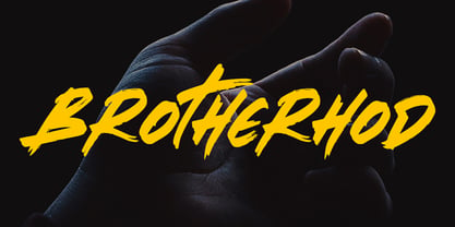 Brotherhod – Brush Font is a modern, hand-drawn typeface, this font looks elegant, classy, readable, stylish, catchy and easy to use. Brotherhod is the best choice for your professional design projects, including signature, watermark on photography, quotes, wedding, fashion, letter, invitation, business card, logo, branding, magazines, social media, advertisements, product designs, and much other design projects. Highlight: - Easy instalation - Work on PC or Mac - PUA Encoded Support - Basic Latin A-Z and a-z - Numbers - Symbols - No special software is required, The fonts can be opened and used in Adobe Illustrator, Adobe Photoshop, Adobe InDesign, even work on Microsoft Word.
 - Stannard by Greater Albion Typefounders,
$12.95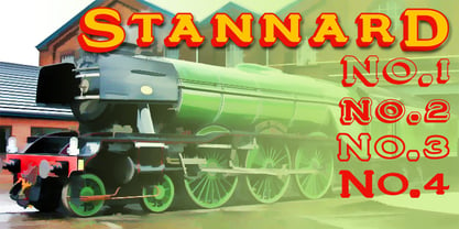 Stannard speaks to us of the happy days of the inter-war period, of enamel advertising 'street-jewelry' as seen on the railways and in all the best shops, of youngsters' train set boxes and toy catalogues, of traditional magazine mastheads, of a simpler, happier and just maybe better era, when summers lasted for ever and all was well with the world. It's a great family of faces for use in nostalic poster design, for nostalgic packaging design or signage or book covers, or even just for making a bold statement anywhere. Four decorative faces are offered.
 - Bang by ITC,
$29.00Bang was designed by David Sagorski in 1993 as a playful font of spirals. It consists of two capital alphabets which can be combined like the usual capitals and small caps, although both have the same height. They differ from one another only in the decorative forms which adorn them and the highly decorated characters of one set are complemented by the slightly more reserved characters of the second. Serious this font is not, rather, with its circles and spirals, Bang is best in point sizes 12 and larger and is meant for short texts and headlines. - Xotor by Typogama,
$19.00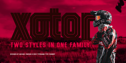 Xotor is a double styled typeface family destined for use in titling and headlines. The main style, the Triline weight, is a modular typeface composed of three strokes and is best used in large sizes. For smaller bodies of text, the second Regular style is based on the same letter construction but in a simple, solid stroke. Both weights can either be used individually or combined to add extra effect to any layout. With an extended Latin language support, Xotor covers most Latin based scripts and equally features a range of Opentype features, from ligatures, alternative letters or different styles of numerals.
 - ITC Honda by ITC,
$29.99This simplified blackletter typeface shares some geometric characteristics with a line of typefaces popular that were especially popular in Germany during the 1920s and 30s. Their forms may have originally come about after a desire to mix the classical Fraktur" forms found in typefaces like Linotype Luthersche Fraktur or Fette Fraktur with more modern sans serif typefaces, like Basic Commercial or Futura. ITC Honda's letters are rather narrow and angular. The type can be used for a number of headlines or logo purposes, and is best legible when set large. A similar typeface in our library is Linotype Gotharda." - Butterfly Ball by Hanoded,
$15.00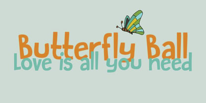 The Butterfly Ball and the Grasshopper's Feast is a 70's concept album/rock opera by Deep Purple's Roger Glover. The music video to Love Is All, featuring a lute playing frog in a cape, must be one of the best videos ever made. At least, I believe so. When working on this font, the song popped up in my head (it is still there), so I decided to name this cute, cartoonish font after the album. Butterfly Ball is a fun and happy typeface with rounded glyphs and an uneven baseline. Of course it comes with a hallucinatory range of diacritics.
 - News Gothic BT by Bitstream,
$29.99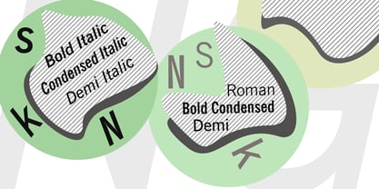 The standard American sanserif of the first two thirds of the twentieth century, prepared for ATF by Morris Fuller Benton in 1908 under the name News Gothic, with a matching lightface known as Lightline Gothic. Linotype’s Trade Gothic follows News Gothic except for its widely-spaced straight-sided boldface based on ATF Alternate Gothic No.3. Linotype matches News Gothic Bold, a boldface version that originated at Intertype, with Trade Gothic Bold No.2. Ludlow Record Gothic follows News Gothic more loosely. News Gothic BT™ font field guide including best practices, font pairings and alternatives.
 - Blushing Spring by Rhd Studio,
$15.00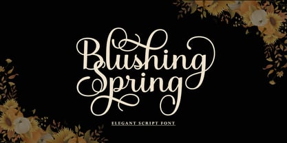 Blushing Spring is a smooth, elegant, and flowing handwritten font. It has a very balanced character and as a result, it fits into a wide set of designs. Blushing's history features varied baselines, smooth lines, beautiful glyphs and stunning alternatives. Add to your most creative ideas and see how they put them into action! Blushing Spring has 358 Alternates, including multiple language support. With OpenType features with alternative styles and elegant binding. The OpenType feature works automatically, but you can access it manually and for the best results necessary for your creativity in combining these variations of the Glyph.
 - Blize Queen by Putracetol,
$24.00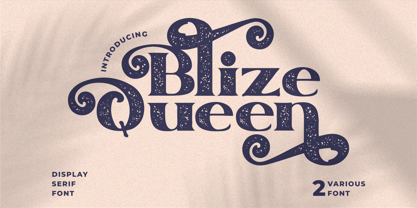 Blize Queen - Display Serif Font. Blize Queen is bold, groovy, clean and unique with display fell. Blize Queen is very versatile serif font that works great in large and small sizes. Helps to create layout display design in 60s or 70s design projects. Blize Queen is a display serif font with beautiful ligatures, tons of alternative glyphs and multilingual support. Come with open type feature with a lot of alternates, its help you to make great lettering. Blize Queen best uses for heading headlines, cover, poster, logos, quotes, product packaging, merchandise, social media & greeting cards and many more.
 - Density by Alandya TypeFoundry,
$15.00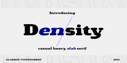 Density Heavy Slab Serif Features a smooth slab serif and a wide surface that makes it especially suitable for horizontal and lengkungan compositions. This is a front view, best used at larger sizes when weight and impact are desired. It's classic with a modern edge and most importantly packed with different styles, and ligatures Density is a heavy slab serif that comes with regular, oblique, outline, outline slanted, rough, rough slanted, extrude and extrude slanted style. this font is perfect for every project. suitable for branding logo, badge design, or apparel design. This font also comes with multilingual support.
 - Gosford by Factory738,
$15.00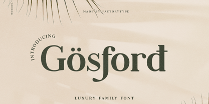 Gosford is a luxury and elegant serif font. It teases your eyes with its curves yet still able to maintain its classy composure. The variety of weights provide a range of choices that will help you find the best typographic colour. The available stylistic Ligature and Alternate offer a perfect font for anything your creativity takes you. 5 Weights (Light, Regular, Semibold, Bold, Black) Basic Latin A-Z and a-z Numerals & Punctuation Stylistic Alternates & Ligatures Multilingual Support for ä ö ü Ä Ö Ü ... OTF file format Free updates and feature additions Thanks for looking, and I hope you enjoy it.
 - Bastion by Volcano Type,
$19.00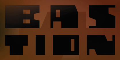 Are you looking for a font? One that makes every single word stand out like a bastion? That's been the motive for the design of this font, of every single letter. The font Bastion works at its best if used just for a couple of words, standing by themselves! You can label a subculture brand as well as a very sophisticated space! And don't worry, you won't miss a single character. The Font is fully developed and serves you no matter what you want to set with it, whether in Latin, Cyrillic, Greek, or Hebrew. Have fun with it and enjoy the possibilities.
 - Maggot by Malgorzata Bartosik,
$10.00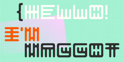 Maggot is crazy geometric display typeface. First 36 characters were designed during #36daysoftype 2021. Each letter of the typeface fits into a square composed of 49 modules. Maggot contains 112 letters - Basic Latin, Western, Central and South Eastern European diacritics. Each character that contains a mark has two versions: regular, where the mark is above or below the height of the character and alternate, where character with mark is the same height as characters without marks. Maggot is a display typeface, it works best as short inscriptions, for example on vinyl and book covers, posters, T-shirts, packaging.
 - Conglomerate by Typetanic Fonts,
$39.00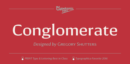 Sans or serif? Square or rounded? Calligraphic or geometric? Conglomerate is both all and none of these things — a subtle yet unorthodox blend of typographic traits resulting in a clean, unique, and versatile font family with large, open counters for legibility in text yet crisp, sharp details that sparkle at display sizes. Conglomerate is sturdy but never stiff, crisp but never stark — perfect for projects that require a more contemporary feel than either a traditional serif or geometric sans might bring. Conglomerate received a PRINT Magazine Best in Class award, and was one of Typographica’s Favorite Typefaces of 2016.
 - Kuenstler 165 by ParaType,
$30.00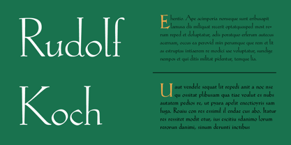 Bitstream typeface based on Koch Antiqua by Rudolph Koch (Klingspor, 1922). Koch Antiqua, also known as Locarno and Eve, is the most popular face of one of the great lettering artists of the 20th century. This delicate display face has a small x-height, very tall ascenders, and main strokes that taper gracefully downward. Koch-Antiqua appeared extensively in advertising between the wars. A refined letterform, it is best used sparingly for a distinctive look in advertising, book, and job work. Two weights of Cyrillic version including alternative lc characters were developed by Isabella Chaeva and released in 2008 by ParaType.
 - M Comic HK by Monotype HK,
$523.99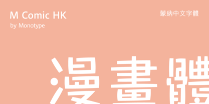 M Comic is a humanistic script design characterised by its modern, stiff, free and blocky construction. M Comic incorporates free and irregular characteristics of M Cute. Crossbars (橫) and stems (豎) are straight and slightly slanted. Entry and finial points of strokes are squarish and parallel without flare. Contrast of stroke is low, together with its bold stems (豎), making it suitable for large display text to catch attention. The result is a loosely coupled line of text of free, stiff and blocky glyphs. It is best for casual and humanistic display, illustrations, set upright, non-condensed.
 - Grave Ornaments by Intellecta Design,
$19.90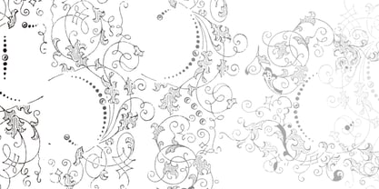 Grave is a Intellecta's best seller, a classic font design remastered, distressed and antique, merging the bodonian style with tendrils and victorian ornaments. Ideal to use in in display purposes for a stylized type design. Its family of fonts has too Grave Ornaments, a dingbat/decorative display font featuring many different styles of flourishes and ornaments, great for a vintage antique feel. Completes the collection Grave Plus, where six different fonts has different styles of victorian fleurons and ornaments merging with a bodonian shaded typeface in great style. A beautiful and big family, available single or in pack with an attractive price.
 - Minor by Glen Jan,
$25.00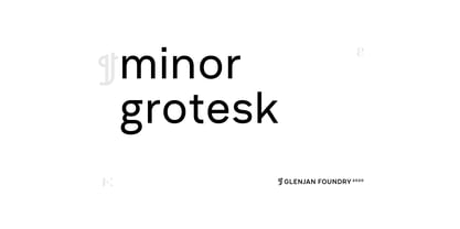 Minor is contemporary simple equable text grotesk in 6 weights with italics. It combines the best features of neo- and humanist sans types for legibility and easy reading. Clean design and balanced white spaces enables using Minor for long texts. Or in any other work as secondary invisible type in pair with display face. Using as primary type in large sizes it, static and non-emotional, will focus attention to text content. Minor family supports Latin Extended-A (Western, Central Europe, Baltic, Turkish) and Cyrillic Extended encoding languages. All styles contain basic OT-features and numeric forms for text typography.
 - Soccer SS by Sensatype Studio,
$15.00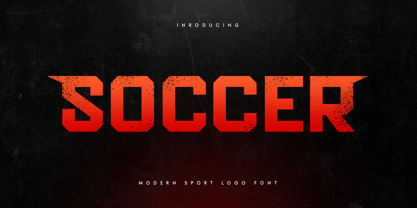 Soccer is a Modern Sport Logo font that created special for Logo, Title and more stand out typography for sport and action. It's so perfect to add your style and headline overview for sport, technology, actions, and fighting theme. And specially for this font, we crafted for bold action style and modern feels so enjoy to create any project that will show your main idea out. Soccer Modern Sport Logo font ready with: Creative characters prepared to get best results Preview as a inspirations that you can do with Soccer font Ready with All Uppercase characters Wish you enjoy our font. :)
 - Drumbeat by EdyType,
$60.00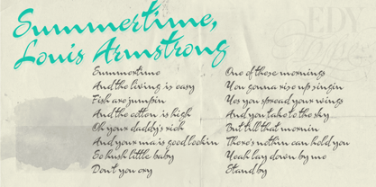 DRUMBEAT, a brand new face from Edy Type, coming to help resolve the necessities of loose scripts in Packaging and Editorial Design. Its' very particular thicks and thins and ups and down, makes it very suitable whenever informalities is required. Used with tiny little characters, enlarged to mammoth sizes or filling a large page with it, would show it’s perfect balance and color, almost as if where hand writen. In fact, a truly different script, a graphologist would declare that is written by a person very sure of what he wants, and besides and best of all, it’s pretty.
 - Mixtra Roman by T4 Foundry,
$21.00Mixtra is a versatile and complete type family designed by Bo Berndal. The three Mixtra family branches are Roman, Sansserif and Slabserif, each with a full set of weights. The Roman also has a Small Caps font. Combining the three family members is a good starting point for creating a coherent typographical design. Mixtra works well in magazines and all sorts of print in need of a strong visual identity. "Mixtra is a multiface", says Bo Berndal. "With or without serifs, or with powerful slabserifs, you can pick the version that best suits the design and printing technique you have chosen." - Poster Brush by Fenotype,
$18.00Poster Brush is a hand drawn font pair with lots of character. Poster Brush is packed with OpenType features - Contextual Alternates changes prevents identical double letters from being next to each other. With Stylistic Alternates you can manually change the letters. When you turn on Discretionary Ligatures you’ll get interlocking ligatures when typing with caps. Poster Brush Script is equipped with Standard Ligatures and Contextual Alternates to keep the flow smooth. It also has Swash alternates for certain letters. Poster Brush & Poster Brush Script work great together or as themselves. For the best price purchase the whole family. - Montix by Linotype,
$49.00Montix is a narrow, constructed type family that developed by the German designer Diana Fischer in 2003. With five weights (light, light italic, regular, regular italic, and bold), Montix is a particularly effective small family, especially when used for headline or display purposes. Montix's letterforms have relatively long ascenders and descenders, which compared with its horizontally compact body gives it its unique style. Words or lines of text set in Montix would look best when some amount of white space is left around them. Because of this, the faces are well suited for logos and corporate identity uses. - OTC Eugen by Ograda Type Company SRL,
$29.00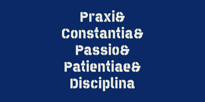 OTC Eugen is a geometric grotesque with industrial socialist aspect. It is a somewhat brute interpretation of the graphic environment and old era typography found around cities or in the country side in Romania. It works best as a display typeface used in big titles, in branding projects for clear wordmarks, or around the house where you can just go wild and make your own mark with the stencil version. Two styles: Display & Stencil. Various stylistic and contextual alternates, and a considerable amount of ligatures, arrows and more. Language support for: Basic Latin, Western, Central & Eastern European languages.
 - Linotype Killer by Linotype,
$29.99Linotype Killer is part of the Take Type Library, selected from the contestants of Linotype’s International Digital Type Design Contests from 1994 and 1997. Designed by German artist Andre Nossek, the font seems to describe the Technosound of the 1990s with its electronically produced sights and sounds. It represents repetition, mass production and conformity. The alphabet consists exclusively of capital letters, all based on a rectangular form, all of the same height, and, with the exception of the I’, all of the same width. The cool and distant Linotype Killer is best suited to short headlines. - Double Frames by Putracetol,
$22.00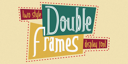 Introducing Double Frames - Display Font, a font with unique shape. there are two styles – standard and decorative. The modern and powerful display font you've been looking for. Each character is carefully crafted until the result is perfect. A lot of detail is preserved when characters are digitized, so uppercase looks fantastic up close Come with open type feature with a lot of alternates, its help you to make great lettering. best uses for wedding invitation, invitations, signature, typography lettering, branding, label, poster, logos, quotes, product packaging, header, merchandise, social media & greeting cards and many more. Double Frames is also support multi language.
 - M Comic PRC by Monotype HK,
$523.99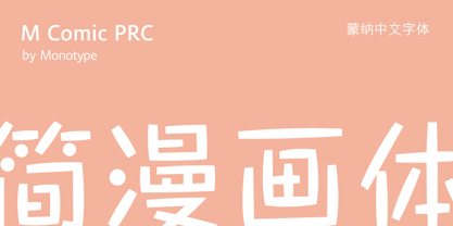 M Comic is a humanistic script design characterised by its modern, stiff, free and blocky construction. M Comic incorporates free and irregular characteristics of M Cute. Crossbars (橫) and stems (豎) are straight and slightly slanted. Entry and finial points of strokes are squarish and parallel without flare. Contrast of stroke is low, together with its bold stems (豎), making it suitable for large display text to catch attention. The result is a loosely coupled line of text of free, stiff and blocky glyphs. It is best for casual and humanistic display, illustrations, set upright, non-condensed.
 - Taronge by Sensatype Studio,
$15.00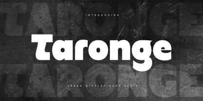 Taronge - Urban Display Sans Serif that created special for Logo, Title and more stand out typography for sport and action. It's so perfect to add your style and headline overview for sport, technology, actions, and fighting theme. And specially for this font, we crafted for bold action style and modern feels so enjoy to create any project that will show your main idea out. Taronge - Urban Display Sans Seri ready with: Creative characters prepared to get best results Preview as a inspirations that you can do with Taronge font Ready with All Uppercase characters Wish you enjoy our font. :)
 - Kaikoura by Hanoded,
$15.00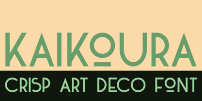 Kaikoura is a small town on the east coast of the South Island of New Zealand. It is a very pleasant, laid-back place where the mountains meet the sea. Kaikoura is also the best place in the world to spot sperm whales. Kaikoura font is quite similar in appearance: it is laid-back and beautiful, has sharp peaks and generous curves. I am still trying to find out how to add whale watching to this description… Kaikoura is an all caps font with a lower case alternative for the o and y. It comes with an ocean of diacritics.
 - Comma Base by Martin Majoor,
$-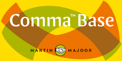 Comma Base is a sans typeface for it has no serifs. No wait, it is a typical serif typeface because it has a high contrast. Strictly speaking, Comma Base is a missing link between serif and sans, offering the best of both worlds. Comma Base supports several OpenType features for advanced typographic control. It consists of 16 styles, 8 weights from Hairline to Ultra, in both roman and italic. Comma Base is a uniwidth font. This means changing a text from normal to bold doesn’t effect the set width, a professional feature that is highly appreciated by graphic designers.
 - Bon Vivant Family by Nicky Laatz,
$20.00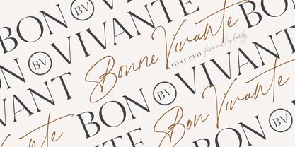 If you've got style and love all the luxuries in life, you're Bon Vivant! Add a touch of luxury and style to your projects too, with the new Bon Vivant Font Collection. It's highly recommended to turn your Opentype features on while using the script font, to make use of it's best features - the multitude of OpenType ligatures. As you type, your text looks like natural handwriting, and less like a monotonous font. The handsome serif comes in 2 weights, regular and bold. Designed to be a perfect complimentary font to the script, its just as striking used on its own.
 - Kinders by Rometheme,
$25.00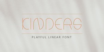 KINDERS is a Thin Linear typeface with elegant in every single letter. This font looks modern, readable, stylish, catchy and easy to use. KINDERS Font is the best choice for your professional design projects, including : logo, poster design, t-shirt, headline, flyer, cd cover album, quotes, business card, branding, magazines, social media, advertisements, product designs. Highlight: - Easy instalation - Work on PC or Mac - PUA Encoded Support - Basic Latin A-Z and a-z - Numbers - Symbols - No special software is required, The fonts can be opened and used in Adobe Illustrator, Adobe Photoshop, Adobe InDesign, even work on Microsoft Word.
 - Lunette by Reyrey Blue Std,
$18.00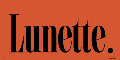 Introducing, Lunette Typeface. It's strong and classy with an elegant touch of typeface. A unique modern font that is a mix of old and new. Lunette boasts 3 stunning styles, with beautiful upper and lower case letters, numbers, and punctuation marks. Lunette Typeface is perfectly suitable for a layout design for quotes or body copy, best used as a display for headings, logos, branding, magazines, product packaging, invitations: logotypes, and much more. Don't wait to add this font to your collection and explore the uniqueness of this typeface! Features : All Uppercase and Lowercase Number & Symbol Supported Languages Ligatures PUA Encoded
 - Sans Serif Shaded - Unknown license

- Xander by Monotype,
$29.99Based on the handwriting of the eminent Dutch typographer Alexander Verberne, Julius de Goede's Xander typeface manages to be both sophisticated and whimsical. This monoline connecting script dances across the page with the grace of a ballerina. An accomplished graphic designer and writer of more than 20 books on calligraphy, de Goede's lettering skills are evident in this careful translation of casual handwriting into a lighthearted, affable typeface family. Like a warm breeze on a spring day, Xander is fresh and welcome. - BD Roylac by Typedifferent,
$30.00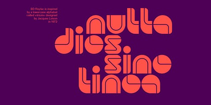 The BD Roylac typeface has its roots in some lowercase glyphs drawn by Jacques Loison in 1972. Some of these characters are included in the use of stylistic alternates. Filed under a retro-futuristic design the font separates two filled shapes by a thin and curvy line; sometimes following to the path leaning readability and sometimes interfere with it. The font is dedicated to the BD fanboy Monsieur «Eric de Broche des Combes» aka «Roy La Combe» to his fiftieth anniversary.
 - "Club Dia" is a unique and vibrant font designed by dibujado | dabnotu, an artist known for their distinctive and imaginative approach to creation. This particular typeface stands out with its bold a...
- La Mona Pro by RodrigoTypo,
$49.00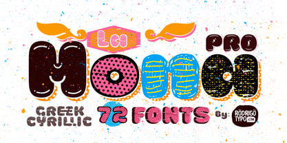 La Mona Pro is a redesign of the Mona 2012 design. Greek is case sensitive, as also the Cyrillic. La Mona Pro contains ligatures, ornaments, layers, shadows, swash alternatives (72 fonts) Play :)
 - TA Bankslab by Tural Alisoy,
$33.00 The building of the Northern Bank of St. Petersburg's Baku branch was built in 1903-1905. It was the first Art Nouveau-style building in Baku, Azerbaijan. Later the bank was transformed into the Russian-Asian Bank. After the oil boom in Baku in the 19th century, branches of many banks and new banks were opened in the city. The branch of the Northern Bank of St. Petersburg was among the first banks that was opened in Baku. N.Bayev was the architect of the building for the branch of the Northern Bank of St. Petersburg located at Gorchakovskaya 3 in 1903-1905. The building currently houses the Central Branch of the International Bank of Azerbaijan. My purpose in writing this is not to copy and paste the information from Wikipedia. What attracted me to the building was the word "Банкъ" (Bank) written in Cyrillic letters, which was also used in Azerbaijan during the Soviet era. The exact date of the writing is not known. Every time I pass by this building, I always thought of creating a font of this writing someday. I had taken a photo of the building and saved it on my phone. I did a lot of research on the font and asked a lot of people. However, some did not provide information at all and some said they did not have any information. I was interested in the history of this font but I do not know if this font really existed or it was created by the architect out of nowhere. If there was such a history of this font, I wanted to recreate this font and make it available. If not, I had to create it from scratch in the same way, using only existing letters on the building. Finally, I made up my mind and decided to develop the font with all letters I have got. It was difficult to create a font based on the word, Банкъ. Because in the appearance of the letters, the midline of the letters on A, H, K was very distinct, both in the form of inclination and in more precise degrees. The serif part of the letters, the height of the upper and lower sides, differed from each other. I don't know whether it was done this way when the building was constructed or it happened over time. I prepared and kept the initial version of the font. I took a break for a while. I started digging on the story of the font again. Meanwhile, I was researching and got inspired by similar fonts. Unfortunately, my research on the font's history did not yield any results. I decided to continue finishing up the font. After developing the demo, I created the font by keeping certain parts of these differences in the letters. In addition, I had to consider the development of letters in the Cyrillic, as well as the Latin alphabet, over the past period. Thus, I began to look at the appearance of slab-serif or serif fonts of that time. In general, as I gain more experience in developing fonts, I try to focus on the precision of the design for each font. In recent years, I specifically paid attention to this matter. YouTube channel and articles by Alexandra K.'s of ParaType, as well as, information and samples from TypeType and Fontfabric studios on the Cyrillic alphabet were quite useful. I gathered data regarding the Latin alphabet from various credible sources. I do not know if I could accomplish what I aimed at but I know one thing that I could develop the font. Maybe someday I'll have to revise this font. For now, I share it with you. I created the font in 10 styles. 7 weight from Thin to Extra Black, an Outline, Shadow, and Art Nouveau. The Art Nouveau style was inspired by the texture in the background used for the text on the building. The texture I applied to capital letters adds beauty to the font. If you like the font feel free to use it or simply let me know if your current alphabet doesn't support this font.
 - TA Bankslab Art Nouveau by Tural Alisoy,
$40.00 TA Bankslab graphic presentation at Behance The building of the Northern Bank of St. Petersburg's Baku branch was built in 1903-1905. It was the first Art Nouveau-style building in Baku, Azerbaijan. Later the bank was transformed into the Russian-Asian Bank. After the oil boom in Baku in the 19th century, branches of many banks and new banks were opened in the city. The branch of the Northern Bank of St. Petersburg was among the first banks that was opened in Baku. N.Bayev was the architect of the building for the branch of the Northern Bank of St. Petersburg located at Gorchakovskaya 3 in 1903-1905. The building currently houses the Central Branch of the International Bank of Azerbaijan. My purpose in writing this is not to copy and paste the information from Wikipedia. What attracted me to the building was the word "Банкъ" (Bank) written in Cyrillic letters, which was also used in Azerbaijan during the Soviet era. The exact date of the writing is not known. Every time I pass by this building, I always thought of creating a font of this writing someday. I had taken a photo of the building and saved it on my phone. I did a lot of research on the font and asked a lot of people. However, some did not provide information at all and some said they did not have any information. I was interested in the history of this font but I do not know if this font really existed or it was created by the architect out of nowhere. If there was such a history of this font, I wanted to recreate this font and make it available. If not, I had to create it from scratch in the same way, using only existing letters on the building. Finally, I made up my mind and decided to develop the font with all letters I have got. It was difficult to create a font based on the word, Банкъ. Because in the appearance of the letters, the midline of the letters on A, H, K was very distinct, both in the form of inclination and in more precise degrees. The serif part of the letters, the height of the upper and lower sides, differed from each other. I don't know whether it was done this way when the building was constructed or it happened over time. I prepared and kept the initial version of the font. I took a break for a while. I started digging on the story of the font again. Meanwhile, I was researching and got inspired by similar fonts. Unfortunately, my research on the font's history did not yield any results. I decided to continue finishing up the font. After developing the demo, I created the font by keeping certain parts of these differences in the letters. In addition, I had to consider the development of letters in the Cyrillic, as well as the Latin alphabet, over the past period. Thus, I began to look at the appearance of slab-serif or serif fonts of that time. In general, as I gain more experience in developing fonts, I try to focus on the precision of the design for each font. In recent years, I specifically paid attention to this matter. YouTube channel and articles by Alexandra K.'s of ParaType, as well as, information and samples from TypeType and Fontfabric studios on the Cyrillic alphabet were quite useful. I gathered data regarding the Latin alphabet from various credible sources. I do not know if I could accomplish what I aimed at but I know one thing that I could develop the font. Maybe someday I'll have to revise this font. For now, I share it with you. I created the font in 10 styles. 7 weight from Thin to Extra Black, an Outline, Shadow, and Art Nouveau. The Art Nouveau style was inspired by the texture in the background used for the text on the building. The texture I applied to capital letters adds beauty to the font. If you like the font feel free to use it or simply let me know if your current alphabet doesn't support this font.
