10,000 search results
(0.054 seconds)
- Hostilica by Heypentype,
$20.00 Hostilica is a semi-serif family designed by mixing classic serifs in the age of romanticism era with contemporary modern shape and curves. It gives a warm, friendly, and inviting feeling without losing a formality of text fonts. Every weight was designed carefully to provide a unique look while maintained the unity of the type family. A thin weight gives your content an elegant, luxurious design feel. While the regular weight, designed for body text, gives your content a warm and friendly design feel. The bold weight will make your headlines stand-out with its fat counters and curves. Therefore, Hostilica will accomodate all your design needs, from text to display, from catchy to luxury. The italics of each weight will spice up your design project especially with letter 'f,s,r,k, and y'. Those italic versions paired with alternate and discretional ligatures will add an organic feeling to your designs. The italic styles are designed by emulating a handwriting stroke, and will give a more personal feel while still maintained a formal sense.
 - Molde by Letritas,
$25.00 Molde is a super sans serif font family, belonging to the neo-grotesque style. Formally, Molde was inspired by the extreme sobriety of famous post-Bauhaus Swiss Movement of the mid-twentieth Century. The masters of this style are famous for eliminating all the ornaments, as a brilliant mind said “Ornament und Verbrechen”(Ornament and Crime) as a creation law: ending up with only the essential. Thanks to the purity of its shapes, Molde spreads the message as clear as possible and this quality makes it much more versatile than any other typography. Molde can be therefore used in all types of designs, If we consider its personality and its amount of weights and widths. Molde is composed of 6 widths ranging from the tablet to the expanded and in the set of characters includes a Unicase version and a small caps version. The family is composed of 3 parts: the regular version, the italic version and the reverse version. Each one of them has 9 weights. Each weight has 649 characters and it has been thought for 219 latin languages.
 - Clementine by Okaycat,
$24.50Clementine, from Okaycat, is a font designed to be expressive. First, we wanted Clementine to be uplifting, friendly and warm. Secondly, we wanted it to be familiar, but neither staid nor boring. To make Clementine more warm and friendly, 90 degree corners and cubic forms were not allowed. All straight edges are either subtly curved or lightly tapered (with the small exception of the serif foundations, to create a secure base). To add an uplifting feel, all tapering flows towards the apex of the forms and the ascenders were allowed extra rising freedom above the capital height, similar to the effect intended in the architecture of old European churches -- to point all elements gently upwards towards heaven. To keep Clementine familiar, traditional type setting shapes were used throughout the font. To avoid the usual coldness of typical typewritten fonts, all forms were opened up, calligraphic touches were introduced, and any unnecessary serif elements were omitted. The result is a look that brings a touch of nostalgia or a "retro" feel. Clementine is highly appropriate anywhere a soft and friendly feel is desired. Can work well as a body text, or as ad copy. Clementine is extended, containing the full West European diacritics & a full set of ligatures, making it suitable for multilingual environments & publications. - FS Blake by Fontsmith,
$80.00 Art deco The inspiration for FS Blake’s elegant, lightly geometric forms can be traced back to design of the 1930s; designer Emanuela Conidi was influenced by the typography of cool, European, art deco posters. FS Blake bears traits of the art deco style, from its thin weights to its heavy weights, giving a set of faces each with their own distinct character, but still with a strong family resemblance. Mechanical type Mechanical and organic shapes combine in FS Blake to create a harmonious whole of generous curves and cursive spikes. A strong, punchy contender in display sizes, it’s also got a gentle touch with small text in lighter weights. Lively, versatile and with plenty of character contrast between weights, the FS Blake family offers impact in whatever task it’s given.faces each with their own distinct character, but still with a strong family resemblance. Sketch book Great fonts still emerge from a combination of hand, paper and pencil. After filling her sketch book with ideas, Emanuela and Jason extracted the elements that both felt could work in a font. The process yielded a whole crop of starting points for future designs as well as a focus for FS Blake as a striking, characterful, almost industrial font.
 - Press Gothic by Canada Type,
$24.95 Press Gothic is a revival of Aldo Novarese's Metropol typeface, released by Nebiolo in 1967 as a competitor to Stephenson Blake's Impact (designed by Goeffrey Lee). Though Metropol enjoyed a few short months of popularity and use in Italy, Germany and France, Impact won the technological outlasting battle by moving on to film type then to computer outlines bundled with mainstream software, while Metropol never made it past the metal state until now. Too bad really, since this is one of the few faces that could have played well with all the horrendous stretch'n'squeezing of the 1970s. Just like its inspiration, Press Gothic aims to be a fresh alternative to big economical poster fonts with clear sans serif forms and an urgent, strong, yet elegant design appeal. In the summer of 2008, Press Gothic underwent a major linguistic and aesthetic reworking for an international publishing company. The result of this on the retail side are new small capitals and biform/unicase additions to the main font, as well as expanded language support that includes Cyrillic, Greek, Turkish, Baltic, Central and Eastern European, Maltese, and Esperanto. Press Gothic Pro, the OpenType version, combines all three fonts into one, taking advantage of the small caps feature, and the stylistic alternate feature for the biform shapes.
 - Kröwn by Vasava Fonts,
$30.00 Kröwn is a ruthless display font family. It is presented in three styles that can be used stacked to create beveling and dimensional effects. Kröwn’s most distinctive feature is the absence of counter shapes, or at least its minimum impact. All counter shapes width is the same as the separation between characters, this creates a blocky, strong and hardcore rhythm. Use it with precaution to build strong titling, powerful logotypes or short letterings. With Kröwn, the less is more, the bigger the better. Its visual style draws inspiration from sword and sorcery fantasy genre and historical periods as the middle age.
 - Obvia Wide by Typefolio,
$29.00 'Obvia' appeared as a result of direct observation on typefaces classified as geometric and the plan to explore for the first time width axes Condensed, Narrow (soon), Normal and new Wide and Expanded. The idea behind 'Obvia's design was to create a distancing from geometrically pure shapes, in this case, square shapes. Then some details were added, such as subtle inktraps, concave endings of the stems and carefully drawn alternate characters, giving a 'geohumanist' tone to the font. This first family of 'Obvia' has 9 weights ranging from Thin to Black, delivering a strong typographic identity, from the paper to the pixel.
 - Obvia Expanded by Typefolio,
$29.00 'Obvia' appeared as a result of direct observation on typefaces classified as geometric and the plan to explore for the first time width axes Condensed, Narrow (soon), Normal and new Wide and Expanded. The idea behind 'Obvia's design was to create a distancing from geometrically pure shapes, in this case, square shapes. Then some details were added, such as subtle inktraps, concave endings of the stems and carefully drawn alternate characters, giving a 'geohumanist' tone to the font. This first family of 'Obvia' has 9 weights ranging from Thin to Black, delivering a strong typographic identity, from the paper to the pixel.
 - Linked Now by Jehoo Creative,
$16.00 Linked Now is so named because this Typeface has Multiple Discreationary Ligatures that unite two different letters to make a striking shape. Is a powerful grotesque typeface designed to be versatile in a wide range of contexts. Having more than 50 stylish Dsicreationary Ligatures on Uppercase letters and unique Alternate on certain letters makes it seem like they have various shapes, so they are great to use as display fonts. To complete it, Linked Now typeface is equipped with 8 weights from Extralight to black and each includes italic. More than 485 glyphs on each and support most European languages .
 - Obvia Condensed by Typefolio,
$29.00 'Obvia' appeared as a result of direct observation on typefaces classified as geometric and the plan to explore for the first time width axes Expanded, Wide, Normal, Narrow and Condensed The idea behind 'Obvia's design was to create a distancing from geometrically pure shapes, in this case, square shapes. Then some details were added, such as subtle inktraps, concave endings of the stems and carefully drawn alternate characters, giving a 'geohumanist' tone to the font. This first family of 'Obvia' has 9 weights ranging from Thin to Black, delivering a strong typographic identity, from the paper to the pixel.
 - Budare by fragTYPE,
$14.00 Budare is a geometric font family that rebelled to find its own identity within an ocean of other typefaces of the same style. Its design is based on the shape of the wrought iron plate used in Venezuela and other countries to make arepas and other foods. Its appearance is strongly defined by basic geometric shapes such as the circle and its upright style is accompanied by rotated italics "rotalics" that complement its rebellious spirit. Because of its strong display characteristics, its best uses are focused on posters, branding, titles and anything that needs a strong graphic emphasis.
 - Obvia Narrow by Typefolio,
$29.00 'Obvia' appeared as a result of direct observation on typefaces classified as geometric and the plan to explore for the first time width axes Condensed, Narrow, Normal, Wide and Expanded. The idea behind 'Obvia's design was to create a distancing from geometrically pure shapes, in this case, square shapes. Then some details were added, such as subtle inktraps, concave endings of the stems and carefully drawn alternate characters, giving a 'geohumanist' tone to the font. This first family of 'Obvia' has 9 weights ranging from Thin to Black, delivering a strong typographic identity, from the paper to the pixel.
 - Malmo Sans Pro by Martin Lexelius Core,
$33.00 Malmö Sans was born from the preconception that geometry is neutral, and neutral fonts have a wide application window. No ornaments, no quirks – just clean. Design process: establishing the main proportions, grids and library of geometric shapes. However, people are not math, people are not built from grids. We are irregular, not always logical, and, foremost, we are human. So: humanisation – define parts and areas, and make the needed adjustments to shapes and forms, although being mathematically correct. Basically, changing it into something that pleases the eye. Much effort has been made to achieve equal parts minimalism, aesthetics and legibility.
 - Kanibal by Milos Zlatanovic,
$80.00 Kanibal is typeface that creates a game of different shapes and styles. Have fun!
 - Strandall by Patria Ari,
$15.00 Strandall is sharp display typeface inspired from warrior themes to support your brand/project.
 - Minnak by Esintype,
$18.00 Minnak, as a whole geometric display type is our take on Square Kufic (Makili) style Latin script fonts, comes in eleven weights with linear progression. It is an Uniwidth typeface at the core. From Hairline to Black, all multiplexed weights take up the same space in width and can be used interchangeably. Supports wide range of Open Type features, with many stylistic alternates in 12 context. Minnak is also have a close relation with pixel fonts, because in spite of its based on Makili forms, it all started as a pixel font in the drawing stage before further steps came into play. The key difference between Minnak and Makili style is that the latter must have the exact square counters with no diagonal strokes, and any other components of a letterform must conform to be proportional. Such style-specific requirements determine the overall dimensions of the glyphs and therefore, there can be only minor differences between the typefaces. In Minnak, counters are rectangular because of its narrow and condensed proportions, but the Makili form influence is still manifest. This impression is best confirmed with Medium weight where negative spaces and stem thickness are equal. Contrast and virtually no optical correction were presented, as characteristic of its genre had to have equal horizontal and vertical line thicknesses. As per the minimal and authentic look of the type, all glyphs are drawn as straight or only as 45-degree diagonal strokes. The representation of the ‘diagonalless’ approach is preserved by stylistic alternatives, making its similarity in visual aesthetics clearly visible. Marks and punctuation is another feature that doesn’t follow the strict rules of the origin style. Although not a pixel font, all building parts of the glyphs in Minnak share the same unit precision as they are designed with pixel equivalents in mind. Even space characters are designed to match glyph widths, meeting the demands of certain typesetting or multi-line lettering compositions. With its Pseudo Ancient and Runic alternates, extention parts and ornaments included in all weights, Minnak is suitable for branding, logo and monogram designs, the screen titles and headlines, packaging, posters, book covers and more, where it shines at big sizes. Its pixel font-like appearance makes it a significant choice for the modern compositions. Thanks to mostly uniform width design, it is possible to use Minnak also as a system for lettering. This feature can be used as vertical fitting of the letters between the lines. As a casual expression in Turkish, “Minnak” is one of the seven typeface designs in Esintype's ancient scripts of Anatolia project, Tituli Anatolian series — representing Seljuk period in the medieval Anatolia and their tradition of architectural stone ornamentation.
 - Konrad Kachelofen by Proportional Lime,
$9.99 Konrad Kachelofen was a printer in the city of Leipzig beginning around 1483. He printed many works by contemporary authors and also many of the classics. He acquired an unusually large amount of typefaces for his shop, a place that included a wine bar and book store. This type face is based on Typ.11:340G GfT510 Gesamtkatalog der Wiegendrucke and is similar to Proportional Lime’s “Kachelofen'' font. The major differences are that the whole miniscule set is slimmer and the majuscule set has different style glyphs and this face was used solely for titles and section headings because of its sharper and clearer appearance at large point values. Konrad probably died in 1529 after passing his business on to his son-in-law Melchior Lotter, who also went on to fame as an industrious and illustrious printer.
 - ProLamina - 100% free

- Trium - Personal use only

- Regina by Laura Worthington,
$25.00 Regina is a broad, welcoming, and highly legible script. Its languorous letterforms are a reminder of an era when people took the time and care to share beautifully penned thoughts by hand. Regina shines when used in display or text settings on letters, invitations, and menus. See what’s included! http://bit.ly/2bOqfVW
 - Reyhan by Plantype,
$30.00 Reyhan is a low contrast typeface that looks legible and clean in small sizes. On large sizes, it wraps the space around. Finely drawn negative spaces, neat and minimal shapes define Reyhan. Simple and clean lines give the typeface a solid and finished look. Reyhan is pure and powerful with well designed proportions. Different alternatives such as square dots, alternate /a /l /y /R /1 /6 /9, coverage of 94 Latin languages, various Opentype features, and 18 styles expand the usage area of Reyhan, making it a versatile workhorse. With high-quality spacing, Reyhan looks good on all sizes, making it not only a valuable tool for graphic designers but also a total typeface solution for every person who communicates with type. Reyhan is a typeface designed to adapt requirements of modern and traditional communication. For more information please visit www.plantype.co
 - Glosa Headline by DSType,
$55.00Glosa is a type family designed for editorial purposes. Glosa is delicate and highly readable at very small sizes but reveals all it’s strength and personality when used at big sizes. The contrast of the sharped serifs and ball terminals, provide a fresh and very contemporary look. Glosa Text is a bracketed serif, softer, smooth and less idiosyncratic, suitable for text settings. Both styles have four weights and italics, in a workhorse typeface, full of OpenType features such as Small Caps, Tabular Figures, Central Europe characters and Historical Figures, among others. Glosa Headline is ideally suited for nameplates and headline typography, with four weights and with lowercase matching the small caps. In Glosa most of the diacritics were designed to fit the gap between the x-height and the caps height, avoiding some common problems with the accented characters. - Glosa by DSType,
$55.00Glosa is a type family designed for editorial purposes. Glosa is delicate and highly readable at very small sizes but reveals all its strength and personality when used at big sizes. The contrast of the sharped serifs and ball terminals, provide a fresh and very contemporary look. Glosa Text is a bracketed serif, softer, smooth and less idiosyncratic, suitable for text settings. Both styles have four weights and italics, in a workhorse typeface, full of OpenType features such as Small Caps, Tabular Figures, Central Europe characters and Historical Figures, among others. Glosa Headline is ideally suited for nameplates and headline typography, with four weights and with lowercase matching the small caps. In Glosa most of the diacritics were designed to fit the gap between the x-height and the caps height, avoiding some common problems with the accented characters. - Fansan by W Type Foundry,
$25.00 Organic and sublime, Fansan is an Art Nouveau type family that includes roman, italic, and optical sizes. Its roots can be found in famous works such as Benguiat, Windsor, and Melbourne — worldwide typographic references which all have a sense of being imperfectly appealing. The aesthetic influence of Art Nouveau on Fansan can be seen in the top-heavy stress found in most characters. Applying this stress consistently throughout the character set was a significant challenge in the design of the family. The sharp terminals of numerous lowercase characters — including the a, f and g — provide a visual link between the upper and lowercase forms. As a result, Fansan is able to be elegant and pointed in its lighter weights, and playful and full of character in its heavier styles. Fansan is ideally suited for use at display sizes where personality is needed.
 - Glosa Text by DSType,
$55.00Glosa is a type family designed for editorial purposes. Glosa is delicate and highly readable at very small sizes but reveals all its strength and personality when used at big sizes. The contrast of the sharped serifs and ball terminals provides a fresh and very contemporary look. Glosa Text is a bracketed serif, softer, smooth and less idiosyncratic, suitable for text settings. Both styles have four weights and italics in a workhorse typeface, full of OpenType features such as Small Caps, Tabular Figures, Central European characters and Historical Figures, among others. Glosa Headline is ideally suited for nameplates and headline typography, with four weights and with lowercase matching the small caps. In Glosa most of the diacritics were designed to fit the gap between the x-height and the caps height, avoiding some common problems with the accented characters. - Wishes Script by Typesenses,
$32.00 Plenty of swashes, ligatures, beginning and ending shapes, Wishes is a wit option for invitations, cards, stationery, fashion and apparel, among a wide range of uses. The curves of the cursive style are neither too solemn or pompous, its grace and playfulness are more 1950s than 1750s. This family offers the designer an additional decorative toolkit full of frames, ribbons, hearts, flowers and ornaments, plus a collection of caps and small caps. Wishes Script Pro includes the complete set of Script characters plus Ornaments and Caps. The family offers optically optimized Display and Text styles for each of the weights: Light, Regular and Bold. Use professional software that widely support Open Type features. Otherwise, you may not have access to some glyphs. For further information about features and alternates, see the User Guide Use Wishes to express your greetings!
 - Hermush by Letterhend,
$19.00 Hermush Display is a condensed unique typeface with unusual anatomy. This type of font perfectly made to be applied especially in logo, headline, signage and the other various formal forms such as invitations, labels, logos, magazines, books, greeting / wedding cards, packaging, fashion, make up, stationery, novels, labels or any type of advertising purpose. Features : numbers and punctuation multilingual alternates / swashes and ligatures PUA encoded We highly recommend using a program that supports OpenType features and Glyphs panels like many of Adobe apps and Corel Draw, so you can see and access all Glyph variations. How to access opentype feature : letterhend.com/tutorials/using-opentype-feature-in-any-software/ Email us to letterhend@gmail.com if you need something! Happy Designing!
 - Nachinta by Letterhend,
$19.00 Nagintha is a handwritten script with natural look and feel. You can use also for headline or signature. This type of font perfectly made to be applied especially in logo, and the other various formal forms such as invitations, labels, logos, magazines, books, greeting / wedding cards, packaging, fashion, make up, stationery, novels, labels or any type of advertising purpose. Features : uppercase & lowercase numbers and punctuation multilingual alternates and ligatures PUA encoded We highly recommend using a program that supports OpenType features and Glyphs panels like many of Adobe apps and Corel Draw, so you can see and access all Glyph variations. How to access opentype feature : letterhend.com/tutorials/using-opentype-feature-in-any-software/
 - Krostenia by Letterhend,
$19.00 Introducing, Krostenia - a monoline script with a touch of vintage look and feel. You will also get 12 detailed hand drawn objects ready to use. This type of font perfectly made to be applied especially in logo, headline, signage and the other various formal forms such as invitations, labels, logos, magazines, books, greeting / wedding cards, packaging, fashion, make up, stationery, novels, labels or any type of advertising purpose. Features : uppercase & lowercase numbers and punctuation multilingual alternates / swashes and ligatures PUA encoded 12 hand drawn objects We highly recommend using a program that supports OpenType features and Glyphs panels like many of Adobe apps and Corel Draw, so you can see and access all Glyph variations.
 - Carton by Nowak & Degeilh,
$45.00 Carton is a font family whose origin comes from his Display version, which is made up of a parallelepiped in isometric projection on a large grid. The Carton type family boasts an entire range of original forms with a number of different constraints other than calligraphic strokes or modular construction techniques. The constraints chosen in the process of creating this alphabet allowed us to give it specific features which would lead to the development of a coherent family of type. The design of the Bold and Regular departs from the earlier strict geometrical forms and increases in contrast and complexity. It paved the way for the creation of a thinner character for the reading of ordinary texts.
 - Hinzatis by Aga Silva,
$39.99 It is up to you how big and voluptuous statement you will be making with this font, as Hinzatis is about old Hollywood glamour and attitude. With lots of options encoded in handy open type files you can easily fine-tune your text for best visual effect. Looks perfect when placed as: titles, headers, labels, names, business cards, just to name a few. Open-type Pro version features 1200 + characters including initial and terminal letters, numerous caps styles, ligatures and alternates. Other versions feature over 1000+ characters and focus mostly on foreign languages with accented letters (incl. Vietnamese); So depending on option you choose you can create realistic and multilingual hand-calligraphy on all of your creations!
 - MFC Brass Rules Grand by Monogram Fonts Co.,
$9.95 The inspiration source for Brass Rules Grand is a collection of the brass rules from the 1889 “Convenient Book of Specimens” from Franklin Type Foundry in Cincinnati. This is a collection of basic utilitarian brass rules that has been created as combinable and endlessly expanding. Filling the Numerals and all Capital and Lowercase glyph slots are a total of 62 traditional Brass Rule designs, all extendable by combining with other rules, or by extending the pin line by simply typing a dash "-" or ".". A truly sleek and simple utilitarian font for invitations, menus, business cards, and whatnot. Download and view the “MFC Brass Rules Grand Guidebook” if you would like to learn a little more.
 - Stano Sans by Letterhend,
$17.00 Stano is a strong and bold sans serif with a touch of vintage look and feel. This type of font perfectly made to be applied especially in logo, headline, signage and the other various formal forms such as invitations, labels, logos, magazines, books, greeting / wedding cards, packaging, fashion, make up, stationery, novels, labels or any type of advertising purpose. Features : uppercase & lowercase numbers and punctuation multilingual alternates / swashes and ligatures PUA encoded We highly recommend using a program that supports OpenType features and Glyphs panels like many of Adobe apps and Corel Draw, so you can see and access all Glyph variations. How to access opentype feature : letterhend.com/tutorials/using-opentype-feature-in-any-software/
 - Nero by Skinny Type,
$19.00 Nero is built on the Nero framework, our popular family of geometric types. Like the sans-serif Nero letterform, it has two contemporary look and feel styles. Echoing late 20th-century modernism, the Rounded's overall look is clean and sleek, more ephemeral and dynamic than pared-down bourgeois asceticism. Nero's place in font history is a complex one. Praised for their readability and also at the same time their fashionable qualities, they look very modern and nostalgic, easy to read and very stylish, authoritative and fun. Nero and Nero Rounded when combined, offer 2 styles to suit all text types and sizes. Both are excellent for short texts that require a sense of urgency or playfulness.
 - Skiltmaler by Imagi Type,
$15.00 Skiltmaler is the typeface that refers to the style of decorative arts during the Victorian era 1837 to 1901, the Victorian era was the period in which fly poster typography emerged. The large amount of colour in combination with large font sizes were created from movable metal type. As well as being made from wood, this was used to create the two-coloured typefaces. You would imagine this would be specific to the '3D' styled type seen on the poster to create the drop shadow. Skiltmaler works well with normal size text, but it works even better for large displays, short words, or even just to incorporate a few or single characters in a design.
 - Edgeriver by Letterhend,
$16.00 The Edgeriver is a serif display typeface with a touch of vintage look and feel. it was made hand drawn, so it makes looks more natural. it comes with regular and slant version. This type of font perfectly made to be applied especially in logo, headline, signage and the other various formal forms such as invitations, labels, logos, magazines, books, greeting / wedding cards, packaging, fashion, make up, stationery, novels, labels or any type of advertising purpose. Features : uppercase & lowercase numbers and punctuation multilingual alternates / swashes and ligatures PUA encoded We highly recommend using a program that supports OpenType features and Glyphs panels like many of Adobe apps and Corel Draw, so you can see and access all Glyph variations.
 - Chillday Script by Letterhend,
$19.00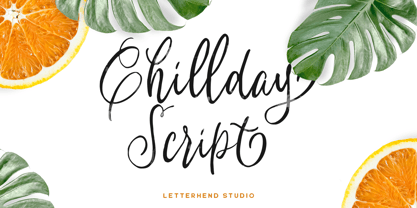 Introducing, Childay Script. A beautiful and unique modern calligraphy script typeface. This type of font perfectly made to be applied especially in logo, and the other various formal forms such as invitations, labels, logos, magazines, books, greeting / wedding cards, packaging, fashion, make up, stationery, novels, labels or any type of advertising purpose. Features : uppercase & lowercase numbers and punctuation multilingual swashes and ligatures alternates PUA encoded We highly recommend using a program that supports OpenType features and Glyphs panels like many of Adobe apps and Corel Draw, so you can see and access all Glyph variations. How to access opentype feature : letterhend.com/tutorials/using-opentype-feature-in-any-software/ Email us to letterhend@gmail.com if you need something! Happy Designing!
 - Monstain by Letterhend,
$19.00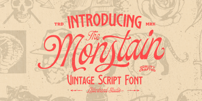 Introducing, The Monstain - a script with a touch of vintage look and feel. You will also get several detailed hand drawn objects ready to use. This type of font perfectly made to be applied especially in logo, headline, signage and the other various formal forms such as invitations, labels, logos, magazines, books, greeting / wedding cards, packaging, fashion, make up, stationery, novels, labels or any type of advertising purpose. Features : uppercase & lowercase numbers and punctuation multilingual alternates / swashes and ligatures PUA encoded hand drawn objects We highly recommend using a program that supports OpenType features and Glyphs panels like many of Adobe apps and Corel Draw, so you can see and access all Glyph variations.
 - Schwennel by Linotype,
$29.00Linotype Schwennel is part of the Take Type Library, selected from the contestants of Linotype’s International Digital Type Design Contests of 1994 and 1997. This prize-winning font was designed by the German artist Svenja Voss. The figures seem to have been somehow eroded, parts of some strokes are completely missing, contours seem washed away. The eye works to put the pieces together to form a meaningful series of figures. The second weight, lila+negro, completes the letter fragments of the lila weight. Missing pieces are filled in and contours completed, making the resulting text stronger and a bit more legible. Linotype Schnwennel is intended exclusively for headlines in larger point sizes. - Gladick Display by Dora Typefoundry,
$17.00 Gladick is a modern take on a sans style typeface but mixes in the added contrast of serifs to make the font contemporary and memorable. Each letter is crafted with care to make your text unique yet stylish. Soft curves make for a bold type Now with the addition of italics. Great for fashion branding and editorial design. Features: All Uppercase and Lowercase Number & Symbol Supported Languages Alternates and Ligatures PUA Encoded This type of family has become the work of true love, making it as easy and fun as possible.I really hope you enjoy it! if you have any questions or problems please contact email:doratypefoundry@gmail.com Thank you and good job.

