10,000 search results
(0.136 seconds)
- Brose by Linecreative,
$16.00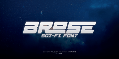 Brose - Bold oblique font with sharp angles for dynamic effects. Use ligature characters to give you unlimited designs, this font is great for your work such as posters, logos, branding, covers, banners, t-shirts and headers, or even large-scale artwork Brose oblique Bold, offers you: Brose -oblique bold font including Upper & Lowercase characters(ALL CAPS has a different form characte), Ligatures Character Numbers and Punctuation Supports Multi linguage (Latin Western Europe), Numbers and Punctuation
 - Mantana by Anomali Creative,
$10.00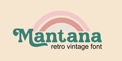 Mantana - Retro Vintage DIsplay font is an old style serif font, its funky, round, hight-contrast and bold shape with a retro touch is perfect for displayed, head text, logotype and many more. Mantana - Retro Vintage DIsplay font comes with stylishtic alternates and ligatures. We highly recommend using a program that supports OpenType features and Glyphs panels like many of Adobe apps and Corel Draw, so you can see and access all Glyph variations.
 - Tracking by Sensatype Studio,
$15.00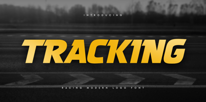 Faster Racing Modern Logo Font is a Modern Logo Racing Font that Modern, Racing and unique characters are ready for Race event, that you can combine to get any variations and unique shapes easily just in seconds with great characters. What's Included: FASTER (Regular & Italic) Character set A-Z All Uppercase Numerals & Punctuation Accented Characters (West Europe) Works on PC & Mac Recommended using Adobe Illustrator or Adobe Photoshop. Wish you enjoy our font. :)
 - Beking by Grontype,
$12.00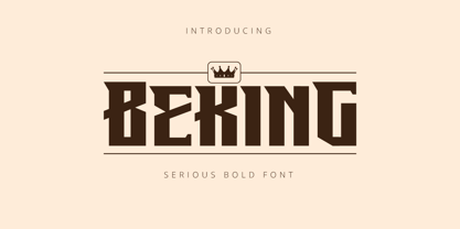 Beking is a brand new bold font, it looks tough and sharp edges. the font is fun and created with unique style through lines. Beking is a perfect for any project from posters or flyer designs, logo tagline to t-shirts and packaging, Bold Condensed look will give your designs outstanding look and make your creative work look great. Features : Beking Standard glyphs Numeral and Punctuations Multilingual Support Thankyou for Choosing This Font, Regard. Grontype
 - Lucky Beauty SS by Sensatype Studio,
$15.00 Lucky Beauty is a Styled Classy Beauty Font pairing between regular and italic style. Crafted specially for Branding needs to make any elements standout and Perfect beauty look. With a simple and classy shape will make your design more classy, elegant, and certainly unique with this font. Lucky Beauty is also included full set of: regular and italic version uppercase and lowercase letters multilingual characters numerals *punctuations Wish you enjoy my font! :)
 - Knighthood by Letterara,
$12.00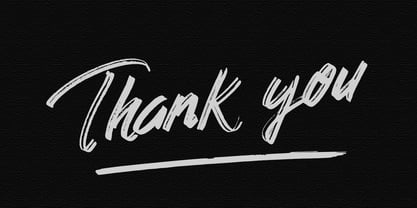 Knighthood is a elegant and masculin font Brush. with extra attention to quick strokes and sharp details, Knighthood contains uppercase, lowercase and ligature. This font can also be used to show elegance in a wedding and christmas. Grotters is ideal for logos, apparel, wedding, book, t-shirts, hoodies, quotes, youtube, quotte, product packaging, website or anything that needs a typographic turbo-boost and you’ll get a unique swash to accompany the font.
 - Milford by SparkyType,
$19.00Milford is a font with its feet planted in several styles of design. It has aspects of Art Deco shapes and proportions, but has modern additions and tweaks that make it a handsome substitute for your tired heading fonts. Because of its tight spacing and filled, super-black forms, it responds nicely to treatments such as negative letter spacing and outlining. - Piano Teacher by Haksen,
$14.00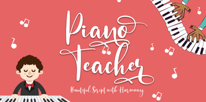 This font is about fleeting vision, touch of moments. some letters may be illegible, but their shapes arouses emotions. sometimes in design emotions are more important. our brain can uncode the letter shapes.It includes full set of uppercase and lowercase letters, multilingual symbols, numerals, punctuation and ligatures. The font has bold texture. Thanks and have a great day, Haksen Studio
 - Dekal by The Northern Block,
$29.00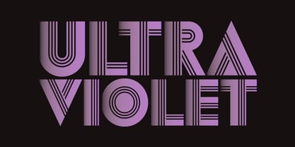 A modern display typeface with ultra sharp detailing. The unique line style takes influence from earlier fonts produced in the 1970’s by Letraset. These lines are then blended with a stronger letterform creating a more visually dynamic font suitable for today’s market. Details include: three unique styles, all caps character set with alternatives, manually edited kerning and Euro symbol.
 - Aligarh Arabic by NamelaType,
$29.00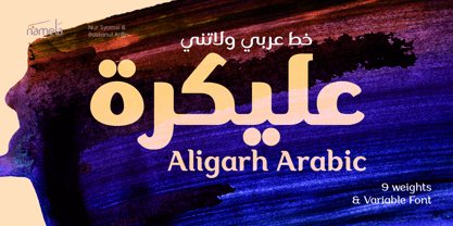 Aligarh Arabic is new version of Aligarh with the addition of Arabic glyphs, for Arabic, Urdu, and Farsi Basic form for arabic font is refers to the arabic kufi style, semi-slab serif font formed with a smooth rounded bracket whose edges end with unique shapes, an exploration of combining unique styles in a typefaces to harmony with Latin version.
 - Metilda by Raditya Type,
$14.00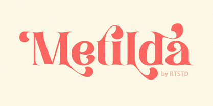 Metilda is a quirky, fun and versatile serif Font with ligatures and alternates that you can combine to get beautiful curves and shapes in just seconds. Play with it to make the display even more stunning. This font is suitable for use in many forms of design, such as magazines, postcards, logos, vintage looks, old classics, 60s, 70s, 80s, wedding projects and more.
 - Really Distinct by Haksen,
$17.00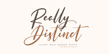 This font is about fleeting vision, touch of moments. some letters may be illegible, but their shapes arouses emotions. sometimes in design emotions are more important. our brain can uncode the letter shapes.It includes full set of uppercase and lowercase letters, multilingual symbols, numerals, punctuation and ligatures. The font has bold texture. Thanks and have a great day, Haksen Studio
 - Liston by Gatype,
$14.00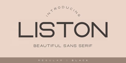 Liston is a modern multilingual elegant display font enhanced with ligatures, alternations, and strokes. Liston is a very versatile font character - with its seamless shapes and modern features it will cover a wide range of design projects from greeting cards to magazines, wedding invitations, websites, etc. The number of alternatives is incredible, from simple style alternatives to sweeps, ligatures, and alternatives. Enjoy!
 - Big Gorilla by Aminmario Studio,
$20.00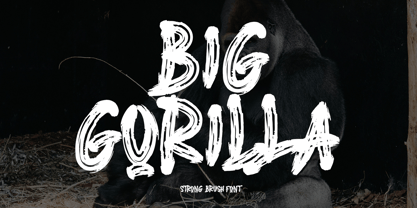 INTRODUCING This is a supercharged font, with natural brush, quick strokes and sharp details. Contains ALL CAPS, numbers, some punctuation and ligature. Perfect for challenging jobs, titles, movie,logos, apparel, t-shirts, hoodies, quotes, product packaging, or anything that needs a typographic turbo-boost and a typographic unique style. Thanks for checking out this font. I hope you enjoy it! AminMario
 - Brignell Square by IB TYPE Inc.,
$40.00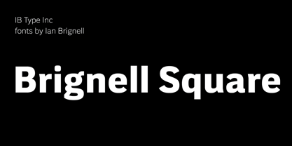 BRIGNELL SQUARE is a ten font family designed by Ian Brignell. Modern and crisp, this strong-shouldered sans serif offers tonal neutrality. Like Helvetica, Brignell Square is a classic "do anything" font. Spatial balance defines these letter shapes. Creatively, this typeface was born in 1990 out of Ian’s frustration with ubiquitous, barely readable highway signage. Use everywhere. Extended Latin set.
 - Desira by Sarid Ezra,
$15.00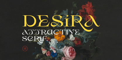 Desira is an attractive and modern serif that comes with stylish shape. With unique uppercase and lowercase, this fonts will make your presentation, poster, or logo even more stunning and stand out! You can mix and match the uppercase and lowercase for unlimited form. This fonts support Multi Language. Features Uppercase with unique lowercase Number & Symbol Multi language Happy Creating!
 - Vallato by Scratch Design,
$9.00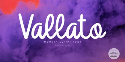 Vallato is a modern script font made with an elegant concept, but still has a dynamic shape and makes this font look beautiful. Vallato very matches and useful for logo design, flyers, brochure, signature, quote text and also menu design for food & beverage. Feature: Uppercase & Lowercase Number Punctuation Ligature Multilingual Support (ÀÁÂÃÄÅÇDÐEÈÉÊËIÌÍÎÏNÑOØÒÓÔÕÖUÙÜÚÛWYÝŸỲŸÆŒßÞþ) Support in Mac and Windows OS Easy to install
 - Mono 91 by 103cia,
$9.00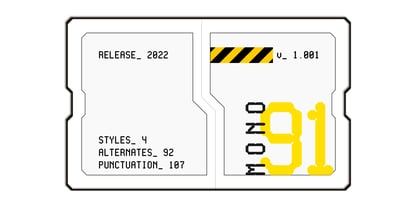 Mono 91 font is a scientific display typeface with a retro style. The shape is inspired by a spaceship door design, combined with a science fiction genre film style. Suitable for digital content, crypto site, source code programming, industrial, manufacture, and retro/vintage style projects. This font is PUA encoded, which means you can access all of the glyphs with ease.
 - Show Biz JNL by Jeff Levine,
$29.00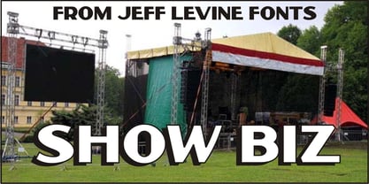 The lettering style of Show Biz JNL is a classic sanserif with Art Deco influences. Slight variations in some letter shapes set it off from similar releases. The basic inspiration for this font was a set of ceramic letters and numbers used for home movie titling, but a few touches were added to give the font its own style and flavor.
 - Starsight by Gatype,
$12.00 Starsight is a modern multilingual elegant display font enhanced with ligatures, alternations, and strokes. Starsight is a very versatile font character - with its seamless shapes and modern features it will cover a wide range of design projects from greeting cards to magazines, wedding invitations, websites, etc. The number of alternatives is incredible, from simple style alternatives to sweeps, ligatures and alternatives. Enjoy!
 - Technobaby JF by Jukebox Collection,
$32.99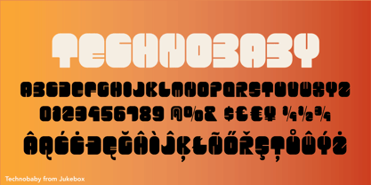 Technobaby is a funky futuristic font done with modular letterforms. This typeface arose from playing around with the basic rounded rectangle shape. Jason wanted to see how many different letters he could create by simply changing the locations of the slots cut into the rectangles. Overall it lends the font a very cohesive and unique look. Get your "mod" on with Technobaby!
 - Kangmas by Azzam Ridhamalik,
$12.00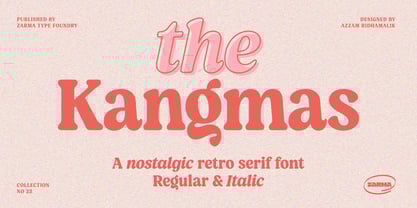 Introducing Kangmas, a nostalgic retro serif font with regular and true italic style. This font has rounded serif inspired by all the retro aesthetics making a comeback and the awesome classic "Cooper Black" typeface, but includes more modern letter shapes in it. The combination make it has a nostalgic retro vibes and also gives modern looks at the same time.
 - Another Stencil JNL by Jeff Levine,
$29.00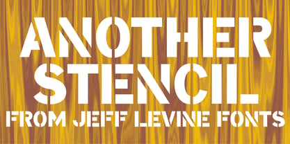 With a large variety of stencil fonts contained within the Jeff Levine Fonts library, Another Stencil JNL is simply another stencil design added to this growing collection. Modeled from a lettering guide manufactured in the 1970s, the style is influenced by Franklin Gothic, but has enough differences in the shapes of the stencil characters to be considered a cousin to that classic design.
 - Goat by Oliveira 37,
$30.00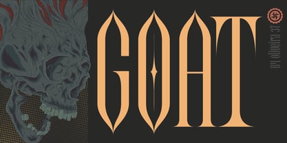 Goat is a font display with extremely fine and sharp serifs, inspired by Gothic architecture, which brings a vertical elongation in extent and an allusion to the typical ogival vaults of the style. A font that not only carries a texture of writing with magnitude and elegance, but also causes some kind of strangeness for the subversion of some typographic laws.
 - Mauline by Yukita Creative,
$14.00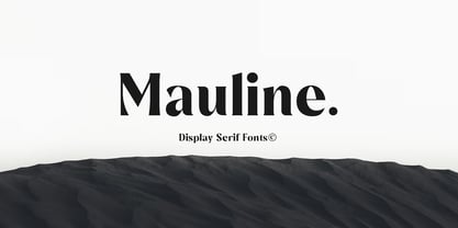 a modern, stylish serif font that offers excellent legibility for a variety of applications. This font is ideal for use in any kind of graphic design or advertising work, from logo designs to web design and print projects. Its easy-to-read character shapes, distinct letterforms, and beautiful typographic details make this typeface perfect for creating impactful and captivating visual designs.
 - Shohibul by Arendxstudio,
$15.00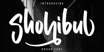 Shohibul - Brush Font with sharp and beautiful letters that create fonts that are modern, trendy and elegant. Came with opentype features such stylistic alternates, stylistic sets & ligatures good for logotype, poster, badge, book cover, tshirt design, packaging and any more. Features : • Character Set A-Z • Numerals & Punctuations (OpenType Standard) • Accents (Multilingual characters) • Ligature • Alternate There it is! I really hope you enjoy it
 - Chelsnuts by Kimmy Design,
$25.00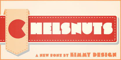 Chelsnuts was inspired by old Art Deco typefaces used in poster art back in the 1920s. Yet, in addition it has a playful side that makes it unique to the sharp letterforms typically seen in similar ultra-thick typefaces. Also included are lowercase letters, not typically seen in fonts such as this, and a customized outlined version of the font.
 - FS Lucas by Fontsmith,
$80.00 Pure and not-so-simple Maybe it’s the air of purity, openness and transparency that they transmit, but geometric typefaces are more popular than ever among leading brands. Based on near-perfect circles, triangles and squares, geometric letterforms look uncomplicated, even though making them readable is anything but – something the designers of the first wave of geometric fonts discovered nearly a century ago. Many of the world’s most recognisable brands in technology, retail, travel, food, manufacturing and other industries continue to be drawn to the straightforward, honest character that geometric fonts convey. Fontsmith set out in 2015 to develop a typeface in the same tradition, but optimised for the demands of modern brands – online and offline usage, readability and accessibility. And, of course, with the all-important Fontsmith x-factor built in. FS Lucas is the bold and deceptively simple result. Handle with care The letterforms of FS Lucas are round and generous, along the lines of Trajan Column lettering stripped of its serifs. But beware their thorns. Their designer, Stuart de Rozario, who also crafted the award-winning FS Millbank, wanted a contrast between spiky and soft, giving sharp apexes to the more angular letterforms, such as A, M, N, v, w and z. Among his inspirations were the colourful, geometric compositions of Frank Stella, the 1920s art deco poster designs of AM Cassandre, and the triangular cosmic element symbol, which led him to tackle the capital A first, instead of the usual H. The proportions and angles of the triangular form would set the template for many of the other characters. It was this form, and the light-scattering effects of triangular prisms, that lit the path to a name for the typeface: Lucas is derived from lux, the Latin word for light. Recommended reading Early geometric typefaces were accused of putting mathematical integrity before readability. FS Lucas achieves the trick of appearing geometric, while taking the edge off elements that make reading difficult. Perfectly circlular shapes don’t read well. The way around that is to slightly thicken the vertical strokes, and pull out the curves at the corners to compensate; the O and o of FS Lucas are optical illusions. Pointed apexes aren’t as sharp as they look; the flattened tips are an essential design feature. And distinctive details such as the open terminals of the c, e, f, g, j, r and s, and the x-height bar on the i and j, aid legibility, especially on-screen. These and many other features, the product of sketching the letterforms in the first instance by hand rather than mapping them out mechanically by computer, give FS Lucas the built-in humanity and character that make it a better, easier read all-round. Marks of distinction Unlike some of its more buttoned-up geometric bedfellows, FS Lucas can’t contain its natural personality and quirks: the flick of the foot of the l, for example, and the flattish tail on the g and j. The unusual bar on the J improves character recognition, and the G is circular, without a straight stem. There’s a touch of Fontsmith about the t, too, with the curve across the left cross section in the lighter weights, and the ampersand is one of a kind. There’s a lot to like about Lucas. With its 9 weights, perfect proportions and soft but spiky take on the classic geometric font, it’s a typeface that could light up any brand.
 - FS Lucas Paneureopean by Fontsmith,
$90.00Pure and not-so-simple Maybe it’s the air of purity, openness and transparency that they transmit, but geometric typefaces are more popular than ever among leading brands. Based on near-perfect circles, triangles and squares, geometric letterforms look uncomplicated, even though making them readable is anything but – something the designers of the first wave of geometric fonts discovered nearly a century ago. Many of the world’s most recognisable brands in technology, retail, travel, food, manufacturing and other industries continue to be drawn to the straightforward, honest character that geometric fonts convey. Fontsmith set out in 2015 to develop a typeface in the same tradition, but optimised for the demands of modern brands – online and offline usage, readability and accessibility. And, of course, with the all-important Fontsmith x-factor built in. FS Lucas is the bold and deceptively simple result. Handle with care The letterforms of FS Lucas are round and generous, along the lines of Trajan Column lettering stripped of its serifs. But beware their thorns. Their designer, Stuart de Rozario, who also crafted the award-winning FS Millbank, wanted a contrast between spiky and soft, giving sharp apexes to the more angular letterforms, such as A, M, N, v, w and z. Among his inspirations were the colourful, geometric compositions of Frank Stella, the 1920s art deco poster designs of AM Cassandre, and the triangular cosmic element symbol, which led him to tackle the capital A first, instead of the usual H. The proportions and angles of the triangular form would set the template for many of the other characters. It was this form, and the light-scattering effects of triangular prisms, that lit the path to a name for the typeface: Lucas is derived from lux, the Latin word for light. Recommended reading Early geometric typefaces were accused of putting mathematical integrity before readability. FS Lucas achieves the trick of appearing geometric, while taking the edge off elements that make reading difficult. Perfectly circlular shapes don’t read well. The way around that is to slightly thicken the vertical strokes, and pull out the curves at the corners to compensate; the O and o of FS Lucas are optical illusions. Pointed apexes aren’t as sharp as they look; the flattened tips are an essential design feature. And distinctive details such as the open terminals of the c, e, f, g, j, r and s, and the x-height bar on the i and j, aid legibility, especially on-screen. These and many other features, the product of sketching the letterforms in the first instance by hand rather than mapping them out mechanically by computer, give FS Lucas the built-in humanity and character that make it a better, easier read all-round. Marks of distinction Unlike some of its more buttoned-up geometric bedfellows, FS Lucas can’t contain its natural personality and quirks: the flick of the foot of the l, for example, and the flattish tail on the g and j. The unusual bar on the J improves character recognition, and the G is circular, without a straight stem. There’s a touch of Fontsmith about the t, too, with the curve across the left cross section in the lighter weights, and the ampersand is one of a kind. There’s a lot to like about Lucas. With its 9 weights, perfect proportions and soft but spiky take on the classic geometric font, it’s a typeface that could light up any brand. - Hologram by Kazer Studio,
$4.00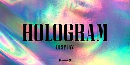 Hologram is a font inspired by a combination of the future and the past. The intention was to design a font that was most effective when applied to Largely Displayed text like Headings, rather than for smaller extended bodies of text. There are 3 distinctive styles offered in the Hologram font family. Each style contains over 350+ Glyphs per style with support for up to 26 Languages as well as specialised kerning & spacing. Display Sans: This style is the cleanest of the 3 fonts. There are no serifs attached to the ends of the strokes, although the stroke weight is varied from thick to thin depending on the letters. Display Serif: This style contains modern serifs at the ends of most character strokes that give more structure to the shapes. A majority of the serifs are horizontal in direction with few characters containing vertical serif details. Display Wedge: The most Bold of all is the Wedge Serif style offered. Featuring thick and thin triangular serifs at the ends of character strokes. This style is most effective in Large Displays & Titling uses. Designed by KAZER STUDIO
 - Syndrome BRK Pro by CheapProFonts,
$10.00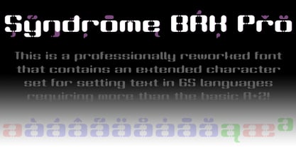 I just loved the design idea behind this font, but the original font had a lot of ugly artifacts - so I have completely redrawn ALL the letters, before expanding the character set. The lowercase has been redrawn with a higher x-height, making the font even more usable (with more "normal" word shapes). ALL fonts from CheapProFonts have very extensive language support: They contain some unusual diacritic letters (some of which are contained in the Latin Extended-B Unicode block) supporting: Cornish, Filipino (Tagalog), Guarani, Luxembourgian, Malagasy, Romanian, Ulithian and Welsh. They also contain all glyphs in the Latin Extended-A Unicode block (which among others cover the Central European and Baltic areas) supporting: Afrikaans, Belarusian (Lacinka), Bosnian, Catalan, Chichewa, Croatian, Czech, Dutch, Esperanto, Greenlandic, Hungarian, Kashubian, Kurdish (Kurmanji), Latvian, Lithuanian, Maltese, Maori, Polish, Saami (Inari), Saami (North), Serbian (latin), Slovak(ian), Slovene, Sorbian (Lower), Sorbian (Upper), Turkish and Turkmen. And they of course contain all the usual "western" glyphs supporting: Albanian, Basque, Breton, Chamorro, Danish, Estonian, Faroese, Finnish, French, Frisian, Galican, German, Icelandic, Indonesian, Irish (Gaelic), Italian, Northern Sotho, Norwegian, Occitan, Portuguese, Rhaeto-Romance, Sami (Lule), Sami (South), Scots (Gaelic), Spanish, Swedish, Tswana, Walloon and Yapese.
 - Getoik by Twinletter,
$18.00 Introducing Getoik, the Retro Condensed Font that will take your designs to the next level. With its clean and smooth edges, this font is perfect for any design project. Getoik features multiple ligatures and alternates, giving you even more design options to choose from. Whether you’re creating a logo, branding materials, or any other design project, Getoik will add a touch of elegance and sophistication to your work. Its condensed shape allows for maximum impact while taking up minimal space, making it perfect for headlines, titles, and subheadings. With its versatility and attention to detail, Getoik is a must-have for any designer looking to elevate their work to the next level. So why settle for less when you can have the best? Get Getoik and take your designs to new heights! What’s Included : - File font - All glyphs Iso Latin 1 - Alternate, Ligature - Simple installations - We highly recommend using a program that supports OpenType features and Glyphs panels like many Adobe apps and Corel Draw so that you can see and access all Glyph variations. - PUA Encoded Characters – Fully accessible without additional design software. - Fonts include Multilingual support
 - Carloti by Din Studio,
$29.00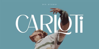 Are you trying to make an elegant, modern, and stylish statement with your invitations, social media, website, or printed materials? Ready to enchant your audience and enhance your branding? Introducing Carloti-A Sans Serif Font Carloti is a gorgeous uppercase sans serif font that will whisk you away to a place of style! We are hoping that through this elegance and passion edged font, you can maximize your designs, reign in sales or make lasting impressions. The ideal font for social media banners; posts, and ads, printed quotes, t-shirt designs, packaging, or even as a modern text overlay to any background image. Carloti includes Multilingual Options to make your branding globally acceptable. Features: Standard Ligatures Multilingual Support PUA Encoded Numerals and Punctuation Thank you for downloading premium fonts from Din Studio
 - Cumhuriyet World by Fontuma,
$34.00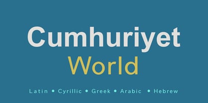 Cumhuriyet means “the form of government in which the nation holds the sovereignty and uses it through deputies elected for certain periods”. The reason why I gave this name to the font is that 2023 is the centennial anniversary of the Republic of Turkey, which was founded by Atatürk. This typeface, which is sans serif, consists of three families: ▪ Cumhuriyet: Font family with Latin letters ▪ Cumhuriyet Pro: Font family including Latin, Arabic and Hebrew alphabets ▪ Cumhuriyet World: Font family including Latin, Cyrillic, Greek, Arabic and Hebrew alphabets Cumhuriyet World is a family of multi-purpose typefaces designed in a geometric style. This font is suitable for use in printed products, media and digital media, as well as in every field that is the subject of writing.
 - Staying Passionate by Nathatype,
$29.00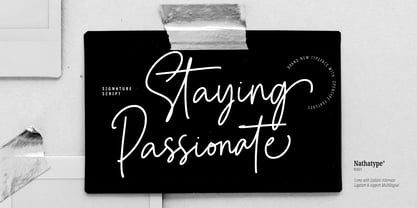 Are you trying to make an elegant, modern, and stylish statement with your invitations, social media, website, or printed materials? Ready to enchant your audience and enhance your branding? Staying Passionate-A Script Font Staying Passionate is a gorgeous handcrafted script font that will whisk you away to a place of style! We are hoping that through this elegance and passion edged font, you can maximize your designs, reign in sales or make lasting impressions. The ideal font for social media banners; posts, and ads, printed quotes, t-shirt designs, packaging, or even as a modern text overlay to any background image. Staying Passionate includes Multilingual Options to make your branding globally acceptable. Features: Standard Ligatures Ligatures PUA Encoded Numerals and Punctuation Thank you for downloading premium fonts from Nathatype
 - Quercus 10 by Storm Type Foundry,
$69.00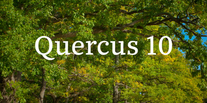 Quercus is characterised by open, yet a little bit condensed drawing with sufficient spacing so that the neighbouring letters never touch. It has eight interpolated weights with respective italics. Their fine gradation allows to find an exact valeur for any kind of design, especially on the web. Quercus serif styles took inspiration from classicistic typefaces with vertical shadows, ball terminals and thin serifs. The italics have the same width proportion as upright styles. This “modern” attitude is applied to both families and calls for use on the same page, e g in dictionaries and cultural programmes. Serif styles marked by “10” are dedicated to textual point sizes and long reading. The sans-serif principle is rather minimalistic, with subtle shadows and thinned joints between curved shapes and stems. Quercus family comprises of the usual functionality such as Small Caps, Cyrillics, diacritics, ligatures, scientific and aesthetic variants, swashes, and other bells & whistles. It excels in informational and magazine design, corporate identity and branding, but it’s very well suited for book covers, catalogues and posters as well. When choosing a name for this typeface I've been staring out from my studio window, thinking helplessly without any idea in sight. Suddenly I realised that all I can see is a spectacular alley of oaks (Quercus in Latin) surrounding my house. These oaks were planted by the builders of local ponds under the leadership of Jakub Krčín in the fifteenth century.
 - Quercus Whiteline by Storm Type Foundry,
$69.00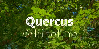 Quercus is characterised by open, yet a little bit condensed drawing with sufficient spacing so that the neighbouring letters never touch. It has eight interpolated weights with respective italics. Their fine gradation allows to find an exact valeur for any kind of design, especially on the web. Quercus serif styles took inspiration from classicistic typefaces with vertical shadows, ball terminals and thin serifs. The italics have the same width proportion as upright styles. This “modern” attitude is applied to both families and calls for use on the same page, e g in dictionaries and cultural programmes. Serif styles marked by “10” are dedicated to textual point sizes and long reading. The sans-serif principle is rather minimalistic, with subtle shadows and thinned joints between curved shapes and stems. Quercus family comprises of the usual functionality such as Small Caps, Cyrillics, diacritics, ligatures, scientific and aesthetic variants, swashes, and other bells & whistles. It excels in informational and magazine design, corporate identity and branding, but it’s very well suited for book covers, catalogues and posters as well. When choosing a name for this typeface I've been staring out from my studio window, thinking helplessly without any idea in sight. Suddenly I realised that all I can see is a spectacular alley of oaks (Quercus in Latin) surrounding my house. These oaks were planted by the builders of local ponds under the leadership of Jakub Krčín in the fifteenth century.
 - Quercus Serif by Storm Type Foundry,
$69.00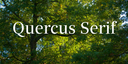 Quercus is characterised by open, yet a little bit condensed drawing with sufficient spacing so that the neighbouring letters never touch. It has eight interpolated weights with respective italics. Their fine gradation allows to find an exact valeur for any kind of design, especially on the web. Quercus serif styles took inspiration from classicistic typefaces with vertical shadows, ball terminals and thin serifs. The italics have the same width proportion as upright styles. This “modern” attitude is applied to both families and calls for use on the same page, e g in dictionaries and cultural programmes. Serif styles marked by “10” are dedicated to textual point sizes and long reading. The sans-serif principle is rather minimalistic, with subtle shadows and thinned joints between curved shapes and stems. Quercus family comprises of the usual functionality such as Small Caps, Cyrillics, diacritics, ligatures, scientific and aesthetic variants, swashes, and other bells & whistles. It excels in informational and magazine design, corporate identity and branding, but it’s very well suited for book covers, catalogues and posters as well. When choosing a name for this typeface I've been staring out from my studio window, thinking helplessly without any idea in sight. Suddenly I realised that all I can see is a spectacular alley of oaks (Quercus in Latin) surrounding my house. These oaks were planted by the builders of local ponds under the leadership of Jakub Krčín in the fifteenth century.
 - Quercus Sans by Storm Type Foundry,
$69.00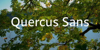 “Quercus” is characterised by open, yet a little bit condensed drawing with sufficient spacing so that the neighbouring letters never touch. It has eight interpolated weights with respective italics. Their fine gradation allows to find an exact valeur for any kind of design, especially on the web. Quercus serif styles took inspiration from classicistic typefaces with vertical shadows, ball terminals and thin serifs. The italics have the same width proportion as upright styles. This “modern” attitude is applied to both families and calls for use on the same page, e g in dictionaries and cultural programmes. Serif styles marked by “10” are dedicated to textual point sizes and long reading. The sans-serif principle is rather minimalistic, with subtle shadows and thinned joints between curved shapes and stems. Quercus family comprises of the usual functionality such as Small Caps, Cyrillics, diacritics, ligatures, scientific and aesthetic variants, swashes, and other bells & whistles. It excels in informational and magazine design, corporate identity and branding, but it’s very well suited for book covers, catalogues and posters as well. When choosing a name for this typeface I've been staring out from my studio window, thinking helplessly without any idea in sight. Suddenly I realised that all I can see is a spectacular alley of oaks (Quercus in Latin) surrounding my house. These oaks were planted by the builders of local ponds under the leadership of Jakub Krčín in the fifteenth century.
 - Disquete by Tipos do aCASO,
$23.90Inspired by the shape of a 3.25" floppy disk this unicase font was designed from the combination of three square modules. Made in 1998 Disquete is one of the first projects of Buggy, founder of the Brazilian type foundry Tipos do aCASO.