10,000 search results
(0.064 seconds)
- Embassy by Bitstream,
$29.99The English roundhand has always occupied the central position in the group of faces appropriate to the social printing handled by engravers, and their contemporary imitators, thermographers. At the end of the nineteenth century when engraving was mechanised by the pantographic engraving machine, the traditional roundhands found their way onto pantographic pattern plates. Embassy is a traditional roundhand of vigorous contrast with straightforward capitals with ball terminals; it was transferred from such an engravers’ pattern plate to the Fotosetter at Intertype about 1955. Alphatype’s Yorktown is similar, but appears to have less contrast. - Hickory by FontMesa,
$25.00Hickory is the revival of an old unnamed font dating back to 1852 and was sold through a few different type foundries including Bruce, MacKellar Smiths & Jordan and James Conner's Sons. By the year 1900 this font disappeared from the major type foundries, now with the digital age of type we're proud to revive this old classic font that hasn't been used in over one hundred years. The original font was only available as an uppercase with punctuation and an ampersand. Today the character set has been updated to include a new lowercase, numbers and accented characters for Eastern, Central and Western European countries. Three fill fonts have been created for the Hickory font making it easier for you to add different colors, textures and patterns to the letters. You will need an application that works in layers such as Adobe Photoshop or Illustrator in order to use the fill fonts, some fill fonts may look good as a stand alone font, the Hickory fill fonts however do not look good used apart from the Hickory main font. I hope you enjoy this old font as much as I did making it. - Futura Classic by Wiescher Design,
$39.50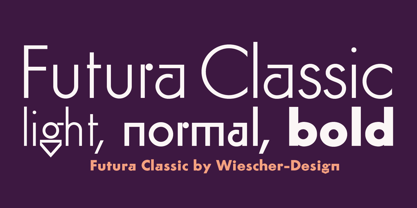 FuturaClassic is a recut of Paul Renners original Futura. This version was what Mr. Renner wanted the Futura to look like. He had to change his very stringent design because the market wanted a more pleasing typeface. I think the original design is worth saving because it is much more typical and has a personal and distinguished touch. I have also designed Geometra Rounded with rounded endings that looks more interesting than your usual DIN type Yours trying to save the typographical past Gert Wiescher
 - Croog by TipografiaRamis,
$29.00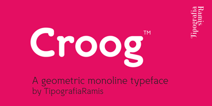 Croog is a rounded geometric monoline typeface, built in three weights with true italics. Inspiration for this typeface was derived from FF Roice, with desire to create typeface less spicy or unconventional in appearance and more neutral, calm and friendly to use. Squarish in proportions, monoline letterfoms gain more readability by having short rounded serifs and terminals. The typeface is ideal for use in display sizes, though is quite legible in text. Croog is released as OpenType single master with a Western CP1252 character set.
 - Submariner R24 by Type Fleet,
$-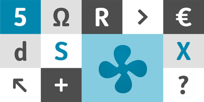 Submariner R24 diving sans serif experience Submariner R24 is a modification of the Submariner type family. It still holds pleasant humanistic construction, but now the letters are easier. Rounded corners enhance the typeface’s sophistication and broaden its usability. It is a remarkable typographic discovery. The letter construction is more open and the corners are rounded. It is suitable for longer texts, information graphics, signalization, headers and decoration. The typeface’s x-height is exactly 70% of its capitals. The italics are designed at a 9° angle.
 - Vin Sans Pro by Mint Type,
$35.00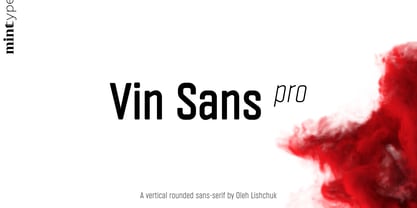 Vin (translated from Ukrainian as “he”) is a superfamily consisting of three robust typefaces with pronounced vertical stems and rounded corners. All three typefaces feature very large x-height for even more expression and assertiveness. Vin Sans Pro is a quite narrow rigid sans-serif typeface with extra-large x-height and rounded corners. It is perfect for any kind of short copy with lots of attention guaranteed. Be sure to check other two typefaces of Vin superfamily: Vin Slab Pro and Vin Mono Pro .
 - Heavenly Bodies by Aah Yes,
$0.25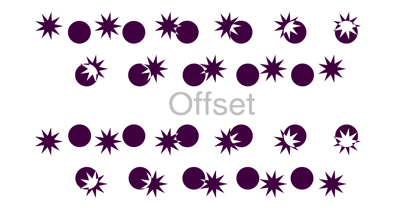 All 6 fonts use the characters A - K and a - k to show two planets/stars/moons moving across each other. Nice and simple. There's a different number of points on the stars, or they're different sizes, and some appear to pass left-to-right, and some appear to pass the other way. Just type in ABCDEFGHIJK or abcdefghijk and you'll see. Two fonts have all the characters on the same level, (All-Black and Black+White). The Offset font has the 'sun/moon' with one slightly above the other and in black and white, and Half has them all-black. Partial has them even further separated in 2-tone. NearMiss is a very close shave. Comma, hyphen, and full stop/period give just a single symbol; there's a Space, and that's it.
 - Haven by Signature Type Foundry,
$33.00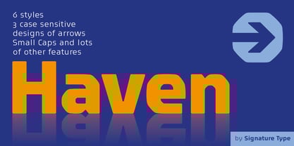 Haven font family is based on the compositionality of constructive elements that create the final shape of individual letters. Mechanical connecting was continuously adjusted by a type designer’s feeling. In this way Haven differs from similar typefaces of the 1960s and 1990s. Six fonts of different stroke intensity create a rich family of typefaces for a variety of uses in typography for special occasions. Although the typeface was drawn for headings, it is suitable for typesetting of long texts in a book. Even in extreme reduction it retains its technical basis, negating classic book alphabets, and it adds an experimental look to the text. Both extreme fonts Thin and Black create strong contrast and their magnification brings attention to their interconnection of all details. Serif version Haven Serif is also being prepared.
 - Diamond Braille by Echopraxium,
$5.00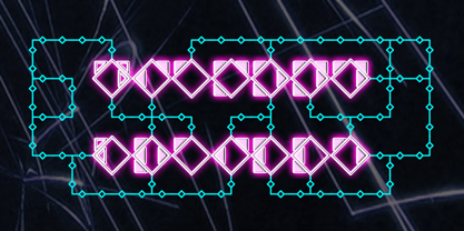 Here is a "Decorative Braille font". The initial design was indeed drawn on a K.I.S.S digital sketchpad, the Windows default drawing tool (Microsoft Paint, classic version). A. Glyph Concept The Braille 2x3 dot matrix is weaved around a diamond-shape. a.1. Each "dot" is represented by a "right-angle isocel triangle". a.2. Braille dots in Diamond Braille a.2.I. "Dots" are outside the diamond for first Braille row (Braille dots 1, 4) and third Braille row (Braille dots 3, 6). a.2.II. "Dots" are inside the diamond for second Braillle row (Braille dots 2, 5). a.3. Diamond lattice Glyphs are connected horizontally (to/bottom diamond's corners) and vertically (left/right corners) to each other (see poster 5). a.4. Special Glyphs - Space: its is either empty ("Empty cell") or a "non Braille shape" { _, ° } depending on your display needs (as explained in b.3.II) - 6 dots: { £, =, û } - 6 empty dots: { ç, ¥ } B. Font user guide b.1. Lowercase glyphs { A..Z } In these glyphs the "dots" are represented as a white right-angle isocel triangle filled with a smaller black triangle. b.2. Uppercase glyphs { a..z } In these glyphs, the "dots" are represented as an empty triangle (this is an "empty dot"). b.3. 'Space' vs 'Empty Cell' b.3.I. 'Space' - 'Space' glyph is an empty shape - '¶' glyph (at the end of each line in Microsoft Word) is also an empty shape b.3.II. 'Empty cell' glyphs: _ (underscore), ° (degree). In these glyphs there are 2 "empty dots" at top and bottom corners of the diamond, which differentiates them from regular Braille glyphs (which dont have a "dot in the middle"). b.4. Diamond Lattice To display text as a 'diamond lattice', replace each 'Space' by an 'Empty cell' (as explained in b.3.II, see poster 5) b.5. Connectors The connector glyphs allow the creation of "circuit like" designs (see poster 1). Here are the connector glyphs: { µ, à, â, ä, ã, è, é, ê, ë, î, ï } b.6. Domino feature Some Glyphs represent numbers 1..6 in a way which is similar than on dominos (see poster 6) C. Posters Poster 1: the "Font Logo", it displays "Diamond Braille" text together with the Connectors feature. Poster 2: a pangram which is published on pangra.me ( "Adept quick jog over frozen blue whisky mix" ). Poster 3: an illustration of the Domino feature. Poster 4: a DiamondBraille version of the Periodic table. Poster 5: illustration of the Diamond lattice using only 6 dots ( û ) and 6 empty dots ( ç ) glyphs.
 - Open Book ING by Ingrimayne Type,
$9.00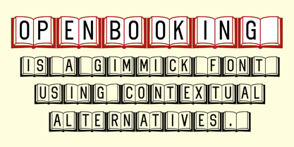 OpenBookING is a gimmick or novelty font that has letters on pages of a book. It is caps only and monospaced. The letters on the upper-case keys are on the left-handed pages of an open book and the letters on the lower-case keys are the same letters but on the right-handed pages of an open book. One could alternate upper and lower case keys to get letters on complete books, but the Opentype feature of contextual alternatives (calt) does this automatically. Several previous typefaces from IngrimayneType used the calt feature to alternate shapes that fit together in an interlocking pattern, such as alternating concave and convex shapes. OpenBookING uses the calt feature in a different way, to alternate two halves of a symmetrical shape. To provide two copies of numbers and common symbols, some non-alphabetical characters are unavailable because their slots were taken by the second form of the number or common symbol. If stylistic set one (ss01) is turned on, spaces are replaced with empty pages. This may leave you with unwanted spaces at the end of lines, and to eliminate them, turn off the feature (or change the font) for these spaces. The empty pages can be used in a layer to add color to the text. There is also a second set of empty pages with a filled page that can also be used in layers. (See poster for examples.) These pages are on the (logicalnot multiply) and (register divide) characters for the first set and on the (ordmasculine ellipsis) and (macron trademark) keys for the second set. Finally, OpenBookING has a large set of accented characters if anyone should need them. The letters used on the books were derived from the font Myhota-Bold. For a related typeface of letters on book covers, see NewLibrary. OpenBookING has limited uses and is priced accordingly.
 - Boogaloo Avenue NF by Nick's Fonts,
$10.00A new take on the perennial Art Deco favorite, Broadway, interpreted by 1930s lettering artist Harold Holland Day, and named after a 1960s R&B song. - Dino Dingbats by Beewest Studio,
$10.00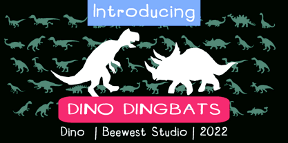 Dino Dingbats Font is cute and adorable Dinosaurus dingbats font. Whether you’re using it for crafts, digital design, presentations, or making greeting cards, this font has the potential to become your favorite go-to font, no matter the occasion!.
 - Akageeh by Twinletter,
$18.00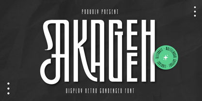 We are pleased to present Akageeh Retro Condensed Sans, a contemporary, elegant, and bold font. Your projects will have a timeless, refined, and contemporary feel thanks to this font. This font is excellent for branding and logo design. Akageeh is a lovely option to add elegance to your designs because of this font’s special qualities, which include ligatures, alternatives, and many others. You can play around with this font easily to produce fancy designs. What’s Included : - All glyphs to fulfil ISO Latin 1 - Alternate, ligatures - Simple installation - We recommend using applications supporting OpenType features and Glyphs panels like many Adobe apps and Corel Draw so that you can see and access all Glyph variations. - PUA Encoded Characters – Fully accessible without additional design software. - Fonts include multilingual support
 - Bomber TV by Kustomtype,
$25.00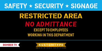 I was asked by a good friend of mine to design his tattoo lettering. This fellow prefered an easy stencil with no ornament, such as swirls or loops. After some preliminary design I finally accepted the challenge and while completing the whole alphabet, the idea of creating a cool font of it occured to me. Only a few months later this new font family already contained 4 weights, every weight has a companion Italic style, punctuation, numerals and mathematical operators, as well as all accented characters. Bomber TV is a brand-new font and all glyphs have been contemplated very carefully so that all characters match in a well-balanced and streaming way. In both shaped weights, the font suits extraordinary well for headings, slogans etc. The cleanly cut and powerful Bomber TV font can easily be used for logotype, games, prints, magazines, web, apps, packaging, posters, T-shirts, signage & design projects. The font is original and custom made by Kustomtype.
 - Dare by Device,
$39.00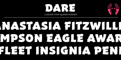 Dare is a bold, single-weight titling font in capitals only. It is built from flat-pen strokes, with looping bowls and sharp, incised darts. It borrows a pinch of the hand-drawn swagger of Bauer's Cartoon (designed in 1936 by H. A. Trafton), used as Dan Dare's signature logo in the British boy's comic Eagle, and also the upward-pointing serifs of machine-moderne typefaces such as Dynamo (designed by K. Sommer for Ludwig & Mayer in 1930). Suitable for book covers, magazines, branding, packaging – any place where an impactful, contemporary statement is required, but still with an undertone of 20th century tradition.
 - Lemon Smash by Bogstav,
$18.00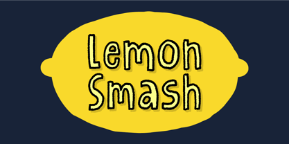 Lemons here and lemons there - I really love lemons! I use them in foods, deserts and drinks. I even eat them just for the taste of it! And, I name a lot of my fonts something with lemon! This Lemon font has 3 different versions of each lowercase letter and comes in both Regular, Outside and Inside versions - use them as single fonts, or mix them for nice results! Go go Lemon Smash!
 - Ekberg Demo - Unknown license

- Diamond Gothic - Unknown license

- TOMO Ernest by TOMO Fonts,
$10.00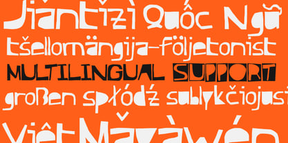 Ernest is a handmade typeface with an unique yet strong personality. Say it bold with this font. Punk & Wave styles. Ideal for type based designs.
 - Andorra Script by Hanoded,
$15.00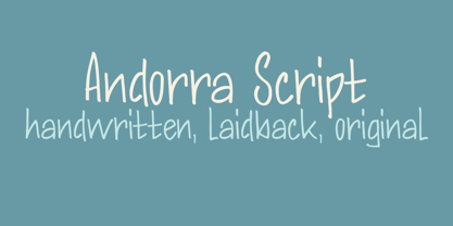 Andorra Script is a hand written font - it is very legible, quite elegant (in an informal way) and useful. Andorra Script comes with all diacritics.
 - Hello Arsenio by Figuree Studio,
$18.00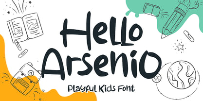 Say hello to Hello Arsenio font. Made with love and joy. Kids look, so it will make your design more beautiful, cute, fun, and colorful.
 - Kurilian by Wooden Type Fonts,
$15.00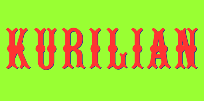 A very unusual type based on wooden type designs of the 19th century, lacking lower case which may not have been designed for this font.
 - Houdini by Solotype,
$19.95Houdini was extemporized from the single word "Houdini" on a lithographed poster for the magician. The original was a shaded outline like our Houdini Shaded font, but we felt that a solid version would be worthwhile too. Like the companion font Houdini, the shaded version was created from the single word Houdini on an old lithographed poster for the famous magician. The original was hand-lettered by a litho lettering artist. - Refinery by Kimmy Design,
$10.00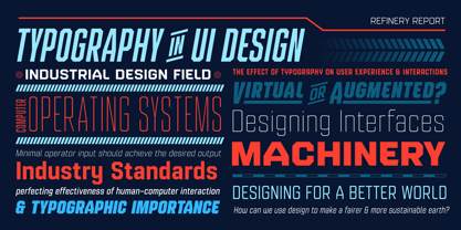 Refinery is the newest font in the Evanston Collection of square typefaces. With a similar capital structure to Tavern and Alehouse, Refinery includes both lowercase and small caps, making it an ideal typeface for paragraph text settings. It also comes in a wide array of weights and widths, with 85 font files in total. DESIGN Refinery has it’s roots in early 20th century signage and saloon typography, but has been modernized - even future-ized - to fit the 21st century digital landscape. The design was aimed at providing a type family that could work in many modern design fields, from sports, tech and military to gaming, HUD, virtual reality and augmented reality. ENGINEERING Essentially. Refinery is a simple mono-linear square design has been expertly refined into an easy-reading sans serif typeface. It was designed to be used in both display and text settings. From hairline to black in ultra-narrow or extended, the wide array of weight and width options makes it easy to find the right font for each text need. SPECS Refinery not only includes 85 font files, but each one include a wide array of Opentype Extras that allow even further customization. • Stylistic Alternatives: Letters A W Y have a styling variation that rounds the pointed apex into a square curve. The S and 2 variation straightens the spine, making all curves in the alphabet read as 90º angles. • Small Capitals: A shortened version of the capitals for alternate header settings. • Titling Alternatives: In this typeface, this feature turns on lifted small caps. Take the small capitals, raise them to level with capitals and underline at the baseline. When multiple lowercase or small capital letters are typed in a row, the underlines connect, creating unique ligatures. • Figures: There are different figure styles for different text needs. Options include, proportional lining, tabular lining (for math), old style and small capitals. • Discretionary Ligatures: A little funk to this otherwise serious typeface. Letters with a long baseline or cap height stem - F, L, T - get elongated to hug a small capital vowel. Other ligatures include Co. and No. • Catchwords: These are common words that bring emphasis to a design. In English these words include ‘and’ ‘as’ ‘by’ ‘in’ ‘of’ ‘the’ ‘to’ ‘when’, among others. Refinery also includes multilingual catchwords of ‘el’ ‘la’ ‘oder’ ‘go’ ‘para’ ‘pour’ ‘und’ ‘y’, among others. For the full list, please check out the specimen images. EXTRAS To round the typeface off, a set of over 150 ornaments, icons, arrows, patterns and line breaks is included to provide complimentary graphics. These can be found in the Ornaments labelled font, it is recommended to use the Glyphs panel to select which text glyph is needed.
 - Aethelred NF by Nick's Fonts,
$10.00This unicase typeface, with alternate characters in several of the lowercase positions, is patterned after Mosaik, designed by Martin Kausche for Schriftgeißerei Stempel in 1954. A stencil treatment has been employed, and the outlines have been roughened to enhance its ancient feel. The typeface is named for a king of England, Æðelred the Unready, who ruled over a millenium ago. Unlike its namesake, this typeface is quite ready to do yeoman's duty on your next project. The Opentype, Truetype and Windows Postscript versions of this font contain both the Windows 1252/ANSI character set and the 1250/Central European character set. - Marydale by Three Islands Press,
$29.00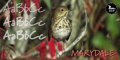 While helping produce a trade magazine years ago, I admired the hand-lettering of the art director -- a woman named Marydale -- and suggested she let me model a font after her penmanship. She agreed and drew out the alphabet, and I launched an old copy of Fontographer and (to shorten a long story) ended up developing my very first digital typeface. Which has since, astonishingly, become famous worldwide. So now the real Marydale gets the mixed blessing of seeing her handwriting (and name) plastered all over the planet. Full release has regular, bold, and black weights.
 - Bunken Tech Sans Wide by Buntype,
$49.00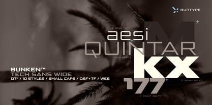 The Bunken Tech Sans superfamily: A reminiscence of constructed fonts of the modern age designed with considerably cleaner forms. •See other members of the Superfamily: Bunken Tech Sans •For further details, view the Specimen PDF. Bunken Tech Sans Wide follows in the best tradition of the straight-lined and somewhat angular structures of its predecessors while offering a much more open and mild design. The shapes of the letters are therefore reduced to the most essential elements: The spurs on a, b, n and other lower case letters occur just as little as decorative or style details, the lightly rounded inside edges are more pleasing to the eye than certain historic role models and make for a harmonic, flowing style. Use In particular Bunken Tech Sans Wide stands out as an easy, distinctive headline font with its straight-lined, technical design. Open counters and large x-height make it equally suited for use in shorter texts. It is also perfectly complemented by Bunken Sans or Bunken Slab in longer texts (available soon). Features Available in 16 styles with widths ranging from Light to Heavy with associated Italics. All of the styles are very extensive: Support for at least 58 languages, Small Capitals, 9 number sets (e.g. Lining, Oldstyle, Tabular and Small Cap Figures), ligatures, alternate characters, numerous Opentype functions, and lots of other small features that make it more pleasant to work with the font on a daily basis as well as fulfilling typographic desires. Each style contains more than 870 characters! Each style is available in a professional (Pro) standard (Std) and Small Caps (SC) edition with a different range of functions. (Language support, OpenType features and number of glyphs). Details can be found on the respective pages. Bunken Tech Sans Wide is part of the Bunken Tech superfamily and is available in Condensed, Normal and Wide. Also of interest: The slab serif variation Bunken Tech Slab Features in Detail: 16 Weights: -Light -Book -Medium -SemiBold -Bold -ExtraBold -UltraBold -Heavy and corresponding Italics 3 Widths: -Condensed -Normal -Wide Alternate Characters: A, E, F, L, S, e, f, t, s, y, etc. Small Capitals 5 Sets of Figures: -Lining Figures -Old Style Figures -Tabfigures -Old Style Tabfigures -Small Cap Figures Automatic Ordinals Automatic Fractions Extended Language Support and more...
 - Duepuntozero Pro by Zetafonts,
$39.00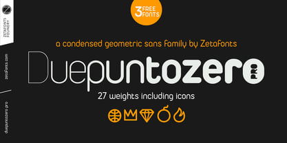 Created as a logo typeface in 2004 by Francesco Canovaro, Duepuntozero is one of Zetafonts classic typefaces. A monolinear sans serif typeface with rounded corners and condensed proportions, strictly based on modular geometric design, it was at first designed in five weights to be used as a condensed companion typeface to the rounded display family Arista. In 2019 the family was completely redesigned by the Zetafonts Team, expanding the original character set to include cyrillic and greek glyphs and adding four extra weights and italics to the original weight range. This restored and revamped version, named Duepuntozero Pro, also includes full Open Type features for positional figures, fractions and Small Caps. With his rounded, minimal aesthetic, Duepuntozero embodies the desire for simplicity and playfulness of contemporary mobile applications, making it a perfect choice for gaming and app interface design. Its compact design allow for maximum space saving on mobile screens when used as a text typeface, while the strictly geometric design and the extreme range of weights (including thin and black) make it excel in display, logo and editorial use. A complementary set of free icons in the same range of weights of the font is provided to help designers build consistent branding through pictograms in infographics, interfaces and editorial products.
 - Spookytooth by Comicraft,
$19.00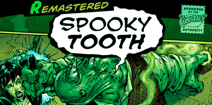 Sink your teeth into the World of Horror! SPOOKYTOOTH is sharp enough to penetrate even the most stubborn necks and has proven unnerving enough to make Ghost Rider, Deadpool, the Confessor and even ELEPHANTMEN’s Obadiah Horn sound both sinister and nefarious! Remastered Spookytooth includes a new Bold weight, automatic alternate letters, improved spacing & kerning, additional European, Vietnamese & Cyrillic language support, and Crossbar I Technology™ Script by Jeph Loeb & art by Ian Churchill with Liquid's Aron Lusen
 - Stanford Breath by Arterfak Project,
$20.00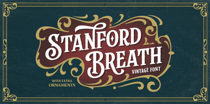 Introducing 'Stanford Breath' a vintage decorative font inspired by the western typography and victorian style. this font has strong look with the rounded serif, all-caps, and decorative uppercase. Collected from many references such as vintage signage, logo, badges, and old-fashioned graphics. Stanford Breath is complete with extra ornaments that look great to combine. This font is perfect for many display purposes. You can use this font for posters, labels, logos, signboards, t-shirts, book covers, decorations, merchandise, and more! Multilingual support with a ton of alternate characters! Fonts Featured : Uppercase Smallcaps Numbers & punctuations Stylistic Set 01-14 Custom ligatures Accented characters: ÀÁÂÃÄÅÆÇÈÉÊËÌÍÎÏÑÒÓÔÕÖØÙÚÛÜÝÞŒŠŽßàáâãäåæçèéêëìíîïñòóôõöøùúûüýþÿœšž Stanford Breath font is PUA Encoded which means you don't need any special software to access the OpenType features.
 - Oscan Expanded by Afkari Studio,
$17.00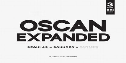 Oscan Expanded - Display Sans Serif Font Oscan Expanded is A special display sans serif font with expanded style and lowercase included. This font also contains some alternates to make your design cooler. The oscan expanded font is perfect for headline titles, fashion, magazines, logos, branding, photography, invitations, poster, movie title, quotes, blog headers, advertisements, postcards, book covers, websites, branding, etc. Features; – 3 Styles; Regular, Rounded and Outline – Uppercase, Lowercase, Number, and Punctuation – Special Alternates – Works on PC & Mac – Simple installations – Accessible in Adobe Illustrator, Adobe Photoshop, Adobe InDesign, even work on Microsoft Word – Fully accessible without additional design software. - Mültîlíñgúãl Sùppört for; ä ö ü Ä Ö Ü ß ¿ ¡ Hope you enjoy our font and this font is useful for your projects!
 - Radhistone by ZetDesign,
$14.00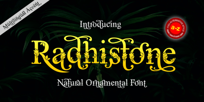 Radhistone is a decorated serif font with a natural theme. This font is equipped with OpenType features and there are many choices of shapes and swashes (up to 6 shapes) that can be accessed so that users can make choices according to their creativity to produce amazing works.
 - HavingWrit - Unknown license

- Half SunBurst-w4-02 - Unknown license

- Rocket Queen by Ferry Ardana Putra,
$19.00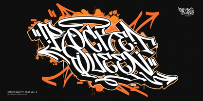 Unleash your inner street artist with Rocket Queen! The definitive font for urban self-expression. Inspired by the bold strokes of tagging graffiti markers found on city walls, this font encapsulates the raw energy of the streets. Its uppercase and lowercase characters ensure versatility, while support for foreign languages guarantees global appeal. Graffiti artists worldwide adore its iconic rounded tip marker style for its unique and entertaining aesthetics. Rocket Queen's "Urban Tags" font is more than just a typeface; it's an urban art form. Designed with a nod to the vibrant world of graffiti scenes, this font embodies the spirit of tagging graffiti markers, creating a gritty, authentic experience. With full support for foreign languages and both uppercase and lowercase characters, Rocket Queen empowers your creativity. Its iconic rounded tip marker style, favored by graffiti artists globally, offers a unique and entertaining touch to your designs. Plus, it's enriched with street graffiti ornaments for that added urban flair. Rocket Queen is more than a font; it's the language of rebellion and urban creativity. Drawing inspiration from the bustling streets and tagging graffiti markers, this font captures the raw spirit of street art. Its iconic rounded tip marker style, beloved by graffiti artists worldwide, sets your designs apart with a unique and captivating aesthetic. Supporting foreign languages and featuring a complete set of uppercase and lowercase characters, Rocket Queen is your canvas for bold, edgy statements. Step into the world of street art with Rocket Queen, a font that embodies the raw spirit of urban graffiti. Inspired by the legendary rounded tip marker style, this font captures the essence of tagging in the streets. Its captivating, one-of-a-kind design is favored by graffiti artists across the globe. With support for foreign languages and a full set of uppercase and lowercase characters, Rocket Queen is the ultimate choice for artists who want their work to resonate with the vibrant, rebellious energy of the graffiti scene. And, don't forget to explore the collection of street graffiti ornaments to take your designs to the next level! "Rocket Queen" font is perfect for a wide range of creative and artistic applications. Here are some ideal uses for this unique and edgy font: Graffiti Artwork: Use "Rocket Queen" to create authentic graffiti-style artwork on canvas, walls, or digital platforms. Its street-inspired design will add an urban, edgy vibe to your work. Streetwear Brand Logos: Design logos and branding materials for streetwear clothing lines or urban fashion brands. The font's bold and expressive style is a great match for this niche. Event Posters and Flyers: Create eye-catching event posters and flyers for music concerts, art exhibitions, or street festivals. "Rocket Queen" will help your event materials stand out and evoke a gritty, streetwise feel. Album Covers: Design album covers for music genres like hip-hop, rap, punk, or any style that demands a rebellious and energetic look. The font can give your cover artwork an authentic street vibe. Tattoo Lettering: Tattoo artists and enthusiasts can use "Rocket Queen" for lettering in tattoos. Its unique graffiti-inspired characters can create distinct and personalized tattoos. Skateboard Deck Graphics: Use the font to design custom graphics for skateboard decks, reflecting the rebellious and urban culture of skateboarding. Street Art Installations: If you're creating street art installations, "Rocket Queen" can be used for text elements within the artwork, giving it an authentic urban graffiti feel. Urban Magazine Titles: "Rocket Queen" can be an ideal choice for magazine titles and headlines in publications that focus on urban culture, street art, or graffiti. Video Game Titles and Graphics: Design video game titles, logos, or in-game graphics for games with an urban or street culture theme. The font's distinctive style can enhance the game's visual appeal. YouTube Channel Branding: Content creators with a street art or urban lifestyle focus can use "Rocket Queen" for their channel logos, banners, and thumbnails. Product Packaging: For products targeting a youthful, urban audience, the font can be used in product packaging design, making the brand and product look fresh and exciting. Digital and Print Advertisements: Incorporate "Rocket Queen" in advertising campaigns that aim to connect with a young, rebellious, or urban demographic. The "Rocket Queen" font is versatile and can be adapted to a wide range of applications where a bold, streetwise, and artistic look is desired. It's all about bringing an authentic graffiti vibe to your creative projects. ——— Rocket Queen features: A full set of uppercase and lowercase Numbers and punctuation Multilingual language support PUA Encoded Characters OpenType Features Layered Style +345 Total Glyphs +100 Graffiti Swashes and Ornaments included!
 - Linefeed by Typodermic,
$11.95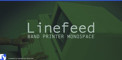 Introducing Linefeed, the retro-inspired monospaced typeface that transports you back to the 1960s and 1970s era of computer band printers. Drawing inspiration from the revolutionary technology of the time, Linefeed captures the essence of the clunky yet iconic machines that were responsible for producing some of the most important documents of the time. Imagine a row of hammers, one for each column, smacking the paper against the ribbon and raised characters embossed on a constantly revolving steel band. This is the heart of the Linefeed font, paying homage to the technology that paved the way for the digital age. Most band printers of the time were restricted to uppercase, digits, and a little punctuation to ensure maximum efficiency, but Linefeed brings this beloved typeface to life with added lowercase letters, extra punctuation, and accents. Linefeed was once one of the most widely used computer fonts during the 1960s and 1970s. It could be found on a plethora of documents, including driver’s licenses, magazine subscription labels, report cards, invoices, and auto dealership window stickers, among other things. In a world where sleek and modern designs dominate, Linefeed offers a refreshing throwback to the golden age of computing. Its technical design, inspired by the machines of yesteryear, is a testament to the ingenuity and creativity of early computer designers. With its monospaced layout and vintage charm, Linefeed is sure to bring a touch of nostalgia to any design project. Most Latin-based European writing systems are supported, including the following languages. Afaan Oromo, Afar, Afrikaans, Albanian, Alsatian, Aromanian, Aymara, Bashkir (Latin), Basque, Belarusian (Latin), Bemba, Bikol, Bosnian, Breton, Cape Verdean, Creole, Catalan, Cebuano, Chamorro, Chavacano, Chichewa, Crimean Tatar (Latin), Croatian, Czech, Danish, Dawan, Dholuo, Dutch, English, Estonian, Faroese, Fijian, Filipino, Finnish, French, Frisian, Friulian, Gagauz (Latin), Galician, Ganda, Genoese, German, Greenlandic, Guadeloupean Creole, Haitian Creole, Hawaiian, Hiligaynon, Hungarian, Icelandic, Ilocano, Indonesian, Irish, Italian, Jamaican, Kaqchikel, Karakalpak (Latin), Kashubian, Kikongo, Kinyarwanda, Kirundi, Kurdish (Latin), Latvian, Lithuanian, Lombard, Low Saxon, Luxembourgish, Maasai, Makhuwa, Malay, Maltese, Māori, Moldovan, Montenegrin, Ndebele, Neapolitan, Norwegian, Novial, Occitan, Ossetian (Latin), Papiamento, Piedmontese, Polish, Portuguese, Quechua, Rarotongan, Romanian, Romansh, Sami, Sango, Saramaccan, Sardinian, Scottish Gaelic, Serbian (Latin), Shona, Sicilian, Silesian, Slovak, Slovenian, Somali, Sorbian, Sotho, Spanish, Swahili, Swazi, Swedish, Tagalog, Tahitian, Tetum, Tongan, Tshiluba, Tsonga, Tswana, Tumbuka, Turkish, Turkmen (Latin), Tuvaluan, Uzbek (Latin), Venetian, Vepsian, Võro, Walloon, Waray-Waray, Wayuu, Welsh, Wolof, Xhosa, Yapese, Zapotec Zulu and Zuni.
 - Tropical Jungle by Colllab Studio,
$19.00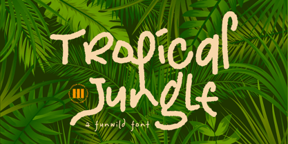 "Hi there, thank you for passing by. Colllab Studio is here. We crafted best collection of typefaces in a variety of styles to keep you covered for any project that comes your way! Tropical Jungle is a fun wild font, inspired by the wild life of the jungle. Inspired by the tropical rainforests of South America, Africa, and Asia, this font will inspire you to get out there and explore! Tropical Jungle is a bold, quirky typeface that captures the joyous spirit of life on earth or at least, of the parts we’re most familiar with: monkeys swinging through trees, tigers stalking their prey through the jungle, butterflies flitting from flower to flower. You can tell just from looking at it that this is going to be a fun-loving font that will bring a smile to your face and a bounce to your step. With over 500 glyphs, this stack of jungle animals will be a joy to use! We made sure our font was easy to read in any application so you don’t have to worry about your documents cluttering up. We know you can’t wait to get started using it in your next project. So go ahead! Grab Tropical Jungle now! A Million Thanks Colllab Studio www.colllabstudio.com
 - Tango by ITC,
$40.99Colin Brignall designed the Tango typeface in 1974. A groovy swirl of a font, Tango looks like disco party ready to lift off. Tango is one of many fonts that have come to symbolize the party music of the 1970s, familiar forms can be found on countless album covers from that era. Tango is a child of it's times - flashy, lively, and fun! - Barrowboy by Studio K,
$45.00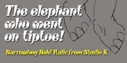 Barrowboy was inspired by the handwritten sales tickets that are still to be found on market stalls and fruit barrows, and are as familiar as the street cries that accompany them. The signage is mostly confined to numerals, so translating it into a font is pretty much a work of imagination. See also my other fun fonts Bebopalula, Calypso and Pier Arcade.
 - Midnight Chalker by Hanoded,
$15.00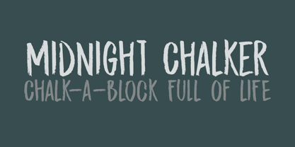 Midnight Chalker is, well, a chalk(ish) font and it was (fro the greater part) created around the midnight hour. That’s usually when I get my inspiration. Midnight Chalker is a tall, eroded font - all caps, but the upper and lower case differ and can be mixed. Of course it comes with more diacritics than you can throw a chalkboard at.


