10,000 search results
(0.223 seconds)
- Firon by Maulana Creative,
$14.00 Firon is a modern Decorative Display font. Bold strokes, fun character with a bit of ligature and alternates. To give you extra creative work. Firon font support multilingual more than 100+ language. This font is good for logo design, Social media, Movie Titles, Books Titles, short text even long text letters, and good for your secondary text font with script or serif. Make stunning work with Firon font. This is all caps font style. Cheers, Maulana Creative
 - Skisterstone by Maulana Creative,
$12.00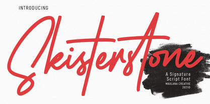 Skisterstones Signature Script Font Skisterstone is a Casual Signature Script font. With regular mono-line stroke, fun character with a bit of ligatures. To give you an extra creative work. Skisterstone font support multilingual more than 100+ language. This font is good for logo design, Social media, Movie Titles, Books Titles, a short text even a long text letter and good for your secondary text font with sans or serif. Make a stunning work with Skisterstone font. Cheers, MaulanaCreative
 - Feeltrips by Maulana Creative,
$15.00 Feeltrips is an all caps handwritten display font. With bold stroke, italic and fun character with a bit of ligatures. To give you an extra creative work. Feeltrips font support multilingual more than 100+ language. This font is good for logo design, Social media, Movie Titles, Books Titles, a short text even a long text letter and good for your secondary text font with sans or serif. Make a stunning work with Feeltrips font. Caps only fonts. Cheers, MaulanaCreative
 - Strong Heart by Sarid Ezra,
$13.00 Introducing my another font duo, Strong Heart! This is my newest font, I made two very different style that will compliment each other. Strong Heart contain two font, Script with lovely vibes, and Caps with strong form. The script also comes with ligatures that will make the signature font more real. This fonts are totally applicable in any project, like your social media post, merchandise, signature, etc. Font Features: Script Ligatures Number and Symbol Multi Language Support PUA Encoded
 - ATF Poster Gothic by ATF Collection,
$59.00 ATF Poster Gothic is an expansion of a typeface designed in 1934 by Morris Fuller Benton for American Type Founders. The one-weight design was a slightly condensed display companion to Benton’s ubiquitous Bank Gothic family. This new family of aggressively rectilinear headline types expands the design’s possibilities, offering 30 fonts. The all-cap design sports square corners in the counters, creating tension between angular and curved details; this feature, and the generally rectangular shape of the whole alphabet, makes ATF Poster Gothic distinctive on the page or screen, while its relationship to Bank Gothic makes it seem somehow familiar. Vertical strokes on the C, G, J, and S, as well as on several of the numerals, are cut off at an angle, which suggest the curves those strokes might typically display if the characters were less boxy in design and more along the lines of late-19th-century headline faces. Certain weights also recall the style of lettering used on athletic team jerseys, television crime dramas, action & adventure movie titles, and engraved stationery. With three widths and five weights, ATF Poster Gothic is distinctive and versatile at the same time. The full family is also available in a “Round” version, with corners subtly rounded for a softer, more “printed” feel.
 - Benacio by Keristyper Studio,
$14.00 Introducing Benacio Display Font is a handmade font style dance and then traces of life to have a Grungy brush and unique calligraphic shape, the writing style is very natural and simple. Benacio Handwriting Font multilingual support: Afrikaans, Albanian, Catalan, Danish, Dutch, English, Estonian, French, Finnish, German, Icelandic, Indonesian, Italian, Malay, Norwegian, Portuguese, Spanish, Swedish, Zulu, and many more. What’s Included : Web Fonts Standard & Multilingual glyphs Ligature Works on PC & Mac Simple installations Accessible in Adobe Illustrator, Adobe Photoshop, Adobe InDesign, even work on Microsoft Word. Hope you enjoy with our font!
 - Rotosh BKL Regular by Bakeel Studio,
$35.00 Rotosh BKL Regular Font is a modern Arabic and English font designed to meet the needs of a wide variety of users. It contains many characters, signs and languages, including the splintered languages derived from Arabic and English . The font is distinguished by its unique drawing and shape, making it a truly versatile font. The font is also easy to read and legible, making it the perfect choice for any project. With Rotosh BKL Regular, you can be sure that your designs will be truly unique and stand out from the rest.
 - Nadimo by Twinletter,
$12.00 Nadimo is an elegant, charming, and sensual sans serif font. Designed with subtle curves and flexible shapes to create a beautiful typeface that fits all your projects. Whether you’re looking for a typeface for a logo, t-shirt, poster, or even a large typography installation, Nadimo is here to help. Of course, your various design projects will be perfect and extraordinary if you use this font because this font comes with a font family, both for titles and subtitles and sentence text, start using our fonts for your extraordinary projects.
 - Bahoda by 160 Std,
$3.00 Bahoda is a sans serif font that comes in 4 styles. Bahoda font has bold and high contrast. This font looks very modern when paired with contrasting design colors. This font is impressive and features a clean and elegant font, professionally shaped, and as a result, it will easily match a variety of creations that require a different touch. Add it with confidence to your projects, and you’ll love the results. This typeface is perfect for powerful logos, branding, promotions, book covers, magazine layouts, or simply as a stylish text overlay onto any background image.
 - Hughoney by Arterfak Project,
$17.00 Introducing our new exploration of a brush font, Hughoney . This freestyle script font is created by creative randomization the letter shapes. Gives minimalist, sweet, elegant and solid looks to your creative projects. This font has a lot of feature that you can apply as you need. The features in this font have a consistent adjustment with the basic letters. This sweet brush font is suitable for your poster, quotes, t-shirt design, menu, product design, invitation, etc. Very recommended for Headline or your display. We hope you are interested.
 - Viktors Littl Creepy Horror by TypoGraphicDesign,
$19.00 CHARACTERISTICS The dark and sharp character of the typeface is a very unique atmosphere. The letter-forms can with broken trees, rotten and old and branches are associated. The partially pointed edges remind thorns (bushes) a rose. APPLICATION AREA The edgy, contrasty horror and fantasy font »Viktors Littl Creepy Horror« would look good at display size for headlines in magazines or websites, movie posters, music covers or webbanner. TECHNICAL SPECIFICATIONS Headline Font / Display Font / Fancy Font »Viktors Littl Creepy Horror« OpenType Font with 354 glyphs - alternative letters and ligatures (with accents & €) & 1 style (regular)
 - Stronger by MlkWsn,
$25.00 Stronger is a supercharged, street-wise brush font bursting with energy. With extra attention to quick strokes and sharp details, Stronger is ideal for logos, apparel, quotes, product packaging, or anything which needs a typographic turbo-boost. What's Included: Stronger Regular - The standard version of the font. Perfect for titles and logos. Stronger Swash - Need a cool underline under your text or a splash of paint? This font set has you covered. Type any letter a-z using this font, and you'll get a unique swash to accompany the font
 - Astone Nouvea by Gatype,
$12.00 Astone Nouvea is a unique and very elegant font for brand and logo designs. With this font, it will be easy for you to fulfill the wishes of customers who are often asked to design a logo with a unique style but with an elegant shape. So, we tried to brainstorm and come up with this font to get ideas out. It is perfect for BRANDING and LOGO DESIGN. You will get a classy, elegant, and of course unique logo with this font. Hope you enjoy this font!!
 - Racesky by ZetDesign,
$20.00 Racesky is a racing-themed font but is still suitable for other purposes. This font is created in two bevel styles to give different choices to each user. This font is also accompanied by open type features in the form of kerning, ligature, and stylistic alternate to make it easier to choose styles and shapes. Consistent lettering is also an advantage that makes it easier for you to produce a perfect and stylish work. don't hesitate to choose this font as part of your collection ... happy working and enjoy your font ...!
 - QEWUR by Twinletter,
$15.00 Introducing QEWUR, our newest font, an authentic font with a Japanese style theme, with an attractive and decent font shape to make your project elegant, special, gorgeous, and charming, and easy to remember for the audience. Logotypes, food banners, branding, brochure, posters, movie titles, book titles, quotes, and more may all benefit from this font. Of course, using this font in your various design projects will make them excellent and outstanding; many viewers are drawn to the striking and unusual graphic display. Start utilizing this typeface in your projects to make them stand out.
 - Nightsans by URW Type Foundry,
$19.99 The family Night by Nicolai Gogoll includes 10 styles – five serifs and five sans. Both variants harmonize well with each other and each come in five weights, which allows for good use in CI. Combining the Serif and Sans also enables versatile and hierarchical design, which is great for interfaces and infomedia.
 - Bolognia by Craft Supply Co,
$15.00 Bolognia is a classic serif typeface with high-contrast leaning to the concept of contemporary typefaces. Bolognia has a tall x-height value, modern proportion, transitional serif and extreme stroke contrast with vertical stress. Available in 6 weights, this typeface is a good choice to provide clear solutions for a variety of situations and settings such as editorials and headlines.
 - La Paz by Underground,
$24.90 La Paz is a typeface created to emulate handwriting. It consists of three different alphabets which are interleaved to provide variations in height, weight and inclination, typical of handwriting. In addition it has tens of ligatures, ornaments and opentype programming that help to recreate human gestures. It's ideal for use in small sizes for designs with a warm imprint and with manual gestures.
 - Adequate by K-Type,
$20.00 ADEQUATE is a basic geometric sans serif typeface comprising 6 weights plus a free italic with each. The family has modern, workaday letterforms with a tall x-height for clarity and legibility. Adequate does the job; it doesn't claim to be beautiful and lacks the fashionable mannerisms of many contemporary faces, but there is something timeless, perhaps elegant, about its mathematical simplicity.
 - Hatchway by Rômulo Gobira,
$15.00 Hatchway is a monospaced display typeface with rounded corners, suitable for headlines and short passages of text. Hatchway has a tall x-height and unusually short ascenders and descenders. The family contains seven weights from Thin to Black and five widths from Ultra Condensed to Ultra Extended. This version (1.0) comes with Multiple Language Support, including Extended Cyrillic, and Opentype Features.
 - Yalla Pro by Borutta Group,
$39.00 Yalla PRO was inspired during a trip Mateusz Machalski took to Cairo (Egypt). The vast array of strong Arabic headline type, geometric forms working in interesting ways and contrasting with smooth, calligraphic details fed the design. Due to the same proportions and heights, Yalla works great together with Afronaut. Yalla was extended in 2024 by Mateusz Machalski & Małgorzata Bartosik with new weights.
 - FS Lucas by Fontsmith,
$80.00 Pure and not-so-simple Maybe it’s the air of purity, openness and transparency that they transmit, but geometric typefaces are more popular than ever among leading brands. Based on near-perfect circles, triangles and squares, geometric letterforms look uncomplicated, even though making them readable is anything but – something the designers of the first wave of geometric fonts discovered nearly a century ago. Many of the world’s most recognisable brands in technology, retail, travel, food, manufacturing and other industries continue to be drawn to the straightforward, honest character that geometric fonts convey. Fontsmith set out in 2015 to develop a typeface in the same tradition, but optimised for the demands of modern brands – online and offline usage, readability and accessibility. And, of course, with the all-important Fontsmith x-factor built in. FS Lucas is the bold and deceptively simple result. Handle with care The letterforms of FS Lucas are round and generous, along the lines of Trajan Column lettering stripped of its serifs. But beware their thorns. Their designer, Stuart de Rozario, who also crafted the award-winning FS Millbank, wanted a contrast between spiky and soft, giving sharp apexes to the more angular letterforms, such as A, M, N, v, w and z. Among his inspirations were the colourful, geometric compositions of Frank Stella, the 1920s art deco poster designs of AM Cassandre, and the triangular cosmic element symbol, which led him to tackle the capital A first, instead of the usual H. The proportions and angles of the triangular form would set the template for many of the other characters. It was this form, and the light-scattering effects of triangular prisms, that lit the path to a name for the typeface: Lucas is derived from lux, the Latin word for light. Recommended reading Early geometric typefaces were accused of putting mathematical integrity before readability. FS Lucas achieves the trick of appearing geometric, while taking the edge off elements that make reading difficult. Perfectly circlular shapes don’t read well. The way around that is to slightly thicken the vertical strokes, and pull out the curves at the corners to compensate; the O and o of FS Lucas are optical illusions. Pointed apexes aren’t as sharp as they look; the flattened tips are an essential design feature. And distinctive details such as the open terminals of the c, e, f, g, j, r and s, and the x-height bar on the i and j, aid legibility, especially on-screen. These and many other features, the product of sketching the letterforms in the first instance by hand rather than mapping them out mechanically by computer, give FS Lucas the built-in humanity and character that make it a better, easier read all-round. Marks of distinction Unlike some of its more buttoned-up geometric bedfellows, FS Lucas can’t contain its natural personality and quirks: the flick of the foot of the l, for example, and the flattish tail on the g and j. The unusual bar on the J improves character recognition, and the G is circular, without a straight stem. There’s a touch of Fontsmith about the t, too, with the curve across the left cross section in the lighter weights, and the ampersand is one of a kind. There’s a lot to like about Lucas. With its 9 weights, perfect proportions and soft but spiky take on the classic geometric font, it’s a typeface that could light up any brand.
 - FS Lucas Paneureopean by Fontsmith,
$90.00Pure and not-so-simple Maybe it’s the air of purity, openness and transparency that they transmit, but geometric typefaces are more popular than ever among leading brands. Based on near-perfect circles, triangles and squares, geometric letterforms look uncomplicated, even though making them readable is anything but – something the designers of the first wave of geometric fonts discovered nearly a century ago. Many of the world’s most recognisable brands in technology, retail, travel, food, manufacturing and other industries continue to be drawn to the straightforward, honest character that geometric fonts convey. Fontsmith set out in 2015 to develop a typeface in the same tradition, but optimised for the demands of modern brands – online and offline usage, readability and accessibility. And, of course, with the all-important Fontsmith x-factor built in. FS Lucas is the bold and deceptively simple result. Handle with care The letterforms of FS Lucas are round and generous, along the lines of Trajan Column lettering stripped of its serifs. But beware their thorns. Their designer, Stuart de Rozario, who also crafted the award-winning FS Millbank, wanted a contrast between spiky and soft, giving sharp apexes to the more angular letterforms, such as A, M, N, v, w and z. Among his inspirations were the colourful, geometric compositions of Frank Stella, the 1920s art deco poster designs of AM Cassandre, and the triangular cosmic element symbol, which led him to tackle the capital A first, instead of the usual H. The proportions and angles of the triangular form would set the template for many of the other characters. It was this form, and the light-scattering effects of triangular prisms, that lit the path to a name for the typeface: Lucas is derived from lux, the Latin word for light. Recommended reading Early geometric typefaces were accused of putting mathematical integrity before readability. FS Lucas achieves the trick of appearing geometric, while taking the edge off elements that make reading difficult. Perfectly circlular shapes don’t read well. The way around that is to slightly thicken the vertical strokes, and pull out the curves at the corners to compensate; the O and o of FS Lucas are optical illusions. Pointed apexes aren’t as sharp as they look; the flattened tips are an essential design feature. And distinctive details such as the open terminals of the c, e, f, g, j, r and s, and the x-height bar on the i and j, aid legibility, especially on-screen. These and many other features, the product of sketching the letterforms in the first instance by hand rather than mapping them out mechanically by computer, give FS Lucas the built-in humanity and character that make it a better, easier read all-round. Marks of distinction Unlike some of its more buttoned-up geometric bedfellows, FS Lucas can’t contain its natural personality and quirks: the flick of the foot of the l, for example, and the flattish tail on the g and j. The unusual bar on the J improves character recognition, and the G is circular, without a straight stem. There’s a touch of Fontsmith about the t, too, with the curve across the left cross section in the lighter weights, and the ampersand is one of a kind. There’s a lot to like about Lucas. With its 9 weights, perfect proportions and soft but spiky take on the classic geometric font, it’s a typeface that could light up any brand. - Quercus 10 by Storm Type Foundry,
$69.00 Quercus is characterised by open, yet a little bit condensed drawing with sufficient spacing so that the neighbouring letters never touch. It has eight interpolated weights with respective italics. Their fine gradation allows to find an exact valeur for any kind of design, especially on the web. Quercus serif styles took inspiration from classicistic typefaces with vertical shadows, ball terminals and thin serifs. The italics have the same width proportion as upright styles. This “modern” attitude is applied to both families and calls for use on the same page, e g in dictionaries and cultural programmes. Serif styles marked by “10” are dedicated to textual point sizes and long reading. The sans-serif principle is rather minimalistic, with subtle shadows and thinned joints between curved shapes and stems. Quercus family comprises of the usual functionality such as Small Caps, Cyrillics, diacritics, ligatures, scientific and aesthetic variants, swashes, and other bells & whistles. It excels in informational and magazine design, corporate identity and branding, but it’s very well suited for book covers, catalogues and posters as well. When choosing a name for this typeface I've been staring out from my studio window, thinking helplessly without any idea in sight. Suddenly I realised that all I can see is a spectacular alley of oaks (Quercus in Latin) surrounding my house. These oaks were planted by the builders of local ponds under the leadership of Jakub Krčín in the fifteenth century.
 - Quercus Whiteline by Storm Type Foundry,
$69.00 Quercus is characterised by open, yet a little bit condensed drawing with sufficient spacing so that the neighbouring letters never touch. It has eight interpolated weights with respective italics. Their fine gradation allows to find an exact valeur for any kind of design, especially on the web. Quercus serif styles took inspiration from classicistic typefaces with vertical shadows, ball terminals and thin serifs. The italics have the same width proportion as upright styles. This “modern” attitude is applied to both families and calls for use on the same page, e g in dictionaries and cultural programmes. Serif styles marked by “10” are dedicated to textual point sizes and long reading. The sans-serif principle is rather minimalistic, with subtle shadows and thinned joints between curved shapes and stems. Quercus family comprises of the usual functionality such as Small Caps, Cyrillics, diacritics, ligatures, scientific and aesthetic variants, swashes, and other bells & whistles. It excels in informational and magazine design, corporate identity and branding, but it’s very well suited for book covers, catalogues and posters as well. When choosing a name for this typeface I've been staring out from my studio window, thinking helplessly without any idea in sight. Suddenly I realised that all I can see is a spectacular alley of oaks (Quercus in Latin) surrounding my house. These oaks were planted by the builders of local ponds under the leadership of Jakub Krčín in the fifteenth century.
 - Quercus Serif by Storm Type Foundry,
$69.00 Quercus is characterised by open, yet a little bit condensed drawing with sufficient spacing so that the neighbouring letters never touch. It has eight interpolated weights with respective italics. Their fine gradation allows to find an exact valeur for any kind of design, especially on the web. Quercus serif styles took inspiration from classicistic typefaces with vertical shadows, ball terminals and thin serifs. The italics have the same width proportion as upright styles. This “modern” attitude is applied to both families and calls for use on the same page, e g in dictionaries and cultural programmes. Serif styles marked by “10” are dedicated to textual point sizes and long reading. The sans-serif principle is rather minimalistic, with subtle shadows and thinned joints between curved shapes and stems. Quercus family comprises of the usual functionality such as Small Caps, Cyrillics, diacritics, ligatures, scientific and aesthetic variants, swashes, and other bells & whistles. It excels in informational and magazine design, corporate identity and branding, but it’s very well suited for book covers, catalogues and posters as well. When choosing a name for this typeface I've been staring out from my studio window, thinking helplessly without any idea in sight. Suddenly I realised that all I can see is a spectacular alley of oaks (Quercus in Latin) surrounding my house. These oaks were planted by the builders of local ponds under the leadership of Jakub Krčín in the fifteenth century.
 - Quercus Sans by Storm Type Foundry,
$69.00 “Quercus” is characterised by open, yet a little bit condensed drawing with sufficient spacing so that the neighbouring letters never touch. It has eight interpolated weights with respective italics. Their fine gradation allows to find an exact valeur for any kind of design, especially on the web. Quercus serif styles took inspiration from classicistic typefaces with vertical shadows, ball terminals and thin serifs. The italics have the same width proportion as upright styles. This “modern” attitude is applied to both families and calls for use on the same page, e g in dictionaries and cultural programmes. Serif styles marked by “10” are dedicated to textual point sizes and long reading. The sans-serif principle is rather minimalistic, with subtle shadows and thinned joints between curved shapes and stems. Quercus family comprises of the usual functionality such as Small Caps, Cyrillics, diacritics, ligatures, scientific and aesthetic variants, swashes, and other bells & whistles. It excels in informational and magazine design, corporate identity and branding, but it’s very well suited for book covers, catalogues and posters as well. When choosing a name for this typeface I've been staring out from my studio window, thinking helplessly without any idea in sight. Suddenly I realised that all I can see is a spectacular alley of oaks (Quercus in Latin) surrounding my house. These oaks were planted by the builders of local ponds under the leadership of Jakub Krčín in the fifteenth century.
 - Saskatoon Stencil JNL by Jeff Levine,
$29.00 Inspiration for font design takes on many shapes and forms. It can be vintage source material, visualized concepts or simply suggestions made by others. In an email conversation with Kevin Redekop (the Principal Designer for FabArts Creative Fabricators in Canada) who had purchased a number of Jeff Levine Fonts, a sample sketch of a desired stencil font was provided. This set the wheels into motion for the drawing and production of Saskatoon Stencil JNL.
 - ITC American Typewriter by ITC,
$40.99 ITC American Typewriter was designed by Joel Kaden and Tony Stan. It is an ode to the invention that shaped reading habits and the idea of legibility, the typewriter. A compromise between the rigidity of its ancestor and the expectations of the digital age, ITC American Typewriter retains the typical typewriter alphabet forms, lending the font a hint of nostalgia. ITC American Typewriter™ font field guide including best practices, font pairings and alternatives.
 - Bogista by Ronny Studio,
$19.00 Bogista is an elegant bold serif display font. This font impresses and features an elegant, professionally shaped font, and as a result, it will easily match a variety of creations that call for a different twist. Add it confidently to your projects, and you'll love the results. Features : - Lowercase & Uppercase - numbers and punctuation - multilingual - ligatures - alternates - PUA encoded Please contact us if you have any questions. Enjoy Crafting and thanks for supporting us! :) Thank you
 - Centric by Scholtz Fonts,
$19.00Centric is a rounded and happy font. The circular design that covers the face of this font was inspired by the ripples made when a pebble is thrown into a pond. The outline shapes of the characters were derived from the Font Mafuta. Centric is doubly effective when used in conjunction with Mafuta. It is best used for headings and where you intend to make a strong impact, possibly with an African flair. - Collage BB by Posterizer KG,
$24.00 Collage BB font was created for visual imitating of cuted paper Serif letters. The idea was to imitate kid’s clumsiness and irregular shape of letters. Good readability allows using this font for making some long texts. The font contains all the Latin and Cyrillic glyphs. BB - Bajina Bašta (Bašta in English means Garden) is the name of the small town where I spent my carefree childhood. That’s why I was inspired by Peter Pan.
 - Sagordi by Objectype,
$20.00 Sagordi is a font that displays a strong and modern style. With clean lines and bold shapes, Sagordi is perfect for use in various applications, ranging from logo design to marketing materials, digital publications, and more. This font is designed with careful details to ensure excellent readability at various sizes and resolutions. Sagordi is a great choice for designers who are looking for a flexible and adaptable font that can match various design styles.
 - Another Thing by Supfonts,
$10.00 Another Thing is a cute handwritten font perfect for headings, flyer, greeting cards, product packaging, book cover, printed quotes, logotype, apparel design, album covers, etc., or just adding a handwritten touch to any project! Font is an open type with clean shapes and precise kerning. It includes ligatures encoded by the PUA. Language support: All European languages Don't forget to subscribe so you don't miss out on the new awesome fonts Dima
 - Sans Andreas by Java Pep,
$11.00 Proudly presenting the newest handwritten font called Sans Andreas. These font made by handwritten style, so all shape looks unique and natural. Sans Andreas is a family font, with 4 styles regular, italic, bold, bold italic. Sans Andreas is also perfect for all your project that has sense fun, playful, art, and .etc If you have any questions or technical support don't hesitate to comment, message or contact java.indonesian@yahoo.com. Have a nice day.
 - Calorie Suit by PizzaDude.dk,
$17.00 Calorie Suit is a clean and super sharp comic font. Actually the use of Calorie Suit is quite wide. I'd like to dare you to use this font for massive texts, even though the real force of the font is for one liners or catchwords. Originally drawn in hand, and then cleaned up beyond recognition - but keeping the characteristics of the original sketch. You may notice influences from graffiti here and there too! :)
 - Fladerling by Graphicfresh,
$18.00 This minimalist font inspired by cherry stems is a great choice for impactful logo design and branding. The elegant and simple shapes of each character make it versatile and suitable for any type of logo, whether it's a wordmark or a symbol. The cherry stem inspiration adds a unique touch that sets it apart from other fonts. Use this font to create a lasting impression and memorable branding for your business or project.
 - Brose by Linecreative,
$16.00 Brose - Bold oblique font with sharp angles for dynamic effects. Use ligature characters to give you unlimited designs, this font is great for your work such as posters, logos, branding, covers, banners, t-shirts and headers, or even large-scale artwork Brose oblique Bold, offers you: Brose -oblique bold font including Upper & Lowercase characters(ALL CAPS has a different form characte), Ligatures Character Numbers and Punctuation Supports Multi linguage (Latin Western Europe), Numbers and Punctuation
 - Mantana by Anomali Creative,
$10.00 Mantana - Retro Vintage DIsplay font is an old style serif font, its funky, round, hight-contrast and bold shape with a retro touch is perfect for displayed, head text, logotype and many more. Mantana - Retro Vintage DIsplay font comes with stylishtic alternates and ligatures. We highly recommend using a program that supports OpenType features and Glyphs panels like many of Adobe apps and Corel Draw, so you can see and access all Glyph variations.
 - Tracking by Sensatype Studio,
$15.00 Faster Racing Modern Logo Font is a Modern Logo Racing Font that Modern, Racing and unique characters are ready for Race event, that you can combine to get any variations and unique shapes easily just in seconds with great characters. What's Included: FASTER (Regular & Italic) Character set A-Z All Uppercase Numerals & Punctuation Accented Characters (West Europe) Works on PC & Mac Recommended using Adobe Illustrator or Adobe Photoshop. Wish you enjoy our font. :)