10,000 search results
(0.151 seconds)
- Fat Times by Wiescher Design,
$39.50 FatTimes is an extension to my HardTimes family. Times are too hard for boring typefaces, so try the fat one one for a change. Your hardworking typedesigner - Gert Wiescher
 - Jackdaws by Bogstav,
$17.00 A rough, yet legible version of my handwriting. Comes with contextual alternates that makes your text look even more cool! Also with loads of international letters! Viva multilingual support!
 - Classy Diner by Haiku Monkey,
$10.00Handwritten with care, and made bold and consistent with an art deco flair. If I owned a classy diner, this is how I'd like my chalkboard menus to look. - Finalist Round Slab by Bülent Yüksel,
$19.00 The font was intended primarily to have a stronger body. It has a simple geometrical surface. This font has a strong personality, that makes it perfect for use in headline sizes but means it also works gracefully within text blocks. "Finalist Round Slab" is carefully crafted and a unique slab serif. Use for websites, print, motion graphics, logo design, packaging design, t-shirts and more. The designation “Finalist Round Slab Regular” forms the central point. The first figure of the number describes the stroke thickness: Thin to Black. "Finalist Round Slab" comes 7 weights and italics total 14 types. The family contains a set of 450+ characters. Case-Sensitive Forms, Classes and Features, Fractions, Superior, Inferior, Denominator, Numerator, Old Style Figures just one touch easy In all graphic programs. You can enjoy using it. UPDATES: - 30 December 2015 Opentype Feature (fractions) and some kerning. - 11 June 2018 Solving some UNICODE problems on the internet. - 12 March 2019 Some error has been fixed. - 19 November 2019 Some error has been fixed. - 16 August 2021 New Version - 2.0 Some error has been fixed.
 - Abigail Script by Roland Hüse Design,
$15.00 Abigail Script is a handwritten, monoline cursive font. All the uppercase letters has stylistic alternates and some lowercase letters as well, ligatures and positional forms. Also have a few ornaments in place of numbers 1-9 best fit under words up to 5-6 characters long. See the gallery for preview. It contains Eastern and Western European accented characters. I hope you like this font, good luck with your project and let the creativity flow!
 - Almahira by Rometheme,
$16.00 Almahira is a modern calligraphy typeface, beautiful and luxurious. This elegant and beautiful font is stylish and versatile so you can use in a plethora of designs in both digital and print applications. Almahira font is the best choice for your professional design projects, including : signature, watermark on photography, quotes, album cover, book cover, business card, logo, branding, magazines, social media, advertisements, product designs, and many other design project. Enjoy designing, Rom
 - Stylish Delight by Sarid Ezra,
$19.00 Introducing, Stylish Delight - Modern and Luxury Serif Stylish Delight is a stylish and modern serif with unique italic as alternates that will make your presentation or logo more attractive and fashionable! You can use this font for your branding, logotype, or even quotes. This fonts support Multi Language. By combining standard and alternative characters, you will get the best look with endless possibilities. Features Uppercase & Lowercase Number & Symbol Multi language Italic as Alternates PUA Encoded
 - Angelina Script by Din Studio,
$25.00 Introducing Angelina Script - Beautiful Handwritten. It's made with a naturally handwritten and modern style. Angelina font best use for wedding, branding, logotype and quotes. This includes both a Regular version and a Dots version. How to access alternate glyphs? you can see it on this link ( http://goo.gl/1vy2fv) I hope this font can meet your design needs. Fell free to contact me in message or direct email donis4design@gmail.com. Happy Design :) Thank You, Donis
 - Dunelm by MADType,
$21.00 Dunelm is a typeface that was inspired by the type used in an English book from 1636. The typeface used in the book was unique and the goal in creating this font was to emulate the printing feel of the 17th century. The authentic ink-blotted and imperfect feel of the letter-pressed type was preserved with care. For best effect, this font should be used at text and smaller title sizes.
 - Feldberg by Putracetol,
$28.00 Feldberg is a elegant and luxury serif font with tons of beautiful alternative glyphs and multilingual support. Feldberg is font that will bring in your projects a touch of luxury and style. Come with open type feature with a lot of alternates, its help you to make great lettering, composition and layout. Feldberg best uses for heading headlines, cover, poster, logos, quotes, product packaging, merchandise, social media & greeting cards and many more.
 - Sweet Orange Blossom by The Gelato,
$10.00 The Sweet Orange Blossom font is a handwritten font that gives neat but realistic roller pen feelings when being displayed! It offers support for all the characters in all western European languages as well as standard punctuation glyphs. Perfectly suitable for numerous use such as product labels, quotations, banners, logos, product packaging, titles, headers, menu lists, and even for digital note taking! It comes in OTF format. Feel free to purchase and try!
 - HU Geulwoll by Heummdesign,
$15.00 Geulwoll is a Korean word for letters. HU Geulwoll is a handwritten font that conveys a calm feeling by creating a lyrical and old atmosphere. In order to emphasize the feeling of writing with a marker, each end was made to fall diagonally, a characteristic of the marker. It is a highly readable font with a curve applied to the bent part to save the stroke order. There is 1 weight of HU Geulwoll : Medium
 - Rainbow Candy by The Gelato,
$10.00 Rainbow Candy font is a very neat handwritten font that gives a cute and tidy note-taking style! Its semi-bold weight conveys relaxation and cuteness to your projects. It offers support for all the characters in English, Italian, Spanish, French, and German as well as standard punctuation glyphs. It is perfectly suitable for numerous use such as quotations, banners, logos, product packaging, titles, headers, menu lists, and even for digital note-taking!
 - Roman by MacCampus,
$30.00Linotype Banjoman was designed by Paul Veres. Most of its basic forms are constructed although some characters, like the a, g, or p, are more freely designed. This font is available in a variety of weights and styles. The bold weights are best for headlines or emphasis in text and the balanced Text styles were designed specifically for running text. Linotype Banjoman is an independent yet well-mannered font suitable for a variety of purposes. - ITC Bailey Quad by ITC,
$29.99 ITC Bailey Quad Bold was designed by Kevin Bailey in 1994. It is a semiserif typeface in the style of slab serif faces. The unusual placement of some serifs and unconventional forms of some characters give the font a modern feel. The overall look of Baily Quad Bold is robust and strong and the font is best used in headlines and short to middle length texts in point sizes of 12 and larger.
 - Black Ghost by Rotterlab Studio,
$12.00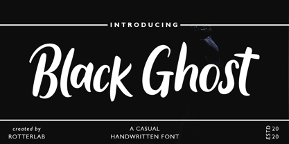 Black Ghost is a classy script font. Combined with that textured handwritten brush will make your design project even stronger. Made for professional project branding. This works best for logos, branding, and of course quotes. Each letter has a unique and beautiful touch. Features: PUA Encoded Multilingual Support Numbers and Punctuation Please send us a message if you have any questions or concerns, Thank you for downloading premium fonts from Rotterlab Studio
 - Arnold Böcklin by URW Type Foundry,
$35.00 Arnold Boecklin is a true Art Nouveau font, evocative of outdoor cafes in the years prior to World War l. Arnold Boecklin seems to be telling a story, with its decorative curves and varying emphasis of strokes. The Arnold Boecklin font should be used for specific copy as in headlines or advertisements, bearing in mind its strong design. Arnold Boecklin is a trademark of Linotype GmbH and may be registered in certain jurisdictions.
 - Qaylla by MIX.Jpg,
$17.00 Qaylla is a handwritten font inspired by 80s-90s music, retro, disco, grunge, and pop culture. Best used for posters, logos, clothing, books, invitations and more. Qaylla includes a complete set of upper and lower case letters, numbers, various punctuation marks and ligatures. All lowercase letters include the beginning and end of swash, giving your projects a realistic handwriting style. All uppercase letters include the beginning of swash, which makes the font look great!
 - Grivas by Nathatype,
$29.00 Prepare to be entranced by the unparalleled allure of Grivas, a serif display font that redefines typographic elegance. Each letter of Grivas is a work of art, meticulously crafted with two distinct outlines that harmoniously coexist. One outline boasts a refined delicacy, evoking a sense of timeless sophistication, while the other exhibits bold strokes that command attention and add a modern twist. For the best legibility use this font in the bigger text sizes.
 - Noble Jungle by Olivetype,
$18.00 Noble Jungle is an urban-style hand brush font, with a unique brush texture. It is the best choice for creating eye-catching logos, branding, headlines, apparels, and quotes. The font Noble Jungle contains 204 glyphs. Supporting more than 66 languages, from English to Zulu. It is also PUA encoded, multilingual, and has open-type features such as ligatures. Noble Jungle is cool, casual, and carefree.. Handcrafted with passion and love for your awesome projects.
 - Sanos Extended by WildOnes,
$9.95 Sanos Extened is perfect for handwriting style projects. The font features both uppercase and lowercase letters, so you will have a wide range of characters to use in typographic work. It has updated OpenType features, advanced kerning and multiple language support. This brush script font works best for fashion, beauty products, food, apparel and magazines. Sanos Extended could also be used for film, television, marketing, advertising and websites. Made by Krisjanis Mezulis.
 - Keltichi by Dima Pole,
$27.00 Keltichi typeface is based on the Book of Kells, the Irish uncial manuscript, the most beautiful European medieval style of writing. Keltichi contains many Opentype features, which make this font absolutely awesome. It looks great, specially titling uppercase sets, simulating the real Book of Kells scripts. Work on this project lasted 1 year, and now, I believe, Keltichi it is the best font simulating the Book of Kells scripts. Glory, glory to the Celts!
 - Magrit by Creativemedialab,
$20.00 Magrit is a bold serif display font, It has many alternates character with nice curve that you can arrange to create a nice logo lettering, or use it as a display face on a poster and add a few alterations to it to make a beautiful eye catching words. Magrit font is best for branding, logo lettering, headlines, product packaging, tshirt design, wedding theme, poster, book cover, wedding invitation, Christmas and many more
 - Mirallove Restimond by MJB Letters,
$20.00 Hello everyone, we hope you have a great day. Say hi to Mirallove Restimond a new casual modern font that is very perfect for branding, wedding designs, quotes, posters, business cards, logotype, display, watermarks, signatures, etc. This font also has a special character in terms of thickness and thinness on each side, so it will give a neat handwritten impression that will make your design look very attractive and it is PUA Encoded.
 - Garava - 100% free

- Corporaet by Characters Font Foundry,
$25.00 CFF Corporaet is a corporate brand typeface that comes in 5 sans serif weights; Light, Regular, SemiBold, Bold & Black. Its character is warm, friendly, humane, clear and soft. The humanistic design style is rooted in the cursive style of handwriting, clearly visible in letters such as the e, f, g and y. The spurless letters round it off. Striking characters, such as the z, and small quirky details make it both a corporate and a friendly typeface. The proportions of each character are carefully constructed in such a way that they're balanced and create an even colour in text. That’s why it works extremely well with long body copy. Making it a hero for magazines and editorial design challenges. The Corporaet fonts can be applied in large sizes for print or web, bringing out the refined details that give the fonts its distinctive personality.
 - CA Saygon by Cape Arcona Type Foundry,
$40.00 CA Saygon was originally conceived for a large corporate design project, but as this was never implemented, the way was free to make a public font. As a striking corporate typeface, it transports the fractions of a society after the post-modernist phase. After hundreds of sketches a bunch full of letters were selected, some of them quite twisted, others rather conventional. The combination of these letters reflects a rebellion of individuality but also leads to a coherent typeface. Additionally there are alternative letterforms in the Stylistic Sets or in the glyphs palette, which keeps the font always exciting to the designer. Thanks to the Cyrillic and Latin Extended character sets, a huge language area is covered that even extends to Vietnam! Numerous OpenType features make life easier for the professional typographer: There are fractions, superscript and subscript numbers, as well as proportional and tabular numbers.
 - Morthena by Blankids,
$24.00 Hello i came back with a new product, this is Morthena Script, this is a copperplate style font that looks classic, vintage and retro but still looks elegant, luxurious and georgeous. Morthena is a little different from some existing fonts, I made a slightly different shape and added an alternative character with a more decorative shape as well I added 35 different swashes that you can use easily, please see this video how to using this font: https://www.youtube.com/watch?v=mwp1yyOko4s&feature=youtu.be
 - Tepuy by John Moore Type Foundry,
$20.00 Tepuy is the name given to the ancient plateau-shaped mountains that abound in the Venezuelan Amazon. Tepuy is a display typeface inspired by the symbolic forms of the Venezuelan ethnic roots. It is constructed based on a very precise geometry of open forms that produce a double letter in form and counterform. Tepuy originates as an evolution curve of my Font Makiritare rectilinearly. Was devised for a book of photographs of the ancient mountains of the Venezuelan Amazon, its form and Makiritare are morphologically inspired crafts in the ethnic groups of the region. Tepuy is held in a very precise geometric construction based on rounded forms, each letter is a form envelope enclosing another in counterform, is a letter to display. Tepuy comes in four versions Regular, Light and thin, and there is a double line version enclosed. Tepuy recommended for creative headlines for the label and packaging design aimed at all ages.
 - beestings - Unknown license

- Vernacular Sans by jpFonts,
$19.95 The Vernacular trilogy was designed by Swiss designer Hans-Jürg Hunziker, who had worked for Adrian Frutiger in Paris for many years. Based on the concept of a transitional Linear Antiqua, he has developed a colorful bouquet of typefaces that contain the entire spectrum of typefaces for book design and corporate identity. Thanks to his "Swiss school" and his outstanding skills, he has succeeded in giving the typefaces a particularly noble and sympathetic expression. In addition to the Sans family, there is a Serif family and a Clarendon family, each of which, including the separately drawn italics, is equipped with 12 font weights that are finely tuned to one another. Each of the 3 font styles develops its own character, but thanks to a concept that brings the different font styles closer together, they also work well together and complement each other perfectly. Sans and Clarendon have a vertical axis and similar endings in contrast to the Serif, which has a traditional diagonal axis and horizontal endings. The straight stems and the proportions are used as an element to stress the closeness of the typeface-trilogy. They thus share a comon feature. All fonts contain tabular and proportional figures as well as old style figures. Small caps and small cap figures are also available in all fonts. In addition, some fonts have alternative characters available via style set, such as «g», which can be used to further vary the typeface. Vernacular offers all the options for well-kept typesetting for print and web - for small and large orders.
 - Vernacular Serif by jpFonts,
$19.95 The Vernacular trilogy was designed by Swiss designer Hans-Jürg Hunziker, who had worked for Adrian Frutiger in Paris for many years. Based on the concept of a transitional Linear Antiqua, he has developed a colorful bouquet of typefaces that contain the entire spectrum of typefaces for book design and corporate identity. Thanks to his "Swiss school" and his outstanding skills, he has succeeded in giving the typefaces a particularly noble and sympathetic expression. In addition to the Sans family, there is a Serif family and a Clarendon family, each of which, including the separately drawn italics, is equipped with 12 font weights that are finely tuned to one another. Each of the 3 font styles develops its own character, but thanks to a concept that brings the different font styles closer together, they also work well together and complement each other perfectly. Sans and Clarendon have a vertical axis and similar endings in contrast to the Serif, which has a traditional diagonal axis and horizontal endings. The straight stems and the proportions are used as an element to stress the closeness of the typeface-trilogy. They thus share a comon feature. All fonts contain tabular and proportional figures as well as old style figures. Small caps and small cap figures are also available in all fonts. In addition, some fonts have alternative characters available via style set, such as «g», which can be used to further vary the typeface. Vernacular offers all the options for well-kept typesetting for print and web - for small and large orders.
 - Vernacular Clarendon by jpFonts,
$19.95 The Vernacular trilogy was designed by Swiss designer Hans-Jürg Hunziker, who had worked for Adrian Frutiger in Paris for many years. Based on the concept of a transitional Linear Antiqua, he has developed a colorful bouquet of typefaces that contain the entire spectrum of typefaces for book design and corporate identity. Thanks to his "Swiss school" and his outstanding skills, he has succeeded in giving the typefaces a particularly noble and sympathetic expression. In addition to the Sans family, there is a Serif family and a Clarendon family, each of which, including the separately drawn italics, is equipped with 12 font weights that are finely tuned to one another. Each of the 3 font styles develops its own character, but thanks to a concept that brings the different font styles closer together, they also work well together and complement each other perfectly. Sans and Clarendon have a vertical axis and similar endings in contrast to the Serif, which has a traditional diagonal axis and horizontal endings. The straight stems and the proportions are used as an element to stress the closeness of the typeface-trilogy. They thus share a comon feature. All fonts contain tabular and proportional figures as well as old style figures. Small caps and small cap figures are also available in all fonts. In addition, some fonts have alternative characters available via style set, such as «g», which can be used to further vary the typeface. Vernacular offers all the options for well-kept typesetting for print and web - for small and large orders.
 - Reina Neue by Lián Types,
$29.00 Hey! See Reina Neue in action here! INTRODUCTION When I designed the first Reina¹ circa 2010, I was at the dawn of my career as a type designer. The S{o}TA, short for the Society of Typographic Aficionados, described it as complex display typeface incorporating hairline flourishes to a nicely heavy romantic letterform². And it was like that; that’s what I was pursuing at that time since I was very passionate about ornaments and accolades of Calligraphy. Why? I felt that Typography, in general, needed more of them. These subtle flourishes could breathe life into letters. Maybe, I thought it was the only way I could propose something new into the field of type. However, after some years, I came across a very interesting quote: –Beautiful things don’t ask for attention– Wow! What did this mean? How could something be attractive if it’s not actually showing it. Could this be applied to my work? Sure. I think every type-designer goes through this process (aka crisis) regarding his or her career. At the beginning we love everything. We are kind of blind, we only see the big picture of a project. And that’s not because we are lazy. We actually can’t see the small mistakes nor the subtleties that make something simpler beautiful. We are not able. But, the small subtleties… They are actually everything: With experience, one puts more attention into the details and learns that every single decision in type has to be first meticulously planned. Here I am now, introducing a new Reina, because I felt there was a lot of it that could be improved, also the novelty of Variable Fonts caught my attention and I had to take that to my type library. THE FONT A thing of beauty is a joy forever Now, a decade later, I’m presenting Reina Neue. This font is not just an update of its predecessor: –A thing of beauty is a joy forever– is the first line of the poem ‘Endymion’ by John Keats, and despite the meaning of “beauty” may vary from person to person, and even from time to time (as read in the last paragraph), with Reina I always wanted to bring joy to the eye. In 2010, and now, in 2020. I believe the font is today much better in every aspect. It was entirely re-designed: Its shapes and morphology in general are much more clean and pure. The range of uses for it is now wider: While the old Reina consisted in just one weight, Reina Neue was converted into a big family of many weights, even with italics, smallcaps and layered styles. The idea behind the font, this kind of enveloping atmosphere made out of flourishes, is still here in the new Reina. This time easier to get amazing results due to the big amount of available alternates per glyph and also more loyal from a systemic point of view. However, and as read in the introduction -Beautiful things don’t ask for attention-, if none of the flourishes are activated the font will look very attractive anyway. Reina Neue is ready to be used in book covers, magazines, wedding cards, dazzling posters, storefronts, clothing, perfumes, wine labels and logos of all kind. Like it happened with the previous Reina, I hope this new font satisfies every design project around the world if used, and can be a joy forever. SOME INSTRUCTIONS Before choosing the right style for your project, hear my advice: -Reina Neue Display was meant to be used at big sizes. If you plan to print the font smaller than 72pt, I suggest using Reina Neue, not Display. Otherwise, if the font will be BIG or used on a digital platform, Reina Neue Display should be your choice. For even smaller sizes, use Reina Neue Small. This style was tested and printed in 12pt with nice results. (Note for variable fonts: Print them in outlines) -Reina Italic is not a slanted version of the roman, and this means some flourishes are different between each other. The Italic version has other kind of swirls. More conservative, in general. -All the styles of Reina Capitals have Small Capitals inside. -Reina Capitals Shine should be used/paired ONLY with Reina Capitals Black. The engraved feeling can be achieved if Reina Capitals Black and Reina Capitals Shine are used as layers, with the same word. Variable fonts instructions: -For more playful versions, choose Reina Neue VF, Reina Neue Italic VF or Reina Neue Capitals VF: With them you can adjust between 3 axes: Weight (will change the weight of the font) – Optic Size (will thicken/lighten the thin strokes and open/close the tracking) – Accolades (will modify the weight of the active flourishes). SOME VIDEOS OF REINA NEUE VF https://youtu.be/8cImmT5bpQM https://youtu.be/1icWfPmKAkg https://youtu.be/YC9GkJDL1a8 NOTES 1. The original Reina, from a decade ago: https://www.myfonts.com/fonts/argentina-lian-types/reina/ 2. In 2011, Reina received an honourable mention by S{o}TA. “Great skill is shown in the detailing, and an excellent feel for the correct flow of curves and displacement of stroke weight.” https://www.typesociety.org/catalyst/2011/ Reina was featured in the “Most Popular Fonts of the year” in MyFonts in 2011 https://www.myfonts.com/newsletters/sp/201201.html In 2012, the font was also selected in Tipos Latinos, the most prestigious competition of type in Latinoamerica. https://www.tiposlatinos.com/bienales/quinta-bienal-tl2012/resultados Also, chose as a “Favorite font of the year” in Typographica. https://typographica.org/typeface-reviews/reina/
 - Kulture Grotesk by SilverStag,
$19.00 I am thrilled to present you the KULTURE GROTESK, a brand new sans serif font meticulously crafted to elevate your design projects to new heights. This contemporary typeface seamlessly blends modernity, chic aesthetics, and boundless creativity to offer a truly unique and captivating visual experience. With its clean lines and refined forms, this grotesk font embodies a perfect balance of simplicity and sophistication. Designed with the utmost attention to detail, it brings a breath of fresh air to the world of typography. Its versatility knows no bounds, making it the ideal choice for a wide range of applications, from editorial design and branding to web design and advertising. Whether you are looking to create a sleek corporate identity or add a touch of elegance to your personal projects, this font will undoubtedly leave a lasting impression. One of the most exciting features of the new font is the inclusion of over 300 alternate letters and ligatures.These unique characters offer a world of possibilities, allowing you to create stunning and original typography. From distinctive logo designs to captivating headlines, this grotesk font enables you to break free from the ordinary and infuse your creations with a touch of individuality. KULTURE GROTESK - Modern Sans Serif Font Includes: Over 300 ligatures and alternate letters Numerals & Punctuation Language Support Web Font Kit is included as well Detailed instructions on how to use alternates in most of the apps on your computer as well for Canva Would you like to get 5 completely free fonts worth over $75? No tricks, no hidden words, terms or anything. Just subscribe to my newsletter, make sure to check your email to approve the subscription, add me to your contacts so that the emails don't end up in spam folder and you will get 5 fonts for free. The fonts are packed with alternates, ligatures and some even come with extra goodies. Happy creating everyone!
 - Thermal by TipoType,
$35.00 Thermal is an exploration of balance and contrast. Combining the elegance of classical typography with the sharpness of contemporary design. It was conceived to be a variable font with two axes: weight & optical size, providing a wide range of options for texts & display applications. The regular and italic text weights breathe a warm atmosphere, their design inspiration is a relaxed interpretation of the work of 16th-century French type designer Robert Granjon, evoking a comforting rhythm and a sense of familiarity that makes reading enjoyable. On the other end of Thermal's design spectrum lie the extreme weights – thin and heavy –, specifically designed for larger sizes. These weights borrow stylistic cues from several distinct influences: the characteristic woodtype from the 19th century, the sharp lettering styles from the 70s, and the bold work of Oscar Ogg. One of Thermal's disctint features is its italic's 20° inclination, an significant inclination by all standards, this design choice finds its roots in the "Ascendonica Cursive" of 1571, but is a contemporary interpretation that generates a captivating contrast with the regular version. Thermal studies the past and analyzes the present to create a unique blend, bringing a dictint dichotomic identity.
 - Fancia by Mchcrafter,
$16.00 Fancia is a bold, detailed and assertive serif font. This font is imposing and features uniquely shaped letters, and as a result, it will easily match a wide range of creations that require a distinct touch.
 - Rara by Jiaone,
$9.00 Rara is a display font that has a free and energetic expressive character. Rara has a letter shape similar to brushes but solid, this font is suitable for use as a medium that complements passive objects
 - Tenbitesch - Personal use only

- XStarsAndStripes by Ingrimayne Type,
$14.95 These two typefaces contain elaborate star patterns. XSarsAndStripesOne and XStarsAndStripesTwo are mirror images of each other.


