10,000 search results
(0.065 seconds)
- Matchout by Zanfonts,
$12.00 Matchout is caligraphy sans serif with seven variation weigh, This font is comes in uppercase, lowercase, punctuations, symbols, numerals including basic and advance cyrillic. Matchout can used in various styles, casual, fun and simple letter. You are also worry-free because with more than 323 glyphs every weight, and Support for up to 73 languages Matchout perfect for branding, websites, quotes, invitation, flyers, greeting cards, poster, education, fun, logo, and marketing purpose
 - Megatrans by Craft Supply Co,
$15.00 Introducing Megatrans: A font from the future, where innovation and design meet. With its sleek lines and visionary style, Megatrans embodies a sense of futuristic aesthetics. Transform your projects with Megatrans' cutting-edge presence, adding a touch of tomorrow to your creative endeavors. This typeface is ideal for greeting card, packaging, brand identity, poster, or any purpose to make your design project look eye catching and trendy. Feel free to play with this typeface!
 - Sports Wave by Funk King,
$10.00Sports Wave is a specialty font that can be used for sports-themed projects. Previously available as a free version with only the pictograms, Sports Wave has been a popular download. Now we offer you the added usability of a full and extended character set. Some glyphs have been provided to extend the height of the shorter “banner” glyphs. These glyphs are negatively kerned and appear near the end of the set. - Gamilia by Craft Supply Co,
$15.00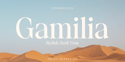 Presenting Gamilia: A stylish serif font that exudes elegance and sophistication. With its refined lines and contemporary charm, Gamilia adds a touch of class to your projects. Elevate your designs with Gamilia's timeless style, perfect for capturing attention with a dash of refinement. This typeface is ideal for greeting card, packaging, brand identity, poster, or any purpose to make your design project look eye catching and trendy. Feel free to play with this typeface!
 - Aks Vendara by Sitintahitam,
$15.00 Aks Vendara is a display typeface with 3 style, regular, stamp, and inked. This typeface inspired by motorcycle and custom culture. Aks Vendara perfect for people looking for vintage with rough feel. Suitable for any graphic designs such as branding materials, t-shirt, print, logo, poster, packaging .etc. We hope you enjoy the font, please feel free to comment if you have any thoughts or feedback. Thanks for purchasing and have fun! Cheers 🍻
 - Vulnerable by Gian Studio,
$12.00 Vulnerable is an elegant script typeface inspired by a vintage type specimen I found some time ago at an art fair. Thin to thick contrasting lines and elegant curves make Beginta the perfect font for this type of logo and display purposes. Hope you enjoy it Feel free to contact me if you have any questions or concerns you may have and I will get back to you as soon as I can.
 - Macing by Issam Type,
$19.00 Macing is a gorgeous sans-serif typeface consisting of 8 weights that is both classically elegant and inherently modern. Macing is perfect to create beautiful wedding invitations, use it as an elegant solution for your next magazine layout, branding projects, Logo design, product packaging, and more! Features: 8 Weights font Uppercase & Lowercase Numerals & Punctuation Accented characters If you have any questions, before or after purchase, please feel free to get in touch. Thank you
 - Becham by Craft Supply Co,
$15.00 Introducing Becham: A bold sans-serif font that commands attention with its strong presence. With its impactful lines and modern appeal, Becham adds a bold touch to your projects. Elevate your designs with Becham's assertive style, making a striking statement that can't be ignored. This typeface is ideal for greeting card, packaging, brand identity, poster, or any purpose to make your design project look eye catching and trendy. Feel free to play with this typeface!
 - Brittany Signature by Creatype Studio,
$25.00 Brittany Signature Script consists of a fashionable sophisticated signature-style script with its own unique curves and an elegant inky flow. This font is perfect for photography, watermark, social media posts, advertisements, logos & branding, invitation, product designs, label, stationery, wedding designs, product packaging, special events, or anything that needs handwriting taste. Thanks for checking it out, and feel free to message me if you have any questions! say hello by e-mail: creatypestudioco@gmail.com
 - Halena Jordan by Bungletter,
$12.00 Halena Jordan is a beautiful script that's perfect for branding, wedding invitations, and other romantic projects. This love centered look makes it perfect for use in all your design projects be it logos, labels, packaging designs, blog titles, posters, wedding designs, social media posts, Instagram designs, etc. Contains full set: -Uppercase -Lowercase -Alternative -Ligature -Punctuation -Number -Multilingual support. I hope you enjoy this font. If you have any questions, feel free to message me.
 - Peaky Rangers by Mega Type,
$12.00 Introducing "Peaky Rangers". Peaky Rangers is a handwritten script font in a modern calligraphy style, with a fun and modern look! Peaky Rangers are perfect for elegant home designs, wedding decorations, invitations, cricut projects, crafts, svg files, shirts, quotes, greating cards, branding, prints, logos, and more! Have fun using Peaky Rangers!!! I really hope you enjoy it! Feel free to follow, like and share. Thank you so much for checking out my shop!
 - Nauplia by Eurotypo,
$48.00 Nauplia is an organic script font, specially designed for use in logotypes, advertising and packaging. It is interesting to note the use of free-flowing lettering to perform its own eye-catching, connected and unconnected. Nauplia contain 450 glyphs with full OpenType features: swashes, ligatures, stylistics alternates and much more. Nauplia is a Greek city, its name according to Strabo, derives from the mythological character Nauplio, the son of Poseidon and Amimone.
 - Asthetic by Craft Supply Co,
$15.00 Introducing Asthetic: A nostalgic serif font that channels the essence of bygone eras. With its timeless lines and vintage charm, Asthetic evokes a sense of nostalgia in your projects. Infuse your designs with the allure of the past using Asthetic's classic and enduring style. This typeface is ideal for greeting card, packaging, brand identity, poster, or any purpose to make your design project look eye catching and trendy. Feel free to play with this typeface!
 - Hanthing by IRF Lab Studio,
$12.00 Hanthing Script consists of a fashionable sophisticated signature-style script with its own unique curves and an elegant inky flow. This font is perfect for photography, watermark, social media posts, advertisements, logos & branding, invitation, product designs, label, stationery, wedding designs, product packaging, special events, or anything that needs handwriting taste. Thanks for checking it out, and feel free to message me if you have any questions! say hello by e-mail: irflabstudio@gmail.com
 - Unibody Pro by Underware,
$50.00 Unibody 8 is a cross-platform OpenType font that optimizes your screen performance at pixel point size 8. It is free to download from Underware. The Underware site also contains technical information, including how to use Unibody in Flash and Photoshop, and links to various websites where Unibody is used. Unibody comes with Underware’s infamous Latin Plus character set standard, pairing with exactly 219 languages. There’s also Arabic version existing, by Yanone.
 - Now Appearing JNL by Jeff Levine,
$29.00Now Appearing JNL is a digital version of some hand-lettering spotted on an early 1960s ad for a Miami Beach night club. Its fun, casual appearance makes it perfectly suitable for any project that conveys a relaxed atmosphere. The font was intentionally not kerned, so the free-flowing form of the lettering is at its best, but it can be set tight by hand if a more compact look is desired. - Joss Rilex by Rotterlab Studio,
$15.00 Introducing a new beautiful calligraphy font, Joos Rilex! Joos Rilex is perfect for elegant logos, high-end packaging, wedding stationery, websites and other projects that require a handwritten and luxurious touch. A wide variety of doodles and alternatives are included so you can give your logo or name a hand-drawn calligraphic look. Features: Joss Rilex (OTF) Thank you for visiting my shop, and feel free to contact if you have any questions!
 - Hungry Beast by Bombastype,
$35.00 Hungry Beast is a Victorian theme font. With another old fashioned feel on it, because we were very passionate with that kind of typeface style. This typeface will be suitable for a lot of display purposes like you can see in our previews for the work samples. And don't forget about the Layer system, because who hates layers typeface? We also give you the ornaments for FREE. So let's try this Beast asap.
 - Notedinary by Invasi Studio,
$17.00 Notedinary comes with elegant script calligraphy with a personal touch. Take inspiration from diary notes. A delicate modern calligraphy script ideal for weddings, elegant branding, and adding a soft feminine touch to your projects. Notedinary comes with alternates and supports 60+ Latin-based languages. In the previews, I have paired Notedinary Script with the free Cormorant font. Features: - Total 204 Glyph - Uppercase & Lowercase - Numerals & Punctuation - Alternates - Multilanguage Supports 60+ Latin based languages
 - Levino by Punch,
$39.00 Levino is an italic font family which comes in 9 weights (and/or Variable). The light weights have an elegant look, the middle weights are perfect for texts like menus, copywriting & product descriptions, where the bolder weights create an inviting, prominent statement. Regardless of its classic characteristics, we believe Levino can be a great addition to modern design as well! Try out the several OpenType features and don't forget to download your free demo copy!
 - Housewife by Arendxstudio,
$18.00 Housewife Font that has a distinctive character that is very thick and elegant to use Housewife is a relaxed and flowing Calligraphy Font. Incredibly versatile, this font fits a wide pool of designs, elevating them to the highest levels. Add this font to your favorite creative ideas and notice how it makes them come alive! Features : • Character Set A-Z • Numerals & Punctuations (OpenType Standard) • Accents (Multilingual characters) • Ligature Multilingual Support : Afrikaans, Albanian, Asu, Basque, Bemba, Bena, Catalan, Chiga, Cornish, Danish, English, Estonian, Faroese, Filipino, Finnish, French, Friulian, Galician, German, Gusii, Icelandic, Indonesian, Irish, Italian, Kabuverdianu, Kalenjin, Kinyarwanda, Low German, Luo, Luxembourgish, Luyia, Machame, Makhuwa-Meetto, Makonde, Malagasy, Malay, Manx, Morisyen, North Ndebele, Norwegian Bokmål, Norwegian Nynorsk, Nyankole, Oromo, Portuguese, Romansh, Rombo, Rundi, Rwa, Samburu, Sango, Sangu, Scottish Gaelic, Sena, Shambala, Shona, Soga, Somali, Spanish, Swahili, Swedish, Swiss German, Taita, Teso, Vunjo, Zulu
 - Mojacalo AH - Unknown license

- Sanctum Island by Skinny Type,
$19.00 Introducing Sanctum Island an handwritten font with a high detailed dry brush texture. Sanctum Island has been designed to fit a wide range of projects from urban style to classic branding with a characters set to completely change the look of your design. You can use it for business branding, Instagram quotes, blog headers, fashion apparel, stationery and more... Please note that Sanctum Island includes both standard and alphabets. Sanctum Island includes: Sanctum Island • A dry brush script font with uppercase and lowercase characters, ligatures, numerals and punctuation. Kingston Extras • A full set of brushed elements : 52 hand-drawn swashes, doodles and paint drips. How to use Sanctum Island Extras To use the Sanctum Island Extras characters simply install the Sanctum Island Extras.otf file, select it from your font menu and type any letter from uppercase A to lowercase z to have a swash or a paint splat. You can refer to the Sanctum Island Extras Map Character included in the folder to see which letter correspond to which element. Multilingual support Sanctum Island supports multilingual characters for western, central and south-east European languages. Feel free to message me if you're unsure of any language support. More Sanctum Island is compatible with any software that can read a standard font, though ligatures require a software that is Opentype capable. Most programs now are compatible with Opentype features. Fonts are provided in OTF and TTF. Any question? Feel free to contact me i’ll be glad to help you :) Enjoy!
 - Valley - 100% free

- Serpentine by Image Club,
$29.99Dick Jensen (USA) designed Serpentine, is a contemporary-looking display font, for the Visual Graphics Corporation in 1972. With the rise of digital typesetting and desktop publishing, this typeface quickly became both popular and ubiquitous. This dynamic, wide, boxy design is identifiable via tiny triangular swellings at the stroke endings - what might be called semi-serifs. Serpentine is available in six different font styles: Light, Light Oblique, Medium, Medium Oblique, Bold, and Bold Oblique. Serpentine" is a greenish rock that sometimes resembles a serpent's skin, and is often used as a decorative stone in architecture. Though this font doesn't seem at all snaky or sinuous, it does have an architectural, stone-like solidity. The subtle, almost non-existent curves and semi-serifs keep it from being too stern or cold. Although the underlying strokes of each weight are similar, the six members of the Serpentine font family all present their own individual personalities. Serpentine Light lends itself well to text for onscreen displays, for instance, while the numbers from typeface's heavier weights are seen around the world on soccer jerseys! Additionally, the oblique styles convey a streamlined sense of speed, furthermore lending Serpentine well to sport and athletic applications (especially the faster, high-speed varieties). Because of its 1970s pedigree, Serpentine has come to be known as a genuine "retro" face. This makes the typeface even more appropriate for display usage, in applications such as logo design, magazine headlines, and party flyers. If you like Serpentine, check out the following similar fonts in the Linotype portfolio: Copperplate Gothic (similar serifs) Eurostile (similar width) Princetown (another "athletic" font) Insignia (similar "techno" feeling)" - Serpentine by Linotype,
$29.00Dick Jensen (USA) designed Serpentine, is a contemporary-looking display font, for the Visual Graphics Corporation in 1972. With the rise of digital typesetting and desktop publishing, this typeface quickly became both popular and ubiquitous. This dynamic, wide, boxy design is identifiable via tiny triangular swellings at the stroke endings - what might be called semi-serifs. Serpentine is available in six different font styles: Light, Light Oblique, Medium, Medium Oblique, Bold, and Bold Oblique. Serpentine" is a greenish rock that sometimes resembles a serpent's skin, and is often used as a decorative stone in architecture. Though this font doesn't seem at all snaky or sinuous, it does have an architectural, stone-like solidity. The subtle, almost non-existent curves and semi-serifs keep it from being too stern or cold. Although the underlying strokes of each weight are similar, the six members of the Serpentine font family all present their own individual personalities. Serpentine Light lends itself well to text for onscreen displays, for instance, while the numbers from typeface's heavier weights are seen around the world on soccer jerseys! Additionally, the oblique styles convey a streamlined sense of speed, furthermore lending Serpentine well to sport and athletic applications (especially the faster, high-speed varieties). Because of its 1970s pedigree, Serpentine has come to be known as a genuine "retro" face. This makes the typeface even more appropriate for display usage, in applications such as logo design, magazine headlines, and party flyers. If you like Serpentine, check out the following similar fonts in the Linotype portfolio: Copperplate Gothic (similar serifs) Eurostile (similar width) Princetown (another "athletic" font) Insignia (similar "techno" feeling)" - TA Bankslab by Tural Alisoy,
$33.00 The building of the Northern Bank of St. Petersburg's Baku branch was built in 1903-1905. It was the first Art Nouveau-style building in Baku, Azerbaijan. Later the bank was transformed into the Russian-Asian Bank. After the oil boom in Baku in the 19th century, branches of many banks and new banks were opened in the city. The branch of the Northern Bank of St. Petersburg was among the first banks that was opened in Baku. N.Bayev was the architect of the building for the branch of the Northern Bank of St. Petersburg located at Gorchakovskaya 3 in 1903-1905. The building currently houses the Central Branch of the International Bank of Azerbaijan. My purpose in writing this is not to copy and paste the information from Wikipedia. What attracted me to the building was the word "Банкъ" (Bank) written in Cyrillic letters, which was also used in Azerbaijan during the Soviet era. The exact date of the writing is not known. Every time I pass by this building, I always thought of creating a font of this writing someday. I had taken a photo of the building and saved it on my phone. I did a lot of research on the font and asked a lot of people. However, some did not provide information at all and some said they did not have any information. I was interested in the history of this font but I do not know if this font really existed or it was created by the architect out of nowhere. If there was such a history of this font, I wanted to recreate this font and make it available. If not, I had to create it from scratch in the same way, using only existing letters on the building. Finally, I made up my mind and decided to develop the font with all letters I have got. It was difficult to create a font based on the word, Банкъ. Because in the appearance of the letters, the midline of the letters on A, H, K was very distinct, both in the form of inclination and in more precise degrees. The serif part of the letters, the height of the upper and lower sides, differed from each other. I don't know whether it was done this way when the building was constructed or it happened over time. I prepared and kept the initial version of the font. I took a break for a while. I started digging on the story of the font again. Meanwhile, I was researching and got inspired by similar fonts. Unfortunately, my research on the font's history did not yield any results. I decided to continue finishing up the font. After developing the demo, I created the font by keeping certain parts of these differences in the letters. In addition, I had to consider the development of letters in the Cyrillic, as well as the Latin alphabet, over the past period. Thus, I began to look at the appearance of slab-serif or serif fonts of that time. In general, as I gain more experience in developing fonts, I try to focus on the precision of the design for each font. In recent years, I specifically paid attention to this matter. YouTube channel and articles by Alexandra K.'s of ParaType, as well as, information and samples from TypeType and Fontfabric studios on the Cyrillic alphabet were quite useful. I gathered data regarding the Latin alphabet from various credible sources. I do not know if I could accomplish what I aimed at but I know one thing that I could develop the font. Maybe someday I'll have to revise this font. For now, I share it with you. I created the font in 10 styles. 7 weight from Thin to Extra Black, an Outline, Shadow, and Art Nouveau. The Art Nouveau style was inspired by the texture in the background used for the text on the building. The texture I applied to capital letters adds beauty to the font. If you like the font feel free to use it or simply let me know if your current alphabet doesn't support this font.
 - TA Bankslab Art Nouveau by Tural Alisoy,
$40.00 TA Bankslab graphic presentation at Behance The building of the Northern Bank of St. Petersburg's Baku branch was built in 1903-1905. It was the first Art Nouveau-style building in Baku, Azerbaijan. Later the bank was transformed into the Russian-Asian Bank. After the oil boom in Baku in the 19th century, branches of many banks and new banks were opened in the city. The branch of the Northern Bank of St. Petersburg was among the first banks that was opened in Baku. N.Bayev was the architect of the building for the branch of the Northern Bank of St. Petersburg located at Gorchakovskaya 3 in 1903-1905. The building currently houses the Central Branch of the International Bank of Azerbaijan. My purpose in writing this is not to copy and paste the information from Wikipedia. What attracted me to the building was the word "Банкъ" (Bank) written in Cyrillic letters, which was also used in Azerbaijan during the Soviet era. The exact date of the writing is not known. Every time I pass by this building, I always thought of creating a font of this writing someday. I had taken a photo of the building and saved it on my phone. I did a lot of research on the font and asked a lot of people. However, some did not provide information at all and some said they did not have any information. I was interested in the history of this font but I do not know if this font really existed or it was created by the architect out of nowhere. If there was such a history of this font, I wanted to recreate this font and make it available. If not, I had to create it from scratch in the same way, using only existing letters on the building. Finally, I made up my mind and decided to develop the font with all letters I have got. It was difficult to create a font based on the word, Банкъ. Because in the appearance of the letters, the midline of the letters on A, H, K was very distinct, both in the form of inclination and in more precise degrees. The serif part of the letters, the height of the upper and lower sides, differed from each other. I don't know whether it was done this way when the building was constructed or it happened over time. I prepared and kept the initial version of the font. I took a break for a while. I started digging on the story of the font again. Meanwhile, I was researching and got inspired by similar fonts. Unfortunately, my research on the font's history did not yield any results. I decided to continue finishing up the font. After developing the demo, I created the font by keeping certain parts of these differences in the letters. In addition, I had to consider the development of letters in the Cyrillic, as well as the Latin alphabet, over the past period. Thus, I began to look at the appearance of slab-serif or serif fonts of that time. In general, as I gain more experience in developing fonts, I try to focus on the precision of the design for each font. In recent years, I specifically paid attention to this matter. YouTube channel and articles by Alexandra K.'s of ParaType, as well as, information and samples from TypeType and Fontfabric studios on the Cyrillic alphabet were quite useful. I gathered data regarding the Latin alphabet from various credible sources. I do not know if I could accomplish what I aimed at but I know one thing that I could develop the font. Maybe someday I'll have to revise this font. For now, I share it with you. I created the font in 10 styles. 7 weight from Thin to Extra Black, an Outline, Shadow, and Art Nouveau. The Art Nouveau style was inspired by the texture in the background used for the text on the building. The texture I applied to capital letters adds beauty to the font. If you like the font feel free to use it or simply let me know if your current alphabet doesn't support this font.
 - Ghoulish - 100% free

- InsideLetters by Ingrimayne Type,
$9.00 These letters were developed to decorate the font Bowling and then were also used in the fonts Coffeemug and Teapot. For many years the InsideLetters family had only one family member, InsideLetters. An upgrade in early 2019 added two more family members, InsideLettersHalloween and InsideLettersXmas. The first puts the letters from InsideLetters on pumpkins and the second puts them on Christmas tree ornaments. In 2022 and oblique stye was added to the family. Inside letters is caps-only. It is a casual and playful handwritten sans-serif font.
 - Halloween Secret by Pixesia Studio,
$12.00 Introducing Halloween Secret - A Spooky Display Font Halloween Secret is a display font inspired by twig of the halloween tree. This font has strong character with fantasy, scream, mystical feel. It will work great with your halloween design project such book/novel or movie title, logos & branding, social media posts, advertisements & product designs, etc. FEATURES - Stylistic Alternates - Ligatures - PUA Encoded - Uppercase and Lowercase letters - Numbering and Punctuations - Multilingual Support - Works on PC or Mac - Simple Installation - Support Adobe Illustrator, Adobe Photoshop, Adobe InDesign, also works on Microsoft Word Hope you Like it. Thanks.
 - Stempel Sans Print Neo by TypoGraphicDesign,
$9.00 The typeface Stempel Sans Print Neo is designed from 2022 for the font foundry Typo Graphic Design by Manuel Viergutz. The display font based on a original set of 29 old rubber stamps (6 cm height). Digitized via hand-stamped, a scanner and Glyphs app. 3 font-styles (Rough, Misprint, Black) with 321 glyphs incl. decorative extras like icons, arrows, dingbats, emojis, symbols, geometric shapes (type the word #LOVE for ♥︎or #SMILE for ☻ as OpenType-Feature dlig) and stylistic alternates (6 stylistic sets). For use in logos, magazines, posters, advertisement plus as webfont for decorative headlines. The font works best for display size. Have fun with this font & use the DEMO-FONT (with reduced glyph-set) FOR FREE! Font Specifications ■ Font Name: Stempel Sans Print Neo ■ Font Styles: 3 font styles (Rough, Misprint, Black) + DEMO (with reduced glyph-set) ■ Font Category: Display Script for headline size ■ Glyph Set: 321 glyphs (incl. decorative extras) ■ Language Support (36 languages): Asu Bemba Bena Chiga Cornish English German Gusii Indonesian Kalenjin Kinyarwanda Luo Luyia Machame Makhuwa-Meetto Makonde Morisyen North Ndebele Nyankole Oromo Rombo Rundi Rwa Samburu Sangu Shambala Shona Soga Somali Swahili Swiss German Taita Teso Uzbek (Latin) Vunjo Zulu ■ OpenType features (16): aalt calt case ccmp dlig liga lnum onum ss01 ss02 ss03 ss04 ss05 ss06 mark mkmk ■ Design Date: 2022 ■ Type Designer: Manuel Viergutz
 - Somedeals by Din Studio,
$29.00 Somedeals is a captivating script font that beautifully captures the essence of cursive handwriting with a touch of elegance. This typeface exudes a sense of grace and sophistication, making it perfect for projects that require a refined and stylish look. With its smooth and fluid letterforms, this font offers a natural and seamless writing style, evoking the charm of handwritten notes. The high letter contrast in this font adds a dynamic and eye-catching quality, enhancing the overall visual appeal and making each word stand out. The cursive handwriting style of this font ensures that each letter flows gracefully into the next, creating a harmonious and aesthetically pleasing rhythm. This script font exudes a sense of personality and elegance, adding a distinctive flair to your typography. For the best legibility you can use this font in the bigger text sizes. Enjoy the available features here. Features: Stylistic Sets Ligatures Multilingual Supports PUA Encoded Numerals and Punctuations Somedeals fits in headlines, logos, movie posters, flyers, invitations, greeting cards, branding materials, print media, editorial layouts, headers, and many more. Find out more ways to use this font by taking a look at the font preview. Thanks for purchasing our fonts. Hopefully, you have a great time using our font. Feel free to contact us anytime for further information or when you have trouble with the font. Thanks a lot and happy designing.
 - Maffa Latte by Yumna Type,
$15.00 Sometimes it is a boring, tiring process to find a proper font for your project, and what is worse is that the font type you find has no specific character preventing you from delivering messages effectively. For that reason, we have the best solution to your problems. Maffa Latte is a perfect display font for delivering your messages on every design you are working on. Such a display font generally shows you a unique, funny, fun impression for any necessities, increases the nuances of professionalism and attractiveness to the product or brand promoted. The right use of this font makes the design more interesting and fun to cheer up customers. This font, with a clipart as an extra bonus, is legible due to its simple forms and proportions along with high contrasts. You can enjoy the available features here as well. Features: Multilingual Supports PUA Encoded Numerals and Punctuations Maffa Latte fits best for various design projects, such as brandings, posters, banners, headings, magazine covers, quotes, invitations, name cards, printed products, merchandise, social media, etc. Find out more ways to use this font by taking a look at the font preview. Thanks for purchasing our fonts. Hopefully, you have a great time using our font. Feel free to contact us anytime for further information or when you have trouble with the font. Thanks a lot and happy designing.
 - Modern Neon by Ditatype,
$29.00 Modern Neon is an audacious display font that combines the allure of neon lights with an array of captivating lines. With its uppercase letterforms, this typeface commands attention, creating a visually stunning experience that leaves a lasting impression. The defining feature of Modern Neon lies in its bold and adventurous lines that adorn each letter. These radiant lines flow dynamically throughout the characters, adding an element of complexity and intrigue. The interplay of these luminous lines creates a visual spectacle, captivating the viewer's gaze and drawing them into a world of electrifying typography. Inspired by the vibrant glow of neon signs, Modern Neon exudes a futuristic energy. The font's luminosity casts a vivid hue, evoking a sense of innovation and modernity. Each letter pulsates with an otherworldly glow, creating a striking visual impact that cannot be ignored. Each letter of this font has been meticulously crafted to strike a balance between legibility and decorative intricacy. The interconnected lines add depth and movement to the characters, enhancing the overall composition without compromising readability. The result is a font that exudes creativity and boldness while ensuring your message remains clear and impactful. You can also enjoy the various features available in this font. Enjoy the various features available in this font. Features: Alternates Ligatures Multilingual Supports PUA Encoded Numerals and Punctuations The strong and bold strokes demand attention, making this font perfect for headlines, titles, and impactful statements. Whether you're creating posters, branding materials, digital artwork, or anything in between, this font will add a daring and captivating element. It particularly shines in applications related to technology, gaming, fashion, and futuristic themes. Find out more ways to use this font by taking a look at the font preview. Thanks for purchasing our fonts. Hopefully, you have a great time using our font. Feel free to contact us anytime for further information or when you have trouble with the font. Thanks a lot and happy designing.
 - Sintesi Sans by FSdesign-Salmina,
$39.00 Sintesi Sans. Sans meets serif. Are you looking for a robust, contemporary but nonetheless an elegant font? Sintesi Sans might be exactly what you are looking for. Sintesi Sans builds together with Sintesi (SemiSerif) and Sintesi Semi an extended family. However each of the three member of the Sintesi-family accomplish the «synthesis» between Sans and Serif on its own way. Sintesi Sans scores because of its readability, robustness and contemporary style. It is a true Sans Serif and therefore really flexible, universally applicable especially as a body text font and in a broad number of other applications. Worth mentioning is the particularly slim «Extrathin» style, which elegance is not to be outbalanced. Thanks to the good readability and the wide set of styles and glyphs, Sintesi Sans suits to a wide spectrum of applications. Download a free trial package of the extended family with a reduced character set – check it out! Download a free trial version of Sintesi Sans with a reduced character set. Check it out!
 - Annyeong by Ditatype,
$29.00 Annyeong welcomes you with a display font that captures the essence of Korean vibes. This display is a celebration of the dynamic and inviting nature of Korean design. It's a versatile tool that allows you to infuse your projects with a sense of cultural richness and visual impact. The characters in Annyeong are generously sized, ensuring a powerful and visually striking impact. The bold weight adds a sense of solidity, embodying the strength and confidence found in Korean aesthetics. Infused with Korean vibes, Annyeong brings a touch of cultural richness to every letter. In addition, enjoy the features here. Features: Stylistic Sets Multilingual Supports PUA Encoded Numerals and Punctuations Annyeong fits in headlines, logos, posters, flyers, branding materials, greeting cards, print media, editorial layouts, and many more designs. Find out more ways to use this font by taking a look at the font preview. Thanks for purchasing our fonts. Hopefully, you have a great time using our font. Feel free to contact us anytime for further information or when you have trouble with the font. Thanks a lot and happy designing.
 - Middle Thread by Maculinc,
$15.00 Middle Thread is a Script Font with a retro style. Soft curves are combined with high-contrast glyphs, conveying an attractive retro and vintage quality. This font consists of 4 Middle Thread Fonts Regular, Extrude, Swash and Swash Extrude, with many unique ligatures and alternatives provided. Great in layout design for quotes or body copy, best used as a display for posters, headings, logos, branding, magazines, product packaging, and a wide variety of things. Mix Regular and Swash to create a unique and very beautiful look, especially when you add the Extrude feature of the font, it really adds uniqueness and interest by looking even more amazing. What do you get: Middle Three Regular, Swash, Extrude and Swash Extrude OTF, this font is accessible in Adobe Illustrator, Adobe Photoshop, Adobe InDesign, it even works in Microsoft Word. Fully Encoded Characters are accessible without additional design software. Fonts include multilingual support. Images used : All photos/images/vectors used in the preview are excluded, for illustration purposes only. (www.vecteezy.com) Feel free to follow, like and share. thank you very much for checking my store!
 - Chelvin Serif by Dora Typefoundry,
$17.00 Chelvin - is a strong neoclassical serif font family with high contrast, cool, stylish and unique looks with alternative fonts, Ligatures and multilingual support. This font idea has a wide range of references, from vintage to classic to the modern era, making it the perfect typeface for an understated, modern, and sophisticated look. all forms of beauty and luxurious ligature suitable for brands and designs. Chelvin's wide selection of changing styles and ligatures makes this serif font incredibly versatile. Use Chelvin for your branding, magazine design, logo design, headlines, posters, packaging, cards or wedding invitations. Chelvin includes two styles (Standard / Italic) which each include 114 glyphs. OpenType features include 53 standard ligatures and a small number of character variants, and multilingual support (including multiple currency symbols). Features: • 2 Font weight • Uppercase & Lowercase • Alternative & Ligature Styles • Numbers & Punctuation • Characters with accents • Supports Multiple Languages I can't wait to see what you do with Chelvin! Feel free to use the #Dora Typefoundry tag and the # Chelvin Serif font to show what you've been up to!
 - Mechline by Ditatype,
$29.00 Enter the future with Mechline, a visionary font that seamlessly blends futuristic aesthetics with artistic ingenuity. Mechline creates a cutting-edge look that pushes the boundaries of modern design. The characters in Mechline embody the essence of the future, with a weight that strikes the perfect balance between elegance and technological advancement. The artistic letter shapes evoke a sense of creativity, giving each character a distinct and avant-garde identity. Mechline's irregular outlines add an element of unpredictability, contributing to its futuristic allure. Enjoy the features here. Features: Stylistic Sets Multilingual Supports PUA Encoded Numerals and Punctuations Mechline fits in headlines, logos, posters, flyers, branding materials, greeting cards, print media, editorial layouts, and many more designs. Find out more ways to use this font by taking a look at the font preview. Thanks for purchasing our fonts. Hopefully, you have a great time using our font. Feel free to contact us anytime for further information or when you have trouble with the font. Thanks a lot and happy designing.


