10,000 search results
(0.115 seconds)
- Megatura by Haksen,
$19.00 Megatura is a Bold elegant modern vintage with upper and lowercase feel nice balanced curves. This font is inspired by lettering from couple of the good talent artist, but it still has a strong modern appearance. Its wide range of stylistic alternates allows versatile design options and works perfectly for headlines, logos, posters, packaging, T-shirts, postcards and much more. Font Features : Regular and Italic version Character set A-Z Stylistic Alternates & Ligatures Numerals & Punctuation Accented Characters Multiple Languages Supported Recommended to use in Adobe Illustrator or Adobe Photoshop with opentype feature. How to access Alternate Characters? Open glyphs panel : - In Adobe Photoshop choose tool Window > glyphs - In Adobe Illustrator choose tool Type > glyphs If you have questions, just send me a message and I'm glad to help Have a great day Haksen Std
 - NailsNStaples by Ingrimayne Type,
$14.95 In NailsNStaples the letters are made up of nails and staples. (The staples are not the staples one uses to join paper, but the kind one hammers into wood.) It is not often that one needs a typeface made of nails and staples, but if one does, there is a font for that.
 - Sellina Word by Letterhend,
$19.00 Sellina World is a beautiful signature script based on manual hand writing. The stylistic alternate, ligatures and the tick and thin stroke make this font looks a real hand writing instead of typing a font. This type of font perfectly made to be applied especially in logo, and the other various formal forms such as invitations, labels, logos, magazines, books, greeting / wedding cards, packaging, fashion, make up, stationery, novels, labels or any type of advertising purpose. Features : uppercase & lowercase numbers and punctuation multilingual alternates and ligatures PUA encoded We highly recommend using a program that supports OpenType features and Glyphs panels like many of Adobe apps and Corel Draw, so you can see and access all Glyph variations. How to access opentype feature : letterhend.com/tutorials/using-opentype-feature-in-any-software/
 - Varyloop by Roman Melikhov,
$15.00 Varyloop font family is suitable for creating minimalistic logos, wordmarks, titles, taglines. It consists of one solid font and four outline fonts. Each style has a number of alternate characters. You can mix different styles and alternate characters to get an interesting result. For any questions about the font please contact: arbuzzu@gmail.com
 - MMC Grafik by MMC-TypEngine,
$37.00 Modular Matrix «Calligraffiti» Robotic Letterform Typeface! New Edition. Redesigned with Obliques and OT Features! This Typeface was inspired by Graffiti Calligraphic Broad Markers and Underground Lettering Technic and Style, grid based by squares perpendiculars and Diagonals… Is Part of a juxtaposed “Type-Game” based on inversions and rotations… Type cool legible digital manuscript Aesthetics body text, scripts, lyrics, articles; Plus, Create Fancy Display’s Branding designs, Packaging, Publishing, Advertisement, Posters, Art Support, Motion, Games, tastes good to text on everything! Experiment Automatic and Responsive OpenType Features, like Fractions, Ordinals, Nominators, Denominators, Scientific Inferiors, Numerators, Localized forms and Kerning. Previous Released by MMC-Typo* 2020. Post Released by MMC-TypEngine 2022. Tip 1: Combine styles into infinite possibilities of Digital Monochromatic or Color Typesetting, by ‘central pasting’ or you may dislocate layers for improvisations! TIP 2: *BLIND BLOCKS ‘FREE-STYLES’ Use Block «Free Styles» 1 & 2 also to add 3D, change 3D directions by switching Block 1 to Block 2, that way you can Zig-Zag words and lines. *Also shift the block layer up to bottom limit, it makes the 3D direction turn upside down. *All Styles have 917 Glyphs. Follow the Groove!! & Power to The Pixel!! Greetings !! André, MMC-TypEngine.
 - Croog Pro by TipografiaRamis,
$39.00 Croog Pro is an upgraded version of Croog fonts (2009). As its predecessor, the new release is a rounded geometric monoline typeface, but built now in four weights with true italics. One more style has been added - "Black", for display use. Squarish in proportions, monoline letterforms gain more readability by having short rounded serifs and terminals. The typeface is ideal for use in display sizes, though is quite legible in text. Croog Pro is released as OpenType fonts with extended glyph amounts, which enabled support of more Latin languages as well as Cyrillic languages, and includes some OpenType features.
 - Karsten by Nasir Udin,
$25.00 The first development of Karsten typeface was inspired by signs on some old Dutch-buildings in Java. Then in the making, it blends with modern style. It's a synthesis between two cultures, the East & the West. The typeface was named after the Dutch architect who gave major contributions to architecture and town planning in Indonesia, Herman Thomas Karsten. It comes in nine weights from thin to black with matching italics. Its mixture of weights provide a wide range of styles that will help you find the best vibe for your projects, for headlines or a short paragraph. See the full presentation on Behance
 - Hexonu by Ingrimayne Type,
$6.95 Hexonu is a weird, awkward, monospaced font family. In place of true lower-case letters, it has a second set of capitals that, through the magic of the OpenType contextual alternatives (calt) feature, automatically alternates with the set on the upper-case keys. If one wants to use only one set of letters, the contextual alternatives must be turned off and character spacing adjusted. Hexonu is another effort to create a font with alternating sets of letters (see PoultySign, Lentzers, and Caltic for others). The base shape for forming the letters is a lopsided hexagon that resembles an old coffin. In four of the six family members, the alternating shape is a distorted hour-glass. In the other two, coffin shapes heads-up alternate with coffin shapes heads-down. The family was created as an experiment with the calt feature and not for any particular use. It does not work as text but its bizarreness makes it appropriate for some poster and signage applications.
 - P22 Da Vinci by P22 Type Foundry,
$24.95 The great Italian artist, inventor, and visionary Leonardo da Vinci created an extraordinary variety of work which continues to amaze those who study it. This set faithfully captures Leonardo's remarkable imagination and includes an exclusive Da Vinci Backwards font (reflecting the artist's own unique style of handwriting). The 72 extras included are drawn from Leonardo's sketchbooks and journals.
 - Eggad by Ingrimayne Type,
$9.00 Eggad features letters on eggs. It can be a fun font to use at Easter or for any egg-related message. Some of the eggs - those on the upper-case keys - have their large end on the bottom and others - those on the lower-case keys - have their large end on the top. The font uses the contextual alternatives feature of OpenType to alternate the big-bottom and big-top eggs. If you only want eggs with big tops or with big bottoms, turn this feature off. Eggad comes in two styles, a regular style in which the eggs are outlined and a bold style in which the eggs are solid. Both are monospaced. The two styles can be layered to color the eggs. Alternatively, background color can be added (dot accent and ring characters) or the outline color can be changed (sterling and yen characters) using layers in the regular style. If you are typing numbers and you want the start to be big-bottom number, switch on OpenType style set 1.
 - Naive Inline by S&C Type,
$8.00 Naïve Inline is a layered serif handwritten font designed by Fanny Coulez and Julien Saurin in Paris. Our goal was to draw a font with finely irregular lines that give a human and whimsical feeling. We designed three weights to assure a good readability whatever the size. They can be enhanced with five different interior patterns and three shadows to improve your designs and bring a charming and unusual feeling. To do so, you can simply superimpose the layers with a compatible software like Photoshop, the weight above and the pattern(s) below, then choose a color for each. This font is part of our Naïve superfamily that contains lot of variations: Line, Inline, Serif, Sans Serif, and a special Art Deco one. Just click on our foundry name to see them all! We hope you will enjoy our work. Merci beaucoup!
 - 1475 Bastarde Manual by GLC,
$38.00 This script font was inspired by the type called “Bastarde Flamande”, a much appreciated one in the Duke of Burgundy’s court at the end of 1400s for handwritten books. A book titled Histoire Romaine (Roman history), from Roman author Tite Live, translated in French by Pierre Bersuire, circa 1475, was our main source for drawing the lower case characters and many of the upper case. Each character was written by hand with a quill pen on rough paper so as to look like the originals as much as possible. This font includes “long s”, naturally, as typically medieval , also a few ligatures, final and initial characters but there aren't any abbreviations because the text was written in French rather than Latin. Instructions for use are enclosed in the file and identify how to keyboard these special characters. This font can be used for web-site titles, posters, fliers, ancient looking texts, greeting cards, indeed for many types of presentations as it is a very decorative, elegant and luxurious font. Large type size shows this font at its best.
 - Folsom JNL by Jeff Levine,
$29.00Folsom JNL is one of the many stencil fonts Jeff Levine has recreated from original sources. This particular design was modeled from a kit made by the Meyercord Company of Chicago. In the original, some of the letters were solid rather than stencil forms, but Jeff gave all of the letters the traditional treatment for continuity. - Bastion by Volcano Type,
$19.00 Are you looking for a font? One that makes every single word stand out like a bastion? That's been the motive for the design of this font, of every single letter. The font Bastion works at its best if used just for a couple of words, standing by themselves! You can label a subculture brand as well as a very sophisticated space! And don't worry, you won't miss a single character. The Font is fully developed and serves you no matter what you want to set with it, whether in Latin, Cyrillic, Greek, or Hebrew. Have fun with it and enjoy the possibilities.
 - Naive by S&C Type,
$8.00 Naïve is a serif handwritten font designed by Fanny Coulez and Julien Saurin in Paris. Our goal was to draw a font with finely irregular lines that give a human and whimsical feeling. The three weights of this subtle Parisian hand-drawn font can be enhanced with two alternates fancy glyphs for each letter, the “Fantaisies”, to improve your designs and bring a more poetic and unusual feeling. We hope you will enjoy our work :) You could follow us on our Instagram: instagram.com/sc.type Merci beaucoup! Note: This font is part of our Naïve superfamily that contains lot of variations: Line, Inline, Serif, Sans Serif, and a special Art Deco one. Just click on our foundry name to see them all!
 - Loyolliams by Eyad Al-Samman,
$5.00 “Loyolliams” is my first designed Latin typeface which has special meanings and unforgettable memories for me. The font's name, Loyolliams, consists of two mixed syllables stand for two different names. The first syllable is derived from the name “Loyola” and the second syllable is derived from the last five letters of the name “Williams.” These two names are related to “Concordia University”—located in Montreal in Canada—where I studied at a short academic term and spent in a very special period of my life in the late 2005. This renowned Canadian academic institution was created following the 1974 merger of “Loyola College” (1896) and “Sir George Williams University” (1926). This conglomeration formed “Concordia University” and the name Concordia itself was taken from the motto of the city of Montreal, Concordia salus (meaning ‘well-being through harmony’). This font comes in two different weights; light and regular. “Loyolliams” is a square, geometric, techno, and modern font. It is suitable for T-shirts, books' covers, websites’ addresses, advertisement light boards, and titles in technical, artistic, and other types of magazines and signboards. “Loyolliams” can be used also in posters, surfaces of electrical and electronic tools, digital devices and chips, geometrical machines, trucks, tractors, calculators, mobile phones, watches, laptops, personal computers, power equipments, digital cameras, technical magazines, and other digital and electronic tools. This fonts can be effectively used in titles especially when its uppercase and lowercase letters are mixed together and when it is used in its italic mode. "Loyolliams" is suitable for writing and printing small textual paragraphs in cards, magazines advertisements, and also posters. The main characteristic of "Loyolliams" Typeface is its non-curve style in most of its alphanumeric letters. The characters are deliberately designed to have only angular and square shapes.
 - Polyspring by PintassilgoPrints,
$29.00 Polyspring is a handcrafted serif display font, with a cool flowery flair. It was hand-drawn based on Italia Condensed typeface from Keystone Foundry from circa 1906. Loaded with stylish ornaments and flourishing alternates for all its letters and numbers, this font is a terrific toolbox for display purposes. Yet, it has the superpower of changing the first and last letters in words to its germinated alternates at the click of a button, thanks to the smart OpenType programming. Please note that this feature will only work in OpenType savvy applications. Check it performing live on the sample text below: just click on the Advanced Typography option, located next to the sample colors options (look for an icon showing “ff”), and check the option “swash”. Very cool, isn't it? Happy blooming!
 - Archiva by CozyFonts,
$25.00 Archiva Regular - Archiva Italic - Archiva Bold - Archiva Bold Rounded - Archiva Wide Rounded - Archiva Dropline - Archiva Stencil - Archiva Worn - Archiva Outline is the eighth font family created by American Graphic Designer Tom Nikosey. Tom specializes in lettering, typographic design & illustration for branding and trademarks. New from CozyFonts Foundry. Archiva was designed to maximize limited horizontal space reserved for text, type, or headlines, titles and label wording. The Archiva Family is perfect for Labels, headlines, ads and especially signage. The 9 members of the Archiva Font Family maintain a consistency and likeness to each other in form and dynamics but yet each member of the family has it’s own individual personality. Archiva derived from the word archival or place where records are kept. Archiva is the Greek word for Archive. The x-height and organized glyph consistency enables the user to keep files organized and clean much like an archive. Caps and numbers work extremely well together also. There are over 300 glyphs contained in each of the 9 variations of Archiva© by CozyFonts and they work in over 70 Languages. Please visit my website or Google Tom Nikosey for more info on his illustrious career. CozyFonts is Tom's intro into the world of font design.
 - Boardwalk Avenue Rough by Fenotype,
$30.00 Boardwalk Avenue Rough is a textured version of Boardwalk Avenue. It’s a robust type collection of three styles and two weights of each. It’s divided into Boardwalk Pen, Boardwalk Antiqua and Boardwalk Serif. Boardwalk Avenue’s core is a connected mono linear script that works fantastic when paired with either of the impressive serif styles. All the fonts work great on their own but try putting them all together for a complete display font setup for a project. Here’s a short introduction on what’s included: Boardwalk Avenue Rough Pen is a connected Script. It’s great for headlines, quotes or in packaging. It has a casual hand drawn vibe to it but it’s clean and legible. It’s equipped with automatic Contextual Alternates that keep the connections smooth and versatile. For instance when you type double letter another of them will automatically change to add variation. Or if you type “i” for example, as a first letter after space or after capital letter the code will add starting point to the letter to keep the letterforms more balanced. If you need more ambitious letterforms you can try Swash or Titling Alternates -there’s alternates for every standard letter and seek for even more alternates from the glyph palette. Boardwalk Avenue Rough Antiqua is a high contrast serif with strong character. It’s great for glamorous headlines or as a logotype. Boardwalk Avenue Rough Serif is a low contrast serif with bulky character. It’s great for strong and sturdy headlines or as a logotype.
 - Lhont Down by Alit Design,
$15.00 Introducing Lhont Down Typeface The Lhont Down font is designed with a serif font concept that has a decorative display style. Irregular dynamic shapes but impressively bold and unique make the font "Lhont Down" different and steal attention. The "Lhont Down" font has 2 font styles, namely decorative ones with irregular shapes with standard or normal font styles. Can be combined so that the designed design has a different rhythm. The lhon Down font is perfect for serious or non-serious design concepts, also suitable for classic retro designs, fashion, pop designs and so on. Serif typefaces such as "Lhont Down" are very easy to apply to any design, especially those with an retro and classic concept, besides that this font is very easy to use both in design and non-design programs because everything changes and glyphs are supported by Unicode (PUA). The "Lhont Down"contains 692 glyphs with many unique and interesting alternative options.
 - Pascal by GRIN3 (Nowak),
$16.00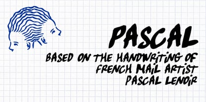 Pascal is a font inspired by handwriting of mail artist Pascal Lenoir.
 - Riot Funky by Beary,
$10.00 Get ready to make a bold statement with our revolutionary font that combines various styles into one. This eclectic, rebellious font is perfect for anyone looking to add an unpredictable touch to their designs. Whether you're creating posters, templates, or any other type of design, this font will help your work stand out and leave a lasting impression. Don't settle for ordinary, upgrade to this bold and daring font today and let your designs do the talking.
 - La Taqueria by Sudtipos,
$39.00 Mexico’s storied culture is one of the most recognizable today. Its amazing vibrant art and delicious foods have made the leap to influence many parts of the world in recent years. This proud, intense and diverse identity was the inspiration behind La Taqueria, a set of four fonts that express different characteristics of Mexican pop culture. The heavy and spicy, the light and gentle, the constant dynamism, all come together with one rhythm to produce an explosion of personality. Just like its predecessors Distillery and Scrapbooker, the La Taqueria set contains down-to-earth alphabets perfect for chalkboard art and handmade design. All the fonts include alternates and ligatures, providing plenty of variation for that spontaneous appearance everyone is looking for these days.
 - FS Split Sans by Fontsmith,
$80.00 Quirky and irregular FS Split is no ordinary typeface. Its irregular proportions make it unique, with round letters appearing wide, and straight letters narrow. Other quirks include its eclectic crossbars – the uppercase ‘A’ has an unusually low bar, while the bar on ‘G’ is particularly long. The uppercase has many interesting features in fact, including large counters, closed terminals on certain letters like ‘J’, and a cap-height that lines up with ascenders. The lowercase also holds surprises – the dots on ‘i’ and ‘j’ are unusually large, and some characters, such as ‘g’, feature double-storey counters. An extreme but stylish italic The italic versions of FS Split Sans and Serif are particularly striking. While similar in style to their upright, Roman versions, they take on a larger-than-usual 18-degree angle, making the forward-slant more dramatic. Although the main purpose of any italic is to help words and phrases stand out, this unique execution helps to make the italic variants of FS Split stylish fonts in their own right – they would work brilliantly on magazine covers, in titles and headlines, pull quotes, and even used commercially in logos and corporate branding. Serif and sans: a split personality FS Split Sans and Serif have their differences but also their similarities, contrasting and complementing each other perfectly. This ‘love hate’ relationship inspired the name of the typeface family, and means the two variants provide a versatile, typographic palette for use in graphics and branding. While its proportions are similar to the sans, the serif has a bigger contrast between its weights of bold, regular and light, bracketed serifs, and different styles of terminals, some being straight and others ball-shaped. FS Split Sans has more subtlety and simplicity, with a smaller weight contrast, less flamboyant terminals, and more consistent counter sizes. The two variants are distinct yet alike, so can be used successfully either in isolation or together.
 - FS Split Serif by Fontsmith,
$80.00 Quirky and irregular FS Split is no ordinary typeface. Its irregular proportions make it unique, with round letters appearing wide, and straight letters narrow. Other quirks include its eclectic crossbars – the uppercase ‘A’ has an unusually low bar, while the bar on ‘G’ is particularly long. The uppercase has many interesting features in fact, including large counters, closed terminals on certain letters like ‘J’, and a cap-height that lines up with ascenders. The lowercase also holds surprises – the dots on ‘i’ and ‘j’ are unusually large, and some characters, such as ‘g’, feature double-storey counters. An extreme but stylish italic The italic versions of FS Split Sans and Serif are particularly striking. While similar in style to their upright, Roman versions, they take on a larger-than-usual 18-degree angle, making the forward-slant more dramatic. Although the main purpose of any italic is to help words and phrases stand out, this unique execution helps to make the italic variants of FS Split stylish fonts in their own right – they would work brilliantly on magazine covers, in titles and headlines, pull quotes, and even used commercially in logos and corporate branding. Serif and sans: a split personality FS Split Sans and Serif have their differences but also their similarities, contrasting and complementing each other perfectly. This ‘love hate’ relationship inspired the name of the typeface family, and means the two variants provide a versatile, typographic palette for use in graphics and branding. While its proportions are similar to the sans, the serif has a bigger contrast between its weights of bold, regular and light, bracketed serifs, and different styles of terminals, some being straight and others ball-shaped. FS Split Sans has more subtlety and simplicity, with a smaller weight contrast, less flamboyant terminals, and more consistent counter sizes. The two variants are distinct yet alike, so can be used successfully either in isolation or together.
 - Ebony by TypeTogether,
$35.00 Some typefaces need time to ripen; Burian and Scaglione made the first sketches for Ebony back in 2008, but it took a few years of maturing in a drawer to be developed into a multi-functional type family. While keeping in tune with TypeTogether’s focus on complex typographic structures needed for magazine, newspapers and books —whether printed or digital—, Ebony goes far beyond editorial use and promises great performance in branding and advertising. The range of dark weights with taut and powerful curves can boost any headline, while the lighter styles create an approachable and clean feel in blocks of continuous text. Ebony does not fall short on aiding legibility either; letterforms have a distinct direction of ductus and features like the top serif on ‘l’ help making them clearly distinguishable from each other. It is a type family that cleverly seeks a balance between the openness and legibility of humanist sans serifs and the striking and more regularised character of grotesques. The letter-shapes feature generous counters and open terminals with crisp angles, and daringly grow both in colour and width as the fonts get bolder. Infused with this strength, Ebony also shows a quirky side in some of her shapes; the vertical fractions, the at-symbol, the old-style numbers, … The predominantly slanted style of the italics is broken up in some letterforms, such as ‘a e f l’, that are more in line with a classic cursive appearance. This, together with a forceful italic angle, ensure a change in texture within a block of text, despite sharing the same letter weight and width with the uprights. With 18 styles, tending towards the heavier part of the weight-spectrum, this face has a powerful quality!
 - Alfie by Monotype,
$29.99 Alfie™ is lively, friendly, inviting and easy on the eyes. What more could you want in a script? How about four flavors of the same design? Alfie Script is a delightful connecting script with a touch of comfortable elegance. Use it for everything from social announcements to headlines and packaging. Alfie Casual is a little more laid-back with letters standing on their own. It works great in short blocks of text copy, subheads and navigational links. Alfie Informal has spirited serifs and its own demeanor, while Alfie Small Caps does a fine job of supporting its other siblings. There’s an immediacy to words and messages set in these lighthearted confections. Jim Ford was practicing drawing with a new brush pen when the inspiration for Alfie came to him. He had filled several pages in a notebook with letters and, at one point, realized that there might be a typeface among them. As it turned out, there were four. The process, however, wasn’t choosing one design and modifying it. The makings of all the designs were on the pages. It was just a matter of culling out the right collection of characters to build the foundations for the four flavors of Alfie. Because they share the same family roots, each design in the Alfie family can be paired and intermixed. Ford admits that there’s a hint of Emil Klumpp’s 1950s Murray Hill typeface (https://www.myfonts.com/fonts/bitstream/murray-hill/) in the Alfie family. Just enough to give the design a 50s vibe. (Some fashions never go out of style.)
 - Space Colony by Dharma Type,
$19.99 Before the original sketches, I had imagined and dreamed this font was used for side characters of retro robot animations such as Gundam and Ideon. But the sketches were put in a PENDING folder. It was a few years ago. In the begining of 2011, I restarted working with the sketches to complete as a font file. Detail and some shape were improved retaining the original concept and they were completed, then named ‘Space Colony’. Just as the name implies, this wide and geometric font family consisting of six weights was designed targeting at use for futuristic product of game, movie, logo and so on. Not only that but the rounded shape makes a lovely, cute and soft impressions so this font is also suited for cartoons, animations and character merchandise too. We released 4 big Sci-Fi families in 2013. Check it out! Clonoid Controller Geom Graphic Space Colony
 - Core Rhino by S-Core,
$29.00 Core Rhino is a contemporary typefamily designed by S-Core. The fonts have the mood of brushed feeling and come across as soft and gentle. Core Rhino displays warmth through its roundness and curved letterforms. Also it is legible in prints and on screens. The Core Rhino family consists of 7weights (Thin, Extra Light, Light, Regular, Bold, Heavy, Black) plus matching italics. The OpenType fonts contain complete Latin 1252, Cyrillic, Central European 1250, Turkish 1254 character sets. Each font includes proportional figures, tabular figures, numerators, denominators, superscript, scientific inferiors, subscript, fractions. If you are looking for a sans serif style font which is practical and friendly, get this family and save your time.
 - Arlista by CBRTEXT Studio,
$15.00 Arlista is a stylish, classy and modern handwritten font with many alternative styles for your beautiful project. We make this font carefully so that each letter can be accessed well. Alternatives to the letters a-z, beautiful decoration, and the ligatures make your project more elegant and classy. Arlista also has multilingual support and is PUA encoded. Features : 350+ Glyphs Ligatures Alternates Simple installations Standard Uppercase and Lowercase Alphabet Numbers and Punctuation Swash Stylistic Set Open Type Features PUA Encoded Multi-lingual Support
 - Supporting Cast JNL by Jeff Levine,
$29.00 Supporting Cast JNL is a hybrid of similar designs for hand lettering found on title cards from two morality photoplays from 1936 dealing with drug abuse, "Cocaine Fiends" and "Marihuana" respectively. The films were produced with the hope of educating the public against the dangers of illicit drugs, but they have taken on a cult status because of the dated approach to the problem. Despite all this, it is the Deco-influenced hand lettering which is being celebrated in this font release, not the subject matter of the films.
 - Vignettic by Allmo Studio,
$19.00 Vignettic font comes with a retro, modern, and vintage touch. Inspired by the dynamic culture, sign, and badges design. Vignettic Script comes with uppercase, lowercase, numerals, punctuations and so many variations on each character include OpenType alternates. This font is great for your creative project such as logos, posters. invitations cards, packaging, badges, logotype, apparel design, and labels. But don't let us restrain your imagination of course. Work well on both vintage and modern designs. You can see our design implementation on preview images to check the resulting sample. Vignettic Font looks Perfect for use in anything from Branding, Web, Packaging, Etc.
 - Workstation Clutter by Zang-O-Fonts,
$25.00This typeface came about when playing with felt tip marker settings in Corel Painter and is derivative of my own handwriting. Up until Workstation Clutter, all of my fonts were designed on paper, then scanned or reproduced into a digital format. With the use of Painter, the non-digital steps were removed, making this the first fully-digital Zang-O-Fonts typeface. Brian J Bonislawsky of the Astigmatic One Eye Typographic Institute helped round out the character set and additional needed characters. The name was inspired by an ex-girlfriend's disorganized desk. - Kurato by Gatype,
$10.00 Kurato font with a simple natural and comic style, you can take advantage of any occasion one of the beautiful ways to highlight your best holiday celebrations, because this font will be the driving force for purposes such as cover design, wedding invitations, parties, graduations, birthdays , gatherings, etc. Kurato font if you want to use for your work this font can be used easily and simply because there are many features in it contains a full set of lowercase and uppercase letters, various punctuation marks, numbers, and multilingual support.
 - Toffee Display by Vástago Studio,
$20.00 Toffee Display is a sans serif project inspired on Gill sans, Helvetica and Eurotstile italics. This project is designed for food packaging, candies, commercial, and fast food. I recommend combining it with a light and calligraphy font to get absolute contrast. That is it, Thanks for buy it and work with it!
 - Biennale by Latinotype,
$29.00 Biennale is a geometric typeface with a strong character and a large x-height which make it an excellent choice for a wide range of applications, such as headlines or branding. Although common in style, Biennale distinctive details and color on the page allow users to create really unique designs. The font comes in 11 weights, from Hair to Heavy, and includes matching italics. As you would expect from Latinotype, this typeface comes with a standard set of 417 characters that support over 200 Latin-based languages.
 - HS Alnasma by Hiba Studio,
$69.00 Hs Alnasma is an Arabic display typeface, under “titles” category. It is useful for book titles, creative designs and modern logos. Also, it is used when a contemporary and simple look is desired that can fit with the characteristics of Latin fonts where horizontal parts are thinner than vertical ones for use in technical and engineering company. The font is based on some modern lines of Kufi calligraphy along with some derived ideas of Latin fonts, maintaining the beauty of the Arabic font and its fixed rates. This font supports Arabic, Persian, Urdu, Kurdish and Pashto and also includes Basic Latin and consisting of two weights (regular and bold) which can add to the library of Arabic and Latin fonts contemporary models that meet with the purposes of various designs for all tastes.
 - Clown by Tereza Smidova,
$20.00 Layering of individual styles forms the basis for the sans typeface Clown. The font family comprises 18 various styles that precisely fit together. Simply cover one style over another to create over 150 original typefaces to freshen up your work. Clown is a striking headline font that would work well for a retro-style café, bar or club and evokes the style of a Wild West saloon. A similarly decorated typeface was popular for decorating posters and advertisements in the early 19th century. The font family contains uppercase letters and diacritics for most Latin languages, figures, arrows and currency symbols.
 - Aardvark Dreams by Hanoded,
$15.00 Aardvark Dreams… Yes, I guess this is the first font ever to have an aardvark in its name! Aardvark Dreams is a bit of an unusual font. It is didone-ish in style, but the glyphs are slightly warped, giving them an almost liquid appearance. The Vark is a cute font for children’s books, games, posters and artwork. It could also work on psychedelic record-sleeves, but I guess they don’t make ‘em no more. Aardvark Dreams comes with a bunch of ligatures and a whole lotta diacritics!
 - Streeter JNL by Jeff Levine,
$29.00 Streeter JNL is an all caps titling font based on the classic Beton Bold Condensed typeface. The Beton family of fonts was a printer's favorite for decades.