10,000 search results
(0.065 seconds)
- Old Buddy by Awanstudio,
$19.00 Old Buddy is an elegant handwritten script font. Get inspired by its unique shape and character! Great and It will turn any design project stand-out!
 - Serious Sans by Ogentroost,
$29.00 Friendly by shape, serious by structure. Serious Sans is a font for many occasions and it includes an alternate 'a' and 'g' for primary school use.
 - Flavor sans by 4RM Font,
$18.00 Suitable for use in casual themed design applications, this font is made with a unique shape and condensed width, as well as a strong authenticity value.
 - PC.DE - 100% free

- P22 Typewriter by IHOF,
$24.95 This font is not overly distressed, nor is it overly clean. It is a typewriter font. It is perfect when you want a document to look like it was made on a typewriter. This font is primarily based on the typewriter used for a typographic conference document from 1966 in Mainz Germany. The model and age of the typewriter used is not known. Additional characters were sourced from other vintage typewriters and others were designed to complete the full character set.
 - ITC Beesknees by Monotype,
$29.00ITC Beesknees font is the work of David Farey. He credits a number of sources as inspirations for his work, including Pushpin Studio, Peter Max, Bob Zoell and the Marx Brothers, whose typographic titles he admired as much as their cinematic humor. He was going to name the font 'Horse Feathers' or 'Monkey Business' after Marx Brothers films, then the name got shortened to 'Business', which then got transformed to 'Beesknees'. ITC Beesknees font contains a capital and small caps alphabet. - Lucida Handwriting by Monotype,
$40.99 Lucida Handwriting is a casual, connected script designed for smooth and fun reading on screens and in print. Its relaxed personality and vigorous energy sends a distinctive message. Lucida Handwriting was originally released in one weight. It is now available in five weights, from Thin to Black. Lucida Handwriting was designed by Kris Holmes and Charles Bigelow based on historic blackletter style cursives. As with other joining script typefaces, all capital letters usage is not recommended: it is best to use upper and lowercase for optimal legibility. Lucida Handwriting is part of the Lucida superfamily of fonts from Bigelow & Holmes. Lucida is highly regarded for legibility and its extensive range of type styles. The Lucida Handwriting typeface family has a Standard character set with 255 glyphs supporting the basic range of Latin languages.
 - DIN 2014 Rounded by ParaType,
$40.00 DIN 2014 Rounded is an extension of the industrial sans serif DIN 2014. It combines the softness and friendliness of the rounded endings with the seriousness and stability of the original typeface. Not a typical childish rounded font. DIN 2014 Rounded works well for medical or architectural topics, headings on the web or in periodicals, brand identity, packaging, and, thanks to the DIN proportions, for signage. DIN 2014 Rounded includes six styles ranging from extra light to extra bold, corresponding to the upright styles of DIN 2014, as well as a variable version. The typeface supports all European languages based on Latin, Cyrillic, and Asian Cyrillic (Tatar, Kazakh, Kyrgyz and other languages). Isabella Chaeva and Alexander Lubovenko worked on the rounded version. The typeface was released by Paratype in 2021.
 - Hucks Serif by S6 Foundry,
$25.00 Hucks Serif is a contemporary serif typeface that seamlessly incorporates large open counters and gracefully curved and rounded forms, resulting in a glyph set that exudes a modern and elegant aesthetic. The pronounced contrast between thick and thin strokes imparts Hucks Serif with a harmonious and stylish appearance. Meticulously crafted to infuse letterforms with an inherent elegance, this font lends a distinctive style and atmosphere to every project it graces. Its versatile nature makes Hucks Serif particularly well-suited for many applications, including but not limited to editorial, headlines, large-format prints, brand identities, social media graphics, advertising materials, editorial designs, posters, magazines, logos, headings, and more. The adaptability of Hucks ensures it can effortlessly enhance the visual appeal and impact of a diverse range of creative projects.
 - Sella Mella by Crowntype Studio,
$12.00 Sella Mella is a script type family of four fonts. It is inspired by Lovely Fonts and has a soft and welcoming look. Sella Mella can be used for branding, packaging and wherever you need a script font that is easy to read and smooth. Sella Mella has many ties, strokes, and alternative characters that will make your designs unique and beautiful. You can also purchase Sella Mella as a Font Family and adjust the weight of Sella Mella seamlessly between Italic and Bold weights. Note that you need design software that supports the Font Family. Thank You...
 - TE New Sarah by Tharwat Emara,
$35.00 Its one of the NEW SARAH ( Arabic – LATIN – URDO) fonts, a spontaneous free line characterized by beauty and speed of reading. To be used in advertisements, writing titles, magazines, cartoons, films, serials, comics and plays. NEW SARAH font is one of the ( Arabic – LATIN – URDO) fonts. It is the most common font and is written in most Arab countries because it has the potential to be written in a narrow space when compared to other Arabic fonts. It is used in the titles of books, magazines, daily newspapers, commercials, banners, advertising, holiday cards, newspaper headlines, Introduction to students.
 - Brooldy by Gatype,
$10.00 Brooldy is a beautiful mono-line font, perfect for logo design, branding, apparel design, signage, posters, wedding invitations and more. My goal with this font was to create an easy-to-read script font that would work for a variety of purposes. Brooldy are encoded with PUA Unicode, which allows full access to all additional characters without having to design special software. Mac users can use Font Book and Windows users can use Character Map to view and copy any additional characters to paste into your favorite text editor/application. Brooldy .OTF Hope you enjoy this font!
 - Mozaquen by Javatypestd,
$10.00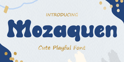 Introducing Mozaquen is a cute font with a modern style and made in a way that follows current trends, a quirky font perfect for all of your craft projects! Mozaquen best uses for Logotype, heading, cover, poster, logos, quotes, product packaging, header, merchandise, social media & greeting cards and many more. This font is also support multi language. What’s Included : - Standard glyphs - Works on PC & Mac - Simple installations - Accessible in Adobe Illustrator, Adobe Photoshop, Adobe InDesign, even work on Microsoft Word. - PUA Encoded Characters – Fully accessible without additional design software. - Fonts include multilingual support Thank you for your purchase! Hope you enjoy our font!
 - Japan Gate by Senekaligrafika,
$12.00 "Japan Gate" is a Japanese-style display font inspired by traditional Japanese gate (Torii Gate) .This font is a sans serif font with a authentic japanese look and feel designed as unique as possible to create a beautiful and easy-to-read combination of sentences. This font is also very flexible for you to use in your various projects, ensuring that your project has a fantastic and appealing appearance that will be remembered by all audiences. Logotypes, food banners, branding, brochure, posters, movie titles, book titles, quotes, and more – may all benefit from this font. The owner of endless possibilities!
 - Soigka Display by Gatype,
$14.00 Soigka Display is a modern font with a unique font. This customizable font will look great on a variety of design ideas such as, inding styles, high contrast and light weight fonts perfect for feminine logo signs, fashion & editorial design heads, branding projects, Clothing Branding, packaging, magazine titles, advertisements, T -shirts, postcards, valentines, posters, invitations, weddings, branding projects, social media posts, magazines, book covers and more! This will add a fun and friendly touch to any of your projects! This font is PUA encoded which means you can access all the glyphs and sweeps easily and more.
 - Vista Nordic by VistaType,
$9.00 Vista Nordic is a minimal and Modern font family. Made for text display purposes, Nordic brings a contemporary and Robust appearance to your design projects with a bold style, making this font suitable as the Prior heading and common text on a website or layout design. The Nordic family includes 18 fonts in a variety of weights and types. 18 fonts 2 font styles Upper / lowercase glyphs Multilingual Webfonts included Free updates and feature additions If you have any questions about licensing, need help with a typeface, or would like to request a new feature, contact us at hello@vistatype.com. Thank you!
 - Bekinder by Gatype,
$2.00 Bekinder is a modern serif font with a unique font. This customizable font will look great on a variety of design ideas such as, inding styles, high contrast and light weight fonts perfect for feminine logo signs, fashion & editorial design heads, branding projects, Clothing Branding, packaging, magazine titles, advertisements, t -shirts, postcards, valentines, posters, invitations, weddings, branding projects, social media posts, magazines, book covers and more. This will add a fun and friendly touch to any of your projects! This font is PUA encoded which means you can access all the glyphs and sweeps easily and more.
 - TE Sara Modern by Tharwat Emara,
$20.00 Its one of the SARA modern ( Arabic – LATIN – URDO) fonts, a spontaneous free line characterized by beauty and speed of reading. To be used in advertisements, writing titles, magazines, cartoons, films, serials, comics and plays. SARA MODERN font is one of the ( Arabic – LATIN – URDO) fonts. It is the most common font and is written in most Arab countries because it has the potential to be written in a narrow space when compared to other Arabic fonts. It is used in the titles of books, magazines, daily newspapers, commercials, banners, advertising, holiday cards, newspaper headlines, Introduction to students.
 - Ds Hand by CozyFonts,
$25.00 Ds Hand Font Family is a handwritten font designed by Tom Nikosey, based on Danielle Nikosey’s printing style. Tom is an American Graphic Designer specializing in Typographic Design and Illustration. Ds Hand is available in Regular & Bold weights CozyFonts Foundry is Tom's intro into the world of font design. Ds Hand Family is a tribute and gift to his daughter. Ds Hand, at first glance, gives a hand drawn aesthetic feel but on closer inspection, when set as text, this font gives off a cool, organized, legibly organic read. Also available in Bold. This is the 5th Hand Drawn Font Family from CozyFonts!
 - Jealousy Heart by Bosstypestudio,
$12.00 Jealousy Heart is a script type family of four fonts. It is inspired by Lovely Fonts and has a soft and welcoming look. Jealousy Heart can be used for branding, packaging and wherever you need a script font that is easy to read and smooth. Jealousy Heart has many ties, strokes, and alternative characters that will make your designs unique and beautiful. You can also purchase Jealousy Heart as a Font Family and adjust the weight of Jealousy Heart seamlessly between Italic and Bold weights. Note that you need design software that supports the Font Family. Thank You...
 - Lacoste Foliage by Gatype,
$14.00 LACOSTE Foliage is a modern serif font with a unique font. This customizable font will look great on a variety of design ideas such as, inding styles, high contrast and light weight fonts perfect for feminine logo signs, fashion & editorial design heads, branding projects, Clothing Branding, packaging, magazine titles, advertisements, T -shirts, postcards, valentines, posters, invitations, weddings, branding projects, social media posts, magazines, book covers and more ! This will add a fun and friendly touch to any of your projects! This font is PUA encoded which means you can access all the glyphs and sweeps easily and more.
 - Moonlight And Wine by The Gelato,
$12.00 The Moonlight & Wine Font is a Handwritten Monoline Font that is perfect for the Neon effect! It can be used as a Neon Handwritten Script Font, Monoline Script Font, Signature Script Font, Summer Handwriting Font, Neon Party Font, Neon Signboard Font, Neon Banner Font, Neon Font for Party Invitations, DJ Logo Font, Y2K Neon Font, Neon Sign Font, Neon Light Font, Neon Wedding Font Perfectly suitable for numerous use such as quotations, banners, logos, product packaging, titles, headers, Business cards, menu lists, and invitation cards! _________________________________ Language Support: Multilingual Support _________________________________ **The preview images are to showcase fonts only and are NOT included.** **The Font comes with a solid version. To add a NEON effect, You can use programs like Canva, Illustrator, Photoshop etc.** _________________________________ 🍦COMPATIBLE PROGRAMS (NOT LIMITED TO): Canva Pro, GoodNotes, Notability, Keynote, Pages, Numbers, Procreate, Photoshop, Illustrator, Cricut, Silhouette, InDesign, Microsoft Word, and more! ++ _________________________________
 - Path 101 - Unknown license

- Pecot - Unknown license

- Poozer by Cool Fonts,
$24.00 Poozer is a hand drawn stencil font that started out as a doodle and ended up on a custom skate deck. It has a nice organic, painted feel. Definitely not your usual stencil font.
 - Nevins Hand by Scriptorium,
$24.00Nevins Hand is our first release of a new collection of fonts based on the designs of Peter Nevins, a San Francisco poster artist who does hand-lettered fonts in the Art Nouveau tradition. - Gmuender Antiqua Pro by RMU,
$40.00 Inspired by the former hot-metal fonts of Imprimatur, Gmuender Antiqua Pro is a fresh designed versatile and multilingual serif font family. All five styles contain three different forms of numbers and small caps.
 - Kota Datoma by Alcode,
$23.00 Kota datoma an luxury and unique calligraphy font. Carefully designed to work together in harmony that makes it perfect for wedding media, book covers, greeting cards, logos, branding, business cards and certificates, even for any design work that requires unique, formal or luxury. Try Kota datoma, enjoy the richness of OpenType features and let her fun and elegant excitement make you happy and enhance your creativity! You can use this font very easily. Included Multilingual Support And Special Ligatures Your download will include OTF format files. If you do not have programs that support OpenType features like Adobe Illustrator and CorelDraw X Versions, you can access all alternative flying machines using Font Book (Mac) or Character Map (Windows)
 - Andit by Papermode Co,
$20.00 Andit is an unique calligraphy font. Carefully designed to work together in harmony that makes it perfect for wedding media, book covers, greeting cards, logos, branding, business cards and certificates, even for any design work that requires classics, formal or luxury. Try Andit, enjoy the richness of OpenType features and let her fun and elegant excitement make you happy and enhance your creativity! You can use this font very easily. Included multiligual support and special ligatures Your download will include OTF format files. If you do not have programs that support OpenType features like Adobe Illustrator and CorelDraw X Versions, you can access all alternative flying machines using Font Book (Mac) or Character Map (Windows)
 - Lightside by Subectype,
$18.00 Lightside is a brush script font, dapper handwritten font with a personal charm. With quick dry strokes and a signature style, Lightside is perfect for branding projects, homeware designs, product packaging - or simply as a stylish text overlay to any background image. Fonts include multilingual support. Please message me if you're unsure of any language support. Ligatures are also available for several lowercase characters (double-letters which flow more naturally). These are only accessible via software with OpenType capability or a glyphs panel, e.g. Photoshop/Illustrator. Note: in the preview there is a swash. I do not provide swash, I made the swash from the characters "Parenleft or right" and "backslash" I edited it in Corel Draw.
 - Thorletto by HandletterYean,
$13.00 Presenting Thorletto! Created with the influence of the background story of the great franchise Fast and Furious, this font are meant to remind you to not give up, be brave, do your best, fight the good fight and fight for the best thing(s) in your life. This unique font characterized by its stroke of brush on every glyph, it made intentionally with a real brush resulting in a unique, bold, and rough looking font. Thorletto includes a complete set of uppercase and lowercase letters in regular and italic style, also support multi-language, numbers, punctuation, and ligature. It is suitable for various kind of design like clothing, poster, quote, branding, logo, packaging, greeting card, invitation, and many more.
 - New Comer Sans by ave,
$12.00 New Comer Sans is a combination of two ideas. First is my speed writing with flat acrylic marker on boards. And second is to make new bold font something like puffy «comic sans» font. Unstable stems (vertical main lines) give it some playful unserious character. The result is cute funny font. You can use it in short text blocks in huge and medium sizes. For example, for comic books or kids applications. NewComerSans includes: uppercase lowercase more than 480 glyphs which support Latin, Western European, Central European languages (Cyrillic is also included) Hope you are enjoying using New Comer Sans. Please do not hesitate to ask me any questions about the product. (c) Photo credit - Unsplash
 - FacetsNF - 100% free

- JunebugStompNF - 100% free

- UppenArmsNF - 100% free

- SF Piezolectric Inline - Unknown license

- DIN Next Arabic by Monotype,
$155.99 DIN Next is a typeface family inspired by the classic industrial German engineering designs, DIN 1451 Engschrift and Mittelschrift. Akira Kobayashi began by revising these two faces-who names just mean ""condensed"" and ""regular"" before expanding them into a new family with seven weights (Light to Black). Each weight ships in three varieties: Regular, Italic, and Condensed, bringing the total number of fonts in the DIN Next family to 21. DIN Next is part of Linotype's Platinum Collection. Linotype has been supplying its customers with the two DIN 1451 fonts since 1980. Recently, they have become more popular than ever, with designers regularly asking for additional weights. The abbreviation ""DIN"" stands for ""Deutsches Institut für Normung e.V."", which is the German Institute for Industrial Standardization. In 1936 the German Standard Committee settled upon DIN 1451 as the standard font for the areas of technology, traffic, administration and business. The design was to be used on German street signs and house numbers. The committee wanted a sans serif, thinking it would be more legible, straightforward, and easy to reproduce. They did not intend for the design to be used for advertisements and other artistically oriented purposes. Nevertheless, because DIN 1451 was seen all over Germany on signs for town names and traffic directions, it became familiar enough to make its way onto the palettes of graphic designers and advertising art directors. The digital version of DIN 1451 would go on to be adopted and used by designers in other countries as well, solidifying its worldwide design reputation. There are many subtle differences in DIN Next's letters when compared with DIN 1451 original. These were added by Kobayashi to make the new family even more versatile in 21st-century media. For instance, although DIN 1451's corners are all pointed angles, DIN Next has rounded them all slightly. Even this softening is a nod to part of DIN 1451's past, however. Many of the signs that use DIN 1451 are cut with routers, which cannot make perfect corners; their rounded heads cut rounded corners best. Linotype's DIN 1451 Engschrift and Mittelschrift are certified by the German DIN Institute for use on official signage projects. Since DIN Next is a new design, these applications within Germany are not possible with it. However, DIN Next may be used for any other project, and it may be used for industrial signage in any other country! DIN Next has been tailored especially for graphic designers, but its industrial heritage makes it surprisingly functional in just about any application. The DIN Next family has been extended with seven Arabic weights and five Devanagari weights. The display of the Devanagari fonts on the website does not show all features of the font and therefore not all language features may be displayed correctly.
 - DIN Next Devanagari by Monotype,
$103.99DIN Next is a typeface family inspired by the classic industrial German engineering designs, DIN 1451 Engschrift and Mittelschrift. Akira Kobayashi began by revising these two faces-who names just mean ""condensed"" and ""regular"" before expanding them into a new family with seven weights (Light to Black). Each weight ships in three varieties: Regular, Italic, and Condensed, bringing the total number of fonts in the DIN Next family to 21. DIN Next is part of Linotype's Platinum Collection. Linotype has been supplying its customers with the two DIN 1451 fonts since 1980. Recently, they have become more popular than ever, with designers regularly asking for additional weights. The abbreviation ""DIN"" stands for ""Deutsches Institut für Normung e.V."", which is the German Institute for Industrial Standardization. In 1936 the German Standard Committee settled upon DIN 1451 as the standard font for the areas of technology, traffic, administration and business. The design was to be used on German street signs and house numbers. The committee wanted a sans serif, thinking it would be more legible, straightforward, and easy to reproduce. They did not intend for the design to be used for advertisements and other artistically oriented purposes. Nevertheless, because DIN 1451 was seen all over Germany on signs for town names and traffic directions, it became familiar enough to make its way onto the palettes of graphic designers and advertising art directors. The digital version of DIN 1451 would go on to be adopted and used by designers in other countries as well, solidifying its worldwide design reputation. There are many subtle differences in DIN Next's letters when compared with DIN 1451 original. These were added by Kobayashi to make the new family even more versatile in 21st-century media. For instance, although DIN 1451's corners are all pointed angles, DIN Next has rounded them all slightly. Even this softening is a nod to part of DIN 1451's past, however. Many of the signs that use DIN 1451 are cut with routers, which cannot make perfect corners; their rounded heads cut rounded corners best. Linotype's DIN 1451 Engschrift and Mittelschrift are certified by the German DIN Institute for use on official signage projects. Since DIN Next is a new design, these applications within Germany are not possible with it. However, DIN Next may be used for any other project, and it may be used for industrial signage in any other country! DIN Next has been tailored especially for graphic designers, but its industrial heritage makes it surprisingly functional in just about any application. The DIN Next family has been extended with seven Arabic weights and five Devanagari weights. The display of the Devanagari fonts on the website does not show all features of the font and therefore not all language features may be displayed correctly. - DIN Next Cyrillic by Monotype,
$65.00DIN Next is a typeface family inspired by the classic industrial German engineering designs, DIN 1451 Engschrift and Mittelschrift. Akira Kobayashi began by revising these two faces-who names just mean ""condensed"" and ""regular"" before expanding them into a new family with seven weights (Light to Black). Each weight ships in three varieties: Regular, Italic, and Condensed, bringing the total number of fonts in the DIN Next family to 21. DIN Next is part of Linotype's Platinum Collection. Linotype has been supplying its customers with the two DIN 1451 fonts since 1980. Recently, they have become more popular than ever, with designers regularly asking for additional weights. The abbreviation ""DIN"" stands for ""Deutsches Institut für Normung e.V."", which is the German Institute for Industrial Standardization. In 1936 the German Standard Committee settled upon DIN 1451 as the standard font for the areas of technology, traffic, administration and business. The design was to be used on German street signs and house numbers. The committee wanted a sans serif, thinking it would be more legible, straightforward, and easy to reproduce. They did not intend for the design to be used for advertisements and other artistically oriented purposes. Nevertheless, because DIN 1451 was seen all over Germany on signs for town names and traffic directions, it became familiar enough to make its way onto the palettes of graphic designers and advertising art directors. The digital version of DIN 1451 would go on to be adopted and used by designers in other countries as well, solidifying its worldwide design reputation. There are many subtle differences in DIN Next's letters when compared with DIN 1451 original. These were added by Kobayashi to make the new family even more versatile in 21st-century media. For instance, although DIN 1451's corners are all pointed angles, DIN Next has rounded them all slightly. Even this softening is a nod to part of DIN 1451's past, however. Many of the signs that use DIN 1451 are cut with routers, which cannot make perfect corners; their rounded heads cut rounded corners best. Linotype's DIN 1451 Engschrift and Mittelschrift are certified by the German DIN Institute for use on official signage projects. Since DIN Next is a new design, these applications within Germany are not possible with it. However, DIN Next may be used for any other project, and it may be used for industrial signage in any other country! DIN Next has been tailored especially for graphic designers, but its industrial heritage makes it surprisingly functional in just about any application. The DIN Next family has been extended with seven Arabic weights and five Devanagari weights. The display of the Devanagari fonts on the website does not show all features of the font and therefore not all language features may be displayed correctly. - DIN Next Paneuropean by Monotype,
$92.99DIN Next is a typeface family inspired by the classic industrial German engineering designs, DIN 1451 Engschrift and Mittelschrift. Akira Kobayashi began by revising these two faces-who names just mean ""condensed"" and ""regular"" before expanding them into a new family with seven weights (Light to Black). Each weight ships in three varieties: Regular, Italic, and Condensed, bringing the total number of fonts in the DIN Next family to 21. DIN Next is part of Linotype's Platinum Collection. Linotype has been supplying its customers with the two DIN 1451 fonts since 1980. Recently, they have become more popular than ever, with designers regularly asking for additional weights. The abbreviation ""DIN"" stands for ""Deutsches Institut für Normung e.V."", which is the German Institute for Industrial Standardization. In 1936 the German Standard Committee settled upon DIN 1451 as the standard font for the areas of technology, traffic, administration and business. The design was to be used on German street signs and house numbers. The committee wanted a sans serif, thinking it would be more legible, straightforward, and easy to reproduce. They did not intend for the design to be used for advertisements and other artistically oriented purposes. Nevertheless, because DIN 1451 was seen all over Germany on signs for town names and traffic directions, it became familiar enough to make its way onto the palettes of graphic designers and advertising art directors. The digital version of DIN 1451 would go on to be adopted and used by designers in other countries as well, solidifying its worldwide design reputation. There are many subtle differences in DIN Next's letters when compared with DIN 1451 original. These were added by Kobayashi to make the new family even more versatile in 21st-century media. For instance, although DIN 1451's corners are all pointed angles, DIN Next has rounded them all slightly. Even this softening is a nod to part of DIN 1451's past, however. Many of the signs that use DIN 1451 are cut with routers, which cannot make perfect corners; their rounded heads cut rounded corners best. Linotype's DIN 1451 Engschrift and Mittelschrift are certified by the German DIN Institute for use on official signage projects. Since DIN Next is a new design, these applications within Germany are not possible with it. However, DIN Next may be used for any other project, and it may be used for industrial signage in any other country! DIN Next has been tailored especially for graphic designers, but its industrial heritage makes it surprisingly functional in just about any application. The DIN Next family has been extended with seven Arabic weights and five Devanagari weights. The display of the Devanagari fonts on the website does not show all features of the font and therefore not all language features may be displayed correctly.


