10,000 search results
(0.062 seconds)
- Ratgohe by Gatype,
$12.00 Ratgohe is an elegant script font with a contemporary atmosphere and impeccable shapes, inspired by timeless classic calligraphy. Neither too thin nor too thick, balanced and varied, Ratgohe is designed to enhance the beauty of your project. These designs are used for branding, web and editorial design, print, crafts, quotes, It's great for logos, wedding invitations, romantic cards, labels, packaging, name spelling and more. Ratgohe includes OpenType style alternatives, ligatures, and International support for most Western Languages. To enable the OpenType Stylistic alternative, you need a program that supports Adobe Illustrator CS, Adobe Indesign & CorelDraw X6-X7, Microsoft Word 2010 or a later version. How to access all alternative characters using Adobe Illustrator: https://www.youtube.com/watch?v=XzwjMkbB-wQ Ratgohe is coded with PUA Unicode, which allows full access to all additional characters without having to design any special software. Mac users can use Font Book, and Windows users can use Character Map to view and copy any additional characters for pasting into your favorite text editor / application. How to access all alternative characters, using the Windows Character Map with Photoshop: https://www.youtube.com/watch?v=Go9vacoYmBw
 - Spartan by Linotype,
$29.99This typeface is Mergenthaler Linotype’s unlicensed version of Futura, copied weight by weight from Bauer. It was produced in 1939 when Metro failed to gain a significant share of the market, and was later adopted by ATF. The small sizes of Book and Heavy cut for classified are original. - Oceanwide Pro by California Type Foundry,
$47.00 A font perfect for not just one, but many projects! Introducing Oceanwide Pro, a sans that loves to be used in just about any situation! Designed with ultra clean lines and versatility in mind, Oceanwide wants to be your new favorite sans! Oceanwide’s ultra clean letters work anywhere you want to communicate orderliness and competence, and designed to build trust and rapport with your audience. Its wide proportions make it ideal for display and logo use. Oceanwide especially shines for white/bright letters on black/dark backgrounds! That’s because the inside shapes are nearly perfect circles in many weights. Here's a quick video tour of Oceanwide Pro by Dave Lawrence, including all the great things Oceanwide can be used for! We've tested Oceanwide for these industries, with stunning results!: Tech Arts Fashion & Style Business & Branding Corporations Logistics Architecture Food and many more... Oceanwide can be used for: Headers Subheadlines Logos Even body text, if tracked. Print & Screen The styles it can take are also many. It's great for: Modern/minimalist design Flat design Cut out design User Interface (UI) Technical designs In combination with text effects, even for grunge and other situations. And many others... DESIGN FEATURES Simplicity Tall x-height Hand-sloped obliques (italics) Narrow spacing Semi-wide proportions Expert kerning Well proportioned, usable lights & extra lights Large caps Great ALL CAPS MODE Uppercase punctuation Uppercase spacing with California Type Foundry’s Smart Tracking™ Advanced fraction support Proportional lining figures Thick joins Smooth curves Sturdy—great for textures and effects Variable font available Latin Pro character set for Central European languages. That's the writing for over 782 languages and transliterations worldwide! DESIGN STORY—THE FORGOTTEN SANS by Dave Lawrence, Lead Designer, California Type Foundry Adrian Frutiger was the 20th century master of sans, but I didn't realize he had made—not one—but TWO geometric sans! It wasn't until I had purchased the book “Adrian Frutiger: Typefaces”. I had hoped to someday meet Adrian Frutiger, but he passed away that very same year. Here is the story of Frutiger's forgotten sans. Back in 1968, Frutiger was approached by Pentagram to make a design for British Petroleum. They wanted a "new version of Futura". However, they wanted him to make a couple adjustments. First, they felt that Futura was "too fiddly." By this, they meant that it narrowed too much at the joins. (Joins are for example where the round and straight parts of the 'd' meet.) This is something that is necessary for small print text (to prevent ink clogging), but is not necessary at large sizes. Second, they wanted it to be entirely geometric, using the circular shape with minimal optical corrections. Unfortunately this font was not even used very consistently in the BP brand. A haphazard mix of Futura and Frutiger's BP font ensued. It was then replaced by another font design very soon after. My design is different in several ways. First, the commas and quotes are a more modern style. I tried his original commas, but these just didn’t work to 21st century eyes. Second, in his drawings, Frutiger went for a more standard u with a downstroke on the right. However, Oceanwide has a simpler u. Third, I made more optical adjustments. At the direction of his employer, Frutiger reluctantly put no font optical corrections into the letters. So I think my optical adjustments are similar to what Frutiger would have wanted. Fourth, I extended the weight into the light and extra light ranges. Fifth, the rest of the font I created according to the principles of Adrian Frutiger, but with no sources for inspiration. Here is Frutiger’s design philosophy, in his own words: “If you remember the shape of your spoon at lunch, it has to be the wrong shape. The spoon and the letter are tools; one to take food from the bowl, the other to take information off the page... When it is a good design, the reader has to feel comfortable because the letter is both banal and beautiful.” The words about the spoon were the ones I kept in my mind as I tried to make the curves ultra smooth, and the shapes ultra simple. Hopefully this font is a worthy successor to the font that inspired it. Released on the 93rd birthday of Adrian Frutiger, to celebrate the life and achievements of this amazing designer. ——————— Simplicity. Versatility. Oceanwide.
 - Moho by John Moore Type Foundry,
$40.00 Moho is a broad family of types inspired by the burgeoning modernism of the early twentieth century. Moho introduces an unconventional style in the form of his glyphs which aims to impregnate the text compounds thus a distinctive aesthetic sobriety and elegance while creating a flow of practical reading. The Moho family consists of a wide range of various weights. Thought for innovative text composition, Moho covers all shades of Medium, Regular, Light, ExtraLight to delicate Thin. Moho has a square shape letter style, provided with a competent OpenType programming for Moho OT family and basic functions for Moho Std family. Among the family characteristics OT has features such as small caps for letters and numbers, stylistics alternates, swash letters where "t" is extend over others, giving the typeface that particular style ideal for headlines, ligatures for pairs and triplets of letters, fractions and ordinals. In addition, each comes with its weight set italics. Moho has a character set to compose texts in European languages of east and west with over 600 glyphs. Moho is a letter in resonance for general topics like sports, art. technology trends, fashion, tourism and transport. There exist two groups of Moho Family OT = Full OpenType Features and full set of glyphs Std= Basic OpenType Features and less glyphs
 - Blue Goblet Frames and Vignettes #2 by insigne,
$22.00 The designer favorite Blue Goblet series has been extended once again with Blue Goblet Frames and Vignettes #2. These animated and lively frames and vignettes can be resized easily without any loss of quality, and can easily be converted to outlines and modified. Combining them to form unique compositions or inserting them into chapter headings are just a few ideas for these versatile ornaments. Please see the sample .pdf to see all 96 Frames and Vignettes in action, and be sure to check out the original Blue Goblet Frames and Vignettes, Blue Goblet brush script and Blue Goblet Ornaments, Emblems and Florals.
 - Pen Swan by Great Lakes Lettering,
$40.00 Pen Swan is the latest offering from Jen Maton & Great Lakes Lettering. A Pen Swan is the species of an adult female swan. It is a fitting name as it contains ‘pen’ in the name which is the tool used to draw the letters. Pen swan demonstrates the same grace as the most elegant type of bird in the animal kingdom. It has a rolling gliding quality, as if the letters are waves forming spontaneously from your computer screen. Pen Swan is optimal for any project that needs an elegant touch. Great for Wedding Invites, Stationery, and Decorative prints.
 - Giraffe Skin by Scholtz Fonts,
$19.00 GiraffeSkin is an exciting, contemporary font. The popularity of the "animal skin" look in contmporary clothing and soft furnishing design make GiraffeSkin a must for designers on the cutting edge. It is best used for headings and where you intend to make a strong impact, with an African wildlife look. The font comes in two versions, one based on the popular Kassena font, the other based on Zim, one of Scholtz Fonts new designs.
 - Irrlicht by Aarhaus,
$30.00 Irrlicht is based on C. H. Kleukens’ 1923 typeface Judith Type . Whilst Dunkle Irrlicht is a fairly faithful rendition and extension of Kleukens’ typeface, the Licht style was initially added as a stand-alone stencil version; yet, the two styles work perfectly together – for different nuances, for emphasis or simply stacked/layered. Irrlicht is equipped with upper- and lowercase ligatures, contextual and stylistic alternates, fractions, superior and inferior figures, extended language support and a few extra goodies. Additional information – How Irrlicht came to life Christian Heinrich Kleukens cut his Judith Type in 1923, at the peak of German expressionism, exclusively for publications with the Ernst-Ludwig-Press, such as a limited series of biblical prints – the first being the Book of Judith , hence the original’s name. I stumbled upon this typeface a couple of years ago in a nice little 1930 booklet of the Gutenberg-Gesellschaft and was struck by its forceful darkness on paper and its seemingly simple, crude letterforms. The lack of a long-ſ in the final version of Judith Type – quite unusual for a German typeface of that time – adds to this feel of crudeness and spontaneity*. Judith Type seemed to me like a semi-blackletter cousin of Rudolf Koch’s typeface Neuland (cast in the same year). Besides its apparent affinity with expressionism, it reflects a lot of that deeply spiritual craftsmanship of the era – much like Neuland. A few months later, when I was working on a stencil project and looking for a typeface that could be cut into thin wooden plates easily, I remembered those dark, sharp letters that seemed to be lacking any curves at all. After enlarging a few letters and tracing them by hand, the whole set was redrawn digitally, using only straight lines. As for spacing, the goal was to keep the letters tight but to avoid touching characters – without ironing out all the original’s tension and rhythm. Deliberate kerning, subtle contextual alternates and ligatures help to deal with critical glyph combinations. Two additional versions were developed: a stencil version with open counters and, in reference to a popular style of the 1920s and inspired by dry, cracked wood, an inline version. These two additional styles were later merged into one font – Lichte** Irrlicht was born. — AARHAUS * Consequently, the original typeface’s German eszett is simply a ligature of the “round s” and standard z . In some of his publications, Kleukens dispenses with using eszett altogether and sets double s instead. Irrlicht , however, does feature a more common eszett (ß); the original, among other more faithful letter forms, can be accessed via the stylistic sets feature ** licht – literally bright – being the German term for inline typefaces – not to be confused with leicht ( light )
 - Kagok by Twinletter,
$15.00 Introducing Kagok Blackletter font Kagok is typography designed with a classic blackletter font style, resulting in a bold and unique anatomical shape. Kagok is a strong and vintage font inspired by the classic Victorian typeface style combined with a strong style so that it looks bold in your projects. This font is perfect for use on projects that need a futuristic, vintage, and elegant style.
 - Comet Hotspur by Putracetol,
$28.00 Comet Hotspur - Display Typeface Font is a bold and distinctive font that seamlessly blends modern and retro aesthetics. With its unique character shapes, bold strokes, and alternative letterforms, this font offers a captivating typographic solution. The font exudes a retro bold and vintage vibe while maintaining a fresh and contemporary edge. Whether you're creating logos, branding materials, titles, posters, film graphics, cards, quotes, or landing page titles.
 - Heroline by Graptail,
$15.00 Introducing Heroline, a retro-inspired font that evokes the 1950s to 90s nostalgia. This font is perfect for creating vintage-themed designs and giving it a touch of nostalgia and personality. Heroline features a soft, solid design with curved corners and a unique letter shape. This font also includes a variety of alternative characters and ligatures, allowing you to create many different looks with the same font.
 - Griaste by Twinletter,
$18.00 Griaste Groovy is a cool, quirky, and fun font that can be used in many ways in your special projects. It has high contrast between thin and thick lines and shapes, which makes it beautiful and visually unique from many existing fonts. This font has alternate and ligature features to add a quirky feel to your project. Maximize your design by using this font right now.
 - Beauchef by Latinotype,
$26.00 Beauchef is a sans serif typeface originally created to meet the needs of Centro de Modelamiento Matemático de la Universidad de Chile (University of Chile Center for Mathematical Modeling). Beauchef is a typeface with rough strokes that features subtle optical compensation and does not strictly follow the laws of perception. This typeface might not be too cheerful, but shows a very particular idiosyncrasy of form. Beauchef is as tough as advanced mathematics; however, it is as legible and exact as numbers themselves. This is an avant-garde typeface that resembles the development of mathematics, but at the same time it is as conservative, calm and respectful as clients who require its services. Beauchef is so astonishing as mathematical formulas that mathematicians work with, but at the same time it is as humble as resulting figures.
 - DIN Neue Roman by Vibrant Types,
$43.00 The DIN Neue Roman adds something new to the established concept of the DIN 1451 type’s technical origin. As a serif counterpart it leaves its static appeal to bring some friendliness into this industrial idea. With more contrast than a slab serif and the dynamic stroke of transitional type DIN Neue Roman defies all conventions, but keeps its legibility. To have enough resources for diverse and complex typography this type family offers 7 weights with italics, small caps and all kind of opentype features. Type designer Philip Lammert likes to play with the great potential of contradictions. That brought him to this design combining two essentially different classics. DIN Neue Roman is part of his 2015’s master thesis at the HAW Hamburg which was supervised by Prof. Jovica Veljovic.
 - Ravensara Serif by NaumType,
$19.00 Ravensara Serif - elegant high contrast classic serif. Style of the typeface originates in a classic Didone but took a step to simplify some letter forms and make Didone feel more contemporary. Ravensara Serif is a part of the Ravensara superfamily, united by the same anatomy, which currently also includes Ravensara Sans and Ravensara Stencil. Ravensara Serif, despite its ancient roots and due to simplified and smoothed forms, can be used in a variety of different styles. It’s a perfect choice for bold headlines, oversize typography, fashion logos, branding, identity, website design, album art, covers, posters, advertising, etc. It is available in 7 weights, including Thin, Light, Regular, Medium, SemiBold, Bold and Black. Ravensara Serif extends multilingual support to Basic Latin, Western European, Euro, Catalan, Baltic, Turkish, Central European, Pan African Latin and Afrikaans.
 - Gitan Latin by Rosetta,
$60.00 Gitan is a flared sans serif, reminiscent of engraving and stone carving. Sturdy and informal, the design features a moderate contrast that provides durability for text setting. Crisp design details like cuneiform head serifs and deeply cut wedge terminals give Gitan a sculptural appeal – a quality desired for all things display. Gitan’s expressiveness evokes the nuances of forms crafted directly in raw materials. The human touch provides vitality so often absent from purely mechanical designs. Pairing a rhythmic pattern with classic construction makes Gitan shine in text. Its natural look reflects a tangibility that thrives in wooden and rock-solid materials. Gitan’s habitat is at the crossroads of editorial and packaging work, grounded by a feeling of substance, but finished by an artisan’s handicraft. By nature, Gitan is flexible and willing to take risks.
 - Leco 1976 by CarnokyType,
$- LECO 1976 is a headline display typeface in OpenType format. The title at the 1976 bottle of Lečo became an inspiration for creating this font. Besides the regular weight of the font, the font is drawn in light and bold font styles too, while each of these typefaces consists of a special alternative of an embedded diacritic. The font contains several specific styles as Stencil, Pixel, Tride, Shadow which combinations offer interesting possibilities for the typesetting. The metrics and kerning of every glyph of the font (except several glyphs in Bold) are identical. All the signs share the same character and size of the capital letters. This font is best used on strong posters or as a headline display typeface.
 - Ring Wind by Ochakov,
$9.00 Typography exists to honor content. Like oratory, music, dance, calligraphy-like anything that lends its grace to language – typography is an art that can be deliberately misused. It is a craft by which the meanings of a text ( or its absence of meaning) can be clarified, honored and shared, or knowingly disguised. When we long for life without difficulties, remind us that oaks grow strong in contrary winds and diamonds are made under pressure. The Ring Font Family continues to grow strong.
 - Open Case JNL by Jeff Levine,
$29.00 Open Case JNL is the distant cousin to the 2009 release by Jeff Levine Fonts called Cold Case JNL, as both were based on sets of lettering stencils designed and manufactured by the Huntington Oil Cured Stencil Company (originally of Huntington, New York and later of Delray Beach, Florida). While sharing similar design traits, there are enough differences to have both type designs work well together in a complimentary setting. Open Case JNL is available in regular and oblique styles.
 - Minora by Alex Meier,
$40.00 Minora is a contemporary sans serif type family of three weights. Glyphs with open, plain and reduced forms are attributes of Minora. Several OpenType features allow different figure sets, fractions and more. Minora had its beginning in 2007 during Alex Meier’s Typedesign study (CAS Typedesign) at the ZHdK in Zurich (Switzerland). After graduation, Alex Meier continued working on this project in a shared studio with his former fellow student Dominique Kerber . He completed this fully developed font in April 2011.
 - Bowie by Latinotype,
$19.00 The name of this typeface comes from the surname of James (Jim) Bowie, American pioneer and inventor of the famous Bowie knife. This is exactly what inspired English rockstar David Jones to change his stage name to David Bowie. Bowie is thenew font by Bercz and Latinotype Team. The typeface is a type system that reflects a strong personality, an urban feel and an unprejudiced style. Bowieis well-suited for publishing projects, branding and packaging. This font family is composed of three sections: a group of sharp-shaped uppercase fonts (smallcaps and all caps) in 5 weights, each with matching regular/back slant italics,providing users with 15 different styles for multiple combinations; a set of script catchwords and eclectic sets of dingbats and flags that communicate the blue-sky thinking and feel of the project. Bowie —a collaborative project between Bercz and Latinotype Team—was developed by Leonidas Loyola, Valentina Vega, Rodrigo Fuenzalida, César Araya and Bruno Jara, under the supervision of Dany Berczeller, Daniel Hernández y Luciano Vergara.. Bowie consists of 5 weights, ranging from Thin toBlack, and comes with a 439-character set that supports 206 languages.
 - Grufy by Stefani Letter,
$12.00 Grufy is an awesome bold and fun display font that will look stunning on any poster flyer or print. It will put a modern twist on any design project with its urban charm. Use this font for your designs and explore its endless possibilities.
 - Tahta by JprintStudio,
$28.00 The Tatha font is a very welcoming and stunning modern script font that will elevate any design project to the highest level and will add luxury to any design project you want to create, be it branding, wedding designs, invitations, signatures, logos, labels and more!
 - Aminetta by HandletterYean,
$14.00 Aminetta is a beautiful hand-written display font which shows happiness and joy in your heart. This font is most suitable to celebrating your holiday season but also to any occasion you have. Feel free to use it on any creative design you want.
 - Hello Sweetday by Gassstype,
$27.00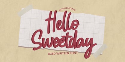 Hello Sweetday - is a Playful Craft font with a natural handwritten feel. This handmade font will make your design has a beautiful natural touch for each details. It is perfect for any design project as Invitation,logo, book cover, craft or any design purposes.
 - Donsky by Lemonthe,
$14.00 Donsky is a dry brush font. Suitable for any projects such as logos, branding projects, product packaging, mugs, quotes, posters, shopping bags, t-shirts, book covers, labels, photography, watermark, and more. Use this gorgeous and unique handwritten font to bring any DIY project to life!
 - Mihbur by Twinletter,
$17.00 Introducing Mihbur, an Art Deco-inspired font that exudes elegance and sophistication. With its sleek lines and geometric shapes, this font captures the essence of the Art Deco movement while also offering a modern twist. Mihbur comes equipped with 51 alternate characters and 43 ligatures, giving you plenty of options to make your designs truly unique. Plus, it’s multilingual, making it a versatile choice for any project. Whether you’re designing invitations, posters, or branding materials, Mihbur is the perfect font to add a touch of vintage glamour to your work. So why settle for a plain font when you can elevate your designs with Mihbur? Try it out today and see the difference for yourself. What’s Included : - File font - All glyphs Iso Latin 1 - Alternate, Ligature - Simple installations - We highly recommend using a program that supports OpenType features and Glyphs panels like many Adobe apps and Corel Draw so that you can see and access all Glyph variations. - PUA Encoded Characters – Fully accessible without additional design software. - Fonts include Multilingual support
 - Nu Sans by Typecalism Foundryline,
$30.00 Nu Sans is a modern and stylish sans-serif font product that was created in 2020. It is a versatile typeface that comes with three different axis options: weight, width, and slant, allowing users to create a wide variety of unique and dynamic typography designs. With a total of 90 complete static fonts, Nu Sans offers an extensive range of options for designers looking for a clean and contemporary font choice. The font family features a bold, geometric design with sharp angles and clean lines, giving it a distinct and modern. Nu Sans is perfect for use in a range of design applications, including advertising, branding, editorial design, and web design. Its dynamic and versatile nature makes it a great choice for any project that requires a strong and bold visual impact. a high-quality font product that offers designers a wide range of options and possibilities. Its modern and stylish design, combined with its triple axis options, makes it a great choice for anyone looking for a versatile and unique sans-serif font.
 - Trafit by Nathatype,
$29.00 Finding the right fonts for your projects is a challenge because improper fonts will deliver improper messages resulting in unprofessional appearances. Therefore, Trafit is here as your problem solver. This is Trafit, a perfect font to show luxury, class, and eternity. Trafit is an outstandingly designed stylish serif font. Its soft, clean lines and indentations show elegant impressions for your prominent designs. Its letter edges have hooks like the other serif fonts. The simple shapes and even sizes help to make it legible. Due to the great legibility, this font is applicable for any text sizes and length. In addition, you can enjoy the features available here. Features: Ligatures Multilingual Supports PUA Encoded Numerals and Punctuations Trafit fits best for various design projects, such as brandings, posters, banners, greeting cards, magazine covers, quotes, printed products, merchandise, social media, etc. Find out more ways to use this font by taking a look at the font preview. Thanks for purchasing our fonts. Hopefully, you have a great time using our font. Feel free to contact us anytime for further information or when you have trouble with the font. Thanks a lot and happy designing.
 - VLNL TpDuro by VetteLetters,
$30.00 VLNL TpDuro was designed by chef Martin Lorenz and Juanra ‘Wete’ Pastor. Its concept was inspired by an Albrecht Dürer design from 1525, which shows a system to construct a gothic lowercase letter. Following the logic of this lowercase construction, but not the traditional uppercase letters of regular fraktur (brokenscript) alphabets, some brand new upper case letters were designed. The 45 degree tilted square that forms the basis of the letters, is as square and hard as a cracker. And we love crackers. You can put cheese on them. The ‘pixel’ feeling of the downstroke was intensified by repeating the rotated square module as often as they could. All this resulted in a strong, dark typeface with a steady rhythm, with one foot in history and the other in modern times. It works well as a display typeface for short texts, headlines and logos. Music festivals and heavy metal bands should also pay attention. This is hard stuff.
 - Miny Fellas by Stringlabs Creative Studio,
$25.00 Miny Fellas is inspired by classic typography and brings its own unique style to any design project. Use this gorgeous and unique handwritten font to bring any DIY project to life!
 - Shibe by Linecreative,
$16.00 Shibe - Bold italic font, has a strong, sharp character, and is combined with the font graffiti styles, To make a beautiful combination, simply mix upper and lower case and mix with alternative glyphs Shibe offers you: Shibe- A clean Bold italic font including Upper & Lowercase characters(ALL CAPS), Stylistic alternates Character (2 Character) Supports Multi linguage (Latin Western Europe), Numbers and Punctuation
 - THD Senus by Tim Hutchinson Design,
$35.00 THD Senus is a modern, high contrast font that expresses a sophisticated and contemporary feeling. The font comes in ‘Roman’ and ‘Bold’ styles plus the softer versions of ‘Roman-Curve’ and ‘Bold-Curve’ – there is also a shadow style available as ‘Roman-Shaded’. The font is perfect for range of uses such as editorial, brand messages, packaging, promotions, campaigns etc.
 - Bome by Nirmana Visual,
$22.00 Introducing Bume Display psychedelic font, designed to transport you to another dimension with its bold. With its fluid and organic shapes, our psychedelic font is perfect for creating striking headlines, logos, and branding materials that demand attention. The intricate curves and loops in this font create an ethereal and dreamlike quality that perfectly captures the essence of the psychedelic aesthetic.
 - Parodisme by Creative17studio,
$20.00 Parodisme is a high-contrast serif font family that has many alternatives and unique shapes. Create a modern and beautiful logotype using this font family. Supports all aspects of design, especially logo design and branding. Suitable to be paired with various types of fonts. Parodisme also supports multilingual languages. If you have further questions contact me. Free updates Thank you
 - Kwark by Hanoded,
$15.00 Kwark is a nice, cartoonesque outline font with a bit of grunginess. Yes, it is an all caps font, but upper- and lowercase letters differ in shape, so you can mix and match. The name is not really related to the way the font looks: kwark means 'curd' in Dutch. You think that sounds delicious? Well, then give Kwark a try!
 - Fluse by Pesotsky Victor,
$10.00 «Fluse» is an accidental sans-serif font. It has an angular design but smooth and sleek shapes. The font is suitable for both active titles and medium-sized texts. It can also be an accent in a poster or the basis of a corporate identity. Fluse supportsBasic Latin, Cyrillic and more than 100 languages all together. The font was designed by Viktor Pesotsky.
 - Rhomantics by BaronWNM,
$12.00 Rhomantics is a sans serif font that carries a classic style. Rhomantics font takes a simple form but still has a classic feel in its shape so it is easy to identify each character of the letter to make it easier for us to read. This font can be used in invoice designs, history book covers, branding, advertisements, business cards, etc.
 - Lined by Oscar Pastarus,
$18.00The Lined font started out with some scribbles - playing with lines and making shapes fold, underlap and overlap, eventually evolving into letters. This is a display/ornamental font and it was made in 2009, it's meant for decorative use and not in large bodies of text. For example it does well used as a headline font. It is proportionally spaced and uppercase only. - Blade Halloween by FadeLine Studio,
$15.00 Halloween soon arrives!!! Blade Halloween is a natural Serif style handwritten font. This font has sharp angles that gives it a horror look, but it still remains firm and attractive. Blade Halloween includes uppercase & lowercase characters, alternate glyphs, punctuation, numerals, and multilingual support. That way this font is perfect for meeting your Design and Branding needs in welcoming Halloween day!