10,000 search results
(0.027 seconds)
- Mantika Informal Paneuropean by Linotype,
$67.99Jürgen Weltin's Mantika Informal is pretty difficult to categorize, but very easy to like. This particularly reader-friendly typeface in regular and bold weights, brings to the table the informal fluidity of a script, the consistency of an inclined italic, and the open and airy forms and contrast of a humanist sans. The result is a warm, approachable, and very legible typeface that is never static and staid, but rather invites an attentive, reading eye. The original idea behind Mantika Informal lay in the challenge to create a typeface for setting children's books. German designer Jürgen Weltin aimed to create a reading typeface for those just starting to learn how to read. On the one hand, it should help create clear word-images; on the other, its letterforms should remain uncomplicated but resist mechanical and industrial sterility. Mantika?s subtle cursive lines stress the printed word's connection with handwriting, in addition to making the transition from school writing exercises to printed texts seamless and effortless. The resulting slightly organic and cursive forms that developed during the design process are so captivating that Mantika Informal may be used for a multitude of unintended applications - anywhere a friendly and informal yet sophisticated character could lend a helping hand, Mantika is there, giving a fresh accent to anything from packaging design to food products. With a broad character set encompassing support for Cyrillic and Green, Mantika Informal's two fonts make for a versatile and dynamic typeface that surely will find its place in a broad range of applications. - Body by Zetafonts,
$39.00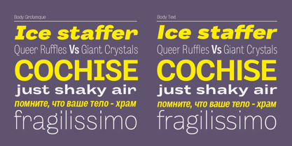 Body graphic project at Behance Body is a type family designed for Zetafonts by Cosimo Lorenzo Pancini with Andrea Tartarelli. Conceived as a contemporary alternative to modernist superfamilies like Univers or Helvetica, Body tries to maximize text readability while providing a wide range of options for the designer. It comes in two variants (Body Text and Body Grotesque), each in four widths and four weights: regular and bold for basic typesetting, light and extrabold for display use. Body Grotesque applies to the sans serif modernist skeleton little imperfections and quirks inspired by our research in early 20th century type specimens. Curves are slightly more calligraphic and a light inverse contrast is applied to bold weights, giving the typeface a slight vintage appearance in display use. Body Text, on the contrary, challenges the modernist aesthetics maximizing horizontal lines and using open terminals for letters like “s” and “a” that appear normally dark in modernist grotesques. For both variants, the normal width family is slightly condensed in an effort to maximize space usage; the Slim width is provided for extremely dense texts or side notes while the Fit width is optimized for display usage as in logos, headings or titles. The Large width manages to look elegant in its light weight while becoming a valid heading or subtitle font in its extrabold weights. All the 64 fonts in the Body superfamily include a complete latin extended character set with small caps for over 70 languages, Russian cyrillic, open type positional numbers, stylist sets and alternate forms.
 - Fino Sans by TypeTogether,
$35.00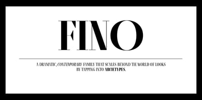 Tall, stately, and refined, with a showy contrast between thick and thin, a certain kind of titling Didone has become synonymous with fashion. Ermin Međedović’s latest type system amplifies the most theatrical aspects of this genre while bringing an uncommon flexibility of style and variation to any type palette — particularly those required for editorial design. Fino Sans is a Rational (or Modern) display serif with sharp details. Its fairly Title proportions produce a regular beat of bold stems at frequent intervals. One can add an unexpected twist to this plot line by introducing the alternate ‘C, D, G, O, and Q’ (found in the uppercase); these replace the standard, Title oval shapes with big, full, show-stopping round ones. Other alternate forms, along with a grand ensemble cast of ligatures, lets the director continually flip the script. This stage is set in three acts: Fino Sans, Fino Sans, and Fino Sans Stencil. Each of these offer six weights and italics, and each actor is comfortable speaking any Latin-based language, from standard Hollywood English to the many accents of Eastern Europe. Finally, every style comes in two optical sizes, with Title having the finest hairlines for the biggest parts. This lets you put Fino Sans to work in a variety of productions, from short texts (24pt–48pt settings) to epic titles. The complete Fino Sans family, along with our entire catalogue, has been optimised for today’s varied screen uses. All these talents let Fino Sans perform a range of roles far broader than your typical Bodoni or Didot.
 - Fino Stencil by TypeTogether,
$35.00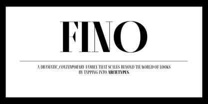 Tall, stately, and refined, with a showy contrast between thick and thin, a certain kind of titling Didone has become synonymous with fashion. Ermin Međedović’s latest type system amplifies the most theatrical aspects of this genre while bringing an uncommon flexibility of style and variation to any type palette — particularly those required for editorial design. Fino Stencil is a Rational (or Modern) display serif with sharp details. Its fairly Title proportions produce a regular beat of bold stems at frequent intervals. One can add an unexpected twist to this plot line by introducing the alternate ‘C, D, G, O, and Q’ (found in the uppercase); these replace the standard, Title oval shapes with big, full, show-stopping round ones. Other alternate forms, along with a grand ensemble cast of ligatures, lets the director continually flip the script. This stage is set in three acts: Fino Stencil, Fino Stencil, and Fino Stencil Stencil. Each of these offer six weights and italics, and each actor is comfortable speaking any Latin-based language, from standard Hollywood English to the many accents of Eastern Europe. Finally, every style comes in two optical sizes, with Title having the finest hairlines for the biggest parts. This lets you put Fino Stencil to work in a variety of productions, from short texts (24pt–48pt settings) to epic titles. The complete Fino Stencil family, along with our entire catalogue, has been optimized for today’s varied screen uses. All these talents let Fino Stencil perform a range of roles far broader than your typical Bodoni or Didot.
 - Mantika Informal by Linotype,
$50.99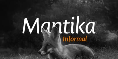 Jürgen Weltin's Mantika Informal is pretty difficult to categorize, but very easy to like. This particularly reader-friendly typeface in regular and bold weights, brings to the table the informal fluidity of a script, the consistency of an inclined italic, and the open and airy forms and contrast of a humanist sans. The result is a warm, approachable, and very legible typeface that is never static and staid, but rather invites an attentive, reading eye. The original idea behind Mantika Informal lay in the challenge to create a typeface for setting children's books. German designer Jürgen Weltin aimed to create a reading typeface for those just starting to learn how to read. On the one hand, it should help create clear word-images; on the other, its letterforms should remain uncomplicated but resist mechanical and industrial sterility. Mantika?s subtle cursive lines stress the printed word's connection with handwriting, in addition to making the transition from school writing exercises to printed texts seamless and effortless. The resulting slightly organic and cursive forms that developed during the design process are so captivating that Mantika Informal may be used for a multitude of unintended applications - anywhere a friendly and informal yet sophisticated character could lend a helping hand, Mantika is there, giving a fresh accent to anything from packaging design to food products. With a broad character set encompassing support for Cyrillic and Green, Mantika Informal's two fonts make for a versatile and dynamic typeface that surely will find its place in a broad range of applications.
 - Elido by Kontour Type,
$50.00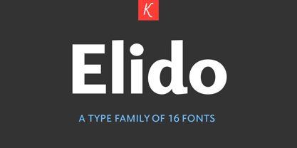 Elido (Odile in reverse) is the sans counterpart to the Odile type. Together they form a sans/serif superfamily with a wide range of variations for editorial use. Elido follows Odile’s proportions and matches the weight and typographic color of its serif twin. Elido is a sans with classical proportions. A slight geometric hint and open counters convey an airy feel. Elido’s family structure and relations within echo the conceptual approach of Odile. The arched stroke low off the stem reveals a script characteristic most pronounced in the Elido Upright Italic. This particular interpretation is gradually diminished in the Italic and becomes even less emphasized in the Regular. Six balanced weights, from an elegant Light to a pronounced Black, are in tune with three display solutions and a set of beautiful Ornaments. These variants allow for a diverse and multifaceted typography for the discerning type user. Sans serif initials amount to a rare finding. The charming monolinear Elido Initials come in two flavors, elaborate and rational, designed to hold their own in editorial and headline sizes. This type design boasts an extensive character set, many OpenType features including roman and italic Small Caps, five sets of numerals, beautiful ligatures, and many more. OT stylistic variants (with accents) offer a one-story “a” for the roman weights, alternate “g” and “s” designs for the italics, and a variant glyph “s” for the Upright Italic. These distinct qualities with its versatile and sincere traits make Elido an excellent choice for text and display use.
 - Ricardo by Bureau Roffa,
$19.00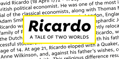 Rather than confining itself to a single style, Ricardo combines the best of two worlds: the conceptual clarity of a geometric design with the legibility and warmth of a humanist design. Its open counters, crisp joints, and even texture allow for effective use in long-form text settings, while its simple geometric shapes combined with some unexpected details make it highly suitable for display settings such as branding and marketing. Ricardo contains seven carefully chosen weights, ranging from ExtraLight to ExtraBold. The Medium weight functions as a slightly darker alternative to the Regular. Ricardo’s 812 glyphs per style support over a hundred languages, and also include arrows and case-sensitive punctuation. The Ricardo family consists of three subfamilies: Ricardo, Ricardo ALT, and Ricardo ITA. Ricardo contains the most conventional forms, and is the most suitable option for long-form text. Ricardo ALT contains simplified shapes for the a, j, u, and t, which are also accessible through Stylistic Set 2 within Ricardo (in opentype-savvy applications). The cursive-like italics of Ricardo ITA provide a slightly more eccentric alternative to the standard italics. Furthermore, all styles contain stylistic alternates that swap the blunt apexes in A, M, N, V, W, v, w, y, and 1 for pointier ones. These are also accessible through Stylistic Set 1. Other opentype goodness includes: (discretionary) ligatures, smallcaps, case-sensitive forms, fractions, nine sets of numerals, and more. David Ricardo (1772-1823) is considered the first of the classical economists, and combined ground-breaking mathematical abstractions with an understandable down-to-earth way of explaining his ideas.
 - Cerafino by AVP,
$29.00Cerafino creates a sense of movement using open, angular strokes on lowercase characters. The capitals and numerals are less exaggerated. - ArcticPatrol by The Northern Block,
$12.80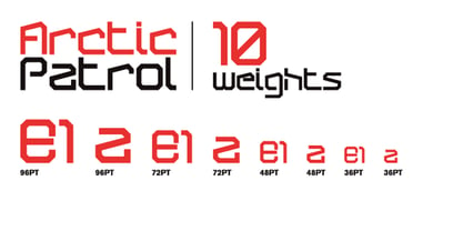 ArcticPatrol is a modern angular font influenced by military related computer games. Examples include: Ghost Recon and Medal of Honor.
 - Musnad Serif by Sultan Fonts,
$19.99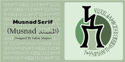 About this font family Musnad Serif Is Old South Arabian typeface for desktop applications ,for websites, and for digital ads. Musnad font family contains two types: Rigular and bold. The font includes a design that supports Latin, Arabic, and Old South Arabian language systems.
 - Ghost Reverie - Personal use only

- Neuropol X Free - Unknown license

- VTC ScreamItLoudOutline - Unknown license

- Schmale Anzeigenschrift Zier - Unknown license

- VTC Krinkle-Kut - Unknown license

- Closterian by Maulana Creative,
$11.00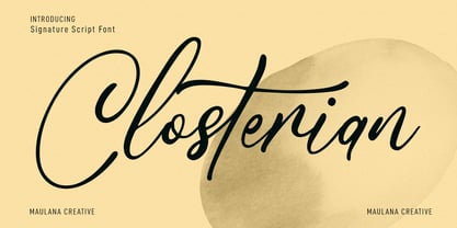 Closterian is a modern signature script font. With regular contrast stroke, fun character. To give you an extra creative work. Closterian font support multilingual more than 100+ language. This font is good for logo design, Social media, Movie Titles, Books Titles, a short text even a long text letter and good for your secondary text font with sans or serif. Make a stunning work with Closterian font. Cheers, Maulana Creative
 - McKnight Kauffer by K-Type,
$20.00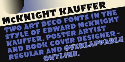 McKnight Kauffer is a casual sans derived from poster and book cover lettering by the American designer, Edward McKnight Kauffer, who mainly worked in England through the 1920s and 1930s. The style owes much to Louis Oppenheim's Fanfare of 1927, but without the Germanic blackletter inflection. The two display fonts, regular and outline, have a playful art deco feel, and share spacing and kerning so can be overlapped for bicolor effects.
 - constructor by Fontop,
$11.00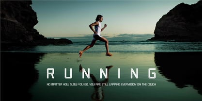 Introducing a new bold CONSTRUCTOR font family. Perfect combination of 2 fonts (Light and Shadow) to create your own layered 3D headlines, eye-catching texts, logotypes, design, posters for sports, music, street culture, modern arts, industries and many more other themes. 2 more fonts (Emboss and Regular) have bold 3D effects thanks to their design and shapes. Fonts have extensive Latin multilingual support, uppercase, small-caps, numbers and basic punctuations.
 - Obcecada Sans & Serif by deFharo,
$15.00 Obcecada Sans & Serif are two geometric digital typefaces in regular and bold versions, very condensed and thin with a rounded finish on the horns and joints with a modern style. They include the Cyrillic and Greek alphabet. These fonts are the result of my obstinacy for very condensed fonts, in this case I have inclined to a very fine proportion with short ascending and descending that gives them elegance decó.
 - Indentia by Garisman Studio,
$19.00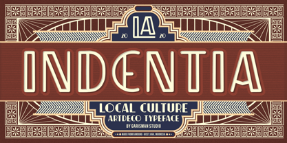 Indentia is a very interesting font, which has been inspired by Art Deco art. It is formed from very careful lines with stylistic sets and ligature features. Indentia has 200+ glyphs consisting of two styles: Indentia Regular and Indentia Black. Suitable for any graphic design projects, prints, logos, posters, t-shirts, packaging and applicable for some types of graphic design. Indentia is compatible with any software without any pain.
 - Callgest by Martype co,
$15.00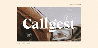 Introducing Callgest serif display. A brand new font with tapered serif, made with love to make it more versatile and stylish. This font also suitable for Branding Design, Logotype, Wedding Invitation, Headline, Posters, Business Card and etc. You can combine with Montserrat, Gotham, or Helvetica to make awful fusion combo font! What's inculded? - Callgest Tall - Callgest Regular - Callgest Wide Multilingual Support support many different languages 60+ Thanks & Happy Designing!
 - Murisa Bazka by Murisa Studio,
$10.00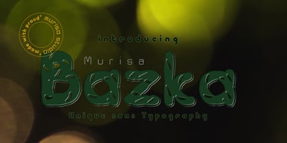 Starting this month, we present our newest font, Murisa Bazka. Murisa Bazka is a blend of regular fonts with a distinctive texture on the body. This is unique considering that this is an additional value for you designers to display artistic design work. The Murisa Bazka font is made with a wide scope for everyone. Murisa Bazka, can be your first choice to be used in your designs and products.
 - Village Hall JNL by Jeff Levine,
$29.00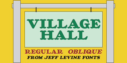 A 1918 poster issued during World War I from the YWCA encouraged women to pitch in to the war effort by joining the “United War Work Campaign”. The Art Nouveau hand lettering of that poster was a slight throwback to the “Western” or “Victorian” style of typography because of the characters having split serifs. This is now available as Village Hall JNL, in both regular and oblique versions
 - RT Singular by Estudio Calderon,
$23.00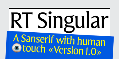 RT Singular is a Sanserif with human touch based on Renaissance inscriptions. It was designed in orden to be use specially in health, beauty and scientific brands. The version 1.0 of RT Singular includes a Regular style with the following specifications. - Available as a suite of OpenType® features, as ligatures and alternate characters - A character set supporting most Central European and many Eastern European languages - German capital sharp S
 - Mister Mustard by AdultHumanMale,
$12.00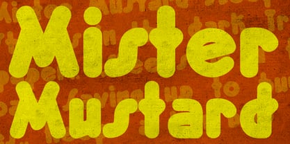 MisterMustard is a chubby art deco style font, not thin or elegant, but plump and jolly. The font is available in two styles regular and italic. While it was designed to be playful, this font has both an uppercase and a lower case, so it works for practically everything (maybe not a headstone or obituary). It’s loaded with extra foreign glyphs so it gives you plenty of options. Buy. Install. Enjoy.
 - Porker by Ingrimayne Type,
$6.95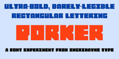 Porker was an experiment in making a barely readable but very simple and very bold typeface with no curves. It is caps only with some of the letters on the lower-case keys giving alternate versions. Include are three variants, a tall version, a striped version, and a randomized version. The striped version can be placed in a layer above the regular version to give two-colored letters.
 - Wild Creatures by Ana's Fonts,
$12.00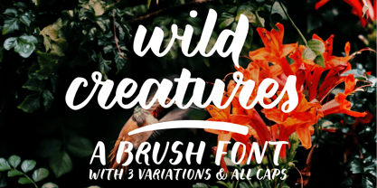 Wild Creatures is a bold brush font, in three variations: regular, jumpy and jumpier. The jumpy and jumpier versions of the font include contextual alternates OpenType feature to give the font a bouncy and bouncier baseline. Wild Creatures also includes an all caps feature and a swash dingbat font, perfect to decorate your lettering designs. Use Wild Creatures in all your modern designs, such as quotes, branding, postcards.
 - P22 Cigno by IHOF,
$24.95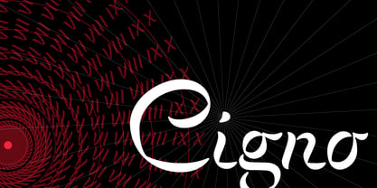 P22 Cigno is a new digitization of the 1950s Italian typeface by Aldo Novarese for the Nebiolo foundry. This semi-formal script has a definite mid-century European flavor suitable for menus, invitations and poster work. Along with the accurate rendition of the regular weight, designer Colin Kahn has added a lighter companion font for another variation on Cigno. Both fonts feature a full Western European character set.
 - Badger Valley by Heinzel Std,
$10.00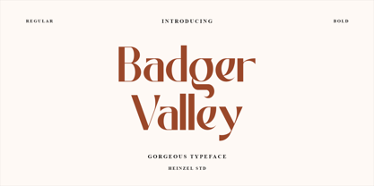 Badger Valley is an elegant and modern sans-serif font. Fall for its ravishing style and use it to create gorgeous wedding invitations, beautiful stationary art, eye-catching social media posts, and much more! This font is PUA encoded which means you can access all of the amazing glyphs with ease! Features : Badger Valley Regular, Bold, and Italic versions, sans serif font, Numerals, and more punctuations. Multilingual support for various languages
 - Bazoka by Juncreative,
$15.00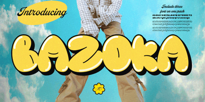 Bazoka font is a display style that mimics the look of hand-drawn graffiti lettering. The letters are rounded and bubbly in shape, with a bold appearance. This style is perfect for informal or urban-themed designs, such as posters, flyers, and street art. Overall, graffiti bubble font is a fun and energetic way to add personality to your design. and this font include 3 styles regular, outline and extrude.
 - Signature Creation by Arterfak Project,
$17.00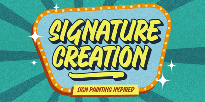 Introducing "Signature Creation," a nostalgic display font inspired by vintage sign painting. Representing craftsmanship, creativity, and movement. Immerse yourself in a wave of nostalgia with this font set, available in 5 distinct styles that harmoniously interact as layers: Regular, Inline, Shadow, Outline, and Extrude. Signature Creation boasts a contemporary aesthetic and seamless design. Complete with swashes and special characters, Signature Creation infuses a playful feel into your design
 - SF Khaled by Sultan Fonts,
$19.99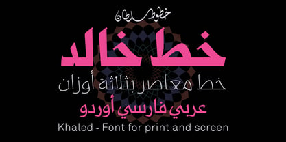 About this font family: Khaled Typeface for different titles and manchites. Khaled is An Arabic typeface for desktop applications, for websites. Khaled font family is Modern style and contains 3 weights: Regular, Medium and Bold. The font includes support for Arabic, Persian, and Urdu. It also includes proportional and tabular numerals for the supported languages. Khaled typeface comes with many opentype features. Designer: Sultan Maqtari Design date: 2019 Publisher: Sultan Fonts
 - Hamis Pro by Fo Da,
$9.00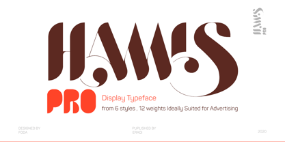 Hamis Pro is a display font of 12 weights: Regular, Shadow, Solid, Book, Book Shadow, Book Solid & Italics. Hamis Pro is an advanced typographical support with features such as ligatures, case-sensitive forms, fractions, super and subscript characters, and stylistic alternates. It's ideally suited for advertising and packaging, festive occasions, editorial and publishing, logo, branding and creative industries, posters and billboards as well as web and screen design.
 - Cerkiymo by Hishand Studio,
$15.00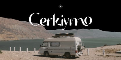 The strokes of the Cerkiymo font dance gracefully across the page, exuding an air of elegance and freshness. With its delicate curves and refined lines, the Cerkiymo font lends an elegant touch to any design, breathing a fresh sense of sophistication into each word. Perfect for logos, branding, invitations, stationery, wedding designs, social media posts, and much more. Complete with ligatures alternates regular italic hollow icon kerning multilingual support
 - Tannen by Rafael Jordan,
$30.00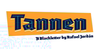 Tannen is an interpretation of the Emil Meyer’s Tannenberg, the result is a fun and cool blackletter display built without curves and casual look with a lot of personality and expressivity. It has 3 independent styles (regular, inline and shadow) that can be combined with each other, plus a stencil style. Tannen counts with 3 weights per style, OpenType features (ligatures, alternates, fractions and more) and supports dozens of latin languages.
 - Bambina by Ivan Rosenberg,
$16.00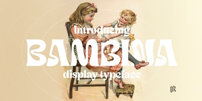 Bambina is a stylish retro font inspired by 19th century architecture and decoration. It looks amazing at display sizes and is easily readable in text size. There are two versions of this font : REGULAR and OUTLINE. Bambina Font is a display font made mainly for headlines, titles, and other short texts and is well-suited for advertising, vintage mood board, branding, logotypes, packaging, titles, editorial design and modern and vintage design.
 - HU Kinderland KR by Heummdesign,
$25.00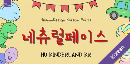 It is a neat and friendly handwriting typeface with unadorned innocence. The tight handwriting gives off a cute atmosphere as if it were written by a young person. In the existing KINDERLAND, only Regular and Bold were introduced, but the Korean version of the font introduces two white weights. White weight can give a unique feel by saving only the border and not filling the typeface. This font contains Korean.
 - Braxia by Greater Albion Typefounders,
$8.95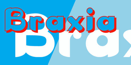 Braxia is a pure and joyful piece of Art Deco Fun. It is a new face that is overflowing with the character of 1930s advertising, lively and yet with impact all at once, its idea for theater handbills and posters, parties or anything else where you want to encourage people to enjoy themselves. Braxia is offered in two faces, regular and embossed, and is a face to really have fun with!
 - Stenographer JNL by Jeff Levine,
$29.00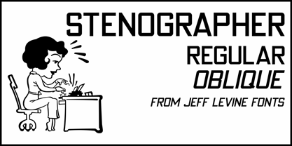 Sheet music for the song “The Little Thing You Used to Do” (from the 1935 motion picture “Go into your Dance” starring Al Jolson and Ruby Keeler) had its title set in what closely resembled Bank Gothic Condensed. [Bank Gothic was originally designed by Morris Fuller Benton for American Type Founders circa 1930.] This reinterpreted version is now known as Stenographer JNL, and is available in both regular and oblique versions.
 - Chromate by Supfonts,
$18.00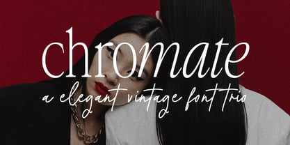 Chromate - a charming family with 3 fonts in retro style of the 80s and 90s! The dense structure will give an incredible retro vibe to your project. There are 3 fonts at your disposal, Regular, Italic and Script. This set covers all your needs and allows you to keep the project in a single style. You no longer need to look for which font is suitable, everything is already here


