10,000 search results
(0.084 seconds)
- Zull Wettis Cyrillic by Ira Dvilyuk,
$18.00 The script font Zull Wettis was handwritten with a dry brush and will look great on branding design, posters, apparel, logotype, website header, fashion design, wedding card design, and more. Zull Wettis script font contains a full set of uppercase and lowercase letters and 23 ligatures - which can be used to create a handwritten calligraphy look. The Cyrillic part of the font contains the uppercase letters and lowercase letters and 18 ligatures, giving a realistic hand-lettered style. Zull Wettis Symbols is a font with over 36 unique, hand-drawn elements and swashes that can help to make your design more original. A different symbol is assigned to every uppercase or lowercase standard character plus numbers 0-9 so you do not need graphics software just simply type the letter you need. Multilingual Support for 32 languages: Latin glyphs for Afrikaans, Albanian, Basque, Bosnian, Catalan, Danish, Dutch, English, Estonian, Faroese, Filipino, Finnish, French, Galician, Indonesian, Irish, Italian, Malay, Norwegian Bokmål, Portuguese, Slovenian, Spanish, Swahili, Swedish, Turkish, Welsh, Zulu. Works perfectly on the Canva platform. For Cricut & Silhouette recommended. And Cyrillic glyphs support Russian, Belorussian, Bulgarian, Ukrainian, and Kazakh languages.
 - Optima Nova by Linotype,
$57.99 With the clear, simple elegance of its sans serif forms and the warmly human touches of its tapering stems, the Optima family has proved popular around the world. In 2002, when it was finally possible to produce digital alphabets without technical limitations and compromises, and more than fifty years after the first sketches, an expansion and redesign of the Optima family was completed and released as Optima nova. Hermann Zapf and Japanese type designer, Akira Kobayashi, collaborated on the project, which included re-working of the existing weights and the addition of several new weights: small caps, old style figures, light, heavy, and condensed. The original Optima was never manufactured with a real italic, only an oblique version of the roman. Optima nova has a complete range of beautifully designed real italics; the new italic forms, of the e, f and g are especially notable. The titling face includes capital letters with special and unusual letter combinations and ligatures, making it an excellent choice for headlines, logos and advertising purposes. Optima continues to be an all-purpose typeface; and Optima nova works for just about anything from book text to signage. Optima Nova® font field guide including best practices, font pairings and alternatives.
 - Situgintu by FallenGraphic,
$15.00 Situgintu Calligraphy has lots of alternate characters, swashes and ligatures. It has also a bunch of tails with different shapes and widths to give the logotype or sports look to your design. You can design beautiful, elegant and diverse typographic elements with it. It’s well suited for logos, lettering artwork, t-shirt designs, editorial illustrations to name a few. Features : -PUA Encoded 100% Acessibility -Stylistic Alternates -Standard Ligatures -Stylistic set SS01-SS07 If you don’t have a program that supports OpenType features such as Adobe Illustrator and CorelDraw X Versions, you can access all the alternate glyphs using Font Book (Mac) or Character Map (Windows).To Access Alternate Characters Click The Link Below: How to access alternates in Adobe illustrator CS https://www.youtube.com/watch?v=geL0Ye02Ryk How to access alternates in Adobe illustrator CC https://www.youtube.com/watch?v=V25yiUh8BcE How to access alternates in Ms Wordhttps://www.youtube.com/watch?v=HxkhZiCuwEw How to access alternates in Coreldraw X7 https://www.youtube.com/watch?v=UBVsufJjons How to access alternates in Indesign CS https://www.youtube.com/watch?v=HgZTCxKG14Q How to access alternates in Adobe Photoshop CC https://www.youtube.com/watch?v=BYKXl58AdNY
 - Super Drift by Mevstory Studio,
$15.00 Super Drift consists of a racing style with sharp lines with a verified tilt angle that will emphasize a modern and sporty style. Super Drift very suitable for automotive magazine covers, racing game covers, logos & branding, product design, labels and so on. What’s Included Super Drift 3D Super Drift Ragular Super Drift Line Standard glyphs Works on PC / Mac Simple installations Accessible in the Adobe Illustrator, Adobe Photoshop, Adobe InDesign, even work on Microsoft Word. Thank you for your purchase! Hope you enjoy with our font!
 - Armont by HansCo,
$15.00 Armont is a Vintage typeface font, it will add an old-time charm to any design project. This collection of font is perfect for everything your project with vintage, retro, wild or organic style. Features : Uppercase & Lowercase ( in All Caps ) Numbers & Punctuation Multilingual Alternate character & ornament How to access alternate / ornament ? : https://hanscostudio.com/tutorial/ Enjoy!
 - ZT Yaglo by Khaiuns,
$16.00 ZT Yaglo is a dynamic and expressive display font, from the first impression you may have noticed that this font is a fishing rod-like concept, with a consistent rhythmic curve that gets sharper at the ends. The ZT Yaglo typeface is framed in a sans theme and added a serif feel to produce a bold, geometric typeface in all thicknesses. ZT Yaglo mixes a simple sans style for extra bold serif energy with the feel of calligraphic shapes. The thicker your choice of style, the more striking the flow of changes in shape becomes spiky. ZT Yaglo is a cool alternative for you to create branding projects, Logo designs, Apparel Branding, product packaging, magazine headers or just as a stylish text overlay onto any background image. ZT Yaglo has 9 Styles, 1 Free for Commercial, and one Variable font. each face has 457 glyphs. Includes Standard Ligature, and the "&" character has an alternate letter in each Weight. I hope you have fun using ZT Yaglo. Thanks for using this font ~ Khaiuns X zelowtype
 - Qweny Check by Ergibi Studio,
$18.00 Qweny Check is a font liquid shaped, with a classic modern feel mouthwatering delights. This liquid font, which was meticulously crafted, is the ideal option for your vintage products. The many ligature in this font add a unique style making this typeface stand out from the usual display fonts, perfect for headlines, logos, posters, packaging, T-shirts, coffee shops, restaurants, magazine headers, signs or gift/post cards, cafe and wedding or any kind of advertising purposes. If there is a problem, question, or anything about my fonts, don't hesitate to ask! Big Thanks ~ Ergibi Studio
 - Smooth Gracier by Nathatype,
$29.00 Smooth Gracier is a stylish display serif font to express modern, friendly, fun nuances on your designs. The unique geometry details and the contrast sketch lines help to make the font visually interesting. It is suitable to apply for bigger sized-texts due to its dramatic, bold styles. Enjoy the lovely features available in this font. Features: Stylistic Sets Multilingual Supports PUA Encoded Numerals and Punctuations Smooth Gracier fits for various design projects, such as posters, banners, logos, magazine covers, quotes, headings, printed products, invitations, merchandise, social media, etc. Find out more ways to use this font by taking a look at the font preview. Thanks for purchasing our fonts. Hopefully, you have a great experience using our font. Feel free to contact us for further information when you have a problem using the font. Thank you. Happy designing.
 - Sugela by Sealoung,
$25.00 Sugela is a Classy New Beautiful Serif Font The serifs that we made specifically for the needs of elegant branding, with additional ligatures and alternates in a more feminine and unique form will be ready to add value to your brand. It's great to take advantage of designers or product owners who need a solution to make their designs look more classy and modern. This font is specially designed for fashion-themed projects, perfectly suitable for creating elegant, chic, lifestyle designs such as logos, titles, magazines, and more. Sugela serif font is ready with: - Any option to get creative variations with unique letters - Preview as inspiration what you can do with Sugela font - Ready with Lowercase and Uppercase characters Hope you enjoy our fonts and if you have any questions feel free to message me & I'm happy to help :)
 - Rocka & Billy by YdhraStudio,
$20.00 Rocka & Billy is a bold script font inspired by Retro and Modern hand lettering style, so you can use this font into any style of your design. It includes standard Multilingual support and OpenType features such as Standard Ligatures, Discretionary Ligatures and Stylistic Sets (ss01 - ss09). Rocka & Billy is great for Logotype, Branding Design, Logo Design, Digital Lettering Arts, Instagram Design, T-Shirt/Apparel, Badge, Packaging, Poster, Magazine, Book Cover, Quotes, Signs, Advertising Design, and any design needs. You can access all those alternate characters by using a program that supports OpenType features such as Adobe Illustrator CS, Adobe Indesign & CorelDraw X6-X7. Mix and match the alternate characters to add an attractive message to your design. Guides to access all alternates glyphs : http://adobe.ly/1m1fn4Y Need help? Please, Feel free to contact me by e-mail yyudhara@gmail.com for any question about my font, Extended License document and more. Good Luck and Have fun ! YdhraStudio
 - Los Lana Niu by Latinotype,
$45.00 Los Lana Niu was designed by Bruno Jara and Luciano Vergara. The typeface is based on Los Lana (2007). Along with the redesign, the font has increased from 1 to 24 different styles. This new version preserves the rustic aesthetics of the original typeface, but it lacks of curves and it visually looks as if it was a nirregular font. Los Lana Niu comes with a wide range of ligatures included in every weight: from Thin to Black. In order to offer a wide array of uses, the typeface has been structured by adding acomplete family of small caps, which makes this font well-suited for headlines, posters, branding and publishing design. Los Lana Niu comprises 3 subfamilies: Los Lana Niu Essential (392 glyphs) – including both regular and alt versions, Los Lana Niu Small Caps (392 glyphs) and Los Lana Niu (820 glyphs), which includes a variety of OpenType features such as stylistic ligatures, contextual alternates and small caps.
 - Gamebred by Alphabet Agency,
$15.00 Alphabet Agency proudly present Gamebred. Gamebred font is all caps with many alternatives letter characters within. The font also contains numbers, punctuation and international (latin) letters. The original inspiration behind the font is vintage lettering used on tobacco products. The initial inspiration developed into Gamebred that uses more elaborate and unorthodox character styles to real make it uniquely dope.
 - Rostalina Signature by madjack.font,
$18.00 Rostalina Signature is a unique, elegant and modern handwritten font. which looks like a signature, this font is intentionally made with unique and alternating ligatures. This handcrafted style makes it perfect for use in all your design projects be it logos, labels, packaging designs, blog titles, posters, wedding designs, social media posts, Instagram designs, etc. What's included? Multiple Language Support: ŠÀÁÂÃÄÅÆÇÈÉÊËÌÍÎÏŸŽÐÑÒÓÔÕÖØÙÚÛÜÝßàáâãäåæçèéêëìíîïñòóôõöøùúûêýÿŒœšž I hope you enjoy this font. If you have any questions, feel free to give me a message :)
 - Pinehills by Fikryal,
$18.00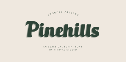 Pinehills – Font is a classical script font. With a classic style that can make your design look simple, elegant, and also bold, this font it’s perfect for logo, branding, title, social media posts, advertisements, product packaging, product designs, label, photography, watermark, special event, magazine, web design, vintage design, etc. Features : Pinehills( Uppercase, Lowercase ) Stylistic alternate Ligatures Multilingual Support If you have any questions please don’t hesitate to contact me. follow my Instagram: @fkryall Thank you 🙂
 - Balcon Round by Tour De Force,
$25.00 Balcon is condensed sans family designed to be your first web font choice. Contains 5 weights: Light, Regular, Bold, ExtraBold and Black, it fits perfect into any project, from editorial editions to packages, labels, posters. If you're looking for "sharp" version of this family, feel free to check Balcon sans family.
 - Valvolina by Device,
$39.00 Valvolina is a bold headline font inspired by Italian Futurism and the Moderne graphic design of the inter-war period. It uses elementary geometric shapes to build its characters, lending it an energy and punch. Dramatic and contemporary.
 - Didyma by Hurufatfont,
$19.00 Didyma display font has at the same time an entertaining appearance with its double-line structure and a luxurious feeling with its sharp and fluid serif structure. Didyma offers designers creative alternatives to create brands, packaging and titles.
 - Rotosh BKL Regular by Bakeel Studio,
$35.00 Rotosh BKL Regular Font is a modern Arabic and English font designed to meet the needs of a wide variety of users. It contains many characters, signs and languages, including the splintered languages derived from Arabic and English . The font is distinguished by its unique drawing and shape, making it a truly versatile font. The font is also easy to read and legible, making it the perfect choice for any project. With Rotosh BKL Regular, you can be sure that your designs will be truly unique and stand out from the rest.
 - Romtthing by Doeltype,
$20.00 Hi, Introducing The Romtthing Girl is a simple and stylish font, comes with Elegant Variations, opentype features such as stylistic alternates, initial and final form, Romtthing Girl Features 500 glyphs and ligatures. We keep this font looks elegant, classy, readable, stylish, catchy and easy to use. The Romtthing Girl Font is the right choice for photography, signature or signature logo design, quotes, album covers, business cards, and many other design projects. From business cards to photo watermarks, because the Romtthing Girl font is a classy signature with luxury. This is a very charismatic & confident font choice for your various design projects.
 - Viable Logic by Twinletter,
$12.00 Viable Logic font, has a neat and clean character new face sans serif fonts, in response to the need for innovative and new designs, for that this sans serif font family has different characters namely bold, thin and regular. This font is simple yet neat and elegant, the design of this typeface gives it a clean, modern look and a unique style to help give it a captivating look when you use it. This font is perfect for strong text with displays for a wide variety of branding, advertising, posters, banners, packaging, news headlines, magazines, websites, logo design, and more.
 - Conflate by ReivNick,
$5.00 Conflate a modern handwritten script font This font is perfect for quotes, branding, shirt designs, logos, and more!
 - Jalopy JNL by Jeff Levine,
$29.00 History, as it's said, tends to repeat itself. The round-point pen lettering used in the 1920s logo and ads for Dodge Brothers cars (pre-General Motors) is an early predecessor to the techno type styles of the 1980s. Square in shape, with unique stylization to some letters, Jalopy JNL can cross the decades and be used for a 1920s period piece and still look fresh in an ad for computer parts. Rather than round out the inside lines of the characters to fully emulate the strokes of a lettering pen, the inside lines have straight intersections for the contemporary side of this font's design.
 - Gemmadonati by Eurotypo,
$28.00 Gemmadonati Regular and Gemmadonati Italic is an organic, modern and casual calligraphy family font that has preserved in its glyphs its original textured appearance for a more personalized effect even more authentic. As an exclusively Open Type release, with 790 glyphs and 63 ornaments, it has several special alternatives for all letters with lots of possibility an an infinity of combinations. There are plenty of options to allow you to create something unique and special: standard and discretionary ligatures, several swashes and stylistics alternates for each letter, catchwords, tails that can be added to the beginning or end of each letter, ornaments, and much more. These lovely fonts have already an extended character set to support Central and Eastern as well as Western European languages. Gemmadonati was made to make your project more beautiful and attractive! Have fun with it!
 - Huevo by Burghal Design,
$29.00Versatile egg-shaped Huevo, like all Burghal Design fonts, includes upper and lower case letters, as well as numbers, symbols, punctuation, and accented foreign characters. Huevo is the head of the household known as Los Huevos. Tequila-guzzling, cerveza-swilling Huevo Loco is the boldest of Los Huevos and includes cocktail glass, olive, and eight ball dingbats. Huevo Loco can drink any other font under the table. Like most red-blooded American fonts, the favorite pastimes of Huevo Gordo are eating and couch warming, and boy, does it show! - RePublic by Suitcase Type Foundry,
$75.00In 1955 the Czech State Department of Culture, which was then in charge of all the publishing houses, organised a competition amongst printing houses and generally all book businesses for the design of a newspaper typeface. The motivation for this contest was obvious: the situation in the printing presses was appalling, with very little quality fonts existing and financial resources being too scarce to permit the purchase of type abroad. The conditions to be met by the typeface were strictly defined, and far more constrained than the ones applied to regular typefaces designed for books. A number of parameters needed to be considered, including the pressure of the printing presses and the quality of the thin newspaper ink that would have smothered any delicate strokes. Rough drafts of type designs for the competition were submitted by Vratislav Hejzl, Stanislav Marso, Frantisek Novak, Frantisek Panek, Jiri Petr, Jindrich Posekany, and the team of Stanislav Duda, Karel Misek and Josef Tyfa. The committee published its comments and corrections of the designs, and asked the designers to draw the final drafts. The winner was unambiguous — the members of the committee unanimously agreed to award Stanislav Marso’s design the first prize. His typeface was cast by Grafotechna (a state-owned enterprise) for setting with line-composing machines and also in larger sizes for hand-setting. Regular, bold, and bold condensed cuts were produced, and the face was named Public. In 2003 we decided to digitise the typeface. Drawings of the regular and italic cuts at the size of approximatively 3,5 cicero (43 pt) were used as templates for scanning. Those originals covered the complete set of caps except for the U, the lowercase, numerals, and sloped ampersand. The bold and condensed bold cuts were found in an original specimen book of the Rude Pravo newspaper printing press. These specimens included a dot, acute, colon, semicolon, hyphens, exclamation and question marks, asterisk, parentheses, square brackets, cross, section sign, and ampersand. After the regular cut was drafted, we began to modify it. All the uppercase letters were fine-tuned, the crossbar of the A was raised, E, F, and H were narrowed, L and R were significantly broadened, and the angle of the leg and arm of the K were adjusted. The vertex of the M now rests on the baseline, making the glyph broader. The apex of the N is narrower, resulting in a more regular glyph. The tail of Q was made more decorative; the uppercase S lost its implied serifs. The lowercase ascenders and descenders were slightly extended. Corrections on the lower case a were more significant, its waist being lowered in order to improve its colour and light. The top of the f was redrawn, the loop of lowercase g now has a squarer character. The diagonals of the lowercase k were harmonised with the uppercase K. The t has a more open and longer terminal, and the tail of the y matches its overall construction. Numerals are generally better proportioned. Italics have been thoroughly redrawn, and in general their slope is lessened by approximatively 2–3 degrees. The italic upper case is more consistent with the regular cut. Unlike the original, the tail of the K is not curved, and the Z is not calligraphic. The italic lower case is even further removed from the original. This concerns specifically the bottom finials of the c and e, the top of the f, the descender of the j, the serif of the k, a heavier ear on the r, a more open t, a broader v and w, a different x, and, again, a non-calligraphic z. Originally the bold cut conformed even more to the superellipse shape than the regular one, since all the glyphs had to be fitted to the same width. We have redrawn the bold cut to provide a better match with the regular. This means its shapes have become generally broader, also noticeably darker. Medium and Semibold weights were also interpolated, with a colour similar to the original bold cut. The condensed variants’ width is 85 percent of the original. The design of the Bold Condensed weights was optimised for the setting of headlines, while the lighter ones are suited for normal condensed settings. All the OpenType fonts include small caps, numerals, fractions, ligatures, and expert glyphs, conforming to the Suitcase Standard set. Over half a century of consistent quality ensures perfect legibility even in adverse printing conditions and on poor quality paper. RePublic is an exquisite newspaper and magazine type, which is equally well suited as a contemporary book face. - Alchimia by Bordet Type,
$22.00 Alchimia is an all caps serif font with a strong focus on ligatures. It captures the medieval aesthetic of the ancient roman serif fonts and remixes it with a modern approach. Imbricated letters gives to the font a playful yet clean and eerie look. It is designed mainly to be used as a display typeface, and it's perfect for striking headlines or unique logo designs. FEATURES : — Total Glyph set: 724 — Uppercase — Base Latin — Diacritics — Numbers — Symbols — 579 contextual ligatures
 - Theo Stevanie by Mazkicibe,
$10.00 Theo Stevanie Font is Beautyful Sans Serif and modern font combined with a sweet touch and beautifully curved each letter. using a touch of soft curves so that it is pleasing to the eye designs. Theo Stevanie Font is great for: Wedding invitations, fashion magazines, logos, signatures, and suitable for watermark photography. Included with Theo Stevanie is a full set of Uppercase and ending lowercase Special Character, Ligature, to create a realistic look for your designs.
 - Cuttie Beary by Good Java Studio,
$18.00 Introducing Cuttie Beary - Fun Handwritten Font Cuttie Beary is the perfect font for all your fun designs. The main font file is equipped with ordinary characters. Everything is made with a funny brush so you can be sure all leters will work well together! It is suitable for you to use in making t-shirt design, quote, labels, packaging, logo types, or long writing because we have compiled kerning and matrices that are tailored to your needs.
 - Penthagon by Gie Studio,
$9.00 Hello Everybody,. Are you going to make your business changes more widely known? Find the solution by giving a small touch to the design of your product promo using a natural and contemporary font style ! Penthagon is Script Font Duo with elegant and signature style, that are very beautiful,luxurious,and high class for creating handwritten-style logos, wedding stationery, photographer watermarks logos, modern websites, fashion branding, name card, wedding invitation, and all the identity of your business products. Features: -Multilingual Support for 83 Country -Ligature collection -PUA Encoded -Numerals and Punctuation What you get : -Penthagon Regular -Penthagon Tail Happy design !
 - Palatino Sans Informal by Linotype,
$29.99 Palatino Sans Informal was designed as part of a group of three font families: Palatino nova, Palatino Sans, and Palatino Sans Informal. Together these three families act as the fulfilment of Herman Zapf’s original Palatino idea. Palatino, which was born as a metal typeface in 1950, proved to be one of the 20th Century’s most popular designs. Not only is Palatino Sans Informal a completely new typeface, it is also a completely new interpretation of the entire sans serif genre. Its letterforms are curved, rounded, and soft, not hard and industrial. In comparison with Palatino Sans, Palatino Sans Informal offers eccentricities that are somewhat artistic and more individual looking. The fonts in the Palatino Sans Informal family include several OpenType features, such as an extended character set covering all Latin-based European languages, old style figures, small caps, fractions, ordinals, ligatures, alternates, and ornaments. Palatino Sans Informal can be mixed well with Palatino and Palatino Sans.
 - Wildflower Blossom by RagamKata,
$14.00 Wildflower Blossom modern serif Wildflower Blossom is a unique serif font with a modern touch. With its elegant and slim letter shapes, it offers a distinctive and captivating beauty. Available in 2 styles, regular and italic, it provides options to customize and tailor your design project to your needs. Use Wildflower Blossom to add a professional impression to your design and make it more appealing to your audience.
 - Orca Pro by (v) design,
$49.00 Orca Pro is a modern sans-serif font family. Its lowercase letters are inspired by the well known OCR-A font, however every single glyph has been more or less revised. Capitals, numerals and all other characters and punctuation marks are entirely new. Feel free to download the PDF Specimen for detailed info and examples. The Orca Pro family consists of 10 fonts – light, regular, medium, bold and heavy weights including real italics. It supports many OpenType features like automatic fractions, ordinals, proportional/tabular figures, numerators, denominators, superiors, inferiors or case sensitive forms and offers great multilingual support for most of Latin-based languages (including CE). Orca Pro contains a number of standard and discretionary ligatures, numerals as well as 62 bullets, symbols and arrows. Orca reveals its soft, rounded character in bigger sizes while it remains distinct and legible in small sizes.
 - Dollan by Twinletter,
$14.00 Dollan, our newest whimsical typeface, is now available. This font is worth implementing in your remarkable projects since it is a distinctive and eye-catching display font that is dynamically crafted to bring out the originality in each letter. This typeface has a cheerful, unique, energetic, and unique vibe to it, and it will give your creative work a unique look as well. This font is perfect for games, sporting events, branding, banners, posters, movie titles, book titles, quotes, logotypes, and more. of course, your various design projects will be perfect and extraordinary if you use this font because this font is equipped with a complimentary font family, both for titles and subtitles and sentence text, start using our fonts for your amazing projects.
 - Bogdan by ParaType,
$30.00 An original script font designed by Victor Kharyk and licensed by ParaType in 2006. Based on Ukrainian Skoropis (fast handwriting) of 16-17th centuries. The font was named after Ukrainian Getman Bogdan Khmelnitsky, because the main sources and inspirations for the project were taken from collection of handwriting Universals (decrees) of that time -- the middle of 17th century. The shape of letters imitates flat nib quill handwriting with stress, bringing them informal liveliness. The Bogdan font character set contains Cyrillic, Old Slavonic , Glagolitic, Latin and Greek alphabets in two variants: Rejestrowy (Regular) and Siczowy (Alternate). The font is for use in display typography, but can work quite well for short text setting. Bogdan type is well suited for historical and cultural texts associated with Europe of 15-17th centuries
 - Oxford by profonts,
$41.99 profonts Oxford was originally designed by Christine Lord in 1960 and digitally re-mastered by profonts in 2009. The font contains lower case characters only. It is a multi-line display design with a continuous connecting horizontal line that combines all characters. This combination makes it special and very sporty. profonts Oxford is ideal for any design of sporting character.
 - Kinglard by Muksal Creatives,
$10.00 Kinglard Modern Display Vintage Font, special glyphs, ornament and multilingual support. It's a very versatile font that works great in large and small sizes. Perfect for editorial projects, Logo design, Clothing Branding, product packaging, magazine headers, or simply as a stylish text overlay to any background image.
 - Zeminous by Muksal Creatives,
$16.00 Zeminous Modern Display Retro Font, special glyphs, ornament and multilingual support. It's a very versatile font that works great in large and small sizes. Perfect for editorial projects, Logo design, Clothing Branding, product packaging, magazine headers, or simply as a stylish text overlay to any background image.
 - Loving Days by Seemly Fonts,
$14.00 Loving Days is a brand new handwritten font perfectly suited for stationery, logos, t-shirts, print design, website headers, photo frames, flyers, music album covers, posters, image sliders, and much more. Add this font to your favorite creative ideas, and notice how it makes them come alive!
 - Anouk by Muksal Creatives,
$10.00 Anouk Modern Display Font, special glyphs, ornament and multilingual support. It's a very versatile font that works great in large and small sizes. Perfect for editorial projects, Logo design, Clothing Branding, product packaging, magazine headers, or simply as a stylish text overlay to any background image.
 - Bavery by Muksal Creatives,
$20.00 Bavery Modern Display Font, special glyphs, ornament and multilingual support. It's a very versatile font that works great in large and small sizes. Perfect for editorial projects, Logo design, Clothing Branding, product packaging, magazine headers, or simply as a stylish text overlay to any background image.