10,000 search results
(0.047 seconds)
- Glize by Linecreative,
$16.00 Introducing "Glize" – a dynamic and bold oblique typeface designed to infuse your projects with an unmistakable sense of speed, strength, and sharpness. Crafted with precision, this font exudes a powerful and energetic vibe, making it an ideal choice for projects centered around superhero themes, sports, esports, and other high-energy contexts. The bold strokes of "Glize" create a commanding presence, instantly capturing attention and conveying a sense of forceful momentum. The oblique angles add a dynamic slant, enhancing the font's overall sense of motion and agility. Each character is meticulously shaped to embody a sleek and streamlined aesthetic, contributing to the font's ability to convey a feeling of speed and intensity. Whether you're designing a logo for an esports team, crafting promotional materials for a high-impact sporting event, or working on a project that demands a bold and powerful visual identity, "Glize" is the perfect companion. Its bold oblique design ensures that your message is delivered with vigor, leaving a lasting impression on your audience. Elevate your designs with the striking and forceful character of "Glize" – where bold meets speed, and strength meets style.
 - Retiro Std by Typofonderie,
$59.00 Full of life Hispanic Didot in 2 optical sizes Retiro is a daring interpretation of Spanish typography. Severe, austere and yet, full of life, Retiro is a vernacular version of Castilian and Andalusian in a typical Didot. Named after a lovely park in Madrid, Retiro started life as a a bespoke typeface designed to give a unique voice to the magazine Madriz. In 2006, the founder of Madriz was looking for a Didot for his new magazine. The Didot is the archetypal typeface used in high-end magazines. Retiro is a synthesis of these high contrast styles mixed with an Hispanic mind. Result is then, after 2-3 years of work, a typeface with countless variations to establish typographic shades adapted to different sections and pages of the Madriz. In 2014, it was necessary to further revise the typeface before its launch at Typofonderie. In order to keep its originality, the unique weight was retained, but complemented with optical size variants to set highly contrasted headlines into various sizes, visually balanced. How to use Retiro optical sizes? Each font provided in Retiro family is named according to the scale of body size: 24 pt and 64 pt. Of course, these names are referring to the body sizes used in typographic design. In the “glorious old days,” the letterpress period, it was customary to cut punches directly to the size at which typefaces would be used. The punchcutter had to visually adapt his design to the engraving size. The aim was to optimize the best contrast and general weight, but also to respect both design’s and reader’s needs. In Retiro’s case, intended for large titling sizes, it’s an adaptation of this ancient practice for our contemporary uses. Although each font is named by a typographic point size, do not feel obliged to use this font at this precise size, but why not, in larger or smaller. It’s rather the concept of gradients that must be preserved in layouts, rather than strictly size numbers. It’s up to the designer to select the right font size for his own designs. Granshan Awards 2012 Creative Review Type Annual 2011 Designpreis 2011 Club des directeurs artistiques, 41e palmarès Type Directors Club 2010 Certificate of Type design Excellence
 - Raina by Nathatype,
$29.00 Want to have a more unique design? Raina is a new way to show uniqueness and freedom in your design. Raina is one of the sans serif font combinations with the display font. Unlike the other solid, firm displays of sans serif font, Raina expresses more artistic, unique displays as a result of the display font’s character combinations. Its differing letter shapes from ordinary alphabets create uniqueness for this font because each letter has no straight lines, but indentations or cavities instead, and no tiny lines or hooks as a sans serif font character. With the unique shape of this font, use this font on bigger screens for a legibility reason. This font has included outstanding features to take your creativity and ideas to the next level. Features: Ligatures Multilingual Supports PUA Encoded Numerals and Punctuations Raina fits for various design projects, such as posters, banners, logos, book covers, quotes. , headings, printed products, merchandise, social media, etc. Find out more ways to use this font by taking a look at the font preview. Feel free to contact us if you require more information when you are experiencing a problem. Thank you. Happy designing.
 - Raphael by Monotype,
$29.99Originally drawn in the style of 19th-century woodcut types with interior shading and ornate English swashes, Raphael was updated in 1974, and the interior shading was removed. It now exhibits modern design elements - very wide letter strokes offset by hairlines - and is easily identified by the swashes that curve over the tops of the capitals, turning into crossbars on the A, E, F, and R. Used sparingly, Raphael adds flash to advertisements, announcements, stationery, notices, and business cards. Featured in: Best Fonts for Logos - Noyh Geometric by Typesketchbook,
$55.00 Noyh Geometric is altered modified from the form of the original “Noyh(2015)” typeface. We added sharp corners in apex, including the structure of typeface. Import to be more Corporate, the font family has flat terminals that harmonize with sharp corners. With all of these features , “Noyh Geometric” is a prominent, eye-catching and unique typeface. It comes with 9 weights and italic type in order to suit for a multifunctional usage, especially for cooperative work, such as website, magazine, editorial, publishing , as well as packaging.
 - Styling by Los Andes,
$25.00 Styling is a simple, light, sans-serif typeface inspired on old cars and planes with an aerodynamic shape. The font comes in 5 weights plus italics. Styling and Styling Alt families offer professionals a wide range of creative options. Styling was created in 2014, while its designer was 30,000 feet in the air and the plane was flying over some Latin America cities. A flight full of flavours and shapes. This typeface is the result of anxiety and speed. Keep on rollin’ and fly high with Styling!
 - Shallot by Eko Bimantara,
$24.00 Shallot is a serif font family with sharp and exquisite characteristic. The initial letterforms are made not completely based on calligraphic strokes, which make it more likely close to transitional serif style. The letterforms have high contrast strokes and sharp serif with curved brackets. The upright styles have a fairly wide proportion. The italic styles have 12 degree angle and redrawn lowercase letters. Shallot consist of 4 styles from regular to extrabold with each matching italics. It contains 462 glyphs that support broad latin languages.
 - Tomoli by PizzaDude.dk,
$20.00Tomoli is short for "things of more or less importance". In this dingbat font you'll find 52 stylized drawings of animals, food and lots of different stuff - that is of more or less importance! :) Furthermore, the drawings are made of remarkbly steady lines! - Go have a look! - Quarantype by Zetafonts,
$- Trapped home during the Coronavirus outburst of March 2020 the Zetafonts team found some solace from the world-wide anxiety by designing letters for the #36daysoftype challenge. To fight dark thoughts and spread some good karma we decided to add a free font twist, selecting the best glyphs drawn to develop a collection of ten free typefaces for download. We did our best to make this little gift to the community valuable, though developed in record time: although playful and excessive, these typefaces all stem from our current research in contemporary trends and historical design solutions, bridging calligraphy and design. The typefaces have been published daily starting Monday, March 30. You can download and use the typefaces in any way you desire, as they are totally free for commercial and non-commercial use. We are not asking anything back, but feel free to share the good karma and, if you want, please consider a donation for hospitals.
 - Le Monde Sans Std by Typofonderie,
$59.00 Humanist sans in 8 styles Designed by Jean François Porchez, Le Monde Sans is a sanserif based on Le Monde Journal — a practice that become commonplace from early nineties. Designed originally in 1994 for the Le Monde newspapers, it was expended over the years to the large family we know today. Le Monde Sans features a “traditional g” in addition to the usual 1994’s g. Le Monde Sans is offered in numerous weights — in roman, italic to meet all kinds of situations. It will help designers to select the best weights depending their needs, from glossy paper printing to high resolution screen. Superfamily The design of Le Monde Sans continues the basic common structure found in the members of the Le Monde family: its proportions, a relatively narrow width, a fairly oblique axis, etc. The typographer can, at all times, switch between Sans & Journal or Courrier without any disruption in the composition. The verticals metrics and proportions of Le Monde Sans are calibrated to match perfectly others Typofonderie families. This family was designed in 1994 as bespoke typeface family for the French newspaper Le Monde. The family is not used any more by this newspaper from November 2005. Type Directors Club .44 1998 European Design Awards 1998
 - Bussi by Schriftlabor,
$29.99 Bussi is an inline font family full of extras. It is rich with alternatives and symbols, which makes it a playful font to use. It was inspired by hand lettering and bullet journaling. The font is perfect for branding and packaging to bring your extra brand personality—an ideal font to use for stationery design or even movie titles. Versatile and high-quality Bussi will be your new font love. Bussi was inspired by hand lettering and bullet journaling. The first drafts were designed during studying for my high school graduation, where I would focus more on the headline lettering than on the actual content. I tried to motivate myself by lettering joyful, swirly headlines, and keywords. Originally designed as a caps-only headline font, over the years more and more letters and symbols were added, resulting in nearly 1400 glyphs and 5 different stylistic sets. Designed by Stella Chupik and Schriftlabor team.
 - Copperplate New by Caron twice,
$39.00 Imagine America in the 1930s. A gangster flick with Al Capone, a crime novel featuring Philip Marlowe. Our hero in a fedora sits in a classy bar, orders a double bourbon, lights a cigar and eyes the evening paper. He turns the pages, reading about a bank heist over on Third Avenue, a scandal involving a baseball player, a small ad for a general practitioner and a large spread about a famous law firm. What do the bottle of booze and the majestic facade of the bank have in common? The elegant baseball uniform and trustworthy attorneys? - Copperplate Gothic - When Frederick William Goudy created his legendary typeface in 1901, it went on to literally become the symbol of early 20th century America. Tiny serifs, characteristically broad letterforms, and particularly bold titles decorated calling cards at 6-point size, enormous bronze-cast logos, newspaper headlines, restaurant menus and more. This was the golden age of Copperplate, lasting up until the arrival of die neue Typografie and monospaced grotesques in the 1960s. Then the typeface almost completely disappeared. It made a partial comeback with the advent of the personal computer; digitizations of varying quality appeared, and one version even became a standard font in Adobe programs. This may have played a role in Copperplate later being used in DIY projects and amateur designs, which harmed its reputation. Copperplate New has been created to revive the faded glory of the original design. Formally, the new typeface expands the existing weight and proportional extremes. The slight serifs are reduced even further, making the typeface sans-like at smaller point sizes and improving readability. In contrast, at large point sizes it retains all of its original character. Decorative inline & shadow styles have been added and both have been created in all five proportions, making it easy to adapt the typesetting to the format you need. Despite these changes and innovations, Copperplate New remains true to Goudy’s original design and represents a snazzy way to evoke a golden era in American culture. Specimen: http://carontwice.com/files/specimen_Copperplate_New.pdf
 - Martini at Joe's by steve mehallo,
$19.56 Googie Architecture, also known as "Midcentury Coffee Shop Modern," was born in California during the Atomic Age. Martini at Joe's is based on lettering from several historic Googie sources - many of which no longer exist. The futuristic Martini at Joe's collection was named for Northern California's famous Italian-themed "Joe's" restaurants, some of which are still serving up large portions of charbroiled beef steak, canned buttered veggies and pretty decent martinis. Martini at Joe's contains many fabulous typographic extras – and is available in single font packages or as a 15 font interchangeable Megaset (with "italic-esque" obliques and "retro obliques"). Martini at Joe's is perfect for use as commercial signage, on the menu for your coffee shop, supper club, tiki bar, fish grotto, smorgy, space port or destination casino. It also holds its own in any vintage store, on greeting cards, t-shirts, hi-brow gallery announcements, product skins, your 'zine masthead, on the faceplate of your futuristic microwave oven, tv dinner packaging, at millionaire's conferences or even embellishing the fuselage of your latest jet airline venture. Martini at Joe's: there's no better way to say, "Hold the olive, I'm having a moment."
 - Faringa by Sensatype Studio,
$15.00 Faringa is a New Bold Vintage Font with Retro style inside. An extraordinary style with vintage and retro in serif font, to make your design more standout. As our focus that analyze any typeface that helps to leverage any logo design to look more modern and unique. We prepared this font with any vintage characters to help you create creative style. Faringa Bold Retro Vintage Font ready with: Better style of characters with creative style Preview as a inspirations that you can do with Faringa font All Uppercase characters Wish you enjoy our font. :)
 - Goxac by Twinletter,
$17.00 Introducing Goxac is a boldly shaped font that gives any project a cutting-edge, futuristic feel. Goxac’s slick lines and distinctive letterforms give your text a contemporary appearance, making it ideal for designs with a science fiction or technological theme. Goxac is the perfect tool for designing eye-catching headlines, posters, and social media graphics because of its bold aesthetic and futuristic theme. They are ideal for branding projects, packaging designs, book covers, and more due to their distinctive letter shapes. With a complete set of punctuation and numbers, Goxac is available in both upper- and lowercase letters. This multipurpose font is ideal for designers, marketers, and anyone looking to add a touch of futurism to their work because it has four different variants. With the Goxac font, rest assured that your designs will look unique, stylish, and futuristic. This font is perfect for those who want to stand out in the modern era, and for those who want to give their designs a touch of innovation. Goxac is a must-have for anyone looking to create a plan that really stands out. So don’t wait, make Goxac your font of choice today, and take your design to the next level! What’s Included : - File font - All glyphs Iso Latin 1 - Alternate, Ligature - Simple installations - We highly recommend using a program that supports OpenType features and Glyphs panels like many Adobe apps and Corel Draw so that you can see and access all Glyph variations. - PUA Encoded Characters – Fully accessible without additional design software. - Fonts include Multilingual support
 - Milea lover by Mega Type,
$12.00 Milea Lover is a beautiful script font with an irregular baseline. Milea Lover comes with a feminine and trendy style that gives a touch of love to your design projects. Milea Lover looks very beautiful for branding, logo, wedding invitations, greeting cards, fashion, book covers, posters, labels, quotes and other romantic projects. Have fun using Milea Lover!!! I really hope you enjoy it! Feel free to follow, like and share. Thank you so much for checking out my shop!
 - Bravado NF by Nick's Fonts,
$10.00 This growing family of friendly faces is based on the typeface Bravour, designed in 1913 by Martin Jacoby-Boy for the D. Stempel AG foundry in Frankfurt am Main. The wide stance and very large x-height shared by the family members makes them warm and inviting, and equally suitable for use in headlines or text blocks. All versions of this font include the Unicode 1250 Central European character set in addition to the standard Unicode 1252 Latin set.
 - Hurme Geometric Sans No. 3 by Hurme,
$49.00 Hurme Geometric Sans No.3 includes seven weights with true Small Caps and obliques. Please see the specimen PDF for complete overview of the typeface and its features. Alternate characters and other Opentype features make for a versatile family that can be adjusted for specific needs. Hurme Geometric Sans is a series of font families all with distinctive qualities and features but share the same basic construction and proportions. See also the other Hurme Geometric Sans families.
 - Novaletra Sans CF by Connary Fagen,
$25.00 Smooth brushstrokes inform the construction of Novaletra Sans. As Novaletra Serif's sister typeface, Novaletra Sans shares its easy readability and excellent performance in a humanist design. Subtle flares and low stroke contrast provide warmth uncommon in sans-serif font families. Novaletra Sans CF pairs well with simple sans-serifs like Articulat® CF, or with detailed and airy display type like Quiverleaf® CF. All typefaces from Connary Fagen include free updates, including new features, and free technical support.
 - Kolaron by IbraCreative,
$17.00 Kolaron – A Modern Condensed Sans Serif Font Kolaron is a contemporary condensed sans-serif font that effortlessly blends sophistication with modernity. Its sleek and streamlined design features condensed letterforms that exude a sense of efficiency and space optimization, making it an ideal choice for projects where legibility and style are paramount. The font’s clean lines and geometric shapes contribute to a polished and professional appearance, making it versatile for a range of applications, from corporate branding to editorial design. Kolaron’s balanced letter spacing and subtle yet distinctive details showcase a meticulous attention to typographic detail, ensuring a harmonious and eye-catching visual experience across various mediums. Whether used for headlines, signage, or digital interfaces, Kolaron stands as a testament to the elegance achievable in contemporary typography. Kolaron is perfect for branding projects, logo, wedding designs, social media posts, advertisements, product packaging, product designs, label, photography, watermark, invitation, stationery, game, fashion and any projects. Fonts include multilingual support for; Afrikaans, Albanian, Czech, Danish, Dutch, English, Estonian, Finnish, French, German, Hungarian, Italian, Latvian, Lithuanian, Norwegian, Polish, Portuguese, Slovak, Slovenian, Spanish, Swedish.
 - EFCO Osbert by Ilham Herry,
$19.00 Meet Osbert, the font that effortlessly marries vintage charm with a contemporary flair. Imagine the nostalgic allure of old tin labels, now reimagined with a fresh twist. With its playful flared serifs and diagonal bars, Osbert brings a touch of modern to classic aesthetics. Boasting a whopping 15 static styles and a variable font, Osbert offers a playground of possibilities for designers. And with three distinct sub-families - text, regular, and display - finding that perfect balance in your designs has never been easier, whether you're crafting some typographic badges, editorial, logo, branding, poster, print, signage, etc. So go ahead, let Osbert add a touch of timeless coolness to your next project!
 - Mailbox Letters JNL by Jeff Levine,
$29.00Many items we use in our day-to-day lives offer wonderful source material for font designs. Mailbox Letters JNL was inspired by a set of self-stick adhesive letters used on mailboxes, doors and other areas of identification at home or in business. Each letter, number and punctuation mark is centered on a black rectangle - just as the actual model for this font. Use it as spaced, or hand set it tighter to form a ribbon with white-on-black text. To provide continuity for the ribbon effect, a blank rectangle is provided on the vertical bar key (the shift position of the backslash key). Limited character set. - Apéro by Resistenza,
$39.00 A cheerful handwritten font family composed by 8 fonts. 5 slab weights, 2 slab effects and a sans serif. Handmade, friendly and classy, this family is inspired in one of our favorite traditions in Torino, “ L'Aperitivo ”. The social event every afternoon! Before dinner friends meet in the local bar and spend the time together eating, drinking, talking, laughing and eating and drinking again. Handwritten to get a friendly and human feeling. Letterforms specially designed to take the charming mood of this event. The sans serif has been inspired in some letterings found in old local liquor labels. Check out also ‘Modern Love Slanted’ Turquoise Nautica
 - Sweet Charlie by AEN Creative Studio,
$12.00 Sweet Charlie is a fun, quirky and authentic font that will easily embody any romantic craft idea. It will turn any creative idea into a true standout.
 - TOMO Tosca by TOMO Fonts,
$15.00 Tosca is a new face designed by TOMO FONTS. Is a massive all-caps font with a stone age feel. Good-humoured shapes ideal strong messages. Very useful for kids related stuff, like books, posters, or websites. Lowercases are a slightly different from uppercases for a more natural look. Enjoy!
 - Brainoise by Ronny Studio,
$19.00 Punk-looking fonts usually embody the rebellious and edgy spirit of the punk subculture. It is characterized by its bold, jagged, and distorted letterforms, which often feature exaggerated or irregular shapes. This font is perfect for your design needs such as: for posters, magazines, covers, brands, logotypes, band logos, etc
 - Chalkene by Aminmario Studio,
$20.00 This is a supercharged font, with natural brush, quick strokes and sharp details. Perfect for challenging jobs, titles, movie,logos, apparel, t-shirts, hoodies, quotes, product packaging, or anything that needs a typographic turbo-boost and a typographic unique style. Thanks for checking out this font. I hope you enjoy it!
 - Singularity Type by Davide Mascioli,
$15.00 Singularity Type is a Modern sans-serif Geometric font with homogeneous thickness, based on essential geometric shapes. Built around 4 different widths, ranging from Extra Light up to Bold, the font contains 744 glyphs and supports more than 30 Latin alphabet languages. Singularity Type is Designed by Davide Mascioli ©2021
 - Mostaneo by Aminmario Studio,
$20.00 This is a supercharged font, with natural brush, quick strokes and sharp details. Perfect for challenging jobs, titles, movie,logos, apparel, t-shirts, hoodies, quotes, product packaging, or anything that needs a typographic turbo-boost and a typographic unique style. Thanks for checking out this font. I hope you enjoy it!
 - Highway Shredded by Aminmario Studio,
$30.00 This is a supercharged font, with natural brush, quick strokes and sharp details. Perfect for challenging jobs, titles, movie,logos, apparel, t-shirts, hoodies, quotes, product packaging, or anything that needs a typographic turbo-boost and a typographic unique style. Thanks for checking out this font. I hope you enjoy it!
 - Gingato by Aminmario Studio,
$20.00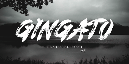 This is a supercharged font, with natural brush, quick strokes and sharp details. Perfect for challenging jobs, titles, movie,logos, apparel, t-shirts, hoodies, quotes, product packaging, or anything that needs a typographic turbo-boost and a typographic unique style. Thanks for checking out this font. I hope you enjoy it!
 - Alacant by Eurotypo,
$28.00 Alacant is a family of slab serif fonts composed of seven weights and their versions in italics. One of the most characteristic advantages of this font is its particularly square shape, very short descenders, open counter-forms and precise kerning that provides a very good visual impact and clear legibility.
 - Angoli by Mashiu,
$12.99ANGOLI is characterized by line geometric and simple. This font is ideal for titles and text in large sizes. The font has two uppercase versions. To realize this character I was inspired by angular shapes of the buildings. Each character has the characteristic of being formed by a single continuous line. - ENEMY by Aminmario Studio,
$30.00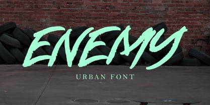 This is a supercharged font, with natural brush, quick strokes and sharp details. Perfect for challenging jobs, titles, movie,logos, apparel, t-shirts, hoodies, quotes, product packaging, or anything that needs a typographic turbo-boost and a typographic unique style. Thanks for checking out this font. I hope you enjoy it!
 - Hard Street by Aminmario Studio,
$30.00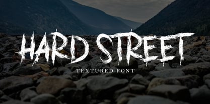 This is a supercharged font, with natural brush, quick strokes and sharp details. Perfect for challenging jobs, titles, movie,logos, apparel, t-shirts, hoodies, quotes, product packaging, or anything that needs a typographic turbo-boost and a typographic unique style. Thanks for checking out this font. I hope you enjoy it!
 - Charlento by Aminmario Studio,
$20.00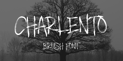 This is a supercharged font, with natural brush, quick strokes and sharp details. Perfect for challenging jobs, titles, movie,logos, apparel, t-shirts, hoodies, quotes, product packaging, or anything that needs a typographic turbo-boost and a typographic unique style. Thanks for checking out this font. I hope you enjoy it!
 - Alpaim by EchadType,
$6.00 Alpaim is a minimalist sans serif font. Uniform characters and sharp geometric features create light modular sensation. Architectural nature of this font is perfectly suited for display use, graphic design, branding and even technical lettering. Originally designed in thin condensed version, now includes weight and width variation, Latin diacritics and Hebrew.
 - Half Death by Aminmario Studio,
$30.00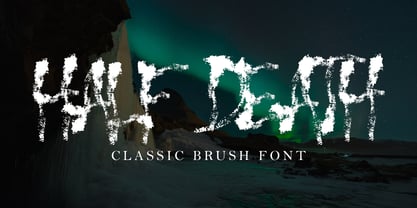 This is a supercharged font, with natural brush, quick strokes and sharp details. Perfect for challenging jobs, titles, movie,logos, apparel, t-shirts, hoodies, quotes, product packaging, or anything that needs a typographic turbo-boost and a typographic unique style. Thanks for checking out this font. I hope you enjoy it!
 - Zombies Night by Aminmario Studio,
$20.00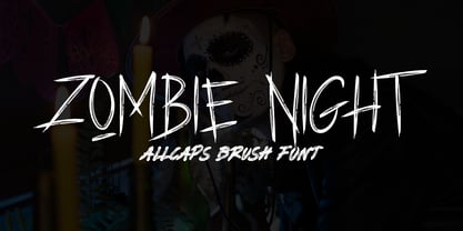 This is a supercharged font, with natural brush, quick strokes and sharp details. Perfect for challenging jobs, titles, movie,logos, apparel, t-shirts, hoodies, quotes, product packaging, or anything that needs a typographic turbo-boost and a typographic unique style. Thanks for checking out this font. I hope you enjoy it!
 - Wonderset by Aminmario Studio,
$20.00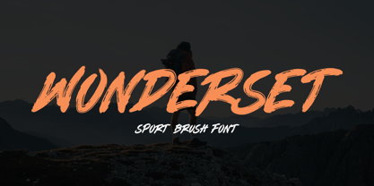 This is a supercharged font, with natural brush, quick strokes and sharp details. Perfect for challenging jobs, titles, movie,logos, apparel, t-shirts, hoodies, quotes, product packaging, or anything that needs a typographic turbo-boost and a typographic unique style. Thanks for checking out this font. I hope you enjoy it!