10,000 search results
(0.034 seconds)
- Julietta Messie by Ghuroba Studio,
$19.00 The Julietta Messie is an elegant brush script. It has an elegant feel and is perfect for adding a luxurious touch to your designs. It�s perfect for branding, wedding invitations, poster designs, business cards, newsletters, stationary, logos, packaging, designs and more.
 - Nouveau Romance JNL by Jeff Levine,
$29.00 The hand lettered title on the sheet music for 1917's "If They'd Never Take You from Me" was the basis for the Art Nouveau sans design of Nouveau Romance JNL. This elegant sans serif is available in both regular and oblique versions.
 - Gloucester by Monotype,
$29.00 Gloucester is a smart, chipper, and studious typeface that evokes British literature and historic books. It's highly legible and great for kids books. Use this font for a pub sign, a book about British history, or anything else that needs a sophisticated look.
 - Birthmont by Typeskets,
$18.00 Birthmont is a vintage display style font, capital letters with interesting combinations, very suitable for use on label designs, titles, or other vintage themed designs. a font inspired by the 80's label designs that used it for the title and headline sections
 - Gingerbread House by Alexandra Korolkova,
$30.00 Gingerbread House is a soft and sweet holiday font which consists of 72 carefully drawn dingbats for Christmas, inspired by soft shapes of sweets and bakery. It is good for greeting cards and other holiday stuff. It has a companion font — Gingerbread.
 - Segmenta by Librito.de,
$15.00Segmenta, a sans serif typeface developed from the gridbased type of the Hamburg S-Bahn (metro). The type is originally used for diplaying informations about the trains. The typeface contains all accents and special letters for extended latin and the baltic languages. - October Nightmare by AEN Creative Studio,
$15.00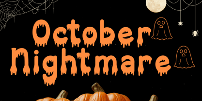 October Nightmare Font is a captivating and spooky display font designed to perfectly encapsulate the spirit of Halloween. This display font is an ideal choice for creating chilling and eye-catching designs for Halloween-themed posters, apparel, embroidery, crafts, and other festive applications.
 - Sunset Trips by Maulana Creative,
$16.00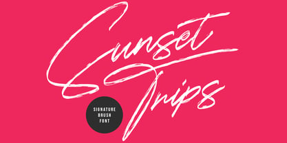 Give your designs an authentic handcrafted feel. Sunset Trips is perfectly suited for signatures, stationery, logos, typography quotes, magazines or book covers, website headers, clothing, branding, packaging design and more. This font includes: - Ligatures - Multilingual Support Thanks for use this font ~ Maulana
 - Renova Pro by Elsner+Flake,
$40.00 Renova was designed by Elsner+Flake in the late 90s as a contractual work. The font family comes as a typical Office pack in EuropePlus layout for at least 72 Latin languages. It is optimized for good legibility in small point sizes.
 - Crown Heights JNL by Jeff Levine,
$29.00Named for his childhood neighborhood in Brooklyn, NY, Jeff Levine's Crown Heights JNL is a lightline all-caps titling font excellent for short words or phrases. Its inspiration is remotely based on the symmetry of earlier designs such as Beton and Stymie. - Christmas Chic by AEN Creative Studio,
$15.00 Christmas Chic is a joyful, festive, and fun slab serif font. It is ideal for Holiday-themed greeting cards and for any crafting project. This font is PUA encoded which means you can access all of the glyphs and swashes with ease!
 - Brandegoris by Scriptorium,
$12.00Brandegoris is a set of traditional split-pen capitals with two forms for most of the letters. It is excellent for headers and titles, especially on web pages and also works well as initial characters in combination with a serif text face. - Practice Sketch by Jehansyah,
$9.00 Practice Sketch This sketch font is perfect for your needs to look elegant and dignified, a luxurious impression will be seen when you use it, aesthetic and modern, very suitable for types of designs that want to look stylish. Thank you very much
 - Olivier by Letters&Numbers,
$28.00 Olivier is based on painted black ink letters. Inspiration for this typeface is fluidity of wine. Shifting base-, mean- and cap lines, varying tails and ascenders give it an organic, playful feel. The font is suitable for logo types, short paragraphs and headings.
 - Laksmi by Dotzeem,
$15.00 Introducing, Laksmi is a clean Variable Sans Serif Typeface for your Design that is fit for your next creative project such as logos, product packaging, Logotype, Letterhead, Poster, Apparel Design, Label, and etc. This Laksmi Typeface includes also support a Multilingual Characters.
 - ZoodMantra by Zooddooz,
$20.00 ZoodMantra is a Pixel-Blackletter typeface developed for nostalgia purposes in the time of video games. It could represent the fantasy world, magic realms, knight's tales and warrior legend. Be suitable for commercial materials, textile design, comic books and classic video games.
 - Restrick by ZetDesign,
$15.00 Restrick is a strong display font. uses curved corners for flexible use on a variety of media displays. This font is very suitable for use as a headline in a newspaper, poster, or magazine. This font is available in regular and italic format.
 - Computer by Monotype,
$40.99Computer is an all-capitals headline font that immediately implies early mainframe computer technology. Although desktop computers and better screen and printer faces have been available for some time, the type style of the Computer font is still used for futuristic topics. - Distressed Groovy Funky by Beast Designer,
$15.99 Distressed Groovy Funky Font is a cute classic display font. It’s suitable for retro design also perfect for designing t-shirts, tote bags, hats, stickers, wedding designs, logos, cards, and more! Incredibly distinct and timeless style and use it to create spectacular designs!
 - Bleached Magenta by Lunas Type,
$19.00 Bleached Magenta is an elegant font. Bleached Magenta will add charm and impression for your design. Bleached Magenta is perfect for many design needs such as merch, T-shirts, signature logo, wedding, book covers, social media posts, websites, events, and many more.
 - Better Saturday by Din Studio,
$29.00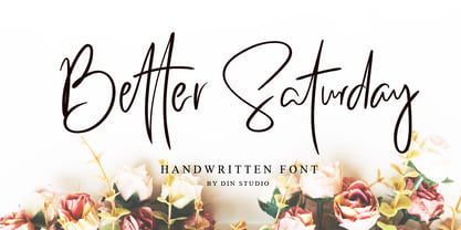 Introducing Better Saturday for your better work. With a classy and natural handwritten style, it brings a classy and chic typeface. Better Saturday is best used for weddings, branding, logotype, and quotes. Features: Beautiful Ligatures PUA Encoded Multilingual Support Numerals and Punctuation
 - Esquina Outline by Green Type,
$37.00 Esquina Outline is a family of octagonal slab serif fonts. Designed for use in outdoor advertising, branding, packaging. Esquina Outline is also ideal for sports related materials such as team logos, flyers, posters and more. Esquina Outline contains Latin, Cyrillic and Greek glyphs.
 - HV Constantine by Harmonais Visual,
$10.00 Constantine - an exquisite display modern serif, inspired by classic roman arts and vintage cars aesthetics. Specially designed for luxury, clean, high-end projects, perfectly suitable for creating elegant, classy design such as magazine, social media, and more. The font features standard ligatures.
 - FlyHigh by Ingrimayne Type,
$12.95 FlyHigh is a decorative text face with slab serifs. It comes in eight styles: plain, semibold, bold, extrabold, italic, semibold italic, bold italic, and extrabold italic. Its low x-height makes it more appropriate for uses such as invitations than for book text.
 - Dunsmuir by Deeezy,
$14.00 Trendy, bold & modern style serif font for your fancy projects. Elegant and classic style on Dunsmuir font will be great for any branding project. Lot of alternates and ligatures will help you to create unique and original logo design or website header! Enjoy :)
 - Mia Love by Dhan Studio,
$20.00 Mia Love is a special brush font designed to look bold, with a perfect texture, suitable for today's designs. Perfect for use in design titles such as invitations, signboards, book titles, stationery designs, quotes, branding, logos, greeting cards, packaging designs, posters, and more.
 - Kasdio by Din Studio,
$29.00 Kasdio is a casual brush font. Made for any professional project branding. Every letter has a unique and beautiful touch. Includes: Kasdio (OTF) Features: Beautiful Ligatures PUA Encoded Multilingual Support Numerals and Punctuation Thank you for downloading premium fonts from DIn Studio
 - Shay Man by Fonts of Chaos,
$10.00 Shay Man is a font design for poster and title tag line. The font is only uppercase in two weights. Shay man is a typicaly straight angular font taking inspiration from the old post brutal design. Use it for making awesome artworks. Enjoy.
 - Dance Routine by Jeff Levine,
$29.00 The hand lettered title on the cover of the 1932 sheet music for “I Wish We Could Dance Forever” was the inspiration for Dance Routine JNL. This bold Art Deco sans serif design is now available in both regular and oblique versions.
 - Carot Sans by Storm Type Foundry,
$39.00 Carot Sans is designed on the basis of three elements - square, circle and triangle. Simple and fresh typeface for visual identities, book covers, magazines and advertisement. The whole Carot system of 64 members offers a modern alternative for all types of design work.
 - Catthy Wellingten by Stringlabs Creative Studio,
$29.00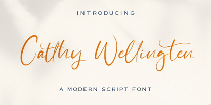 The Catthy Wellingten is a modern script font. It has a playful and feminine look, which is great for wedding invitations and anniversaries, blogs and logos. Catthy Wellingten is a handwritten font, described by an elegant touch, perfect for your favorite projects.
 - Mike Samiya by Grezline Studio,
$8.00 Mike Samiya is a playful and unique font crafted very carefully. Mike Samiya is perfect use for a logo for branding, typography design, christmas card, product packaging, invitation, quotes, t-shirt design, label poster, special events and anything that need handwriting taste.
 - Brooklyn Samuels by Samuelstype,
$30.00 Brooklyn Samuels is a sans-serif family of fonts designed by Hans Samuelson. Based on geometrical shapes it is primarily intended for headline use but also offers excellent legibility in small sizes. Stylistic sets offer a more text-friendly alternative for some letters.
 - Esquina Stencil by Green Type,
$37.00 Esquina Stencil is a family of octagonal slab serif fonts. Designed for use in outdoor advertising, branding, packaging. Esquina Stencil is also ideal for sports related materials such as team logos, flyers, posters and more. Esquina Stencil contains Latin, Cyrillic and Greek glyphs.
 - La storia by Abo Daniel,
$15.00 Introducing La storia - a fine tip signature font. Beautiful monoline signature, looking so classy and natural. There are 2 version, - Regular - Bold La storia is perfect for branding, photography, invitations, quotes, watermarks, advertisements, product designs, labels, and more that needs a natural sign feel. Includes number-punctuations and multilingual support. I created 89 ligatures to keep this font looks natural. at ct dt et ft gt ht it jt kt lt mt nt ot qt rt st tt ut vt wt xt zt an in un en on ar ir ur er or aa ant int unt ent ont att itt utt ett ott ii ee oo uu ff rr ss xx zz ll adl idl udl edl odl ald ild uld eld old art irt urt ert ort fl fh fb jl Fr Gr Hr Ir Kr Mr Nr Or Pr Tr Ur Vr Wr Dr space-r Titling and Ending Swash - Quick Access Add underscore 2x before or after a lowercase (you can see this on the presentation posters). For example a_ _ or _ _a Swash Lines make this font complete. Add underscore 2x before numbers from 1 to 9, you'll get 9 variations of swash line (as shown in the posters). For example _ _1 Thank You so Much!
 - Bruney by Sensatype Studio,
$15.00 Bruney is a Classy and Unique font for brand and logo design. Based on our experience as a graphic designer who works for a lot of companies, we often are requested to design a logo in a unique style but with an elegant shape. So, we try to brainstorming and create this font to make the idea is going out. This is perfect for BRANDING and LOGO DESIGN. You will get classy, elegant, and certainly unique logos with this font. To make it look more classy and unique, here we prepared some ligatures: KA KI KU KE KO LA LI LU LE LO RA RI RU RE RO EB EH EP ER EK HB HP HK HR TB TD TE TF TP TR TT UB UD UF UK UM UN UP UR VA WA AB AD AR AV AW CK OO OC CA CY EA EB ED ES GB GH GK GB GR HB HP HR HK KB KD KS EY FY LS ME MU MB MD MF MH MK MP MR NN SO RS SB SD SE SF SP SY SR ST SS LL UN CS Bruney is also included full set of: uppercase letters multilingual symbols numerals punctuation Wish you enjoy our font. :)
 - Oooh Baby by TypeSETit,
$24.95This happy font is great for scrapping and casual situations. - Madcut by Sebastian Cabaj,
$20.00 Perfect font to use in posters or books for kids!
 - Wawe by Volcano Type,
$19.00A font for all the surfers and beachboys out there! - Roman Ornamented by Intellecta Design,
$23.90 A decorative display font great for large header-like usage.