10,000 search results
(0.124 seconds)
- Ombake by Allmo Studio,
$22.00 OMBAKE is a curly typeface that looks incredible and has an attractiveness when you see it. Each letter shape has been designed to have a character that is easily recorded in the mind. This font has elegant and classy characters, clean lines and smooth curves give any project an extra touch of class. A sans serif modern and curly typeface that has own unique style & modern look. This typeface is perfect for an large point sizes, for example in magazine layouts, packaging, book, title design, fashion brand, clothes, lettering, quotes design and many other ways to your work. We make all the characters is PUA encoded and multilingual. Features: A-Z Character Set a-z Character set Numerals & Punctuations Multilingual Thanks, Alamsa
 - Surfbird by Vintage Voyage Design Supply,
$15.00 Summer vibes are here with Surfbird! • A playful Display family with large variety options. Four styles comes with seven widths & two graphic fonts. The point of this family is getting more modern moods into a classical cowboy-western typographic. The result is a playful western slab which can be used for any design project. Home decor / mugs / t-shirts / stickers / music or podcast covers / menu's / logo's / posters. It can be playful with "western cut" and smooth styles or more serious with the sharp styles. • The Surfbird has two graphic styles. 82 decor graphic elements to add more fancy style to your design. The first one is a contour and the second is a fill for them, to get full color elements.
 - Le Havre Hand by insigne,
$- Le Havre. It's a family with no lack of characters diverse, yet none are as deep or tested in their appearance as the weathered, hand-drawn texture of Le Havre Hand. Tall and lean, the well-aged face carries with it the stories of a thousand miles. Starting with a sans as its origin, this handwritten font's layered structure has been shaped through time and trial, ultimately capturing the simple beauty of a wise, experienced character. This layer-based font family includes style variations and new layering solutions. Le Havre Hand includes 21 font files. It also includes an outline, crosshatched versions and five inline variations, several extruded variants including a unique wireframe options. There are two extruded fonts and two drop shadow fonts. For users that have Opentype programs, such as Adobe Illustrator, Photoshop, InDesign, Microsoft Publisher and Quark, each font also comes with an established set of art deco alternatives. Le Havre Hand's alternate characters come together to exhibit a clear sensitivity to the art deco style. Use them on their own or increase your options by using them with any of the other members of the Le Havre family. Take time to look deep into the soul of Le Havre Hand. It's often the tested, weathered hand that is most reliable to guide you to success.
 - Guild of Professional Actors - Unknown license

- Novaletra Sans CF by Connary Fagen,
$25.00 Smooth brushstrokes inform the construction of Novaletra Sans. As Novaletra Serif's sister typeface, Novaletra Sans shares its easy readability and excellent performance in a humanist design. Subtle flares and low stroke contrast provide warmth uncommon in sans-serif font families. Novaletra Sans CF pairs well with simple sans-serifs like Articulat® CF, or with detailed and airy display type like Quiverleaf® CF. All typefaces from Connary Fagen include free updates, including new features, and free technical support.
 - Farmland JNL by Jeff Levine,
$29.00Farmland JNL is an unusual Western version of Cornfield JNL. The shape of the original letters (inspired by a 1950s popcorn box) create a new variation on the lettering of the Old West. - Ad Lib by SoftMaker,
$15.99 Ad Lib was created by Freeman Craw for ATF in 1961. Sporting irregular character shapes, this informal typeface makes a good impression when a 1960s look is desired in advertising and display work.
 - Park Slope JNL by Jeff Levine,
$29.00 The free-form geometric shapes of the lettering on a vintage piece of sheet music entitled "Four Pictures" is the basis for Park Slope JNL, named for a neighborhood in Brooklyn, New York.
 - Foliart by Struvictory.art,
$14.00 Foliart is thin line uppercase font with floral motives. The typeface includes Decorative and Symbol styles. To get an elegant and unique design, combine letters with symbols. Foliart is suitable for feminine business branding, eco-friendly and minimalistic art, social media design. The font works great for craft products branding and packaging (organic cosmetics and food, jewelry, floristics, handmade soap ect.) Also use individual letters and symbols to create logos and monograms. Foliart combines well with modern graphics: abstract shapes and line art.
 - Yes:Union - Unknown license

- Bornholm Tejn by Trine Rask,
$25.00 Bornholm Tejn is named after the Tejn village on the only rocky island in Denmark, Bornholm. It is the first face in a series of rough stone cut typefaces, that shares proportions, but differs in any other aspect like different pieces of rock. It is powerful face, but still very friendly. Good for very big sizes, but can be used for small texts, movie titles, cartoons and more.
 - Plaquette by FaceType,
$24.00 ‘Plaquette’ is a collection of retro typefaces ranging from victorian to bauhaus to the sixties. They are all equipped with a load of OpenType features such as alternates, catchwords, stylistics sets and others. Plaquette 3D A chromatic set of fonts including gradient and outline layers. Crisp and precise. Plaquette Lovecraft A vintage typeface with some sweet discretionary ligatures to make your typography exciting. Take a look at the many alternates. Plaquette Sittl A clean geometric style with many alternative letters, some inspired by Paul Renner’s original Futura. Plaquette Labels This set provides you with 220 different shapes ideal for logos, plates and… labels.
 - Halagar by Letteralle,
$23.00 Meet Halagar! a versatile font family that brings a dash of masculine charm to your creative toolbox. With a diverse range of 8 weights, Halagar offers endless possibilities for your design projects. Whether you're crafting a bold brand identity, designing eye-catching packaging, laying out engaging body text, creating striking titles, composing captivating posters, or sharing vibrant social media posts, 'Halagar' has you covered. Its strong and assertive presence adds a touch of confidence to every piece. With Halagar, you're not just getting a font; you're getting a reliable design companion that elevates your work to the next level. Explore the endless potential and let 'Halagar' be your go-to choice for all things branding, packaging, and beyond. Unleash your creativity with 'Halagar' today and make your designs stand out in style!
 - Meow Tails by Yumna Type,
$16.00 Meow Tails is a cute, adorable display font inspired by cat theme. All of its letters and characters are designed in flowing and round shapes to express soft and smooth nuances like a sleeping cat. Furthermore, the insertion of additional objects to the letters functions to suggest a cat’s characteristics, such as cute eyes, whiskers, and a long tail. Meow Tails, of which available features and a clipart bonus you can enjoy, will live up and charm your designs in order to attract the audience with the theme you have. In fact, it will also help you build up your brand identity to be unique and memorable, particularly brands related to cats or pets. Features: Alternates Multilingual Supports PUA Encoded Numerals and Punctuations Meow Tails fits best for various design projects, such as brandings, headings, magazine covers, quotes, printed products, merchandise, social media, etc. Find out more ways to use this font by taking a look at the font preview. Thanks for purchasing our fonts. Hopefully, you have a great time using our font. Feel free to contact us anytime for further information or when you have trouble with the font. Thanks a lot and happy designing.
 - Jatukiy by Twinletter,
$13.00 Introducing “JATUKIY Font” – Unleash Playful Creativity! Meet JATUKIY Font, your passport to a world of playful design possibilities. Designed with a whimsical touch, this display font brings a burst of fun to your projects. JATUKIY Font is your go-to choice when you want to infuse energy and a hint of cheekiness into your designs. Whether it’s children’s books, party invitations, or anything that needs a playful twist, this font is your creative ally. The distinctive style of JATUKIY Font is a visual treat. Its playful, bouncy characters instantly grab attention and leave a lasting impression. Let your designs speak volumes with the lighthearted charm of JATUKIY Font. Crafted with precision, this font’s unique design ensures that your message is delivered with a delightful twist. It adds a touch of humor and personality, making your content unforgettable. With JATUKIY Font, you have the power to create designs that stand out from the crowd. Infuse your projects with creativity, laughter, and a dash of whimsy, all with the help of JATUKIY Font. Elevate your design game and let your imagination run wild with this playful typeface. – PUA Encoded Characters – Fully accessible without additional design software.
 - Adventure Island by Larin Type Co,
$12.00 Adventure Island this is a stunning font family that consists of two types of fonts, script and sans serif, and each has 8 weights (Regular, Rough, Halftone, Pressed, Bold, Bold rough, Bold halftone, Bold pressed,). With their help, a lot of options are opened for you to create your projects, both in vintage and in modern style. These fonts are like twin brothers, they fit perfectly and complement each other. The Script type has flowing shapes and is made to shine and lively for the full hand-signature effect. Sans serif type is also made in monoline and has rounded corners and smooth lines. The script style has alternatives for uppercases and many alternates for lowercaes, with them you can make your design more expressive, varied and playful, change them and you will see how many options you can get for your design, also use swashes touches to complement your design. Enjoy using! The font includes 8 script fonts and 8 sans serif fonts (Regular, Rough, Halftone, Pressed, Bold, Bold rough, Bold halftone, Bold pressed,) Full alphabet with Uppercase and Lowercase A-z for script Full alphabet with Uppercase for sans serif Numbers, fractions for all fonts Punctuation and mathematical symbols for all fonts Alternates Uppercase and Lowercase also ampersand for script Swashes for script Multilingual support all fonts
 - Ayr Thrope by Aiyari,
$25.00 Introducing Thrope the irregular retro display font family heavy influence by motter ombra typeface, geometric basic shape, and 60s to 70s pop culture. Thrope typeface includes 3 font family (regular, bold,& heavy) it comes with stylistic alternates 01-04 & ligatures. Thrope font family best used for logotype, headline, header, signage.
 - Cartoon Characters Volume 1 by Celebrity Fontz,
$24.99 Cartoons characters Vol. 1 is collection of Victorian-era fanciful cartoon characters in the shape of letters or characters interacting with objects shaped as letters.
 - Midnight Diner by Roland Hüse Design,
$30.00 Did your client just say ‘can you make it pop’? Then you already know you got it on lock. Introducing: Midnight Diner! A multi-layered dimensional script font family featuring thin, bold, outline and shadow capabilities, with a left-leaning slant to boot. You can experiment with various layer combinations and colour! How fun is that? Being effortlessly casual, retro and elegant all in one, you can play it up or down to your liking – perfect for display graphics, logos, signages, packaging, lifestyle imagery, invitations and more. It features a diverse range of stylistic alternates, contextual alternates, and standard ligatures, ensuring that you’ve countless options to choose from for your design work. This font family is delicately crafted and well thought out with every little detail in mind, to ensure its ease and versatility when used! Midnight Diner is a collaboration between lettering artist and calligrapher, Leah Chong (www.leahdesign.sg) and typeface designer, Roland Huse (www.rolandhuse.com). Product Content: Midnight Diner Layered Font - Thin (TTF) Midnight Diner Layered Font - Bold (TTF) Midnight Diner Layered Font - Outline (TTF) Midnight Diner Layered Font - Shadow (TTF) Font Guide PDF https://drive.google.com/file/d/1KPSf-gGrhX3wyaImEAmlJICERNbxu2IN/view?usp=sharing Font Guide Youtube Video https://youtu.be/GtZ8E7Y7wnQ 6 Bonus SVGs (TTF): Midnight Diner SVG - Red Yellow Midnight Diner SVG - Black Pink Midnight Diner SVG - Blue Green Midnight Diner SVG - Orange Yellow Midnight Diner SVG - Purple Pink Midnight Diner SVG - Black White Font Features: Latin character set: Uppercase & Lowercase A - Z Stylistic Alternates Contextual Alternates Standard Ligatures Numerals, Currency Symbols & Punctuation Accented Characters To access all features of Midnight Diner such as stylistic alternates etc., it's highly recommended to use professional design software such as Adobe Illustrator, Adobe Photoshop, Adobe InDesign or Procreate (via the ‘add text' feature).
 - Maus by Sentinel Type,
$10.00A heavy duty block-shadow font derived from Sentinel Sten Type, Maus' inflexible, near-featureless block-like shapes give the impression of great mass and solidity. Maus is an example of minimalism in type design, using a minimum of sculpting to elicit the essence of familiar Latin forms. Two sets of complimentary letters allow designers to pick and choose combinations for letter fit, for their symmetric values, or to create a particular look or feel to suit the subject. Obviously Maus has great potential for signage, posters and billboards, and screen-printed garments. - Agradable by Mchcrafter,
$18.00 Agradable is a Modern Stylistic Serif typeface A new serif that we created specially for branding needs, with extra ligatures and alternates in a unique shape just to add value to your brand. It so nice to leverage designer or product owner that need solutions to make their design look more stylish and modern. And specially for Agradable font, We prepared all the ligatures, and the alternates characters to help you create unlimited variations for your creative needs. Agradable includes: All uppercase & lowercase letters All numbers 0-9 & Punctuation Ligatures & Alternates Symbols Multiligual Letters
 - Bold Pen Lettering JNL by Jeff Levine,
$29.00 The title on the cover of Street & Smith’s “Wild West Weekly” for Jan. 27, 1934 made for an interesting contrast in terms. Here was a pulp magazine dedicated to stories of the Old West, but its title was hand lettered in an extra bold, squared shape style using a round pen nib – not exactly an alphabet that represented cowboys and desperados… This aside, this type style made for a good digital font revival, and it is now available as Bold Pen Lettering JNL in both regular and oblique versions.
 - Bibalgoski by Mchcrafter,
$18.00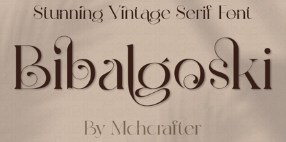 Bibalgoski is a Modern Stylistic Serif typeface. A new serif that we created specially for branding needs, with extra ligatures and alternates in a unique shape just to add value to your brand. It so nice to leverage designer or product owner that need solutions to make their design look more stylish and modern. And specially for Bibalgoski font, We prepared all the ligatures, and the alternates characters to help you create unlimited variations for your creative needs. Bibalgoski includes: All uppercase & lowercase letters All numbers 0-9 & Punctuation Ligatures & Alternates Symbols Multiligual Letters
 - Ingone by Ingrimayne Type,
$9.95 Ingone is a slightly irregular sans-serif face. It was designed to complement PattyDay and HeyPumpkin, but can be used alone if you need an informal, friendly sans-serif font. It has only one weight, but the family includes a shadowed style. In 2018 the inside of the shadowed version was separated out and made a separate typeface. The letters have the shapes of the regular version but the spacing of the shadowed version and can be layered with the shadowed version to easily produce lettering with two colors.
 - Gatsby SF by Scholtz Fonts,
$19.00Gatsby SF portrays the formal elegance of Art Deco, using the rounded shapes typical of the Art Deco movement. The upper case characters are decorated with a classical Art Deco motif, while lower case characters have been left unadorned for increased readability. Gatsby SF functions well as a display font and creates attention-attracting headers and subheaders. Fully professional, Gatsby SF contains a full character set - Upper and Lower case, all numerals, punctuation, symbols and accented characters. It is suitable for layout work in all major European languages. - Salda by Hurufatfont,
$19.00 Salda; It is a modern sans serif family that blends old and new generation sans serif fonts in the same body. It has a wide usage area with its light narrow structure, sharp and clean lines, humanist touches. It provides clean and smooth visuals in vertical screens, mobile applications and block texts. With two different x heights (xL-xS), the body offers richness in text and headings. It consists of a total of 40 styles. Ideal for all kinds of editorial design, packaging, corporate identity, brand, application, web and desktop.
 - Nuber Next by The Northern Block,
$39.95 Nuber Next is a modern geometric sans influenced by the popular neo-grotesques of the 1950s including Helvetica and Univers. Carefully remastered from the original Nuber type family to improve letter shape, overall uniformity and introduce a flexible width system capable of handling a wider variety of typographic applications. Details include 750 characters per font, nine weights and five widths with matching italics. Opentype features include seven variations of numerals, fractions, case-sensitive forms, stylistic alternates, ligatures, extended monetary symbols and language support covering Cyrillic, Western, South and Central Europe.
 - Jasan by Storm Type Foundry,
$49.00 Jasan is the Czech expression for ash tree (Fraxinus Excelsior) which provides great wood for tools and furniture. In a landscape it’s a rather inconspicuous tree which forms beautiful alleys. Jasan typeface represents a synthesis of many famous sans-serifs: despite the concept being strictly rational, it’s not at all cold. Simple shapes & human expression will make your projects nicely colored. It brings excellent clarity for printed and web publishing, visual identity & information systems. The 36-font family contains multi-lingual support including Cyrillics, Small Caps & rich palette of OpenType Features.
 - Tote Bag JNL by Jeff Levine,
$29.00Totebag JNL continues the stencil font series from Jeff Levine originally inspired by classic lettering stencils of the 1940s and 1950s. This particular design is common amongst "painting stencils", the individual letters used for marking and identification. Some characters are solid shapes while others have the more traditional "breaks" in the letters. - Squadzone by DePlictis Types,
$29.00 SQUADZONE it’s a young & sportive unicase style font, having both uppercase and a few smallcase alternating letters that gives it a unique look. It’s geometric anathomy of the letters may have two different types of endings or detail: straight and sharp cut out angles at 45 degrees. This offers a few alternatives in headlines or even logotype purposes that are realy encouraged to use for.
 - Lost and Foundry by Fontsmith,
$15.00 Breaking the cycle of homelessness We are partnered with The House of St. Barnabas, a private members club in Soho Square, whose work as a not for profit charity aims to break the cycle of homelessness in London. Each purchase (of the family pack) comes with a one month membership to The House and 100% of the proceeds from sales of fonts go directly to the charity to help their essential work. This unique collection of 7 typefaces is based on the disappearing signs of Soho, at risk of being lost forever due to the ever changing landscape of the area. By re-imaging the signage as complete fonts, we have rescued this rich visual history from the streets and present the typefaces into a contemporary context for a bright optimistic future. FS Berwick Thanks to its humble tiled origins, this Egyptian serif type maintains a uniform character width, creating the irregular letter proportions found in the final alphabet. Broad-shouldered, the bracketed serifs firmly ground the font, whilst its extreme hairlines become a necessity due to the uniform width. Of note is the upside down ‘S’, to be found on the original sign on Berwick Street. Perhaps due to its ceramic origins, there is a surprising ‘slippiness’ to its final appearance. FS Cattle Cattle & Son is best described as a wide, but not overly extended, grotesque-style sans serif, showing a uniform width and carrying a robust strength to its form. Whilst lightly functional overall, the purposeful diagonal legs of the ‘K’, ‘R’ and the tail of the ‘Q’ add an urgency to its appearance. The reduced size of the ampersand gives away Cattle & Son’s hand-painted origins, and the oblique compacted ‘LTD’ found on the original sign is also included in the final set. This beautiful sign is tucked away under an arch in Portland Mews, sheltering from the weather. Perhaps this is why it has lasted so long. FS Century This somewhat elongated set of Roman capitals was originally rendered in paint circa 1940, but its roots trace back to the Trajan Column in Rome. Witness the slightly unbalanced ‘W’ and the painter’s hand is revealed. Century’s flared serif style is extremely short, sharp and bracketed. The ‘M’ is splayed and has no top serifs. Century has a uniform appearance of width, probably due to its sign-written origins. Yet is elegant, classic and exudes sophistication. FS Charity A true Tuscan letterform, the original is located on The House of St. Barnabas in ceramic tiles and was revealed in all its broken glory in 2014. FS Charity retains the option of using these incorrect characters (try typing lowercase in the test drive above and compare with the more uniform uppercase characters). FS Charity features fishtailed terminals on its strokes, a curious branched ‘T’ and the ‘S’ displays tear-drop ends to its serifs. Almost uniform in width, the ‘A’, ‘M’ and ‘W’ are the widest characters in this set. FS Marlborough The elongated Marlborough features diagonal terminals to some characters and numerals. Also retained is the space-saving contracted ‘T’ glyph from the original sign, while the ‘R’ features a distinctive wedge-shaped leg. Highly individual in this form, similar signage appears around Soho, but featuring a variety of widths in their design. FS Portland The sister type to Cattle & Son, Portland is oblique rather than italic. The serifs are not overly long, yet still enhance its rather rigid cap height and baseline appearance. Its ‘A’ has a top serif, the ‘M’ is square and the ‘G’ foregoes any spur. Particularly delightful is the open ampersand. Numerals align to encourage the horizontal flavour of the oblique style. Overall, Portland is both confident and graceful. FS St James A lineal Continental style, St James also displays a true sense of ‘Londoness’ in its titling form, perhaps influenced by early Underground signage. Irregular letterforms display a continental flavour, particularly evident in its Deco style ‘W’, ampersand and numerals. The rather high cross bar in the ‘A’ is also reflected in the raised middle strokes of the ‘M’. Noteworthy are the distinctive unions found on all of the characters and the additional small caps. The original lettering is still located on Greek St.
 - Black Donshine by Letterhend,
$17.00 Black Donshine is a display typeface that demands attention with its bold in vintage looks. The sharp hooks and strong lines create a sense of toughness. This font is perfect for designs that require a bold and modern look, such as logos, posters, and advertisements such as invitations, labels, logos, magazines, books, greeting / wedding cards, packaging, fashion, make up, stationery, novels, labels or any type of advertising purpose. Features : - Uppercase & lowercase - Numbers and punctuation - Alternates & Ligatures - Multilingual - PUA encoded We highly recommend using a program that supports OpenType features and Glyphs panels like many of Adobe apps and Corel Draw, so you can see and access all Glyph variations.
 - Veotec by Hashtag Type,
$29.00 Veotec is a classic humanist sans that skilfully works for both screen and print due to its steep and precise angles enabling more negative space. Not only does this methodical approach improve legibility and readability at small sizes, it allows the bolder weights to feel harmonised and consistent without the compromise of this legibility. Angles are refined and considered with a balance between sharp and round curves adding a unique feature to this font. This also gives a modern and appealing feel at large sizes. Details include 6 well constructed weights, manually edited kerning, which is more open for on-screen devices, ligatures and alternatives.
 - Genre by Storm Type Foundry,
$26.00The official terseness and grey of Neo-Classical type faces will stand out when we narrow them. The consistently vertical shading of the letters suppresses one's desire for eccentricity, just like tea with bromine. It would, however, be wrong to consider Bodoni as the originator of this - vertically shaded - trend in type face production. In his Manual we can also find type faces with a slanted axis of shade, picturesque italics and a number of normal, more human type faces. It remains a mystery why his name is connected only with one of his many works. Genre's basic design is fairly light in colour, which is why it looks good in illustrated magazines and short texts and directly calls for graphically striking, contrasting headings. It shows off beautifully next to photographs, on diplomas and on printed materials connected with a person's death. - Aravis by AravisFonts.com,
$39.89 Amazingly easy on the eye; it draws the reader in with minimal brain bandwidth use. Designed to enable more focus on the content. Good for web pages. Very Dyslexia friendly. Our mission has been to create a font that scientifically designed to be dyslexia friendly while also being attractive and useful. Dyslexia features: Each letter is unique even if reversed or flipped. The spacing is carefully designed using scientific evidence to help all readers from those who read via word shapes to those who read using phonemes and syllables. The visual stress caused by contrast pattern glare is minimised and has fared well when measured by professionals against other common fonts. Usefully mid-sized to make it easy to transfer artwork from common fonts to Aravis. This is very helpful when providing reasonable adjustments for people with Dyslexia. Based on algorithms found in nature. Range of use: Ø 72 Latin based languages Ø Greek and Coptic Ø IPA extensions Ø Good Maths symbols provision with OT support for vulgar fractions Ø Innovative OT support for creating boxes for forms Ø Small Capitals with some accents also supported (Czech) Ø Subscripts and sups: Complete alphabet upper and lower case and numbers Ø Customers can request additional symbols and characters within reason, or add an accent /shape unique to their country if it fits with the overall mission of the font.
 - Memoire by Reserves,
$49.00 Memoire is an elegant linear hairline contemporary sans. It is based on the underlying form of Vanitas, yet is rendered in a nearly monolinear hairline weight. Memoire is intended to be used selectively for headline use starting at 60pt and above. Stylistically, Memoire retains Vanitas’ alluring, sophisticated sensibility that is directly inspired by high fashion. The delicate linear form creates a sense of cohesiveness and lends the typeface an intriguing lightness of character. The upright styles are complimented by a pairing of optically adjusted true italics, which were purposefully adapted to retain the sharpness of their counterparts. Abandoning traditionally executed cursive italic letterforms retains Memoire’s sharp characteristic through each style.
 - Darka by Sudtipos,
$49.00 Darka is a splendid, mysterious dark lady reincarnated in digital vectors as an original blackletter font. Her gothic, medieval, nocturnal attributes take the form of sharp terminals, seductive curves, calligraphic flair and complex character. Darka blends the balance of Textura, the flow of Fraktur and the elegant lowercase-to-uppercase ratio of Bâtarde into a stylish, inventive typeface with a Mexican soul. Starting as a personal, calligraphic hand, Darka slowly evolved into digital type, developing alternate glyphs, flourishes and special signs to preserve its hand-written origins and delicate tension, making it an excellent display typeface and, surprisingly, even a distinctive, crisp font for short texts. Darka received an Award of Excellence at the Type Directors Club of New York annual competition.
 - SG Noxvile by Studio Gulden,
$24.00 Unleash the power of typography with Noxvile, a revolutionary font that demands attention and exudes confidence. Crafted with precision and designed to make a statement, Noxvile brings a whole new level of intensity to your words. Ignite your creativity and let your message roar with Noxvile's super bold style and captivating all-caps specimen. Whether you're designing eye-catching headlines, striking logos, or empowering social media posts, this font will make your words leap off the page and leave a lasting impression. Stand tall among the rest with Noxvile's commanding presence. Embrace its sharp edges, powerful curves, and unparalleled strength to create a visual experience that is truly unforgettable. Let your message shine brighter than ever before, cutting through the noise and leaving your audience captivated.
 - Occam by Veil of Perception,
$20.00 Occam is an informal calligraphic script face. The letter forms were drawn and constructed rather than penned or brushed but reflect a definite flat pen influence. The ascenders and descenders incorporate an abstract implied loop form. Some curves that would normally be round are pointed and some transitions that would normally be sharp and pointed have been made round. A few exit strokes curve back instead of moving up and out for a little different look. This font could be put to good use as a contrasting style combined with sans and serif faces in applications such as newsletters, brochures, invitations and annual reports. It could be used for heads, subheads, pull quotes, drop caps and as a title font for covers.
 - The Ruby by Vintage Voyage Design Supply,
$15.00 The Ruby Duo - a retro inspired font duo with a wide range of sans and script styles. Rugged and simple sans with a cool pair of mono line script. The main thing is the possibility of various combinations of using - from Condensed to Extra Expanded and from Light to Black. You will definitely find the best way to use in your projects with more than 50 styles. The sans has underline small caps alternates to use it with conjunctions. The script also has some alternates to change the script mood. Also, you will find a five graphic fonts with 130 elements total! A lot of vintage badge shapes and more than 100 vector vintage mood icons to use it in your badges or logos. PDF graphic navigation

