10,000 search results
(0.07 seconds)
- Mystica by Aestherica Studio,
$12.00 Introducing the new Fun Handwritten Font by Aestherica Studio. Proudly Present, Mystica Mystica is perfect for product packaging, branding project, megazine, social media, wedding, or just used to express words above the background. Mystica also multilingual support. Enjoy the font, feel free to comment or feedback, send me PM or email.
 - Jingle Binder by Balpirick,
$15.00 Jingle Binder is a Modern Handwritten Bold Font. Jingle Binder is perfect for product packaging, branding project, magazine, social media, wedding, or just used to express words above the background. Jingle Binder also multilingual support. Enjoy the font, feel free to comment or feedback, send me PM or email. Thank you!
 - Uncle Hours by Adante Creative,
$23.00 Introducing by Adante.Creative Proudly Present, Uncle Hours Uncle Hours is A Bold Display Typeface Font Uncle Hours is perfect for product packaging, branding project, megazine, social media, wedding, or just used to express words above the background. Enjoy the font, feel free to comment or feedback, send me PM or email.
 - Oyscake by Allouse Studio,
$16.00 Proudly Present, Oyscake a Handwritten Font. Oyscake is perfect for any titles, logo, product packaging, branding project, megazine, social media, wedding, or just used to express words above the background. Oyscake also come with Multi-Lingual Support. Enjoy the font, feel free to comment or feedback, send me PM or email.
 - Forsty Candy by Balpirick,
$15.00 Forsty Candy is a Fun Display Hand-brushed Font. Forsty Candy is perfect for product packaging, branding project, megazine, social media, wedding, or just used to express words above the background. Forsty Candy support multilingual. Enjoy the font, feel free to comment or feedback, send me PM or email. Thank you!
 - Donau by Renzler Design,
$12.00 The font Donau is named after the german name for the river Danube. It is an art nouveau inspired sans and slab serif typeface, sharing proportions and widths across two weights. It is intended for any kind of display use as well as short amounts of text. Enjoy!
 - Illustrate IT - Unknown license

- Wooden Alphabet by Yumna Type,
$25.00 Wooden Alphabet is a peculiar wood texture and shape-inspiring display font having unique, attractive letter designs in prominent uppercases along with wood textures to express natural nuances. All of the font letters are very carefully, smoothly designed in detail as if they were made of real wood. In fact, wood textures on the letters leave the impressions of warmth and nature on the designs. Wooden Alphabet excels at the ability to create natural impressions and warm nuances in order to make your designs look interestingly different for increasing the product’s attractiveness. Such a wood-themed font is a perfect match for any nature, environment, or organic related products. To be greatly legible, you can use it for big text sizes. Wooden Alphabet provides a clipart in accordance with the font theme as a bonus and features you can enjoy. Features: Multilingual Supports PUA Encoded Numerals and Punctuations Wooden Alphabet fits best for various design projects, such as brandings, headings, magazine covers, quotes, printed products, merchandise, social media, etc. Find out more ways to use this font by taking a look at the font preview. Thanks for purchasing our fonts. Hopefully, you have a great time using our font. Feel free to contact us anytime for further information or when you have trouble with the font. Thanks a lot and happy designing.
 - Juwitha by Letterafandi Studio,
$14.00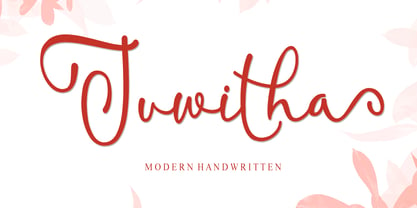 Juwitha is a modern handwitten font featuring charming, playful characters that seem to dance along the baseline. It will add a luxury spark to any design project that you wish to create! This font is PUA encoded which means you can access all of the glyphs and swashes with ease!
 - Gold Fever by FontMesa,
$25.00Gold Fever is a revival of the old classic Caxtonian font originaly designed in the mid to late 1800s. Along with the original engraved shadow version new styles have been created making this decorative font set more complete. The new styles include a solid black, open faced, condensed and fill versions. - Febriella by Letterafandi Studio,
$12.00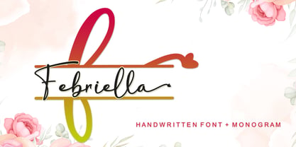 Febriella is a lovely script font featuring charming, playful characters that seem to dance along the baseline. It will add a luxury spark to any design project that you wish to create! This font is PUA encoded which means you can access all of the glyphs and swashes with ease!
 - Beautiful Victoria by Letterena Studios,
$9.00 Beautiful Victoria is a lovely script font featuring charming, playful characters that seem to dance along the baseline. Add this font to your most creative ideas, and notice how it makes them stand out! Beautiful Victoria is PUA encoded which means you can access all glyphs and swashes with ease!
 - Vianova Serif Pro by Elsner+Flake,
$59.00 The font superfamily Vianova contains each 12 weights of Sans and Slab and 8 weights of the Serif style. The design from Jürgen Adolph dates back into the 1990s, when he studied Communication Design with Werner Schneider as a professor at the Fachhochschule Stuttgart. Adolph started his carrier 1995 at Michael Conrad & Leo Burnett. He was responsible for trade marks as Adidas, BMW, Germanwings and Merz. He has been honored as a member of the Art Directors Club (ADC) with more than 100 awards. On February 26, 2014, Jürgen Adolph wrote the following: “I was already interested in typography, even when I could not yet read. Letterforms, for instance, above storefronts downtown, had an irresistible appeal for me. Therefore, it is probably not a coincidence that, after finishing high school, I began an apprenticeship with a provider of signage and neon-advertising in Saarbrücken, and – in the late 1980s – I placed highest in my field in my state. When I continued my studies in communications design in Wiesbaden, I was introduced to the highest standards in calligraphy and type design. “Typography begins with writing” my revered teacher, Professor Werner Schneider, taught me. Indefatigably, he supported me during the development of my typeface “Vianova” – which began as part of a studies program – and accompanied me on my journey even when its more austere letterforms did not necessarily conform to his own aesthetic ideals. The completely analogue development of the types – designed entirely with ink and opaque white on cardboard – covered several academic semesters. In order to find its appropriate form, writing with a flat nib was used. Once, when I showed some intermediate designs to Günter Gerhard Lange, who occasionally honored our school with a visit, he commented in his own inimitable manner: “Not bad what you are doing there. But if you want to make a living with this, you might as well order your coffin now.” At that time, I was concentrating mainly on the serif version. But things reached a different level of complexity when, during a meeting with Günther Flake which had been arranged by Professor Schneider, he suggested that I enlarge the offering with a sans and slab version of the typeface. So – a few more months went by, but at the same time, Elsner+Flake already began with the digitilization process. In order to avoid the fate predicted by Günter Gerhard Lange, I went into “servitude” in the advertising industry (Michael Conrad & Leo Burnett) and design field (Rempen& Partner, SchömanCorporate, Claus Koch) and worked for several years as the Creative Director at KW43 in Düsseldorf concerned with corporate design development and expansion (among others for A. Lange & Söhne, Deichmann, Germanwings, Langenscheidt, Montblanc.”
 - Vianova Slab Pro by Elsner+Flake,
$59.00 The font superfamily Vianova contains each 12 weights of Sans and Slab and 8 weights of the Serif style. The design from Jürgen Adolph dates back into the 1990s, when he studied Communication Design with Werner Schneider as a professor at the Fachhochschule Stuttgart. Adolph started his carrier 1995 at Michael Conrad & Leo Burnett. He was responsible for trade marks as Adidas, BMW, Germanwings and Merz. He has been honored as a member of the Art Directors Club (ADC) with more than 100 awards. On February 26, 2014, Jürgen Adolph wrote the following: “I was already interested in typography, even when I could not yet read. Letterforms, for instance, above storefronts downtown, had an irresistible appeal for me. Therefore, it is probably not a coincidence that, after finishing high school, I began an apprenticeship with a provider of signage and neon-advertising in Saarbrücken, and – in the late 1980s – I placed highest in my field in my state. When I continued my studies in communications design in Wiesbaden, I was introduced to the highest standards in calligraphy and type design. “Typography begins with writing” my revered teacher, Professor Werner Schneider, taught me. Indefatigably, he supported me during the development of my typeface “Vianova” – which began as part of a studies program – and accompanied me on my journey even when its more austere letterforms did not necessarily conform to his own aesthetic ideals. The completely analogue development of the types – designed entirely with ink and opaque white on cardboard – covered several academic semesters. In order to find its appropriate form, writing with a flat nib was used. Once, when I showed some intermediate designs to Günter Gerhard Lange, who occasionally honored our school with a visit, he commented in his own inimitable manner: “Not bad what you are doing there. But if you want to make a living with this, you might as well order your coffin now.” At that time, I was concentrating mainly on the serif version. But things reached a different level of complexity when, during a meeting with Günther Flake which had been arranged by Professor Schneider, he suggested that I enlarge the offering with a sans and slab version of the typeface. So – a few more months went by, but at the same time, Elsner+Flake already began with the digitilization process. In order to avoid the fate predicted by Günter Gerhard Lange, I went into “servitude” in the advertising industry (Michael Conrad & Leo Burnett) and design field (Rempen& Partner, SchömanCorporate, Claus Koch) and worked for several years as the Creative Director at KW43 in Düsseldorf concerned with corporate design development and expansion (among others for A. Lange & Söhne, Deichmann, Germanwings, Langenscheidt, Montblanc.”
 - Vianova Sans Pro by Elsner+Flake,
$59.00 The font superfamily Vianova contains each 12 weights of Sans and Slab and 8 weights of the Serif style. The design from Jürgen Adolph dates back into the 90th, when he studied Communication Design with Werner Schneider as a professor at the Fachhochschule Stuttgart. Adolph started his carrier 1995 at Michael Conrad & Leo Burnett. He was responsible for trade marks as Adidas, BMW, Germanwings and Merz. He has been honoured as a member of the Art Director Club (ADC) with more than 100 awards. On February 26, 2014, Jürgen Adolph wrote the following: “I was already interested in typography, even when I could not yet read. Letterforms, for instance, above storefronts downtown, had an irresistible appeal for me. Therefore, it is probably not a coincidence that, after finishing high school, I began an apprenticeship with a provider of signage and neon-advertising in Saarbrücken, and – in the late 1980s – I placed highest in my field in my state. When I continued my studies in communications design in Wiesbaden, I was introduced to the highest standards in calligraphy and type design. “Typography begins with writing” my revered teacher, Professor Werner Schneider, taught me. Indefatigably, he supported me during the development of my typeface “Vianova” – which began as part of a studies program – and accompanied me on my journey even when its more austere letterforms did not necessarily conform to his own aesthetic ideals. The completely analogue development of the types – designed entirely with ink and opaque white on cardboard – covered several academic semesters. In order to find its appropriate form, writing with a flat nib was used. Once, when I showed some intermediate designs to Günter Gerhard Lange, who occasionally honored our school with a visit, he commented in his own inimitable manner: “Not bad what you are doing there. But if you want to make a living with this, you might as well order your coffin now.” At that time, I was concentrating mainly on the serif version. But things reached a different level of complexity when, during a meeting with Günther Flake which had been arranged by Professor Schneider, he suggested that I enlarge the offering with a sans and slab version of the typeface. So – a few more months went by, but at the same time, Elsner+Flake already began with the digitilization process. In order to avoid the fate predicted by Günter Gerhard Lange, I went into “servitude” in the advertising industry (Michael Conrad & Leo Burnett) and design field (Rempen& Partner, SchömanCorporate, Claus Koch) and worked for several years as the Creative Director at KW43 in Düsseldorf concerned with corporate design development and expansion (among others for A. Lange & Söhne, Deichmann, Germanwings, Langenscheidt, Montblanc.”
 - Swamp Witch - 100% free

- Wayfinder CF by Connary Fagen,
$35.00 Wayfinder® CF imparts both elegance and urgency to any text. Equally warm and intense, Wayfinder is a display font family made for logos, headlines, titles, and other short texts. Seven weights cover everything from an airy thin to a brilliant heavyweight. Wayfinder® CF pairs nicely with simple, unadorned typefaces. Great options include Artifex Hand CF and Greycliff® CF. All typefaces from Connary Fagen include free updates, including new features, and free technical support.
 - Visby CF by Connary Fagen,
$35.00 Friendly in lowercase; sophisticated in capitals. Visby® CF is a geometric font family inspired by the stark beauty of the Arctic. Straight lines and sharp corners mesh with subtle humanist influences, giving Visby a blend of precision and warmth. Includes Latin and Cyrillic scripts. Visby® CF pairs well with contrasting softer typefaces, particularly text-friendly serifs like Artifex CF and Addington CF. All typefaces from Connary Fagen include free updates, including new features, and free technical support.
 - Novaletra Sans CF by Connary Fagen,
$25.00 Smooth brushstrokes inform the construction of Novaletra Sans. As Novaletra Serif's sister typeface, Novaletra Sans shares its easy readability and excellent performance in a humanist design. Subtle flares and low stroke contrast provide warmth uncommon in sans-serif font families. Novaletra Sans CF pairs well with simple sans-serifs like Articulat® CF, or with detailed and airy display type like Quiverleaf® CF. All typefaces from Connary Fagen include free updates, including new features, and free technical support.
 - Willow Eden by Balpirick,
$15.00 Willow Eden is a Modern Handwritten Font. Willow Eden is a magical script font carefully created with a touch of elegance. Whether you’re looking for fonts for Instagram or calligraphy scripts for DIY projects, this font will turn any creative idea into a true piece of art! Willow Eden also multilingual support. Enjoy the font, feel free to comment or feedback, send me PM or email. Thank you!
 - Kristian Paradise by Timurtype,
$14.00 Introduced by Timurtype Studio! Kristian Paradise is a Handwritten Script Font This font is mesmerizing handwritten script that adds a touch of elegance to your design, complete with enchanting swashes and a graceful underline. Elevate your creations with the perfect blend of style and sophistication Kristian Paradise Font also supports multilingualism. Enhance your designs with our original fonts, feel free to comment or provide feedback, Enjoy the fonts 😊
 - Blinky Season by Balpirick,
$12.00 Introducing by Balpirick Studio. Proudly Present, BLINKY SEASON Font. BLINKY SEASON is a Monoline Font. Blinky Season is a cute, quirky and fresh handwritten font. It is ideal for holiday-themed greeting cards and for any crafting project that requires a sweet, romantic touch. This font includes TTF and OTF, BLINKY SEASON also multilingual support. Enjoy the font, feel free to comment or feedback, send me PM or email. Thank you!
 - Metsys by Alias Collection,
$60.00 A typeface derived from a logotype designed for New-Age electronic band System 7 in the early 1990s. Metsys is a soft-tech take on the monoline aesthetic. Letterforms are purified, rounded almost abstract graphic shapes.
 - Amurg - Personal use only

- !Basket of Hammers - Unknown license

- Goldtext by Attractype,
$10.00 f you like being creative with bold serif fonts, then the BOLDTEXT font could be your choice. The thick and sharp shape will direct the eye to your special design. A legible letter style will form words that are easy to read. You can use this font to design logos, titles, magazines, comics, text effects, banners and more. Feel free to contact me about this font.
 - Galaksie by Balpirick,
$15.00 Galaksie is a Modern Calligraphy Font. Galaksie is a stylish script font with a contemporary atmosphere and impeccable form, inspired by timeless classic calligraphy. Not too thin and not too thick, balanced and varied, this font was designed to enhance the beauty of your projects. Galaksie also multilingual support. Enjoy the font, feel free to comment or feedback, send me PM or email. Thank you!
 - Babycakes by Balpirick,
$15.00 BABYCAKES is a Fun Handbrushed Font. Babycakes is a cute and fun display font. It embodies playfulness and authenticity and is the perfect choice for any children activity or school project. Add this chunky lettered font to your designs and notice how it makes them come alive!. BABYCAKES also multilingual support. Enjoy the font, feel free to comment or feedback, send me PM or email. Thank you!
 - Cortair by Letterhend,
$15.00 Cortair is an organic font duo with natural vibes! Contain two fonts, Sans and Serif with Rough and Stamp Style. You can use this font for every project. Suitable for branding logo, hand lettering, or apparel design. We hope you enjoy the font, please feel free to comment if you have any thoughts or feedback. Or simply send me a PM or email me at letterhend@gmail.com
 - Valley Country by Balpirick,
$15.00 Valley Country is a Modern Script Font. Valley Country Script is an enchanting handwritten font. This versatile script font has a wide spectrum of applications ranging from greeting cards to headlines and is guaranteed to add a romantic feel to your next project. Valley Country also multilingual support. Enjoy the font, feel free to comment or feedback, send me PM or email. Thank you!
 - Birdspring Signature by Rillatype,
$14.00 Birdspring Signature is a font that can meet your needs to make handwriting that has strong characteristics. This font is perfect for use in branding, wedding invitations, packaging, and so on. This font also equipped with up to 14 ligatures that will make every word you write more eye catching. We hope you enjoy the font, for more question feel free to ask us at rillatype@gmail.com.
 - Tropical Harmony by Balpirick,
$15.00 Tropical Harmony is a Modern Calligraphy Font. Tropical Harmony Script is an enchanting handwritten font. This versatile script font has a wide spectrum of applications ranging from greeting cards to headlines and is guaranteed to add a romantic feel to your next project. Tropical Harmony also multilingual support. Enjoy the font, feel free to comment or feedback, send me PM or email. Thank you!
 - Brightstone by Balpirick,
$15.00 Proudly Present, Brightstone Font. Brightstone is a Modern Handwritten Script Font. This font is suitable for use in your design projects.s It is perfect for wedding, event, invitation, escort card, table number, header menus, display, logos, slider blog, custom address, stamps, packaging, greeting card, etc. - also multilingual support Enjoy the font, feel free to comment or feedback, send me PM or email. Thank you!
 - Aceituna by Hanoded,
$15.00 Aceituna means ‘olive’ in Spanish. It comes from the Arabic Al-Zeitoun. I am multi-tasking today: finishing this font and thinking about what to cook for my family tonight (yes, I am the one who cooks!). We normally eat Asian food, but I was toying with the idea of serving something Mediterranean and realised we had run out of olives. So there you have it: the super simple trick of naming a new font! But enough of cooking: Aceituna font was made with a Japanese brush pen. It is a very versatile font: tall and thin, elegant and a little messy. A hint of texture and, like olives, it goes with almost anything.
 - FS Irwin by Fontsmith,
$80.00 New York vibes FS Irwin was born in New York while Senior Designer, Fernando Mello, was studying an intensive 5 week typeface design course at the Cooper Union. His brief was to design a perfectly clear typeface that could communicate well, without loud or overtly mannered design features. Fernando was influenced by the subway font in New York: ‘It is very in your face and clear, always in bold. It doesn’t shout much but at the same time is very present and unique. The design is completely different but it was this spirit I wanted to capture for FS Irwin.’ And the vibe of the city: ‘In a similar way to London, New York is so mixed and so cosmopolitan. I was amazed by the different styles and identities I saw there, and tried to encapsulate this essence to create something new, relevant and very now.’ Incisive quality Rather than focusing on quirks or distinctive characteristics, the key to FS Irwin is the quality of its design and spirit of simplicity. The design, proportions and details are usable and authentic and it is suitable for countless situations, without running the risk of being instantaneously noticeable. Families like this can be used on nearly anything, from more playful designs to serious corporate IDs. ‘Extensively tested and precisely drawn text-oriented typefaces are what I enjoy designing the most. There is a beauty and a different approach, a different way of making them interesting, sellable and usable rather than adding flicks or unexpected details.’ Inscriptions and calligraphy FS Irwin’s origin lies in Fernando’s studies in inscriptional lettering and writing-calligraphic exercises at the Cooper Union. Mello started the process by digitising his explorations and adapting them into a more workable sans serif structure. The traditional forms of writing which gave the basis to Latin type as we know it today were the perfect place to start. This influence can be seen in the proportion of the capitals and in slight writing-calligraphic details in the lowercase, such as the slightly angled, chiselled spurs and their open terminals.
 - Japan Stamp by Pavel Boog,
$26.00 Japanese stamp - when creating this font, the author wanted to create a font unlike any other, taking inspiration from Japanese culture and history. It is one of a kind and unique font. It will immerse you in the historical era and add mystery to any of your projects. Anyone who wants to stand out among all this font will suit as out of place.
 - Telepath by Coniglio Type,
$19.95 TELEPATH Telepath by Coniglio Type, first appeared in 1998. It is now in opentype .otf as of 2021. Telepath is a master sampling of a Royal office typewriter of industrial strength provided by the Miller Furniture store, of Dunkirk, New York. It had a baseline set of numbers to make accounting practices easy and line up nicely on the statements. (No gentile old fashioned numerical ascenders and descenders.) Yet, for a a rather old and stolid machine, it was very luxurious and built to definitely take the test of time. Cudo's for Royal Typewriter Company, is all I can say. The set of images were very carefully gathered and has fallen into the preferred category for a typewriter font that has it all. The font has exceptional value as a text font -and- a display font. It contains a great deal of graphic information and doesn't spike at higher sizes. Telepath presents a strikingly handsome typewriter font with a uniquely intuitive difference. Unlike the original source material—scans of monospaced typewriter copy, every font is painstakingly hand kerned for your most demanding copy fitting work in justified or casually ragged settings for print or the web. All Coniglio Type fonts are 100% embeddable. It will get you there.
 - Mr J Smith by Volcano Type,
$29.00When there is no picture of a "most wanted" or "Missing Persons", photofit pictures are used. Once drawn by hand, they are now more and more substituted by photomontage. The personality is created with different modules like head, eyes, nose and mouth. The vague memory of a witness leads to the image of a "concrete" person. Sometimes different combinations of possible looks are attributed to a same person. This new virtual image finds itself soon in thousands of archives and data bases. Anyone can easily have access to those images by internet. To increase security and help track criminals, unknown death (Mr. Smith) or lost and kidnapped people, government asks citizen to help search those people. "Mr. J. Smith" is a font family consisting of 4 portrait-fonts and one letter-fonts. The portrait font "Mr. J. Smith" is a portrait-construction-kit. By layering the fonts "Head", "Eye", "Nose", "Mouth" one over the other, you can design over 7 million different faces. The font "Wanted" gives you the possibility to join names and registration numbers to the unknown or most wanted persons. What is nice about this font is the "surprise moment". Just write a word , "security" e.g., and you will get a nice shot of 8 different characters! - BAKRUV by Twinletter,
$17.00 Find the perfect balance between classic and modern with the Bakruv font collection. Coming with a classic serif theme, this font is the ideal solution for projects that require a touch of classic modernism. Each letter is carefully designed, combining beauty and elegance in one package. With ligature and alternate features, Bakruv provides flexibility in creating a unique and attractive appearance. The richness of characters offered allows you to express your creativity more freely. Also, this font supports multilingualism, allowing you to convey your message fluently in multiple languages. Get an unforgettable design experience with Bakruv. Each letter exudes strength and courage, bringing a standout look to your project. Enjoy the high quality of every detail of this font, ensuring an impressive and professional end result. Explore the Bakruv collection now and add an irreplaceable touch of classic modernism to your designs. Make an unforgettable impression with this high-quality font. What’s Included : File font All glyphs Iso Latin 1 Alternate, Ligature Simple installations We highly recommend using a program that supports OpenType features and Glyphs panels like many Adobe apps and Corel Draw so that you can see and access all Glyph variations. PUA Encoded Characters – Fully accessible without additional design software. Fonts include Multilingual support
 - Gareh Note by Afkari Studio,
$19.00 Introducing Gareh Handwritten Marker Note Font, a font that merges the liveliness of handwritten script with a unique, natural touch. Crafted to captivate attention and infuse a fresh vibe into your designs, Gareh strikes the perfect balance between the elegance of handwriting and a casual feel. With expressive characters and authentic marker accents, each letter exudes warmth and originality. Gareh is the ideal solution for design projects seeking a personal and creative touch. Whether you're creating posters, greeting cards, logos, or working on branding projects, this font will leave an unforgettable impression. Every stroke brings inviting warmth and inspirational vibes. With Gareh, you can add a new dimension to your messages. Easy to use, this font grants the freedom to express limitless creativity. Get Gareh now and discover how each letter can lend that special handmade touch to every design of yours." Highlighted Features: – Uppercase, Lowercase, Number, and Punctuation – Special alternates and ligatures – Works on PC & Mac – Simple installations – Accessible in Adobe Illustrator, Adobe Photoshop, Adobe InDesign, and even work on Microsoft Word – Fully accessible without additional design software. – Mültîlíñgúãl Sùppört for; ä ö ü Ä Ö Ü ß ¿ ¡ Hope you enjoy our font and this font is a useful font for your projects!


