10,000 search results
(0.064 seconds)
- COWABUNGA - Personal use only

- supercar cyr - Unknown license

- Rumini Namamu by Allouse Studio,
$16.00 Proudly Presenting, Rumini Namamu a Handwritten Sans Textured Rumini Namamu is perfect for any titles, logo, product packaging, branding project, megazine, social media, wedding, or just used to express words above the background. Rumini Namamu also come with Multi-Lingual Support. Enjoy the font, feel free to comment or feedback, send me PM or email. Thank You!
 - Kelphyn by Creative17studio,
$11.00 Hello, now I tell you. its time for "Kelphyn". Yes you heard right. Kelphyn is a serif font family that allows you to try out new, innovative designs that suit your taste. Created to support all forms of design, art and ideas. especially for modern magazine designs, website layouts and supporting branding layouts. Grab it fast here Free updates
 - La Arista by Kaer,
$19.00 ‘La Arista Del Sol’ it's the mountains climbing route. I've created this font family to transfer adventure and romantic mood. I believe La Arista is very useful in printing and for web. * Regular, italic and pattern styles * Uppercase and lowercase * Numbers * Ligatures * Punctuation * Multilingual support Please feel free to request to add characters you need: kaer.pro@gmail.com
 - Swordtail by Type Innovations,
$39.00 A friend bought me a Chinese calligraphic brush set in a beautifully decorated box. I started to letter the alphabet on parchment, in my own hand, using quick strokes and found the resulting script had an interesting energy to it. After further refinement in my font application software 'Swordtail' was born. A great free-hand script.
 - Smelly Peach by Allouse Studio,
$16.00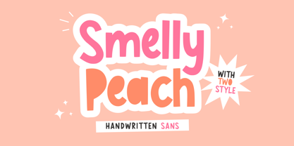 Proudly Presenting, Smelly Peach a Handwritten Friendly Sans. Smelly Peach is perfect for any titles, logo, product packaging, branding project, megazine, social media, wedding, or just used to express words above the background. Smelly Peach also come with Multi-Lingual Support. Enjoy the font, feel free to comment or feedback, send me PM or email. Thank You!
 - Quagey by Craft Supply Co,
$20.00 Quagey - Psychedelic Typeface: Where letters dance with vibrant, kaleidoscopic energy. It's not just a font; it's an electrifying visual experience, making your message unmissable, like a psychedelic journey. This typeface is ideal for greeting card, packaging, brand identity, poster, or any purpose to make your design project look eye catching and trendy. Feel free to play with this typeface!
 - Arfindes Orthem by madeDeduk,
$12.00 Introducing Arfindes Orthem is a brush handwritten font and will be perfect for all your project design book, title branding, product packaging, invitation, quotes, label, poster, logo etc. Feature Uppercase & Lowercase Number & Symbol International Glyphs Multilingual support Alternative Ligature Feel free to drop us a message any time and follow my shop for upcoming updates Hope you enjoy it.
 - Balmoral by ITC,
$40.99 Renowned British designer Martin Wait designed Balmoral in 1978. Balmoral is an elegant and free-flowing copperplate script style typeface. Generous initial capitals complement the more restrained lowercase letters that join for balanced letter spacing in word settings. Balmoral is excellent for use on certificates, citations, diplomas, and in greeting card applications. Featured in: Best Fonts for Tattoos
 - Bohema by Onrepeat,
$14.40 Bohema is an Art Deco font with a modern twist, available in 8 distinct styles + 4 alternative ones as a bonus in the full pack and ideal for headlines, branding, merchandising and a special occasion that requires a different typeface. By buying the full pack you will receive, free, 4 alternative families which include alternative characters.
 - Cookie Powered by PizzaDude.dk,
$15.00 Tall, thin, grid, legible and handmade! What's not to like?! The font was made using a squared paper as a base for the lines. However, I managed to keep the free spirit of the handmade look, despite the guides. Play around with the 4 different versions of each letter and the swashes to make your text stand out!
 - Landeck by Eurotypo,
$40.00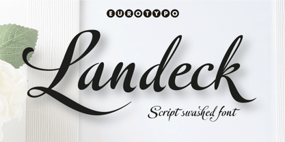 Landeck is an organic script font dramatically slanted giving a dynamic speedy direction. Specially designed for use in logotypes, advertising and packaging. It is interesting to note the use of free-flowing lettering to perform its own eye-catching, connected and unconnected. Landeck contain 473 glyphs with full OpenType features: swashes, ligatures, stylistics alternates and much more.
 - Tequila Sunrise by TypeClassHeroes,
$12.00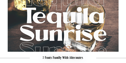 Introducing Tequila Sunrise, access your OpenType features to access the large selection of alternate letters and ligatures. Use this font for any branding, product packaging, invitation, quotes, t-shirt, label, poster, logo etc. Feature 7 Weight Uppercase & Lowercase Number & Symbol International Glyphs Multilingual support Alternative Ligature Feel free to drop us a message any time Hope you enjoy it.
 - Cut Cut Cut by Green Type,
$19.00 Cut Cut Cut is a decorative font family. Designed for use in outdoor advertisements, branding, packaging. Cut Cut Cut is also perfect for children's books and cartoon, greeting cards and posters. It is also suitable for use in online activities. Cut Cut Cut contains latin, cyrillic and greek gliphs. There is also a free symbols style.
 - Eiffel Story by Allouse Studio,
$16.00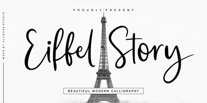 Proudly Presenting, Eiffel Story a Beautiful Modern Calligraphy. Eiffel Story is perfect for any titles, logo, product packaging, branding project, megazine, social media, wedding, or just used to express words above the background. Eiffel Story also come with Multi-Lingual Support. Enjoy the font, feel free to comment or feedback, send me PM or email. Thank You!
 - Woliu Maners by madeDeduk,
$16.00 Woliu Maners is a Modern Sans, use this font for any branding, product packaging, invitation, fashion, label, poster, logo etc. Feature Uppercase & Lowercase Number & Symbol International Glyphs Multilingual support Alternative Ligature Feel free to drop us a message any time and follow my shop for upcoming updates Shoot me on email at: dedukvic@gmail.com Hope you enjoy it.
 - P22 Mucha by IHOF,
$24.95 P22 Mucha is inspired by the free-flowing lettering styles of art Nouveau master Alfons Mucha, circa 1900. This font adapts his distinctive style into a new organic type suitable for many occasions. Mucha evokes the essence of Paris and Prague from 100 years ago, yet it is still fresh in its innovative approach to the alphabet.
 - Royal Kevino by Hanzel Space,
$25.00 This modern serif typeface features serifs. Perfect for gorgeous logos & titles, Royal Kevino will pair beautifully with many fonts and work well with whatever project you're working on. That's it! If you have any questions at all , feel free to pop me a private message , I'm always more than happy to help you along :) Happy creating! Hanzel Studio
 - The Milligram by Allouse Studio,
$16.00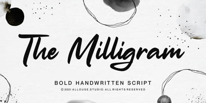 Proudly Presenting, The Milligram a Bold Handwritten Script. The Milligram is perfect for any titles, logo, product packaging, branding project, megazine, social media, wedding, or just used to express words above the background. The Milligram also come with Multi-Lingual Support. Enjoy the font, feel free to comment or feedback, send me PM or email. Thank You!
 - Casty by TypeClassHeroes,
$12.00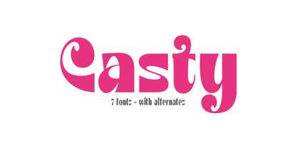 Introducing Casty, access your OpenType features to access the large selection of alternate letters and ligatures. Use this font for any branding, product packaging, invitation, quotes, t-shirt, label, poster, logo etc. Feature 7 Weight Uppercase & Lowercase Number & Symbol International Glyphs Multilingual support Alternative Ligature Feel free to drop us a message any time Hope you enjoy it.
 - Brefid by Gian Studio,
$16.00 Brefid is a luxurious yet elegant display font. characters that suit today's styles will be very interesting for you to create any design work with a classy model while still maintaining a calm and impressive style to look at. You're sure to have inspiration to match your creativity! Free updates for more versions in the future. Thank You
 - Heavy by madeDeduk,
$14.00 Introducing Heavy is a fun bold font and will be perfect for book, title branding, product packaging, invitation, quotes, t-shirt, label, poster, logo etc. Feature Uppercase & Lowercase Number & Symbol Alternates Ligatures International Glyphs Multilingual support Feel free to drop us a message any time and follow my shop for upcoming updates Hope you enjoy it.
 - Impana by Craft Supply Co,
$15.00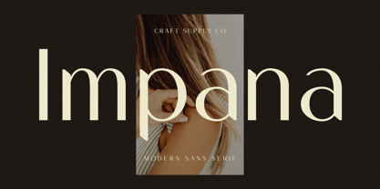 Introducing Impana: A modern sans-serif font that redefines contemporary design. With its sleek lines and versatile style, Impana brings a fresh perspective to modern aesthetics. This typeface is ideal for greeting card, packaging, brand identity, poster, or any purpose to make your design project look eye catching and trendy. Feel free to play with this typeface!
 - Supremely Luxurious by TypeClassHeroes,
$15.00 Introducing Supremely Luxurious, Access your OpenType features to access the large selection of alternate letters and ligatures. Use this font for any branding, product packaging, invitation, quotes, t-shirt, label, poster, logo etc. Feature Uppercase & Lowercase Number & Symbol International Glyphs Multilingual support Alternative Ligature Feel free to drop us a message any time Hope you enjoy it.
 - Dark Shade by Letterhend,
$16.00 Meet Dark Shade, the font that dares you to venture into the shadows where creepy and fascination intertwine. This font an aura of spine-tingling dread, perfect for instilling suspense but playful too in your designs. Whether you're channeling classic horror or crafting a display masterpiece, Nights Side versatility is your creative companion. Features : Uppercase & lowercase Numbers and punctuation Alternates & Ligatures Multilingual PUA encoded
 - KG Tribeca Stamp by Kimberly Geswein,
$5.00 A chunky stamped font with lots of texture. Best used at large sizes for detail. "This font is heavy to load and may freeze or crash in some programs. Windows Users: You should avoid previewing it before installing it (do not double-click on the font file, but right-click > Install)"
 - Ranelte by insigne,
$- The beauty of a classic is that it never really goes out of style. The pure, simple elements which define its greatness only strengthen and solidify with time and exposure--elements like those that inspired Ranelte, the new sans serif from insigne design. While it pays homage to the enduring DIN series of the early-20th century, the new Ranelte is far from outdated. The classic style happily connects with its more modern side, incorporating a more pronounced curve than many of its contemporaries do. This accentuated curve helps pad the type against being cold or overly technical, especially with its inherent semi-modular form and geographic feel. In short, you end up with a good vibe at the intersection of high-tech and friendly. A versatile typeface, Ranelte is designed for headline use as well as print and web copy. Within this family’s three widths and eight weights (along with italics), the letter proportions remain easily readable through their tendency toward equalisation, while still avoiding strict monospacing. The typeface also features sophisticated typographical help in the form of OpenType features. Included in the set are case-sensitive types, fractions, super- and subscript characters, and stylistic alternates. It comes using a comprehensive array of old style and lining figures. All features comprehensively cover the Latin-based languages. Thinking about it again, a classic may never go out of style, but that doesn’t mean you can’t improve on it. A little adjustment can have a beauty all its own. So discover the tuning of Ranelte, and enjoy all the new things you can do with a classic.
 - Thorowgood by Linotype,
$29.99Thorowgood was originally released by the Stephenson Blake typefoundry in the UK. The types were first cut by the English typefounder Robert Thorne, predecessor of William Thorowgood, and first shown in his specimen books in the early nineteenth century. The fat face was revived in roman (1953) and italic. The S and the C appear to be smaller than the other capitals. Most serifs are flat and thin horizontals. In the italic the main strokes of h, k, m, n, and r are curved inwards at the foot. - Display Prominent by Gerald Gallo,
$20.00 Display Prominent is a display font not intended for text use. It was designed specifically for display, headline, logotype, branding, and similar applications. In place of a lowercase there are short caps that are centered horizontally on the tall caps. There are also short numbers, punctuation, and miscellaneous characters.
 - Monarda by Monotype,
$29.99 Monarda™ is Terrance Weinzierl’s take on the loud and splashy brush scripts of the 1950s. It’s energetic, playful, and equally at home in hardcopy headlines as it is in interactive banners. In addition to the basic alphabet, OpenType® fonts of Monarda are also awash in super-sized swash caps, contextual alternate characters and ligatures. Pair Monarda with a mid-century structural sans like Trade Gothic® or a sturdy slab serif like Egyptian Slate™ to create typographic counterpoint that’s confident, compelling and memorable! Named for a riotous bright red flower that attracts butterflies and humming birds, Monarda is a rare combination of flamboyance and effortless beauty. Weinzierl describes it as “casual yet precise: a stiff denim jacket or perfectly white sneakers at a formal event.” Monarda clearly stands out – and always fits in. Well, almost always. Drawn for print, the design’s robust x-height, open counters and wide apertures also make Monarda screen-friendly. Monarda can be perfect for a wide variety of food and lifestyle applications as well as travel, stationery and packaging projects. Advertising campaigns and product branding are also well within its reach. Monarda works best when used large – but economically. Two or three words are its sweet spot. Think: product name, print headline or the lettering on the side of a truck. It could easily become your go-to design for projects that call for a script with a bright personality and fearless demeanor. The excellence of Weinzierl’s work has been recognized by the Type Directors Club and Print Magazine. When not working on creating new typefaces, he augments his professional practice through calligraphy, lettering, and letterpress printing. Monarda is another winner from Weinzierl’s creative mind and talented hand.
 - Basilia by Linotype,
$29.99 Among the countless typefaces available today, the Modern Face style is relatively underrepresented. During the 19th century and then later with the competition from the mechanized hot metal types and film setting, a number of attractive headline types appeared in this style. For text, however, the available types were limited to those based on tried and true classics like Walbaum, Didot and Bodoni, which were created between 1780 and 1830, as well as a few variations from the end of the 19th and beginning of the 20th centuries. The demand for new Modern text types remained nonexistant until the 1960s. Such was the situation when the Haas'sche Schriftgiesserei (Haas Type Foundry) commissioned me to come up with a concept and sketches of a new hot metal type. I was able to convince the director of the foundry that there was a niche to be filled with contemporary Modern typography. Another reason for the production of a new type was of a technical nature: the introduction of a new setting technique should not be limited to existing typefaces, but instead should lead to innovative text types suited to the demands of the new applications. André Gürtler, Basilia's designer: I began to work on the concept and initial designs of the new text type in 1968. I wanted to give the type a classical look, expressed above all in the strong stroke contrast between the robust verticals and fine horizontal strokes and serifs. This is one of the main characteristics of Modern typography.""This new typeface, Basilia, is distinguished by its soft, open appearance as well as a number of details which together mark a departure from historical models. For example, it has nothing of Bodoni's round letters and their angular, narrow spacing, and displays instead round forms with a much softer stroke in the curves. It was very important to me to avoid the Modern characteristic of stiff, vertical, grid-like strokes and to create instead a lighter, more transparent type. I retained the Modern style by using straight horizontal serifs at right angles to the strokes to still give the type its sense of rigidity." Three sketches for Basilia (normal, italic, and bold) were finished in 1973. Only the 9-point size was produced at first. In the following years, basic weights were made and adapted to filmsetting."
 - Honey Ponds by Yumna Type,
$15.00 It is complicated to find an aesthetically charming font in a professional look. The thing is that a wrong font choice can damage your projects. For that reason, Honey Ponds is here for your needs. Honey Ponds is a simple display font in a plain, yet interesting, professional design. To create a better display and to be legible, the font’s form or geometry is presented in a simple style without many details. Additionally, this font provides you a clipart as a bonus. You can enjoy the available features here as well. Features: Multilingual Supports PUA Encoded Numerals and Punctuations Honey Ponds fits best for various design projects, such as brandings, posters, banners, headings, magazine covers, quotes, invitations, name cards, printed products, merchandise, social media, etc. Find out more ways to use this font by taking a look at the font preview. Thanks for purchasing our fonts. Hopefully, you have a great time using our font. Feel free to contact us anytime for further information or when you have trouble with the font. Thanks a lot and happy designing.
 - Analogue Pro by Ingo,
$42.00 very traditional forms strongly slanted italic consistant proportions extraordinary ligatures swashes alternate letters alternate figures lower case l with a hooked “foot” Believe it or not, there are hardly any sans serif fonts in which the lower case letter l also has the hooked form of an l. Instead, we readers have to constantly distinguish whether we are seeing an uppercase I or a lower case l — just take a look at the word “Illinois”... The ingoFont Analogue was developed for exactly this reason. The intent: To create a pretty much »ordinary«, even classical font with its most striking characteristic being the inclusion of the “crooked l.” As a model, I used the »mother of all sans serifs«, Akzidenz Grotesk from Berthold, with its beginnings going back to the 19th century. Analogue is so to say a new interpretation of Akzidenz Grotesk from ingoFonts. All characters — following the model — have been newly designed. And if you want to emphasize the shape of the hooked foot even more, you can also activate the alternate styles for d, h, m, n (Style Set 1). Conversely, the alternate a somewhat softens the “hooked” impression (Style Set 2). The slanted versions — it isn’t truly a real cursive font — are noticeably stronger with 13° than the italics in comparable fonts, and were given a round e with a mind of its own which distinguishes itself considerably compared to the upright characters in the overall appearance of the font. More modern and formal solutions in detail were chosen for some of the characters, for example the M was given lightly slanted sides; the a reflects the curves of the s; the “feet” of a, l and t match; the flared legs of K and R became a “foot”, too. General proportions were carried over almost completely with no changes from Akzidenz Grotesk as well as the slanted trimming on the open forms of a, c, e, s; in comparison, C, G and S were given straight endings. Analogue contains many ligatures, even discretional ligatures, plus proportional, old style as well as tabular figures. All in all, at first sight Analogue brings back memories of the charm of its well-known predecessor; and yet, many small differences give Analogue an unmistakable certain something...
 - DarkPix - Personal use only

- Emoticons - Personal use only

- dearJoe 2 - Unknown license

- Steelplate Textura - Personal use only

- Paulus Franck Initialen - Personal use only

- TV Western JNL by Jeff Levine,
$29.00 In the 1889 Franklin Type Foundry specimen book is a type face called “Armenian”. With lighter weight horizontal slab serifs than more traditional Western fonts, it could be pictured as being used as copy on wanted posters or town notices. This is now available as TV Western JNL in both regular and oblique versions.


