10,000 search results
(0.054 seconds)
- Pickatoon by Colllab Studio,
$14.00 "Hi there, thank you for passing by. Colllab Studio is here. We crafted best collection of typefaces in a variety of styles to keep you covered for any project that comes your way! Pickatoon is a fun display font that we made because we knew what people wanted. Pickatoon has the look of your favorite childhood markers. It's not just for comic books, it's for EVERYTHING. It's for your Instagram selfies, it's for school projects, it's for your business logo, it's for your coloring books—it even works great with watercolors! We put a lot of time into making Pickatoon perfect. We knew you'd need it to be thick and thin and fat and skinny, so we did our best to make sure all those variations were available in every letter. And when you're drawing, you don't just want to draw the same thing over and over again—you want to be able to change things up with some simple tools. So we made sure that Pickatoon had different ways you could vary the thickness and give your work some character. Start create with this font!! A Million Thanks www.colllabstudio.com
 - Lemon Squish by Mans Greback,
$59.00 Lemon Squish is a fun and funky sans-serif font that is perfect for adding a touch of humor and whimsy to any design. This font is inspired by the 70s hippie culture and has a retro feel that is reminiscent of comic books and graffiti. Lemon Squish comes in ten different styles, including Bold, Bold Italic, Italic, Light, Light Italic, Regular, and four Outline variations. These various styles provide versatility and allow you to create dynamic and eye-catching designs. The playful and lighthearted nature of Lemon Squish makes it ideal for anything from branding and logos to social media posts and advertisements. Its fun and quirky design will add a touch of humor and personality to your projects and bring a smile to your audience's face. The font is built with advanced OpenType functionality and has a guaranteed top-notch quality, containing stylistic and contextual alternates, ligatures and more features; all to give you full control and customizability. It has extensive lingual support, covering all Latin-based languages, from Northern Europe to South Africa, from America to South-East Asia. It contains all characters and symbols you'll ever need, including all punctuation and numbers.
 - Renois by Craft Supply Co,
$20.00 Introducing Renois – Display Sans Serif Powerful Impact, Bold and Condensed Renois – Display Sans Serif is more than just a font; it’s a meticulously designed tool for achieving a commanding presence in a variety of display applications. Command Attention Instantly Furthermore, Renois is purpose-built to command attention instantly. Its bold and condensed design ensures that your message takes center stage and captures the viewer’s gaze right away, making it perfect for headlines and displays that demand immediate attention. Clarity in Boldness Remarkably, despite its boldness, Renois prioritizes clarity. Each character is thoughtfully crafted for optimal readability, guaranteeing that your message is not only impactful but also effectively communicated, even at larger sizes. Versatile for Diverse Displays Moreover, Renois’s versatility shines in various display applications, whether it’s for posters, banners, or promotional materials. This typeface seamlessly adapts to your design needs, making a bold and impactful statement in any context. In Conclusion In summary, Renois – Display Sans Serif is the font of choice when you need to make a powerful and clear statement in your displays. Elevate your designs with Renois, ensuring your message rises above the noise, leaving an indelible and memorable impact on your audience.
 - Maritote by I Can Be Your Type,
$20.00While designing a logotype for a client, she described herself as "loud and colorful." Thinking about some eras in typefaces that portrayed this idea, I instantly thought of the "Roaring 20s" and the Prohibition era where the cinema is starting to take off and the Italian mafia are running the bars. (Which is coincidental because my client has family connections to Al Capone.) One of the most iconic typefaces designed for these times was Broadway by Morris Fuller Benton in 1925. This typeface was the zeitgeist of Broadway, the big city, theater, and cinema, which can now be seen in use almost everywhere an old family run cinema is located. Using the heavy influences of the thick and thin contrast of this typeface, Maritote brings the charm of Broadway into the 21st century. - Mystical Memories by Prestige Artsy Studio,
$19.99 Honoured to introduce Mystical Memories — a luxury timeless serif font. Make your work stand-out from the crowd with Mystical Memories' chic and elegant 82 Stylistic Alternates and 19 ligatures. that can be accessed automatically when using Open Type features. Mystical Memories was designed specifically for bold projects in mind — perfect for creating headlines, word mark logos, monograms, quotes, product packaging, invitations, magazines and more... I am excited to see what you can design with Mystical Memories! Happy designing!
 - French Armoire by DimitriAna,
$22.00 French Armoire is a subtle, modern calligraphy font that will give a casual chic look to your designs. It supports Central, Eastern, Western European, Baltic, Turkish and Greek languages and it is delivered in OpenType format. French Armoire has over a 1000 glyphs, with a variety of opentype features in Latin and Greek alphabet: Stylistic alternates, contextual (positional) alternates, swashes, 2 stylistic sets of initial and terminal forms and standard ligatures. The font is fully unicode-mapped (PUA encoded).
 - Svarga by Krismagraph,
$19.00 Introducing our new "Svarga", Elegant Fashionable Typeface with Unique, Classy and Stylish. Svarga Typeface is a classy and elegant serif typeface – This font is both modern and nostalgic and works great for logos, magazine, social media. Already matched up and ready to be used together for your next design! For those of you who are needing a touch of elegant, stylish, classy, chic and modernity for your designs, this font was created for you!
 - Original Absinthe by Vozzy,
$10.00 Introducing a vintage look label font named "Original Absinthe". This family includes seven styles - Regular, Inline, Shadow, Inline FX, Shadow FX, Full and Aged. The posters show the result of combining them. This font will be great for any retro design like poster, t-shirt, label, logo etc.
 - SP Jean by Remote Inc,
$39.00I met her in a saloon called Little Texas. I was drinking mescal like it was vodka. She, tossing midgets like they were lawn darts. When the betting was closed, she launched an extra from The Wizard of Oz an impressive five meters, grabbed her margaritta and sat down. - Miniver Pro by Open Window,
$19.95 Miniver was inspired by a trip made to the library, looking for new ideas. Immediately gravitating towards the DVD for the 1942 film Mrs. Miniver, the hand-lettered title on the cover had a very contemporary look and feel so, there was the 'springboard' into a new font. First drawn were the inline forms and then they were traced, utilizing a playful 'cutout' effect.
 - Bleeding Cowboys Pro by CheapProFonts,
$10.00 A very popular grungy font, now made even more useful! With this Pro version you have the possibility to tone it down a bit - I have made alternate letters without swashes (use the OpenType Swash feature to switch them) and without so much bleed (use the OpenType Stylistic Alternates/ss01 feature). And then you can turn it up again by adding six different swashes to any letter! Write { or after a letter to add a swash to the right side, _ will add one below. Added fun and language support! ALL fonts from CheapProFonts have very extensive language support: They contain some unusual diacritic letters (some of which are contained in the Latin Extended-B Unicode block) supporting: Cornish, Filipino (Tagalog), Guarani, Luxembourgian, Malagasy, Romanian, Ulithian and Welsh. They also contain all glyphs in the Latin Extended-A Unicode block (which among others cover the Central European and Baltic areas) supporting: Afrikaans, Belarusian (Lacinka), Bosnian, Catalan, Chichewa, Croatian, Czech, Dutch, Esperanto, Greenlandic, Hungarian, Kashubian, Kurdish (Kurmanji), Latvian, Lithuanian, Maltese, Maori, Polish, Saami (Inari), Saami (North), Serbian (latin), Slovak(ian), Slovene, Sorbian (Lower), Sorbian (Upper), Turkish and Turkmen. And they of course contain all the usual “western” glyphs supporting: Albanian, Basque, Breton, Chamorro, Danish, Estonian, Faroese, Finnish, French, Frisian, Galican, German, Icelandic, Indonesian, Irish (Gaelic), Italian, Northern Sotho, Norwegian, Occitan, Portuguese, Rhaeto-Romance, Sami (Lule), Sami (South), Scots (Gaelic), Spanish, Swedish, Tswana, Walloon and Yapese.
 - Osovec by Dima Pole,
$27.00 This font is dedicated to the glory of the human spirit and honor. Osovec is a fortress of World War I. On the 6 August 1915, the defenders of the fortress, the Russian soldiers, against whom the enemy had used poison gas; though half-dead, were able to rise to the counter. Thus it was that 60 Russian soldiers routed the 2 thousand strong enemy army. This heroic episode has gone down in history as"Attack of the dead". The font contains more than 700 glyphs, support for all 104 European languages, all Slavic languages, a variety of OT features, including ligatures, old numerals, alternatives, ordinals, and many others.
 - Genie by Canada Type,
$24.95The flower children of Canada Type are at it again. This time we went above and beyond the call of duty and right into the land of reconstruction in order to make this font. When we saw a few letters from an early 1970s film type called Jefferson Aeroplane, we had the sudden urge to bring their beauty to digital life. But since further research revealed no more letters or information, we just had to "wing" the rest of this Aeroplane. Now this Genie is out of the lava lamp, and it's nothing short of groovy. A few symbols and alternates come within the font, so make sure to check out the very full character set. We love this font so much that we couldn't help but play with it for a week. Some of the Wes Wilson-inspired results are in this page's gallery, so check them out for a flashback. Keep on trucking! - Yada Yada Yada by Comicraft,
$49.00 Y'know the real trouble with Spider-man, Superman and the rest of the soulful superheroes, gloating supervillains and musing muckmonsters is They Just Don't Shut Up! For Crying Out Loud, give those iron jaws a REST willya?!? Yak Yak Yak! Blah Blah Blah! Yada Yada Yada... "With Great Power Comes Great Responsibility!" "You won't get away with this, Luthor!" "I'm the best there is at what I do!" SHUT UP!!! Letterers don't get paid by the WORD you know! QUIT YER WHINING! Yeah, yeah, yeah this font IS the much requested typeset -- featuring upper AND lower case characters -- created by Starkings & Roshell for the X-Men back in the Age of Apocalypse. Hell's Squakkin' Teeth -- The X-MEN... don't even get me started on THOSE guys! What THEY need is the mutant ability to put a freakin' sock in it!
 - ITC Vino Bianco by ITC,
$29.99ITC Vino Bianco was created by German designer Jochen Schuss. He drew his inspiration from the handwriting of the waiter in his favorite local pub, especially the form of the capital Q. Based on this one character Schuss developed the entire alphabet. The figures are sketchy and generous and look as though they were written on paper with a ball point pen. Vino Bianco is an alphabet of capital letters, each of which also has an alternative form, making it very flexible and true to the tendency of true handwriting. In spite of its fine strokes, the overall look is open and light due to the large amount of space each character occupies. The cheerful, carefree ITC Vino Bianco is best used for headlines and short texts. - Allisha Croft by Maulana Creative,
$11.00 Allisha Croft is a beautiful feminine script font, With a high contrast stroke clean and fun characters. It has Opentype features of ligatures, makes it a perfect choice for branding and digital designs. Use this font for logos, social media, websites, blogs, instagram, social media, business cards, branding, and more! Allisha Croft font support multilingual more than 100+ language. and good pair for your secondary text font with sans or serif. Make a stunning work with Allisha Croft beautiful feminine script font. Cheers, MaulanaCreative
 - Seven Moon by Four Lines Std,
$15.00 Introducing Seven Moon: A Retro-Inspired Font with Bold and Cheerful Charm. Seven Moon's cheerful charm shines through every character, evoking a sense of nostalgia and excitement. Its bold strokes and unique shape give it a strong presence, while its playful nature adds a touch of warmth and approachability. This font is designed to command attention and leave a lasting impression. Its distinct style ensures that your message will be conveyed with impact, making it an excellent choice for branding, advertising, social media graphics, and more.
 - Goldshift by Maulana Creative,
$10.00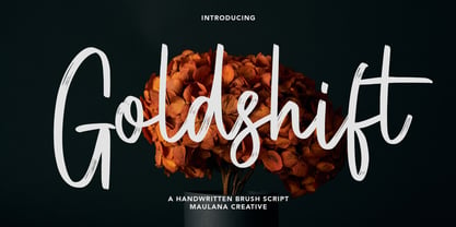 Goldshift is a modern handwritten brush script font, With a rough brush stroke and fun characters. It has Opentype features of ligatures and extra swash, makes it a perfect choice for branding and digital designs. Use this font for logos, social media, websites, blogs, instagram, social media, business cards, branding, and more! Goldshift font support multilingual more than 100+ language. and good pair for your secondary text font with sans or serif. Make a stunning work with Goldshift handwritten brush script font. Cheers, MaulanaCreative
 - Truly Happy by Olivetype,
$18.00 Truly Happy is an ideal font choice for anyone looking to add a bit of fun and playfulness to their projects. This handwritten font has a light and airy feel, making it ideal for any creative project. With its cute and whimsical details, Truly Happy will surely bring a smile to everyone who sees it. So what’s included : Basic Latin Uppercase and Lowercase Numbers, symbols, and punctuations Multilingual Support. PUA Encoded and fully accessible without additional design software Simple Installations Works on PC & Mac Cheers.
 - Rick's Cafe by NorFonts,
$30.00 Rick's Cafe font is my emulation of those typefaces used in newspapers, it's being inspired from my "NorB TypeWriter" typeface. You may want to use this font with any word processing program for text and display use, print and web projects, apps and ePub, comic books, graphic identities, branding, editorial, advertising, restaurant menus, newspapers, scrapbooking, cards and invitations and any casual lettering purpose… or even just for fun! Rick's Cafe font comes in 4 styles, Normal and Bold each with Italic and Condensed versions.
 - Scarville by Factory738,
$15.00 This year's Halloween is approaching quickly!!! Scarville is an excellent choice for Halloween projects. Use its eerie atmosphere as a jumping-off point for your Horror project. There are numbers, punctuation, and multilingual letters included. These ligatures will come in handy for whatever your imagination brings to mind up.. 7 Styles Basic Latin A-Z and a-z Numerals & Punctuation Stylistic Ligatures Multilingual Support for ä ö ü Ä Ö Ü ... Free updates and feature additions Thanks for looking, and I hope you enjoy it.
 - Bad Poser by Gassstype,
$25.00 Here comes a New font, Bad Poser is a All Caps Brush Font that is written casually and quickly. Letters are made with brushes on Procreate. Then crafted carefully drawn into vector format. That is why Bad Poser has Stylish and strong characteristic more natural look to your text with a more modern look to your text. Bad Poser is perfect for homeware designs,branding projects, Logo design, Quotes product packagingprinted quotes, invitations, cards, product packaging, headers, Logotype, Letterhead, PosterLabel, cartoon, and comic etc.
 - Moonsticky by Maulana Creative,
$10.00 Moonsticky is a modern handwritten font. With contrast stroke and fun character. It has Opentype features of ligatures and alternate lowercase to legibility in a short text, makes it a perfect choice for branding and digital designs. Use this font for logos, social media, websites, blogs, instagram, social media, business cards, branding, and more! Moonsticky handwritten font support multilingual more than 100+ language. and good pair for your secondary text font with sans or serif. Make a stunning work with Moonsticky handwritten font. Cheers, MaulanaCreative
 - Leo Slab by Lebbad Design,
$27.95 Leo Slab is a clean, contemporary slab-serif font. It's bold extended design makes it a perfect choice for headline and larger text block use. Extremely readable for a strong impact! Leo Ornate is a decorative companion to Leo Slab. With it's detailed inlines and linear drop shadow, Leo Ornate is ideally suited for use on headlines, display titles, logos, as well as a variety of other applications. Bold, extended and robust, this font is sure to make a strong impact in your next design.
 - LD Elementary by Illustration Ink,
$3.00This font looks like the best effort of small children (when they are trying to be very neat). It is cute. - Sagitaria by Sensatype Studio,
$15.00 Santiago is A Modern Chic Stylish font that special crafted with love to make your brand standout. A new font that we created special for branding needs, with unique characters and awesome ligature characters are ready to add value of your brand. It so nice to leverage designer or product owner that need solutions to make their design look more beauty, chic and modern. And specially for Santiago font, We prepared any ligature characters to help you create unlimited variations for your creative needs. Sagitaria Modern chic font ready with: Any options to get creative variations (combination of Ligature) Preview as a inspirations that you can do with Sagitaria font Ready with Lowercase and Uppercase characters Wish you enjoy our font. :)
 - La Rosaleda by Mevstory Studio,
$15.00 La Rosaleda Font Duo is a ligature font pair with 30 amazing chic logo templates. With this open type font duo you can explore your creativity in unlimited way. To recreate your brand all you need is mix and match from the La Rosa font duo. This font duo is full of stylish ligatures, so that your writing with La Rosaleda can stand out. - Font Features: All fonts are OpenType fonts All fonts are fully vector designed Accurate kerning for all serif family Amazing ligatures to look natural in script font Alternative characters for script lowercase alphabets Multilingual Support for Both Scrip and Serif All OpenType fonts, Serif and Script. 30 Fully editable logos for Adobe Photoshop or Adobe Illustrator Font installing help file for PC and Mac Web-fonts for Script and Serif
 - De Vinne by Bitstream,
$29.99 This revival of the Bruce Foundry’s No. 11 is typical of the nineteenth century types derived from the work of Didot and Bodoni; the face remains popular with lawyers and government printers. In fact, Theodore Low De Vinne opposed this kind of design as hard to print and read; he had Century designed to replace it.
 - Portiere by Cititype,
$14.00 "Portiere" is a natural handwritten font, we created this font using a marker pen, the natural emphasis of the pen makes the round size random. We write one by one on the paper and then we select each glyph to be the font. This is how we get a natural impression. To sharpen the natural impression we made several ligatures because in natural writing you will not find the same composition. Activate the ligature and feel a natural writing sensation. This font is very suitable for writing quotes and short sentences. Even more so for text animations such as on YouTube and other social media. Its unique shape also allows it to be used for logos.
 - Kropotkin Std by sugargliderz,
$30.00 This typeface design was influenced by the British Rail corporate type introduced in an old lettering instruction book published in Japan. Of course, the only clue to this typeface is the lettering instruction book at hand. Therefore, this typeface is based on the British Rail corporate type introduced in an old lettering instruction book published in Japan, and I have expanded the design variations. I started with the Bold design first. Then I designed Light, Regular, and Black in that order. Light and Regular are intended to be used as the text type, while Bold and Black are intended to be used as the base for logotypes, headlines, and other eye-catchers.
 - Ongunkan Adinkra Script by Runic World Tamgacı,
$80.00 The Adinkra alphabet is a way to write some of the languages spoken in Ghana and Ivory Coast, such as Akan, Dagbani, Ewe and Ga. It is a simplified version of the Adinkra symbols, and was introduced in 2015 by Charles M. Korankye, who has written a number of books about it. According to tradition, the Adinkra symbols were created by Nana Kwadwo Agyemang Adinkra, the King Gyaman people in the Ashanti region of Ghana from 1810 to 1820. Or they were created by Gyaman people, and the king liked them so much that he wore them on his clothes and named that after himself. The Adinkra symbols are used as decoration, logos, arts, sculpture, pottery and so on. The symbols represent sayings, proverbs or concepts, such as wisdom, authority, strength, unity, love adaptability, wealth, peace, war or agreement. Since Unicode codes have not been assigned yet, it is designed on a latin-based font. Please contact me if you want changes to the keyboard layout.
 - Ongunkan All Runics Unicode by Runic World Tamgacı,
$250.00 The product of 5 months of work. This unicode font supports 1 latin and 16 ancient languages. When you install this font, the latin alphabet will appear if you do not have the appropriate software. Although there are other unicode fonts that print these ancient texts, this font has the design I use in all my fonts. That's the difference. You can easily use this font with related software. https://www.babelstone.co.uk/Software/BabelPad.html you can choose my font with babelstone babelpad software at this address and write it here and then copy and paste it to the relevant place. This font includes the following languages. Latin, Old Hungarian, Old Turkic, Old Italic, Runic, Tifinagh, Lycian, Lydian, Carian ,Phoenician, Cypriot, Ogham, Old South Arabian, Old North Arabian, Includes, Old Percian, and Ugaritic. This is a unicode font. Please learn how to use it and buy it.
 - Hysteria Rollers by Din Studio,
$20.00 Hi, Everyone! Looking for a font that will make your branding stand out? Do you sometimes have an appetite for a bit more wholesome typography? Looking for a fabulous, stylish, and adventure font? We've got what you want. Hysteria Rollers - A Sans Script Font Duo Hysteria Rollers is a fantastic font duo. An uppercase sans serif font is accompanied by a gorgeous handcrafted script brush font that works together in perfect harmony. Designed primarily as a captivating font to add the right amount of modernity and style, This font duo is an excellent choice to ensure a great font match for your designs and projects! Our font always includes Multilingual Support to make your branding reach a global audience. Features: Ligatures Alternates Stylistic Set Swashes PUA Encoded Numerals and Punctuation Thank you for downloading premium fonts from Din Studio
 - Freaky by Shakira Studio,
$17.00 Start good day for new font! present to you, Freaky! Freaky is a unique display serif font with two versions, regular and outline. Specially designed to create a striking and eccentric look in a variety of design projects. Freaky is a great choice for design projects that require a unique and striking visual identity. From bold branding to creative t-shirt designs, this font will add an unforgettable visual touch to any design medium you use. What did you get? Unique letterforms Works on PC & Mac Simple Installations Accessible in the Adobe Illustrator, Adobe Photoshop, Microsoft Word even work on Canva! PUA Encoded Characters Fully accessible without additional design software. I really hope you'll get pleasure using Freaky font and it will be perfect addition to your font collection! If you have some questions, please write me a letter! Shakira Studio
 - Antique by Storm Type Foundry,
$26.00The concept of the Baroque Roman type face is something which is remote from us. Ungrateful theorists gave Baroque type faces the ill-sounding attribute "Transitional", as if the Baroque Roman type face wilfully diverted from the tradition and at the same time did not manage to mature. This "transition" was originally meant as an intermediate stage between the Aldine/Garamond Roman face of the Renaissance, and its modern counterpart, as represented by Bodoni or Didot. Otherwise there was also a "transition" from a slanted axis of the shadow to a perpendicular one. What a petty detail led to the pejorative designation of Baroque type faces! If a bookseller were to tell his customers that they are about to choose a book which is set in some sort of transitional type face, he would probably go bust. After all, a reader, for his money, would not put up with some typographical experimentation. He wants to read a book without losing his eyesight while doing so. Nevertheless, it was Baroque typography which gave the world the most legible type faces. In those days the craft of punch-cutting was gradually separating itself from that of book-printing, but also from publishing and bookselling. Previously all these activities could be performed by a single person. The punch-cutter, who at that time was already fully occupied with the production of letters, achieved better results than he would have achieved if his creative talents were to be diffused in a printing office or a bookseller's shop. Thus it was possible that for example the printer John Baskerville did not cut a single letter in his entire lifetime, for he used the services of the accomplished punch-cutter John Handy. It became the custom that one type founder supplied type to multiple printing offices, so that the same type faces appeared in various parts of the world. The type face was losing its national character. In the Renaissance period it is still quite easy to distinguish for example a French Roman type face from a Venetian one; in the Baroque period this could be achieved only with great difficulties. Imagination and variety of shapes, which so far have been reserved only to the fine arts, now come into play. Thanks to technological progress, book printers are now able to reproduce hairstrokes and imitate calligraphic type faces. Scripts and elaborate ornaments are no longer the privilege of copper-engravers. Also the appearance of the basic, body design is slowly undergoing a change. The Renaissance canonical stiffness is now replaced with colour and contrast. The page of the book is suddenly darker, its lay-out more varied and its lines more compact. For Baroque type designers made a simple, yet ingenious discovery - they enlarged the x-height and reduced the ascenders to the cap-height. The type face thus became seemingly larger, and hence more legible, but at the same time more economical in composition; the type area was increasing to the detriment of the margins. Paper was expensive, and the aim of all the publishers was, therefore, to sell as many ideas in as small a book block as possible. A narrowed, bold majuscule, designed for use on the title page, appeared for the first time in the Late Baroque period. Also the title page was laid out with the highest possible economy. It comprised as a rule the brief contents of the book and the address of the bookseller, i.e. roughly that which is now placed on the flaps and in the imprint lines. Bold upper-case letters in the first line dramatically give way to the more subtle italics, the third line is highlighted with vermilion; a few words set in lower-case letters are scattered in-between, and then vermilion appears again. Somewhere in the middle there is an ornament, a monogram or an engraving as a kind of climax of the drama, while at the foot of the title-page all this din is quietened by a line with the name of the printer and the year expressed in Roman numerals, set in 8-point body size. Every Baroque title-page could well pass muster as a striking poster. The pride of every book printer was the publication of a type specimen book - a typographical manual. Among these manuals the one published by Fournier stands out - also as regards the selection of the texts for the specimen type matter. It reveals the scope of knowledge and education of the master typographers of that period. The same Fournier established a system of typographical measurement which, revised by Didot, is still used today. Baskerville introduced the smoothing of paper by a hot steel roller, in order that he could print astonishingly sharp letters, etc. ... In other words - Baroque typography deserves anything else but the attribute "transitional". In the first half of the 18th century, besides persons whose names are prominent and well-known up to the present, as was Caslon, there were many type founders who did not manage to publish their manuals or forgot to become famous in some other way. They often imitated the type faces of their more experienced contemporaries, but many of them arrived at a quite strange, even weird originality, which ran completely outside the mainstream of typographical art. The prints from which we have drawn inspiration for these six digital designs come from Paris, Vienna and Prague, from the period around 1750. The transcription of letters in their intact form is our firm principle. Does it mean, therefore, that the task of the digital restorer is to copy meticulously the outline of the letter with all inadequacies of the particular imprint? No. The type face should not to evoke the rustic atmosphere of letterpress after printing, but to analyze the appearance of the punches before they are imprinted. It is also necessary to take account of the size of the type face and to avoid excessive enlargement or reduction. Let us keep in mind that every size requires its own design. The longer we work on the computer where a change in size is child's play, the more we are convinced that the appearance of a letter is tied to its proportions, and therefore, to a fixed size. We are also aware of the fact that the computer is a straightjacket of the type face and that the dictate of mathematical vectors effectively kills any hint of naturalness. That is why we strive to preserve in these six alphabets the numerous anomalies to which later no type designer ever returned due to their obvious eccentricity. Please accept this PostScript study as an attempt (possibly futile, possibly inspirational) to brush up the warm magic of Baroque prints. Hopefully it will give pleasure in today's modern type designer's nihilism. - Sign Sans JNL by Jeff Levine,
$29.00 The original source of design for Sign Sans JNL was an image online of an old New York drinking establishment called the Lenox Lounge. The metal channels encasing the neon had an unusual "feel" to some of the letters. While the original E,G and U of the sign looked "interesting", they didn't quite fit the font's layout. Those letters were scrapped for more traditional versions of them.
 - Kesora Faux by Twinletter,
$15.00 KESORA is a Japanese-style font that we carefully crafted to give your composition the proper look. This font is really versatile, so you may use it for a wide range of projects. Your project will always appear special to your audience if it has the proper composition, beautiful appearance, and unique shape. Logotypes, food banners, branding, brochure, posters, movie titles, book titles, quotes, and more may all benefit from this font. Of course, using this font in your various design projects will make them excellent and outstanding; many viewers are drawn to the striking and unusual graphic display. Start utilizing this typeface in your projects to make them stand out.
 - Miluero by Luxfont,
$18.00 Introducing the stylized Miluero family. Graceful cut, rounded corners combined with austere shapes. Accent fonts with color padding and a classic basic monochrome version in the set. Perfect for logos, headlines and captions. Looks elegant in a minimalist modern design. An assortment of colors will help you get started quickly. This font family is based on the Regular font Pacardo - which means that if necessary you can combine these two families and they will be absolutely stylistically identical and complement each other. Check the quality before purchasing and try the FREE DEMO version of the font to make sure your software supports color fonts. P.s. Have suggestions for color combinations? Write me an email with the subject "Miluero Color" on: ld.luxfont@gmail.com Features: - Free Demo font to check it works. - Uppercase and lowercase the same size but different forms. - Color in letters. - Kerning. IMPORTANT: - Multicolor version of this font will show up only in apps that are compatible with color fonts, like Adobe Photoshop CC 2017.0.1 and above, Illustrator CC 2018. Learn more about color fonts & their support in third-party apps on www.colorfonts.wtf -Don't worry about what you can't see the preview of the font in the tab "Individual Styles" - all fonts are working and have passed technical inspection, but not displayed, they just because the website MyFonts is not yet able to show a preview of colored fonts. Then if you have software with support colored fonts - you can be sure that after installing fonts into the system you will be able to use them like every other classic font. Question/answer: How to install a font? The procedure for installing the font in the system has not changed. Install the font as you would install the classic fonts. How can I change the font color to my color? · Adobe Illustrator: Convert text to outline and easily change color to your taste as if you were repainting a simple vector shape. · Adobe Photoshop: You can easily repaint text layer with Layer effects and color overlay. ld.luxfont@gmail.com
 - Glamour Absolute by Nicky Laatz,
$42.00 Introducing "Glamour Absolute" - A brand new "two-faced" bold serif with both modern and vintage curves. A Two-faced beauty : Modern or Vintage If you are going Vintage Retro : Access your OpenType features to access the large selection of alternate letters and ligatures, select the letters you like from the large variety to get the vintage look you are after. Vary between a light and heavy vintage look based on how many letters you alter. If you are going Modern Chic : Just type with regular letters :) Play with your letter spacing to add even more class to your designs. Due to its split personality , Glamour Absolute is a very versatile font, covering a wide range project types, from bold magazine imagery , to wedding invitations, to branding, poster design and so much more.
 - Farela by Asenbayu,
$14.00 The Farela font is a serif ligature font that has an attractive elegant appearance. You can use this font in vintage, classic, and retro designs. This font gives a beautiful, classy and luxurious feel to your designs. This font is perfect for projects such as logos, branding, fashion, magazines, labels, posters, album covers and many more. This font features Open Type Format, Kerning, Ligature Style, Alternative Style, Numeral, Symbol and Multilingual Supports. Note: To use the alternate and ligature features, please look in the Glyph Panel / Character Map in your software to be able to access all the glyphs in this font. The ligature style in this font is simply "Standard Ligature", meaning it appears automatically. To set your desired letter binding, you can block letters or add them from the glyph panel. Thank you!