10,000 search results
(0.125 seconds)
- Monthly Adventures JNL by Jeff Levine,
$29.00 The cover lettering of a 1940s issue of a romance comic spotted in an auction online was the inspiration for Monthly Adventures JNL. Classic in its Art Deco look, this condensed outline font is evocative of the hand-lettered titles used during the Golden Age of the comic book. Available in both the original outline version and a thick, solid version with the outline removed, as well as oblique variations of both.
 - Autumn Song JNL by Jeff Levine,
$29.00 The cover of the sheet music for the 1931 song "When the Autumn Leaves of Life Begin to Fall" has the song's title hand lettered in a thin monoline Art Deco Style. The song itself was co-written by Buddy G. De Sylva, who would go on to be one of the founders of Capitol Records. Now digitally re-drawn as Autumn Song JNL, the font is available in both regular and oblique versions.
 - Harri by Blancoletters,
$39.00 Harri –“stone” in Basque language– is a display font based on the peculiar letter forms used in signs and fascias all over the Basque Country. This idiosyncratic lettering style, very often used as an identity signifier, evolved from ancient inscriptions carved on gravestones which can still be found in the French part of the Basque Country (Behe Nafarroa, Lapurdi and Zuberoa).Harri takes some of its more significant features from those engraved letter forms, but also from the current overemphasized shapes derived from them, while keeping in sight their antecessors: the Romanesque inscriptions and ultimately the Roman Capitals. Gerard Unger once said “the black version of a font is a caricature of the regular”. This may explain how the odd heavy shapes in use in the Basque Country today might have evolved from their engraved roots, which are already an interpretation of Romanesque and Roman letter forms. This evolution is echoed in Harri through its weights, from the clean formal Roman-inspired light to the extreme expressive Basque-style extra bold.
 - Pea Roxygirl - Unknown license

- Monster Paparazzi - Unknown license

- Pea Alyssa - Unknown license

- Hotabe by Rashatype,
$9.00 Hotabe is a thin, friendly and light lettered display font. No matter the topic, this font will be an incredible asset to your fonts’ library, as it has the potential to elevate any creation.
 - Spylord Bold - Unknown license

- Spylord Laser - Unknown license

- Spylord Outline - Unknown license

- Pinala by Typomancer,
$24.00 'Pinala', a playful script & sans fonts, contains light to bold weights for various designs.
 - Pixa Circle by Ayi Studio,
$10.00 Font family designed for screen texts with eight variants and a variant of dingbats.
 - Monotone - Unknown license

- Sonata Allegro by Tamar Fonts,
$35.00 “The Emperor Has Clothes” Like in music — the Allegro Sonata form consists of three main sections—the Exposition (section), the Development, and the Recapitulation — so in regard to this Allegro Sonata font family — there is an Exposition (font), a Development, and a Recapitulation—in which each theme is restated alongside its development material. While the Recapitulation font is perfect for titling and branding, the Exposition is perfect for branding {as demonstrated in the Inspiration Gallery pertaining this font} as well as being a comfortable read in long runs of text. The Exposition rounded, mono-line, with great x height, contemporary—A Synthesis Between Geometric & Hand-drawn—font, is at times geometric and at times hand drawn; in the end it all came down to finding the balance in a typeface between the robustness needed to function as a text face and enough refinement to look good as a display font. Following the Exposition, comes the Development (section), decorative, botanic-like, exuberant and playful font, signifying ABUNDANCE [of possibilities] & BENEVOLENCE—in regard to each theme/character, and to demonstrate—that 'structures' in music, are solid structures—like architecture {contrary to the words of J. W. von Goethe, who said: “Music is liquid architecture; Architecture is frozen music”}, just in some spiritual domain that is far beyond one's physical senses to grasp. Like in my art and music works in which I consider its 'Texture' element of vital importance, so is the case when it comes to type, as apparent in my previous Phone Pro/Polyphony font, as well as in this current Sonata Allegro/Development font. Each glyph has its own uniqueness, and when meeting with others, will provide dynamic and pleasing proximity. And due to the [individualistic] nature of this Development font, just a minimal amount of kerning/pairing were necessary... The development font is an extravagant design that looks best when used at large sizes—perfect for titling, logo, product packaging, branding project, wedding, or just used to express words against some [light or dark] background. Finally, “The (Exposition Font) Emperor Has (the Development Font) Clothes!” As said, there are three fonts/styles altogether in this Sonata Allegro type family, designed with the intention of harmonizing between Latin and Hebrew, which makes it an ideal font for the side-by-side use of Latin and Hebrew characters. However, they are being sold separately (kindly search for “Sonata Allegro Hebrew” on this MyFonts site), so they are economical for those interested just in either one of them. My aim is to shake up the type-design world with a range of distinctive fonts which break away from the generic letterforms, to make your design projects stand out—as a graphic designer, add this font to your most creative ideas for projects. This typeface has [lots of ligatures /] OpenType features, to enhance your designs even more — happy designing! Sonata Allegro Features: · 3 Weights/Styles · Multilingual Support · Proportional Figures & Ligatures While using this product, if you encounter any problem or spot something we may have missed, please don't hesitate to write to us; we would love to hear your feedback—in order to further fine-tune our products. Copyright Tamar Fonts/Hillel Glueck 2022 ALL RIGHTS RESERVED Any unauthorized distribution of my work is strictly prohibited, and will be prosecuted; do the right thing, and do not participate in the piracy of my typefaces; if you appreciate my work, then please pay for it and help me prosper — thank you!
 - Sonata Allegro Hebrew by Tamar Fonts,
$35.00 “The Emperor Has Clothes” Like in music — the Allegro Sonata form consists of three main sections—the Exposition (section), the Development, and the Recapitulation — so in regard to this Allegro Sonata font family — there is an Exposition (font), a Development, and a Recapitulation—in which each theme is restated alongside its development material. While the Recapitulation font is perfect for titling and branding, the Exposition is perfect for branding {as demonstrated in the Inspiration Gallery pertaining this font} as well as being a comfortable read in long runs of text. The Exposition rounded, mono-line, with great x height, contemporary—A Synthesis Between Geometric & Hand-drawn—font, is at times geometric and at times hand drawn; in the end it all came down to finding the balance in a typeface between the robustness needed to function as a text face and enough refinement to look good as a display font. Following the Exposition, comes the Development (section), decorative, botanic-like, exuberant and playful font, signifying ABUNDANCE [of possibilities] & BENEVOLENCE—in regard to each theme/character, and to demonstrate—that 'structures' in music, are solid structures—like architecture {contrary to the words of J. W. von Goethe, who said: “Music is liquid architecture; Architecture is frozen music”}, just in some spiritual domain that is far beyond one's physical senses to grasp. Like in my art and music works in which I consider its 'Texture' element of vital importance, so is the case when it comes to type, as apparent in my previous Phone Pro/Polyphony font, as well as in this current Sonata Allegro/Development font. Each glyph has its own uniqueness, and when meeting with others, will provide dynamic and pleasing proximity. And due to the [individualistic] nature of this Development font, just a minimal amount of kerning/pairing were necessary... The development font is an extravagant design that looks best when used at large sizes—perfect for titling, logo, product packaging, branding project, wedding, or just used to express words against some [light or dark] background. Finally, “The (Exposition Font) Emperor Has (the Development Font) Clothes!” As said, there are three fonts/styles altogether in this Sonata Allegro type family, designed with the intention of harmonizing between Latin and Hebrew, which makes it an ideal font for the side-by-side use of Latin and Hebrew characters. However, they are being sold separately (kindly search for “Sonata Allegro Hebrew” on this MyFonts site), so they are economical for those interested just in either one of them. My aim is to shake up the type-design world with a range of distinctive fonts which break away from the generic letterforms, to make your design projects stand out—as a graphic designer, add this font to your most creative ideas for projects. This typeface has [lots of ligatures /] OpenType features, to enhance your designs even more — happy designing! Sonata Allegro Features: · 3 Weights/Styles · Multilingual Support · Proportional Figures & Ligatures While using this product, if you encounter any problem or spot something we may have missed, please don't hesitate to write to us; we would love to hear your feedback—in order to further fine-tune our products. Copyright Tamar Fonts/Hillel Glueck 2022 ALL RIGHTS RESERVED Any unauthorized distribution of my work is strictly prohibited, and will be prosecuted; do the right thing, and do not participate in the piracy of my typefaces; if you appreciate my work, then please pay for it and help me prosper — thank you!
 - Black Love Pink by Stefani Letter,
$14.00 Carefully designed, black love pink is a stunning and beautiful handwritten font with a light feel. Fall in love with its delicate and sophisticated characters, and use it for any design project that requires a romantic twist. This font is easy to use. it remains only to add symbols (--,++,--) in front, middle, and back to reveal the features. This font is PUA encoded which means you can access all of the glyphs and swashes with ease! It features a varying baseline, gorgeous glyphs, and stunning alternates.
 - Gizela by Type Salon,
$11.00 Gizela shows her personality with a feminine, sensual, seductive and art deco vibes. Perfect for late December invitations and New Year's cards.
 - Socialite JNL by Jeff Levine,
$29.00Socialite JNL takes its cue from the Art Deco style of the 1930s with its clean, angular lines and stylized letter shapes. - JH Amira by JH Fonts,
$50.00 JH Amira is a display modern typeface; it is designed based on Art Deco style, typical for fashion magazines headlines, logos & titles.
 - Ming by K-Type,
$20.00 A sans serif with the futuristic retro, Art Deco feel of mid 20th century science fiction, particularly the early Flash Gordon serials.
 - Saveur Sans by Arkitype,
$10.00 Saveur Sans is inspired by art deco and French cafes. This display family has clean, simple letterforms that feel modern but at the same time have a retro, art-deco styling. This family can add a sophistication to any layout whether it be print or online. Saveur Sans is a great selection for headlines, logotypes and branding. it is an all-caps display family with some neat alternates including an alternate O and E that instantly give your copy that retro-deco look. The promos have been inspired by french food and design. This family is perfect for use in packaging and branding of food products as well as menus and restaurant or cafe branding.
 - Exterminate by Comicraft,
$19.00 THIS FONT IS ONLY THE BEGINNING... WE WILL PREPARE MORE. WE WILL GROW STRONGER. WHEN THE TIME IS RIGHT EXTERMINATE WILL EMERGE AND TAKE ITS RIGHTFUL PLACE AS THE SUPREME FONT IN THE UNIVERSE! This ragged & worn font is great for titles, sound effects, and the speech of certain genetically engineered universe-conquering sci-fi supervillains. Remastered Exterminate includes Western & Central European language support, automatic alternates, stylistic alternates & Crossbar I Technology™, improved spacing & kerning, and a Color Font
 - Daleant by Maculinc,
$15.00 The new beautiful and attractive Serif Font comes with a unique alternative in each Uppercase, This Font is available in Uppercase and Lowercase Complete with Numbers, Punctuation, Alternate and Ligatures. Daleant Serif Font is available in the family of Light, Light-Italic, Regular, Italic, Medium, Medium-Italic, Semi Bold, Semi Bold-Italic, Bold, Bold-Italic. Alternatives and Ligatures in this font are only available in uppercase letters, Add alternatives to make sentences more unique and interesting.
 - Atnew by Outerend,
$18.00 "Atnew" is a modern typeface that includes six individual fonts (ExtraLight, Light, Regular, Medium, SemiBold, Bold) and a variable font ranging between Light (50pt) and Bold (200pt). Keeping geometric shapes but with soft curves gives fonts a playful feel. They can be used in interfaces, websites, posters, stationery, tv show credits, and many other purposes. It could be for your everyday activities like journaling. The variable font version provides more flexibility for your needs by fine-tuning weight points.
 - Casiore by Grontype,
$12.00 Casiore is an elegant handwritten font with a fun brush style. It has a light modern calligraphy look making it perfect for branding and digital designs. Casiore equipped with alternative glyphs and ligatures. The font is suitable for any graphic design such as quotes, logos, social media, websites, blogs, intitation cards, and more! Casiore Features: light weight font Punctuation & Characters Ligatures and alternates Glyphs included superscript & Symbol Currencies Multilingual Thankyou for picking up this font. Happy creating! Regard, Grontype
 - VTC-Bad Tattoo Hand One - Personal use only

- Ornable by Casloop Studio,
$16.00 Meet Ornable Typeface, your font of choice for a captivating blend of Renaissance, Art Nouveau, Medieval, and Art Deco vibes. This single-weight typeface is designed for those seeking a font that embodies a rich tapestry of artistic nuances. With 35 meticulously crafted ligatures, Ornable ensures your text is not just seen but experienced. Dive into the charm of fractions for precise numerical representation and case-sensitive forms for a perfect interplay of uppercase and lowercase letters. Stand out effortlessly with the inclusion of a unique arrow symbol, adding a modern touch to your designs. Ornable adapts seamlessly to various themes, from the classic allure of Renaissance to the bold geometry of Art Deco. Whether you're crafting posters or logos, Ornable celebrates your creativity with sharp lines and intricate details. It's the ideal choice for projects that demand a touch of mystique and retro charm. Capture the essence of artistic movements with this typeface and step into a world where past and future converge – embrace Ornable and redefine the boundaries of your creative expression.
 - Leokadia Deco, crafted with precision and an eye for elegance by Gophmann A.L., stands as a vibrant testament to the marriage between art deco sensibilities and contemporary design techniques. This f...
- Magedov Military by Mans Greback,
$69.00 The Magedov Military font is a strong and robust font that exudes power and authority. It has a sharp, geometric design with bold, hard edges that gives it a strict, army-inspired feel. In a blend of sans and slab serif styles, its unique and versatile look can be utilized for a wide range of projects. This font is perfect for university or college projects, as its straight and clear-cut design gives it an academic, high-school or college feel. It is also ideal for projects that require a strong and tough look, such as law enforcement, university or sports logos. Use the parenthesis symbols ( ) [ ] { } to make decorative elements. Example: United]States The Magedov Military family consists of four high-quality fonts: Regular, Italic, Bold and Bold Italic The font is built with advanced OpenType functionality and has a guaranteed top-notch quality, containing stylistic and contextual alternates, ligatures and more features; all to give you full control and customizability. It has extensive lingual support, covering all Latin-based languages, from Northern Europe to South Africa, from America to South-East Asia. It contains all characters and symbols you'll ever need, including all punctuation and numbers.
 - TessieOddsNends by Ingrimayne Type,
$9.00 A tessellation is a shape that can be used to completely fill the plane—simple examples are isosceles triangles, squares, and hexagons. Tessellation patterns are eye-catching and visually appealing, which is the reason that they have long been popular in a variety of decorative situations. These Tessie fonts have two family members, a solid style that must have different colors when used and an outline style. They can be used separately or they can be used in layers with the outline style on top of the solid style. For rows to align properly, leading must be the same as point size. To see how patterns can be constructed, see the “Samples” file here. TessieOddsNEnds contains shapes that did not fit into the other Tessie fonts: TessieStandingBirds, TessieFlyingBirds, TessieMoreBirds, TessieXtraBirds, TessieSpinners, TessiePuzzlePieces, TessieAnimals, TessieBugs, TessieMiscellaneous, and TessieMoreStuff. (Earlier tessellation fonts from IngrimayneType, the TessieDingies fonts, lack a black or filled version so cannot do colored patterns. The addition of a solid style that must be colored makes these new fonts a bit more difficult to use but offers far greater possibilities in getting visually interesting results.)
 - Stairway by Cooldesignlab,
$12.00 Stairway is a modern and elegant calligraphy script font that comes with exquisite character changes, a kind of decorative script with a modern twist, designed with high detail to present an elegant style. This font is very interesting for you to use because it is smooth, clean, feminine, sensual, glamorous, simple and very easy to read, because there are many luxurious and simple letter relationships. This font style is perfect for your various designs, such as invitations, labels, restaurant menus, logos, fashion, makeup, stationery, novels, magazines, books, greeting / wedding cards, packaging, labels and others. Stairway has 602 glyphs and 392 alternative characters, including multiple language support. With OpenType features with alternative styles and elegant ties. The OpenType features do not work automatically, but you can access them manually and for the best results required for your creativity in combining variations of this Glyph. The Open Type feature can be accessed using smart Open Type programs such as Adobe Illustrator, Adobe In Design, Adobe Photoshop Corel Draw X version, and Microsoft Word. And this font has provided PUA unicode (special code font). So that all alternative characters can be easily fully accessed by the craftsman or designer.
 - Nightjump by Balpirick,
$15.00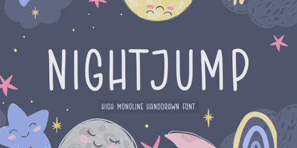 NIGHTJUMP is a High Monoline Hand drawn Font. Night Jump is a handwritten font with a casual look. It is perfect for product packaging, branding project, magazine, social media, wedding, or just used to express words above the background. NIGHTJUMP also multilingual support. Enjoy the font, feel free to comment or feedback, send me PM or email.
 - Neotoxic by Nocturnal Workspace,
$9.00 Neotoxic Font Family has been published since 2022, and can be downloaded for free on the dafont website. This font supports interesting features such as small caps, ligatures, salts, etc. also consists of 6 font styles including thin, light, regular, bold, black, outline. WHAT YOU GET Features : Small Caps, Ligatures, Ligatures Contextual, Salt. 6 versions normal & italic (ttf + otf) 24 types of font files include Regular, Bold, Light, Hollows/Outlines, thin, Italic, light PUA Encode Characters, fully accessible without additional design software. Includes a range of multilingual characters. Neotoxic is suitable typeface for various purposes like logotype, signage, label, poster, dropcap, titles, letterhead, book cover and etc. Thank you!
 - Bulland by Alit Design,
$19.00 Presenting the ✨The Bulland Typeface✨ by alitdesign. The Bulland Typeface is inspired by stylish designs from the 80s to 90s. At that time the font style like "The Bulland Typeface" had a firm and trendy impression. The Bulland Typeface has a wide selection of alternative characters and swashes that make it easy to create bold retro-style designs. The Bulland Typeface is very suitable for making designs with retro concepts, simple and playful designs, for example making magazine cover designs, music covers, YouTube thumbs, text headers, logotypes and so on with an elegant retort theme. Besides that this font is very easy to use both in design and non-design programs because everything changes and glyphs are supported by Unicode (PUA). The Bulland Typeface has a total of 1065 glyphs including symbol, multilingual and alternative glyphs. We really enjoyed the process of making The Bulland Typeface, we hope you are also happy when using The Bulland Typeface. Language Support : Latin, Basic, Western European, Central European, South European,Vietnamese. In order to use the beautiful swashes, you need a program that supports OpenType features such as Adobe Illustrator CS, Adobe Photoshop CC, Adobe Indesign and Corel Draw. but if your software doesn't have Glyphs panel, you can install additional swashes font files.
 - Creaky Frank - Personal use only

- Zipple - Unknown license

- Sphericals - Unknown license

- the Gingerbread House - Unknown license

- the Gingerbread House - Unknown license

- Quarca by insigne,
$24.75 Quarca's masculine power runs strong across the page with bold self-assurance and a raw energy that courses through its thick veins. Don't think the continuous, smooth geometry of this semi-modular face is captively chained to the grid, though. Quarca has been cautiously optimized to engage the reader's eye. Achieving an attractive balance to its sturdy design, the open forms of this "rounded square" geometric sans -together with a tall x-height- make the font legible even when using the compact widths. This high-impact typeface definitely doesn't sacrifice versatility for style. These compact widths, with their raw heart and strength, are perfect for callouts, while the extended widths provide you with the platform for a punchy and extremely efficient headline. The font has a thinner weight and transcends to an intense bold. The face's geometric or technological construction also tends to make it right at home on the web. The family consists of 36 fonts -six weights plus italics. Where Quarca truly stands out, though, is its wide number of OpenType typographic choices and optional glyphs, allowing you to design your piece with a personal, one-of-a-kind variant touch. These variations consist of Experimental Capitals, Angled Capital Terminals, and "Future Stencil". In all, you can find more than one hundred of these alternate glyphs. Quarca is well-suited for anything you are able to throw at it. Devised for today's multi-disciplined designer, this clear and infinitely versatile family provides tremendous value to your toolbox.


