10,000 search results
(0.081 seconds)
- Londers by Letterhend,
$19.00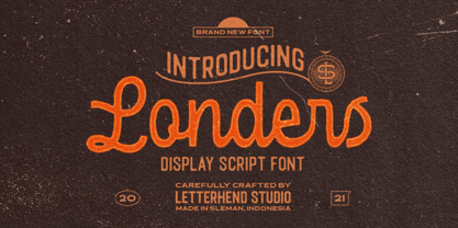 Introducing, Londers - a standout bold script with a touch of vintage look and feel. This type of font perfectly made to be applied especially in logo, headline, signage and the other various formal forms such as invitations, labels, logos, magazines, books, greeting / wedding cards, packaging, fashion, make up, stationery, novels, labels or any type of advertising purpose. Features : Uppercase & lowercase numbers and punctuation multilingual alternates / swashes and ligatures PUA encoded We highly recommend using a program that supports OpenType features and Glyphs panels like many of Adobe apps and Corel Draw, so you can see and access all Glyph variations.
 - Brandice by Letterhend,
$19.00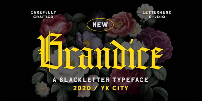 Introducing, Brandice- A blackletter typeface. This type of font perfectly made to be applied especially in logo, and the other various formal forms such as Logo, Clothing, Fashion, Headline, or any type of advertising purpose. Features : uppercase & lowercase numbers and punctuation stylistic alternate multilingual PUA encoded We highly recommend using a program that supports OpenType features and Glyphs panels like many of Adobe apps and Corel Draw, so you can see and access all Glyph variations. How to access opentype feature : letterhend.com/tutorials/using-opentype-feature-in-any-software/ Email us to letterhend@gmail.com if you need something! Happy Designing!
 - Linotype Killer by Linotype,
$29.99Linotype Killer is part of the Take Type Library, selected from the contestants of Linotype’s International Digital Type Design Contests from 1994 and 1997. Designed by German artist Andre Nossek, the font seems to describe the Technosound of the 1990s with its electronically produced sights and sounds. It represents repetition, mass production and conformity. The alphabet consists exclusively of capital letters, all based on a rectangular form, all of the same height, and, with the exception of the I’, all of the same width. The cool and distant Linotype Killer is best suited to short headlines. - Mantaray by Letterhend,
$19.00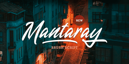 Introducing, Mantaray - a brush script which is purposely made for headline, display or logotype. This type of font perfectly made to be applied especially in logo, and the other various formal forms such as invitations, labels, logos, magazines, books, greeting / wedding cards, packaging, fashion, make up, stationery, novels, labels or any type of advertising purpose. Features : uppercase & lowercase numbers and punctuation multilingual alternates, swashes & ligatures PUA encoded We highly recommend using a program that supports OpenType features and Glyphs panels like many of Adobe apps and Corel Draw, so you can see and access all Glyph variations.
 - The Mallister by Letterhend,
$19.00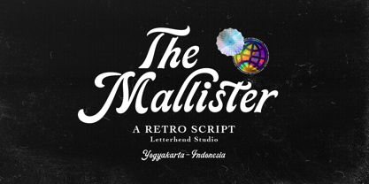 The Mallister is a script with a touch of vintage look and feel. This type of font perfectly made to be applied especially in logo, headline, signage and the other various formal forms such as invitations, labels, logos, magazines, books, greeting / wedding cards, packaging, fashion, make up, stationery, novels, labels or any type of advertising purpose. Features : uppercase & lowercase numbers and punctuation multilingual alternates / swashes and ligatures PUA encoded We highly recommend using a program that supports OpenType features and Glyphs panels like many of Adobe apps and Corel Draw, so you can see and access all Glyph variations.
 - Linotype Russisch Brot by Linotype,
$29.00Linotype Russisch Brot is part of the Take Type Library, chosen from the entries of the Linotype-sponsored International Digital Type Design Contests of 1994 and 1997. The inspiration of German designer Markus Remscheid is not hard to see for those who are familiar with the chocolate cookies in the form of letters which are called Russisches Brot. The font is available in six weights. The basic weight is perfectly legible and is good for both headlines and shorter texts and from there the weights become more and more nibbled away, leaving the basic form of the characters and a few crumbs. - Editors Note by Jen Wagner Co.,
$17.00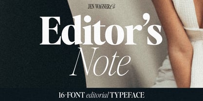 Say hello to the Editor's Note Family, an editorial serif display that includes 16 fonts, regular and italic, from Hairline weight to Bold, and still has all the clean lines, tight curves, and trendy minimalist vibes! I've been loving the clean, editorial type trend happening in design right now (let's be real, there's always a place for timeless editorial type). Editor's Note is a stunningly crisp upper and lowercase typeface that looks incredible in both large settings as a display text (think big headers, pretty quotes, calls to action, etc.). I've been loving combining the regular and italic, especially in big, bold quotes.
 - Backdown by Letterhend,
$19.00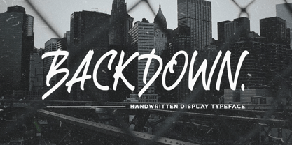 Introducing, Backdown- a handwritten display typeface. This type of font perfectly made to be applied especially in logo, and the other various formal forms such as invitations, labels, logos, magazines, books, greeting / wedding cards, packaging, fashion, make up, stationery, novels, labels or any type of advertising purpose. Features : uppercase & lowercase numbers and punctuation multilingual alternates and ligatures PUA encoded We highly recommend using a program that supports OpenType features and Glyphs panels like many of Adobe apps and Corel Draw, so you can see and access all Glyph variations. How to access opentype feature : letterhend.com/tutorials/using-opentype-feature-in-any-software/
 - Jemmy Wonder by Letterhend,
$19.00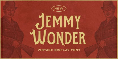 Jemmy Wonder is a display typeface with a touch of vintage look and feel. This type of font perfectly made to be applied especially in logo, headline, signage and the other various formal forms such as invitations, labels, logos, magazines, books, greeting / wedding cards, packaging, fashion, make up, stationery, novels, labels or any type of advertising purpose. Features : uppercase & lowercase numbers and punctuation multilingual alternates / swashes and ligatures PUA encoded We highly recommend using a program that supports OpenType features and Glyphs panels like many of Adobe apps and Corel Draw, so you can see and access all Glyph variations.
 - Mill Valley by Letterhend,
$19.00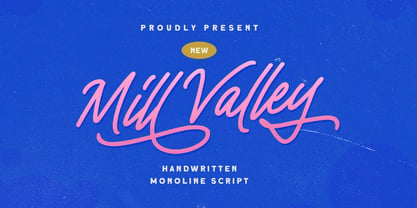 Mill Valley is a monoline script with a casual and fun theme. This type of font perfectly made to be applied especially in logo, headline, signage and the other various formal forms such as invitations, labels, logos, magazines, books, greeting / wedding cards, packaging, fashion, make up, stationery, novels, labels or any type of advertising purpose. Features : uppercase & lowercase numbers and punctuation multilingual alternates / swashes and ligatures PUA encoded We highly recommend using a program that supports OpenType features and Glyphs panels like many of Adobe apps and Corel Draw, so you can see and access all Glyph variations.
 - Mountain Warrior by Letterhend,
$17.00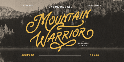 Mountain Warrior is a monoline script with a touch of retro look and feel. This type of font perfectly made to be applied especially in logo, headline, signage and the other various formal forms such as invitations, labels, logos, magazines, books, greeting / wedding cards, packaging, fashion, make up, stationery, novels, labels or any type of advertising purpose. Features : uppercase & lowercase regular & rough numbers and punctuation multilingual alternates / swashes and ligatures PUA encoded We highly recommend using a program that supports OpenType features and Glyphs panels like many of Adobe apps and Corel Draw, so you can see and access all Glyph variations.
 - Palmona Plus by Ingo,
$46.00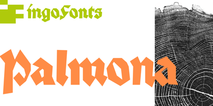 A rustic black letter from the 1930ies — with stylistic alternates. The high degree of abstraction of this typeface allows it to appear modern, even though its shapes clearly show an origin from Fraktur and Gothic. The letters present the effect of woodcarving or silhouette cuttings as they are defined exclusively with straight lines and sharp corners. By doing without any bowls, the typeface becomes a stylistic entity with a decorative effect. Palmona is especially appealing in combination with bold illustrations. Some of the characters of Palmona are available in one or more alternate forms which can be accessed manually or automatically. Use of these alternates is most easily operated with OpenType-Functions Standard-Ligatures and Discretional Ligatures in the user program. With Standard Ligatures activated, problematic letter compositions are substituted with appropriate ligatures. Likewise, in certain letter combinations the alternates are inserted. The Discretional Ligatures include additional alternatives. Configuration of the characters of the Palmona font is according to Unicode ISO 8859-1 (Latin1). Consequently all characters for all European languages with Latin type are covered — including Turkish, the Baltic languages, East European and Scandinavian languages. Congruent with the time of its origin and typical for black letter typefaces, Palmona also includes a long s as well as — uncommon but definitely reasonable — a capital ß. Both characters are automatically applied with the activation of Discretional Ligatures, and the associated ligatures appear automatically as well. When using ”long s,“ you must ensure the correct use of the rules for the Fraktur font: ”round s“ is always at the end of the word, also in compound words. For those of you who want to be even more correct, read the corresponding >> article in Wikipedia.
 - Brotherline by Hendra Pratama,
$25.00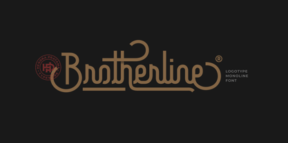 Brotherline is a connected script built from a single bold mono-line, inspired by hand-lettering style and various calligraphy letterforms.The first idea with this font is to create a font for Logotypes. Curves are smooth and flow with very nice circle shapes. This font is great for logos, logotypes, packaging, and store-front or signboard. NOTE: To access the alternate glyphs, you will need a program that supports OpenType Features. Activate the Ligature (liga) and Contextual Alternates (calt) for better experience.
 - Retiro Std by Typofonderie,
$59.00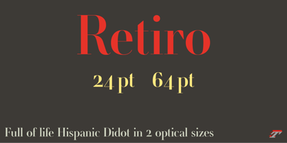 Full of life Hispanic Didot in 2 optical sizes Retiro is a daring interpretation of Spanish typography. Severe, austere and yet, full of life, Retiro is a vernacular version of Castilian and Andalusian in a typical Didot. Named after a lovely park in Madrid, Retiro started life as a a bespoke typeface designed to give a unique voice to the magazine Madriz. In 2006, the founder of Madriz was looking for a Didot for his new magazine. The Didot is the archetypal typeface used in high-end magazines. Retiro is a synthesis of these high contrast styles mixed with an Hispanic mind. Result is then, after 2-3 years of work, a typeface with countless variations to establish typographic shades adapted to different sections and pages of the Madriz. In 2014, it was necessary to further revise the typeface before its launch at Typofonderie. In order to keep its originality, the unique weight was retained, but complemented with optical size variants to set highly contrasted headlines into various sizes, visually balanced. How to use Retiro optical sizes? Each font provided in Retiro family is named according to the scale of body size: 24 pt and 64 pt. Of course, these names are referring to the body sizes used in typographic design. In the “glorious old days,” the letterpress period, it was customary to cut punches directly to the size at which typefaces would be used. The punchcutter had to visually adapt his design to the engraving size. The aim was to optimize the best contrast and general weight, but also to respect both design’s and reader’s needs. In Retiro’s case, intended for large titling sizes, it’s an adaptation of this ancient practice for our contemporary uses. Although each font is named by a typographic point size, do not feel obliged to use this font at this precise size, but why not, in larger or smaller. It’s rather the concept of gradients that must be preserved in layouts, rather than strictly size numbers. It’s up to the designer to select the right font size for his own designs. Granshan Awards 2012 Creative Review Type Annual 2011 Designpreis 2011 Club des directeurs artistiques, 41e palmarès Type Directors Club 2010 Certificate of Type design Excellence
 - Haboro Sans by insigne,
$-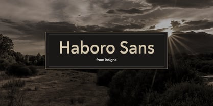 Quit trudging through the thick with encumbering fonts, and spring to the front of the pack with the cutting edge sans serif, Haboro Sans. With nothing to clutter up your work, your editorial designs, websites, and software will be sharp and clear. While this hyperfamily is simple in character, it (like Haboro Slab and Haboro as well) provides you with plenty of options. Haboro Sans features simple geometric shapes to help you achieve that perfect effect wherever you use it. Enjoy the comforting reassurance that this multi-tool of a typeface family can work on most anything, including packaging, branding, web copy, and more. Take the simplicity of Haboro Sans a step farther with OpenType features, too. Haboro Sans contains special glyphs like Titling, Small Caps and Oldstyle figures that give your work just enough of a distinct touch. For even more options, use the entire Haboro hyperfamily to expand your capabilities. Put some simple class into your projects with the traditional look of Haboro Sans. Your layouts, websites, iPhone apps, advertising, and newspapers (to name just a few) will thank you.
 - Mackay by René Bieder,
$39.00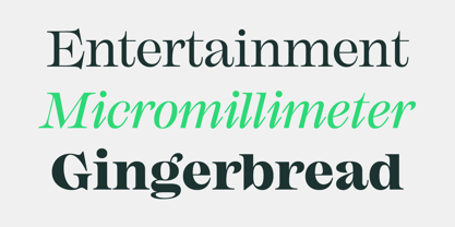 Mackay is a powerful transitional serif in 6 weights plus matching italics, designed for screen and print. The eccentric serifs on uppercase letters like E, F, L and T are inspired by Alexander Kay’s “Ronaldson” from 1884, working as the starting point for the family. The lowercase letters follow the traditional Antiqua model with attributes tracing back to drawings from the early 20th century. The “grotesk” lowercase a, as well as the sharp lowercase s, derived from the closed shapes of uppercase letters like C, G or S, create a compact and bold appearance while a large x-height and small descenders add a modern look. In favor of a dynamic and elegant impression, the design of the italic cuts come with a strong calligraphic influence. This results in completely new shapes for letters like lowercase a or g, ensuring a smooth integration into their surrounding letters while maintaining a distinctive appearance when combining with romans. The family comes with a variety of opentype features like case sensitive shapes, old style figures, fractions, ordinals and many more. Additional attention was given to the standard and discretionary ligatures, extending the structure of the basic glyphs with elegantly designed letter combinations for g/i, i/t or s/t. According to their dynamic architecture, the italic weights are equipped with additional initial swash characters to subtle accentuate the calligraphic roots. As a result of a high stroke contrast the family works great in paragraphs with medium to large font sizes like headlines, short paragraphs or logos. With its 12 cuts, the family meets all requirements on high quality typography.
 - FF DuMifu by FontFont,
$30.99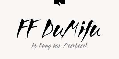 Belgian type designer Dung van Meerbeeck created this script FontFont in 1992. The font is ideally suited for festive occasions, film and tv as well as poster and billboards. FF DuMifu provides advanced typographical support with features such as ligatures. It comes with proportional lining figures.
 - FF DuMathieu by FontFont,
$30.99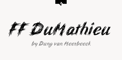 Belgian type designer Dung van Meerbeeck created this script FontFont in 1992. The font is ideally suited for festive occasions, film and tv as well as poster and billboards. FF DuMathieu provides advanced typographical support with features such as ligatures. It comes with proportional lining figures.
 - Craptoy by PizzaDude.dk,
$20.00Craptoy is a grunge Open Type font - full of different auto ligatures! That means you can write words like beer, letter, bubble, success (just to name a few) without having the double letter repeating itself! (You will need to use OpenType supporting applications to use the autoligatures). - FF DuTurner by FontFont,
$30.99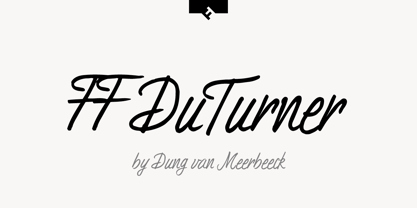 Belgian type designer Dung van Meerbeeck created this script FontFont in 1992. The font is ideally suited for festive occasions, film and tv as well as poster and billboards. FF DuTurner provides advanced typographical support with features such as ligatures. It comes with proportional lining figures.
 - Realico by Digitype Studio,
$17.00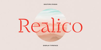 Realico is a serif display made carefully and gives a unique impression to your text. This font is suitable for titles, logos, and other formal forms such as t-shirts, labels, magazines, books, greeting cards, packaging, fashion, makeup, stationery, novels, labels, or whatever—type of advertising objective.
 - Normandy Isle JNL by Jeff Levine,
$29.00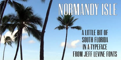 Normandy Isle JNL is a condensed sanserif typeface built off of the basic design of an old wood type, but augmented with thick and thin lines to create a whole different look. The font itself is named after a community in the North end of Miami Beach.
 - Glover by Fype Co,
$16.00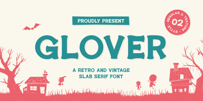 Glover is a Vintage Slab font available in regular and texture, it has styles a spooky, grungy, unique, covering a wide range of project types such as poster design, book covers, prints, headlines, magazines, packaging, branding. It will turn any design project into a true standout!
 - FF DuGauguin by FontFont,
$41.99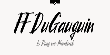 Belgian type designer Dung van Meerbeeck created this script FontFont in 1992. The font is ideally suited for festive occasions, film and tv as well as poster and billboards. FF DuGauguin provides advanced typographical support with features such as ligatures. It comes with proportional lining figures.
 - Monotype Lightline Gothic by Monotype,
$29.99Monotype Lightline Gothic is a thin sans serif face cut by American Type Founders to work with Franklin Gothic, which had been designed as a bold face. The rather condensed nature of the Monotype Lightline Gothic font has made it popular for advertising display and newspaper work. - FF Orbital by FontFont,
$41.99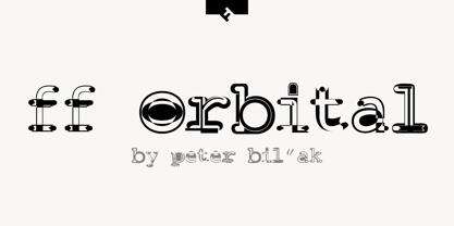 Slovakian type designer Peter Bil'ak created this display FontFont in 1996. The font is ideally suited for film and tv, music and nightlife as well as software and gaming. FF Orbital provides advanced typographical support with features such as ligatures. It comes with tabular lining figures.
 - Urmeba JNL by Jeff Levine,
$29.00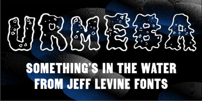 Urmeba JNL has an odd history. Originally conceived a few years back as a... well... ‘barf’ font, this limited-character type design was revised by Jeff Levine into a less-offensive idea... that of friendly little amoebas (such as you'd find in a glass of water).
 - Australis Pro by Latinotype,
$39.00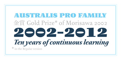 Australis is a hybrid roman font that won first prize in the Morisawa International Type Design Competition in 2002. After 10 years the family is finally complete and its release coincides with the reopening of the competition in 2012, in Japan. Designed by Francisco Gálvez Pizarro.
 - Agincourt by ITC,
$39.00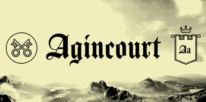 English designer David Quay created the Agincourt font in 1983. Drawn after the Old English style of type, Agincourt features intricate capitals, which complement the more reserved, slightly condensed lowercase. Agincourt is perfect for use on certificates, greeting cards, or anything that should have an historical appearance.
 - MPI Antique by mpressInteractive,
$5.00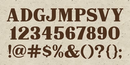 Antique is a bold, classic font with high stroke contrast and no bracketing on the serifs. This letter style was hugely popular during the early 19th century and was the basis for a myriad of other designs. This version is based on wood type of unknown origin.
 - FF DuChirico by FontFont,
$30.99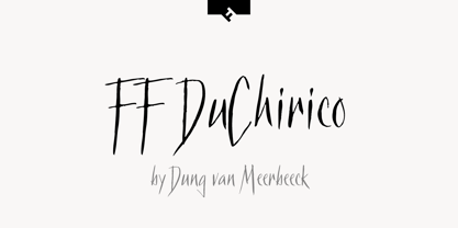 Belgian type designer Dung van Meerbeeck created this script FontFont in 1992. The font is ideally suited for festive occasions, film and tv as well as poster and billboards. FF DuChirico provides advanced typographical support with features such as ligatures. It comes with proportional lining figures.
 - Megaxoid by PizzaDude.dk,
$20.00Megaxoid is a grunge Open Type font - full of different auto ligatures! That means you can write words like beer, letter, bubble, success (just to name a few) without having the double letter repeating itself! (You will need to use OpenType supporting applications to use the autoligatures). - Huggie Bunny by Awan Senja,
$14.00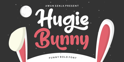 Introducing our newest funny typeface, Hugie Bunny, a nice fun typeface. This font perfectly made to be in poster funny, and the other various formal forms such as invitations, labels, logos, magazines, books, packaging, fashion, make up, stationery, novels, labels or any type of advertising purpose.
 - Linotype Albawing by Linotype,
$29.99Linotype Albawing is the text type that is derived from the original idea for Linotype Albatross. The sketches were done with Fontographer 3.5 using the simplified outlines of Linotype Albatross. Linotype Albawing is an agile, lively and elegant font and well-suited for headlines, posters and advertisements. - Troublemarker by PizzaDude.dk,
$15.00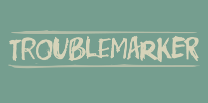 Real trouble is going to hit you with this font! In fact, you most like didn't know what hit you! Perhaps one of the 5 different versions of each letter?! Well, these cycles automatically as you type! Besides all the trouble, Troublemarker has got extensive language support!
 - Wayland by Hanoded,
$15.00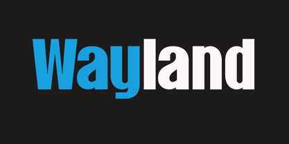 Wayland (Vølund or Völundr) is the mythical blacksmith from Norse mythology. I chose this name, because Wayland is a bulky, sturdy display font. Wayland can be used for many types of design, but headlines, posters and book covers spring to mind. Comes with extensive language support.
 - FF Network by FontFont,
$41.99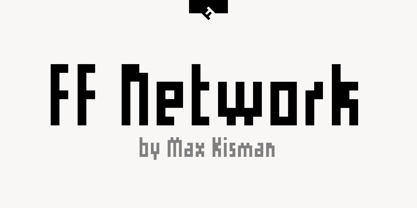 Dutch type designer Max Kisman created this display FontFont in 1991. The font is ideally suited for logo, branding and creative industries and music and nightlife. FF Network provides advanced typographical support with features such as ligatures and case-sensitive forms. It comes with proportional oldstyle figures.
 - Alaska by Solotype,
$19.95This interesting type was introduced by the Chicago firm of Marder, Luse & Company in 1890, about the time designers were beginning to lose some of the excessive ruffles and flourishes that characterized the Victorian age. Originally a caps-only font, we have added a lowercase to match. - Biosphere by Fype Co,
$16.00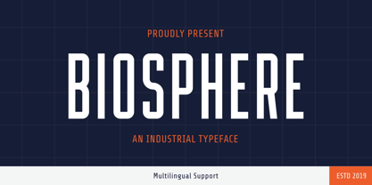 Biosphere is inspired by industrial style typeface that's will give look a modern and technical industrial display font. That will take any design idea to the next level, covering a wide range of project types such as poster design, book covers, prints, headlines, id cards, packaging, branding.
 - Charlatan by PizzaDude.dk,
$20.00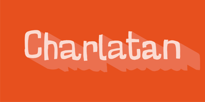 Charlatan is (despite the name!) a truly trustworthy font. Works well with everything that needs something legible and handmade! Comes with contextual alternates (6 different versions of all lower-case letters!) that automatically cycles as you type! And, of course, Charlatan is full of international characters!