10,000 search results
(0.13 seconds)
- Neue Frutiger Paneuropean by Linotype,
$79.00During planning for the new Roissy Charles de Gaulle airport in Paris at the beginning of the 1970s, it was determined that the airport's signage system had to include the clearest and most legible lettering possible. The development of all signage was put into the hands of Adrian Frutiger and his studio. The team carried out their task so effectively that a huge demand for their typeface soon arose from customers who wanted to employ it in other signage systems, and in printed materials as well. The Frutiger® typeface not only established new standards for signage, but also for a range of other areas in which a clear and legible design would be required, especially for small point sizes and bread-and-butter type. The typeface family that which emerged as a result of this demand was added into the Linotype library as "Frutiger" in 1977. Frutiger Next, created in 1999, is a further development of Frutiger, not necessarily a rethinking of the design itself. It was based on a new concept, the most obvious visual characteristics of which is the larger x-height, as well as a more pronounced ascender height and descender depth for lower case letters in relation to capitals. This new design created a balanced image and included considerably narrower letterspacing. Frutiger Next meets the demand for a space-saving, modern humanist sans. 2009's Neue Frutiger is a rethink of the 1977 Frutiger family, now revised and improved by Akira Kobayashi in close collaboration with Adrian Frutiger. Despite the various changes, this "New Frutiger" still fits perfectly with the original Frutiger family, and serves to harmoniously enhance the weights and styles already in existence. The perfect mix, guaranteed Neue Frutiger has the same character height as Frutiger. As a result of this, already existing Frutiger styles can be mixed with Neue Frutiger where necessary. Likewise, Neue Frutiger is perfect for use alongside Frutiger Serif. Newly added are the "Neue Frutiger 1450" weights. Especially for the requirements of the newly released German DIN 1450 norm we have built together with Adrian Frutiger specific weights of the Neue Frutiger. The lowercase l" is curved at the baseline to better differentiate between the cap "I", additionally the number "0" has a dot inside to better differentiate between the cap "O", and the number "1" is now a serifed 1. The font contains additionally the origin letterforms from the regular Neue Frutiger font which can be accessed through an Opentype feature." - Neue Frutiger Cyrillic by Linotype,
$89.00During planning for the new Roissy Charles de Gaulle airport in Paris at the beginning of the 1970s, it was determined that the airport's signage system had to include the clearest and most legible lettering possible. The development of all signage was put into the hands of Adrian Frutiger and his studio. The team carried out their task so effectively that a huge demand for their typeface soon arose from customers who wanted to employ it in other signage systems, and in printed materials as well. The Frutiger® typeface not only established new standards for signage, but also for a range of other areas in which a clear and legible design would be required, especially for small point sizes and bread-and-butter type. The typeface family that which emerged as a result of this demand was added into the Linotype library as "Frutiger" in 1977. Frutiger Next, created in 1999, is a further development of Frutiger, not necessarily a rethinking of the design itself. It was based on a new concept, the most obvious visual characteristics of which is the larger x-height, as well as a more pronounced ascender height and descender depth for lower case letters in relation to capitals. This new design created a balanced image and included considerably narrower letterspacing. Frutiger Next meets the demand for a space-saving, modern humanist sans. 2009's Neue Frutiger is a rethink of the 1977 Frutiger family, now revised and improved by Akira Kobayashi in close collaboration with Adrian Frutiger. Despite the various changes, this "New Frutiger" still fits perfectly with the original Frutiger family, and serves to harmoniously enhance the weights and styles already in existence. The perfect mix, guaranteed Neue Frutiger has the same character height as Frutiger. As a result of this, already existing Frutiger styles can be mixed with Neue Frutiger where necessary. Likewise, Neue Frutiger is perfect for use alongside Frutiger Serif. Newly added are the "Neue Frutiger 1450" weights. Especially for the requirements of the newly released German DIN 1450 norm we have built together with Adrian Frutiger specific weights of the Neue Frutiger. The lowercase l" is curved at the baseline to better differentiate between the cap "I", additionally the number "0" has a dot inside to better differentiate between the cap "O", and the number "1" is now a serifed 1. The font contains additionally the origin letterforms from the regular Neue Frutiger font which can be accessed through an Opentype feature." - Neue Frutiger 1450 by Linotype,
$71.99 During planning for the new Roissy Charles de Gaulle airport in Paris at the beginning of the 1970s, it was determined that the airport's signage system had to include the clearest and most legible lettering possible. The development of all signage was put into the hands of Adrian Frutiger and his studio. The team carried out their task so effectively that a huge demand for their typeface soon arose from customers who wanted to employ it in other signage systems, and in printed materials as well. The Frutiger® typeface not only established new standards for signage, but also for a range of other areas in which a clear and legible design would be required, especially for small point sizes and bread-and-butter type. The typeface family that which emerged as a result of this demand was added into the Linotype library as "Frutiger" in 1977. Frutiger Next, created in 1999, is a further development of Frutiger, not necessarily a rethinking of the design itself. It was based on a new concept, the most obvious visual characteristics of which is the larger x-height, as well as a more pronounced ascender height and descender depth for lower case letters in relation to capitals. This new design created a balanced image and included considerably narrower letterspacing. Frutiger Next meets the demand for a space-saving, modern humanist sans. 2009's Neue Frutiger is a rethink of the 1977 Frutiger family, now revised and improved by Akira Kobayashi in close collaboration with Adrian Frutiger. Despite the various changes, this "New Frutiger" still fits perfectly with the original Frutiger family, and serves to harmoniously enhance the weights and styles already in existence. The perfect mix, guaranteed Neue Frutiger has the same character height as Frutiger. As a result of this, already existing Frutiger styles can be mixed with Neue Frutiger where necessary. Likewise, Neue Frutiger is perfect for use alongside Frutiger Serif. Newly added are the "Neue Frutiger 1450" weights. Especially for the requirements of the newly released German DIN 1450 norm we have built together with Adrian Frutiger specific weights of the Neue Frutiger. The lowercase l" is curved at the baseline to better differentiate between the cap "I", additionally the number "0" has a dot inside to better differentiate between the cap "O", and the number "1" is now a serifed 1. The font contains additionally the origin letterforms from the regular Neue Frutiger font which can be accessed through an Opentype feature."
 - Hamlet by Canada Type,
$24.95Based on a specimen of an obscure and uncredited old face called Kitterland, Hamlet is one of those curiosities hardly ever noticed in the world of modern fonts, the kind that infuses a variety of historic Blackletter and calligraphy traits in an otherwise Roman alphabet. Such typefaces, what few of them exist, are almost always classified by typophiles as traditional decorative Roman alphabets. We beg to differ. We think such hybrids are fascinating enough to deserve a classification of their own. And we think today's aspiring letterers and type designers would benefit from paying special attention to this kind of hybrid alphabet, not only because it has much more hand than machine in it, but also because it is a prime example of how to succeed in mixing different lettering techniques into one self-contained and distinctly functional alphabet. As in any efficient mixture of lettering methods, Hamlet ended up with characters that are uniquely its own, such as the cupped A, M, V, W and Y, the very luscious and inviting curves on the arms of E, F, L and T, both single- and double-story forms of the a, and the humblest, friendliest g and y ever. A dozen alternate characters are sprinkled throughout the character set, so check out the map for a few pleasant surprises. We also made the Handtooled and Headstone styles because we thought these friendly forms were just crying out for such treatments. The Handtooled version turned out quite lovely, if we may say so ourselves, perhaps even better than the main font. The Headstone version is available as a free bonus to those who purchase the complete Hamlet package. All Hamlet styles come with lining figures as well as old style ones. Hamlet comes in all popular font formats. The OpenType fonts contain push-button swapping alternates and figures, which come in handy in software programs that support this kind of thing. - Impulsa by Just Font You,
$16.00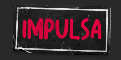 Impulsa is a very impulsive handwritten font. It is finished with digital touch but still keep holding on to the honest of the handwriting feeling. I believe messages with personalized handwriting vibes always deliver deeper feelings to anybody. Impulsa is an all-caps font. You can play with the uppercase and lowercase mix to get the different vibes of every letters so it looks seamlessly handwritten.
 - HT Osteria by Dharma Type,
$19.99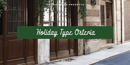 HT Osteria is a monoline script, but you don’t feel it monotonous because of distinctive shapes of the characters. HT Osteria is suitable for signage, package, and posters or any other kind of display use. Holiday Type Project offers retro hand drawing scripts. Inspired by retro script on shopfront lettering, wall paint advertisements in Italy around 1950s. Check out the script fonts from Holiday Type!
 - Seductive Height by Wildan Type,
$15.00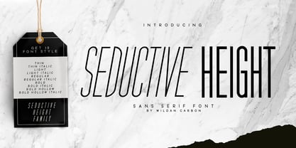 Seductive Height has been realised Seductive Height is sans serif font. It is unic font. all Character have hight stem. That make this font look simple but elegant. Seductive Family has 10 font style with different wieght. you also will get lowercase, uppercase, number, function, multilingual, and some alternate. Suitable for many project (formal or informal). Features Lowercase/Uppercase/ Numbers & Punctuation / Extensive Language Support/Alternate
 - Ancient History by Kaer,
$20.00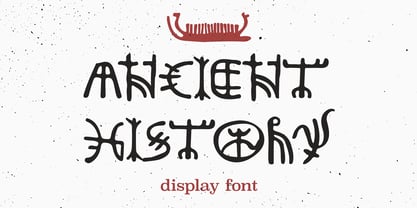 Hey guys! I'm happy to introduce you my new Ancient history based font. Recently I made an adventure to the North and visited a rock art attraction. This font based on pictograms I saw. The font may be used for creating ancient prints, logo design, clothing embroidery, product packaging, historical header, etc. What you will get: * Uppercase and lowercase * Multilingual support * Numbers * Symbols * Punctuation
 - Lamiran by RagamKata,
$14.00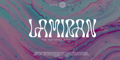 Lamiran is a Distorted Wavy Font . You're not going to write a novel with this font, I will tell you that but... if you want something seriously psychedelic thats part art and part font, then this is the font for you. Using it sparingly to mix and match with a clean sans serif or go all out for a good time. Thanks, Have a wonderful Day. Ragamkata
 - Vulgary by Etewut,
$24.00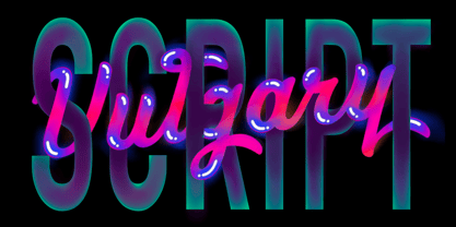 Vulgary is a script family that includes 4 fonts. They match each other but can be used separately as well. It supports all euro languages based on Latin alphabet. To use swashes you have to open glyphs panel in menu Window. The font is compatible on both Windows and Mac. You can use it in all popular apps like Adobe, Corel Draw, Microsoft, Final Cut etc.
 - Nitro Chargers by Mevstory Studio,
$25.00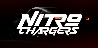 Nitro Chargers an awesome sports fonts, modern cutouts, and dynamic slant. Ideal for fast car racing sports titles, running matches, cycling, automotive game logos and monograms or other modern dynamic text. Nitro Chargerscompare favorably with legibility and size, creating the effect of power and speed. Designed as a fast and dynamic font, but with a slightly different font design, check it out and grab it right away.
 - Knockdown by Hanoded,
$15.00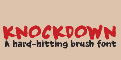 Finding my long-lost inkwell was a lucky moment for me and it resulted in a whole bunch of brushy/inky fonts. The latest font to leak out of this well is Knockdown. It is a bold and wild brushface, but very legible. Use if for your posters, book covers and T-shirts! Or, whatever else you like. Comes with a KO of diacritics.
 - Waiting Awakmu by RGB Studio,
$16.00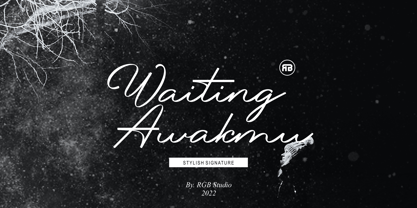 Waiting Awakmu is a classy handwritten font, This is a truly versatile font combining sophisticated, casual and even fun sides depending on the style you use. Files Include : Basic Latin A-Z and a-z Numbers Symbols PUA Encode Multilanguage Support Thanks and have a wonderful day, If you have any questions, please get in touch with us Don't forget to check out our other products.
 - Romsey Duo by Supfonts,
$16.00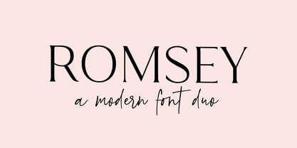 Romsey is a modern and minimalistic serif font combined with a sloppy handwritten font. This combination creates a clean and luxurious style in your designs Thanks so much for checking out my shop, and please get in touch if you have any questions! Romsey Font Features: - Full Set of standard alphabet and punctuation - Handwritten ligatures - PUA Encoded - no special software needed to access extra characters - Multilingual Characters
 - Arcane Land by Fromletterel,
$12.00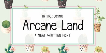 This font will sparks childish energy which is cheerful and playful, but it still usable to any kind of design because its familiarity. Arcane Land is a neat casual handwritten. Despite its neatness, this font is still looked handmade because the stroke and the asymmetrical shape. Suitable for posters, logos, branding, and all designs that need natural text writing. Go get your ticket to the Arcane Land!
 - Caslon Antique by Linotype,
$40.99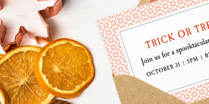 Caslon Antique was designed by Berne Nadall and brought out by the American type foundry Barnhart Bros & Spindler in 1896 to 1898. It doesn’t bear any resemblance to Caslon, but has the quaint crudeness of what people imagine type looked like in the eighteenth century. Use Caslon Antique for that “old-timey” effect in graphic designs. It looks best in large sizes for titles or initials.
 - Maranello by Mevstory Studio,
$25.00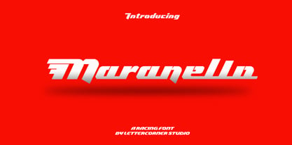 Maranello an awesome sports fonts, modern cutouts, and dynamic slant. Ideal for fast car racing sports titles, running matches, cycling, automotive game logos and monograms or other modern dynamic text. Adegor compare favorably with legibility and size, creating the effect of power and speed. Designed as a fast and dynamic font, but with a slightly different font design, check it out and grab it right away.
 - HT Libreria by Dharma Type,
$19.99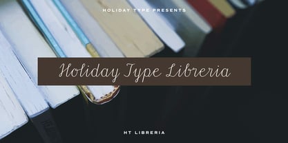 This font consists of thin lines, we get very delicate impression.The straight lines are regularly arranged, at the same time, this font has very beautiful curved lines. So its overall atmosphere is intelligent and sophisticated. Holiday Type Project offers retro hand drawing scripts. Inspired by retro script on shopfront lettering, wall paint advertisements in Italy around 1950s. Check out the script fonts from Holiday Type!
 - Widdershins by Hanoded,
$15.00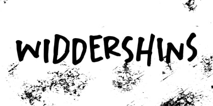 I like strange words. Widdershins is one of them: it means ‘to go counter clockwise’ and I picked it up from a book I am reading at the moment. Widdershins font was created using a broken bamboo satay skewer and Chinese ink. It is a little messy, uneven and maybe even unnerving, but I am sure you’ll find a way to put it to good use.
 - East India Company NF by Nick's Fonts,
$10.00Put the kettle on and break out the biscuits. This no-nonsense stencil face is a faithful recreation of Tea Chest, released by the Stephenson Blake Type Foundry in 1939. Its bold strokes and slender profile retain their freshness, even seventy-plus years on. Both versions include the complete Latin 1252, Central European 1250 and Turkish 1254 character sets, as well as localization for Moldovan and Romanian. - Nobodi by Wilton Foundry,
$29.00This Bodoni-like font sets out to slightly square off rounded shapes, adding a very slight curve to the join from the square serif and stem, and minimizing and softening the pronounced bulbs found in Bodoni. There are hints of Walbaum and Melior but the overall effect is a more subtle, and interesting letterform that is friendly, fresh and contemporary. Ideal for corporate communications, ads and magazines. - Flick by Trequartista Studio,
$25.00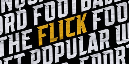 Flick an awesome sports fonts, modern cutouts, and dynamic slant. Ideal for fast car racing sports titles, running matches, cycling, automotive game logos and monograms or other modern dynamic text. Flick compare favorably with legibility and size, creating the effect of power and speed. Designed as a fast and dynamic font, but with a slightly different font design, check it out and grab it right away.
 - Punch Pro by Produce,
$29.00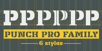 Punch was born because we wanted to create a stencil font. At first glance, Punch gives out an audacious persona with its bold shape and form. It’s softer side is revealed in it’s carefully cut stencil lines. The balance of heavy and refined gives the font family its very own charm. Punch Pro comes in six different weights; Slab, Bracketed, Wedge, Deco, Hairline and Sans.
 - Victory Speech Lower by Comicraft,
$49.00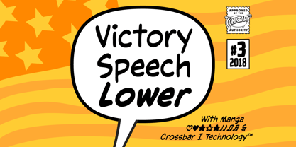 Speak quietly but carry a big stick' as President Theodore Roosevelt once said... so, with so much heated rhetoric in the air this -- let's face it, EVERY -- Election season, we felt that it was important to put together a more dignified and sedate lower case edition of our popular Victory Speech font. Bad Hair and Big Sticks not included. See related font: Victory Speech
 - Habbly by Robert Corseanschi,
$25.00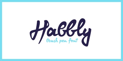 Habbly is a handwritten brush pen font with smooth ligatures and alternates which makes it look more realistic and natural. The font has a slight bold feeling. In order to get the most out of this typeface be sure to use a program that has opentype capabilities. Suitable for wedding invitations, coffee packages, badges, logos, apparel, stationery, magazines, letterpress, film, books and many others.
 - Champloo by One Fonty Day,
$10.00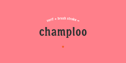 Champloo is very unique typeface which combines serif features and brush stroke. Some letters have serif, but some don’t. Serif to be found on left side of stem only. It gives a quirky impression on short text. However the larger the text become, the more consistent look it gets as a whole. These two versatile weights let you play with the typeface freely and beautifully.
 - Pecking Order by Hanoded,
$15.00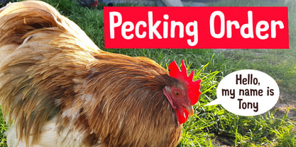 I keep chickens for eggs and meat, but the ones that have names cannot be eaten. ;-) As I was busy working on this font, the chickens were sitting in the window, looking at me and hoping they'd get a treat! Pecking Order is a cartoon and kids font. It comes with a wholesome, homemade goodness and extensive language support, including Sami, Greek and Vietnamese.
 - Salsiccia by Bech Type,
$19.00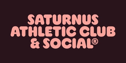 Inspired by bold and rounded typefaces on signs from the 1970s, Salsiccia can promote both your hot dog stand and your international toy store enterprise. Its boldness and roundness is combined with classical proportions, with wide letters — like the O — next to little nubby ones — like the T. This not only looks nice, but helps us even out the white spaces across words and sentences.
 - Legal by Linotype,
$29.99The Legal typeface family grew out a sans serif project that Hellmut G. Bomm began in the 1970s (his HGB Grotesk). This refined, industrial type family is well suited for short amounts of text, headlines, corporate identity and logo design. In small sizes, the typeface works like many other sans serifs, but with better differentiation between characters. The Legal family includes oldstyle figures and true italics. - Squadzone by DePlictis Types,
$29.00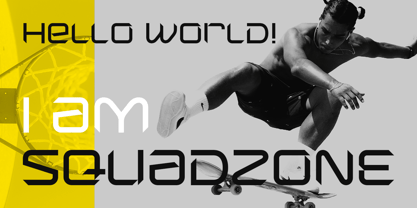 SQUADZONE it’s a young & sportive unicase style font, having both uppercase and a few smallcase alternating letters that gives it a unique look. It’s geometric anathomy of the letters may have two different types of endings or detail: straight and sharp cut out angles at 45 degrees. This offers a few alternatives in headlines or even logotype purposes that are realy encouraged to use for.
 - Oaken Bucket NF by Nick's Fonts,
$10.00A Victorian face named Oakwood provided the pattern for this decorative little number, with its swirls and curls guaranteed to delight boys and girls, saints and churls, and dogs and squirrels…well, maybe not the last pair, but you get the idea. All versions of this font include the Unicode 1250 Central European character set in addition to the standard Unicode 1252 Latin set. - Modernline by Ef Studio,
$10.00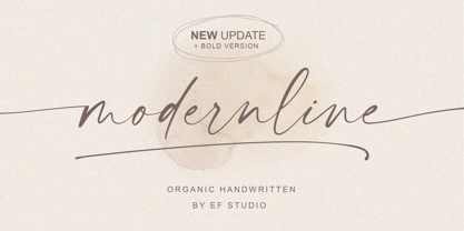 NEW UPDATE : BOLD VERSION Modernline is an organic handwritten font that is suitable for branding, signature, wedding invitation, promotion, product packaging, and other needs. This font is modern, simple, but still authentic. You will get full set of lowercase and uppercase letters, numerals and punctuation, multilingual symbols, lowercase beginning and ending swashes, ligatures and extra swashes. Now come with 2 weights, regular and bold.
 - HighJinkies by Comicraft,
$19.00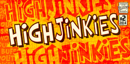 It’s jaunty and flaunty and up to no good! It’s a child born of fairly odd parents and always looking for the good kind of trouble. It'll get you out of the red and into the pink like a panther pawning diamonds! Comicraft’s John Roshell has slipped his hands into the gloves of the Phantom Font Finagler and there’s HighJinks ahead to be sure!
 - Bonehead JNL by Jeff Levine,
$29.00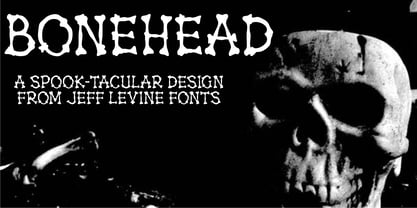 Thematic fonts aren't always big sellers, but they do serve a purpose for specialty projects and applications. Bonehead JNL is a novelty typeface that is constructed out of bones. Whether the need is for a pirate theme, Halloween, horror movies or for things that go bump in the night, this font will fill the bill – no bones about it. Oh, wait! Yes there are!
 - HT Gelateria by Dharma Type,
$19.99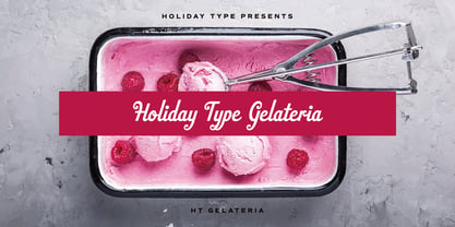 Gelateria is characterized by its dots and tails. This font is as a whole smooth and elegant. But because its dots and end of the tails are little points, Gelateria impressed you very much. Holiday Type Project offers retro hand drawing scripts. Inspired by retro script on shopfront lettering, wall paint advertisements in Italy around 1950s. Check out the script fonts from Holiday Type!
 - SK Brushwood by Shriftovik,
$10.00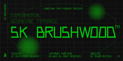 SK Brushwood is an experimental geometric font based on chaotic lines. It is inspired by the Greek stone script, but nevertheless it is modern. The main component of the letter shape is straight and sloping lines ending in straight corners, which makes it look like brushwood. This is why the font gets its name. SK Brushwood is perfect for headlines, posters, print work, and the Internet.
 - Rallynda by Balevgraph Studio,
$12.00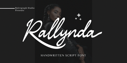 Rallynda is a whimsical yet adaptable handwritten font, that can easily stand out. Simple but with a strong visual effect, this font will instantly make your creation more appealing than any others. This font is PUA encoded which means you can access all of the glyphs with ease! What's Included? Uppercase & Lowercase Numbers & Punctuation Ligature, Alternate & Swashes Multilingual Support PUA Encoded Enjoy our font
 - Lord Rat AOE by Astigmatic,
$19.95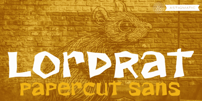 LordRat is a rugged unicase typestyle built for childish and off kilter purposes. A mix of heavy and light with quickcut appearance makes this typestyle offbeat and even festive. Put some dignified childish offbeat flavor into your designs today with LordRat. If you've been looking for a playful yet bold typestyle with papercut looks, LordRat is what you've been looking for. Get it today!
 - Saint Onki by Atom,
$10.00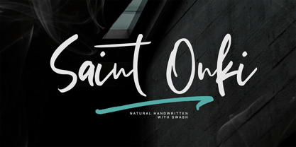 Saint Onki is a natural brush font with 4 styles that will give a casual impression to your design. With stylistic sets and original handmade quality, your design will stand out more. You will get Saint Onki Regular Saint Onki Italic Saint Onki All Caps Saint Onki All Caps Bold Saint Onki Swash Hope you like it with this font. Have a great day and happy buying.
 - Etelka Slab by Storm Type Foundry,
$39.00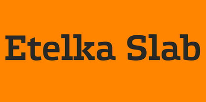 Etelka Slab is a slab-serif variation of Stormtype's Etelka. In the process of adding serifs are applied some arched elements to emphasize its unique character. The usual range of OpenType functions is present as well as multi-lingual capability. You can use Etelka Slab wherever you intended to put Etelka, but with even sharper, louder expression. It shines in corporate identity and branding.