10,000 search results
(0.083 seconds)
- Diamond Lady by Redy Studio,
$19.00 Diamond Lady is so gorgeous, she’ll steal your heart with her hand-lettering and handwritten font shapes, The idea of this font was to create as realistic as the possible texture of hand lettering and keep the style of Signature. Diamond Lady is a handwriting font with delicate curves and a unique blend of thick and thin lines. This font offers all the sophistication and beauty you could ask for in one package. It will help you to create an authentic modern signature or a stylish handwritten effect for your logotype and headlines. The font contains 94 ligatures, so it would be perfect for logos and branding with handwriting/sig logos look. She’s got all the real hand-lettered shine, loveliness, and romance attached to the art of hand lettering. Don’t hesitate, just get it! Diamond Lady features: A full set of upper & lowercase characters Numbers & punctuation 94 Gorgeous ligatures Multilingual symbols PUA Encoded Characters – Fully accessible without additional design software. Feel free to give me a message if you have a problem or question. Thank you so much for taking the time to look at one of our products.
 - Ankle by VType,
$8.00 An elegant sans serif typeface with style. Fashionable, classy but still modern! Designed and shared by Vikers | RerdSystems. Perfect for logos, posters and more.
 - Restora Neue by Nasir Udin,
$25.00 Restora Neue is an evolution of its precursor, Restora. While the Restora has an authentic imperfect letterforms, Restora Neue comes with a neater shape and higher contrast. It’s a mix of old-style roman serif styles. Its sharp and longer serif with a bit touch of medieval, makes Restora Neue a versatile type family that can be used in many different themes of design projects, from classic style to modern. It comes in nine weights from thin to black with matching italics. Its mixture of weights provide a wide range of styles that will help you find the best vibe for your projects, for headlines or a short paragraph. The set of special ligatures and stylistic alternates can be perfect mates for your brand. It is well suited for book covers, editorial, branding, advertising and more. To see the complete presentation please visit my Behance profile.
 - Redgar by Graphite,
$12.00 Redgar is a weathered display family. It comes in four styles – regular, slab, stencil, clean and has a matching set of banners and shapes.
 - Hadriano by Monotype,
$29.99When traveling in Paris, American designer Frederic W. Goudy did a rubbing of a second century marble inscription he found in the Louvre. After ruminating on these letterforms for several years, he drew a titling typeface in 1918, all around the letters P, R, and E. He called the new face Hadriano" as that name was in the original inscription. Robert Wiebking cut the matrices, and the Continental Typefounders Association released the font. Goudy designed a lowercase at the request of Monotype in 1930, though he didn't really like the idea of adding lowercase to an inscriptional letterform. The lowercase looks much like some of Goudy's other Roman faces. Compugraphic added more weights in the late 1970s, and made the shapes more cohesive. Hadriano has nicely cupped serifs and sturdy, generous body shapes. Distinctive individual letters include the cap A and Q, and the lowercase e, g, and z. Hadriano™ is an excellent choice for impressive headings and vigorous display lines." - Cadmium by AVP,
$- Cadmium has a comprehensive latin character set and many Opentype features to enhance text, including small capitals, case-sensitive forms, superscript and subscript. Plenty of numeral variants include old-style figures, lining figures and fractions. Default numerals are proportionally spaced. Alternative styles for a handful of key characters provide some useful variations where stylistic sets can be implemented. The fonts are presented as four width-based sub-families: Expanded, Normal, Condensed and Compressed. Each width has a matching range of six weights and italics (obliques). Regular and Bold weights are style-linked, together with their respective oblique forms. Each width differs in its basic construction but all fonts share the same vertical metrics and may be used in combination with each other. Letter spacing is optimised for text sizes but is tolerant of significant tracking changes. Cadmium is good for signage, publicity and packaging, screen credits and titling, general print and publication, as well as web and screen applications.
 - Mantika News by Linotype,
$67.99 Mantika News™, from German designer Jürgen Weltin, was designed to expand the Mantika super family with text and display typefaces for setting newspapers and periodicals. The suite of typefaces is comprised of regular and bold designs, with italic counterparts, for setting continuous text, and light and extra bold versions for setting larger sizes in headlines, sub heads, pull quotes and decks. The typefaces intended for text copy were designed with shared character widths, so that changes can be made in typeface choice without disrupting line endings or column length. The display designs have a slightly smaller x-height and shorter ascenders creating a more elegant demeanor while ensuring compact multi-line display copy. In addition, fonts of Mantika News have a large Monotype W1G (World Glyph Set 1) character set enabling the setting of Greek, Cyrillic and over 20 Eastern and Western European Latin-based languages. Proportional figures are available, in the OpenType® fonts, as an alternative to the tabular designs.
 - Sisters by Type-Ø-Tones,
$40.00 Sisters is a lively set of stencil display typefaces designed by Type-Ø-Tones’ co-founder Laura Meseguer. The family features four fresh fonts that share foundational principles of construction yet complement each other—as sisters do—by celebrating their differences. Variations in contrast, weight, and design characteristics result in four distinct styles dubbed One through Four. This cool quartet contains no lowercase, asserting the family’s rightful place in the titling typography space. Like many Type-Ø-Tones typefaces, Sisters was conceived as a custom lettering project—in this case, the design was crafted for the identity of an art exhibition. Laura initially drew only the limited character set the show required, but from the outset, she saw great potential for a fully developed type family based on her lettering concept. The first member of Laura’s new family was, naturally, Sisters One. She later added contrast to produce Sisters Two, then equalized the weight of Sisters Two to create Sisters Three. To round out the group, Laura added a deco touch to Sisters Two, resulting in the festive but retro-elegant Sisters Four. Each Sister shares DNA with the other members of the family, just as human siblings do :). Credit for the Sisters name goes to Eider Corral and we couldn’t imagine a more fitting moniker for this little family.
 - Neonrec by Ditatype,
$29.00 Neonrec is an innovative display font that merges futuristic aesthetics with the mesmerizing allure of neon lights. With its bold uppercase letterforms and a luminous neon backlight, this typeface commands attention, creating a visually stunning and forward-thinking experience. The special characteristic of this font lies in the sleek and cutting-edge design, embodying the essence of a futuristic world. Each letter is meticulously crafted with precision and sharp lines, exuding a sense of technological advancement and modernity. The neon backlight adds a striking visual element that elevates the font to new heights. Inspired by the captivating glow of neon lights, Neonrec infuses a sense of energy and innovation into each character. The luminous backlight creates a radiant glow that casts a captivating hue, reminiscent of the neon signs that adorn the streets of a futuristic metropolis. This futuristic neon effect adds depth and dimension to the font, creating an eye-catching visual impact. Features: Ligatures Multilingual Supports PUA Encoded Numerals and Punctuations Neonrec is perfect for attention-grabbing headlines, logos, and sleek branding applications that require a touch of futuristic sophistication. It is thrives in designs that embrace a forward-thinking and cutting-edge style. Whether you're creating posters, digital interfaces, sci-fi themed artwork, or anything in between, this font will add a captivating futuristic element that sets your project apart. It shines particularly bright in applications related to technology, gaming, science, and futuristic-themed designs. Find out more ways to use this font by taking a look at the font preview. Thanks for purchasing our fonts. Hopefully, you have a great time using our font. Feel free to contact us anytime for further information or when you have trouble with the font. Thanks a lot and happy designing.
 - Mamute by PintassilgoPrints,
$18.00 Mamute is a block rockin' family with a cool letterpress look. Its upper- and lower-case slots hold glyphs with slightly different textures for a natural look. Numbers and punctuation marks also have alternate versions. Just trigger the Contextual Alternates feature to easily cycle the alternate glyphs, preventing double letters from displaying the same texture. Mamute is a highly decorative typeface available in 2 widths, regular and condensed, each also offered as a layered font, a handy and playful way for adding shades to your composition. There’s also a generous ornaments font and a catchwords one to spice up your designs. Mamute is based on Aldine wood type spirit (as there were many incarnations of it!), from circa 1870. Please note that this family has a limited character set and doesn't bring diacritics nor accented characters. But yet it does rock, you bet!
 - Steel Grrrder Script by ULGA Type,
$9.00 Steel Grrrder is an industrial-style joining script with a stencil effect, available in six weights ranging from Light to Black. Great for all kinds of display purposes including posters, film titles, book covers, magazines, advertising, signage, packaging, logos and tanks, this is a script with a sharp personality and a steely presence. However, if you’re searching for a “nice” script - sorry, bud - you’re looking in the wrong place. Steel Grrrder Script doesn’t entice the reader with voluptuous curves, flowing swashes or frisky letterforms, instead its sharp chiselled features compel the reader to pay attention. Characters muscle their way along like robotic bulldogs in steel-toe cap boots. Steel Grrrder Script is a veritable slab fest, best categorised as a constructivist joining script. Forged from carbon steel and wrapped in a layer of Graphene, this is a robust display typeface family able to withstand even the most demanding typographical situations. The Steel Grrrrder extended family also includes a six-weight sans-serif with corresponding italics and two display fonts, Groove & Nutjob - all designed to work with each other.
 - Neo Sans Cyrillic by Monotype,
$103.99The branding agency's client wanted an ultra modern"" typeface that was ""futuristic without being gimmicky or ephemeral,"" according to the design brief. Designer Sebastian Lester took on this intriguing custom font assignment, but soon, a bureaucratic decision cancelled the project. ""I was left with a sketchbook full of ideas and thought it would be a shame not to see what came of them,"" says Lester. He decided to finish the design on his own. Lester's research confirmed that the principal ingredient of an ""ultra modern"" typeface was simplicity of character structure: a carefully drawn, monoline form, open letter shapes and smooth, strong curves. To conceive a typeface that crossed the line from modern to futuristic, Lester decided to amplify these qualities. About a year after Lester's initial conceptual work, two highly functional and versatile typefaces emerged. These are Neo Sans and Neo Tech, designs Lester describes as ""legible without being neutral, nuanced without being fussy, and expressive without being distracting."" Both the Neo Sans and the more-minimalist Neo Tech families are available in six weights, ranging from Light to Ultra. Each has a companion italic, and Neo Tech offers a suite of alternate characters. While engineered to look modern as tomorrow, Neo Sans and Neo Tech display the functional and aesthetic excellence that earns them a place in the list of classic designs from the Monotype typeface library. - Neo Sans Paneuropean by Monotype,
$114.99The branding agency's client wanted an ultra modern"" typeface that was ""futuristic without being gimmicky or ephemeral,"" according to the design brief. Designer Sebastian Lester took on this intriguing custom font assignment, but soon, a bureaucratic decision cancelled the project. ""I was left with a sketchbook full of ideas and thought it would be a shame not to see what came of them,"" says Lester. He decided to finish the design on his own. Lester's research confirmed that the principal ingredient of an ""ultra modern"" typeface was simplicity of character structure: a carefully drawn, monoline form, open letter shapes and smooth, strong curves. To conceive a typeface that crossed the line from modern to futuristic, Lester decided to amplify these qualities. About a year after Lester's initial conceptual work, two highly functional and versatile typefaces emerged. These are Neo Sans and Neo Tech, designs Lester describes as ""legible without being neutral, nuanced without being fussy, and expressive without being distracting."" Both the Neo Sans and the more-minimalist Neo Tech families are available in six weights, ranging from Light to Ultra. Each has a companion italic, and Neo Tech offers a suite of alternate characters. While engineered to look modern as tomorrow, Neo Sans and Neo Tech display the functional and aesthetic excellence that earns them a place in the list of classic designs from the Monotype typeface library. - Showboat by Canada Type,
$25.00You are looking at the friendliest, happiest and most faithful of puppies. It comes to greet you as soon as your eyes see it, radiates its joy, wags its tail, jumps in circles, and begs to be played with. Showboat is a very unique bragger of a font. Its bouncy metrics and whimsical shapes are a sure formula for attention. People will soak it in and feel happy while they do. How can anyone greet such happy letters with anything other than a smile? No matter how many fonts your design box has, you can be sure that none of them is this radiant, lively or cute. This happy camper comes in four fonts: two weights and a large number of corresponding ligatures and alternates. Showboat can be used in a vast number of design applications; flyers and webs for parties, pre-teen and teen events, scrapbooking, candy branding, posters, children's publications and web sites, pet stores and products, toys, and many many other things. - Vaccine by ParaType,
$30.00 Vaccine is a slab serif font family with a mixture of the usual and one-sided serifs. We call it ‘semi semi slab serif’. Serifs and terminals have soft rounded shapes, but stem junctions on the contrary use hard constructions. Such combination of basic design features makes the font distinct and strong in a setting and delicate and soft in appearance. This design peculiarity, together with low contrast and strong serifs, produces the qualities needed for using the font in small sizes, in low quality print, and in bad reading conditions. Vaccine got modern stylish design and has a prominent place in the set of popular faces. The family consists of 10 members - five weights with the corresponding italics. It can be used in a wide range of applications - magazines, advertising, corporate identity, urban navigation, packaging, children books, etc. Design by Manvel Shmavonyan with the help of Gayane Bagdasaryan as a consultant. Released by ParaType in 2013.
 - Gambit Nouveau SG by Spiece Graphics,
$39.00 Sinuous but sturdy; ornate but legible - Gambit Nouveau is modern-day design created in the spirit of Art Nouveau. This delicate and natural typeface features tapered spurs, compact swashes, and spiral curling. You will find it ideally suited for announcements and invitations as well as decorative headlines. And for your convenience, Gambit Nouveau comes equipped with corner and free-standing ornaments plus a wide range of alternate characters. Gambit Nouveau is also available in the OpenType Std format. Some new features including initial forms and old style figures have been added to this OpenType version. Advanced features currently work in Adobe Creative Suite InDesign, Creative Suite Illustrator, and Quark XPress 7. Check for OpenType advanced feature support in other applications as it gradually becomes available with upgrades.
 - Pebl by Formation Type Foundry,
$25.00 Pebl is inspired by the naturally simplified and smoothed shapes of beach pebbles. The result is a bold, super-rounded display typeface. It's pared back to just the most basic, smooth outlines without counters, for a friendly and organic look. It’s ideal for logos, branding, headlines or just abstract type shapes in print, in displays, on the web, on T-shirts, wherever. Enjoy.
 - Maus by Sentinel Type,
$10.00A heavy duty block-shadow font derived from Sentinel Sten Type, Maus' inflexible, near-featureless block-like shapes give the impression of great mass and solidity. Maus is an example of minimalism in type design, using a minimum of sculpting to elicit the essence of familiar Latin forms. Two sets of complimentary letters allow designers to pick and choose combinations for letter fit, for their symmetric values, or to create a particular look or feel to suit the subject. Obviously Maus has great potential for signage, posters and billboards, and screen-printed garments. - Agradable by Mchcrafter,
$18.00 Agradable is a Modern Stylistic Serif typeface A new serif that we created specially for branding needs, with extra ligatures and alternates in a unique shape just to add value to your brand. It so nice to leverage designer or product owner that need solutions to make their design look more stylish and modern. And specially for Agradable font, We prepared all the ligatures, and the alternates characters to help you create unlimited variations for your creative needs. Agradable includes: All uppercase & lowercase letters All numbers 0-9 & Punctuation Ligatures & Alternates Symbols Multiligual Letters
 - Bold Pen Lettering JNL by Jeff Levine,
$29.00 The title on the cover of Street & Smith’s “Wild West Weekly” for Jan. 27, 1934 made for an interesting contrast in terms. Here was a pulp magazine dedicated to stories of the Old West, but its title was hand lettered in an extra bold, squared shape style using a round pen nib – not exactly an alphabet that represented cowboys and desperados… This aside, this type style made for a good digital font revival, and it is now available as Bold Pen Lettering JNL in both regular and oblique versions.
 - Blog Cube by Say Studio,
$17.00 Blog Cube - Display Typeface Blog Cube is a bold and strong display typeface from rectangle shape that is perfect for your work such as posters, logos, branding, covers, banners, t-shirts and headers, or even large-scale artwork. Creative & Decorative Typography Web Design, Try this font on any surface it will look Stunning!. happy creating. hope you like it! well, Blog Cube also has an Outline style, is a strong and bold typeface, it has multilingual language, it is useful for your coolest and coolest project up next. Thanks, Have a wonderful day Say Studio
 - Golum by Type Innovations,
$39.00 Deep in the bowels of the earth a tortured creature tries to mimic the writings of mankind. It labors long and hard carving the letter forms on the walls of its cave. Many years later, rubbings where taken of these impressions and fashioned to create this hideous font. All kidding aside, with such a formal training in type design, it was not easy for me to create these ill-shaped letters. I kept wanting to smooth out the outlines. Anyway, it was a good exercise and we now have this antique heavy-weight.
 - Bibalgoski by Mchcrafter,
$18.00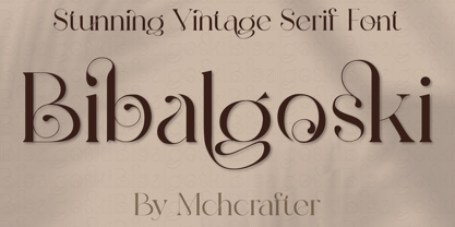 Bibalgoski is a Modern Stylistic Serif typeface. A new serif that we created specially for branding needs, with extra ligatures and alternates in a unique shape just to add value to your brand. It so nice to leverage designer or product owner that need solutions to make their design look more stylish and modern. And specially for Bibalgoski font, We prepared all the ligatures, and the alternates characters to help you create unlimited variations for your creative needs. Bibalgoski includes: All uppercase & lowercase letters All numbers 0-9 & Punctuation Ligatures & Alternates Symbols Multiligual Letters
 - Ingone by Ingrimayne Type,
$9.95 Ingone is a slightly irregular sans-serif face. It was designed to complement PattyDay and HeyPumpkin, but can be used alone if you need an informal, friendly sans-serif font. It has only one weight, but the family includes a shadowed style. In 2018 the inside of the shadowed version was separated out and made a separate typeface. The letters have the shapes of the regular version but the spacing of the shadowed version and can be layered with the shadowed version to easily produce lettering with two colors.
 - Bandera Text by AndrijType,
$21.00 This serif typeface is a real workhorse. It is a modern tool for text design: extremely legible and well shaped. Bandera Text has six weights with original italics. It catches attention in headlines of posters and magazines or makes reading comfortable in plain texts. Don't forget to try Medium and Medium Italic faces for free. Bandera Text works well with Bandera (slab serif), Osnova (sans serif) and Bandera Display (contrast serif) fonts. Bandera is Spanish for ‘flag’. And Bandera is a symbol of Ukrainian fighting for freedom for many years.
 - Kantata Aksara by IKIIKOWRK,
$17.00 Introducing Kantata Aksara - Ethnic Type, created by ikiiko. Kantata Aksara inspired by indian culture has beautiful gestures, with a touch of tradition. Kantata Aksara is a display typeface with unique shape and stylistic. This typeface is perfect for an cultural logo, ethnic stuff, yoga & meditation stuff, beauty product, packaging product , magazine, quotes, or simply as a stylish text overlay to any background image. What's included? Uppercase & Lowercase Number & Punctuation Alternates Multilingual Support Works on PC & Mac Enjoy our font and if you have any questions, you can contact us by email : ikiikowrk@gmail.com
 - Bandera Text Cyrillic by AndrijType,
$21.00 This serif typeface is a real workhorse. It is a modern tool for text design: extremely legible and well shaped. Bandera Text Cyrillic has six weights with original italics. It catches attention in headlines of posters and magazines or makes reading comfortable in plain texts. Don't forget try Medium and Medium Italic faces for free. Bandera Text Cyrillic works well with Bandera Cyrillic (slab serif), Osnova Cyrillic (sans serif) and Bandera Display Cyrillic (contrast serif) fonts. Bandera is Spanish for ‘flag’. And Bandera is a symbol of Ukrainian fighting for freedom for many years.
 - Fugues by TEKNIKE,
$39.00 Fugues is a modern monospace display font. The typeface is made from a basic line, circle and square geometry. Fugues Regular and Italic are inspired by straight geometric shapes and Fugues Rounded and Rounded Italic are inspired by organic geometry similar to works by Antoni Gaudí and Alphonse Mucha. The name is derived from the Latin “Fuga” meaning flight and its current meaning “compositions of many parts on a short theme and using counterpoint.” Fugues is great for display work, logos, film titles, sports, monograms, headings and posters.
 - Savior Sans by Sudtipos,
$39.00 Savior Sans is the third collaboration between Sudtipos and Vástago, this is a 9 weight typeface in 3 different widths, condensed, regular and expanded. Its simple design with open shapes offers a different texture that works in different uses, such as web design, packaging or branding. Savior Sans offers a contemporary look at traditional sans fonts, maintaining the identity in each of its weights. In its variable version, it allows multiple options when designing, adapting to different composition solutions. We hope you enjoy it and get the most out of it.
 - Shockwave by Type Innovations,
$39.00 I'm always experimenting with new ideas for display fonts. I took the inside counter of a capital 'O', divided it into quarters, and applied an outline stroke to all the elements. By removing two quarters of the inside counter I had the beginnings for an interesting new design. Of course, the hard part was getting all the other letters in the alphabet to work well together using this approach. It's often a labor of love trying to shape an idea into a new typeface. I find the entire process stimulating and rewarding.
 - Gatsby SF by Scholtz Fonts,
$19.00Gatsby SF portrays the formal elegance of Art Deco, using the rounded shapes typical of the Art Deco movement. The upper case characters are decorated with a classical Art Deco motif, while lower case characters have been left unadorned for increased readability. Gatsby SF functions well as a display font and creates attention-attracting headers and subheaders. Fully professional, Gatsby SF contains a full character set - Upper and Lower case, all numerals, punctuation, symbols and accented characters. It is suitable for layout work in all major European languages. - Salda by Hurufatfont,
$19.00 Salda; It is a modern sans serif family that blends old and new generation sans serif fonts in the same body. It has a wide usage area with its light narrow structure, sharp and clean lines, humanist touches. It provides clean and smooth visuals in vertical screens, mobile applications and block texts. With two different x heights (xL-xS), the body offers richness in text and headings. It consists of a total of 40 styles. Ideal for all kinds of editorial design, packaging, corporate identity, brand, application, web and desktop.
 - Nuber Next by The Northern Block,
$39.95 Nuber Next is a modern geometric sans influenced by the popular neo-grotesques of the 1950s including Helvetica and Univers. Carefully remastered from the original Nuber type family to improve letter shape, overall uniformity and introduce a flexible width system capable of handling a wider variety of typographic applications. Details include 750 characters per font, nine weights and five widths with matching italics. Opentype features include seven variations of numerals, fractions, case-sensitive forms, stylistic alternates, ligatures, extended monetary symbols and language support covering Cyrillic, Western, South and Central Europe.
 - Fielke by IKIIKOWRK,
$17.00 Introducing Fielke - Decorative Type, created by ikiiko. Fielke is elegant type with a beautiful decorative shape. This type is crafted with the touch of craftmanship. Fielke also clean have a ton of stylistic alternatives to choose. This typeface is perfect for an elegant logo, interior magazine, beauty product, packaging product, quotes, or simply as a stylish text overlay to any background image. What's included? 2 Weight : Regular & Italic Number & Punctuation Alternates Multilingual Support Enjoy our font and if you have any questions, you can contact us by email : ikiikowrk@gmail.com
 - Jasan by Storm Type Foundry,
$49.00 Jasan is the Czech expression for ash tree (Fraxinus Excelsior) which provides great wood for tools and furniture. In a landscape it’s a rather inconspicuous tree which forms beautiful alleys. Jasan typeface represents a synthesis of many famous sans-serifs: despite the concept being strictly rational, it’s not at all cold. Simple shapes & human expression will make your projects nicely colored. It brings excellent clarity for printed and web publishing, visual identity & information systems. The 36-font family contains multi-lingual support including Cyrillics, Small Caps & rich palette of OpenType Features.
 - Montana Belluci by Hatftype,
$17.00 Is a display font that is inspired by gothic and horror style because its shape is very unique and is perfect for any project that you will use with this theme. Features : 1.Uppercase & Lowercase 2.Multilingual support 3.Number 4.Symbol 5.Punctuation. 6.Extra Dingbat 7.Support in Mac and Windows OS -Support in design application (photoshop, illustrator, and more). I really hope you enjoy it. Comments & likes are always welcome and accepted. More importantly, don’t hesitate to send a message if you have a problem or question.
 - SK Lisovik by Shriftovik,
$32.00 SK Leshiy is an authentic monumental font inspired by ancient Slavic legends and fairy tales. This font combines geometric and natural forms, each of its symbols creates a unique image of a fabulous creature that hides in the forest thicket. The SK Leshiy font has a basic and alternative character sets that allow you to expand the font's capabilities and its decorative functions. The font supports a multilingual set and an extended table of Cyrillic and Latin characters.
 - HS Alwajd by Hiba Studio,
$50.00 Hs Alwajd is an Arabic display typeface, under “titles” category. It is useful for book titles, creative designs and modern logos. Also, it is used when a contemporary and simple look is desired that can fit with the characteristics of Kufi fatmic where horizontal parts are equal than vertical ones. It is a new style based on HS Almajd but without swirling round forms terminating in ball. The font is based on Kufi Fatmic calligraphy along with some derived ideas of decorative fonts, maintaining the beauty of the Arabic font and its fixed rates. Undoubtedly, the insertion of curved ornament in some parts adds more beauty and fascinating diversity in the flow line between sharp, soft and curved parts. This font supports Arabic, Persian, Pashtu, Kurdish Sorani, Kurdish Kirmanji and Urdu, consisting only one weight which can add to the library of Arabic Kufic fonts contemporary models that meet with the purposes of various designs for all purposes and all tastes.
 - Bonkard by Twinletter,
$15.00 Bonkard is a font created with great care to meet all of your requirements. Your project will be more flawless if you use this font; everyone will think it’s attractive and charming. We completed this font with standard and thick-thin families, so you may use it for subtitles and text titles because we made it with ease and flexibility in mind for you to use in all types of special projects. Not only that, but the unique shape of each letter is something we pay close attention to so that your customers fall in love at first sight. This graffiti font is great for product logos, poster titles, headlines, packaging, film titles, logotypes, gorgeous writing, and trendy graffiti designs, among other things. Of course, if you utilize this font in your numerous creative projects, they will be perfect and outstanding. Use this typeface right away for your one-of-a-kind and remarkable projects.
 - Merengue Script by Sudtipos,
$59.00 Merengue Script is the second typeface designed by Panco, once again together with Ale Paul, who supervised the whole development. In this opportunity, the process of shape research and the systematization of signs led him to dive into new waters. The objective was to generate a system of signs in which the construction of such was not directly bound to traditional calligraphy, nor to texts typography. Instead, the point was to create signs inspired in “Brush pen” calligraphy but with their main features drawn or literally illustrated. The result was a font with personality, authenticity and uncommon formal aspects that make Merengue Script an interesting, highly attractive and rather unusual font. From the very beginning, the search was based on creating a font with weight and good presence in big formats, but, at the same time, efficient for brief texts of small formats. The aim was to make it usable mainly in candy, sweets and chocolate packaging. The predominance of round shapes, harmonious modulations and funny and friendly-looking visual rhythms spark a special effect in the usage of Merengue Script. Texts are enhanced with an interesting visual charm, capable of transforming a very simple text into a virtual illustration that semantically reinforces the messages in a simple way, without putting legibility at risk. With a basic set of stylistic alternatives full of frills and flounces for initials, ornamental and final letters, plus a set of disconnected signs, Merengue Script offers a wide and versatile range of options for graphic designers in the process of packaging design.