10,000 search results
(0.066 seconds)
- REGISTRATION PLATE UK - Personal use only

- Decorretro by Sorriso Design,
$18.80 Introducing a stunning geometric Art Deco style typeface, inspired by the retro aesthetics of 1930s Shanghai posters. This font design boasts clean, crisp lines and a modern look while still honoring the classic design elements of the past. Its carefully crafted curves and angles create a perfect balance between simplicity and sophistication, making it an excellent choice for a wide range of design projects. This typeface is sure to captivate and engage your audience, adding a touch of timeless elegance to any design.
 - Gill Hebrew by Lerfu,
$55.00Near the end of his life, legendary type designer Eric Gill lived in Jerusalem, and became interested in the typesetting of the Hebrew alphabet and the challenges it entailed. He designed his own Hebrew font which has not (to my knowledge) been digitized before. It is sometimes held up as an example of how not to do a Hebrew font: Gill introduced strange serifs and shapes that were jarring to readers used to more traditional fonts. But it is quite readable, and does start to grow on you after a while; extended text in Gill Hebrew is possible. I've added a set of alternate digits that are based on the shapes of the letters (Gill's digits are pretty standard text figures). I've also made some of the Unicode Hebrew symbols that Gill didn't (e.g. New Sheqel Sign, Alef-Lamed ligature, etc.) and also included vowel-points. - Excritura by Linotype,
$29.99Excritura is the third typeface created by the Spanish designer Alex Camacho. The robust personality of this original calligraphy-derived italic font will undoubtedly also win you over.Organic shapes determine the character of Excritura, a calligraphic typeface by Alex Camacho. The font has been modelled on the work of the Spanish Architect Antoni Gaudí and was inspired by his love of natural forms and craftsmanship. This is perhaps unsurprising in view of the fact that Camacho grew up in Barcelona, home to much of Gaudí’s creative oeuvre. Organic shapes determine the character of Excritura, a calligraphic typeface by Alex Camacho. The font has been modelled on the work of the Spanish Architect Antoni Gaudí and was inspired by his love of natural forms and craftsmanship. This is perhaps unsurprising in view of the fact that Camacho grew up in Barcelona, home to much of Gaudí’s creative oeuvre. - Divulge by Typodermic,
$11.95 Welcome to the world of Divulge—a modern grotesque that echoes the refined beauty of nineteenth and early twentieth-century sans-serif metal type. With its austere and nuanced voice, Divulge exudes an old-fashioned charm that feels both familiar and fresh. In a world of cookie-cutter fonts, Divulge is a standout. Its idiosyncrasies are generously peppered throughout, giving your message a unique and memorable character. But fear not—these quirks are not distracting. Rather, they add just the right touch of personality without overwhelming your reader. Divulge comes in three weights—light, regular, and bold—and two widths, allowing you to choose the perfect style for your message. And if you really want to make a statement, the elegant italics add a touch of class and sophistication. So whether you’re crafting a classic, old-fashioned design or looking to add warmth and personality to a modern project, Divulge has you covered. Try it out today and see how it elevates your message to new heights. Most Latin-based European writing systems are supported, including the following languages. Afaan Oromo, Afar, Afrikaans, Albanian, Alsatian, Aromanian, Aymara, Bashkir (Latin), Basque, Belarusian (Latin), Bemba, Bikol, Bosnian, Breton, Cape Verdean, Creole, Catalan, Cebuano, Chamorro, Chavacano, Chichewa, Crimean Tatar (Latin), Croatian, Czech, Danish, Dawan, Dholuo, Dutch, English, Estonian, Faroese, Fijian, Filipino, Finnish, French, Frisian, Friulian, Gagauz (Latin), Galician, Ganda, Genoese, German, Greenlandic, Guadeloupean Creole, Haitian Creole, Hawaiian, Hiligaynon, Hungarian, Icelandic, Ilocano, Indonesian, Irish, Italian, Jamaican, Kaqchikel, Karakalpak (Latin), Kashubian, Kikongo, Kinyarwanda, Kirundi, Kurdish (Latin), Latvian, Lithuanian, Lombard, Low Saxon, Luxembourgish, Maasai, Makhuwa, Malay, Maltese, Māori, Moldovan, Montenegrin, Ndebele, Neapolitan, Norwegian, Novial, Occitan, Ossetian (Latin), Papiamento, Piedmontese, Polish, Portuguese, Quechua, Rarotongan, Romanian, Romansh, Sami, Sango, Saramaccan, Sardinian, Scottish Gaelic, Serbian (Latin), Shona, Sicilian, Silesian, Slovak, Slovenian, Somali, Sorbian, Sotho, Spanish, Swahili, Swazi, Swedish, Tagalog, Tahitian, Tetum, Tongan, Tshiluba, Tsonga, Tswana, Tumbuka, Turkish, Turkmen (Latin), Tuvaluan, Uzbek (Latin), Venetian, Vepsian, Võro, Walloon, Waray-Waray, Wayuu, Welsh, Wolof, Xhosa, Yapese, Zapotec Zulu and Zuni.
 - Inflex by Monotype,
$29.99 Released by the Monotype Corporation around 1932, Inflex Bold is a Scotch Roman fat face design similar to many others popular in the nineteenth century. A high-contrast bold roman, Inflex Bold is good for informal display work when used sparingly.
 - Ebenezer by Typodermic,
$11.95 Welcome to the world of darkness and fear, where shadows dance and nightmares come to life. Introducing Ebenezer, the typeface that will send shivers down your spine and make your message stand out like never before. With Goldburg-inspired letterforms and intricate, eerie details, Ebenezer is the perfect choice for any project that requires a macabre touch. Each character is carefully crafted to evoke a sense of dread and terror, making it the perfect typeface for horror movies, Halloween-themed designs, or any project that requires a dark and ominous feel. But Ebenezer is more than just a typeface. With its OpenType ligatures, common character sequences are automatically substituted with bespoke combos, ensuring that your message has an even more ghastly impact. Each word becomes a work of art, with letters combining and twisting into haunting shapes that will leave your audience speechless. So embrace the darkness and let Ebenezer lead the way. Its spooky, highly detailed design will take your project to the next level, ensuring that your message is unforgettable and truly terrifying. Whether you’re designing a poster, creating a logo, or simply looking to add a touch of macabre elegance to your text, Ebenezer is the perfect choice. Most Latin-based European writing systems are supported, including the following languages. Afaan Oromo, Afar, Afrikaans, Albanian, Alsatian, Aromanian, Aymara, Bashkir (Latin), Basque, Belarusian (Latin), Bemba, Bikol, Bosnian, Breton, Cape Verdean, Creole, Catalan, Cebuano, Chamorro, Chavacano, Chichewa, Crimean Tatar (Latin), Croatian, Czech, Danish, Dawan, Dholuo, Dutch, English, Estonian, Faroese, Fijian, Filipino, Finnish, French, Frisian, Friulian, Gagauz (Latin), Galician, Ganda, Genoese, German, Greenlandic, Guadeloupean Creole, Haitian Creole, Hawaiian, Hiligaynon, Hungarian, Icelandic, Ilocano, Indonesian, Irish, Italian, Jamaican, Kaqchikel, Karakalpak (Latin), Kashubian, Kikongo, Kinyarwanda, Kirundi, Kurdish (Latin), Latvian, Lithuanian, Lombard, Low Saxon, Luxembourgish, Maasai, Makhuwa, Malay, Maltese, Māori, Moldovan, Montenegrin, Ndebele, Neapolitan, Norwegian, Novial, Occitan, Ossetian (Latin), Papiamento, Piedmontese, Polish, Portuguese, Quechua, Rarotongan, Romanian, Romansh, Sami, Sango, Saramaccan, Sardinian, Scottish Gaelic, Serbian (Latin), Shona, Sicilian, Silesian, Slovak, Slovenian, Somali, Sorbian, Sotho, Spanish, Swahili, Swazi, Swedish, Tagalog, Tahitian, Tetum, Tongan, Tshiluba, Tsonga, Tswana, Tumbuka, Turkish, Turkmen (Latin), Tuvaluan, Uzbek (Latin), Venetian, Vepsian, Võro, Walloon, Waray-Waray, Wayuu, Welsh, Wolof, Xhosa, Yapese, Zapotec Zulu and Zuni.
 - Ritts Cursive by Eurotypo,
$59.00 The most notable characteristic of this typeface is that it has a compact and regular shape that is slightly condensed but fluidly connected. Its glyphs emulate the look of handwritten, inked characters. Their exuberant graphic strokes and sharp edges maintain the influences of printed types produced by mechanical processes. Unlike most of the italic type of today, the capital letters are as high as the ascending lower-case letters. The brush script style (Originally designed in 1942 by Robert E. Smith for the ATF) inspired many contemporary and beautiful typefaces, such as Wisdom Script, Mission Script, Marketing Script, Motion Picture, Thirsty Script, Lauren Script, Deftone Stylus and many others. This font has more than 700 glyphs, Central European languages support, including Open Type features, swashes, and contextual stylistic alternates. It also includes old-style figures, discretional and standard ligatures, is case-sensitive and has a set of tails and ornaments.
 - Ongunkan Wardruna Arabic Runes by Runic World Tamgacı,
$50.00 Wardruna Arabic is a method of writing Arabic with a Runic-like alphabet devised by Devin Lester. He imagined that if some vikings had settled in the Middle East, they might have started speaking Arabic and writing it with a version of the Runic alphabet. This particular alphabet is based on Tolkien's Cirth Runes. A band of vikings went to Baghdad after raiding in Europe. The markets in Constantinople were closed as the Turks had just sacked the city. These men had heard of the great market in Baghdad and went there to sell their wares, seeing that this land was warm and fertile they decided to stay. They ended up settling the land and taking Arab wives and having children, because of thier Northern European accent their Arabic evolved into a part-Arabic dialect of Iraqi arabic. This is why today you see a few Arabs with green eyes and dark blonde or red hair. The Arabic alphabet was too fluid for them and vikings disdained the use of paper as a persons writings could be burned, so the evolved their runes to fit Arabic.
 - Grayson by Gleb Guralnyk,
$14.00 Introducing a modern display font "Grayson". It's a sans serif typeface with straight geometrical shape that has a lot of ligatures and stylistic alternates. Those OpenType features can help you to create an awesome unique lettering compositions with unexpected characters combinations. Use capital letters to access all those features. Nevertheless it can be a quite simple font if you'll type lowercase letters, which can be useful for small supporting text. This font has West European multi-lingual support (check out the screenshot with available characters).
 - Beth Harmone by MotionTail,
$18.00 Based on our experience as a graphic designer who works for a lot of companies, we often are requested to design a logo in a unique style but with an elegant shape. So, we try to brainstorming and create this font to make the idea is going out. This is perfect for BRANDING and LOGO DESIGN. You will get classy, elegant, and certainly unique logos with this font. Beth Harmone is also included full set of: · uppercase letters · multilingual symbols · numerals · punctuation Wish you enjoy our font. :)
 - Tawakkal Sans by Fontdation,
$15.00 New month means new font. Let us introduce our latest (another) sans serif; Tawakkal Sans. This font is a mix of modern and classic style, its cleanliness and irregular shapes represent the future, while its elegant curve mimicking old style typography. Tawakkal Sans is highly versatile, you can use it on many designing fields, ex: headline, editorial, quote-writing, tees/poster design, logo, etc. Packed with lots of glyphs (including OpenType chars), this font is a must have weapon on your designing arsenal. Enjoy!
 - Killuminati by IKIIKOWRK,
$17.00 Introducing Killuminati - Gothic Type, created by ikiiko. Killuminati is a simple english old type with modern blackletter style. This typeface is inspired by gothic & classic rock band logo. killuminati has a bold font with a combination of sharp and curved corners. This font is perfect for an poster event, stencil, logotype, magazine layout, fashion stuff, quotes, and so much more. What's included? Uppercase & Lowercase Number & Punctuation Alternates Multilingual Support Enjoy our font and if you have any questions, you can contact us by email : ikiikowrk@gmail.com
 - Tres Tres Chic by dooType,
$39.00 First partnership between Firmorama.com & dooType studios, Très Très Chic is a display font, developed to be versatile and illustrative, with strong features that provide personality to the drawing. The characters were built based in primary geometric forms and the gentle delicate lines, in their main purpose, make this font very appropriate to the feminine universe. On the other hand, this font has its form filled with black, that could be applied evenly for a composition more dynamic and amazing, with variation of shapes and weight.
 - Águila by Latinotype,
$29.00 Águila design is based on the combination of straight lines, curves and triangular shapes as well as on Didone typefaces. The font also has semi serifs— a notable characteristic that gives it a singular appearance. Águila was specially designed to be used as a display font for editorial design, packaging, branding, broadcasting purposes and for any project that requires a clean, modern font with a strong character. Águila comes with a set of more than 400 characters that support over 200 Latin-based languages.
 - Butan by Butan,
$30.00 Butan was originally designed as a typographic project for the Specialization in Typography Design at the University of Buenos Aires, during the years 2013 and 2014. The project was conceived as a “wayfinding” font, that would be functional for bilingual signage systems. The main guideline for its design was to create a font that could be readable from great distances and it could be potentially used in signage systems. Therefore the neutral aesthetics and clean shapes were very relevant in order to create this particular font.
 - Certiveit by Ridtype,
$28.00 Certiveid is a serif display font inspired by the history of peace in the Third Crusade (1189–1192). Therefore, with a modern classic touch and combined with some serif (pointed) ornaments that signify this font is sharp, dashing, and bold, This font also has complementary ornaments such as arrows sign, enclosed alphanumerics, fractions, and ligatures, which function as a complement to text works as well as in support as a design if needed. Thanks for your support of our product, and using it in your project.
 - Geometrix by d[esign],
$17.38 The handprinted Geometrix font family is an alternative to the usual distressed typeface. Rather than drawing on a sans-serif style and tearing it to shreds, Geometrix provides an intresting and compelling set of shapes which ties into a nice worn effect. The Geometrix font family consists of two fonts; Geometrix and Geometrix Nero. Geometrix and Geometrix Nero can be used together to create a fill for Geometrix's letters, by layering Geometrix above a differently coloured Geometrix Nero in your image editor of choice.
 - Brown Pro by Shinntype,
$39.00 At text size, Brown is a classic grotesque, distinguished by its semi-condensed proportions—especially in the capitals, which harmonize well with the lining figures—and an exceptional clarity in certain high-resolution media, such as offset printing, achieved by micro-detailing. At display size, the detailing provides the otherwise austere forms of the neo-grotesque with a subtle wealth of visual interest.
 - Caturrita Display by Armasen,
$18.00 Caturrita Display is a new version of Caturrita. Better for titles and small pieces, with a large contrast in the heavy weights. It preserves the same structure of Caturrita, but with a more calligraphic touch, in the ligatures and almost all the characters. It comes in five weights, giving more elegance in the light ones, and strongly and expressive in the heavy tones.
 - Watchmaker by Ingrimayne Type,
$5.95 Watchmaker was designed with the limitations imposed by a simple LCD that is meant only to display numbers. Most LCD typefaces use some diagonals to make the letters look better. This one does not and from it you can see why a few diagonals are needed to display letters on a LCD. Watchmaker is monospaced and comes in plain and bold weights.
 - Candelivers by Armasen,
$12.00 Candelivers is a fun and display typeface, for better use in short sentences, or letterings and logo designs. It comes with a several features, like swashes, alternates and ligatures. It has a little not simmetry between the characters that gives a personality and handmade touch. A Glow version is also available to give more soft and fun personality. I hope you enjoy it!
 - Letterpress Extras JNL by Jeff Levine,
$29.00 Letterpress Extras JNL gathers more re-drawn images from the rich trove of vintage letterpress cuts. There's plenty of pointing hands and decorative ornaments, a few cartoons and some assorted miscellany. Also included are images of dip pen nibs from an old catalog and a decorative border set. To access the pen points, use the shift key and type any numeral key.
 - Times Eighteen by Linotype,
$29.00In 1931, The Times of London commissioned a new text type design from Stanley Morison and the Monotype Corporation, after Morison had written an article criticizing The Times for being badly printed and typographically behind the times. The new design was supervised by Stanley Morison and drawn by Victor Lardent, an artist from the advertising department of The Times. Morison used an older typeface, Plantin, as the basis for his design, but made revisions for legibility and economy of space (always important concerns for newspapers). As the old type used by the newspaper had been called Times Old Roman," Morison's revision became "Times New Roman." The Times of London debuted the new typeface in October 1932, and after one year the design was released for commercial sale. The Linotype version, called simply "Times," was optimized for line-casting technology, though the differences in the basic design are subtle. The typeface was very successful for the Times of London, which used a higher grade of newsprint than most newspapers. The better, whiter paper enhanced the new typeface's high degree of contrast and sharp serifs, and created a sparkling, modern look. In 1972, Walter Tracy designed Times Europa for The Times of London. This was a sturdier version, and it was needed to hold up to the newest demands of newspaper printing: faster presses and cheaper paper. In the United States, the Times font family has enjoyed popularity as a magazine and book type since the 1940s. Times continues to be very popular around the world because of its versatility and readability. And because it is a standard font on most computers and digital printers, it has become universally familiar as the office workhorse. Times™, Times™ Europa, and Times New Roman™ are sure bets for proposals, annual reports, office correspondence, magazines, and newspapers. Linotype offers many versions of this font: Times™ is the universal version of Times, used formerly as the matrices for the Linotype hot metal line-casting machines. The basic four weights of roman, italic, bold and bold italic are standard fonts on most printers. There are also small caps, Old style Figures, phonetic characters, and Central European characters. Times™ Ten is the version specially designed for smaller text (12 point and below); its characters are wider and the hairlines are a little stronger. Times Ten has many weights for Latin typography, as well as several weights for Central European, Cyrillic, and Greek typesetting. Times™ Eighteen is the headline version, ideal for point sizes of 18 and larger. The characters are subtly condensed and the hairlines are finer. Times™ Europa is the Walter Tracy re-design of 1972, its sturdier characters and open counterspaces maintain readability in rougher printing conditions. Times New Roman™ is the historic font version first drawn by Victor Lardent and Stanley Morison for the Monotype hot metal caster." - Times Europa LT by Linotype,
$29.99In 1931, The Times of London commissioned a new text type design from Stanley Morison and the Monotype Corporation, after Morison had written an article criticizing The Times for being badly printed and typographically behind the times. The new design was supervised by Stanley Morison and drawn by Victor Lardent, an artist from the advertising department of The Times. Morison used an older typeface, Plantin, as the basis for his design, but made revisions for legibility and economy of space (always important concerns for newspapers). As the old type used by the newspaper had been called Times Old Roman," Morison's revision became "Times New Roman." The Times of London debuted the new typeface in October 1932, and after one year the design was released for commercial sale. The Linotype version, called simply "Times," was optimized for line-casting technology, though the differences in the basic design are subtle. The typeface was very successful for the Times of London, which used a higher grade of newsprint than most newspapers. The better, whiter paper enhanced the new typeface's high degree of contrast and sharp serifs, and created a sparkling, modern look. In 1972, Walter Tracy designed Times Europa for The Times of London. This was a sturdier version, and it was needed to hold up to the newest demands of newspaper printing: faster presses and cheaper paper. In the United States, the Times font family has enjoyed popularity as a magazine and book type since the 1940s. Times continues to be very popular around the world because of its versatility and readability. And because it is a standard font on most computers and digital printers, it has become universally familiar as the office workhorse. Times™, Times™ Europa, and Times New Roman™ are sure bets for proposals, annual reports, office correspondence, magazines, and newspapers. Linotype offers many versions of this font: Times™ is the universal version of Times, used formerly as the matrices for the Linotype hot metal line-casting machines. The basic four weights of roman, italic, bold and bold italic are standard fonts on most printers. There are also small caps, Old style Figures, phonetic characters, and Central European characters. Times™ Ten is the version specially designed for smaller text (12 point and below); its characters are wider and the hairlines are a little stronger. Times Ten has many weights for Latin typography, as well as several weights for Central European, Cyrillic, and Greek typesetting. Times™ Eighteen is the headline version, ideal for point sizes of 18 and larger. The characters are subtly condensed and the hairlines are finer. Times™ Europa is the Walter Tracy re-design of 1972, its sturdier characters and open counterspaces maintain readability in rougher printing conditions. Times New Roman™ is the historic font version first drawn by Victor Lardent and Stanley Morison for the Monotype hot metal caster." - Times Ten by Linotype,
$40.99In 1931, The Times of London commissioned a new text type design from Stanley Morison and the Monotype Corporation, after Morison had written an article criticizing The Times for being badly printed and typographically behind the times. The new design was supervised by Stanley Morison and drawn by Victor Lardent, an artist from the advertising department of The Times. Morison used an older typeface, Plantin, as the basis for his design, but made revisions for legibility and economy of space (always important concerns for newspapers). As the old type used by the newspaper had been called Times Old Roman," Morison's revision became "Times New Roman." The Times of London debuted the new typeface in October 1932, and after one year the design was released for commercial sale. The Linotype version, called simply "Times," was optimized for line-casting technology, though the differences in the basic design are subtle. The typeface was very successful for the Times of London, which used a higher grade of newsprint than most newspapers. The better, whiter paper enhanced the new typeface's high degree of contrast and sharp serifs, and created a sparkling, modern look. In 1972, Walter Tracy designed Times Europa for The Times of London. This was a sturdier version, and it was needed to hold up to the newest demands of newspaper printing: faster presses and cheaper paper. In the United States, the Times font family has enjoyed popularity as a magazine and book type since the 1940s. Times continues to be very popular around the world because of its versatility and readability. And because it is a standard font on most computers and digital printers, it has become universally familiar as the office workhorse. Times™, Times™ Europa, and Times New Roman™ are sure bets for proposals, annual reports, office correspondence, magazines, and newspapers. Linotype offers many versions of this font: Times™ is the universal version of Times, used formerly as the matrices for the Linotype hot metal line-casting machines. The basic four weights of roman, italic, bold and bold italic are standard fonts on most printers. There are also small caps, Old style Figures, phonetic characters, and Central European characters. Times™ Ten is the version specially designed for smaller text (12 point and below); its characters are wider and the hairlines are a little stronger. Times Ten has many weights for Latin typography, as well as several weights for Central European, Cyrillic, and Greek typesetting. Times™ Eighteen is the headline version, ideal for point sizes of 18 and larger. The characters are subtly condensed and the hairlines are finer. Times™ Europa is the Walter Tracy re-design of 1972, its sturdier characters and open counterspaces maintain readability in rougher printing conditions. Times New Roman™ is the historic font version first drawn by Victor Lardent and Stanley Morison for the Monotype hot metal caster." - Times Ten Paneuropean by Linotype,
$92.99In 1931, The Times of London commissioned a new text type design from Stanley Morison and the Monotype Corporation, after Morison had written an article criticizing The Times for being badly printed and typographically behind the times. The new design was supervised by Stanley Morison and drawn by Victor Lardent, an artist from the advertising department of The Times. Morison used an older typeface, Plantin, as the basis for his design, but made revisions for legibility and economy of space (always important concerns for newspapers). As the old type used by the newspaper had been called Times Old Roman," Morison's revision became "Times New Roman." The Times of London debuted the new typeface in October 1932, and after one year the design was released for commercial sale. The Linotype version, called simply "Times," was optimized for line-casting technology, though the differences in the basic design are subtle. The typeface was very successful for the Times of London, which used a higher grade of newsprint than most newspapers. The better, whiter paper enhanced the new typeface's high degree of contrast and sharp serifs, and created a sparkling, modern look. In 1972, Walter Tracy designed Times Europa for The Times of London. This was a sturdier version, and it was needed to hold up to the newest demands of newspaper printing: faster presses and cheaper paper. In the United States, the Times font family has enjoyed popularity as a magazine and book type since the 1940s. Times continues to be very popular around the world because of its versatility and readability. And because it is a standard font on most computers and digital printers, it has become universally familiar as the office workhorse. Times™, Times™ Europa, and Times New Roman™ are sure bets for proposals, annual reports, office correspondence, magazines, and newspapers. Linotype offers many versions of this font: Times™ is the universal version of Times, used formerly as the matrices for the Linotype hot metal line-casting machines. The basic four weights of roman, italic, bold and bold italic are standard fonts on most printers. There are also small caps, Old style Figures, phonetic characters, and Central European characters. Times™ Ten is the version specially designed for smaller text (12 point and below); its characters are wider and the hairlines are a little stronger. Times Ten has many weights for Latin typography, as well as several weights for Central European, Cyrillic, and Greek typesetting. Times™ Eighteen is the headline version, ideal for point sizes of 18 and larger. The characters are subtly condensed and the hairlines are finer. Times™ Europa is the Walter Tracy re-design of 1972, its sturdier characters and open counterspaces maintain readability in rougher printing conditions. Times New Roman™ is the historic font version first drawn by Victor Lardent and Stanley Morison for the Monotype hot metal caster." - Times by Linotype,
$40.99In 1931, The Times of London commissioned a new text type design from Stanley Morison and the Monotype Corporation, after Morison had written an article criticizing The Times for being badly printed and typographically behind the times. The new design was supervised by Stanley Morison and drawn by Victor Lardent, an artist from the advertising department of The Times. Morison used an older typeface, Plantin, as the basis for his design, but made revisions for legibility and economy of space (always important concerns for newspapers). As the old type used by the newspaper had been called Times Old Roman," Morison's revision became "Times New Roman." The Times of London debuted the new typeface in October 1932, and after one year the design was released for commercial sale. The Linotype version, called simply "Times," was optimized for line-casting technology, though the differences in the basic design are subtle. The typeface was very successful for the Times of London, which used a higher grade of newsprint than most newspapers. The better, whiter paper enhanced the new typeface's high degree of contrast and sharp serifs, and created a sparkling, modern look. In 1972, Walter Tracy designed Times Europa for The Times of London. This was a sturdier version, and it was needed to hold up to the newest demands of newspaper printing: faster presses and cheaper paper. In the United States, the Times font family has enjoyed popularity as a magazine and book type since the 1940s. Times continues to be very popular around the world because of its versatility and readability. And because it is a standard font on most computers and digital printers, it has become universally familiar as the office workhorse. Times™, Times™ Europa, and Times New Roman™ are sure bets for proposals, annual reports, office correspondence, magazines, and newspapers. Linotype offers many versions of this font: Times™ is the universal version of Times, used formerly as the matrices for the Linotype hot metal line-casting machines. The basic four weights of roman, italic, bold and bold italic are standard fonts on most printers. There are also small caps, Old style Figures, phonetic characters, and Central European characters. Times™ Ten is the version specially designed for smaller text (12 point and below); its characters are wider and the hairlines are a little stronger. Times Ten has many weights for Latin typography, as well as several weights for Central European, Cyrillic, and Greek typesetting. Times™ Eighteen is the headline version, ideal for point sizes of 18 and larger. The characters are subtly condensed and the hairlines are finer. Times™ Europa is the Walter Tracy re-design of 1972, its sturdier characters and open counterspaces maintain readability in rougher printing conditions. Times New Roman™ is the historic font version first drawn by Victor Lardent and Stanley Morison for the Monotype hot metal caster." - Rikale by Sensatype Studio,
$15.00 A Fashion Modern serif font that we created special for elegant branding needs, with extra alternates in unique shape will be ready to add value of your brand. It so nice to leverage designer or product owner that need solutions to make their design look more classy and modern. And specially for Gingka font, We prepared any alternate characters to help you create unlimited variations for your creative needs. Rikale Condensed Fashion Modern Font ready with: Any options to get creative variations (combination of Alternate characters) Preview as a inspirations that you can do with Rikale font Ready with Lowercase and Uppercase characters Wish you enjoy our font. :)
 - Logotype Style by Sensatype Studio,
$15.00 Logotype is Modern Logo Font is a well-balanced modern font with a minimalist, unique, and iconic sans serif, font that you can combine to get any variations and unique shapes easily just in seconds with choose ligatures of them. It is a sans serif font with minimalist style that perfect for branding projects, logo, poster designs, social media posts, advertisements, product packaging, product designs, label, photography, watermark, invitation, stationery, and any projects, it makes with a high level of legibility. What's Included: Character set A-Z Numerals & Punctuation Accented Characters (West Europe) Works on PC & Mac Recommended using Adobe Illustrator or Adobe Photoshop. Wish you enjoy our font. :)
 - Quning by Sensatype Studio,
$15.00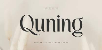 An Elegant serif font that we created special for elegant branding needs, with extra alternates in unique shape will be ready to add value of your brand. It so nice to leverage designer or product owner that need solutions to make their design look more classy and modern. And specially for Quning font, We prepared any alternate characters to help you create unlimited variations for your creative needs. Quning Modern Classy Elegant Serif Font ready with: Any options to get creative variations (combination of Alternate characters) Preview as a inspirations that you can do with Quning font Ready with Lowercase and Uppercase characters Wish you enjoy our font. :)
 - Elegancy Style by Sensatype Studio,
$15.00 Elegancy is Modern Luxury Elegant Font is a well-balanced contemporary font with a fancy, unique, and versatile Luxury serif, font that you can combine to get any variations and unique shapes easily just in seconds with choose alternates of them. It is a serif display font with moderate contrast that perfect for branding projects, logo, wedding designs, social media posts, advertisements, product packaging, product designs, label, photography, watermark, invitation, stationery, and any projects, it makes with a high level of legibility. What's Included: Character set A-Z Numerals & Punctuation Accented Characters (West Europe) Works on PC & Mac Recommended using Adobe Illustrator or Adobe Photoshop. Wish you enjoy our font. :)
 - Royal by Sensatype Studio,
$15.00 Royal is Modern Luxury Unique Serif Font is a well-balanced contemporary font with a fancy, unique, and versatile Luxury serif, font that you can combine to get any variations and unique shapes easily just in seconds with choose alternates of them. It is a serif display font with moderate contrast that perfect for branding projects, logo, wedding designs, social media posts, advertisements, product packaging, product designs, label, photography, watermark, invitation, stationery, and any projects, it makes with a high level of legibility. What's Included: Character set A-Z Numerals & Punctuation Accented Characters (West Europe) Works on PC & Mac Recommended using Adobe Illustrator or Adobe Photoshop. Wish you enjoy our font. :)
 - Carves by Sensatype Studio,
$15.00 CARVES is a Modern Display Font A new Display Serif that we created special for logo and branding needs, with extra unique shape that will add your brand value. It so nice to leverage designer or product owner that need solutions to make their design look more Unique and modern. And specially for Sugar font, We prepared any alternate characters to help you create unlimited variations for your creative needs specially for logotype or wordmark. CARVES Modern Display font ready with: Any options to get creative variations (combination of Alternates) Preview as a inspirations that you can do with Carves font Ready with All Uppercase characters Wish you enjoy our font :)
 - Souljah by 38-lineart,
$17.00 Let us introduce you our new font Souljah, a natural script font. This font has a very contrast stroke, very wide down stroke and very tiny up stroke. Every glyphs shaped very flowy and smooth as if it is written by a dancing hand. All glyphs are connected nicely, this font also included ligature to add more natural touch. "Natural and Soulful Calligraphy" is a perfect tagline to describe Souljah Included Opentype font with ligature, swash alternate and multilingual support. Souljah swash Uppercase for beginning swash and lowercase for ending swash, this file was made to the user who is not common to opentype stylistic feature.
 - Necoti by Sensatype Studio,
$15.00 A serif font that we created special for elegant branding needs, with extra ligature and alternates in unique shape will be ready to add value of your brand. It so nice to leverage designer or product owner that need solutions to make their design look more classy and modern. And specially for this font, We prepared any ligatures, and any alternate characters to help you create unlimited variations for your creative needs. Necoti serif font ready with: Any options to get creative variations (combination of Alternate and Ligatures) Preview as a inspirations that you can do with Necoti font Ready with Lowercase and Uppercase characters Wish you enjoy our font. :)
 - Aldora Style by Sensatype Studio,
$15.00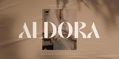 A Modern Elegant Display Font that we created special for elegant and Fashion branding needs, with extra characters alternate in unique shape will be ready to add value of your brand. It so nice to leverage designer or product owner that need solutions to make their design look more classy and modern. And specially for this font, We prepared any alternate characters to help you create unlimited variations for your creative needs. Aldora Modern Display font ready with: Any options to get creative variations (combination of Any Alternates) Preview as a inspirations that you can do with Aldora font Ready with Lowercase and Uppercase characters Wish you enjoy our font. :)
 - Megate by Sensatype Studio,
$15.00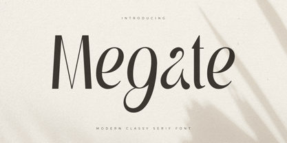 A Beauty serif font that we created special for elegant branding needs, with extra alternates in unique shape will be ready to add value of your brand. It so nice to leverage designer or product owner that need solutions to make their design look more classy and modern. And specially for Voyage font, We prepared any alternate characters to help you create unlimited variations for your creative needs. Megate Modern Classy Serif Font ready with: Any options to get creative variations (combination of Alternate characters) Preview as a inspirations that you can do with Megate font Ready with Lowercase and Uppercase characters Wish you enjoy our font. :)
 - Gray by Sensatype Studio,
$15.00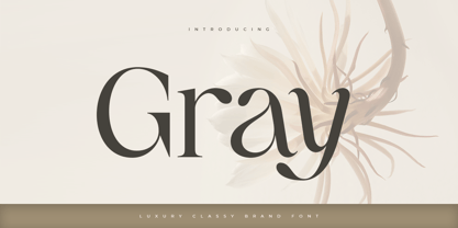 A Modern Classy Luxury Font that we created special for Luxury and Fashion branding needs, with extra characters alternate in unique shape will be ready to add value of your brand. It so nice to leverage designer or product owner that need solutions to make their design look more classy and modern. And specially for this font, We prepared any alternate characters to help you create unlimited variations for your creative needs. Gray Modern Classy Luxury Font ready with: Any options to get creative variations (combination of Any Alternates) Preview as a inspirations that you can do with Gray font Ready with Lowercase and Uppercase characters Wish you enjoy our font. :)
 - Autumn by Sensatype Studio,
$15.00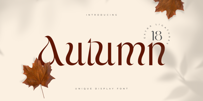 An Unique Modern Display Font that we created special for Elegant and Classy branding needs, with extra characters alternate in unique shape will be ready to add value of your brand. It so nice to leverage designer or product owner that need solutions to make their design look more classy and modern. And specially for this font, We prepared any alternate characters to help you create unlimited variations for your creative needs. Autumn Unique Display font ready with: Any options to get creative variations (combination of Any Alternates) Preview as a inspirations that you can do with Autumn font Ready with Lowercase and Uppercase characters Wish you enjoy our font. :)
