10,000 search results
(0.073 seconds)
- Stempel by Linotype,
$29.99The Stempel family consists of two fonts; each made to look like a set of block stamps. Each letter appears inside its own roughly drawn square. Stempel One's letters are very simple form/counterform objects. Stempel Two's forms are more ornate: each square stamp has a thin border inside of it, and then the individual letterforms have been knocked-out, so that the colored area depicts the counters around the letters rather than the letters themselves. As a line of text is typed, a box appears for each letter entered, and all of the boxes slightly nudge against each other to form the line. The Stempel fonts have the appearance of a hand-made quality to them. Their forms appear too random, too delicate, and too thought out to have been made on a machine. Using these fonts will add a nice warm, linoleum-cut touch to your work. Both Stempel One and Stempel Two were designed by German designer Martina Balke in 2002, and are part of the Take Type 5 collection from Linotype GmbH." - San Giuseppe by Mans Greback,
$59.00 San Giuseppe is a serif font with finesse and unique charm. Inspired by the romantic, ornate style of the Victorian era and the bold, captivating geometry of Art Deco, San Giuseppe is the perfect blend of neo-classic and vintage aesthetics. This serif font family is designed to infuse your work with an air of grace and refinement that is sure to leave a lasting impression. Ideal for wine labels, luxury branding and high-end packaging, San Giuseppe is an all-capitals font, featuring a stunning array of alternate characters that allow you to create a truly bespoke typographical experience. With its fine, intricate serifs and delicate, artistic letterforms, this font is a testament to the beauty and craftsmanship of yesteryear, created for a modern setting. The San Giuseppe font family consists of six high-quality styles: In addition to the Regular font, it is provided in both Bold and Light, and each of the weights as Italic. The font is built with advanced OpenType functionality and has a guaranteed top-notch quality, containing stylistic and contextual alternates, ligatures and more features; all to give you full control and customizability. It has extensive lingual support, covering all Latin-based languages, from Northern Europe to South Africa, from America to South-East Asia. It contains all characters and symbols you'll ever need, including all punctuation and numbers.
 - Pop Flowers by kapitza,
$79.00 Pop Flowers is set of 64 cute graphic flower illustrations derived from Kapitza's graphic pattern font Pop. Pop Flowers marks a new direction in Kapitza's exploration of shapes in nature. While their projects such as Blossomy and We Love Nature Leaves are based on photographs of plants and flowers, Pop Flowers is constructed of graphic shapes. In moving away from 'realistic' forms, Pop Flowers creates a reality of its own that evokes a magical atmosphere.
 - Wienerlinien by Wannatype,
$26.00 Versatile pixel fonts inspired by underground LEDs in Vienna. 4 styles (Pro, Poster, Caption, Mosaique) with different shapes and proportions are bound to one pixel grid to be combined perfectly in 5 pixel shapes: Square, Rounded, Dots, Hatch, Polaris. Pro: strong emphasis, wide proportions, best for legible text. 400+ symbols, greek alphabet. Poster: strong + compressed for large text use. Caption: legibilty for small text use. Mosaique: monospaced tiles with letters and pattern.
 - Ankle by VType,
$8.00 An elegant sans serif typeface with style. Fashionable, classy but still modern! Designed and shared by Vikers | RerdSystems. Perfect for logos, posters and more.
 - Displace Serif by Serebryakov,
$35.00 Displace Serif is a continuation of my Displace fonts. Adding serifs allows you to see the font in a new way. There is a more pronounced charm of Italian monumental fonts, but in an expressive way. The appearance of the serifs allowed the font to move to the antiqua class, but this is purely a formal matter. The proportion of serifs changes markedly from weight to weight, allowing the font to retain its decorative character. In the Light drawing the serifs are barely visible and delicate, while in the Black they are in superposition. The font is catchy, noticeable, which makes it suitable for graphics requiring instantaneous spectator emotions. Displace Serif is suitable for editorial design, as despite the modern image it retains the classic concept.
 - Fonstery by Miracledsign,
$9.00 Fonstery is a font that is inspired by modern life with all the sophistication and excellence in the field of technology that makes fontstery very elegant and modern with style and full of future accents. Fonstery is formed and made by combining the contours and anatomy of a strong and sharp letter by highlighting the modern side so that it has extraordinary value when used in a template, game font, or your selling product which of course will be very interesting for those who see it and will certainly make the product. you look more elegant, modern and will add value to your product and add value to your product.
 - Boot Hill NF by Nick's Fonts,
$10.00 Here's an unusual take on the classic Tuscan face of the 1880s. The unusual finials lend a slightly spooky feel to the face, hence its current name. Both versions support the Latin 1252, Central European 1250, Turkish 1254 and Baltic 1257 codepages.
 - Wildflower Blossom by RagamKata,
$14.00 Wildflower Blossom modern serif Wildflower Blossom is a unique serif font with a modern touch. With its elegant and slim letter shapes, it offers a distinctive and captivating beauty. Available in 2 styles, regular and italic, it provides options to customize and tailor your design project to your needs. Use Wildflower Blossom to add a professional impression to your design and make it more appealing to your audience.
 - Snuggels by Ingrimayne Type,
$9.95 Snuggles began as a set of hexagons and hour-glass shapes that fit together. Letters were formed from these shapes with effort made to preserve as much as possible the original outlines. The result is two sets of letters that by themselves are awkward and misshapen and that only look good when mixed together. The OpenType contextual alternatives (calt) feature automatically alternates the sets in computer programs that support this feature. Snuggles-Lower replaces the letters of Snuggles-Regular with lower-case shapes, but without ascenders or descenders, and the results are jarring. Several of these lower-case shapes (D, N, T, W, and Y) are available as OpenType stylistic-set alternatives in the Snuggels-Regular font. Both Snuggels-Regular and Snuggels-Lower have light versions. Snuggels loves to be noticed so it likes to be large and it considers foolish anyone who would use it as body text.
 - Matita Informal by Trine Rask,
$30.00 Matita Informal is part of a larger type family developed from 2005-2019 with handwriting in mind. A humanistic informal sans serif in five weights containing swashes, alternative characters, old style, lining, tabular & proportional figures. The family share proportions and weights to ensure all fonts (family members) work together well. Matita Informal is a very friendly typeface suitable for many purposes.
 - The Nos by Lone Army,
$17.00 The NOS font embodies sleek, dynamic lines mirroring the speed and energy of modern sports racing. Its bold typography captures the essence of velocity, with sharp, futuristic contours that evoke a sense of adrenaline-fueled motion.
 - Alphacorsa by Mevstory Studio,
$25.00 The Alphacorsa font embodies sleek, dynamic lines mirroring the speed and energy of modern sports racing. Its bold typography captures the essence of velocity, with sharp, futuristic contours that evoke a sense of adrenaline-fueled motion.
 - Toscana by Hemphill Type,
$20.00 A traditional Italian style font family inspired by the rural landscape and characterful back streets of Tuscany. The blend of gently rolling hills leading onto sharply peaked mountains has influenced the natural shapes of the letterforms.
 - Smooth Soul by Get Studio,
$15.00 SmoothSoul is a display sans-serif font with a smooth shape and a retro style characterized by its lack of decorative lines, which gives it a clean and modern-retro appearance. The smooth curves of this font create a sense of fluidity and ease, while the lack of serifs makes it feel relaxed and informal. The retro style of this font is evocative of the 1960s and 70s, with a nod to the playful and carefree design sensibilities of that era. Overall, this font is perfect for conveying a sense of fun and approachability, while still maintaining a sense of professionalism and modernity.
 - Mixcross by Din Studio,
$29.00 Mixcross is a display font in the capital letters particularly created in a racing theme to express courage and power, which relates to the theme of racing. It is frequently applicable in 1) titles either to highlight the emphasizing phrases or to attract readers’ attention, and 2) large-sized texts owing to the unique sizes and shapes. Additionally, Mixcross provides interesting features to help designers improve their design products. Features: Multilingual Supports PUA Encoded Numerals and Punctuations This font type works best for any design projects, for instance, posters, banners, logos, book covers, headings, printed products, merchandise, social media, and so on. Find out more ways to use this font by taking a look at the font preview. Thanks a lot for purchasing our font. Happy designing.
 - Solingen by Mysterylab,
$14.00 Solingen is an elegant display serif font well suited to logo design applications. The capital letter set features many unique double-letter pairings which serve as inspirational design features when creating posh, delicate, and luxurious logos. Suggested uses for Solingen might include high-end branding for boutique apparel, accessories, jewelry, or cosmetics; unique wedding invitation headlines; packaging for personal care items, and much more. In many applications, the ligatures feature is turned on by default as Standard Ligature alternates, but these can generally be easily overridden in the Glyphs panel when you prefer to use the standard characters instead.
 - Treacherous by Comicraft,
$29.00 Midnight, Pacific Coast Highway. You're driving home alone at night and your battery's dying. Your headlights have dimmed and you can barely see the road or the signpost up ahead. But there's an eerie green light glimmering in your rear view mirror and that strange warning uttered by the pump attendant at the Devil's Elbow gas station has put the frighteners on you. Is that Satan's face glowering at you through the mist, or something far worse? The only way to handle this font is with one foot on the gas pedal and one foot on the brake. Originally designed by John Roshell for GAMBIT titles, this sharp font has appeared on vampire & rock magazine covers, Star Wars & Star Trek merch, and the logo for the INHUMANS comic & TV show!
 - Nieves by Anastasia Kuznetsova,
$17.00 Say hello to the freshly baked beautiful and neat vintage serif font! Amazing handwritten font Nieves :) The unusual, freshly baked font is perfect for greetings, illustrations, children's books, delicious packaging, labels, logos and much more :) This beautiful neat retro font with imperfect ink edges and slightly sloppy shading is inspired by nature. Eco-friendly fashion takes into account the health of consumers, the health of the planet. The font "Nieves" is perfectly combined with any stylized graphics, watercolors, and also looks great on its own within the framework of a minimalist design. Play with letters to get different effects. Font features: A-Z; character set a-z; 1 language (English); numbers and punctuation marks, symbols. A font containing uppercase and lowercase letters, numbers, and a wide range of punctuation marks. Fonts can be opened and used in any software that can read standard fonts, even in MS Word. It is recommended to use it in Adobe Illustrator or Adobe Photoshop. Made with love and magic ♡ Thank you for checking this out and feel free to write me a message if you have any questions! ~ Anastasia
 - Givry by TypeTogether,
$49.00 The bâtarde flamande is a style of writing used predominantly in France and present-day Belgium in the 15th century. The style shares an ancestry with other writing styles traditionally grouped as blackletter— fraktur, textura, rotunda, and schwabacher. It had evolved, however, into an æsthetic far removed from its relatives. While high-contrast in nature, the bâtarde flamande is more delicate and dynamic than the austere and condensed fraktur and textura. Quick curves lack the rigidity of the schwabacher and rotunda. Flair through swashes is thematic, as are the variations in letterforms. The flowing rhythm, achieved through a letterform axis that is overall slightly rightward, is most noticable in the hallmark f and long s. Round forms are fused together for economy of space. It is a writing hand that, with its syncopation and fluidity, produces a vibrance uncharacteristic of other blackletters. Givry has been created in the spirit of the bâtarde flamande. It melds the particular traits compiled from the works of the style’s prominent scribes—Jean Fouquet, Loyset Liédet, and Jean Bourdichon. While suitable as an elegant and energetic display face, Givry was conceived for setting continuous text. The result of many refinements and adjustments is the preservation of the style’s irregular nature, as well as a consistency that continuous-text typography requires. Carefully researched and developed in OpenType format for a wealth of typographic features and support for more than forty languages, Givry is neither derivative nor experimental, but historically accurate. Of the many blackletter digital typefaces available, fraktur and all its connotations have become representative. In contrast, the bâtarde flamande is essentially non-existent in digital form, and has until now been overlooked. Givry provides designers and anyone searching for typographic expression a lively, delicate, and striking side to blackletter.
 - Manor Smiths by Maulana Creative,
$14.00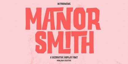 Manor Smiths is a decorative display font. With bold sharp edges stroke, fun character with a bit of ligatures and alternates. To give you an extra creative work. Manor Smiths font support multilingual more than 100+ language. This font is good for logo design, Social media, Movie Titles, Books Titles, a short text even a long text letter and good for your secondary text font with sans or serif. Make a stunning work with Manor Smiths display font. Cheers, Maulana Creative
 - Bagefi by Maulana Creative,
$22.00 Bagefi is a modern sans serif display font. With semi rectangle shape edge and bold stroke, fun character with a bit of ligatures. To give you an extra creative work. Bagefi font support multilingual more than 100+ language. This font is good for logo design, Social media, Movie Titles, Books Titles, a short text even a long text letter and good for your secondary text font with script or serif. Make a stunning work with Bagefi font. Cheers, Maulana Creative
 - Karbines by Maulana Creative,
$14.00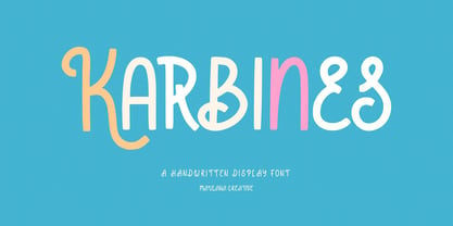 Karbines is a modern handwritten display font. With medium consist stroke with sharp edge, fun character with a bit of ligatures and alternates. To give you an extra creative work. Karbines font support multilingual more than 100+ language. This font is good for logo design, Social media, Movie Titles, Books Titles, a short text even a long text letter and good for your secondary text font with sans or serif. Make a stunning work with Karbines font. Cheers, Maulana Creative
 - Freik by Maulana Creative,
$13.00 Freik is a wide strong headlines display sans font. With bold sharp edge stroke, fun character with a bit of ligatures and alternates. To give you an extra creative work. Freik font support multilingual more than 100+ language. This font is good for logo design, Social media, Movie Titles, Books Titles, a short text even a long text letter and good for your secondary text font with sans or serif. Make a stunning work with Freik font. Cheers, Maulana Creative
 - The Impostor by Maulana Creative,
$15.00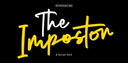 The Impostor is a regular casual script font. With sharp felt-tip stroke, slant and fun character with a bit of ligatures. To give you an extra creative work. The Impostor font support multilingual more than 100+ language. This font is good for logo design, Social media, Movie Titles, Books Titles, a short text even a long text letter and good for your secondary text font with sans or serif. Make a stunning work with The Impostor font. Cheers, MaulanaCreative
 - Gina by Tipo Pèpel,
$22.00 Gina is an unbiased humanist sans. The simple skeleton of the characters and the organic strokes are essential features to the design. It is a typeface that looks to the future while keeping an eye on classic letterforms. If we have a closer look, we will notice there is a tendency towards vertical proportions. Ascenders and descenders are long, making for a light texture in small text sizes. The type family includes 8 weights and 8 italics. There is a clear link between styles, both in the structure and shape of the letterforms. The italic counterpart uses a moderate inclination and some letters adopt characteristics of cursive forms. Besides Latin, the character set of Gina includes Cyrillic and essential features for covering current typographic needs. Gina has a wonderful set of ligatures, which indeed will catch the attention of those who love connected letterforms.
 - OBO Star by Juri Zaech,
$19.00 OBO Star is a fat, subtly flared display typeface with a not so subtle groove factor. The letters are based on a square and do not have ascenders or descenders. This way the typeface can be used for horizontal and vertical settings, or mixed like crosswords. There are a few exceptions for certain punctuation and special characters that are half the width for better spacing; and the word space’s width can easily be adjusted through OpenType stylistic sets. Talking about spacing, for strictly horizontal typesetting there is the option to turn on kerning for a number of characters to create a more optimal texture across words and phrases. But that’s all just technical talk. The true character of OBO Star is the funky look, amplified by the wide 1x1 format that creates space for unconventional shapes, mostly pronounced in the letters R, K and G.
 - Cyceon Pro by DBSV,
$90.00 Fluted pillars… As for the name of "Cyceon", it is a "juice-drink" that they made in ancient Greece...! In this font the straight lines are not vertical but inclined like something from the Doric columns!!! There are two versions of letters. In the first version, it is of a normal character, while in the second version I have mixed some capitals with lower case letters. I have given them the acronym Msc "miscellaneous". I tried in this way to give another version of the small capitals and I think they show a different view from the purely small capitals… And in this family, the “Strap”/“Strap Msc”/“StrapIt”/ and “Strap MscIt” with “Solid”/“Solid Msc”/“SolidIt”/ and “Solid MscIt” engage in the same way like… “Layered font families” as the previous series. This series is composed and includes twenty-four fonts with 642-658 glyphs each, with true italics and supports Latin, Greek and Cyrillic.
 - Breve Title by DSType,
$50.00 Breve was designed for use in editorial projects. Simple but with enough personality to stand by is own, in a quest for a more forceful and contemporary appearance. All the fonts in Breve superfamily, share the same exact structure, both in terms of anatomy and functionality. The Text versions provide a softer and warm feel to the typographic palette and is intended for use in much longer passages of text, while the Title versions are distinguished by non-descending letterforms, making the titles and headlines much more uniform and interesting. The News version is more classic, with ball terminals and classic proportions, while the Display is, somehow, the set of fonts we had to design: extra-black, ultra-contrasted, proud-display fonts.
 - Breve News by DSType,
$50.00 Breve was designed for use in editorial projects. Simple but with enough personality to stand by is own, in a quest for a more forceful and contemporary appearance. All the fonts in Breve superfamily, share the same exact structure, both in terms of anatomy and functionality. The Text versions provide a softer and warm feel to the typographic palette and is intended for use in much longer passages of text, while the Title versions are distinguished by non-descending letterforms, making the titles and headlines much more uniform and interesting. The News version is more classic, with ball terminals and classic proportions, while the Display is, somehow, the set of fonts we had to design: extra-black, ultra-contrasted, proud-display fonts.
 - Breve Text by DSType,
$50.00 Breve was designed for use in editorial projects. Simple but with enough personality to stand by is own, in a quest for a more forceful and contemporary appearance. All the fonts in Breve superfamily, share the same exact structure, both in terms of anatomy and functionality. The Text versions provide a softer and warm feel to the typographic palette and is intended for use in much longer passages of text, while the Title versions are distinguished by non-descending letterforms, making the titles and headlines much more uniform and interesting. The News version is more classic, with ball terminals and classic proportions, while the Display is, somehow, the set of fonts we had to design: extra-black, ultra-contrasted, proud-display fonts.
 - Breve Sans Text by DSType,
$50.00 Breve was designed for use in editorial projects. Simple but with enough personality to stand by is own, in a quest for a more forceful and contemporary appearance. All the fonts in Breve superfamily, share the same exact structure, both in terms of anatomy and functionality. The Text versions provide a softer and warm feel to the typographic palette and is intended for use in much longer passages of text, while the Title versions are distinguished by non-descending letterforms, making the titles and headlines much more uniform and interesting. The News version is more classic, with ball terminals and classic proportions, while the Display is, somehow, the set of fonts we had to design: extra-black, ultra-contrasted, proud-display fonts.
 - Breve Slab Text by DSType,
$50.00 Breve was designed for use in editorial projects. Simple but with enough personality to stand by is own, in a quest for a more forceful and contemporary appearance. All the fonts in Breve superfamily, share the same exact structure, both in terms of anatomy and functionality. The Text versions provide a softer and warm feel to the typographic palette and is intended for use in much longer passages of text, while the Title versions are distinguished by non-descending letterforms, making the titles and headlines much more uniform and interesting. The News version is more classic, with ball terminals and classic proportions, while the Display is, somehow, the set of fonts we had to design: extra-black, ultra-contrasted, proud-display fonts.
 - Breve Sans Title by DSType,
$50.00 Breve was designed for use in editorial projects. Simple but with enough personality to stand by is own, in a quest for a more forceful and contemporary appearance. All the fonts in Breve superfamily, share the same exact structure, both in terms of anatomy and functionality. The Text versions provide a softer and warm feel to the typographic palette and is intended for use in much longer passages of text, while the Title versions are distinguished by non-descending letterforms, making the titles and headlines much more uniform and interesting. The News version is more classic, with ball terminals and classic proportions, while the Display is, somehow, the set of fonts we had to design: extra-black, ultra-contrasted, proud-display fonts.
 - Breve Display by DSType,
$50.00 Breve was designed for use in editorial projects. Simple but with enough personality to stand by is own, in a quest for a more forceful and contemporary appearance. All the fonts in Breve superfamily, share the same exact structure, both in terms of anatomy and functionality. The Text versions provide a softer and warm feel to the typographic palette and is intended for use in much longer passages of text, while the Title versions are distinguished by non-descending letterforms, making the titles and headlines much more uniform and interesting. The News version is more classic, with ball terminals and classic proportions, while the Display is, somehow, the set of fonts we had to design: extra-black, ultra-contrasted, proud-display fonts.
 - Breve Slab Title by DSType,
$50.00 Breve was designed for use in editorial projects. Simple but with enough personality to stand by is own, in a quest for a more forceful and contemporary appearance. All the fonts in Breve superfamily, share the same exact structure, both in terms of anatomy and functionality. The Text versions provide a softer and warm feel to the typographic palette and is intended for use in much longer passages of text, while the Title versions are distinguished by non-descending letterforms, making the titles and headlines much more uniform and interesting. The News version is more classic, with ball terminals and classic proportions, while the Display is, somehow, the set of fonts we had to design: extra-black, ultra-contrasted, proud-display fonts.
 - ITC Caslon No. 224 by ITC,
$40.99 The Englishman William Caslon (1672-1766) first cut his typeface Caslon in 1725. His major influences were the Dutch designers Christoffel van Dijcks and Dirck Voskens. The Caslon font was long known as the script of kings, although on the other side of the political spectrum, the Americans used it as well for their Declaration of Independence. The characteristics of the earlier Renaissance typefaces are only barely detectable. The serifs are finer and the axis of the curvature is almost or completely vertical. The overall impression which Caslon makes is serious, elegant and linear. Next to Baskerville, Caslon font is known as the embodiment of the English Baroque-Antiqua and has gone through numerous new interpretations, meaning that every Caslon is slightly different. ITC Caslon 224 was designed by Edward Benguiat and appeared with ITC in 1982. It is the text font which expanded upon the title font ITC Caslon 223. The alterations in the proportions of the letters make this Caslon 224 a noticeable departure from the original, but make the font overall more legible.
 - Balmecia by IbraCreative,
$17.00 Balmecia – A Tall Display Serif Typeface Balmecia is a distinguished tall display serif typeface that exudes a timeless elegance and sophistication. With its tall and slender letterforms, Balmecia commands attention and lends a touch of grace to any design it graces. The carefully crafted serifs add a classic flair, while the generous letter spacing ensures optimal legibility even in larger sizes. Balmecia’s vertical proportions create a sense of stateliness, making it an ideal choice for headings, titles, and other display applications where a touch of refinement is desired. This typeface seamlessly blends tradition with a modern aesthetic, offering a unique personality that captures the essence of both vintage and contemporary design sensibilities. Balmecia is perfect for branding projects, logo, wedding designs, social media posts, advertisements, product packaging, product designs, label, photography, watermark, invitation, stationery, game, fashion and any projects. Fonts include multilingual support for; Afrikaans, Albanian, Czech, Danish, Dutch, English, Estonian, Finnish, French, German, Hungarian, Italian, Latvian, Lithuanian, Norwegian, Polish, Portuguese, Slovak, Slovenian, Spanish, Swedish. **Uppercase
 - Radellin by Supfonts,
$15.00 Radellin is a modern serif with vintage charm, fashionable appearance with a touch of retro Quick access - using the built-in OPEN TYPE functions. Just add "-" or "_" to the letter and instantly get an alternative. This feature works in most applications Font is an open type with clean shapes and precise kerning. It includes ligatures encoded by the PUA. Language support: All European languages Don't forget to subscribe so you don't miss out on the new awesome fonts Dima
 - Lalalo by Cuda Wianki,
$25.00 Lalalo is a casual, modern sans-serif font family based on hand-lettering. It's oval letter shapes provide soft and friendly appearance. Lalalo font is very legible with a warm touch perfectly suited for children books. Lalalo family consists of 6 weights ( Extra Light, Light, Regular, Semibold, Bold, ExtraBold). You can use it with normal fill or outlined. You can mix various colors and stroke widths to gain interesting results. There is also a set of nice frames available.