10,000 search results
(0.044 seconds)
- Bonega by Locomotype,
$16.00 Bonega is a display font inspired by classic typography on ancient stone inscriptions. Consist of 4 weight (light, regular, bold, black) with each matching italics. With sharp and manly characteristics, Bonega family is suitable for powerful headlines, logotypes, beautiful signs, posters and more. Contains more than 400 glyphs including stylistic sets that make your typographic design more attractive.
 - AT Move Frutta by André Toet Design,
$39.95 FRUTTA (Fruit) is a new typeface made with the ever expanding food industry in mind. But don’t let that deter you from using our font on the cover of the forthcoming cd of the Black Keys or Beady Eye or Damon Albarn or Paul Weller or Daft Punk or Whatever... Concept/Art Direction/Design: André Toet © 2017
 - Curlaight by Outerend,
$18.00 The type family “Curlaight” has whimsical curly shapes but has some level of uniformity with straight lines and angles. These modern retro feel fonts look great for children’s books, posters, book covers, packaging labels, or even logos like TV and movie titles. Seven weights - thin, light, regular, medium, semibold, bold, and black - are available for your creative projects.
 - Railway Point by Melissa Lapadula,
$11.95This typeface has been influenced by the ongoing traffic congestion in Melbourne, and its lack of functional and reliable public transport as a possible solution. The font shapes are square-edged constrained angles, reflecting the way the Melbourne population feels when using the public transport system or roads. Use as headings and body copy in any graphic situation. - MyCard by John Moore Type Foundry,
$15.00 MyCard is a display sans serif font of modernist spirit, where uppercase letters take the height of the lowercase letters (unicase), where only ascending and descending exceed the x-height. MyCard is ideal for creating logos, packaging, labels, advertising and short titles, in texts produced interesting textures. MyCard comes in three weights Regular, Bold and Black.
 - Brush Marker by Fenotype,
$18.00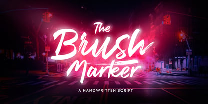 Brush Marker is a strong hand drawn dry brush font. Brush Marker is great for headlines and logotype use. Brush Marker is packed with automatic Contextual Alternates and Standard Ligatures that keep the text vivid. Brush Marker has a wide language support and it is PUA encoded so you can access extra glyphs in most graphic design softwares.
 - Iago NF by Nick's Fonts,
$10.00Two classics from American Type Founders specimen catalogs of the 1880s—Othello and ATF Black Caps—inspired this powerful headline face with a decidedly menacing quality. Suitable for creepy, eerie and spooky occasions. Both versions of the font include complete Latin 1252, Central European 1250 and Turkish 1524 character sets, with localization for Moldovan, Romanian and Turkish. - Pragnea by Hazztype,
$20.00 Introducing Pragnea, a modern sans serif font with a unique touch. It had many unique quirks such as its distinctive e, curved stroke on R, K, V, W, and many others. The type family consists of three weights plus matching italics. Packed with 300+ glyphs, it works well both for impactful headlines and for reading sizes.
 - Eastport JNL by Jeff Levine,
$29.00 Eastport JNL is the interpretation by Jeff Levine Fonts’ of the classic Stymie Extra Bold (a/k/a Stymie Black), designed in 1931 for American Type Founders by Morris Fuller Benton. Stymie and the somewhat similar Beton were both derivations of the popular European typeface Memphis. Eastport JNL is available in both regular and oblique versions.
 - Rundigsburg by Ingrimayne Type,
$9.95 Is Rundigsburg a calligraphic face morphing into sans serif or sans serif reverting back to a medieval, calligraphic face? The letters are angular and some retain traces of older letter forms, but the ornamentation is gone. Rundigsburg is decorative but also very legible, suitable for both display and some text purposes. The family has four weights, each with an italics style. There are two shadowed versions and each has an "inside" style designed for uses in layers with its shadowed style to add color. These "inside" style are similar to the light style but the spacing matches its shadowed complement. Among Rundigburgs OpenType features are a few basic fractions and some alternative letter forms.
 - Walklike by Cerulean Stimuli,
$17.00 You've searched for "Egyptian" but, thanks to a quirk of type jargon history, much of what you found is not what you had in mind for the voice of Thoth in your comic book, or the hints in your Mummy's Tomb game. And you don't want to fall back on You-Know-What. Fear not; now there's Walklike! Pyramids, reeds, the Eye of Horus, and other recognizable symbols inspire the letterforms of Walklike to create the feel of Ancient Egyptian hieroglyphs while remaining fully legible. The strokes are casual but careful, at home in ink or stone alike, and kept interesting and natural-looking automatically with ligatures and some contextual alternates. The air of ancient mystery is unmistakable!
 - Doovy Groovy Party by Mofr24,
$11.00 Introducing the Doovy Groovy Party font! This stylized, psychedelic, and round Groove Display Font takes you back to the 90's and 00's era. With its multilingual support, it's perfect for creating a pop, funky, and bold vibe. What sets the Doovy Groovy Party font apart is its unique ability to capture the essence of the vibrant and energetic 90's and 00's era. Its stylized, psychedelic design evokes a sense of nostalgia while still offering a fresh and contemporary look. This font is a true standout, allowing your designs to stand out as well. For designers looking to create harmonious compositions, the Doovy Groovy Party font has a few relatives and typefaces that complement it beautifully. Consider pairing it with "Retro Sans Serif" for a bold and cohesive look, or experiment with "Funky Display" to amplify the funky vibes. These combinations will add an extra layer of creativity and versatility to your design projects. The Doovy Groovy Party font comes in three variations - Regular, Outline, and Shadow - making it a versatile tool for various design needs. The Regular version provides a solid foundation, ideal for headlines and titles that demand attention. The Outline variation adds an element of sophistication and can be used for modern designs, while the Shadow option creates depth and dimension for a more dynamic appearance. Additionally, this font boasts extensive multilingual support, ensuring that it can be used effectively across different languages and cultures. The Doovy Groovy Party font draws inspiration from the bold and expressive typography prevalent in the 90's and 00's. It captures the vibrant and carefree spirit of that era, where music, art, and pop culture collided to create an explosion of creativity. The psychedelic elements incorporated into the font pay homage to the colorful and trippy visuals that defined the time. This font encapsulates the nostalgia and excitement of those years, allowing designers to infuse their projects with a sense of fun and playfulness. We created the Doovy Groovy Party font with a passion for celebrating the bold and expressive designs of the past. We wanted to provide designers with a versatile tool that brings the nostalgic charm of the 90's and 00's to their modern projects. By using this font, you can effortlessly transport your audience to a time when colors were brighter, music was groovier, and creativity knew no bounds. Let your imagination run wild with the Doovy Groovy Party font and infuse your designs with a vibrant touch that will captivate and inspire! Unlock the power of nostalgia and creativity with the Doovy Groovy Party font. Its unique design, versatile variations, and multilingual support make it the perfect choice for posters, marketing materials, T-shirt designs, headlines, and much more. Get ready to groove and let this font elevate your creative projects to a whole new level!
 - Boldini by Luxfont,
$18.00 Introducing the unique family of COLORED fonts "Boldini" with minimalistic clean letters of a harmonious form in the style of modern POP culture. You no longer need to adjust the gradient for each letter, letters are immediately printed in gradient! Gradient fonts is perfect for headlines for fashion websites, magazines, and print design, and the basic solid font is suitable for branding boutique signs as well as for large amounts of text, because the font is very readable in a small size. Font family has two thicknesses - bold & regular, 6 gradient directions, gradient fonts also 2 type - with transparency and without transparency, as well as 2 basic monochrome fonts. Font consists of letters of the same height without division into uppercase and lowercase glyphs. *See also these fonts, which based on this family: Culoare & Anaglyph. Which means that if necessary you can combine these families and they will be absolutely stylistically identical and complement each other. Check the quality before purchasing and try the FREE DEMO version of the font to make sure your software supports color fonts. Features: Such color combinations in gradients are universal and very convenient for repainting. IMPORTANT: - OTF SVG fonts contain vector letters with gradients and transparency. - Multicolor OTF version of this font will show up only in apps that are compatible with color fonts, like Adobe Photoshop CC 2017.0.1 and above, Illustrator CC 2018. Learn more about color fonts & their support in third-party apps on www.colorfonts.wtf - Don't worry about what you see all fonts in black and not in multicolor in the tab “Individual Styles” - all fonts are working and have passed technical inspection, but not displayed in multicolor they, just because the website MyFonts is not yet able to show a preview of colored fonts. Then if you have software with support colored fonts - you can be sure that after installing fonts into the system you will be able to use them like every other classic font. Question/answer: How to install a font? The procedure for installing the font in the system has not changed. Install the font as you would install the classic OTF | TTF fonts. How can I change the font color to my color? · Adobe Illustrator: Convert text to outline and easily change color to your taste as if you were repainting a simple vector shape. · Adobe Photoshop: You can easily repaint text layer with Layer effects and color overlay. Try to experiment, it is so interesting and very easy! ld.luxfont@gmail.com
 - Albion's Very Old Masthead by Greater Albion Typefounders,
$15.00 Albion’s Very Old Masthead is inspired by traditional newspaper mastheads. A heavy Black Letter which brooks no argument, and can be emphatic and refined (emphatically refined?) at the same time. Very Old Masthead has been deliberately weather to suggest that it has been set with timeworn, well-used, type.
 - Hailgen by Akufadhl,
$29.00 Hailgen is a Serif typeface that explores the flexibility in contrast, with a thicker horizontal and thinner vertical contrast. Designed specially for short texts or quotes. Hailgen comes with 5 weights ranging from Thin to Black and is armed with several opentype features and Latin and Cyrillic language support.
 - Ruqia Arabic by Zaza type,
$29.00 Ruqia Arabic typeface is a modern Arabic typeface designed by Ahmed Zaza. the design is inspired by the Naskh style. The result is a hybrid that combines modern proportions with Classic Arabic scriptsit's suitable for branding, editorial, packaging, and advertising.Ruqia Arabic Features five weights from Light to Black.
 - Mafra by DSType,
$26.00 Mafra, the debut typeface by Pedro Leal, a type family suited both for editorial and corporate design, available in five weights, ranging from Light to Black with matching italics. Mafra is a contemporary typeface with plenty of style, asymmetrical and very dynamic serifs, and pleasant openness and balance.
 - Gibralt by NamelaType,
$19.00 Designed with high contrast. The stems are not completely straight, slightly narrow in the middle, combining rounded and right angle at the terminals and serif ends. Gibralt consists of 8 styles from Extra light to Black, each matching with italics version. Suitable for Headlines, paragraph, text, printing and more.
 - Public Utility JNL by Jeff Levine,
$29.00 Public Utility JNL digitally duplicates the look of those small white-on-black self-adhesive stickers used by cities, power companies and telecommunication firms in order to identify utility poles and other service locations. A blank rectangle is available on both the solid and broken vertical bar positions.
 - St Mika by Stereotypes,
$25.90 St Mika is big, black and beautiful. A little bit clumsy, Mika has his very own style of serifs and letterforms, making him very unique. If you want to yell or scream at someone, Mika is not your partner. This typeface is more about harmony and big letters.
 - Cyntho Next by Mint Type,
$35.00 Cyntho Next is a totally reworked typeface based on our previous bestseller Cyntho Pro. It also has a slab-serif counterpart - Cyntho Next Slab. Cyntho Next is a modern geometric sans based on a hybrid waterdrop-like shape with eight weights varying from Thin to Black and featuring Cyrillic.
 - Mafra Display by DSType,
$26.00 Mafra, the debut typeface by Pedro Leal, a type family suited both for editorial and corporate design, available in five weights, ranging from Light to Black with matching italics. Mafra is a contemporary typeface with plenty of style, asymmetrical and very dynamic serifs, and pleasent openness and balance.
 - Gothic Gothic by Typeco,
$29.00Gothic Gothic is a fusion of old and new that is both Gothic and Gothic. In typography Gothic can refer to German Blackletter or Old English styles. Gothic can also mean block or sans serif style lettering. By combining and balancing the elements from both of these ideas we have created a contemporary extended block letter typeface. The Gothic Gothic family contains 2 companion fonts. Gothic Gothic Text is a more minimal variation that has a more roman looking style while still retaining some Blackletter feel. Gothic Gothic Black is a bolder version designed to tend more toward the Blackletter style of Gothic with more contrast of stroke and a few of the more unusual Blackletter forms thrown in for flavor. Gothic Gothic has been honored with an award of Excellence in Type Design from Association Typographique International (ATypI) in 2001. Typeco has updated this font and has released it as an expanded family. Gothic Gothic is a crepuscular family of 3 fonts - Hoyle by Mans Greback,
$49.00 Hoyle is a dynamic high-quality serif typeface. Drawn and created by Måns Grebäck between 2019 and 2020, this classic design makes use of the fact that timelessness is the best manner to achieve modernity; the letters are of such composition that they will always be simultaneously contemporary and traditional. Hoyle is a family containing five weights: Thin, Light, Medium, Bold and Black. Each weight is also provided as Italic, resulting in 10 unique styles. The weights are harmonic and created to balance perfectly agaist each other. Try the included Variable Font! A format where you can set any weight manually, and any slant, resulting in more than 5000 variations. More info: https://www.mansgreback.com/variable-fonts This slab serif typeface is also filled with OpenType features such as ligatures, alternates, oldstyle, superscript, subscript, fractional and alternate numbers. It has a very extensive lingual support, covering European Latin, Vietnamese, Zulu and many more scripts. The font contains all characters you'll ever need, including all punctuation and numbers.
 - Majora Pro by Latinotype,
$29.00 Majora Pro is a slab serif typeface which derives its name from a Portuguese historical toy manufacturer. The font comes in 8 styles, ranging from a delicate Thin to a robust Black, with matching italics and an upright version of stencil fonts, resulting in a total of 24 weights. Majora Pro is well-suited to a wide range of design projects which include packaging, editorial design, screen use, etc. Its humanistic features and moderate contrast between thick and thin strokes make it also suitable for long block of texts while having a high degree of legibility. The font includes a set of alternate glyphs which help give your compositions a different and unique look. The Stencil version was specially designed for use in signage, packaging, titles and headings. Majora Pro contains an extensive set of 750 characters (including small caps, different figure styles, etc.) that support over 200 Latin-based languages. Majora is the previous version of Majora Pro.
 - Creo by Wahyu and Sani Co.,
$25.00 Creo is a low contrast, classic proportioned sans serif family, consisting of 18 fonts, 9 weights from thin to black; with uprights and italics. The word "Creo" was taken from the Latin language and means "I create, make, produce" (verb), which also stands for 'Classic Ratio'. The uppercase letters are highly influenced by Roman Inscriptional Capital letterform, and the lowercase letterform and their proportions were influenced by oldstyle serif typefaces. Creo font family is equipped with some OpenType features, such as fractions, alternates, ordinals, numerator, denominator, superscript, scientific inferior, proportional lining, etc. The alternate style letters are separated for individual usage of alternate style. Each font file has 500+ glyphs which covers major Western and Eastern Europe languages. Creo typeface with its classic letter proportions will give a different touch to your typographic work and will be a great choice for branding project, display poster, website, packaging, and a broad range of graphic design projects.
 - Saviko Sans by Luhop Creative,
$12.00 Saviko Sans is a geometric sans font family who dares the modernism and the harmony. with very open terminals that makes this font family elegant, friendly and contemporary. Saviko Sans has been designed with a higher a-height than other fonts in its class to make tiny readability more obvious in any use situation. It will be ideal for use in small sizes such as business cards or mobile applications. The family contains 23 weights from Thin to Extra Black and is ideally suited for film and TV, advertising and packaging, editorial and publishing, logo, branding, music and nightlife, software and gaming, sports as well as web and screen design. Saviko Sans provides advanced typographical support with features such as ligatures, alternate characters, case-sensitive forms, fractions, super- and subscript characters, and stylistic alternates. It comes with a complete range of figure set options – oldstyle and lining figures, each in tabular and proportional widths.
 - Minuet by Canada Type,
$24.95 Minuet, an informal script with crossover deco elements giving it an unmistakable 1940s flavor, is a revival and expansion of the Rondo family, the last typeface drawn by Stefan Schlesinger before his death. This family was initially supposed to be a typeface based on the strong, flowing script Schlesinger liked to use in the ads he designed, particularly the ones he did for Van Houten’s cocoa products. But for technical reasons the Lettergieterij Amsterdam mandated the face to be made from unattached letters, rather than the original connected script. Schlesinger and Dooijes finished the lowercase and the first drawings of the uppercase just before Schlesinger was sent to a prison camp in 1942. Dooijes completed the design on his own, and drew the bold according to Schlesigner’s instructions. The typeface family was finished in February of 1944, and Schlesinger was killed in October of that same year. Though he did see and approve the final proofs, he never actually saw his letters in use. It took almost four more years for the Lettergieterij Amsterdam to produce the fonts. The typeface was officially announced in November of 1948, and immediately became a bestseller. By 1966, according to a memo from the foundry, the typeface had become “almost too popular”. This digital version of Schlesigner’s and Dooijes’s work greatly expands on the metal fonts. Both weights include a complete set of lowercase alternates — based on Schlesinger’s own drawings, as well as alternative variations for some of the capitals, a few ligatures, and extended language support covering Western, Eastern and Central European languages, plus Baltic, Celtic/Welsh, Esperanto, Maltese and Turkish. Minuet is available in all popular formats. The OpenType version, Minuet Pro, takes advantage of internal font programming to combine the main and alternate fonts into a single file per weight, making all alternates and ligatures automatically available at the push of a button in OpenType supporting programs.
 - Torus Pro by Monotype,
$40.00 Torus Pro is a rounded monoline typeface. As its name suggests, this is a more professional version of my original Torus family released in 2017. Each glyph has been scrutinised and redrawn where necessary. In addition, there are now italics, small caps, old style figures, and numerous other improvements. Torus Pro includes many new decorative alternates and ligatures that will add distinctive flourishes to your typographic compositions. With up to nine alternates for some glyphs, these additional styles include stencilled, simple dots, looped and smooth swashes, plus a more aggressive angled option for those looking for something a little different. When used subtly, these alternates and glyph combinations will add flair and personality to your own creations. Perfect for titling and branding, Torus Pro also packs a punch without these features activated, as well as being a comfortable read in long runs of text. There are 12 fonts altogether, ranging from Thin to Heavy weights in both roman and italic. The variable font versions of the family allow you to define the weight exactly to your liking. Torus Pro has an extensive character set that covers all Latin European languages. Key features: 6 weights in both roman and italic Variable fonts included with full family 212 Alternates 20 Ligatures Small Caps Full European character set (Latin only) 1450+ glyphs per font.
 - Sign Language by Comicraft,
$39.00 Here at Comicraft we have seen the signs on the headline news, we have read the portents of things to come... yes, just as thunder is a sign of storm, just as pumpkins outside Ralph's on November the 1st are sure to be on sale, just as fresh produce becomes rotten, as sure as night turns to day, dark turns to gray, winter turns to spring and milk turns sour if you leave it out on the kitchen table overnight... Yes, here at Comicraft we know there's a signpost up ahead... a sign heading not into the twilight zone, but down a road of hope and hard work, a banner year, a red letter day, we know it's time to knuckle down, soldier on and pull ourselves up by our bootstraps. Well, we should probably pull ourselves up by our bootstraps BEFORE we soldier on, NEVERTHELESS, here it is -- not a soundbite, not an unfulfilled campaign promise -- SignLanguage is a font that makes the impossible possible, a font that cuts the taxes for 95% of American families, a font that closes down Gitmo and brings our troops home from Iraq. Senator Joe "Six Pack" Biden has described SignLanguage as articulate and bright and clean -- and a nice-looking font. In conclusion, Comicraft recommends you elect Sign Language.
 - Saikend by Twinletter,
$17.00 Welcome to the world of Sakend! A display font that describes the strength and courage of a superhero. Whether you are working on film projects, games, or designs with strong and action-packed themes, Saikend is the perfect choice for you. With a style inspired by superheroes, Saikend will make your designs the center of attention. The courage and strength that radiate from each letter will bring your project to life, giving it a bold and unforgettable look. Not only has an attractive appearance but Saikend is also equipped with special features. Alternate ligatures and characters provide flexibility in usage, allowing you to create unique and creative typographical combinations. In addition, Saikend supports multiple languages, so you can get your message across the world. It’s time to show the power of Saikend in your projects. Bring a touch of hero to your designs with this font, and create an unforgettable look for your audience. Feel free to express courage and thickness through Saikend, and create stunning and inspiring pieces. What’s Included : File font All glyphs Iso Latin 1 Alternate, Ligature Simple installations We highly recommend using a program that supports OpenType features and Glyphs panels like many Adobe apps and Corel Draw so that you can see and access all Glyph variations. PUA Encoded Characters – Fully accessible without additional design software. Fonts include Multilingual support
 - Ansage by Sudtipos,
$49.00 Ansage does not claim to be neutral; it escapes from the rationalist sans of closed strokes and regular forms. Meaning Announcement in German, Ansage is versatile and communicates effectively across a broad range of media and formats such as branding, posters, websites, apps, titles and compositions with little spacing). Ansage is a sans serif font with a strong personality that emerges from an interest in and the study of a wide variety of typographic specimens of Gothic fonts from the nineteenth century. The design process behind Ansage brought about constant transformations in form; the result is a compact and robust font, with a large x-height, small ascenders and descenders, and open terminals that grow in expressiveness as it increases in weight. It is available in 10 weights, ranging from Hairline to Black, and 3 widths – Condensed, Regular and Expanded – plus italics, which make a total of 60 perfect variables to combine and contrast with each other. In addition, it also includes multiple open-type functions such as alternative styles, Old Style Figures, Tabular Forms, fractions, case sensitive, ligatures and more.
 - Carey Castle by Putracetol,
$24.00 Introducing Carew Castle, a new display sans font inspired by luxury displays from classic book covers and combined with an elegant typeface style. With a total of 291 glyphs, this font offers endless display combinations for your lettering needs. Carew Castle comes packed with open type features, including numerous alternates and end swashes, to help you create amazing lettering. The font also supports multiple languages, making it a versatile choice for a wide range of design projects. Carew Castle is best used for logotypes, headings, covers, posters, logos, quotes, product packaging, headers, merchandise, social media, greeting cards, and more. To access the alternate glyphs, you will need a program that supports OpenType features, such as Adobe Illustrator CS, Adobe Photoshop CC, Adobe InDesign, or CorelDRAW. The zip package includes Carew Castle in otf, ttf, and woff formats, and comes with a range of features, including uppercase and lowercase letters, opentype alternates and ligatures, numbers, punctuation and symbols, and multilanguage support. Thanks for choosing Carew Castle - we can't wait to see what amazing designs you create
 - Grafical by Halbfett,
$30.00 Grafical is a contemporary take on 19th-century sans serifs. In this family, the amount of geometry inherent within the letterforms has been amped up. Many shapes have received further streamlining, too. All the geometric forms you see have been optically corrected, ensuring their delivery of better legibility. Grafical ships in two different formats: depending on your preference, you can install the typeface as two Variable Fonts or use the family’s 16 static OpenType font files instead. The static fonts offer eight weights, running from Extralight through Black. Each weight has an upright and an italic font available. While the static-format fonts offer a good intermediary-step selection, users who install the Variable Fonts have vastly greater control over their text’s stroke width. The Grafical Variable and Grafical Variable Italic font’s weight axes allow users to differentiate between almost 1,000 possible font weights. That enables you to fine-tune your text’s exact appearance on-screen or in print. Grafical is the perfect tool for a range of design uses, including text on the web, text in print, and text in motion graphics. Its fonts are typographic workhorses – not just from their legibility perspective but also because of the amount of OpenType features they include. There are ligatures, for instance, as well as proportional and tabular lining and oldstyle figures, fractions, numbers placed inside circles, and even Roman numerals. Users can also substitute alternate versions of the “a”, “g”, “i”, “j”, “y”, “G”, and “Q” into their work.
 - Burnaby Stencil by Typodermic,
$11.95 Listen up! Got a font that’s gonna give your text that raw, tough edge you’re lookin’ for. Burnaby Stencil, baby. This typeface is all about the spray-painted stencil vibe, with bold headlines that’ll grab attention like a bear trap. But don’t think it’s all bark and no bite. Burnaby Stencil packs a punch with a gritty tone that’ll make your message feel like it’s coming straight from the streets. And if you’re worried about it looking too cookie-cutter, no need to fret. This font switches up custom letter pairs in OpenType savvy apps, giving your text a natural, hand-painted feel. So if you’re ready to unleash the rugged, urban vibes in your designs, Burnaby Stencil is your new best friend. Let your words speak loud and proud with this font that’ll make ’em stand up and take notice. Most Latin-based European writing systems are supported, including the following languages. Afaan Oromo, Afar, Afrikaans, Albanian, Alsatian, Aromanian, Aymara, Bashkir (Latin), Basque, Belarusian (Latin), Bemba, Bikol, Bosnian, Breton, Cape Verdean, Creole, Catalan, Cebuano, Chamorro, Chavacano, Chichewa, Crimean Tatar (Latin), Croatian, Czech, Danish, Dawan, Dholuo, Dutch, English, Estonian, Faroese, Fijian, Filipino, Finnish, French, Frisian, Friulian, Gagauz (Latin), Galician, Ganda, Genoese, German, Greenlandic, Guadeloupean Creole, Haitian Creole, Hawaiian, Hiligaynon, Hungarian, Icelandic, Ilocano, Indonesian, Irish, Italian, Jamaican, Kaqchikel, Karakalpak (Latin), Kashubian, Kikongo, Kinyarwanda, Kirundi, Kurdish (Latin), Latvian, Lithuanian, Lombard, Low Saxon, Luxembourgish, Maasai, Makhuwa, Malay, Maltese, Māori, Moldovan, Montenegrin, Ndebele, Neapolitan, Norwegian, Novial, Occitan, Ossetian (Latin), Papiamento, Piedmontese, Polish, Portuguese, Quechua, Rarotongan, Romanian, Romansh, Sami, Sango, Saramaccan, Sardinian, Scottish Gaelic, Serbian (Latin), Shona, Sicilian, Silesian, Slovak, Slovenian, Somali, Sorbian, Sotho, Spanish, Swahili, Swazi, Swedish, Tagalog, Tahitian, Tetum, Tongan, Tshiluba, Tsonga, Tswana, Tumbuka, Turkish, Turkmen (Latin), Tuvaluan, Uzbek (Latin), Venetian, Vepsian, Võro, Walloon, Waray-Waray, Wayuu, Welsh, Wolof, Xhosa, Yapese, Zapotec Zulu and Zuni.
 - First Grade by m u r,
$10.00Searching for a font that resembled true children's handwriting, this font's creator designed a font from his own first grade penmanship assignments. Ideal for anything related to children. - Verbatim by Monotype,
$25.99 This extensive 60-font type family was inspired by the best (and worst) of 1970s science fiction TV shows and movies. Verbatim aims to extract the essence of futuristic type from that era, add a dash of modern style and conjure a cinematic typeface for the 21st century. From the extremes of the thin condensed, all the way through to the black extended, Verbatim has the scope to add drama to your titles and headings, and finesse to your logo and branding projects. Distinguishing features include a large x-height and open counters that aid legibility. This typeface crosses a few boundaries of type specification in that it is both rounded and square, it is part geometric in construction with a touch of humanistic flair and stroke contrast – giving Verbatim a distinctive and confident air. Key features: • 6 weights in Roman and Oblique • 5 Styles – Condensed, Narrow, Regular, Wide, Extended • Small Caps and 7 Alternates • European Language Support (Latin) • 600 glyphs per font. See more detailed examples at the Verbatim microsite.
 - Oz Handicraft BT WGL by Bitstream,
$50.99Oswald Cooper is best known for his emblematic Cooper Black™ typeface. Although he was responsible for several other fonts of roman design, Cooper never drew a sans serif typeface. But that didn’t stop George Ryan from creating one. Ryan saw a sans serif example of Cooper’s lettering in an old book and decided that it deserved to be made into a typeface. Ryan’s initial plan was to make a single-weight typeface that closely matched the slender and condensed proportions of the original lettering. While the resulting Oz Handicraft™ typeface proved to be very popular, Ryan was not satisfied with the limited offering. So, between other projects – and over many years – Ryan worked on expanding the design’s range. The completed family includes light, semi bold and bold weights to complement the original design, plus a matching suite of four “wide” designs, which are closer to normal proportions. Fonts of Oz Handicraft include a Pan-European character set that supports most Central European and many Eastern European languages. - Eutopia by Tipofil,
$- I was inspired by the letters of the mythical “Ideales” tobacco package, designed in 1936 in Barcelona by Carlos Vives, director of the designers studio of the Rieusset graphical industry. We have also studied other geometrical models from the 1920s, to be highlighted among them the alphabet drawn by Cornelis André Vlaanderen at Amsterdam in 1928, which would have been very probably the inspiration for the famous tobacco package. Eutopia has been born with the aim to be useful for the current graphic communications. For that purpose almost 400 glyphs have been designed and more than 2200 kerning pairs have been defined. The multiple diacritic signs have been prepared to allow a multilingual use in most of the languages based on Latin alphabet. The OpenType features have been used to get alternate characters of “A” and “g”, and also ligatures, lowercase numbers and other typographic refinements.
 - Mayfair by Canada Type,
$24.95The long awaited and much requested revival of Robert Hunter Middleton's very popular classic is finally here. Mayfair Cursive was an instant hit for Middleton in 1932, and it went on being used widely until late into the 1970s, in spite of it never having crossed over to film type technology. Like a few of its contemporary designs, most notably the work of Lucien Bernhard, Mayfair is a formal script that is somewhat based on traditional italic forms with swash uppercase, but also employs subsidiary hairline strokes in some of its lowercase as an emphasis to the script's cursive traits. Why these gorgeous letters never made the leap into photo typesetting is a mystery to us. But here they are now in digital form, almost three quarters of a century since they first saw the light in metal. Mayfair was redrawn from original 48 pt specimen. It also underwent a major expansion of character set. Plenty of swash characters and ligatures were added. An alternate set of lowercase was also made, in order to give the user a choice between connected and disconnected variations of the same elegant script. Mayfair ships in all popular font formats. While the Postscript Type 1 and True Type versions come in two fonts (Mayfair and Mayfair Alt), the OpenType version is a single font containing all the extra characters in conveniently programmed features that are easily accessible by OpenType-supporting software applications. We are quite sure today's graphic designers will be appreciative of having access to the face that all but defined menus, romance covers, wine and liquor labels and chocolate boxes for almost two 20th century generations.