10,000 search results
(0.062 seconds)
- Pinstripe Limo - Personal use only

- MONACO - Personal use only

- MythBusters - Personal use only

- Futurex Voyager - Unknown license

- Humblegirl by Allouse Studio,
$16.00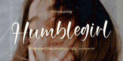 Proudly Presenting, Humblegirl A Modern Handwritten Script. Humblegirl is perfect for any titles, logo, product packaging, branding project, megazine, social media, wedding, or just used to express words above the background. Humblegirl also come with Multi-Lingual Support. Enjoy the font, feel free to comment or feedback, send me PM or email. Thank You!
 - Tiger Chest by Four Lines Std,
$15.00 Introducing "Tiger Chest" - Unleash Your Creativity with Urban Pop Vibes! With Tiger Chest, your creativity knows no bounds. Break free from the mundane and explore the wild side of design. Whether you're crafting social media graphics, YouTube thumbnails, event posters, or comic book covers, this font will give your projects the urban edge they deserve.
 - Balcon by Tour De Force,
$25.00 Balcon is condensed sans family designed to be your first web font choice. Contains 5 weights: Light, Regular, Bold, ExtraBold and Black, it fits perfect into any project, from editorial editions to packages, labels, posters. If you're looking for a bit decorative version of this family, feel free to check Balcon Round sans family.
 - Brushwork by Celebrity Fontz,
$24.99 Brushwork is a free-flowing brush font that combines a modern aesthetic with a very unique style. Some have suggested that Brushwork looks like a cross between Roman and Japanese characters but most agree it evokes total freedom of expression. Includes a full set of accented characters to accommodate most of the Romance languages.
 - Bordershine Script by CBRTEXT Studio,
$15.00 Bordershine Script is a beautiful and elegant modern calligraphy font. It's perfect for branding, wedding invitations, photography, bloggers, logos, content, greeting cards and more. Bordershine script calligraphy has beautiful uppercase and lowercase letters, numbers, and ligatures. If you have any questions, before or after purchase, please feel free to get in touch. Thank You.
 - Hewy by Kaer,
$19.00 HEWY is an elegant sans serif font family in Scandinavian design style. Simple line letters will add a touch of style to your projects. What you will get: Line and regular styles Uppercase and lowercase glyphs Numbers and symbols Multilingual support Ligatures Please feel free to request to add characters you need: kaer.pro@gmail.com
 - Highstuffy by Allouse Studio,
$16.00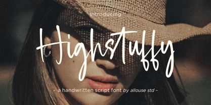 Proudly Presenting, Highstuffy A Fancy Handwritten Script. Highstuffy is perfect for any titles, logo, product packaging, branding project, megazine, social media, wedding, or just used to express words above the background. Highstuffy also come with Multi-Lingual Support. Enjoy the font, feel free to comment or feedback, send me PM or email. Thank You!
 - Wide Plump by Kaer,
$19.00 Wide Plump is a bold Stylish Stencil Font. Most of the glyphs are without any holes, it's provide powerful impact. You can use it in fashion magazines covers, short advertise slogan and so on. * Uppercase and some lowercase * Numbers * Symbols * Multilingual support Please feel free to request to add characters you need: kaer.pro@gmail.com
 - Speed Test by Kaer,
$20.00 Hey! I'm happy to introduce to you my new font in fast speed style. Dry brush stroke with grunge lines and dots. Perfect for Taxi logo, Race poster, Sport identity, etc. You’ll get: * Uppercase (lowercase glyphs are the same) * Numbers * Symbols Please feel free to request any help you need: kaer.pro@gmail.com Best, Roman.
 - Lupina by Craft Supply Co,
$15.00 Introducing Lupina, where modern simplicity meets timeless sophistication. This sleek sans-serif grotesque font effortlessly enhances your projects with a clean, contemporary vibe. This typeface is ideal for greeting card, packaging, brand identity, poster, or any purpose to make your design project look eye catching and trendy. Feel free to play with this typeface!
 - Brskovo by TypeClassHeroes,
$14.00 Introducing Brskovo is a modern uppercase serif, use this font for any branding, product packaging, invitation, quotes, t-shirt, label, poster, logo etc. Feature - Uppercase & Lowercase - Number & Symbol - International Glyphs - Multilingual support - Alternative - Ligature Feel free to drop us a message any time and follow my shop for upcoming updates Hope you enjoy it.
 - Bleakfall by Allouse Studio,
$16.00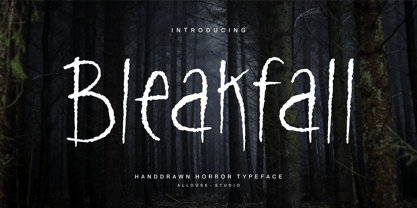 Proudly Present, Bleakfall a Handdrawn Horror Typeface. Bleakfall is perfect for any titles, logo, product packaging, branding project, megazine, social media, wedding, or just used to express words above the background. Bleakfall also come with Multi-Lingual Support. Enjoy the font, feel free to comment or feedback, send me PM or email. Thank You!
 - Dupliciter by JAF 34,
$9.90 DUPLICITER is an experimental display sans serif font which has two typefaces for comfortable and experimental use. DUPLICITER is a (latest) part of new school in type design that could be called like mind-free and geometric direction in the world. Sans serif, condensed, sharp edges, geometric, experimental, these are the main attributes of DUPLICITER.
 - Bemsod Decker by madeDeduk,
$14.00 Introducing Bemsod Decker is a casual handwritten font and will be perfect for book, title branding, product packaging, invitation, quotes, label, poster, logo etc. Feature Uppercase & Lowercase Number & Symbol International Glyphs Multilingual support Alternative Ligature Feel free to drop us a message any time and follow my shop for upcoming updates Hope you enjoy it.
 - Blackstock by Aerotype,
$29.00 Blackstock has a distressed alternate for every capital letter, consecutive characters are controlled with the OpenType Ligature feature. Blackstock Pro extends the character set to support Eastern European Latin, Baltic, Greek and Turkish.
 - Tenika by Eaver Studio,
$12.00 Minimal & squarish techno style type for your graphic design project. Designed based off a modified square for the small letters and developed to have the capital letters. Available in upright and oblique (italic).
 - Muguet by Max Prive,
$28.00 MUGUET is a reinvention of the Skin typeface designed by Max Prive in 2016. MUGUET features reimagined capital letters and improved kerning. It’s ultra clean, ultra minimalist with a hint of retro aesthetics.
 - Integral CF by Connary Fagen,
$35.00 Integral CF is designed for maximum visual and emotional impact with its stunning, superbold letterforms. An all-caps titling font family, Integral's six weights excel in posters, social media, headlines, video, and print. Hidden behind the linear, confident construction is a hint of roguish charm. Designed to be bold and large, Integral pairs nicely with lighter typefaces that provide contrast, such as a sans serif like Greycliff CF, Criteria CF, or Work Sans. Text-friendly serifs like Artifex CF are also pair well with Integral. All typefaces from Connary Fagen include free updates, including new features, and free technical support.
 - Greenwich Mean - Unknown license

- Vintage Glader by Ditatype,
$29.00 Vintage Glader is a beautifully crafted script font that exudes a timeless elegance and sophistication. Designed with a fairly thick weight, this font makes a bold statement while maintaining a classic script style. Its well-balanced proportions ensure a consistent and harmonious look across all letters, making it both visually appealing and highly readable. One of the defining characteristics of Vintage Glader is its contrasting strokes, which add a dynamic rhythm to the text. This contrast not only enhances the overall aesthetic but also contributes to the font's excellent legibility, making it suitable for a wide range of design applications. Adding to its charm, Vintage Glader swinging ends on some letters, lending a playful yet refined touch to the script. In addition, enjoy the features here. Features: Ligatures Stylistic Sets Multilingual Supports PUA Encoded Numerals and Punctuations Vintage Glader fits in headlines, invitations, logos, posters, flyers, branding materials, greeting cards, print media, and many more designs. Find out more ways to use this font by taking a look at the font preview. Thanks for purchasing our fonts. Hopefully, you have a great time using our font. Feel free to contact us anytime for further information or when you have trouble with the font. Thanks a lot and happy designing.
 - ZentenarZier - Unknown license

- Yanone Kaffeesatz - Unknown license

- stamPete - Unknown license

- Xpress Rounded by Wiescher Design,
$12.00 »XPress-Rounded« is my new addition to »XPress«, my Sans-Serif that impresses – especially in small sizes – with its outstanding readability. »XPress-Rounded« looks very different, almost like a completely new font. But the rounded version has the same seven precisely calibrated weights from »Thin« to »Heavy« and its corresponding italics make this font-family universally usable. The »XPress« fonts got their bearings from the fabulous American »Gothic« fonts of the twenties of last century. Modern, present day elements, high lowercase letters and infinitesimal elegant slight curves in start- and end strokes make the font family not only great for body copy, but also very useful in advertising. Enjoy! »XPress-Rounded« ist meine neue Erweiterung zur »XPress« Familie, die durch aussergewöhnliche Lesbarkeit auffällt. »XPress-Rounded« sieht jedoch vollkommen anders aus als sein älterer Bruder. »XPress-Rounded« hat jedoch die selben sieben präzise aufeinander abgestimmten Schnitte von »Thin« bis »Heavy« und die dazu passenden Kursiven. Das macht die Schriftfamilie vielseitig einsatzfähig. Die »XPress« Schriften basieren auf der Formensprache der grossen amerikanischen Groteskschriften der zwanziger Jahre des letzten Jahrhunderts. Durch moderne Formelemente, große Mittellängen und unendlich leichte, elegante An- und Abstriche ist die Schrift jedoch nicht nur als Textschrift, sondern auch im gesamten Bereich der Werbung vielseitig einsetzbar. Viel Erfolg!
 - Ahmed by Linotype,
$187.99Ahmed is a modern Arabic headline face, first produced by Linotype-Hell Ltd. in the early 1980s. Originally developed as a simplified face, its design recalls the inscriptional and decorative tile work lettering of the medieval period. The strong treatment of the tails of certain characters departs from the more traditional style of tapering these finials, introducing a modern feel to the design. The contrasting proportions of the tall vertical strokes and the rather elongated counters lend a monumental look to Ahmed, allowing its effective use in titling. During the later 1980s Ahmed was developed into a traditional typeface, with the introduction of medial forms to improve character spacing and balance. Recently, Ahmed has been converted into the OpenType font format, ensuring its continued popularity as a heading face for newspaper typesetting. The Ahmed typeface contains two weights, Ahmed and Ahmed Outline. Both of the OpenType fonts include Latin glyphs from Clearface Gothic Roman inside the font files, allowing a single font to set text in both most Western European and Arabic languages. The two Ahmed fonts include the Basic Latin character set and the Arabic character set, which supports Arabic, Persian, and Urdu. They include tabular and proportional Arabic, Persian, and Urdu numerals, as well as a set of tabular European (Latin) numerals. - Marcus Traianus by Eurotypo,
$48.00 The famous lettering “Capital Trajana” (inscription at the bottom of the column that bears its name erected in the year114 A.D.) is usually identified as the classic example that defines Imperial Capital forms. However, much earlier, there were already countless examples of Greco-Roman epigraphy of excellent execution, as evidenced by the monumental inscriptions from year 2 b.C. sculpted in the Portico di Gaio e Lucio Cesari in front of the facade of the Basilica Emilia, in the Roman Forum, erected by Augustus, dedicated to his two grandchildren for propaganda and dynastic needs. It has been more than two thousand years and the forms of these letters are still part of our daily life, product of their qualities of readability and beauty. It is probably the added semantic value that have made them an icon full of symbolism that expresses majesty, monumentality, order and universal power. Numerous authors, calligraphers and designers have studied this legacy such as Giovanni Francesco Cresci, Edward Catich, L.C. Evetts, Armando Petrucci, Carol Twombly, John Stevens, Claude Mediavilla, just to name a few. Marcus Traianus font is a fitted version of the two models mentioned, which is accompanied by Small Caps, lowercase (carolingas) and a set of numbers (Indo-Arabics) in addition to the Romans figures and diacritics for Central European languages Marcus Traianus is presented in two weight: Regular, Italic, Bold and ExtraBold.
 - Jasmine Century by Timurtype,
$14.00 Introduced by Timurtype Studio! Jasmine Century is a Handbrushed Font This fonts are a beautiful and artistic type of font that mimics the look of letters created by hand using a brush or paint. Each character in a handbrushed font is carefully crafted with fluid brush strokes, resulting in a unique and natural handwritten appearance. These fonts add a touch of authenticity, creativity, and a sense of personalization to any design project. Whether used for logos, branding, invitations, or social media graphics, handbrushed fonts bring a charming and organic feel that can convey a wide range of styles, from casual and playful to elegant and sophisticated. With their versatility and ability to evoke emotions, handbrushed fonts have become a popular choice for designers looking to add a touch of artistic expression to their artwork. Jasmine Century Font also supports multilingualism. Enhance your designs with our original fonts, feel free to comment or provide feedback, Enjoy the fonts 😊 Thank You
 - Maestrale by Catharsis Fonts,
$25.00 Maestrale is a paradigm-breaking new take on calligraphy, built around a compact, serif-style core and outrageously long, flamboyant extenders. At large sizes, its confident, charismatic lettershapes are ideally suited for branding and decorative uses, whereas longer texts at smaller sizes naturally weave themselves into a flowing texture. The font comprises 1299 glyphs, including many stylistic alternates, ligatures, small capitals, and initial, terminal, and linking forms, and offers extensive OpenType programming to support them. The calligraphic form of Maestrale is complemented by a matching text font (Maestrale Text) with short extenders, available in three cuts (a serif-style Roman, an upright Cursive, and a tilted Italic). Maestrale is all about the lowercase; its capitals are deliberately understated so as not to steal the limelight. In fact, the font works very well when set exclusively in lowercase. Maestrale�s small capitals are fitted into the core space of the lowercase, allowing them to be freely interspersed with lowercase characters. Alternately, an OpenType feature is available to replace a and e in small-caps text with their lowercase equivalents for a fresh unicase look. Since alternates and ligatures play such an important role, Maestrale offers three different modes of use. The most straightforward approach is simply to start typing using Maestrale Pro � the extensive OpenType programming will ensure that collisions between extenders are avoided and attractive ligatures are substituted for common glyph combinations. A more interactive approach is provided by the font Maestrale Manual, which allows the user to manually select alternate forms and ligatures even in typographically unsavvy applications, such as PowerPoint (as long as standard ligatures are supported). Stylistic alternates are simply represented as ligatures of their base forms with one or more instances of the rarely-used by easily-accessed characters "~" (ASCII tilde) and "`" (spacing grave accent); linking forms are built with �_� (underscore), multi-character ligatures with "|" (pipe), and initial and terminal forms with the �less than� and �greater than� characters. For instance, the Maestrale wordmark in the posters above was simply typeset with the string (`ma`est|r_a```l```e)| in Maestrale Manual (The parentheses represent �less than� and �greater than� characters here.) Feel free to type this string into the test line below and see what happens! Make sure Standard Ligatures are enabled. An instruction sheet listing all alternate forms and their accessibility is available from the Gallery tab on this page. The third mode of usage is aimed at professional designers, who make use of sophisticated software with extensive OpenType support. These power users are advised to use the font Maestrale Pro again, where all glyphs are accessible as stylistic alternates. Maestrale Text is a less extravagant but more versatile variation on the design of Maestrale, replacing Maestrale�s swashes with efficiently compact extenders. It is intended to serve as a perfectly matching text companion to Maestrale calligraphy, but constitutes a full-fledged typeface in its own right. It is equally at home at display sizes as it is in pull quotes, titles, and high-impact blocks of text. Maestrale Text comes in three complementary faces: A serif-style Roman, an upright Cursive, and a tilted Italic. Maestrale is the Italian word for �masterful�. It is also the traditional Italian name for the northwesterly mediterranean wind, better known by its French name, Mistral. Acknowledgements: I am grateful to the helpful souls on the Typophile forums for extensive feedback and encouragement on Maestrale, and to the TypeDrawers forum for feedback on Maestrale Text. This font is dedicated to Simone.
 - Weiss Rundgotisch by Linotype,
$67.99The German designer Emil Rudolf Weiss originally created Weiss Rundgotisch for the Bauer typefoundry in 1937. In their catalog for the typeface, Bauer began with this quote from Leonhard Wagner: The round gothic (rundgotisch) script is the most beautiful kind of script; she is called the mother and the queen of all the rest." While designing Weiss Rundgotisch, Weiss was inspired by Renaissance types cut by the Augsberg printer Erhard Ratdolt. Ratdolt had spent some time in Venice, which is most likely where he became familiar with round gothic letters. This sort of letterform was never as popular in Germany as Fraktur or Gotisch may have been, but round gothic types were used there for centuries to represent arts and craft feelings, as well as old-fashioned handwork. For a blackletter typeface, Weiss Rundgotisch is very similar to normal serif and sans serif designs, especially its uppercase letters, which seem to have some uncial influence in them as well. Therefore, Weiss Rundgotisch is more legible for contemporary readers, making this an excellent choice for anyone looking to set text, logos, or headlines with in blackletter. Weiss Rundgotisch was apparently quite a difficult typeface to design, even for a master designer like Weiss. He began work on the face in 1915; Weiss Rundgotisch's development took over 20 years to complete." - MARIAMNE by Type Innovations,
$39.00 MARIAMNE is an original design by Alex Kaczun. It is an elegant, modern and traditional interpretation based on and modeled after his successful "Contax Pro" and "New Age Gothic" typeface series. As such, it has generous proportions with clean, crisp lines—ideally suited for easy reading and long lines of copy. Alex felt that the skeleton for "Contax" was perfectly suited to transform the design into a modern version of 'old-style', somewhat reminiscent of German Black Letter. Numerous modifications where made to the body proportions, stems and shapes. True 'old-style' serifs and unusual 'cross-strokes' where added for a touch of distinction. The 'cross-strokes' where added at exactly visual mid-point on the overall heights. This gives the typeface a romantic, female-like quality to the overall design. Strong, yet delicate. Visually stimulating in appearance and function. The result is a truly unique transitional and modern design. Unlike other typefaces, MARIAMNE incorporates uniform stems throughout the capitals, lower case and figures. This gives the design a uniform appearance in overall color and strength. There is a perfect visual balance between inter-letter spacing, stem weights and proportions. The accents are equally large, bold and command attention. This font includes a large 'Pro' character set, which supports most Central European and many Eastern European languages. As a result, the design is ideally suited for display copy as well as text composition. In the near future, Alex plans to expand the typeface series to include a light and heavy weight, along with true italics.
 - Ganymede3D - Personal use only

- Grange by Device,
$39.00 The Device interpretation of the classic “Grot” thick/thin sans style. Unlike the traditional models on which it is based, Grange takes a rational, consistent approach across wide range of weights and widths for contemporary use. The "Text" weights are designed for use at smaller sizes, and have more open character shapes and spacing for legibility. The font includes alternative curved and straighter versions of key characters, most obviously the lower-case ‘g' and capital ‘R', allowing the font to take on either a sharper or warmer, more playful appearance. These can be toggled on or off using the ‘Alts' feature in Illustrator, or ‘Stylistc Sets’ in Indesign. Contains proportional, lining and tabular numerals. Perfect for both headline and text.
 - Lina by Roy Cole,
$34.00 The Lina typeface family was designed by Roy Cole and completed in 2003. The roman font, Lina 30, was drawn originally by hand and later its character set extended and digitally redrawn with the aid of Fontographer. The five additional fonts, 60, 90, and the italics 33, 66, 99 followed and were all produced digitally from scratch. Lina is characterized by economy, lightness and evenness of weight. The capitals and figures are not as tall as the lower-case but retain the latter’s weight, and the figures are designed to provide enhanced recognition. The characters are relatively large on the body and text and benefit from additional leading. Lina is essentially a typeface for text composition. Roy Cole's other typeface families are Zeta, Colophon and Coleface.
 - Zaftig by Typeco,
$29.00Many current poster artists like to reference the graphic type styles that were popular in the ’60s and ’70s. Zaftig is a contemporary font that takes the geometric and blocky inspiration from that era but then steps off in a modern direction. At first glance, it may appear that the capitals of Zaftig all take up the same amount of space, but certain letters have been designed proportionally for a better flow. Zaftig contains the basic character set and will work for most European languages. If you like your OpenType fonts with more features, Typeco also offers Pro version of Zaftig that includes Tiling Alternates, Stylistic Alternates, Small Caps, Small Cap Figures, and support for most languages that use Latin, Central European, Cyrillic, and Greek scripts. - Hello Crimsons by Gilar Studio,
$16.00 HELLO CRIMSONS was inspired by a recent trip to London, England where I happened upon a bustling pub with beautiful typographic signage. HELLO CRIMSONS delivers a multitude of Opentype features, For a number of capital and lowercase letters, large swashes expand above and below the characters. Contextual swashes are also applied to some characters when placed at the beginning or end of a word. This font is made in a modern style with a very beautiful beginning and ending.elegantly,very casual and suitable for your various design needs I'ts.Perfect for logo,branding, tittle, social media posts, advertisements, product packaging, product designs, label, photography, watermark, special event,magazine,web design. Included: multilingual support beginning and ending swash Check my other Font here https://gilarstudio.com/
 - Paradigm Pro by Shinntype,
$59.00 Originally released in 1995 as a three font family, Paradigm forcefully addressed the emaciating effect that digitization was then exerting upon traditional serifed typography. Investigating the new media of a much previous era, Nick Shinn deconstructed the first roman type, designed by Sweynheym and Pannartz in 1467, and gleaned, from its minuscules, the low contrast and discreet serif treatment (portrayed by a novel convex effect), which he subsequently applied to both capitals and lower case of a classically proportioned Venetian invention. In 2008 the glyphs, metrics and hinting of the 1995 fonts were refined, Extra Bold and Light weights added, a full range of OpenType features instituted, and the number of characters per style increased almost threefold. A major upgrade to a unique typeface.


