10,000 search results
(0.054 seconds)
- Kecumik by IbraCreative,
$17.00 Kecumik, a stunning Glamour Serif typeface, seamlessly blends elegance with modern sophistication. Its graceful letterforms exhibit a harmonious balance of curves and serifs, exuding a timeless allure that captivates the eye. Kecumik’s intricate details and refined strokes contribute to its distinctive personality, making it an ideal choice for projects that demand a touch of glamour and a nod to classical aesthetics. Whether used in editorial design, branding, or luxury packaging, Kecumik’s versatile charm elevates any visual composition, embodying a sense of refined beauty that resonates across diverse design applications.
 - Danton by Hoftype,
$49.00 Danton is a serif dominated face with a crisp and distinct graphical flavor. Designed especially for use in magazines and newspapers, It is superb in headlines and, because of its solid structure, it is also an excellent choice for text applications. The Danton family consists of 14 styles and is well suited for ambitious typography. It comes in OpenType format with extended language support. All weights contain small caps, ordinals, ligatures, proportional lining figures, tabular lining figures, proportional old style figures, lining old style figures, matching currency symbols, fraction- and scientific numerals, and arrows.
 - Dynascript by Alphabet Soup,
$60.00 Typography enters the Space Age! Dynascript brings the ease of “Pushbutton Automatic” to your typesetting experience. Dynascript is actually Two fonts in One–without switching fonts you can instantly change from Dynascript’s connecting font to the non-connecting italic with the simple push of a button. For more details download “The Dynascript Manual” from the Gallery Section. What is Dynascript? Dynascript is the slanted script cousin of Dynatype. It shares many of the characteristics of it’s sibling, but is drawn entirely from scratch and has it’s own unique character. To some it may be reminiscent of various mid-century neon signage, and of sign writing, Speedball alphabets and even baseball scripts. The design of Dynascript also takes some cues from a historical typographic curiosity that began in Germany in the ‘20s and which lasted into the ‘60s—when Photo-Lettering gave it the name "Zip-Top". Basically it was believed to be the wave of the future—that by weighting an alphabet heavier in its top half, one could increase legibility and reading speed. The jury’s still out on whether or not there’s any validity to this claim, but I think you’ll agree that in the context of this design, the heavier weighting at the top of the letters helps to create some uniquely pleasing forms, and a script unlike any other. Typesetters across the planet will also be able to set copy in their language of choice. Dynascript’s 694 glyphs can be used to set copy in: Albanian, Basque, Catalan, Cornish, Croatian, Czech, Danish, Dutch, Esperanto, Estonian, Faroese, Finnish, French, Galician, German, Hungarian, Icelandic, Indonesian, Irish, Italian, Kalaallisut, Latvian, Lithuanian, Malay, Maltese, Manx, Norwegian Bokmål, Norwegian Nynorsk, Oromo, Polish, Portuguese, Slovak, Slovenian, Somali, Spanish, Swahili, Swedish, Turkish, and Welsh—and of course English. Sorry! Off-world languages not yet supported. PLEASE NOTE: When setting Dynascript one should ALWAYS select the “Standard Ligatures" and “Contextual Alternates” buttons in your OpenType palette. See the “Read Me First!” file in the Gallery section.
 - Relagina by Muksal Creatives,
$12.00 Introducing Relagina is a elegant and classy serif typeface – This font is both modern and nostalgic and works great for logos, magazine, social media. Already matched up and ready to be used together for your next design! For those of you who are needing a touch of elegant, stylish, classy, chic and modernity for your designs, this font was created for you!
 - ITC Bodoni Seventytwo by ITC,
$29.99Giambattista Bodoni (1740-1813) was called the King of Printers; he was a prolific type designer, a masterful engraver of punches and the most widely admired printer of his time. His books and typefaces were created during the 45 years he was the director of the fine press and publishing house of the Duke of Parma in Italy. He produced the best of what are known as modern" style types, basing them on the finest writing of his time. Modern types represented the ultimate typographic development of the late eighteenth and early nineteenth centuries. They have characteristics quite different from the types that preceded them; such as extreme vertical stress, fine hairlines contrasted by bold main strokes, and very subtle, almost non-existent bracketing of sharply defined hairline serifs. Bodoni saw this style as beautiful and harmonious-the natural result of writing done with a well-cut pen, and the look was fashionable and admired. Other punchcutters, such as the Didot family (1689-1853) in France, and J. E. Walbaum (1768-1839) in Germany made their own versions of the modern faces. Even though some nineteenth century critics turned up their noses and called such types shattering and chilly, today the Bodoni moderns are seen in much the same light as they were in his own time. When used with care, the Bodoni types are both romantic and elegant, with a presence that adds tasteful sparkle to headlines and advertising. ITC Bodoni™ was designed by a team of four Americans, after studying Bodoni's steel punches at the Museo Bodoniana in Parma, Italy. They also referred to specimens from the "Manuale Tipografico," a monumental collection of Bodoni's work published by his widow in 1818. The designers sought to do a revival that reflected the subtleties of Bodoni's actual work. They produced three size-specific versions; ITC Bodoni Six for captions and footnotes, ITC Bodoni Twelve for text settings, and ITC Bodoni Seventytwo - a display design modeled on Bodoni's 72-point Papale design. ITC Bodoni includes regular, bold, italics, Old style Figures, small caps, and italic swash fonts. Sumner Stone created the ornaments based on those found in the "Manuale Tipografico." These lovely dingbats can be used as Bodoni did, to separate sections of text or simply accent a page layout or graphic design." - ITC Bodoni Twelve by ITC,
$29.99Giambattista Bodoni (1740-1813) was called the King of Printers; he was a prolific type designer, a masterful engraver of punches and the most widely admired printer of his time. His books and typefaces were created during the 45 years he was the director of the fine press and publishing house of the Duke of Parma in Italy. He produced the best of what are known as modern" style types, basing them on the finest writing of his time. Modern types represented the ultimate typographic development of the late eighteenth and early nineteenth centuries. They have characteristics quite different from the types that preceded them; such as extreme vertical stress, fine hairlines contrasted by bold main strokes, and very subtle, almost non-existent bracketing of sharply defined hairline serifs. Bodoni saw this style as beautiful and harmonious-the natural result of writing done with a well-cut pen, and the look was fashionable and admired. Other punchcutters, such as the Didot family (1689-1853) in France, and J. E. Walbaum (1768-1839) in Germany made their own versions of the modern faces. Even though some nineteenth century critics turned up their noses and called such types shattering and chilly, today the Bodoni moderns are seen in much the same light as they were in his own time. When used with care, the Bodoni types are both romantic and elegant, with a presence that adds tasteful sparkle to headlines and advertising. ITC Bodoni™ was designed by a team of four Americans, after studying Bodoni's steel punches at the Museo Bodoniana in Parma, Italy. They also referred to specimens from the "Manuale Tipografico," a monumental collection of Bodoni's work published by his widow in 1818. The designers sought to do a revival that reflected the subtleties of Bodoni's actual work. They produced three size-specific versions; ITC Bodoni Six for captions and footnotes, ITC Bodoni Twelve for text settings, and ITC Bodoni Seventytwo - a display design modeled on Bodoni's 72-point Papale design. ITC Bodoni includes regular, bold, italics, Old style Figures, small caps, and italic swash fonts. Sumner Stone created the ornaments based on those found in the "Manuale Tipografico." These lovely dingbats can be used as Bodoni did, to separate sections of text or simply accent a page layout or graphic design." - ITC Bodoni Ornaments by ITC,
$29.99Giambattista Bodoni (1740-1813) was called the King of Printers; he was a prolific type designer, a masterful engraver of punches and the most widely admired printer of his time. His books and typefaces were created during the 45 years he was the director of the fine press and publishing house of the Duke of Parma in Italy. He produced the best of what are known as modern" style types, basing them on the finest writing of his time. Modern types represented the ultimate typographic development of the late eighteenth and early nineteenth centuries. They have characteristics quite different from the types that preceded them; such as extreme vertical stress, fine hairlines contrasted by bold main strokes, and very subtle, almost non-existent bracketing of sharply defined hairline serifs. Bodoni saw this style as beautiful and harmonious-the natural result of writing done with a well-cut pen, and the look was fashionable and admired. Other punchcutters, such as the Didot family (1689-1853) in France, and J. E. Walbaum (1768-1839) in Germany made their own versions of the modern faces. Even though some nineteenth century critics turned up their noses and called such types shattering and chilly, today the Bodoni moderns are seen in much the same light as they were in his own time. When used with care, the Bodoni types are both romantic and elegant, with a presence that adds tasteful sparkle to headlines and advertising. ITC Bodoni™ was designed by a team of four Americans, after studying Bodoni's steel punches at the Museo Bodoniana in Parma, Italy. They also referred to specimens from the "Manuale Tipografico," a monumental collection of Bodoni's work published by his widow in 1818. The designers sought to do a revival that reflected the subtleties of Bodoni's actual work. They produced three size-specific versions; ITC Bodoni Six for captions and footnotes, ITC Bodoni Twelve for text settings, and ITC Bodoni Seventytwo - a display design modeled on Bodoni's 72-point Papale design. ITC Bodoni includes regular, bold, italics, Old style Figures, small caps, and italic swash fonts. Sumner Stone created the ornaments based on those found in the "Manuale Tipografico." These lovely dingbats can be used as Bodoni did, to separate sections of text or simply accent a page layout or graphic design." - ITC Bodoni Brush by ITC,
$29.99Giambattista Bodoni (1740-1813) was called the King of Printers; he was a prolific type designer, a masterful engraver of punches and the most widely admired printer of his time. His books and typefaces were created during the 45 years he was the director of the fine press and publishing house of the Duke of Parma in Italy. He produced the best of what are known as modern" style types, basing them on the finest writing of his time. Modern types represented the ultimate typographic development of the late eighteenth and early nineteenth centuries. They have characteristics quite different from the types that preceded them; such as extreme vertical stress, fine hairlines contrasted by bold main strokes, and very subtle, almost non-existent bracketing of sharply defined hairline serifs. Bodoni saw this style as beautiful and harmonious-the natural result of writing done with a well-cut pen, and the look was fashionable and admired. Other punchcutters, such as the Didot family (1689-1853) in France, and J. E. Walbaum (1768-1839) in Germany made their own versions of the modern faces. Even though some nineteenth century critics turned up their noses and called such types shattering and chilly, today the Bodoni moderns are seen in much the same light as they were in his own time. When used with care, the Bodoni types are both romantic and elegant, with a presence that adds tasteful sparkle to headlines and advertising. ITC Bodoni™ was designed by a team of four Americans, after studying Bodoni's steel punches at the Museo Bodoniana in Parma, Italy. They also referred to specimens from the "Manuale Tipografico," a monumental collection of Bodoni's work published by his widow in 1818. The designers sought to do a revival that reflected the subtleties of Bodoni's actual work. They produced three size-specific versions; ITC Bodoni Six for captions and footnotes, ITC Bodoni Twelve for text settings, and ITC Bodoni Seventytwo - a display design modeled on Bodoni's 72-point Papale design. ITC Bodoni includes regular, bold, italics, Old style Figures, small caps, and italic swash fonts. Sumner Stone created the ornaments based on those found in the "Manuale Tipografico." These lovely dingbats can be used as Bodoni did, to separate sections of text or simply accent a page layout or graphic design." - ITC Bodoni Six by ITC,
$40.99Giambattista Bodoni (1740-1813) was called the King of Printers; he was a prolific type designer, a masterful engraver of punches and the most widely admired printer of his time. His books and typefaces were created during the 45 years he was the director of the fine press and publishing house of the Duke of Parma in Italy. He produced the best of what are known as modern" style types, basing them on the finest writing of his time. Modern types represented the ultimate typographic development of the late eighteenth and early nineteenth centuries. They have characteristics quite different from the types that preceded them; such as extreme vertical stress, fine hairlines contrasted by bold main strokes, and very subtle, almost non-existent bracketing of sharply defined hairline serifs. Bodoni saw this style as beautiful and harmonious-the natural result of writing done with a well-cut pen, and the look was fashionable and admired. Other punchcutters, such as the Didot family (1689-1853) in France, and J. E. Walbaum (1768-1839) in Germany made their own versions of the modern faces. Even though some nineteenth century critics turned up their noses and called such types shattering and chilly, today the Bodoni moderns are seen in much the same light as they were in his own time. When used with care, the Bodoni types are both romantic and elegant, with a presence that adds tasteful sparkle to headlines and advertising. ITC Bodoni™ was designed by a team of four Americans, after studying Bodoni's steel punches at the Museo Bodoniana in Parma, Italy. They also referred to specimens from the "Manuale Tipografico," a monumental collection of Bodoni's work published by his widow in 1818. The designers sought to do a revival that reflected the subtleties of Bodoni's actual work. They produced three size-specific versions; ITC Bodoni Six for captions and footnotes, ITC Bodoni Twelve for text settings, and ITC Bodoni Seventytwo - a display design modeled on Bodoni's 72-point Papale design. ITC Bodoni includes regular, bold, italics, Old style Figures, small caps, and italic swash fonts. Sumner Stone created the ornaments based on those found in the "Manuale Tipografico." These lovely dingbats can be used as Bodoni did, to separate sections of text or simply accent a page layout or graphic design." - Dom Loves Mary by Correspondence Ink,
$39.99 Dom Loves Mary has a baby brother! Check out Fratello Nick here: http://www.myfonts.com/fonts/correspondence-ink/fratello-nick/ The DomLovesMary font family has all you need to create unique, custom stationery products. THE INSPIRATION BEHIND THE DOMLOVESMARY FONT FAMILY: DomLovesMary is named in memory of Dominic and Mary Sementelli, Debi’s in-laws. Dom and Mary were opposites who were truly “made for each other”. A snazzy dresser, Mary was feisty, loved to dance, sing, and be the life of the party. Dom was cool, calm and collected and was happy to shine the spotlight on the love of his life. They balanced each other out in a really great way. Going through some of her in-laws old photos, Debi found their wedding album. She was struck by the beautiful look on their faces as they got ready to start their life together. She saw the excitement, joy and anticipation of them envisioning “Una Bella Vita!” (A beautiful life!) She decided to create a hand-lettered font with them in mind represented by two totally different lettering styles that were, like Dom and Mary, “made for each other”. It’s her way of honoring them and sharing their beautiful life with all of the couples just starting theirs together. They truly had “Una Bella Vita” and we hope you do too. WHAT'S UNIQUE ABOUT THE DOMLOVESMARY FONT FAMILY: The SCRIPT & TEXT FONTS are lettering styles that were made to compliment each other. With a vintage, classic feel, they will add elegance to your design, while the TEXT serves to offer support with easy to read simplicity. In addition to the standard character set, each of the uniquely styled script fonts includes a collection of flourished ornaments. Use them to create corners, headers or other embellishments to complete the look. And if you really want to fancy things up, we offer two sets of 72 additional flourishes that were specifically made to add to upper and lower case letters for easy customization. Dress them up with one, two or more. It’s like choosing simple pearls or piling on the glitz! Or combine several to create unique flourished ornaments of your own. To add even more panache, we're pleased to present our ready made set of most frequently used ADD-ON WORDS. Created with the wedding client in mind, this set of 66 includes envelope friendly titles: Mr and Mrs, Mr, Mrs, Miss, Ms, Doctor, the Doctors, as well as words to fill out your invitation suite: RSVP, Respond, Save the Date, Accommodations, Directions and more! Easily create Bride and Groom signs or Thank You cards or tags with the click of a key. Or use angled words like “and, at, to, on, for, from and of” to add a special touch to your large groups of copy. PACKAGES: We are pleased to have a variety of customers. From professional invitation designers to DIY brides, publishing companies and website / blog designers among others. So we've created packages to help fit their diverse needs. Purchase just one of our beautiful DomLovesMary SCRIPT fonts, each with its collection of included flourishes or the PRO VERSION complete with ALL THREE script fonts and a combined total of over 100 flourished ornaments. Add our TEXT font, a set of FLOURISHES or ADD-ON WORDS. Love the idea of customizing your letters with all the possible combinations? We offer a special price when you purchase both sets of flourishes. Or choose our Accoutrements Package containing both sets of FLOURISHES for letter customization as well as our ADD-ON WORDS. Want to have it all? The “DomLovesMary Total Design” package is for you. Each of these packages are offered at a 25% savings. WHAT PROGRAM WILL YOU USE?: All of the font options come in both Pro and Standard format fonts. For those with programs that can take advantage of OpenType features (click on the link to see if the program your using is one of them) the Pro fonts are for you. http://www.typotheque.com/fonts/opentype_feature_support/ For others without the ability to use Open Type features, we provide all of the script fonts that comprise the Pro Version as separate versions (Regular, Contextual and Stylistic). If you are using a program like Microsoft Word, and want all three script fonts, you can still purchase the Pro Version (a $50.00 savings), and install the individual fonts bundled in the Standard Fonts folder. We have set it up so they will appear separately as DomLovesMary, DomLovesMary Contextual and DomLovesMary Stylistic in your fonts list. Exciting news! In an effort to help our customers access all the goodies that are normally only available in Open Type Capable programs (like the flourished ornaments that come with our script fonts), we have found a simple application that allows you to do just that. For this reason, we've made sure to unicode all of our characters and glyphs so that they will work in this type of program. There may be others, but we checked this one out and found that it works. Check out PopChar
 - Round Rope by Putracetol,
$28.00 Round Rope - Playful Display Font Round Rope - Playful Display Font is a fun and colorful typeface that is perfect for adding a playful touch to any design. This font was inspired by the idea of creating a font that is both playful and whimsical, perfect for children's books, branding, packaging, posters, and any design that requires a fun and lighthearted touch. The font is designed with a playful, rounded appearance and features a hand-drawn feel that adds to its charm. Round Rope is a versatile typeface that can be used for a variety of design projects. Its playful and whimsical appearance makes it perfect for use in children's books, cartoons, and other designs that require a fun and lighthearted touch. It's also great for branding, packaging, and posters, where its unique style can help your designs stand out. This font comes with a range of features that make it a versatile and functional typeface. It includes uppercase and lowercase letters, as well as Opentype features such as alternates and ligatures, which allow you to create unique designs and add even more character to your text. It also includes support for multilingual characters, making it easy to use in designs that require different languages. In the font package, you will receive three file formats: Round Rope otf, Round Rope ttf, and Round Rope woff. These formats make it easy to use the font across different platforms and devices, ensuring that your designs look great no matter where they are viewed. Round Rope is a fun and playful font that is sure to bring a smile to your face. Its unique style and playful appearance make it a great choice for a wide range of design projects. Whether you're designing for children or adults, this font is sure to add a touch of whimsy and playfulness to your work. In summary, Round Rope - Playful Display Font is a fun and colorful typeface that is perfect for adding a playful touch to any design. Its unique style and playful appearance make it a great choice for a wide range of design projects, including branding, packaging, posters, and children's books. With its range of features and file formats, it's also a versatile and functional typeface that can be used across different platforms and devices.
 - Steffyray by Maulana Creative,
$12.00 Steffyray is a fancy Signature font, has slanted and fun characters. It has Opentype features of ligatures, makes it a perfect choice for branding and digital designs. Use this font for logos, social media, websites, blogs, instagram, social media, business cards, branding, and more! Steffyray font support multilingual more than 100+ language. and good pair for your secondary text font with sans or serif. Make a stunning work with Steffyray signature font. Cheers, MaulanaCreative
 - Hottest Vibes by Maulana Creative,
$12.00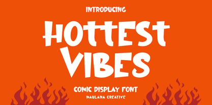 Hottest Vibes Comic Display Font. With bold brush stroke, fun character with a bit of ligatures. To give you an extra creative work. Hottest Vibes font support multilingual more than 100+ language. This font is good for logo design, Social media, Movie Titles, Books Titles, a short text even a long text letter and good for your secondary text font with sans or serif. Make a stunning work with Hottest Vibes font. Cheers, Maulana Creative
 - Aestero by Craft Supply Co,
$20.00 Aestero Futuristic Typeface Cutting-Edge Inspiration Aestero Futuristic Typeface, drawing from Gundam and sci-fi aesthetics, embodies a cutting-edge design for a bold display impact. Sleek Sci-Fi Elegance Named Aestero, this font seamlessly blends Gundam inspiration with sci-fi elegance, presenting sleek characters with a futuristic charm. Dynamic and Bold Presence Aestero commands attention with dynamic and bold letterforms, making it an ideal choice for projects seeking a strong visual presence.
 - Willee by Maulana Creative,
$12.00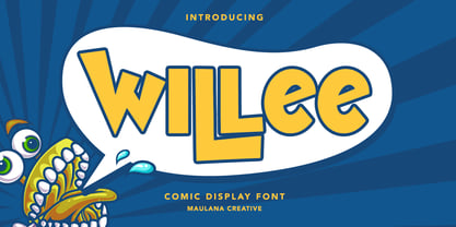 Willee Comic Display Font. Bold stroke, fun character with a bit of ligatures and alternates. To give you an extra creative work. Willee font support multilingual more than 100+ language. This font is good for logo design, Social media, Movie Titles, Books Titles, a short text even a long text letter and good for your secondary text font with script or serif. Make a stunning work with Willee font. Cheers, Maulana Creative
 - Sagordi by Objectype,
$20.00 Sagordi is a font that displays a strong and modern style. With clean lines and bold shapes, Sagordi is perfect for use in various applications, ranging from logo design to marketing materials, digital publications, and more. This font is designed with careful details to ensure excellent readability at various sizes and resolutions. Sagordi is a great choice for designers who are looking for a flexible and adaptable font that can match various design styles.
 - Mylestock by Maulana Creative,
$13.00 Mylestock is a handwritten script font, With fancy slanted and fun characters. It has Opentype features of ligatures, makes it a perfect choice for branding and digital designs. Use this font for logos, social media, websites, blogs, instagram, social media, business cards, branding, and more! Mylestock font support multilingual more than 100+ language. and good pair for your secondary text font with sans or serif. Make a stunning work with Mylestock script font. Cheers, MaulanaCreative
 - Ownttys by Maulana Creative,
$14.00 Ownttys is a handwritten script font, With fancy slanted and fun characters. It has Opentype features of ligatures, makes it a perfect choice for branding and digital designs. Use this font for logos, social media, websites, blogs, instagram, social media, business cards, branding, and more! Ownttys font support multilingual more than 100+ language. and good pair for your secondary text font with sans or serif. Make a stunning work with Ownttys script font. Cheers, MaulanaCreative
 - Kersa by Olivetype,
$18.00 Kersa is a stylish handwritten brush font. It is a nice choice for creating eye-catching logos, branding, and quotes. It has beautiful and well-balanced characters and as a result, it matches a wide pool of designs. Add it to your most creative ideas and notice how it makes them come alive! You’ll get : Basic Latin A-Z & a-z. Numbers, symbols, and punctuations Swashes & Ligatures Multilingual Support. Accented Characters : ÀÁÂÃÄÅÆÇÈÉÊËÌÍÎÏÑÒÓÔÕÖØŒŠÙÚÛÜŸÝŽàáâãäåæçèéêëìíîïñòóôõöøœšùúûüýÿžß Thank You.
 - Amberlayton by Maulana Creative,
$14.00 Amberlayton Signature Font, with monoline stroke, condensed and fun characters. It has Opentype features of ligatures, makes it a perfect choice for branding and digital designs. Use this font for logos, social media, websites, blogs, instagram, social media, business cards, branding, and more! Amberlayton font support multilingual more than 100+ language. and good pair for your secondary text font with sans or serif. Make a stunning work with Amberlayton signature font. Cheers, MaulanaCreative
 - Open Book by Olivetype,
$18.00 Open Book is a stylish and lovely script font. It is a nice choice for creating eye-catching logos, branding, and quotes. This script font is supporting more than 66 languages, which include: Afrikaans Albanian Catalan Danish Dutch English Estonian Finnish French German Italian Norwegian Portuguese Spanish Swedish Zulu, and more. So what's included : Basic Latin A-Z & a-z. Numbers, symbols, and punctuations Ligatures Multilingual Support. Accented Characters : ÀÁÂÃÄÅÆÇÈÉÊËÌÍÎÏÑÒÓÔÕÖØŒŠÙÚÛÜŸÝŽàáâãäåæçèéêëìíîïñòóôõöøœšùúûüýÿžß Thank you
 - Cashwoots by Maulana Creative,
$12.00 Cashwoots is a handwritten script font, With fancy and fun characters. It has Opentype features of ligatures, makes it a perfect choice for branding and digital designs. Use this font for logos, social media, websites, blogs, instagram, social media, business cards, branding, and more! Cashwoots font support multilingual more than 100+ language. and good pair for your secondary text font with sans or serif. Make a stunning work with Cashwoots handwritten script font. Cheers, MaulanaCreative
 - DT Skiart Lexiconic by Dragon Tongue Foundry,
$10.00 Apparently, Lexicon is the most expensive font in the world. ‘Skiart Lexiconic’ has been on a long growing path getting to where it is now. This font family was originally inspired by the san serif font ‘Skia’, by Mathew Carter for Apple. ‘Skiart’ was designed to feel more like a serifed font, but without any actual serifs. It took a small step between sans serif and serif fonts. Next on the path towards a serif font came Skiart Serif Mini, with tiny serifs added. This was a true serif font, although they were subtle. Then came ‘Skiart Serif Leaf’. and now... We present to you... DT Skiart Lexiconic. Having evolved from the Skiart family, we chose to give it the serifed styling of Lexicon. This is no way a copy or clone of Lexicon. It still has the basic bones of the original Skiart font, but the position, shape and size of the serifs were very much influenced by the world famous Lexicon font. DT Skiart Lexiconic is not the most expensive font in the world.
 - Brody by Linotype,
$40.99Not to be confused with the prolific, 1980s British super-star graphic and type designer Neville Brody, this brush script typeface was designed in 1953 by the American type designer Harold Broderson. Broderson worked for ATF (the American Type Founders), who were the original publishers of this design. Body is a brush script face that mimics the show card style of lettering, which was very popular throughout the United States during the first half of the 20th Century. The letters appear as if they were drawn quickly and spontaneously with a wide, flat lettering brush. The lowercase letters connect to each other, cursive script style. Brody is the perfect display face to provoke a nostalgic feeling for the 1950s. Anything having to do with apple pie, home cooking, or last minute sales would look great in this face. You could outfit a whole supermarket signage system in a snap with Brody. If you need the original version with more lettered characters then Brophy Script is a good alternate, - CA Play by Cape Arcona Type Foundry,
$29.00 This font invites you to play with it. The Real version has longer tails, while the Roman version cuts them up to make the font more suitable for text. The Script version connects the letters, while the Dynamic version is just an italic style.
 - Univers Next Cyrillic by Linotype,
$49.00 Linotype Univers is a completely reworked version of the original Univers typeface family designed by Adrian Frutiger in 1957. After a long process of painstakingly detailed revision, Frutiger and the design staff at Linotype completed this large joint project in 1997. The result: a brilliant and cohesive font family of 63 weights and styles including the 4 monospaced typewriter weights. All the existing weights were completely redrawn, with careful attention paid to making the proportions more consistent with each other and improving fine details such as curves and thick-to-thin stroke ratios. The family was expanded from 27 to 63 weights, providing a much larger framework to graphic designers for choosing just the right style. The bold and condensed weights were reworked for improved legibility and on-screen application. The stroke weights were revised for consistency within each face as well as in relationship to the other weights. By following Frutiger's original designs, the humanist character of the sans serif Univers now comes through more distinctly. The systemized numbering system has also been updated. With its sturdy, clean forms Univers can facilitate an expression of cool elegance and rational competence. In fact, the strong familial relationships between all the styles and weights make it a serviceable choice for large graphic design projects that require versatility with consistency. Frutiger was successful in staying true to his initial aims; the new Linotype Univers does indeed work in longer texts as well as for display settings. In 2010 the typeface family was extended and renamed into a more logical naming of "Univers Next" to fit better in the Platinum Collection naming.
 - K&T Heidi by K and T,
$70.00 This is a well-built, functional (all caps) typeface, which is very modern in character. The use of diagonal corners in this angular typeface is inspired by the pennant numbers on British Royal Navy warships, which adds an military quality to this typeface. The gaps, which form the Stencil divisions, follow pre-established horizontal and vertical lines, they help to achieve both geometric and proportional harmony. The direction of the gaps is always at a right angle to the stroke.
 - Regisa by Haniefart,
$17.00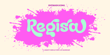 Regisa is a handcrafted typeface, inspired by water drops, coming in uppercase, lowercase, ligature and alternate. You can really make Regisa feel personalized for your client's project. Regisa is suitable for business brands, magazines, comics, T-shirts, banners and many others.
 - Webcomic by Gassstype,
$22.00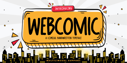 Webcomic - Comical Handwritten Typeface Font that will make your designs look modern, unique and fun. It’s perfect for labels, quotes, posters, DIY projects, branding, packaging, greeting cards, websites, photos, photography overlays, signs, window art, scrapbooking, tags and so much more!
 - Coldera by Haniefart,
$12.00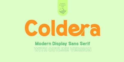 Coldera is a sans serif typeface deliberately modified to make it look beautiful, attractive and modern, available in uppercase, lowercase, ligature and alternative letters. Coldera is suitable for business brands, brochures, posters, magazines, comics, t-shirts, banners and many others.
 - Dreadful by Aiyari,
$14.00 Introducing a new layered typeface called Dreadful. Inspired from classic horror movie and vintage comic. Dreadful typeface best uses for headings, Logo type, quotes, apparel design, invitations, flyer, poster, greeting cards, product packaging, book cover, printed quotes, cover album, movie, etc.
 - Tekanan by San Studio,
$10.00 Tekanan Typeface is an experiment and designed by Zainul Faozi. Tekanan Typeface looks futuristic and it's a great choice to use on your designs, such as a shop sign, poster, cover, headline, and more. Designer: Zainul Faozi Publisher: San Studio
 - Grapple BRK Pro by CheapProFonts,
$10.00 Another very squarish and futuristic font from Brian Kent. This time I've kept the very thin style of the diacritics, but I have redesigned the A and H (and a couple of other letters and glyphs ;) - mostly to give them a little more "meat". And then added the usual plethora of accented letters for our unique language support, of course. Result! ALL fonts from CheapProFonts have very extensive language support: They contain some unusual diacritic letters (some of which are contained in the Latin Extended-B Unicode block) supporting: Cornish, Filipino (Tagalog), Guarani, Luxembourgian, Malagasy, Romanian, Ulithian and Welsh. They also contain all glyphs in the Latin Extended-A Unicode block (which among others cover the Central European and Baltic areas) supporting: Afrikaans, Belarusian (Lacinka), Bosnian, Catalan, Chichewa, Croatian, Czech, Dutch, Esperanto, Greenlandic, Hungarian, Kashubian, Kurdish (Kurmanji), Latvian, Lithuanian, Maltese, Maori, Polish, Saami (Inari), Saami (North), Serbian (latin), Slovak(ian), Slovene, Sorbian (Lower), Sorbian (Upper), Turkish and Turkmen. And they of course contain all the usual "western" glyphs supporting: Albanian, Basque, Breton, Chamorro, Danish, Estonian, Faroese, Finnish, French, Frisian, Galican, German, Icelandic, Indonesian, Irish (Gaelic), Italian, Northern Sotho, Norwegian, Occitan, Portuguese, Rhaeto-Romance, Sami (Lule), Sami (South), Scots (Gaelic), Spanish, Swedish, Tswana, Walloon and Yapese.
 - Freibeuter NR by Otto Maurer,
$23.00 FREIBEUTER NR is a typical Western font but this is based on a FAMOUS Motorcycle Club from the television that everyone knows. The word FREIBEUTER is the German version of pirate. FREIBEUTER did in earlier times what pirates do, but they do it with the government togetherness. NR stands for NIEDERRHEIN, this is the area where I live and work. The PATCH Version is the best way to make fast a nice Banner or Patch with this font. You can use the WrapTEXT tool in Illustrator or Photoshop to wrap the banner in al forms!
 - Linotype Compendio by Linotype,
$40.99Linotype Compendio is a part of the Take Type Library, chosen from the contestants of the International Digital Type Design Contests from 1994 and 1997. Christian Bauer designed this font based on the basic forms of Transitional faces of the 17th century. The outer contours of the letters are purposely raw and irregular, much like alphabets printed on low-quality paper. The legibility of the font is thus reduced, making it necessary to use this font only for shorter texts or headlines, but it is exactly this characteristic which lends Linotype Compendio its distinctiveness. - Romanson by Larin Type Co,
$15.00 Romanson - a modern display serif font with a lot of alternates and ligatures. This font can look more classic (conservative) serif, which is perfect for texts. So same he can be more expressive, playing and more modern with alternative substitutes and ligatures, try to play with them and you will get the uniqueness in your project. Just try to create a logo from uppercase, change them to create the best and harmonious and inimitable design. This font includes 205 Uppercase, 27 Lowercase alternates and 51 Ligatures.
 - Ugroh Black by Saffatin.co,
$12.00 Get ready to jazz up your design game with the brave Ugroh Display Black font include Italic! Armed with a whopping 260 glyphs, it's got all the languages covered and comes with a bonus of ligatures and alternative glyphs. So, whether you want to add a fancy twist or a subtle tweak, it's got you covered and will make your designs shine like a star! With its bold and modern look, Ugroh Display Black font is a perfect choice for any design project that requires a touch of elegance. Its clean lines and sharp edges will give your designs a professional look that will impress any audience. Whether you're creating a logo, a poster, or a website layout, Ugroh display black font will give your project a unique and stylish look. Its versatile character set makes it a great choice for a variety of design styles, from minimalistic to ornate. And with its extensive language support, you can be sure that your message will be heard loud and clear, no matter where your audience is located. So, why settle for a dull and uninspired design when you can jazz it up with Ugroh display black font? Try it out today and see your designs shine like never before!
 - Ingrid Font by Enrich Design,
$24.95This font was created from the handwriting of my friend Ingrid. I always felt she had great handwriting and this font is proof of this. There are for styles to choose from, a great alternative to the common handwriting fonts seen everywhere. - Marble by URW Type Foundry,
$59.99 Marble is part of Asterisk Type Collection by URW Type Foundry. Marble is a modern sans serif with a distinct character and comes in 108 styles plus Variable Fonts. It grew from the desire to create full bodied letters in contrast to the economy of most sans serif faces. Designed for corporate and publishing use it is rounded and approachable, its three styles (Condensed, Normal and Wide) range from slender elegance to warmth and playfulness without ever being informal. Designed by Alessia Mazzarella and Vaibhav Singh, Marble derives its character from the generous roundness of the x-heights which is balanced by the striking horizontal or vertical cuts to the terminals. The result is a readable font that encourages the eye to move from one shape to the next and that offers a range of possibilities for digital and print. The Marble family has nine weights in Latin for each variant. Eminently versatile, it’s ideal for establishing hierarchies of information with a wealth of choices for headlines, subheadings, captions and body copy styles that are all in harmony with each other. The Wide style allows headlines to be set with width and presence.
 - VLNL TpDuro by VetteLetters,
$30.00 VLNL TpDuro was designed by chef Martin Lorenz and Juanra ‘Wete’ Pastor. Its concept was inspired by an Albrecht Dürer design from 1525, which shows a system to construct a gothic lowercase letter. Following the logic of this lowercase construction, but not the traditional uppercase letters of regular fraktur (brokenscript) alphabets, some brand new upper case letters were designed. The 45 degree tilted square that forms the basis of the letters, is as square and hard as a cracker. And we love crackers. You can put cheese on them. The ‘pixel’ feeling of the downstroke was intensified by repeating the rotated square module as often as they could. All this resulted in a strong, dark typeface with a steady rhythm, with one foot in history and the other in modern times. It works well as a display typeface for short texts, headlines and logos. Music festivals and heavy metal bands should also pay attention. This is hard stuff.