10,000 search results
(0.068 seconds)
- CEREAL KILLERZ - Personal use only

- Erotica by Lián Types,
$49.00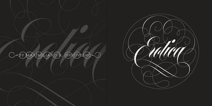 “A picture is worth a thousand words” and here, that’s more than true. Take a look at Erotica’s Booklet; Erotica’s Poster Design and Erotica’s User’s Guide before reading below. THE STYLES The difference between Pro and Std styles is the quantity of glyphs. Therefore, Pro styles include all the decorative alternates and ligatures while Std styles are a reduced version of Pro ones. Big and Small styles were thought for better printing results. While Big is recommended to be printed in big sizes, Small may be printed in tiny sizes and will still show its hairlines well. INTRODUCTION I have always wondered if the circle could ever be considered as an imperfect shape. Thousands of years have passed and we still consider circles as synonyms of infinite beauty. Some believe that there is something intrinsically “divine” that could be found in them. Sensuality is many times related to perfectly shaped strong curves, exuberant forms and a big contrasts. Erotica is a font created with this in mind. THE PROCESS This story begins one fine day of March in 2012. I was looking for something new. Something which would express the deep love I feel regarding calligraphy in a new way. At that time, I was practicing a lot of roundhand, testing and feeling different kinds of nibs; hearing the sometimes sharp, sometimes soft, sound of them sliding on the paper. This kind of calligraphy has some really strict rules: An even pattern of repetition is required, so you have to be absolutely aware of the pressure of the flexible pen; and of the distance between characters. Also, learning copperplate can be really useful to understand about proportion in letters and how a minimum change of it can drastically affect the look of the word and text. Many times I would forget about type-design and I would let myself go(1): Nothing like making the pen dance when adding some accolades above and below the written word. Once something is mastered, you are able to break some rules. At least, that’s my philosophy. (2) After some research, I found that the world was in need of a really sexy yet formal copperplate. (3) I started Erotica with the idea of taking some rules of this style to the extreme. Some characters were drawn with a pencil first because what I had in mind was impossible to be made with a pen. (4) Finding a graceful way to combine really thick thicks with really thin hairlines with satisfactory results demanded months of tough work: The embryo of Erotica was a lot more bolder than now and had a shorter x-height. Changing proportions of Erotica was crucial for its final look. The taller it became the sexier it looked. Like women again? The result is a font filled with tons of alternates which can make the user think he/she is the actual designer of the word/phrase due to the huge amount of possibilities when choosing glyphs. To make Erotica work well in small sizes too, I designed Erotica Small which can be printed in tiny sizes without any problems. For a more elegant purpose, I designed Erotica Inline, with exactly the same features you can find in the other styles. After finishing these styles, I needed a partner for Erotica. Inspired again in some old calligraphic books I found that Bickham used to accompany his wonderful scripts with some ornated roman caps. Erotica Capitals follows the essentials of those capitals and can be used with or without its alternates to accompany Erotica. In 2013, Erotica received a Certificate of Excellence in Type Design in the 59th TDC Type Directors Club Typeface Design Competition. Meet Erotica, beauty and elegance guaranteed. Notes (1) It is supossed that I'm a typographer rather than a calligrapher, but the truth is that I'm in the middle. Being a graphic designer makes me a little stubborn sometimes. But, I found that the more you don't think of type rules, the more graceful and lively pieces of calligraphy can be done. (2) “Know the forms well before you attempt to make them” used to say E. A. Lupfer, a master of this kind of script a century ago. And I would add “And once you know them, it’s time to fly...” (3) Some script fonts by my compatriots Sabrina Lopez, Ramiro Espinoza and Alejandro Paul deserve a mention here because of their undeniable beauty. The fact that many great copperplate fonts come from Argentina makes me feel really proud. Take a look at: Parfumerie, Medusa, Burgues, Poem and Bellisima. (4) Some calligraphers, graphic and type designer experimented in this field in the mid-to-late 20th century and made a really playful style out of it: Letters show a lot of personality and sometimes they seem drawn rather than written. I want to express my sincere admiration to the fantastic Herb Lubalin, and his friends Tony DiSpigna, Tom Carnase, and of course my fellow countryman Ricardo Rousselot. All of them, amazing.
 - Carpe Noctem by Hanoded,
$20.00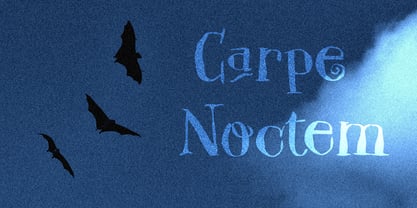 Carpe Noctem (Latin for ‘Seize The Night’), was a bit of a surprise. Someone asked me if I could create a lower case for my Closet Skeleton font. I began working on it and lo and behold, a beautiful font started taking shape. So, if you’re in need of a slightly scary fairytale font, complete with angled edges, swirly bits, a couple of alternate - even more curly - glyphs and an alternate medieval ampersand, then Carpe Noctem is your typeface!
 - Aquatory Serif by Gleb Guralnyk,
$14.00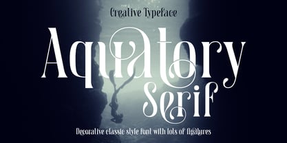 Hi, presenting a classic style font Aquatory Serif. It's a decorative classic style typeface with lots of ligatures and thin high contrast shape. A descent advantage of this font is a set of 75 ligatures for small letters. Aquatory Serif font supports most of the european languages and also has ukrainian cyrillic characters. *Make sure that "Standard Ligatures" feature is supported & enabled in your software. Also please consider that this feature is available only for english alphabet.
 - Color Paper by Artyway,
$16.00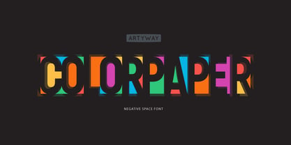 New expressive font "ColorPaper". It was made using the negative space of letters and it looks amazing! This design captures you with its originality and simplicity. Thoroughly selected geometric shapes make a piece of art out of every symbol. Unfold the full potential of this font, experiment with the color and get pleasant impressions. Production of an original and expressive design of a poster, title, logo, emblem using this font is very simple and fascinating. Make sure yourself.
 - Blackstripe by Mirror Types,
$15.00This font was inspired by the bricks of my wall, I stared at them all the time thinking, wouldnt be great if fonts live in cooperation with bricks, and then, it came to my mind…A font family that shows naked bricks, like it is RIGHT on the middle of design process. The main features are the informal and wired look that make it worthwhile for bands and informal invitations, flyers, for concerts or infantile designs. - Riky by Eurotypo,
$28.00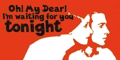 Riky is a heavy sans typeface carefully hand-drawn made, with different letter shapes, full of ligatures, and stylistic alternates that will provide great flexibility for your designs. Ricky's typeface is lively, dynamic and energetic. This font has an informal and decorative style. Riky fonts come in 2 versions: Shadow and solid. These fonts are quite perfect for packaging design, posters, children books and many other purposes. Play with them, be creative with them and enjoy them.
 - Difayuni by Twinletter,
$15.00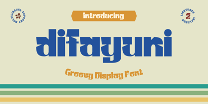 difayuni, the ideal font for all your design requirements, is now available! This elegant font is suitable for your readers because it is simple to read. It’s also ideal for branding, product packaging, or even just to add a little flair to your editorial work. Difayuni is a contemporary font with geometric shapes and accuracy that will add a touch of elegance to any design. Thus, stop delaying and incorporate difayuni into your designs right away!
 - Organa by TypeFaith Fonts,
$5.00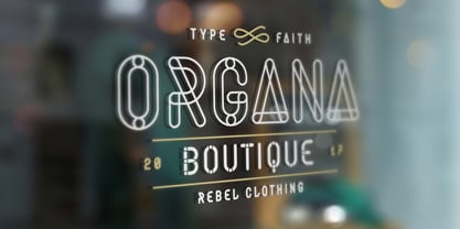 Now that we're done with the hipster stuff, the handwritten and the brush fonts, it is time for something new: Organa, a stylish geometric font family. Create a new feel for your designs. Organa is a unique and creative font that can be used for logo design and branding, posters flyers and book covers. Organa will help you to shake off the old feel and to create something new. It comes in three styles that are easy to combine.
 - Gingham by SilkType,
$47.50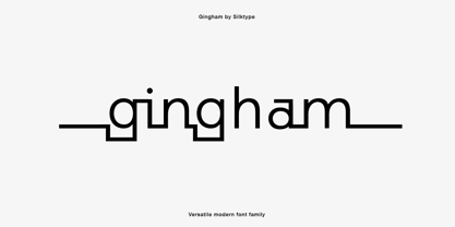 Gingham is a modern sans serif typeface. The unaltered version of the font is clean and classic. However, the font has multiple different options for alteration. Each letter has up to 8 different versions, which the user can choose from to make connections between letters and words, creating a completely new shape. The font also includes two stylistic sets, nr. 01 gives the overall feel of the text a more modern look and nr. 02 a more traditional one.
 - Floren by Alit Design,
$16.00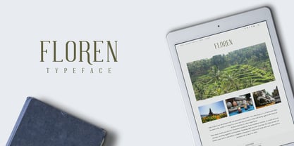 Introducing the FLOREN typeface, a simple and beautiful font made with persistence and passion. FLOREN typeface have a unique character when compared with the others serif font, it have special bracketed serif shape. Floren typeface is suitable for simple logo design, website header, menu fonts for website. to design fashion, and others who have a minimalist and simple concept. Features : • Character Set A-Z • Numerals & Punctuations (OpenType Standard) • Accents (Multilingual characters) you can find more previews on my Instagram
 - Zodchiy by Chvyalev,
$15.00 Cyrillic (and Latin) poster font is limited in composition by uppercase. Monumental, dry, ascetic. Designed for the design of posters, title pages of projects, signage, book covers, building facades. It is formed based on architectural and drawing fonts. It combines Russian traditions and modern trends. The shape of the letters varies from round wide to oblong narrow, in this contrast lies the idea of the font. At first glance, this contradictory decision finds harmony with closer acquaintance.
 - Wagnesday by Arterfak Project,
$19.00 don't think you're alone, watch your behind "Wagnesday" is a thriller-horror styled font, inspired by thriller movies and designed with an elegant touch of horror, and thrilling. This all-caps font adds a dark vibe to your designs, making them more attention-grabbing. With its bold and sharp font style, Wagnesday can be applied to various themes, including underground, gothic, sports, and even vintage designs. Wagnesday becomes even more versatile with the addition of stylistic alternates.
 - Belgia by HansCo,
$15.00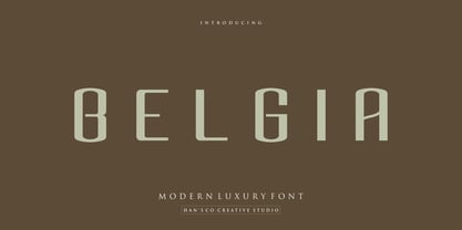 Here come our latest product with sans serif typeface called Belgia. This font has the characteristics of a rounded shape on each side. Besides this font is perfect for those of you who are looking for font with bold and rounded but still look classy. You can use it on corporate branding, logo, document, social media design, presentation, print design, web, etc. This typeface is comes in uppercase, lowercase, punctuation, symbols, numerals, etc also support multilingual.
 - Beau's Varsity by Beau Williamson,
$4.99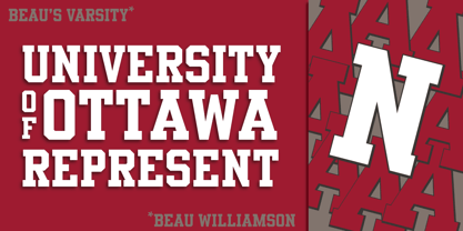 I designed this font a few years ago to address a direct problem. My work demanded small paragraphs of text to be screenprinted in a varsity font style. The house varsity was rather uneven and created small blobs of ink at sharp angles when printed. I designed Beau's Varsity to address both of these problems. The new font eliminated the blobbing, and I like to think my original design is a step up in evenness from the other options.
 - Austera Text by Corradine Fonts,
$30.00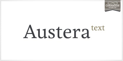 Austera Text is a clean and structural humanist font face whose purpose is to be clear while don't interferes with the message concept. Austera Text is a contemporary serif with moderate contrast, sharp shapes, fairly large x-height and moderate aperture with the aim to make it very legible in continuous text. The italic version has a unique appearance with its pronounced angle mixed whit its elongate beginning and ending strokes. Although Austera Text was created to be used in continuous text, it also could be applied to many other uses obtaining nice results, from editorial and corporate design to advertising, packaging and digital design. Austera Text has OpenType features such Old Style figures, standard and discretionary ligatures, ordinals and fractions. Composed of more than 500 glyphs, Austera Text supports Western European, Central/Eastern European, Baltic, Turkish and Romanian Languages.
 - akaFrivolity - 100% free

- Mariachi by FontMesa,
$25.00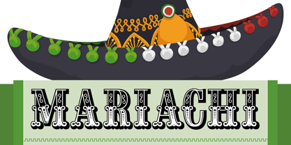 Mariachi is a new condensed version of our Maison Luxe font which is a revival of an old 1800's classic ornate French font. This new 2021 condensed version takes this old classic to an all new level by adding small caps, italics and a new solid black version. Mariachi is perfect for headlines and logos from advertising to product labels, t-shirt lettering and restaurant menus. Fill fonts are also part of this family, new to this font style is the half fill font for creating a two color effect on the letters, you'll need an application that works in layers to use the fill fonts in Mariachi. The regular fill font for Mariachi isn't meant to be used as a stand alone font so we've created a solid black version with thicker serifs on top and adjusted outlines throughout for a better appearance as a solo font. The difference between Mariachi and our Mi Casa font is that Mariachi has a squared off shadow on the top half of the letters. We hope you enjoy Mariachi as much as we did making it. Mariachi is a trademark of FontMesa LLC
 - Sica Condensed by dooType,
$30.00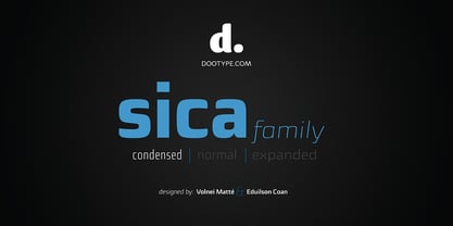 The Sica Family was designed in order to address issues related to technology, while maintaining humanistic forms. Thus, a font with square shapes emerged, but with smooth curves and slightly rounded terminals making it friendly. The family has three widths – condensed, normal and expanded – each of them with six weights and their respective italics, resulting in 36 fonts. With particular details and open shapes that increase legibility, it can be used for both text compositions as well for display sizes. It has 774 glyphs, covering more than 50 languages, as well as ligatures, lining, oldstyle, tabular and proportional figures, fractions, superiors, inferiors, and small caps, all of them accessible through OpenType features.
 - Camplones by Miracledsign,
$8.00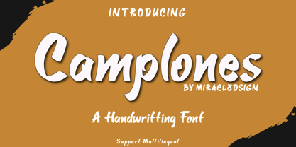 Camplones is a handwritten font that accentuates the style and curve of the hand when inking the ink on the paper by perfecting the shape of each character so that Camplones looks very beautiful when applied in a sentence. Camplones is specially shaped and made so that users feel the touch of a hand that lives in the character of the letters so that it has tremendous value when used in your templates, game fonts, wedding invitations or sales products which will surely be very attractive to consumers when they see it and will definitely love it. make the product look more elegant and will increase the selling value of your product.
 - Twentieth Century by Monotype,
$29.99 Twentieth Century was designed and drawn by Sol Hess in the Lanston Monotype drawing office between 1936 and 1947. The first weights were added to the Monotype typeface library in 1959. Twentieth Century is based on geometric shapes which originated in Germany in the early 1920's and became an integral part of the Bauhaus movement of that time. Form and function became the key words, unnecessary decoration was scorned. This clean cut, sans serif with geometric shapes was most appropriate. The lighter weights of the Twentieth Century font family can be used for text setting; the Twentieth Century bold and condensed fonts are suitable for display in headlines and advertising. Commonly spelled 20th Century.
 - Route 66 NF by Nick's Fonts,
$10.00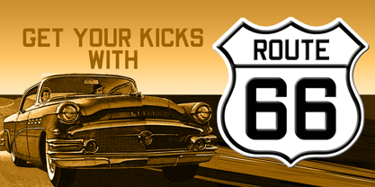 Statistics Prove. Near and Far. That Folks Who Drive Like Crazy. Are! Burma-Shave. In the days before the Interstate Highway system, you were likely to encounter a series of signs like this, somewhere in the backwoods between the large and small towns connected by the U.S. Highway system. The fonts in this series are based on the typefaces used on U.S. Highway signs from the 1930s to the 1950s. Included in each font are a sign shield in the backslash position, and a Burma-Shave logo in the section mark position. The Truetype and Opentype versions contain the complete Latin language character set (Unicode 1252) plus Central European (Unicode 1250) languages as well.
 - Sica Expanded by dooType,
$30.00The Sica Family was designed in order to address issues related to technology, while maintaining humanistic forms. Thus, a font with square shapes emerged, but with smooth curves and slightly rounded terminals making it friendly. The family has three widths – condensed, normal and expanded – each of them with six weights and their respective italics, resulting in 36 fonts. With particular details and open shapes that increase legibility, it can be used for both text compositions as well for display sizes. It has 774 glyphs, covering more than 50 languages, as well as ligatures, lining, oldstyle, tabular and proportional figures, fractions, superiors, inferiors, and small caps, all of them accessible through OpenType features. - Sica by dooType,
$30.00The Sica Family was designed in order to address issues related to technology, while maintaining humanistic forms. Thus, a font with square shapes emerged, but with smooth curves and slightly rounded terminals making it friendly. The family has three widths – condensed, normal and expanded – each of them with six weights and their respective italics, resulting in 36 fonts. With particular details and open shapes that increase legibility, it can be used for both text compositions as well for display sizes. It has 774 glyphs, covering more than 50 languages, as well as ligatures, lining, oldstyle, tabular and proportional figures, fractions, superiors, inferiors, and small caps, all of them accessible through OpenType features. - Lemands by Arterfak Project,
$18.00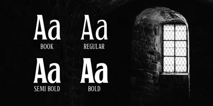 Lemands is a strong-sharp serif font in condensed height. Designed with medium contrast and inspired by the modern-classic typography and the High Octane Rock genre. The serif is quietly sharp and has assertive lines and curves, giving the letterform looks solid and strong as a display font. Lemands is a display typeface that is perfect for many purposes such as a headline, sub-headline, logo, and short body text for magazines, books, fashion, quotes, youth t-shirt, signboards, logos, and many more! Available in 4 weights: Regular - Book - SemiBold - Bold. A great choice for a brave concept! Zip file featured: Uppercase Lowercase Numbers Symbols Punctuation Standard ligatures Accents : ÀÁÂÃÄÅÆÇÈÉÊËÌÍÎÏÐÑÒÓÔÕÖØÙÚÛÜÝÞßàáâãäåçèéêëìíîïñòóôõöøùúûüýþÿ ĀāĂ㥹ĆćĈĉĊċČčĎďĐđĒēĔĕĖėĘęĚěĜĝĞğĠġĤĥĦħĨĩĪīĮįİıIJijĴĵĹ弾ĿŀŁłŃńŇňŌōŎŏŐőŔŕŘř ŚśŜŝŞşŠšŤťŦŧŨũŪūŬŭŮůŰűŲųŴŵŶŷŸŹźŻżŽžẀẁẂẃẄẅ Thank you, Ramz
 - HS Alhandasi by Hiba Studio,
$59.00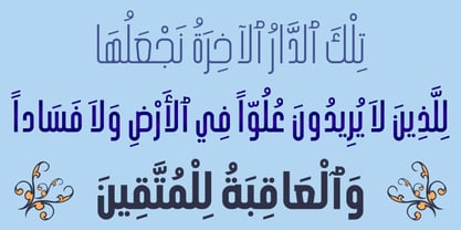 HS Alhandasi is an Arabic display typeface. It is useful for book titles and graphic projects where a contemporary, streamlined look is desired. The font is based on the simple lines of modern and simplified Kufi calligraphy, that support Arabic, Persian and Urdu. This font was created in the beginning as regular weight in 2007 for use in technical and engineering company. The company tends to follow the geometrical shape with equal dimensions in both vertical and horizontal storks. There is also a tendency to make all characters to be similar to oval shape with the impression that they are all geometrical and clear. I followed that with two other weights in 2011, thin and bold.
 - Longhorn by Belldorado,
$20.00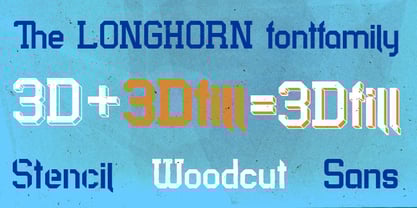 I saw a cool UT-Ligature on an old (maybe 70's or 80's) Texas Longhorns fan-shirt - it was in 3D and I wanted something like that with my own initials A and B to print it on a baseball hat. I started drawing it and when I was finished, I thought it might be nice to do the same for my officemates. I needed another G, T and K. After finishing that I thought it might be cool to do this for other people as well. Since the source of all the 3D glyphs is found in the regular ones which get moved by a 45 degree angle and then connected with lines , I first draw all the uppercase regular glyphs. The thing that followed was kind of an addiction: after finishing the uppercase letters, I wanted to add lowercase letters, after finishing the 3D letters, I thought it would be nice to have a fill version to layer with the 3D letters. Having a rough, woodcut version of the regular style would be cool, too. And the font is also pretty much suited to make a stencil version. When all this was done, I was interested on how the font would look like without the serifs and curves instead of the 45 degree angles, so I did the Longhorn Sans. Good to use for all sports-related designs, especially retro-style soccer/football shirts. Uppercase characters can be combined to form ligatures or logotypes.
 - Eymen Pro by Arodora Type,
$50.00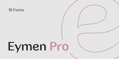 Eymen is a font that has both hard and fun dynamics. In fact, it was primarily dedicated to cool magazine paragraphs and content in the textile industry. But thanks to its large family structure, it can be used easily in many sectors and products. In addition, Eymen can be your companion in your heavy, aesthetic logo designs. In addition, the Eymen Pro family offers you alternative glyphs, ligarutes and more. Thanks to its wide character structure, it supports you for all kinds of languages.
 - Roadbrush by Kustomtype,
$25.00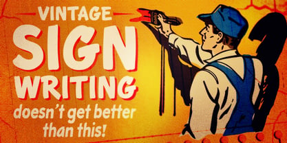 Roadbrush was inspired by the mid-20th-century hand lettering of Albert Eckhardt, Jr., that I found in a 1950’s sign painting book. Roadbrush is a retro brush-style script that I re-designed and completely re-mastered. Roadbrush is a powerful font that can be used for logotype, packaging, posters, T-shirts, signage & design projects with a retro & vintage feel. Roadbrush comes with four styles that contain all upper and lower case characters, punctuation, numerals and mathematical operators, as well as all accented characters.
 - Banchero by Jehoo Creative,
$25.00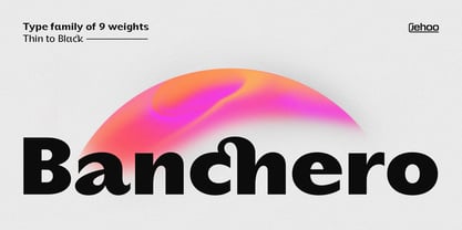 Banchero is inspired by charming vintage designs, bringing a relaxed and elegant feel to contemporary typography. The strong sans base features graceful discretionary ligatures between sensitive letters, so this font family is useful for all kinds of design needs from headlines to body, from posters to editorials, Banchero will stand out. Its power and versatility also comes from its 9 complete weights and each weight contains over 520 glyphs. These weights are carefully crafted and cut to achieve the best desired result for your next design.
 - Flank Steak by Mysterylab,
$17.00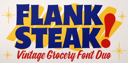 This duo of handlettered-style vintage Americana fonts is a versatile package that can not only provide that subtle secret sauce that transports the viewer back 60 or 70 years to the neighborhood grocery store, it's also capable of conjuring up a very forward-looking and relaxed modern vibe. Whether it's the extra bold mid-century signpainter style of the sans serif, or the quick-brush liveliness of the casual script, you'll find this versatile pair is a real go-to for a variety of great looks.
 - Metalizer by Rochart,
$49.00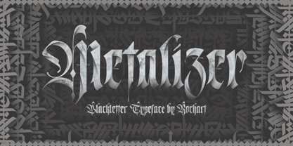 Metalizer sketched with calligraphy flat pen, then vectorized with Ai & generated with font creator. Inspired by the amazing style from Raghuveer G. Some Metalizer character is composed by broken strokes, adding a handmade feeling to this geometric kind of calligraphy. Metalizer contains some interesting alternates and ligatures that make this type more real. To enable the OpenType Stylistic alternates, you need a program that supports OpenType features such as Adobe Illustrator CS, Adobe Indesign & CorelDraw X6-X7. Guides to access all alternates glyph : http://adobe.ly/1m1fn4Y Cheers!
 - Balloon Bash by SavoringSurprises,
$10.00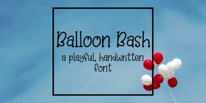 Balloon Bash is a hand lettered serif font. It's very playful and could be used for a variety of designs, such as a wooden sign or a kid's t-shirt! - Contains over 200 accented characters for language support. Some of the languages supported are: English, Spanish, Portuguese, German, Italian, French, Polish, Catalan, Irish, Norwegian, Croatian, Gaelic, and more! If you would like to know if a certain language is supported, please contact me with the language and/or any special characters you wanted to know about.
 - Revla Serif by Eclectotype,
$40.00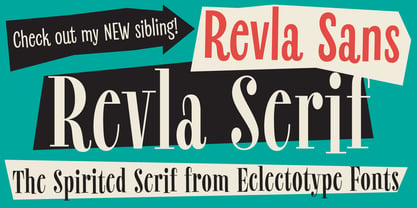 Meet Revla Serif, an unashamedly spirited font, with a spring in its step and a lust for life. Loosely based on a few letterforms from a mid century poster, it takes the feel of Madison Avenue print ads and runs with it. OpenType acrobatics ensure letters don't repeat monotonously, using the contextual alternates feature. Also included for your viewing pleasure - automatic fractions, case sensitive forms and one solitary stylistic alternate, an alternative ampersand. And that's it! Put the fun back into your text with Revla Serif.
 - Dubbel Zout by Hanoded,
$15.00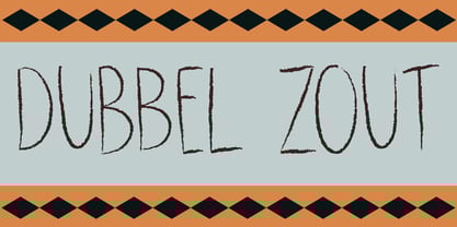 Dubbel Zout in Dutch means ‘Double Salt’. I admit, it sounds better in Dutch… Dubbel Zout is a kind of licorice which we (in Holland) love! Not many people actually like it, but I know of one addict in Denmark, who eats it by the bagful. Dubbel Zout is a ‘crayon-ish’ font - all caps, different upper and lower glyphs that you can mix and a royal assortment of diacritics. It may be an acquired taste, but once you get used to it, you’re hooked!
 - LOLO Dingcats by Okaycat,
$24.50LOLO Dingcats are here! Need some cats? Find just about any kind of cat you can imagine here. Not just a A-Z & 0-9 font, LOLO Dingcats has many extra characters. Check it out! There's a mother cat nursing kittens, a cat curled up sleeping, running cats and sleeping cats.There are black cats, white cats and striped cats. Even cats you might not expect: a pirate cat, a cat with an afro, even a robot cat -- and MORE! A must-have for any serious cat lover! - Relove by Storictype,
$17.00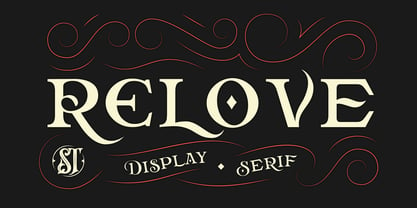 Relove typeface is a all caps typeface decorative-serif font embodying vintage and elegant curves with functional structure with a extra ornaments.it was inspired by natural forms and structures and the curved lines. with strong and sleek letters, which create a brilliant foundation for the flourished alternatives to rest. The result is beautiful interlocking and totally unique designs. Relove Typeface is great for any kind of display purpose from branding, emblem, advertising , t-shirt , etc you name it. Features : Uppercase Numbers & Punctuation Alternate 1 Alternate 2
 - Entitled JNL by Jeff Levine,
$29.00Way back before digital imaging, video tape and computer editing, the home movie enthusiast had to shoot on film his own titles using any one of a variety of movie titling kits on the market. One common approach was to arrange white ceramic letters on a colored background and film them. A set of such letters provided the inspiration for Entitled JNL from Jeff Levine. The classic, sleek Art Deco lines of this font makes it an all-purpose design for any headline needs. - Sekhmet by Three Islands Press,
$29.00Stylish, elegant, and alluring, Sekhmet got its name from the lion-headed war goddess of ancient Egypt. And the typeface does possess a kind of feline, forward-directed energy - a result of its calligraphic detailing combined with a very slight slope in the roman. Sekhmet is essentially a display face; still, it's as carefully crafted as any of the designer's text fonts and so also works well in reasonably large text blocks, especially at larger point sizes. Comes with a book-weight roman and calligraphic italic. - MB TyranT - Personal use only


