10,000 search results
(0.056 seconds)
- Martinaz by Typogama,
$19.00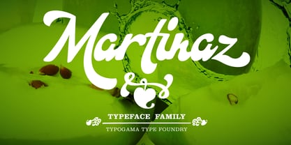 Martinaz is a retro inspired, bold script typeface created for use in logos, posters or packaging. Through the use of extensive Opentype features, this font offers variable letter combinations that can easily be integrated or mixed. An added feature is the inclusion of a few typographic fleurons that can either be used with the text or as icons in your design.
 - Valkyrie by Brave Lion Fonts,
$9.49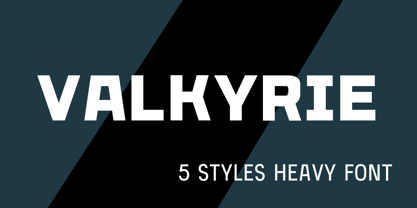 Valkyrie was designed following the idea to have realy strong letters taking a lot of room. This results in a heavy appearance and gives Valkyrie its special look. It is possible to give it an even more uniform look by using the alternate characters. What can a strong font be used for? Valkyrie hopes to break rules. Use its power.
 - Ongunkan Tolkien English Runic by Runic World Tamgacı,
$50.00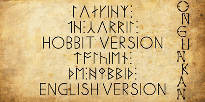 Cirth was invented by J.R.R. Tolkien for use in his novels. It is modelled on the Anglo-Saxon Runic alphabet, and is used to write the language of the Dwarves (Khuzdul) in The Hobbit and The Lord of the Rings in inscriptions in wood and stone. It is also used as a alternative alphabet for English. This font is english version.
 - Upstanding Pro by Multiformis,
$10.99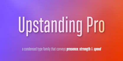 Upstanding Pro is suited for use as a display typeface, but legible enough to be used in small blocks of text (lighter weights), thus providing a lot of flexibility for all kinds of projects. Upstanding Pro conveys presence, strength and speed with the italics, yet conserving certain traces of sobriety and elegance. Want to make a statement? Use Upstanding Pro!
 - Fusione by Paweł Burgiel,
$38.00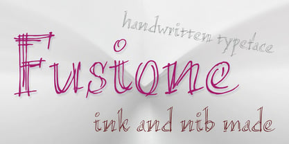 Fusione is a handwritten, informal, sketch-like typeface drawn by hand using ink and a sharp nib pen on smooth paper. It is useful for display, poster, books titling, advertising, and magazine work. Best used in Open Type apps, it has automatically exchanging alternates for better simulate true handlettering. Character set support Central and Eastern European as well as Western European languages.
 - Wagerton by PizzaDude.dk,
$20.00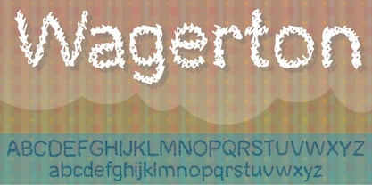 Wagerton is my very legible scribbled font! The fine scribbled details are very visible at large sizes, but also leaves a good impression when used in small sizes as well. Comes with ligatures for double letters and double numbers - along with alternative letters for both upper- and lowercase! You will need to use OpenType supporting applications to use the autoligatures.
 - Warm Thanksgiving by Mvmet,
$15.00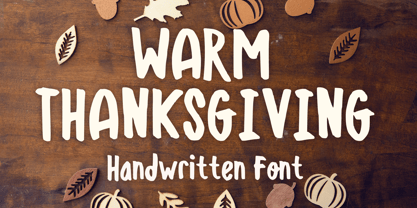 Warm Thanksgiving is a warm and fun font for your thanksgiving day, you can use it for everyday use too for its versatility. Create something with it from regular typing notes, to t-shirts, kids’ book designs, greeting cards, stickers, posters, or anything that needs a casual touch. Fall in love with its incredible style and use it to create lovely designs!
 - Fette Deutsche Schrift by Lamatas un Slazdi,
$35.00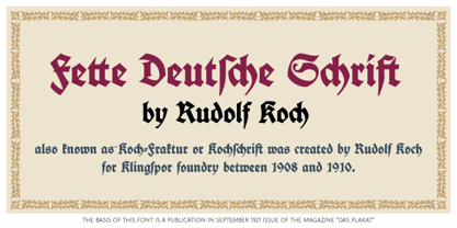 Fette Deutsche Schrift also known as Koch-Fraktur or Kochschrift was created by Rudolf Koch for Klingspor foundry between 1908 and 1910. The basis of this font is a publication in the magazine “Das Plakat” of September 1921. The font contains swash capitals to use as dropcaps, contextual alternates, glyphs for line endings, ligatures, discretional ligatures for use in German, ornaments and other OpenType features. It supports all the European languages using Latin alphabets (including slashed S and slashed long s used in Latvian old orthography till 1930s).
 - Side Black by Zamjump,
$19.00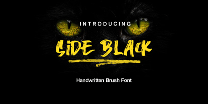 Side Back is a brush handwriting font following the correct writing rules in making brush letters. This font is a bit more unique because the lowercase style uses uppercase but there are some with lowercase style. Equipped with a ligature, and a wash to be used as a complement or sweetener to the design you make. very suitable for use in various designs, such as headers, websites, clothing, products, even for writing quotes. Congratulations on exploring your design using black side fonts. Included : - Multilingual support - Ligatures - Swash -character symbols
 - Dissident by Ronny Studio,
$25.00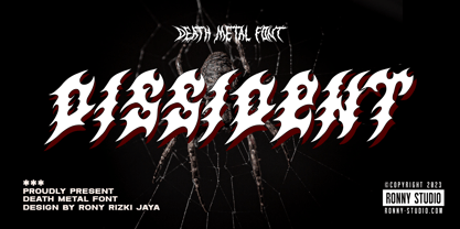 Dissident Font is a cool alternative for you to easily create your Underground band logo or whatever. Using alternative fonts and ornaments will liven up the font and will look cooler and fiercer. It comes with a basic character set and a small group of symbols and signs frequently used in the extreme music sector - Death- and Blackmetal classics such as pentagram drops, roots, wings and more. Features : - All Caps - numbers & punctuation - Multilingual - PUA encoded Please contact us if you have any questions. Enjoy Crafting and thanks for supporting us! :) Thank you
 - Jaxell by Twinletter,
$14.00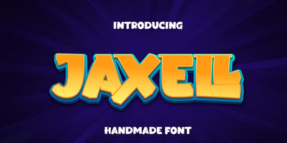 Jaxell is a whimsical display typeface with distinct and unique qualities that may be used as the title of your project, and it’s also lovely when used in sentence text. This font is perfect for games, sporting events, branding, banners, posters, movie titles, book titles, quotes, logotypes, and more. of course, your various design projects will be perfect and extraordinary if you use this font because this font is equipped with a complimentary font family, both for titles and subtitles and sentence text. start using our fonts for your amazing projects.
 - Alcantera by Typebae,
$15.00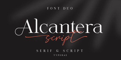 Alcantera Font Duo is a stunning pair of fancy script and serif fonts. These typography are designed to contrast and complement each other with elegant beauty and contemporary style. Use Alcantera Font Duo to create beautiful wedding invitations, beautiful stationery art, great social media posts, cute greeting cards and much more. To use the stylistic alternate, beginning and ending swashes you don't need to use software that supports opentype, because we have made it separately so it's very easy to use. Features: Stylistic Alternate, Ligature, Swashes, Multilingual & PUA Encoded
 - Fabbabi by astroluxtype,
$20.00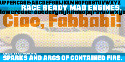 Fabbabi is a vintage bold retro-font suggested uses would be for headlines that catch the eye. The glyphs are hard edged with soft corners that makes for a fun playful look in the uppercase version and an useful display font using the lowercase letterforms for subheads and the like. Slightly condensed, this bold font applied to projects that need an attention grabbing headline but expresses the fun of the info being convened. Best used larger than 42 points in size. Fabbabi is a wonderful, beautiful and fabulous big baby of a font- Ciao!
 - African Textile by Scholtz Fonts,
$19.00The African Textile font had two major influences. The pattern is derived from the bogolan cloths from Africa, originally made using a traditional dyeing technique from Mali that uses bogo or clay as prime dye material. The character shapes are largely based on the Tabwa font. The font is best used as a heading or poster font, although the boldness of the design allows it to be useful at medium sizes, as subheadings as well. It is professionally letter-spaced and kerned and contains a complete character set. - Ryo Text PlusN by Adobe,
$79.00Ryo is a Japanese kana typeface design composed of hiragana, katakana and some punctuation marks. Available in four weights--extra light, light, regular and medium, Ryo Text has been specifically designed for use when producing text settings. Supplied in the cross-platform OpenType format, this special kana font can be used to supplement or replace the existing kana designs in existing Japanese fonts that contain full character sets. Creative professionals using the Japanese version of Adobe InDesign may use that program's Composite Font tool to easily combine Ryo Text with other typefaces. - Sedifo by Twinletter,
$15.00 Introducing our newest display font, Sedifo, which has a fun, cheerful, and unique font. When used in conjunction with other fonts in our collection, it gives you the ability to create unique, captivating, and highly impressive visual displays. This multipurpose font will be very easy for you to use in your various projects. of course, your various design projects will be perfect and extraordinary if you use this font because this font is equipped with a font family, both for titles and subtitles and sentence text, start using our fonts for your extraordinary projects.
 - Bhoory by Twinletter,
$15.00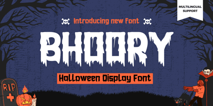 Bhoory Halloween Font is a bold font that will help you create powerful text or logos and designs for your Halloween-themed projects. Use it to create invitations, flyers, and posters, or use the font as a headline or just a decoration. You can use this font to depict Halloween in an artistic or spooky way while showing your creative talents. Of course with this font your various design projects will be perfect and amazing, get a beautiful title and start using our font for your special project.
 - Eloquence by Monotype,
$31.99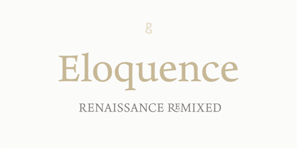 Eloquence has a modern aesthetic with a strong classical influence – this is the “Renaissance Remixed”. While being inspired by the first printed texts of the Renaissance period, this typeface has contemporary features such as a high x-height, open bowls and counters, along with razor-sharp serifs and terminals. It has been designed specifically for creating a pleasant reading experience. With a comprehensive character set, Eloquence can comfortably handle printed documents such as novels, magazines, annual reports, along with their equivalent online/digital formats. This 14-font family also has a few tricks up its sleeve by means of some neat, complementing discretionary ligatures and alternates that will prove to be useful embellishments to your typography. Small Caps are included too, along with corresponding diacritics meeting the Latin Extended specification. You can view more details, design examples, and a specimen PDF at eloquence-font.com Key Features: • 14 font family – 7 weights in Roman and Italic • Small Caps, Alternates, Ligatures, with Proportional, Old Style, Small Cap, Fractions, Numerators, Denominators, Superior, and Inferior Figures • Full European character set (Latin Extended) • 900+ glyphs per font.
 - Daitengu by Hanoded,
$15.00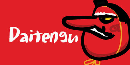 I have always been fascinated by Tengu - a mythical creature from Japan. Tengu are usually depicted with a red face, a very long nose, white moustaches and a funny hat. They used to be regarded as harbingers of war, but over the centuries, their image softened and they became the protective spirits of mountains and forests. Daitengu means ‘greater tengu’ and stems from the Genpei Jōsuiki - an extended version of the ‘The Tale of the Heike’ - an epic account of the struggle between the Taira and Minamoto clans for control of Japan. So, now you know about tengu, end of the history lesson! Daitengu is an epic brush font. I made it with a soft brush and China ink (like most of my brush fonts), but instead of forming the glyphs I saw in my head, I let the brush do the work. A more ‘zen’ approach to brushwork if you will! The result is a messy, organic brush font with a lot of spirit. Comes with diacritics and double letter ligatures.
 - AmpleNuSoft by Soneri Type,
$50.00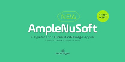 AmpleNuSoft is a display type family derived from the AmpleNutypeface by softening the edges. It has optical mono-linear stroke and a bit squarish form in nature. It has a seamless stroke movement instead of sharp angles formed by the junction of two strokes, which is a prominent feature of its design. It is designed to be a little eye-catching yet legible. It has clear and distinguishable letterforms, which help to elaborate and emphasize the message. It is graphically strong and commands the viewer's attention. The overall appearance of type is suitable for setting and using it as heading, title, headline, logotype, etc. The type family consists of twelve styles which include six upright weights and their italics. AmpleNuSoft has a bit more squarish counters and angles than Ample typeface, it even has straight terminals while Ample has a slight curve. In addition to this, few characters have some major or minor changes and the letter ‘g’ plus ‘y’ and their respective diacritics have alternate style variations. AmpleNuSoft is designed by Aakash Soneri during the period between 2020-2021.
 - Gradl Highstep by HiH,
$8.00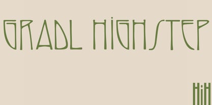 Gradl Highstep is an archetypical Art Nouveau face by the prolific and mysterious Max Joseph Gradl. It epitomizes the visual language of elegance and sophistication. It seems strange that so little information is available today about Max Gradl: He seems to have been well known in his day. In addition to his jewelry design, he did advertising work for customers in Naples, London and New York in addition to customers in cities all over Germany. Gradl Highstep is an all-cap font with a wide range of ligatures: 094=SA, 123=CH, 125=CK, 126=TS, 167=FA, 172=PA, 177=TA, 188=WA and 190=YA. In addtion, 137=Gradl’s dated monogram “MJG 1903,” 175=LLC abbreviation, 181=alternate S. This is a subtle font with thin, variable strokes. It is best used at 28 points and larger to give it the presence it needs to be be appreciated. Gradl Highstep Initials is a companion font, incorporating a deft line drawing of a fashionable woman of the period who is every bit as elegant as the underlying font.
 - Wolverton by Greater Albion Typefounders,
$10.00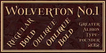 The extensive Wolverton family was inspired by a turn of the 20th century luggage label designed by the London and North Western railway. The Wolverton family combines period flair and charm with respect for the modern need for legibility and purposefulness. The family has at its heart four Body text faces (regular, italic, bold and bold italic). These are complimented by three display text faces, offering upper and lower case letter forms, all offered in regular, oblique, bold and bold oblique forms. Four all-capital based display design are also included if offered in the same four style, making an extensive and flexible family suitable for a wide range of uses; everything from setting large amounts of text to large scale signage and poster work. Wolverton offers a unique blend of charm an modern flexibility, why not give it a try today? All faces include lining and old style numerals and are extensively kerned. Individual faces are all economically priced and substantial discounts offered for the purchase of larger sets of typefaces.
 - AmpleNu by Soneri Type,
$50.00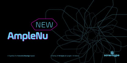 AmpleNu is a display type family derived from the Ample typeface. It has optical mono-linear stroke and a bit squarish form in nature. It has a seamless stroke movement instead of sharp angles formed by the junction of two strokes, which is a prominent feature of its design. It is designed to be a little eye-catching yet legible. It has clear and distinguishable letterforms, which helps to elaborate and emphasize the message. It is graphically strong and commands the viewer's attention. The overall appearance of type is suitable for setting and using it as heading, title, headline, logotype, etc. The type family consists of sixteen styles which include eight upright weights and their italics. AmpleNu has a bit more squarish counters and angles than Ample typeface, it even has straight terminals while Ample typeface has a slight curve. In addition to this, few characters have some major or minor changes and the letter ‘g’ plus ‘y’ and their respective diacritics have alternate style variations. AmpleNu is designed by Aakash Soneri during the period between 2018-2020.
 - Salty Milky by Yumna Type,
$15.00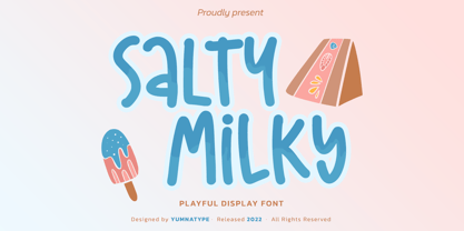 Salty Milky is a display font in thick weights to be your best choice for showing casual, charming, fun expressions. The uneven proportions and forms of the artistic letters add more attractiveness to this font. Furthermore, Salty Milky gives you a special bonus called the clipart. Use this font for big text sizes for a legibility reason and you can make use of the interesting features available here as well. Features: Multilingual Supports PUA Encoded Numerals and Punctuations Salty Milky fits for various design projects, such as posters, banners, logos, magazine covers, quotes, headings, printed products, merchandise, social media, etc. Find out more ways to use this font by taking a look at the font preview. Thanks for purchasing our fonts. Hopefully, you have a great experience using our font. Feel free to contact us for further information when you have a problem using the font. Thank you. Happy designing.
 - Pixel Grid by Caron twice,
$39.00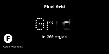 Pixel Grid is a font that lets us know that we have entered the digital age. We know about grid systems from the very first computers and electronic LED boards. Pixel Grid offers three types of grid resolution as well as many incarnations of individual segments. It is an electronic game: characters can be animated, overlapped, and played with in different ways. If you need a font that is strictly technical in nature, you can use tried-and-true square and round points. You can save ink by using them on receipts, for example, so the font can be used sustainably. Pixel Grid is suitable for engraving, or it can be used as a stencil. This complete font family aims to gain an extensive selection covering the early digital font style, facilitating the use of the style in professional applications today. Specimen: http://carontwice.com/files/specimen_Pixel_Grid.pdf
 - Honey Splash by Yumna Type,
$15.00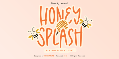 Honey Splash is a stylish display font to express unique, fun impressions focusing on various line style combinations in friendly curves. Furthermore, the different shapes and heights makes the font visually unique. In addition, Honey Splash gives you a special bonus called the clipart. Use this font for big text sizes for a legibility reason and make use of the available interesting features to beautify your designs as well. Features: Multilingual Supports PUA Encoded Numerals and Punctuations Honey Splash fits for various design projects, such as posters, banners, logos, magazine covers, quotes, headings, printed products, merchandise, social media, etc. Find out more ways to use this font by taking a look at the font preview. Thanks for purchasing our fonts. Hopefully, you have a great experience using our font. Feel free to contact us for further information when you have a problem using the font. Thank you. Happy designing.
 - 1769 by Almarena,
$22.00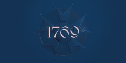 1769® Display is an elegant and modern serif typeface inspired by the history of France and more particularly the Romantic movement (1700s and 1800s). The roundness of its characters and its numerous ligatures reflect the grace, refinement and sensitivity that were omnipresent during the 18th century. Its name refers to the birth of Napoleon Bonaparte, the fascinating or revolting emperor, the emblematic figure of this period.
 - Relampago NF by Nick's Fonts,
$10.00This distinctive titling face is based on Elegant Lichte, designed by Hans Möhring for D. Stempel in 1928, with the helpful addition of a lowercase not found in the original. It functions equally well as either a period piece or a contemporary masterpiece. Both versions include the complete Latin 1252, Central European 1250 and Turkish 1254 character sets, as wellas localization for Moldovan and Romanian. - Display Digits One by Gerald Gallo,
$20.00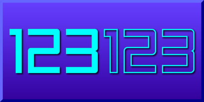 Display Digits One is a display number font with eight sets of variations of the same digits. The digits 0 through 9, with period and comma in appropriate variations, are prepared as (1) solid, (2) outline, (3) solid with contour outline, (4) outline with 3-D shadow, (5) 3-D shadow only, (6) outline with drop shadow, (7) positive in circle, (8) negative in circle.
 - Display Digits Six by Gerald Gallo,
$20.00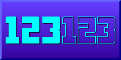 Display Digits Six is a display number font with eight sets of variations of the same digits. The digits 0 through 9, with period and comma in appropriate variations, are prepared as (1) solid, (2) outline, (3) solid with contour outline, (4) outline with 3-D shadow, (5) 3-D shadow only, (6) outline with drop shadow, (7) positive in circle, (8) negative in circle.
 - Johabu by Monotype,
$29.99Johabu is based on Gebrochene Fraktur, a lighter softer sort of type, compared to the German forms of the same period. Johabu was drawn by Johannes Bureus, around 1620, cut and cast by Peter van Selow in Stockholm. Johannes Bureus, archaeologist and linguist, designed and let Selow cast runes in 1598, and he became the first Swedish keeper, archivist, of the National Record Office State Archives. - Display Digits Four by Gerald Gallo,
$20.00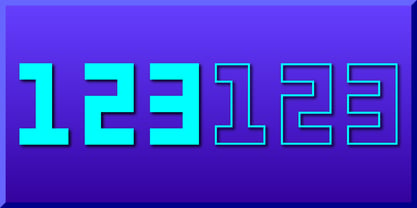 Display Digits Four is a display number font with eight sets of variations of the same digits. The digits 0 through 9, with period and comma in appropriate variations, are prepared as (1) solid, (2) outline, (3) solid with contour outline, (4) outline with 3-D shadow, (5) 3-D shadow only, (6) outline with drop shadow, (7) positive in circle, (8) negative in circle.
 - Ink Spots JNL by Jeff Levine,
$29.00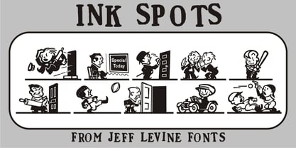 For decades, spot illustrations - whether by hot type, photoengraving, clip art or (in later years) digital means provided decorative and often lighthearted breaks in reading printed copy. This collection of twenty-six cartoon images has been meticulously re-drawn in digital format from 1920s-1930s era source material. By adding a simple caption underneath a design, your ad copy can be enhanced with these wonderful period pieces.
 - Perigord by Scriptorium,
$18.00Perigord has mixed origins. It was inspired by Gutenberg’s capitals and by lettering developed by German designer Ernst Bentele, but its calligraphic antecedents go back to French initials of the Carolingian period. The result of this is a formal, attractive and antique look which we hope you'll like. The full version includes alternate forms for many of the letters, as well as numbers and punctuation. - Wittenbach by Scriptorium,
$18.00Wittenbach is based on lettering by Rudolf Koch which really embodies the essence of classic gothic-style poster lettering of the 1920s. It brings together the traditional style of gothic lettering and a strong, more modern sensibility characteristic of Koch's work and his era. It is very vertical and stylized, but also extraordinarily attractive without the harshness of many of the designs of that period. - Gjallarhorn by Scriptorium,
$18.00Gjallarhorn is based on uncial-style lettering by artist Willy Pogany from his titles for Padraig Colum's classic collection of Scandinavian myths, The Children of Odin. It has various peculiar letter forms, and the font includes two or more different versions of many of the characters. An excellent example of stylized hand lettering by one of the great decorative artists of the Art Nouveau period. - Granville by Greater Albion Typefounders,
$14.95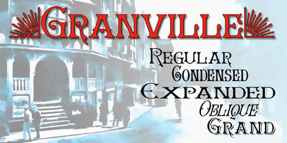 Granville, is inspired by traditional British (and transatlantic) shop signage. It's an elaborate confection, drawing on Roman and Blackletter influences and is ideal to give any project an instant Victorian feel. Granville is offered in Regular, Condensed and Expanded widths as well as an oblique form and a yet more decorative 'Grand' form. These faces are especially suitable for posters, period advertising, Chapter headings and signage.
 - Display Digits Seven by Gerald Gallo,
$20.00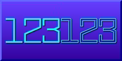 Display Digits Seven is a display number font with eight sets of variations of the same digits. The digits 0 through 9, with period and comma in appropriate variations, are prepared as (1) solid, (2) outline, (3) solid with contour outline, (4) outline with 3-D shadow, (5) 3-D shadow only, (6) outline with drop shadow, (7) positive in circle, (8) negative in circle.
 - Renard Moderne NF by Nick's Fonts,
$10.00Twentieth Century Poster, designed by Sol Hess for Lanston Monotype in the 1940s, provided the inspiration for this family of faces. Although, historically, the design falls outside the time period normally considered the Art Deco era, its sensibilities are pure Art Moderne. Both versions of this font contain the Unicode 1252 (Latin) and Unicode 1250 (Central European) character sets, with localization for Romanian and Moldovan. - SK Sistematica by Shriftovik,
$32.00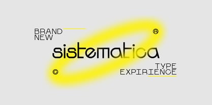 SK Sistematica is a unique modular geometric font. It combines the experimental features of the constructivist period and the strict consistency inherent in the grotesques. SK Sistematica is adapted to modern needs and technologies, which allows it to be easily combined with current design trends. The font is suitable for a wide range of applications: from corporate identification to advertising graphics, from web design to typographic design.