10,000 search results
(0.066 seconds)
- Lightron by Sensatype Studio,
$15.00 Newon is an Unique Neon Light Font with Floating shape make your design look unique and modern A new Display Font that we created special for Headline, Title and more stand out typography needs, with extra ligature that will add your variations. It's so perfect to add your style and headline overview. And specially for this font, we crafted for unique style and modern feels so enjoy to create any project that will show your main idea out. Newon Neon Light Font ready with: Any options to get creative variations (combination of Ligature Characters) Preview as a inspirations that you can do with this font Ready with Uppercase & Lowercase characters Wish you enjoy our font. :)
 - Attack by Sensatype Studio,
$15.00 Attack is Corporate Logo Sans Serif Font is a well-balanced modern font with a minimalist, unique, and iconic sans serif, font that you can combine to get any variations and unique shapes easily just in seconds with choose ligatures of them. It is a sans serif font with minimalist style that perfect for branding projects, logo, poster designs, social media posts, advertisements, product packaging, product designs, label, photography, watermark, invitation, stationery, and any projects, it makes with a high level of legibility. What's Included: 9 Weights Attack font Ligature Characters Character set A-Z Numerals & Punctuation Accented Characters (West Europe) Works on PC & Mac Recommended using Adobe Illustrator or Adobe Photoshop. Wish you enjoy our font. :)
 - Grave Ornamental by Intellecta Design,
$25.95Grave is a Intellecta's best seller, a classic font design remastered, distressed and antique, merging the bodonian style with tendrils and victorian ornaments. Ideal to use in in display purposes for a stylized type design. Its family of fonts has too Grave Ornaments , a dingbat/decorative display font featuring many different styles of flourishes and ornaments, great for a vintage antique feel. Completes the collection Grave Plus , where six different fonts has different styles of victorian fleurons and ornaments merging with a bodonian shaded typeface in great style. A beautiful and big family, available single or in pack with an attractive price. - Painless Feedback by Bogstav,
$15.00 Here you go...a handmade sans font without much of surprise...actually, this is how I draw letters with my eyes closed...well, almost! I wanted to make a font with letters that were pretty obvious, but had that handmade look that I love so much. The result is this really painless font - it won't hurt or scare anyone, but it could help making your handmade things (such as posters, postcards, flyers, books and alike) come more alive! Anyway, I've added 3 different versions of each lowercase letter...just to add some spice to the painlessness of the font!
 - Raqilla Kids by Zamjump,
$15.00 Introducing Raqilla Kids - Playful Display Font Raqilla Kids is a display font with a cute character. This is a kids themed font look, inspired by children's writing in general, with a shape that looks irregular but is very distinctive, these characters will add a warm touch to any look. Add this beautiful display font to your every creative idea and see how it makes them stand out! FEATURES - Uppercase - Lowercase - Numbering - Punctuations - Ligature - Alternate - Swash - Multilingual Support - Works on PC or Mac - Simple Installation - Support Adobe Illustrator, Adobe Photoshop, Corel Draw, also works on Microsoft Word Thanks
 - Bekorg by Twinletter,
$14.00 Bekorg is a graffiti-themed font with an unusual and weird shape, yet its application was developed with neatness and harmony in mind. Use this font in your projects to create a cool style that will instantly capture and amaze your audience. This graffiti font is great for product logos, poster titles, headlines, packaging, film titles, logotypes, gorgeous writing, and trendy graffiti designs, among other things. Of course, if you utilize this font in your numerous creative projects, they will be perfect and outstanding. Use this typeface right away for your one-of-a-kind and remarkable projects.
 - Grave Plus by Intellecta Design,
$29.90 Grave is a Intellecta's best seller, a classic font design remastered, distressed and antique, merging the bodonian style with tendrils and victorian ornaments. Ideal to use in in display purposes for a stylized type design. Its family of fonts has too Grave Ornaments, a dingbat/decorative display font featuring many different styles of flourishes and ornaments, great for a vintage antique feel. Completes the collection Grave Plus, where six different fonts has different styles of victorian fleurons and ornaments merging with a bodonian shaded typeface in great style. A beautiful and big family, available single or in pack with an attractive price.
 - Caught by Sensatype Studio,
$15.00 Caught is Unique Vintage Serif font with a fancy, unique, and vintage serif, font that you can combine to get any variations and unique shapes easily just in seconds with choose alternates of them. It is a serif display font with moderate contrast that perfect for branding projects, logo, wedding designs, social media posts, advertisements, product packaging, product designs, label, photography, watermark, invitation, stationery, and any projects, it makes with a high level of legibility. What's Included: Character set A-Z Numerals & Punctuation Accented Characters (West Europe) Works on PC & Mac Recommended using Adobe Illustrator or Adobe Photoshop. Wish you enjoy our font. :)
 - OTC New York by OTC,
$39.00 OTC New York is a geometric sans serif font family with support for Latin, Cyrillic and Greek. The display font comes in 18 styles, 9 weights (including italics) and as a variable font which supports two axis variability: weight and italic. It’s ideal for branding, logos, headlines, editorial design, packaging, web and television use. The font family is inspired by the Bauhaus school with its simplified geometric form, balanced layout, harmonious geometric shapes that are simple but strong. OpenType features contain stylistic alternates (for A, a, e & g); old style figures; fraction figures; subscript, superscript, numerator and denominator figure position and tabular figures.
 - Morn by Wahyu and Sani Co.,
$20.00 Morn is a sharp geometric sans font with roman proportion. Every characters are essence from a rectangle (square), a circle and a triangle with require little adjustment to make them appear optically equivalent. This font is equipped with some OpenType Layout Features such as fraction and ligature and the default layout for numbers is proportional lining, but can be changed as tabular lining. So the space between numbers looks more even. Morn has total 20 fonts which are upright and oblique. Each font has 460+ characters, and it supports many Latin languages such as Western Europe, Central/ Eastern Europe, Baltic, Turkish, Romanian.
 - Qukiha by Twinletter,
$15.00 Looking for the perfect font for your next gothic project? Do not look elsewhere than QUKIHA! A great place to look for fonts for your most recent logo, label, badge, music video, or movie is the QUKIHA Blackletter font. You can select the ideal word for your project by choosing from the beautiful and harmonious shapes available in the QUKIHA font. The capital letters are impressive, and the letters are slick and fashionable. QUKIHA Blackletter is a necessity if you’re designing labels, posters, or other things. They are also of a professional caliber, making them ideal for any design task.
 - Kinure by Twinletter,
$15.00 Look no further KINURE from Blackletter for the perfect Gothic font! This is a professional-grade font that you should use to design Labels, Retro, Stamps, Badges, Oktoberfest Posters, or anything else. It’s perfect for any kind of project that needs a bit of a gothic touch. Plus, it comes in a variety of beautiful, harmonized shapes so you can use the perfect word for your project. Whether you’re looking for a font for your logo, label, or badge, or you’re looking for a font for your latest music video or movie, KINURE Blackletter is the way to go!
 - Elanrose by Keristyper Studio,
$14.00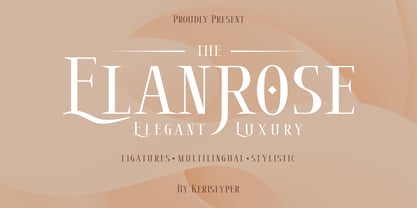 Introducing the modern-style serif font Elanrose with an elegant and luxurious feel in every shape. This font is good for logo design, Social media, Movie Titles, Books Titles, short text even long text letters, and good for your secondary text font with sans or serif. Featured: Standard Uppercase & Lowercase Numeral & Punctuation Multilingual : ä ö ü Ä Ö Ü ß ¿ ¡ Alternate & Ligature PUA encoded We recommend programs that support the OpenType feature and the Glyphs panel such as Adobe applications or Corel Draw. so you can use all the variations of the glyphs. Hope you enjoy our fonts!
 - Triplepass by Shapovalov Fonts,
$10.00 Triplepass is a narrow grotesque with 3 styles: normal, with cut corners and a stencil shape. The font has a retro character, contains both humanistic rounded designs and modern smooth alternatives. The font is suitable for logos, large headlines, posters, signs, prints, font compositions, as well as for sports-related layouts where clear numbers and space savings are needed. Triplepass contains extended Latin, Cyrillic, fractions, ligatures and two icons of a basketball. It contains OpenType features: liga, numr, dnom, calt, ss01, ss02. The font is also case sensitive, has fractions, currency signs including the rouble sign.
 - SK Nomerok by Shriftovik,
$48.00 SK Nomerok is an elegant geometric font with a minimalistic design. A unique pattern of symbols in a compartment with a strict classical design creates a strong and reliable structure, ideal for modern design. The sharp and angular letters of SK Nomerok are easy to read both on the screen and when printing. The geometric elements of the font are complemented with unique details, which adds to its originality and attractiveness. This font is perfect for branding, headlines and decorative text, adding modernity to any project. The font is multilingual and supports both extended Latin and Cyrillic character set.
 - Gautters Mickey by Creative17studio,
$18.00 Introducing : "Gautters Mickey" is a unique modern serif font. comes with a large selection of alternative characters and ligatures. The distinctive shape of each character makes this font even better for any design, both personal and corporate. Create your own unique design by using this font. very suitable for formal and informal use. Available in two types of styles: regular & italic. Features : 1. standard character set 2. multilingual support 3. numbers and punctuation marks 4. many ligatures and alternatives What are you waiting for, get this premium font right away. Free updates. Any questions? just ask. Thank you
 - Nettle Sans by Duck Soup Design,
$11.00 Influenced by Blackletter type and highway fonts, the Nettle Sans font family sets out to be both a quirky and confident headline font (at the heavier weights), and an easily legible body font for print or screen (at the lighter weights). Careful attention was taken in choosing distinct shapes for each letter to maximise legibility, and to balance a daring experimental form with function. Through its brutal angled cuts out of the ends of tapered links, ink-traps, ascenders and descenders, Nettle Sans' defining motif offers a visual language that communicates speed, efficiency, advancement and the "cutting edge".
 - Couturier by Latinotype,
$29.00 Couturier font is all about haute couture: classy ready-to-use characters for each project, perfectly drawn curved shapes and well-balanced counterforms. Elegantly embroidered ligatures, alternative glyphs and beautiful swashes give the font an extremely elegant look. Couturier comes in 4 weights, ranging from Regular to Black, with matching italics, resulting in a total of 8 fonts that help you achieve a strong composition in your publishing projects. Its true italics with a humanist feel give each design a chic personality. The font contains a set of more than 1,200 characters that support over 200 languages.
 - REVOKA by Twinletter,
$15.00 Revoka is a display typeface with the notion of an Asian font with unique and modern traits. Fonts with unusual shapes will brighten up your project and give it a unique pattern, giving it an attractive, appealing, and natural feel. Logotypes, food banners, branding, brochure, posters, movie titles, book titles, quotes, and more may all benefit from this font. Of course, using this font in your various design projects will make them excellent and outstanding; many viewers are drawn to the striking and unusual graphic display. Start utilizing this typeface in your projects to make them stand out.
 - SK Parnik by Shriftovik,
$32.00 SK Parnik is a modern display font inspired by the culture of vegetarianism. This font is based on the shape of a bean pod, which gives the symbols a unique playful character, perfect for working with the branding of companies that are aimed at a children's audience, as well as engaged in restaurant activities. The character composition consists of uppercase and lowercase letters and supports extended Cyrillic and Latin letters. This allows you to expand the scope of this font. Despite the pronounced decorative component, thanks to its tools, the font will fit perfectly into the collection of any designer.
 - Grave Ornaments by Intellecta Design,
$19.90 Grave is a Intellecta's best seller, a classic font design remastered, distressed and antique, merging the bodonian style with tendrils and victorian ornaments. Ideal to use in in display purposes for a stylized type design. Its family of fonts has too Grave Ornaments, a dingbat/decorative display font featuring many different styles of flourishes and ornaments, great for a vintage antique feel. Completes the collection Grave Plus, where six different fonts has different styles of victorian fleurons and ornaments merging with a bodonian shaded typeface in great style. A beautiful and big family, available single or in pack with an attractive price.
 - Ribeka by Product Type,
$19.00 Ribeka is a bold display font with a modern vibe and an unforgettable quality. Its sharp and strong typefaces make it perfect for the superhero, war, or whatever posters you need. what are you waiting for start using this font for a super look project! What’s Included : File font All glyphs Iso Latin 1 Ligature, Alternate We highly recommend using a program that supports OpenType features and Glyphs panels like many Adobe apps and Corel Draw, so you can see and access all Glyph variations. PUA Encoded Characters – Fully accessible without additional design software. Fonts include Multilingual support Thank you for your purchase!
 - High Table by SAMUEL DESIGN,
$39.00 The key words for this font are taste, elegance, storytelling, and a little bit of dynamism. HIGH TABLE family have exquisite details and great quality. We believe that only high quality and unique details can move people more than exaggerated shapes. Fonts are so powerful, they tell a moving story. The PACE typeface was chosen to tell a story quietly but with dynamism. Readers are delighted and relaxed when they see this font family, and colleagues read the story with respect. A brand needs a story, and a brand’s story needs the most appropriate font to carry it.
 - Qifila by Khoir,
$15.00 Qifila is a serif font with a retro feel with the characteristic slopes and angles of the Victorian era, has a unique letter shape for each letter and has alternative fonts and ligatures that can make your work even more attractive. This font is perfect for your creative projects like packaging, logotype, printed quotes, cards, invitations, letterheads, clothing, magazines, covers, etc. Qifila Uppercase Lowercase 75+ Language Alternates & Ligature So what are you waiting for? immediately purchase this font, feel free to comment, or send me my PM or email at khoirtypework@gmail.com Thank you for seeing Show Less
 - White Wolf by Match & Kerosene,
$25.00 Set it large... I dare you! 100pt+ is definitely encouraged with this face. White Wolf was created to fill the void for condensed sharp wedge serif fonts. Taking inspiration from other hybrid fonts such as FF Dog, FF Vortex and HI Halfway House, I wanted to create a font that would offer something different for artists looking for a condensed font that has a lot of character. Use it for titles, subtitles, logos, posters, signs and pair it with some heavy wood types or slab serifs and you will be pleased with the attitude White Wolf will bring to your project!
 - SK Fushimi by Shriftovik,
$32.00 SK Fushimi is an accidental experimental font inspired by modern Japanese culture and aesthetics. Its futuristic geometric shapes, on the one hand, follow the spirit of the time of the land of the rising sun, and on the other hand, they make homage to technology. Like Japanese culture, the SK Fushimi font plastic fits perfectly into many areas of graphic design, supporting and complementing any graphic solutions. In addition, this font supports a multilingual set of more than fifty characters, including Cyrillic and Latin alphabets. Unusual in all respects, the font is perfect for the same unusual design or will make it so!
 - Mogicka by Keristyper Studio,
$14.00 Mogicka is a classic bold serif font with a stylish shape, It has both a modern and retro look. This font is good for logo design, Social media, Movie Titles, Books Titles, short text even long text letters, and good for your secondary text font with sans or serif. Featured: Standard Uppercase & Lowercase Numeral & Punctuation Multilingual : ä ö ü Ä Ö Ü ß ¿ ¡ Alternate & Ligature PUA encoded We recommend programs that support the OpenType feature and the Glyphs panel such as Adobe applications or Corel Draw. so you can use all the variations of the glyphs. Hope you enjoy our fonts!
 - Kalvier by Keristyper Studio,
$14.00 Introducing Kalvier a horror display font for your Halloween project with sharp and spiky style. This font is good for logo design, Social media, Movie Titles, Books Titles, short text even long text letters, and good for your secondary text font with sans or serif. **Featured:** * Standard Uppercase & Lowercase * Numeral & Punctuation * Multilingual : ä ö ü Ä Ö Ü ß ¿ ¡ * Alternate & Ligature * PUA encoded We recommend programs that support the OpenType feature and the Glyphs panel such as Adobe applications or Corel Draw. so you can use all the variations of the glyphs. Hope you enjoy our fonts!
 - Smooth Soul by Get Studio,
$15.00 SmoothSoul is a display sans-serif font with a smooth shape and a retro style characterized by its lack of decorative lines, which gives it a clean and modern-retro appearance. The smooth curves of this font create a sense of fluidity and ease, while the lack of serifs makes it feel relaxed and informal. The retro style of this font is evocative of the 1960s and 70s, with a nod to the playful and carefree design sensibilities of that era. Overall, this font is perfect for conveying a sense of fun and approachability, while still maintaining a sense of professionalism and modernity.
 - Candelize by Graphicfresh,
$16.00 Introducing our Art Deco Font: a classic yet modern and elegant typeface that adds a touch of sophistication to your logo designs. Inspired by the iconic Art Deco movement, this versatile font is perfect for creating sleek and stylish editorial layouts. It's clean lines and geometric shapes bring a sense of timeless beauty to any project. Whether you're designing a magazine, website, or branding materials, our Art Deco Font Editorial will elevate your work to new levels of elegance and professionalism. Embrace the allure of Art Deco and make a bold statement with our captivating font.
 - Mentolope by IbraCreative,
$17.00 Mentolope, a casual handwritten script font, embodies an effortless blend of informality and charm, offering a versatile typographic experience. Its fluid strokes and gentle curves give each character a relaxed and organic appearance, reminiscent of handwritten notes shared between friends. Whether used for personal projects, invitations, or informal branding, Mentolope adds a touch of warmth and authenticity to any design. The font’s natural flow and approachable style create a laid-back atmosphere, making it perfect for conveying a sense of friendliness and approachability. With Mentolope, every word becomes a handwritten expression, bringing a personal and welcoming touch to your creative endeavors. Mentolope is perfect for branding projects, logo, wedding designs, social media posts, advertisements, product packaging, product designs, label, photography, watermark, invitation, stationery, game, fashion and any projects. Fonts include multilingual support for; Afrikaans, Albanian, Czech, Danish, Dutch, English, Estonian, Finnish, French, German, Hungarian, Italian, Latvian, Lithuanian, Norwegian, Polish, Portuguese, Slovak, Slovenian, Spanish, Swedish.
 - JUSTICE LEAGUE - Personal use only

- Vendetta by Emigre,
$69.00 The famous roman type cut in Venice by Nicolas Jenson, and used in 1470 for his printing of the tract, De Evangelica Praeparatione, Eusebius, has usually been declared the seminal and definitive representative of a class of types known as Venetian Old Style. The Jenson type is thought to have been the primary model for types that immediately followed. Subsequent 15th-century Venetian Old Style types, cut by other punchcutters in Venice and elsewhere in Italy, are also worthy of study, but have been largely neglected by 20th-century type designers. There were many versions of Venetian Old Style types produced in the final quarter of the quattrocento. The exact number is unknown, but numerous printed examples survive, though the actual types, matrices, and punches are long gone. All these types are not, however, conspicuously Jensonian in character. Each shows a liberal amount of individuality, inconsistency, and eccentricity. My fascination with these historical types began in the 1970s and eventually led to the production of my first text typeface, Iowan Old Style (Bitstream, 1991). Sometime in the early 1990s, I started doodling letters for another Venetian typeface. The letters were pieced together from sections of circles and squares. The n, a standard lowercase control character in a text typeface, came first. Its most unusual feature was its head serif, a bisected quadrant of a circle. My aim was to see if its sharp beak would work with blunt, rectangular, foot serifs. Next, I wanted to see if I could construct a set of capital letters by following a similar design system. Rectangular serifs, or what we today call "slab serifs," were common in early roman printing types, particularly text types cut in Italy before 1500. Slab serifs are evident on both lowercase and uppercase characters in roman types of the Incunabula period, but they are seen mainly at the feet of the lowercase letters. The head serifs on lowercase letters of early roman types were usually angled. They were not arched, like mine. Oddly, there seems to be no actual historical precedent for my approach. Another characteristic of my arched serif is that the side opposite the arch is flat, not concave. Arched, concave serifs were used extensively in early italic types, a genre which first appeared more than a quarter century after roman types. Their forms followed humanistic cursive writing, common in Italy since before movable type was used there. Initially, italic characters were all lowercase, set with upright capitals (a practice I much admire and would like to see revived). Sloped italic capitals were not introduced until the middle of the sixteenth century, and they have very little to do with the evolution of humanist scripts. In contrast to the cursive writing on which italic types were based, formal book hands used by humanist scholars to transcribe classical texts served as a source of inspiration for the lowercase letters of the first roman types cut in Italy. While book hands were not as informal as cursive scripts, they still had features which could be said to be more calligraphic than geometric in detail. Over time, though, the copied vestiges of calligraphy virtually disappeared from roman fonts, and type became more rational. This profound change in the way type developed was also due in part to popular interest in the classical inscriptions of Roman antiquity. Imperial Roman letters, or majuscules, became models for the capital letters in nearly all early roman printing types. So it was, that the first letters in my typeface arose from pondering how shapes of lowercase letters and capital letters relate to one another in terms of classical ideals and geometric proportions, two pinnacles in a range of artistic notions which emerged during the Italian Renaissance. Indeed, such ideas are interesting to explore, but in the field of type design they often lead to dead ends. It is generally acknowledged, for instance, that pure geometry, as a strict approach to type design, has limitations. No roman alphabet, based solely on the circle and square, has ever been ideal for continuous reading. This much, I knew from the start. In the course of developing my typeface for text, innumerable compromises were made. Even though the finished letterforms retain a measure of geometric structure, they were modified again and again to improve their performance en masse. Each modification caused further deviation from my original scheme, and gave every font a slightly different direction. In the lower case letters especially, I made countless variations, and diverged significantly from my original plan. For example, not all the arcs remained radial, and they were designed to vary from font to font. Such variety added to the individuality of each style. The counters of many letters are described by intersecting arcs or angled facets, and the bowls are not round. In the capitals, angular bracketing was used practically everywhere stems and serifs meet, accentuating the terseness of the characters. As a result of all my tinkering, the entire family took on a kind of rich, familiar, coarseness - akin to roman types of the late 1400s. In his book, Printing Types D. B. Updike wrote: "Almost all Italian roman fonts in the last half of the fifteenth century had an air of "security" and generous ease extremely agreeable to the eye. Indeed, there is nothing better than fine Italian roman type in the whole history of typography." It does seem a shame that only in the 20th century have revivals of these beautiful types found acceptance in the English language. For four centuries (circa 1500 - circa 1900) Venetian Old Style faces were definitely not in favor in any living language. Recently, though, reinterpretations of early Italian printing types have been returning with a vengeance. The name Vendetta, which as an Italian sound I like, struck me as being a word that could be taken to signifiy a comeback of types designed in the Venetian style. In closing, I should add that a large measure of Vendetta's overall character comes from a synthesis of ideas, old and new. Hallmarks of roman type design from the Incunabula period are blended with contemporary concerns for the optimal display of letterforms on computer screens. Vendetta is thus not a historical revival. It is instead an indirect but personal digital homage to the roman types of punchcutters whose work was influenced by the example Jenson set in 1470. John Downer.
 - Sintesi Serif by FSdesign-Salmina,
$- Sans meets serif. Would you like to express tradition by using a contemporary font? Sintesi might be exactly what you are looking for. Sintesi stands for synthesis: the unification of serif and sans-serif into a contemporary font, which surprises with different facets depending on its application. In copy size Sintesi performs like a sans-serif. It is a compact and well readable font that fulfills all requirements of modern digital media. In larger sizes, Sintesi unfolds its traditional character. Now, its strong contrast and the perceptible feather-ductus stand out clearly, as we appreciate it in a historical old style face. Sintesi is completed by a suitable italic. Its cursive character has more to do with writing-speed than to moderate inclination. Therefore Sintesi may be well-suited for many other purposes, not only for emphasis. The whole font family consists of 20 styles and offers a wide range of Western and Eastern European special characters, typographical ligatures, uppercase, oldstyle and fraction figures. Sintesi (Serif) builds together with Sintesi Semi and Sintesi Sans an extended family. Start combining antiquity with modernity! Download a free trial version of Sintesi with a reduced character set. Check it out!
 - Raqib by Twinletter,
$18.00 Introducing Raqib, a distinctive and eye-catching font that gives any project a robotic, sci-fi edge. Raqib is ideal for creating futuristic and intriguing designs due to its bold font shape and distinctive robot style. Raqib is the ideal option if you’re working on a project with a sci-fi theme or want to incorporate robotics into your branding. Because of its bold design, it’s perfect for headlines, posters, and social media graphics, and its distinctive font shapes give your text a standout, memorable appearance. For those looking to stand out in the modern era and add a touch of innovation and futurism to their designs, the Raqib font is ideal. This font is a must-have for anyone looking to create designs that really stand out. Don’t miss this limited-time offer, get the unique and versatile Raqib font today and start creating designs that will be remembered. With Raqib, you can create stylish and professional designs, with a futuristic robotic look that’s sure to stand out. What’s Included : - File font - All glyphs Iso Latin 1 - Alternate - Simple installations - We highly recommend using a program that supports OpenType features and Glyphs panels like many Adobe apps and Corel Draw so that you can see and access all Glyph variations. - PUA Encoded Characters – Fully accessible without additional design software. - Fonts include Multilingual support
 - Gampolins by Patria Ari,
$15.00 Inspired from bubble gum shapes, Gampolins come with playful bubble shapes in a fun way.
 - Brazarri Pro AOE by Astigmatic,
$24.00 The Brazzari Pro AOE is an unusual but fun geometric typestyle design. It is the historical revival and elaboration of the "Bizarre" typeface created by MacKellar, Smiths, & Jordan Co. in 1884. What began as a basic character set of Capitals, lowercase, numerals, and a small handful of punctuation characters has been expanded to a full character set including unlimited fractionals, superiors & inferiors, ordinals, tabular & proportional figures, and an expanded language glyph set, all with a smallcaps and Caps to Smallcap set to match. Definitely a niché use typeface, however, it has some great appeal. The letterforms of Brazarri Pro AOE are easy to convert to paths and extend various stems, making this revival something you can really let your imagination run wild with for your designs. WHAT'S INCLUDED: Enable the Stylistic Alternates feature for standardized letterforms without the extensions. Extensive language support. Invocation has accented and special characters that support the following languages: Afrikaans, Albanian, Basque, Bosnian, Breton, Catalan Cornish, Corsican, Croatian, Czech, Danish, Dutch, Embu, English, Esperanto, Estonian, Faroese, Filipino, Finnish, French, Galician, German, Hungarian, Icelandic, Irish, Indonesian, Italian, Kurdish, Leonese, Luxenbourgish, Malay, Maltese, Manx, Maori, Meru, Morisyen, North Ndebele, Norwegian Bokmål, Norwegian Nynorsk, Nyankole, Occitan, Oromo, Polish, Portuguese, Rhaeto-Romanic, Romanian, Scottish Gaelic, Scots, Serbian (Latin), Slovak, Slovenian, Spanish, Swahili, Swedish, Tagalog, Turkish, Walloon, & Welsh. One of my guilty pleasures is in taking the time to recreate historical typefaces as digital fonts, and expand on their character sets to enable them to be used more widely than their limited originals. A lot of incredible historical typestyles created as wood or metal type with bare bones character sets have been lost or only exist as limited specimen proofs in old books. These typefaces may have more niché uses than modern typefaces, but I believe it is important nonetheless to preserve these typefaces for future generations. These typefaces, if nothing else, can often inspire new creations.
 - Shackle One by Christoph Reichelt,
$18.00 Shackle One is a geometric Sans Serif with a twist. As a modern classic that does not wear out visually it is suitable, for example, for luxury items, leather goods, watches and jewelry, high-class sports, documentation of historical technology or graphics in the field of art and design. It works excellently for huge headlines, but can also show particular strengths in continuous text – its gray value is almost flawlessly uniform. All line connections and terminations are perpendicular, which means that slopes or curves have a light bend at their ends, similar to the lordosis of the cervical spine. This makes the font look upright and straight and at the same time agile and dynamic, like an athlete with good posture – a typeface that is powerful and confident without appearing steely or violent. Shackle One is a classic but casual looking font with sophisticated details. It has a classy appearance without being pretentious. It can appear stern and serious as well as playful and humorous. Its strong character also makes it an excellent corporate font for certain branches. You will love it.
 - SF Seen by Sultan Fonts,
$9.99 "Seen" is the name of the gods in Kingdom of Hadhramaut 3,000 years ago Kingdom of Hadhramaut - Wikipedia "Seen" Font Family Will Add a Splash Of Historical Musnad writing To Your Designs Coming in 4 Styles: Regular,Medium,Bold and Black, "Seen" Font Family is a serif typeface designed by Sultan Maqtari. Each style of the font is incredible in its own way, with attractive curves, spacing, and ligatures. Ideal for bold headlines, short sentences, unique logos, and general graphics, this typeface will effortlessly add a hint of Musnad writing and a splash of Amazing past to any design. "سين" اسم آلهة في مملكة حضرموت قبل ٣٠٠٠ عام ستضيف مجموعة خطوط "سين" لمسة من كتابات المسند التاريخية إلى تصاميمك. تأتي عائلة الخطوط "سين" بأربعة أنماط: عادي،متوسط،عريض واسود ، وهي عبارة عن خط مزخرف صممه سلطان المقطري. كل نمط من الخط لا يصدق بطريقته الخاصة ، مع منحنيات جذابة ، ومسافات ، ووصلة ربط. مثالي للعناوين العريضة والجمل القصيرة والشعارات الفريدة والرسومات العامة ، سيضيف هذا الخط دون عناء لمسة من كتابة المسند ونفحة من الماضي المذهل إلى أي تصميم.
 - Terminus by Dresser Johnson,
$25.00 The Terminus typeface is an exploration of what occurs to letterforms when flip-disc display and variable-message signs begin to malfunction. Whether caused by analog or computer error, there is a mechanical beauty and randomness in the deterioration of the forms. Dresser's wild take on this concept purposely pushes the limits of legibility along with incorporating historical bits and pieces from blackletter and uncial script forms into this modern digital grid. OpenType font features provide the user with four options to use the typeface. Simply load the default Terminus for a surprisingly legible breakdown of digital characters. Select “Contextual Alternates” for a random selection of altered forms from the 994 glyphs included in the font. With the Glyph Palette open, manually select from the five full character sets to create your own unique settings. Lastly, choose “Stylistic Alternates” for an extreme test of legibility. This setting combines characters from the default font with the most elaborate set of alternates and best exemplifies the organic disintegration of Terminus.
