6,356 search results
(0.214 seconds)
- HU Storyserif by Heummdesign,
$15.00 HU Storyserif is a textual font in the form of a slab serif and contains a concise and neat feeling through the round conclusion of straight lines and lines. It is a typeface designed to contain a distinctive feeling by adding a round topknot, not a typical square topknot of slab serif, and a gothic solidity through a straight straight line. There is 1 weight of HU Storyserif : Regular Features : Uppercase & Lowercase Numbers & Puncuatuion Multilanguage 882 Glyphs
 - Code Saver by Dharma Type,
$9.99 Code Saver — Next-generation monospaced font — 1. Code Saver is a monospaced font family for coding and tabular layout. 2. Code Saver is a clean, natural and simple monospaced font family. 3. Code Saver consists of 6 style, Regular, Medium, Bold and their 11° Italic. 4. Code Saver has 93.33% condensed width for more usable space. 5. Code Saver has good distinguishability and legibility especially numerals. 6. Code Saver brings a fresh sensitivity to boring old existing monospaced fonts.
 - Giardino by Bake me a font,
$20.00 Giardino is a contemporary display serif font. Inspired by nature it has a unique floral vibe with elegant graphic elements. Both graceful and expressive it makes an unforgettable typographical image. It is a great choice for branding, packaging and advertising, if you want to represent a vegetable world without directly illustrating it. Giardino consist of basic sets for Latin and Cyrillic, figures, punctuation, many ligatures and few contextual alternatives (Stylistic Sets 1/2). It has 194 glyphs.
 - Far Fetch by Kijiji Hub,
$20.00 Farfetch is inspired by the serif typefaces used in editorial media and magazines. Farfetch is a contemporary typeface sans-serif typeface designed to give a fresh extended look. This typeface is ideal for display purposes like logos and big, bold headlines with extended language support (+ Cyrillic), fractions, tabular figures, arrows, ligatures and more. here are over 547 glyphs that allow you endless customizations It comes in 2 different weights with 1 styles in each weight (Standard & Slanted).
 - Happenstance by Just My Type,
$25.00 Happenstance came out of a play session with Bezier curves with a sense of fun built into its being. First came play, then came work. Thomas Edison once said,”Creativity is 1% inspiration and 99% perspiration.” Nikola Tesla thought the opposite. In this case, what started as inspiration took a lot of perspiration to corral into a usable font. So maybe the reality is a) different for different people or b) somewhere in the middle. Just sayin’.
 - Desert Island by Carnley Design Co.,
$20.00 Take a trip to a remote tropical island with the Desert Island typeface. This display typeface is great for headlines and is sure to add a touch of island mystique to your work. The uppercase set is concave and the lowercase set is convex. Alternate each letter to create type that fits perfectly together or use all uppers or all lowers for unique lettering. It is 4 fonts in 1! Stamp illustration created by Adam Grason of studiograson.com/.
 - Block Monogram by MonogramBros,
$12.00 Block Monogram is a perfect shaped monogram font consisting of 78 letters and 1 basic frame. With just a single font file you will be able to create beautiful monograms in just a matter of minutes after the purchase! Block Monogram Font comes with font file in OTF format. It features all the modern advanced font features such as Contextual Alternates, effectively eliminating the need to use multiple separate font files for left, center and right letters.
 - Ascender Sans Mono by Ascender,
$92.99 The Ascender Sans Mono font family was designed by Steve Matteson as an innovative, refreshing sans serif design that is metrically compatible with Courier New. Ascender Sans Mono offers improved on-screen readability characteristics and the pan-European WGL character set. The Ascender Sans Mono Family (4 fonts) solves the needs of developers looking for width-compatible fonts to address document portability across platforms. Character Set: Latin-1, WGL Pan-European (Eastern Europe, Cyrillic, Greek and Turkish).
 - Pumpkin Magic by Anastasia Kuznetsova,
$16.00 Say hello to the "Pumpkin Magic" font! Funny font with bonus seamless patterns! The regular solid font version is also included for you. Great for sweet greeting cards and invitations, for playful branding and quotes, for unusual packaging and much more! This font is unique and simple :) Font Features • A-Z character set; • 1 language (English); • numbers and punctuation marks, symbols It is recommended to use it in Adobe Illustrator or Adobe Photoshop Made with love ♡
 - Western Monogram by MonogramBros,
$12.00 Western Monogram Font is a perfect shaped monogram font consisting of 78 letters and 1 basic frame. With just a single font file you will be able to create beautiful monograms in just a matter of minutes after the purchase! Western Monogram Font comes with font file in OTF format. It features all the modern advanced font features such as Contextual Alternates, effectively eliminating the need to use multiple separate font files for left, center and right letters.
 - Darleyna by Jamalodin,
$19.00 Darleyna Script is a new classic legendary calligraphy font that is suitable for branding, wedding invitations, greeting cards, posters, name card, quotes, blog header, logo, fashion, apparel, letter, stationery and other projects. Come with 600+ glyphs. Uppercase (Two style) & Lowercase, International Language, Symbols Support Punctuation & Numeral, Alternates Stylistic Set 1-17 Character Variant Contextual. And this Font has given PUA Unicode. so that all the alternate characters can easily be accessed in full by a craftsman or designer.
 - Liquid Monogram by MonogramBros,
$12.00 Liquid Monogram Font is a perfect round shaped monogram font consisting of 78 letters and 1 frame. With just a single font file you will be able to create beautiful monograms in just a matter of minutes after the purchase! Liquid Monogram Font comes with font file in .otf format. It features all the modern advanced font features such as contextual alternates, effectively eliminating the need to use multiple separate font files for left, center and right letters.
 - New Beginnings by Hanoded,
$15.00 A new year has begun, new resolutions have been made. Fresh ideas are popping up and a new life is about to begin. All in all, I figured New Beginnings was the perfect name for my first font in 2016. It is a very happy, very original typeface. All caps, but upper and lower glyphs differ and can be interchanged. New Beginnings font can be used virtually anywhere, but children’s books and product packaging spring to mind. Comes with an abundance of diacritics.
 - HGB Memento by HGB fonts,
$32.00 HGB Memento was designed to replace 12 bronze plaques with the names of those who died in World War I. The 12 plaques were stolen in 2016. Stone tablets were made on which the original writing was engraved using sandblasting. Memento is therefore suitable for commemorative plaques and for texts of a sacred nature. Extremely short ascenders and descenders allow very narrow lines. The design language of the Memento comes from the 1920s with echoes of Art Nouveau and Art Deco.
 - Bombarda by ParaType,
$30.00 Bombarda is a big gun, and surely a font named like that must have specific dimensions in order to make the text sound loud and powerful. Due to extreme thickness of basic strokes and of maximum possible serifs it will look great on the cover of a comic book, colorful splash screens of computer games as well as other applications where the title should have particular weight. The font was designed by Alexander Lubovenko and released by ParaType in 2016.
 - Specimen Book JNL by Jeff Levine,
$29.00 A thin Roman typeface with slab serifs shown in various editions of the American Type Founders’ Specimen Book as either Lining Antique or Lining Central Antique was the model for Specimen Book JNL which is available in both regular and oblique versions. This is the 1700th design released by Jeff Levine Fonts since its inception in January, 2006 and was named Specimen Book JNL to celebrate the era when metal type and letterpress were the modern technology of their time.
 - Kartell by ParaType,
$25.00 Kartell type family was designed by Oleg Karpinsky for ParaType in 2006. Design features: lower contrast between strokes and slim serifs. It consists of three weight styles with corresponding Italics. The Open Type version contains a lot of alternate characters and additional ligatures. Italic styles contain some alternate letterforms and lots of swash characters. Kartell is recommended for long text passages at magazines, books and booklets, as well as for headlines, logos, billboards, visit cards, newspaper adds and so on.
 - Calarosta by Chunlettering,
$10.00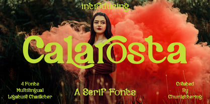 Calarosta - is a versatile unique, beautiful and clean serif font family, created with precision in each glyphs character. This font is perfect for logo branding, product designs, quotes, posters, display, website, invitation card, greeting card, headline, website, magazine, and your various other design projects with an outstanding style. Calarosta includes 4 weight styles which each include 225 glyphs. Features: 4 Font Weight Uppercase & Lowercase Multilingual Support Number & Punctuation Alternatives & Ligatures Thank you, for supporting us.
 - Karben 105 Stencil by Talbot Type,
$19.50 Karben 105 Stencil is a contemporary stencil font. The stencil breaks in the letters are applied in a way that is sensitive to the forms of the character in pursuit of a more elegant stencil. Karben 105 Stencil is available in a family of three weights. Karben 105 Stencil is closely related to Karben 105 and Karben 205 . All of the Karben fonts feature an extended character set, including accented characters for Central European languages.
 - Spina by OhType!,
$28.00 The 225 glyphs that make “Spina Typeface” are the result of experience with hundreds of drawings, sketches and digital tests in seeking to achieve a typeface that represents the fluidity of the script and elegance of the modern roman. Thereby, based on this principle and a unique style, an infinitely versatile typeface was designed that evokes both the beauty and finesse of the plant as power its thorns and its deadly poison.
 - PB Capitalis Rustica IVc by Paweł Burgiel,
$32.00 PB Capitalis Rustica IVc is a font face designed for imitate latin writing style found in manuscripts from 1st to 9th century. All characters are handwritten by use ink and reed pen (calamus), scanned, digitized and optimized for best quality without lost its handwritten visual appearance. Character set support codepages: 1250 Central (Eastern) European, 1252 Western (ANSI), 1254 Turkish, 1257 Baltic. Include also additional characters for Cornish, Danish, Dutch and Welsh language, spaces (M/1, M/2, M/3, M/4, M/6, thin, hair, zero width space etc.) and historical characters (overlined Roman numerals, I-longa, historical ligatures for "nomina sacra" and "notae communes"). OpenType TrueType TTF (.ttf) font file include installed OpenType features: Access All Alternates, Localized Forms, Fractions, Ordinals, Superscript, Tabular Figures, Proportional Figures, Stylistic Alternates, Stylistic Set 1, Historical Forms, Historical Ligatures. Include also kerning as single 'kern' table for maximum possible backwards compatibility with older software. Historical ligatures for "nomina sacra" and "notae communes" are mapped to Private Use Area codepoints. Use of OpenType features to get historical characters: ïTo get "I-longa" use Stylistic Alternates for: "I"(U+0049), "i"(U+0069), "dotless i"(U+0131). ïTo get "nomina sacra" use Historical Ligatures and write uppercase letters: DS for: "Deus", DMS or DNS for: "Dominus" EPS for: "Episcopus", IHS for: "Iesus", PBR for: "Presbiter", SCS for: "Sanctus", SPS for: "Spiritus", XPS for: "Christus". ïTo get "notae communes" use Historical Ligatures and write: B(U+0042) + "middle dot"(U+00B7) for: "-BUS", Q(U+0051) + "middle dot"(U+00B7) for: "-QUE". ïTo get "scriptio continua" (writing without words separation) use Historical Forms (regular spaces are replaced by zero width spaces between words). ïTo get "middle dot" for separate words use Stylistic Set 1 (regular spaces are replaced by middle dot between words).
 - MMC Insignia by MMC-TypEngine,
$30.00 MMC Insignia, is an Iconic & Emblematic Neogothic Geometric Capitals Display… Assembled by Trivial Squares and Diagonals Symbols Pattern from a puzzled grid Aftermath!! Includes Stylistic Alternates!! +Extra Monospaced Figures. In 22 styles, with Obliques, both for single display and layer Typesetting, plus OpenType Features & Bonus Blocks Fonts! MMC Insignia is a Small Caps Typeface, which default lowercases character set is included in the Pro family, its cursive version, apart from it, has also Exclusive Stylistic Alternates… Its atmosphere stands by on both Corporative to Decorative, Modern, Fashion, Federalist, Bohemian, Romantic, Ludic, Treasured Look, Etc. This Display font-family is the result of the repeated applications of this unique infamous Icon or Symbol, of two counterpointed triangles, implicit as hourglasses, in order to compose an innovative and unprecedented typographic pattern and modulation concept through the letterforms, in an extremely Geometric style. The Graphic Sign used throughout this type, is a remarkable trend used already in Logos of different businesses, whose most famous case refers to a famous International Bank, which doesn’t need to be mentioned, as it is instantly associated! This characteristic innovation was the main motivation while creating this type. Usage Suggestions: Type Fancy Titling texts, Display Remarkable Logos, Branding Projects, Labels, Emblems, Fashion Patterns, or in everything Noble and designed for Excellence as a type of Insignia, or distinguished marks and attributes of Royalty and Power!! That’s also forwardly, the reason why it was named MMC Insignia… TIPS: 1-Combine styles into innumerous possibilities of Chromatic Typesetting, by ‘central pasting’ layers… You may dislocate layers for improvisations! 2-USE BLOCK “FREE-STYLES” 1 & 2 also to add default 3D! Change 3D directions by switching Block 1 to Block 2, that way you can Zig-Zag words and lines. *Also shift the block layer up to bottom limit, it makes the 3D direction turn upside down. Greetings! André, MMC-TypEngine.
 - Eastman Condensed by Zetafonts,
$39.00 Discover here the Eastman Roman Family See the Eastman Grotesque Family Designed in 2020 for Zetafonts by Francesco Canovaro and Andrea Tartarelli with help from Solenn Bordeau and Cosimo Lorenzo Pancini, the original Eastman typeface family was conceived as a geometric sans workhorse family developed for maximum versatility both in display and text use. The original wide weight range has been complemented with three more additional widths, to give you maximum control over the appearance of text in your page. While Eastman Compressed and Eastman Condensed behave as space-saving condensed families, Eastman Grotesque adapts the family design style to humanist proportions. All share a solid monolinear design and a tall x-height that makes body text set in Eastman extremely readable on paper and on the screen. Influenced by Bauhaus ideals and contemporary minimalism, but with a nod to the pragmatic nature 19th century grotesques, Eastman has been developed as a highly reliable tool for design problem solving, and given all the features a graphic designer needs - from a wide language coverage (thanks to over one thousand and two hundred latin, Cyrillic and greek characters) to a complete set of open type features (including small capitals, positional numbers, case sensitive forms). The most impressive feature of all Eastman fonts remains the huge choice of alternate characters and stylistic sets that allows you to fine-tune your editorial and branding design by choosing unique, logo-ready variant letter shapes. Don’t want to lose too much time with the glyphs palette? Use the Eastman Alternate weights, thought for display use and presenting a selection of some of the more eye catching & unusual letter shapes available for the family.
 - Cairoli Now by Italiantype,
$39.00 Cairoli was originally cast by Italian foundry Nebiolo in 1928, as a license of a design by Wagner & Schmidt, known as Neue moderne Grotesk. Its solid grotesque design (later developed as Aurora by Weber and Akzidenz-Grotesk by Haas) was extremely successful: it anticipated the versatility of sans serif superfamilies thanks to its range of weights and widths, while still retaining some eccentricities from end-of the century lead and wood type. In 2020 the Italiantype team directed by Cosimo Lorenzo Pancini and Mario De Libero decided to produce a revival of Cairoli, extending the original weight and width range and developing both a faithful Classic version and a Now variant. The Cairoli Classic family keeps the original low x-height range, very display-oriented, and normalizes the design while emphasizing the original peculiarities like the hook cuts in curved letters, the high-waisted uppercase R and the squared ovals of the letterforms. Cairoli Now is developed with an higher x-height, more suited for text and digital use, and adds to the original design deeper ink-traps and round punctuation, while slightly correcting the curves for a more contemporary look. Born as an exercise in subtlety and love for lost letterforms, Cairoli stands, like its lead ancestor from a century ago, at the crossroads between artsy craftsmanship and industrial needs. Its deviations from the norm are small enough to give it personality without affecting readability, and the expanded weight and width range make it into a workhorse superfamily with open type features (alternates, stylistic sets, positional numbers) and coverage of over two hundred languages using the latin extended alphabet.
 - Baystar Script by Mans Greback,
$59.00 Baystar Script is a high-quality script typeface. Drawn and created by Mans Greback in 2021, this calligraphic font has power, style and stamina. The type’s organic, handwritten lettering is well suited for a variety of applications: from happy, playful designs, to super sleek web graphics and vivid logotypes. It has velocity like a mustang, a brilliant look and–with its hundreds of alternates–is truly dynamic. It flows with quick turns, marking out brush strokes and connecting tails, like a genuine, hand-painted writing should. Write multiple underscores to make swashes of different lengths. Example: Corvette_______ Baystar Script is legible and professional while retaining the personality that is valued in handwriting. Drawn in accordance with the latest trends in design, but is inspired by retro logotype lettering such as Chevrolet Chevelle and Camaro. A modern calligraphy, fast as a sport race car or sharp as a stingray, the letters are characterized by thorny edges and tall ascenders. It comes in three weights; Light, Medium and Bold, making it useful in any size and context. The font is built with advanced OpenType auto-functionality and guaranteed top-notch quality, containing stylistic and contextual alternates, ligatures and more automatic and manual features; all to give you full control and customizability. It has extensive lingual support, covering all Latin-based languages, from North Europa to South Africa, from America to South-East Asia, as well as Cyrillic (Russian, Serbian, Bulgarian) and the Greek alphabet. It contains all characters and symbols you'll ever need, including all punctuation and numbers. Let this font help you to transform your professional work into an energetic piece of handmade art!
 - Cairoli Classic by Italiantype,
$39.00 Cairoli was originally cast by Italian foundry Nebiolo in 1928, as a license of a design by Wagner & Schmidt, known as Neue moderne Grotesk. Its solid grotesque design (later developed as Aurora by Weber and Akzidenz-Grotesk by Haas) was extremely successful: it anticipated the versatility of sans serif superfamilies thanks to its range of weights and widths, while still retaining some eccentricities from end-of the century lead and wood type. In 2020 the Italiantype team directed by Cosimo Lorenzo Pancini and Mario De Libero decided to produce a revival of Cairoli, extending the original weight and width range and developing both a faithful Classic version and a Now variant. The Cairoli Classic family keeps the original low x-height range, very display-oriented, and normalizes the design while emphasizing the original peculiarities like the hook cuts in curved letters, the high-waisted uppercase R and the squared ovals of the letterforms. Cairoli Now is developed with an higher x-height, more suited for text and digital use, and adds to the original design deeper ink-traps and round punctuation, while slightly correcting the curves for a more contemporary look. Born as an exercise in subtlety and love for lost letterforms, Cairoli stands, like its lead ancestor from a century ago, at the crossroads between artsy craftsmanship and industrial needs. Its deviations from the norm are small enough to give it personality without affecting readability, and the expanded weight and width range make it into a workhorse superfamily with open type features (alternates, stylistic sets, positional numbers) and coverage of over two hundred languages using the latin extended alphabet.
 - Eastman Grotesque by Zetafonts,
$39.00 Designed in 2020 for Zetafonts by Francesco Canovaro and Andrea Tartarelli with help from Solenn Bordeau and Cosimo Lorenzo Pancini, the original Eastman typeface family was conceived as a geometric sans workhorse family developed for maximum versatility both in display and text use. The original wide weight range has been complemented with three more additional widths, to give you maximum control over the appearance of text in your page. While Eastman Compressed and Eastman Condensed behave as space-saving condensed families, Eastman Grotesque adapts the family design style to humanist proportions. All share a solid monolinear design and a tall x-height that makes body text set in Eastman extremely readable on paper and on the screen. Influenced by Bauhaus ideals and contemporary minimalism, but with a nod to the pragmatic nature 19th century grotesques, Eastman has been developed as a highly reliable tool for design problem solving, and given all the features a graphic designer needs - from a wide language coverage (thanks to over one thousand and two hundred latin, cyrillic and greek characters) to a complete set of open type features (including small capitals, positional numbers, case sensitive forms). The most impressive feature of all Eastman fonts remains the huge choice of alternate characters and stylistic sets that allows you to fine-tune your editorial and branding design by choosing unique, logo-ready variant letter shapes. Don’t want to lose too much time with the glyphs palette? Use the Eastman Alternate weights, thought for display use and presenting a selection of some of the more eye catching & unusual letter shapes available for the family.
 - Eastman by Zetafonts,
$39.00 Discover the complete Eastman type family: Eastman Grotesque and Eastman Condensed! Designed in 2020 for Zetafonts by Francesco Canovaro and Andrea Tartarelli with help from Solenn Bordeau and Cosimo Lorenzo Pancini, the original Eastman typeface family was conceived as a geometric sans workhorse family developed for maximum versatility both in display and text use. The original wide weight range has been complemented with three more additional widths, to give you maximum control over the appearance of text in your page. While Eastman Compressed and Eastman Condensed behave as space-saving condensed families, Eastman Grotesque adapts the family design style to humanist proportions. All share a solid monolinear design and a tall x-height that makes body text set in Eastman extremely readable on paper and on the screen. Influenced by Bauhaus ideals and contemporary minimalism, but with a nod to the pragmatic nature 19th century grotesques, Eastman has been developed as a highly reliable tool for design problem solving, and given all the features a graphic designer needs - from a wide language coverage (thanks to over one thousand and two hundred latin, cyrillic and greek characters) to a complete set of open type features (including small capitals, positional numbers, case sensitive forms). The most impressive feature of all Eastman fonts remains the huge choice of alternate characters and stylistic sets that allows you to fine-tune your editorial and branding design by choosing unique, logo-ready variant letter shapes. Don’t want to lose too much time with the glyphs palette? Use the Eastman Alternate weights, thought for display use and presenting a selection of some of the more eye catching & unusual letter shapes available for the family.
 - ZT Gatha by Khaiuns,
$14.00 ZT Gatha is a continuation of the "Gatha Duo font family", which focuses only on more complete variations of sans serif, this font has two variants, one of which is a normal sans font and the other is unique in that it minimizes edges. of each letter produces a unique character with a smoothly curved groove. ZT Gatha features 10 styles covering a complete set of beautiful upper and lower case letters, numbers, and various punctuation marks, providing a clean and realistic sans serif style with great versatility. With a lot of weight, this typeface can be used successfully in Magazines, Posters, Branding, Websites, etc. I hope you have fun using ZT Gatha. Thanks for using this font ~ Khaiuns X zelowtype
 - Cutmark by J Foundry,
$25.00 INDUSTRIAL-STRENGTH UTILITY. Designed for function. Cutmark fonts features common 45˚ chamfered corners, flattened ink traps and wide apex forms. Customize the look with alternates including an Angled Set, Straight Set, Beam I, single-story a, and hooked l. The OpenType version includes 10 weights in 3 widths with matching italics. Variable Font Cutmark Variable contains the full family of styles in a single file! Select variations along width, weight and slant axes. Test and explore at jfoundry.com. Cutmark Variable is included in the complete package at no additional cost. Use which ever font format you prefer! Please email hello@jfoundry.com for any questions. Variable Fonts require MacOS 10.14 or higher. For browser and software support visit: v-fonts.com/support
 - Meleo by Alexis Luengas,
$1.00 Meleo is a semiserif consisting of 10 fonts with a few original quirks but still very legible at both text and display sizes. Since its conception, the aim was a balance of uniqueness and functionality. The typeface owes its energy to the slight suggestion of calligraphic crafting and humanist structure. But it also breaks the rules: a small x-height and a whimsical uppercase with resemblance to the lowercase may render Meleo more friendly than a conventional (semi-)serif. Titles and texts of moderate length, like those found on websites, flyers and packaging, are the natural habitat of Meleo, but it may as well thrive under different settings. Meleo supports most of western-european latin languages which are included in the ISO-Adobe character set.
 - Power Breakfast by Hanoded,
$15.00 I am a firm believer in the fact that breakfast is the most important meal of the day. So, for the last 10 years (ever since I became a father), I have been serving my family a healthy breakfast. I live in The Netherlands, so the main portion of breakfast is bread, but I try to serve something ‘nice’ every day. Like strawberries, yoghurt with banana and brown sugar (not too much sugar!), oatmeal porridge or granola. I myself like Indonesian fried rice (nasi goreng) for breakfast, but I am afraid my kids won’t eat that in the morning… Power Breakfast is a handmade display font. Yes, it is wobbly, yes, it is uneven, but that’s what’s so darn good about it!
 - Carlin Script by Linotype,
$40.99The Carlin Script family, inspired by the Carolingian minuscule alphabet (ca 800 A.D.), is one of the great new families available through Linotype's Library's Take Type 5 collection. Take a closer look at these beautiful characters; with them, one can create a different, more personal feeling than commonly comes from more available script and chancery fonts. Like a monk with his writing table, German designer Hans-Jürgen Ellenberger created this new design, which includes 10 different weights, bringing scribal excellence directly to your keyboard. The Carlin Script family includes an additional Initial set-allowing the creation of medieval-flavored drop or initial caps in snap. And the critics are raving: Carlin Script was a winner in the New York-based Type Directors Club's 2003 Type Design Contest!" - Raldo RE by URW Type Foundry,
$49.99 Quite unusual, Musenberg started his Raldo design with the italic. However, he managed to preserve the temperament and vividness of the italic in the roman without questioning the stability of the individual characters. Raldo is a modern Sans Serif family already quite popular in Germany. The German IGEPA group chose Raldo as corporate typeface family. Now, Marc Musenberg redesigned and extended his Raldo typeface family. The new Raldo RE Pro comprises 10 styles, 5 roman and 5 corresponding italics. All fonts now include the complete Latin character set plus fractions, different sets of figures and fractions as well as small caps and small caps figures for Raldo RE Pro Text, Regular, Semibold and Bold. Raldo RE Pro has been chosen to be part of the URW++ SelecType.
 - Vary by Monotype,
$50.99 Vary by Olli Meier is a geometric sans serif typeface inspired by Bulgarian Cyrillic. Vary is fun and adaptable and was built with three feelings (variations): classic, modern, and loopy, offering an opportunity for designers to be playful in their creations. The inspiration in Bulgarian Cyrillic is seen mostly in the character “g,” which was inspired by a very uncommon handwritten “?” spotted by the designer in a shop window in Sofia, Bulgaria. When he flipped this design in 180°, the Latin character ‘g’ was born for Vary Another example is the “R” in the modern stylistic set, which was inspired by the handwritten Cyrillic character “?”. Vary is available as a variable font and also comes with 10 preset instances from Hairline to ExtraBlack.
 - Ciutadella Rounded by Emtype Foundry,
$69.00 Ciutadella Rounded is not only a font with soft corners, it has a real rounded terminal across all the weights. It was a challenge to achieve a rounded effect in close counters characters, especially in the heaviest weights where there is less space available to accommodate the round ending. Suitable to be used across a wide range of applications, from identity systems to publications. It is available in Open Type format and includes Alternate Characters (‘a’, ‘t’ and ‘&’), Ligatures, Tabular Figures, Fractions, Numerators, Denominators, Superiors and Inferiors. It supports Central and Eastern European languages. The type family consists of 10 styles, 5 weights (Light, Regular, Medium, SemiBold and Bold) plus italics. For more details see the PDF. See also Ciutadella and Ciutadella Slab.
 - Cream Opera by Factory738,
$10.00 Cream Opera is a bold sans-serif font family. The combination of simple and geometric elements renders a bold design. It can be used to create almost all types of design projects like print materials and web design. Just use your imagination and your project will become more alive and vivid than ever with one of the Opera fonts. You want to make a greeting card or a package design, or even a brand identity? Feel free to play with all font styles, that will lead you to your next successful project. 10 styles (Thin, Light, Regular, Medium, Bold, Black, Outline, Inline, Stencil, and Western) Oblique font is available Numbers & Punctuation Extensive Language Support Thanks for looking, and I hope you enjoy it.
 - FF Celeste by FontFont,
$79.99 British type designer Chris Burke created this serif FontFont in 1994. The family has 10 weights, ranging from Regular to Black (including italics) and is ideally suited for book text, editorial and publishing as well as logo, branding and creative industries. FF Celeste provides advanced typographical support with features such as ligatures, small capitals, alternate characters, case-sensitive forms, fractions, and super- and subscript characters. It comes with a complete range of figure set options – oldstyle and lining figures, each in tabular and proportional widths. As well as Latin-based languages, the typeface family also supports the Cyrillic and Greek writing systems. This FontFont is a member of the FF Celeste super family, which also includes FF Celeste Sans and FF Celeste Small Text.
 - Meow Zilla by Putracetol,
$22.00 Introducing “Meow Zilla” - a Display Cat Theme Font that is as playful and fun as a kitten! This unique font, inspired by the whimsical world of cats and kittens, is designed to add a touch of charm to any project. With 10 distinct variations, each reflecting the delightful themes of paws, playful kittens, and more, Meow Zilla is versatile and adorable. Crafted with care and precision, it’s perfect for children’s themes, crafting projects, logos, branding initiatives or any design enriched by a touch of feline grace. Whether you’re creating invitations, packaging or personalized stickers – Meow Zilla shines in its versatility. Every stroke embodies the essence of fun making it an excellent choice for titles in children’s books or playful branding.
 - Without Sans by W Type Foundry,
$30.00 Without Sans is a new geometric sans serif of 10 weights plus matching italics and alt family. It was designed by Felipe Sanzana and Diego Aravena, the founders of “Without Foundry”, in 2014/15. It is inspired by the geometric-style sans serif typefaces that were famous during the 50s. The fonts are based on the geometric forms with a mix of grotesque typefaces. The opentype fonts have an extended character set to support Central and Eastern European as well as Western European languages. It is perfectly suited for highlighting lettering, magazines, web, interaction design, advertising, logotypes, etc. Learn about upcoming releases, work in progress and get to know us better! On Instagram W Foundry On facebook W Foundry wtypefoundry.com