10,000 search results
(0.555 seconds)
- Bodoni Classic Swashes by Wiescher Design,
$39.50 Bodoni Classic Swashes is my personal addition to Bodoni’s family of typefaces. Bodoni did not design a decorative version. His quest was for purity in book design. Even though in his days it was not called design; he thought of himself purely as a printer. But I think, especially after visiting the Bodoni museum in Parma, if Giambattista were alive today he would design a decorative typeface. Yours classico, Gert Wiescher
 - Yellabelly by Chank,
$99.00Being a lefty makes it challenging to write in cursive. Unlike righthanders who pull the pencil across the page, lefties must push the pencil as they write. As a result, the letterforms created by pushing instead of pulling the implement are different from each other. The lefty’s cursive script is seen here in Yellabelly, the fontified version of Chank Diesel’s left-handed handwriting. This one’s named after a cowardly cowboy. - ITC Noovo by ITC,
$29.99ITC Noovo is from British designer Phill Grimshaw and grew out of his work on ITC Rennie Mackintosh. He says, I still had 'Nouveau' coming out of my ears" and he drew it after a series of computer-intensive projects, "when I was missing the smell of permanent marker pens and the feel of paper." ITC Noovo is highly stylized yet works as both a text and display typeface." - Normandia by Canada Type,
$30.00 Designed over three years after the second World War, and published in 1949 by the Nebiolo foundry, Normandia was Alessandro Butti’s take on the fat face. As it usually was with Butti’s designs, this face effectively injected a catchy yet expertly calculated calligraphic spin into its source of inspiration — which was the essentially geometric/deco, thicker model of Bodoni’s very popular aesthetic. The metal Normandia saw some widespread use for a handful of years after its publication, not least because of the multitude of sizes in which it was available. It stepped out of the limelight by the mid-1950s, due to a combination of the popularity of cold type and Nebiolo’s refusal to retool its faces for new technologies. It was copied by a few small film typesetting outfits on both sides of the Atlantic, but never really found its way back to the mainstream. By the time computer type became the norm, Normandia was pretty much relegated to a type historian’s collection of anecdotes. This digital update of the classic series revives and refines the three original metal designs (Tonda/Regular, Corsiva/Italic, and Contornata/Outline) and expands the character set to more than 600 glyphs per font, including small caps, six types of figures, fractions and nut fractions, a full set of f-ligatures, some stylistic alternates, and other fine typography niceties.
 - ITC Tyke by ITC,
$29.99Tomi Haaparanta got the idea for the Tyke typeface family after using Cooper Black for a design project. He liked Cooper's chubby design, but longed for a wider range of weights. “I wanted a typeface that was cuddly and friendly,” recalls Haaparanta, “but also one that was readable at text sizes.” He started tinkering with the idea, and Tyke began to emerge. Even though Haaparanta knew his boldest weight would equal the heft of Cooper Black, he began drawing the Tyke family with the medium. His goal was to refine the characteristics of the design at this moderate weight, and then build on it to create the light and bold extremes. Haaparanta got the spark to design type in 1990, when he attended a workshop held by Phil Baines at the National College of Art and Design in Dublin. “I've been working and playing with type ever since,” Haaparanta recalls. He released his first commercial font in 1996, while working as an Art Director in Helsinki. After about two dozen more releases, he founded his own type studio, Suomi Type Foundry, early in 2004. At five weights plus corresponding italics, Tyke easily fulfills Haaparanta's goal of creating a wide range of distinctive, completely usable designs. The light through bold weights perform well at both large and small sizes, while the Black is an outstanding alternative to Cooper for display copy. - Rezak by TypeTogether,
$36.00 Nothing is hidden in the simplistic forms and overt aesthetic of Anya Danilova’s Rezak font family. Rezak is not a type family directly from the digital world, but was inspired by the stout presence of cutting letters out of tangible material: paper, stone, and wood. With only a few cuts, the shapes remain dark and simple. With more cuts, the shapes become lighter and more defined, resulting in a dynamic type family not stuck within one specific category. The Black and medium weights began as one approach before separating into display and text categories. The four text weights were created through pendulum swings in design direction that experimented with contrast, angles, tangent redirections, and the amount of anomalies allowed. The text weights are vocal when set larger than ten points and subtle at smaller sizes. The tech-heavy Incised display style came last, employing a surprising range of trigonometric functions to make it behave exactly as desired. Its look can result in something distinctive and emotional or completely over-the-top. Most normal typefaces change only in thickness; Rezak changes in intention, highlighting the relationship between dark and light, presence and absence, what’s removed and what remains. Rezak’s Black and Incised display styles are like a shaft of light in reverse and are perfect in situations of impact: websites, headlines and large text, gaming, call-outs, posters, and packaging. The tone works for something from youthful or craft-oriented to organic and natural products. Try these two in logotypes, complex print layering, branding, and words-as-pattern for greater experimentation. The text styles are bold, energetic, well informed, and round out the family with four weights (Regular, Semibold, Bold, Extrabold) and matching italics for a family grand total of ten. These jaunty styles work well in children’s books, call-outs, movie titles, and subheads for myriad subjects such as architecture, coffee, nature, cooking, and other rough-and-tumble purposes. Rezak’s crunchy letters are meant to expose rough, daring, or dramatic text. A further benefit is that this family is not sequestered within one specific genre or script, so it can be easily interpreted for other scripts, such as its current Latin and extended Cyrillic which supports such neglected languages as Abkhaz, Itelmen, and Koryak. Rezak’s push toward creativity and innovation, with an eye on typography’s rich history, reinforces our foundry’s mission to publish invigorating forms at the highest function and widest applicability.
 - Lektorat by TypeTogether,
$35.00 Florian Fecher’s Lektorat font family is one for the books, and for the screens, and for the magazines. While an editorial’s main goals are to entertain, inform, and persuade, more should be considered. For example, clear divisions are necessary, not just from one article to the next, but in how each is positioned as op-ed or fact-based, infographic or table, vilifying or uplifting. From masthead to colophon, Lektorat has six concise text styles and 21 display styles to captivate, educate, and motivate within any editorial purpose. Magazines and related publications are notoriously difficult to brand and then to format accordingly. The research behind Lektorat focused on expression versus communication and what it takes for a great typeface to accomplish both tasks. In the changeover from the 19th to 20th century, German type foundry Schelter & Giesecke published several grotesque families that would become Lektorat’s partial inspiration. Experimentation with concepts from different exemplars gave birth to Lektorat’s manifest character traits: raised shoulders, deep incisions within highly contrasted junctions, and asymmetrical counters in a sans family. After thoroughly analysing magazine publishing and editorial designs, Florian discovered that a concise setup is sufficient for general paragraph text. So Lektorat’s text offering is concentrated into six total styles: regular, semibold, and bold with their obliques. Stylistic sets are equally minimal; an alternate ‘k, K’ and tail-less ‘a’ appear in text only. No fluff, no wasted “good intentions”, just a laser-like suite to focus the reader on the words. The display styles were another matter. They aim to attract attention in banners, as oversized type filling small spaces, photo knockouts, and in subsidiary headings like decks, callouts, sections, and more. For these reasons, three dialed-in widths — Narrow, Condensed, and Compressed — complete the display offerings in seven upright weights each, flaunting 21 headlining fonts in total. If being on font technology’s cutting edge is more your goal, the Lektorat type family is optionally available in three small variable font files for ultimate control and data savings. The Lektorat typeface was forged with a steel spine for pixel and print publishing. It unwaveringly informs, convincingly persuades, and aesthetically entertains when the tone calls for it. Its sans serif forms expand in methodical ways until the heaviest two weights close in, highlighting its irrepressible usefulness to the very end. Lektorat is an example of how much we relish entering into an agreed battle of persuasion — one which both sides actually enjoy.
 - Le Havre Layers by insigne,
$19.00 With this charming new layered typeface, the possibilities are endless with your vision behind it. Accomplish the effect you've been searching for by layering these exceptional fonts and altering opacity and color, for a unique custom appearance that yells “hello there!” Play around a bit with the potential of Le Havre Layers. Build effects which include realistic 3D appearances reminiscent of the storefronts of old and adding centerlines, dotted centerlines, and shadow variations. Inspired by the affable appearance of vintage signage from the 1930s to the 1960s, Le Havre Layers spacing is altered from Le Havre Titling’s to accommodate shadows and other options properly. With its generous width it sends a message of refinement and grace. The geometric and art deco curves are a beautiful addition to your work. Mix and match with the other members of the Le Havre Hyperfamily. There are many amazing design solutions for you to discover. See what you could build with Le Havre Layers!
 - Pie charts for maps - Unknown license

- BECOOL - Unknown license

- Agita MF by Masterfont,
$59.00 Free form scribble is what you get when you draw freely on your canvas.
 - Rumba by Corradine Fonts,
$29.00Rumba is ideal for any informal projects when youthful and free style are required. - Bruce Influence by Intellecta Design,
$16.90Free interpretation of Great Primer Ornamented No. 30, from the Bruce's TypeFoundry 1869 catalog. - Glowy by Redy Studio,
$17.00 Glowy modern serif font is an exceptional font choice. This font effortlessly blends contemporary aesthetics with a touch of elegance, resulting in a visually captivating and professional typeface. Glowy Modern Serif font unique attribute lies in its luminous and bold quality. The letters seem to emit a soft glow, which sets it apart from traditional serif fonts and adds a modern twist. Glowy modern serif font also includes ligatures and alternate character, it's easy to achieve custom typography for stunning logos, headlines, and quotes. Feel free to give me a message if you have a problem or question. Thank you so much for taking the time to look at one of our products. ~Redy
 - Nursery Rhyme Initials by Celebrity Fontz,
$24.99High-quality ornamental initials superimposed on nursery rhyme backgrounds such as Humpty Dumpty, Ride a Cock Horse, Baa Baa Black Sheep, Tom Tom the Piper's Son, Rub-A-Dub-Dub, the Queen of Hearts, Old King Cole, and many others. Includes one set of A-Z ornamental initials conveniently assigned to both the upper and lower case alphabet characters. Ornate and accurate renderings that can be used for the beginning of paragraphs in any children's publication or texts relating to nursery rhymes and fairy tales. - The Great Escape - Personal use only

- DIG DUG - Personal use only

- Tucker Handwritten - Unknown license

- Black Gold VP by VP Creative Shop,
$15.00 Black Gold is sophisticated typeface with tons of alternate glyphs, ornaments and multilingual support. It's a very versatile font that works great in large and small sizes. Black Gold is perfect for branding projects, home-ware designs, product packaging, magazine headers - or simply as a stylish text overlay to any background image. Feel free to contact me if you have any questions!
 - Nagissta by madeDeduk,
$11.00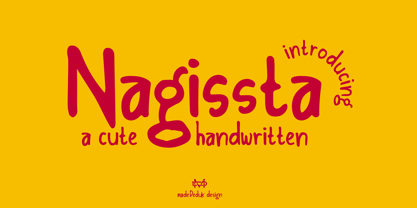 Introducing Nagissta is a cute handwritten font with a matching script and regular will be perfect for book, title branding, product packaging, invitation, quotes, t-shirt, label, poster, logo etc. Feature Uppercase & Lowercase Number & Symbol International Glyphs Multilingual support Ligature Feel free to drop us a message any time and follow my shop for upcoming updates Hope you enjoy it.
 - Chenica by Scratch Design,
$9.00 Chenica is an elegant, clean & simple sans serif. It has a sophisticated, minimalist and elegant typeface design. This beautiful font has been designed for projects which are suitable for modern & elegant design, such as branding, magazines, logos, headers, and many more. Shepia includes: Letters Numbers Symbols & Punctuation Multilingual Support Beautiful Ligatures If you have any questions, please feel free to contact us Thanks!
 - Long Shine Script by BonjourType,
$17.00 LongShine Script is a fluid handwritten calligraphy fonts, combining calligraphy typefaces with a free flowing and moving baseline. It has a casual, yet elegant touch. Features 275 glyphs. Including initial and terminal letters, alternates, ligatures and multiple language support. Can be used for various purposes. such as headings, signature, logos, wedding invitation, t-shirt, letterhead, signage, lable, news, posters, badges etc.
 - Heidar by Craft Supply Co,
$17.00 Unveil the Bold Elegance Serif Font – Where letters stand strong, strokes exude confidence, and design speaks with authority. Elevate your creations with this typographic powerhouse that turns words into captivating stories. This typeface is ideal for greeting card, packaging, brand identity, poster, or any purpose to make your art/design project look eye catching and trendy. Feel free to play with this typeface!
 - Imperia by Wiescher Design,
$49.50 Imperia is derived from my Classic font Imperium – the Roman Original from the Trajan column. I pushed Imperia a lot further, adding two versions of swings. To make the family more usable I threw in my own version of lowercase letters for free; Roman did not have lowercase letters of that kind! The other three cuts – A, B, and C –have classic smallcaps.
 - Nikoovers by madeDeduk,
$15.00 Nikoovers Font is a modern rounded sans that exudes simplicity and versatility. Its clean and geometric letterforms make it ideal for various design applications, from corporate branding to editorial layouts. Feature Uppercase & Lowercase Number & Symbol International Glyphs Multilingual support Alternative Ligature Feel free to drop us a message any time and follow my shop for upcoming updates Hope you enjoy it.
 - Marticus by TypeClassHeroes,
$14.00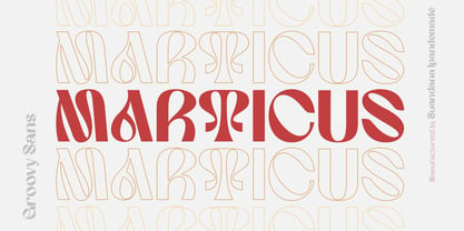 Introducing Marticus is a Groovy Sans, Comes with unique style and access your OpenType features to access the large selection of alternate letters and ligatures. Use this font for any branding, product packaging, invitation, quotes, t-shirt, label, poster, logo etc. Feature Uppercase & Lowercase Number & Symbol International Glyphs Multilingual support Alternative Ligature Feel free to drop us a message any time Cheers!!
 - Hellrose by madeDeduk,
$12.00 Hellrose is a scratches hand drawn font contains 50+ ligatures with three alternative. Hellrose is great for branding, posters, logos, invitation, writing and headings. Feature Uppercase & Lowercase Number & Symbol International Glyphs Multilingual support Ligature Thanks so much for checking out my shop and feel free to drop us a message any time and follow my shop for upcoming updates. Hope you enjoy it.
 - Likely by Adam Ladd,
$25.00 Likely is a joyful, brush script type family with complementary sans and extras styles. Hand drawn freely but carefully, each font is designed to work together to present a vibrant and natural package. Layer and colorize the free Counter styles to easily enhance the color palette or use the over 170 matching catchwords and shapes to make your designs even more fun!
 - Mighty Dust by madeDeduk,
$12.00 mighty dust is a blackletter. There's come with 3 style font with much alternative inside. Suitable to create any branding, product packaging, invitation, quotes, t-shirt, label, poster, logo etc. Feature otf. and ttf. file woff and woff2. file Uppercase & Lowercase Number & Symbol International Glyphs Multilingual support Alternative Ligature Feel free to drop us a message any time Hope you enjoy it.
 - Emirah by madeDeduk,
$11.00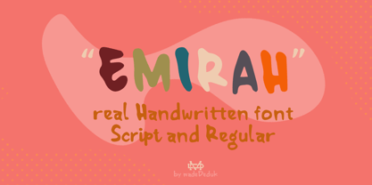 Introducing Emirah is a cute handwritten font with a matching script and regular will be perfect for book, title branding, product packaging, invitation, quotes, t-shirt, label, poster, logo etc. Feature Uppercase & Lowercase Number & Symbol International Glyphs Multilingual support Ligature Feel free to drop us a message any time and follow my shop for upcoming updates Hope you enjoy it.
 - Little Comet by Allouse Studio,
$16.00 Little Comet a Bubbly Handdrawn Typeface with two style that will give you choices to explore. Little Comet is perfect for product packaging, branding project, megazine, social media, wedding, or just used to express words above the background. Both styles also come with Multi-Lingual Support. Enjoy the font, feel free to comment or feedback, send me PM or email. Thank You!
 - Mocha Cherry by Allouse Studio,
$16.00 Proudly Present, Mocha Cherry a Handwritten Fun Sans with Two Styles, Inline and Regular. Mocha Cherry is perfect for product packaging, branding project, megazine, social media, wedding, or just used to express words above the background. Mocha Cherry also come with Multi-Lingual Support. Enjoy the font, feel free to comment or feedback, send me PM or email. Thank You!
 - Raeling by Volcano Type,
$19.00Raeling is a display font inspired by a visit to Luxembourg, capturing shadows falling intricately from park railings appearing as broken-script lettering. A mixture of manmade / natural, traditional / new, ugly / beautiful reflecting the paradox and contradictions of the city. A single curve and stroke developed into a grid block from which characters emerged and broke free of their barriers and conformity. - Gloomy Mummy by Allouse Studio,
$16.00 Proudly Presenting, Gloomy Mummy a Handdrawn Halloween Typeface with two styles! Gloomy Mummy is perfect for any titles, logo, product packaging, branding project, megazine, social media, wedding, or just used to express words above the background. Gloomy Mummy also come with Multi-Lingual Support. Enjoy the font, feel free to comment or feedback, send me PM or email. Thank You!
 - Nimous Daven by madeDeduk,
$12.00 Nimous Daven is a distinct hand drawn font contains 50+ ligatures with two alternative. Nimous Daven is great for branding, posters, logos, invitation, writing and headings. Feature Uppercase & Lowercase Number & Symbol International Glyphs Multilingual support Alternative Ligature Thanks so much for checking out my shop and feel free to drop us a message any time and follow my shop for upcoming updates
 - Ameda by Craft Supply Co,
$15.00 Introducing Ameda: A modern, stylish sans-serif font with high contrast that radiates sophistication. Elevate your designs with Ameda's attention-grabbing style, infusing an exhilarating flair into your creative projects. This typeface is ideal for greeting card, packaging, brand identity, poster, or any purpose to make your design project look eye catching and trendy. Feel free to play with this typeface!
 - Wesloy by Kaer,
$19.00 Introducing my new brush serif typeface Wesloy. Vintage font with unique dry strokes with rough edges decoration elements. Perfect to use in any fashion labels, glamour posters, luxury identity, etc. What you will get: * Regular style * Uppercase and lowercase glyphs * Numbers and symbols * Multilingual support * Ligatures Please feel free to request to add characters you need: kaer.pro@gmail.com Thank you!
 - Castaway by Studio K,
$45.00 Fun, footloose and fancy free, Castaway is a font family that knows no boundaries: equally at home in Naples and Nairobi, Rimini and Rio, Tijuana and Timbuktu. It was inspired by those ‘far away places with strange sounding names’, and will bring a touch of the exotic to tourist and travel promotions, and a breath of fresh air to any graphics project.
 - Ambelia Script by Gatype,
$12.00 Ambelia Script is a natural handwritten font, it is perfect for logos, invitations, stationery, wedding designs, social media posts, advertisements, product packaging, product design, labels, photography, watermarks, special events or anything else. Ambelia Script comes with a full set of uppercase and lowercase letters, lowercase strokes, multilingual symbols, numbers, punctuation and liature. If you have any questions, feel free to message me
 - MGT Vallery Hills by Magetype,
$15.00 When I was surfing the internet, with rock n 'roll music. I accidentally found a picture of a hotel sign with a very unique style, namely: Mid-century Modern (MCM). It looks very pretty and charming to me. And inspired me to create Font Family. And I am proud to present the Vallery Hills Font Family. This font is in the Retro style of the 50s to 60s. Okay, here are the specifications. 1. Vallery Hills Schrift There is one unique thing about this font. Usually, script fonts with Retro style always have an angled anatomical shape, but I made this font upright. The goal is to make a difference with other script fonts I've seen. By the way, this font comes in two styles, namely: Regular and Bouncy. Why do I make it like that? Because I want to make this font into two different functions, namely: If you want to make it a Display Font, which is usually used for Headings, then use the Bouncy style. And if you want to use it as Bodytext, then use Regular. 2. Vallery Hills Sherift This second font is a font that is very synonymous with the Mid-century Modern (MCM) era. A very distinctive form of the serif font of that era. Similar to the first font, this font also has 2 styles, namely: Regular and Bouncy. You can combine this font with the other two fonts in Vallery Hills. It could be Title, or Bodytext. And you can also combine two styles, namely: Regular and Bouncy. Try! 3. Vallery Hills Suns Sherift This last font is Sans Serif. Also has 2 styles like his two brothers, namely: Regular and Bouncy. The goal is actually the same. I am sure you are cooler to create a design that uses this font family. Well, there is one advantage of this font from its two siblings, which is that it has a feature, namely: SMALLCAPS. Which will be an option when you are bored with the mediocre shape or style of Lowercase. Try combining the Smallcaps with Uppercase or Lowercase. Must be cool! : D Oops, almost forgot. This font consists of several font formats, namely: OTF, TTF, and Webfonts. And of course everything is MULTILANGUAGE. OK, friends. That's all I can describe about the Vallery Hills Family. Hopefully it will please all of you. Cheers!


