10,000 search results
(0.056 seconds)
- Mollaroid Signature by Aldedesign,
$15.00 Mollaroid - Signature Font - A stylish and quirky new signature font script. Mollaroid font was created to look as close to a natural handwritten script as possible by including over a lot ligatures, titling, and swash. This font is for those who want to show something smooth and modern. You may use this font if you want to attract modern buyers. The font design seems to show that you have a passion in the business and give your love to the products and services you are offered to customers. Because it is an eye-catching signature font, you can use it for a variety of purposes including design, branding, signature, logo, poster, and many more. Even, you can just print it in a t-shirt and the font makes the t-shirt looks interesting to see.
 - Old Earthy by Gustav & Brun,
$16.00 Old Earthy is a hand drawn font inspired by the mid 19th-century art movement with William Morris and the Pre-Raphaelite Brotherhood in the front line. The art and the patterns from that time is reflected in Old Earthy. It comes with a set of basic English/Latin letters and some west European diacritics.
 - Bubblegum Superstar - Unknown license

- Monthly Goals by WAP Type,
$20.00 Monthly Goals A Playful Font It is perfect for headings, flyer, greeting cards, product packaging, book cover, printed quotes, logotype, apparel design, album covers, etc.
 - ITC Handel Gothic by ITC,
$40.99 The Handel Gothic? typeface has been a mainstay of graphic communication for over 40 years - all the while looking as current as tomorrow. Designed by Don Handel in the mid-1960s, and used in the 1973 United Airlines logo developed by Saul Bass, Handel Gothic was an instant success when released to the graphic design community. Its generous lowercase x-height, full-bodied counters and square proportions make the design highly readable at a wide range of sizes. Handel Gothic's slightly idiosyncratic character shapes gave the face a futuristic look 40 years ago that retains its power today. In addition, its Uncial-like lowercase is instantly identifiable - and unique among sans serif typestyles. Award-winning type designer Rod McDonald was attracted to the simple, decisive forms of the original, but he felt the design needed to be refined and updated. ?One of my goals was to bring a modern typographic discipline to what was really an old phototypesetting font.? To achieve his goal, McDonald re-proportioned every character and balanced the delicate relationship between the curves and the straight strokes. He also added a number of alternate characters to extend the range of the design. ?I wanted to give designers a large enough character set so they wouldn't feel constrained in what they could do. I want them to be able to play with the fonts, not just set words.? McDonald enlarged the family from the single-weight original to five weights, each with a full suite of alternate characters.In 2015 Nadine Chahine designed matching arabic weights to this family.
 - Heller Sans JNL by Jeff Levine,
$29.00 Heller Sans JNL is based on the main letterforms of an experimental alphabet designed by Steven Heller; noted author of over 170 books on design and visual culture. Some modifications were made in turning his design into a digital font. In his own words, here is the background to this typeface: “I recently recovered this from the junk heap. It is a yellowing photostat of my first and only typeface design (1969-70). Total folly! At the time I was smitten by Art Moderne lettering. I called it “Klaus Boobala Bold” because I liked the K and B. I’ve lost the letters S through Z, which were made. The letters were drawn with compass, Techno pen (that frequently clogged). as well as a triangle and T-square. The inline and outline made no real logical sense. I based the design, in part, on Kabel, Avant Garde and it was a product of whatever I could accomplish with those tools. The caps-only alphabet was photographed and produced as a film negative that was cut in foot-long strips and spliced to fit on a Typositor reel. Sadly, the negatives made for the font were too brittle and the splice snapped apart in the Typositor. I worked on it for well over a month and used the face only once. I realized with this attempt, like so many other times I attempted different challenges, that type design — indeed mechanical drawing — was not my strong suit.” Heller Sans JNL is available in both regular and oblique versions.
 - Midmoon Gothik by Andy Peat,
$10.00 About this font family Midmoon Gothik was designed for typesetting magazines and information-heavy publications; using simple, clean letterforms for clear communication but with enough character to make it enjoyful. The new lighter weights are a nice addition to the set allowing for finer control over the texture of the page. Features 4 weights; Hairline, Thin, Light and Regular. Multi language Ligatures: fi fl ij ffi ffl fb fj ff fk fh Numerals: tabbed lining, proportional lining, proportional oldstyle Fractions: ½, ¼, ¾, ⅛, ⅜, ⅝, ⅞ Symbols: ¶ § © ® ℗ ™ ° † ‡ ℮ ¢ ¤ $ € ₣ ₤ ₧ £ ₽ ¥ Maths: ⁼+−×÷=≠> Arrows: ↑↗→↘↓↙←↖↔↕ Capital spacing To be able to access alternative fonts, make sure the software you use can support opentype features such as Microsoft Word, Paint, Adobe, Corel draw, Cricut and other applications. Designed and published by Andy Peat. www.andypeat.com Released October 2022
 - Period Piece JNL by Jeff Levine,
$29.00 A period piece is something of or pertaining to a specific era or time. Anything evoking a knowledge or feeling of an era can be labeled as such. The aptly named type font Period Piece JNL reflects the hand lettering found on the cover of early 20th century vintage sheet music entitled "My Baby's Arms" (from the stage production of "Ziegfeld Follies of 1919"). Although strongly akin to the coming Art Deco movement in its lettering style, Period Piece JNL still contains a strong influence of the Art Nouveau era of the 1900s through the 1920s.
 - Street Tag vol1 by Tomatstudio,
$17.00 Street Tag vol1 is inspired from graffiti tag in urban areas in Jakarta, i also draw graffiti, tag and throw up since high school. This is originally my style, inspired from some my favourite graffiti artist, my tag style is not so tidy and i think you guys should adjust the kerning manually again, because it’s impossible to adjust them to be tidy. I also create special letter "G",“Y” and “T” in vector base, so you can edit the path as you like, combine with the original font, you can see the sample.
 - Jonathan by Supfonts,
$10.00 Hi everyone. This is my new signature style script. Any inscription will look like a natural stroke. This will give a unique look to your projects. Try my new font, it is lined with all the distances and it looks professional and at ease. It is ideal for signature or design, postcards and greetings, websites or blogs. Test it out below to see how it could look for your next project! Includes: Uppercase and lowercase Numbers and punctuation Foreign language support Ligatures Check out my blog: https://www.instagram.com/zloillev pinterest.com/dmitriychirkov7 Enjoy
 - Varisse by AVP,
$19.00 Varisse spans over two centuries of type design and draws its inspiration from well-loved classics that are as fresh today as they were when they were created. The range stretches from a quintessential 18th century transitional serif to an uncompromising 20th century sans. Think Baskerville, think Gill. The idea was to create a family that shared similar forms and the same vertical metrics, allowing them to be mixed to provide impact and readability as required. With a generous x-height and a host of options, the Varisse family is ideally suited to branding, packaging, magazines and editorial. It also provides a wealth of opportunity in website presentation. The fonts are divided into five subfamilies by degree of ‘serification’. Varisse Sans Varisse Soft Sans Varisse (normal) Varisse Soft Serif Varisse Serif Each subfamily contains six weights and accompanying italics.
 - Hilender Rhapsody by Bungletter,
$12.00 Hilender Rhapsody is a modern script font that has a cute and elegant touch. Hilender Rhapsody is attractive because it is sleek, clean, feminine, sensual, glamorous, simple and very easy to read, thanks to its many luxurious lettering connections. I also offer a number of decent stylistic alternatives for some of the letters. The classic style is very suitable to be applied in various formal forms such as invitations, labels, restaurant menus, logos, fashion, make up, stationery, novels, magazines, books, greeting/wedding cards, packaging, labels or all kinds of advertising purposes. . . . . . . . . Files include: • Hilender Rhapsody Regular • Hilender Rhapsody Bold • Hilender Rhapsody Slant • Hilender Rhapsody Bold Sant Contains full set: -Has 4 font models: Regular, Bold, Slant and Bold Slant -Uppercase -Lowercase -Alternative -Ligatures -Punctuation -Number -Multilingual support. need help or have questions let me know. I'm happy to help. Thanks & Congratulations on the Design!
 - Clarks by PintassilgoPrints,
$45.00 Clarks is a modular typeface built from a work by Lygia Clark, one of the giants of Brazilian postwar art. Packed in a font equipped with clever OpenType programming, there are at least 7 different designs for each letter, thus allowing, or rather, proposing, boldly unconventional compositions. The font is programmed to cycle all these different lettershapes, avoiding repetition. The user can also manually pick up preferred forms in a glyph palette. There are choices to both keep and to defy readability and it's almost hypnotic to play with these. Lygia Clark used to invite viewers to touch her works and so we did with her 'Planes in Modulated Surface no. 4', from 1957: we fragment it and turned and inverted and recombined it. Now we return it as audacious typography and invite you to put it to work in your designs. Keep it bold and have fun! Cheers!
 - Alzheimer by Designsuh,
$12.00 The 'Alzheimer' font has a shape in which parts of the font have been erased as if memories are being erased. The remaining letters, which are minimal enough to be distinguished from other letters, create a different feeling, like an alien language. It is useful for creating titles or logos rather than expressing text. It was produced thinking of all of us adults whose memories are slowly disappearing. May they be full of health and love.
 - HU Sansans KR by Heummdesign,
$25.00 HU Sansans KR is a San-serif Korean fonts. It is a solid and trendy full square typeface that contains powerful and bright energy. I created a young and bright feeling by making a blank at the bottom of the first consonant of the initial letter, and the curve of the first part continued the bright feeling of the font. By configuring 4 types of font families, the usability of typefaces has been increased.
 - HU Sansans by Heummdesign,
$15.00 HU Sansans is a San-serif latin alphabet font. It is a solid and trendy full square typeface that contains powerful and bright energy. I created a young and bright feeling by making a blank at the bottom of the first consonant of the initial letter, and the curve of the first part continued the bright feeling of the font. By configuring 4 types of font families, the usability of typefaces has been increased.
 - Fab Figures by Letterwerk,
$10.00 Fab Figures is a numbers-only font. This high contrast display font family with curly terminals is a great choice for infographics and posters. The entire font family consists of 10 styles: 2 styles for big usage, 2 styles for normal usage, 2 styles for small usage and 3 patterned styles (fitting to the big styles). Character Set: 1 2 3 4 5 6 7 8 9 0 | % # • ~ { $ £ € } . , : ; + - = ÷ / ° * ' ’ (Arrows) (No-Symbol) (Nr-Symbol)
 - Vanillate by Letterhend,
$10.00 Vanillate is a unique monoline script typeface with two styles of monoline. This font is comes in uppercase, lowercase, punctuation, symbols, numerals, stylistic set alternate, and ligatures. This consist of 4 fonts: Vanillate Regular that is the regular version of this font. Vanillate Alt is the regular version with an overlapping effect. Vanillate Rounded is the regular version with rounded edge. Vanillate Rounded Alt is the rounded version with an overlapping effect on it.
 - Chalk Hand Lettering by Fontscafe,
$39.00 If you are into the vintage feel, you will love this one. This is as vintage as it probably gets. There are probably only a handful of places in the world where schools still use blackboards and chalk – they’ve given way to their white board and marker counterparts for decades now. White boards are definitely more practical and less messy when compared to chalk, but then if you are creatively inclined you will agree that a little bit of mess is worth it if you are going to get the effects that you desired! Well, we can give you the effects minus the mess with our chalk hand lettering fonts! As the name suggests, this font gives you that distinctly unique chalk on slate feel, and if you are wondering what’s distinct about it; writing on slate or blackboard was a slow process which required deliberated and concentrated efforts resulting in a handwriting which was usually quite different to a person’s handwriting on paper. Typography of chalk on slate was an everyday event in the classrooms of yesterday, and today we hardly ever get to see one of these if it all. Writing on a black board with chalk was quite an interesting achievement in its own right, if you ended up with anything legible and if your writing remained focused and ‘in-line’! But of course like everything else, his took time to master and when you did get it right, chalk hand lettering was quite an enjoyable experience! For semi-permanent designs, say for example an eventful day at school; students of the day would create beautiful typography on the boards, and add a solidarity to it sometimes by shading one side of the lettering – usual y the right side towards which the lettering leaned. This is the effect our chalk hands lettering shaded variation gives you. You could get this font individually, but we strongly advise you check out the “chalk hand lettering pack” font. It includes the simple “chalk hand lettering” (minus the shading effect) and also a “chalk hand elements” bag of tricks. The elements is a collection of graphic art which resemble shapes and designs that used to be added to chalk art, to beautify the typography. If you enjoyed seeing the effects of our Chalk Hands font, and the shaded variant – you are simply going to go gaga over Chalk Hand Elements! The chalk hand font of course enables you to make typographic art similar to the effect of chalks on slates and black boards. This was quite the art form in the days gone by! The shaded variation added a bit of solidarity and the technique was commonly used to make semi-permanent designs say for example a welcome note when somebody important was to visit. Classic chalk hand designs, especially the semi permanent ones often had little pieces of art to help beautify the creation as a whole. It could simply be symmetrical graphics appearing before and after the title and headings, maybe just an interesting shape to fill in an empty area on the board, and such…our Chalk Hand Elements offers you a ton of such graphics. The two chalk hand variations and the elements are all included in the Chalk Hand Family, and this is strongly recommended if you want to make designs that are truly reminiscent of the days of chalk on slate.
 - Metaverse Display by Brenners Template,
$19.00 Metaverse Display Font Family The basic skeleton structure of this font family is based on block-shaped rectangles and arcs. Therefore, it contains the possibility of being simple, but free of transformation. Alternates are designed to give individual glyphs a special transforming effect, and can be used as a means to emphasize contextual characteristics. 94 Alternates are included, and it is designed to maximize the characteristics of glyphs through defiant and irregular free deformation, not just width deformation. These Alternates can be used in most apps that support Opentype. It is included in Stylistic Set 1 and 2 for uppercase and Stylistic Set 3 and 4 for lowercase. The function of the App to switch on Alternates, refer to the Opentype provided by each App.
 - East of Wild by Clevus,
$17.00 Proudly present East of Wild is a Ornament serif font with a touch of elegant. Font Features : Lettres, numbers, symbols, and punctuation 28 alternates and ligatures No special software required they may be used even in canva, any basic program /website apps that allows standard fonts That's it folks! Multilingual Support Language Support: Danish, English, Estonian, Filipino, Finnish, French, Friulian, Galician, German, Gusii, Indonesian, Irish, Italian, Luxembourgish, Norwegian Bokmål, Norwegian Nynorsk, Nyankole, Oromo, Portuguese, Romansh, Rombo, Spanish, Swedish, Swiss-German, Uzbek (Latin) Follow My Shop For Upcoming Updates Including Additional Glyphs And Language Support. And Please Message Me If You Want Your Language Included or If There Are Any Features or Glyph Requests, Feel Free to Send me A Message. Kindly check over on Instagram! https://www.instagram.com/clevustudio/ Have a Good Day !
 - Wildstyler by Tomatstudio,
$10.00 Today everyone can create wildstyle graffitii easily! With all my experience in graffiti and my street art life, i proudly present "Wildstyler fonts". Wildstyler style is combined my original graffiti style and several best graffiti styles around the world. Combine Wildstyler Line and Wildstyler Fill for best result, add it with drop shadow or extrude to make it more realistic, also add highlight shine is also make it stand out! Best for your Graffiti assets, Street art design concept, Hip-Hop events and many more! Although i already set the kerning and spacing, i reccomend you guys to adjust the kerning manually for the best results, it's because yea you know.. this is real graffiti styles! not an ordinary fonts.
 - Fortune Teller by Kitchen Table Type Foundry,
$15.00 Back in the nineties I had a deck of Tarot cards. It was part interest and part curiosity, but I also liked the look of them. My readings were just for fun; I thought it was all a joke, but when people started to return for more readings (because what I had predicted actually happened), I quit. That was way out of my comfort zone! Fortune Teller is a nice brush font. I made it with one of my late father in law’s Chinese brushes and ink. It comes with all diacritics and a set of alternate glyphs. If you buy this font, you will meet with a tall and handsome stranger and you will win the lottery. Guaranteed! Haha!
 - Venereal - Unknown license

- KG Payphone by Kimberly Geswein,
$5.00 This font was specifically created for my husband. He teaches 5th grade and wanted a font that was legible enough for students to read but still playful enough to add a touch of whimsy to his classroom. Legible enough for body text but fun enough for titles.
 - Bobgert by Oleg Gert,
$30.00 Bobgert – is a whimsical, optimistic and inspiring modern sans-serif font with a touch of monospace that is wonderful for headings and is perfect for posters, Instagram, magazines, print, branding, logos and anything else you can imagine. I hope my font will help you in your creativity.
 - Crushland by Ditatype,
$29.00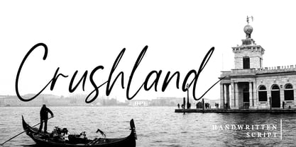 Crushland is a beautiful handwritten font. With a natural handwritten style, it brings a classy and beautiful typeface. Crushland is best used for branding, logotype, and quotes. Features: - Multilingual Support - Stylistics Set - Beautiful Ligatures - PUA Encoded - Numerals and Punctuation Thanks for visiting and purchasing my font!
 - Alt Ayame Long by ALT,
$10.00 A long version of my Ayame font. Ayame is a display font which looks great on posters, logos, and titles. Ayame Long is a 2-weight family with a heavy retro look. Works great with the regular version of Ayame you can check out the original.
 - Mango Flavor by PizzaDude.dk,
$13.00 Mango Flavor is my super cool comic-ish font with a taste of ... you may have guessed it...Mango! :) It's playful and jumpy and wants to be a part of the action!
 - Chunky Fries by PizzaDude.dk,
$13.00 Chunky Fries is my incredibly smooth and handsome comic font! Charming and delightful without overdoing it, and useful for most occasions, but mostly for something that needs a sparkle of funky business!
 - Public Interest by Bogstav,
$16.00 Public Interest in my all caps fine looking handmade font. Each letter has 5 different versions and they automatically cycle as you type - making your text look even more lively and vibrant!
 - Baby Boss by Nirmalagraphics,
$14.00 Baby Boss was inspired by the writing style of my brother who focused on learning to write and read. This font works well for children themed uses and has multi-lingual support.
 - Plastic Toys by Trim Studio,
$12.00 Plastic Toys is a basic display font for mom and kids crafter. It created to complete the normal type of font but need a playful and plasticy feel that crafter always needed. because of it feels, you can mix and match this style with various handbrush and normal strong font to get the feel of what your design needed Its perfectly suited for crafter and graphic artist to complete their design such as invitation, advertisement, poster, logo, birthday, product sign, and many more! Plastic Toys Font also Lightweight, even so contains All Standard glyphs and punctuations
 - Posh by Lián Types,
$49.00 I've always been in love with fat didones. That’s the reason of Posh. In search of something unique, I started this family back in 2013 with the aim of creating the fattest yet readable bodonian typeface in the market: It was a challenge, because roman fonts need generous counters (or what some call white spaces) and taking them to the extreme of inexistence attempted against the construction of many glyphs. Ears, dots, terminals and serifs always need some extra space so I had to find the exact point of boldness to make characters which have those attributes work well in the middle of those which haven't. (1) After a while, I felt I was again ‘in my element’: Big contrasted letters, sexy and elegant curves, and that Lubalinesque feeling that characterise my fonts. (2) Words written with Posh are a explosion of elegance and sensuality due to the fact that its didone attributes were exaggerated. Since it’s full of alternate glyphs, one can change and choose them until a nice block of ‘‘black’’ is achieved. (3) To accompany the regular style, I designed Posh Inline, a font with the same quantity of glyphs than the regular one; an all caps style called Posh Capitals, and also a really playful Italic version. I hope you find this one delicious like I do! This font is dedicated to all who understand letters are not just meant to be read, but also to be appreciated in group and individually. Enjoy it. NOTES (1) In example, it can be easy to design a fat letter ‘n’ with almost no counter, but really tough to make a satisfactory letter ‘s’ with serifs to match that ‘n’. (2) Also, it wasn't my first attempt in fat didones. Take a look at my font Reina, made in 2012. (3) Posters above show many words with ball terminals that seem to dance above and below the words in order to fill those “undesired” blank spaces.
 - Honcho by Jonahfonts,
$29.95 A bold-face font with interesting lower case letter forms.
 - PR Viking by PR Fonts,
$20.00 This typeface is inspired by the angular shapes of runes; the early writing of Northern European peoples. The letters have been given an eroded finish, as though they were carefully carved a thousand years ago, and weathered over time. This font includes at least two versions of every letter one simple, one more ornate, with all alternate characters for other European languages. The Alternates Font includes additional variations of some characters as well as Ligatures, astrological and elemental symbols. More Nordic symbols are available in the Valknut font.
 - Autor by Latinotype,
$29.00 Autor is a medium-contrast sans serif font with a dynamic stroke modulation. Its clean look and angled terminals give your designs a ‘sharp’ and contemporary feel. Autor Family comes in 7 weights, ranging from Thin to Black, with matching italics, resulting in a total of 14 styles. Autor is well-suited for editorial design, body text in books and magazines, headers and titles. It can also be used—as a display font—for logotypes, branding, advertising and publishing. The font includes a character set containing more than 400 glyphs that support over 200 languages.
 - Outbacker by Rook Supply,
$14.00 With Outbacker you're not just getting a typical a-z font. You're getting a font that has over 100 alternate glyphs, so that you can use the font to write phrases a ton of different ways. So, if you're looking for the perfect 'R', you have 6 additional options to choose from in addition to what's programmed for the default uppercase and lowercase characters. Choose more sharp characters if you're going for something more aggressive, or more rounded characters if you want something with more of a laid back flow.
 - Romeo Juliet by Letterara,
$12.00 Romeo Juliet is a beautiful and romantic handwritten font. It features amazing sweet heart-shaped titling. These sweet handwritten fonts with connecting hearts are great for creating personalized items. This font is PUA encoded which means you can access all of the cute glyphs and swashes with ease! It also features a wealth of special features including alternate glyphs and ligatures. Fall in love with its authentic feel and use it to create gorgeous wedding invitations, beautiful stationary art, eye-catching social media posts, and cute greeting cards, and many more.
 - Cadora Woods by Hanoded,
$15.00 Last year I walked half of Offa’s Dyke path, a long distance trail on the Welsh/English border. Walking the trail, I came across a beautiful stretch of forest with a lovely name: Cadora Woods. Cadora Woods font was made with a Japanese brush pen. It sort of looks medieval and a friend of mine suggested it would be the font of choice for maps of ‘The Shire’. I guess that is true, but I am convinced you can come up with some innovative uses for this font!

