10,000 search results
(0.041 seconds)
- MC Mercyan Bolish by Maulana Creative,
$15.00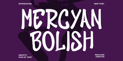 Mercyan Bolish graffiti display font. With Bold Sharp stroke, Upright and fun character with a bit of ligatures. To give you an extra creative work. Mercyan Bolish graffiti display font support multilingual more than 100+ language. This font is good for logo design, Social media, Movie Titles, Books Titles, a short text even a long text letter and good for your secondary text font with Script. Make a stunning work with Mercyan Bolish graffiti display font. Cheers, Maulana Creative
 - TWIGS 4 kids by TypoGraphicDesign,
$- The typeface TWIGS 4 kids was originally designed for a garden exhibition for children by Daniela Costa, Julia Stanossek, Alexander Branczyk and Manuel Viergutz. 4 font-styles (Einerseits, Andererseits, Invert, Icons) with 495 glyphs (Adobe Latin 1) incl. decorative extras like icons, arrows, dingbats, emojis, symbols, geometric shapes, catchwords, decorative ligatures (type the word #LOVE for ❤ or #SMILE for ☻ as OpenType-Feature dlig) and stylistic alternates (20+ stylistic sets). For use in logos, magazines, posters, advertisement plus as webfont for decorative headlines. The font works best for display size. Have fun with this font & use the DEMO-FONT (with reduced glyph-set) FOR FREE! Font Specifications ■ Font Name: TWIGS 4 kids ■ Font Weights: Einerseits, Andererseits, Invert, Icons + DEMO (with reduced glyph-set) ■ Font Category: Display for headline size ■ Glyph Set: 495 glyphs (Adobe Latin 1) ■ Specials: Decorative extras like arrows → emojis, ornaments, geometric shapes, catchwords, decorative ligatures (type the word #LOVE for ❤ or #SMILE for ☺ as OpenType Feature. dlig) and stylistic alternates (20 stylistic sets) ■ Design Date: 2005–2020 ■ Type Designer: Manuel Viergutz
 - Signsurfers Script by Learning Kiddos,
$18.99 Signsurfer is a unique retro font - a signpainter font, handwritten by me. Inspired by the golden ages of handlettering, this script font highlights: - a bouncy baseline - tight spacing - and full Latin support --- Lots of really cool catchwords & shapes (you will get all the catchwords & shapes seen in the preview pics), five alternates and 37 ligatures help you to really get creative with this one. --- What you can use it for: - branding - logotype - poster - t-shirt designs - all kind of labels - greeting cards - wedding invitations ...and so much more --- This font also works great as a running text, too. = ) --- Process behind it: first I drew all of those fancy letters & catchwords with a brush on paper. I then carefully traced all of those letters & catchwords in Illustrator and transferred them into my Font Creator program. This helped getting the unique sign painters flow. --- Note: You will a need program that support OpenType Features for accessing the alternative glyphs.
 - Paradise Garden by Nathatype,
$29.00 Would you like a professional, yet friendly looking design? If so, Paradise Garden is the best option. Paradise Garden is a serif font in thick weights and round shapes. Due to the weight and shape, this font expresses cute, friendly impressions on your designs. Its main characters are first, the noticeable differences between the thick and the thin lines and second, vertical and horizontal hooks or little wipes on the edges of each letter. It is better applied for big texts for a legibility purpose. You can also enjoy fascinating features on this font. Features: Ligatures Stylistic Sets Multilingual Supports PUA Encoded Numerals and Punctuations Paradise Garden fits for various design projects, such as posters, banners, logos, book covers, album covers, quotes, invitations, greeting cards, printed products, social media, etc. Find out more ways to use this font by taking a look at the font preview. Feel free to contact us if you require more information when you are dealing with a problem. Thank you. Happy designing.
 - Grand Atlantic by Fenotype,
$35.00 Grand Atlantic is a powerful display package by Fenotype. It’s a genuine Brush script packed with features and Swoosh extras and it’s a striking condensed flared serif in two weights, designed with the same sharp edges on the flares as the Brush. Together they make stunning logotypes, posters or headlines. On top of that there’s a “Printed” version of each. Printed versions are the same but with rugged outlines and a print texture. Grand Atlantic is great for creating powerful identities for artisanal coffee brands, craft beer, organic juice or a sports teams. Grand Atlantic Brush is equipped with Standard Ligatures and Contextual alternates that help keeping the connections between letters smooth. They’re automatically on as you should normally keep them. On top of that Grand Atlantic Brush has Stylistic, Titling and Swash Alternates for standard characters if you need more ornamental letters and if you want to break up the rectangular word shapes. There’s even more alternates in the glyph palette, making it total more than 600 glyphs. Grand Atlantic Swoosh contains 52 shapes designed to go with the Brush. There’s many “terminal swashes” that you can put in the end of a word and it will connect to the last letter, and swirl under the word from there.
 - Meloneads 2 by PizzaDude.dk,
$20.00Although being made of geometric shapes, Meloneads 2 is a playful and funny set of drawings. - Shearlight by Patria Ari,
$15.00 Shearlight is a beautiful signature monoline script typeface with elegant but strong shapes in every glyphs.
 - Barnsley Gothic by Red Rooster Collection,
$60.00 Barnsley Gothic is a condensed sans serif font family. It was designed by Steve Jackaman (ITF) in 2017. It was developed alongside its sister font family, Steelplate Gothic Pro, and includes support for Latin 1 and Central/Eastern European languages. The family is named after the town of Barnsley, a coal mining town in Yorkshire, England. In 1960, there were roughly seventy collieries within a fifteen-mile radius of Barnsley town center, however the last of these closed in 1994. Barnsley Gothic has a straightforward, industrious, no-nonsense feel, much like the town it shares a name with. Always ready to do the heavy lifting in any design project, Barnsley Gothic is the quintessential workhorse font family.
 - Eldes Cordel by Eldes,
$22.00 Font directly inspired by woodcut — mainly on the covers of Brazilian Cordel literature booklets — and created mainly to compose graphic pieces that have Brazilian culture as a reference and or that want to convey the concept of handmade, this typography brings some of the characteristics of visual effects of this printing technique, such as the gaps and inaccuracies of the carving in the wood matrix. Because of its peculiar glyph design is also a suitable font for creating an atmosphere of mystery in horror graphic pieces.
 - Noise Maker by Bogstav,
$15.00 Can noise be a beautiful sound? Well, I guess...because the other day when I was playing the good old Bleach album by Nirvana (which I consider lovely grunge music!) my wife yelled "Could you stop that noise?!" - and I answered "What noise?!" - ha-ha-ha! Anyway, I finished this font while listening to that particular lovely noise, and I knew that this crunchy, grungy, handmade and full of contextual alternates and multilingual font had to be named something with the word "noise" in it!
 - Coche by Sudtipos,
$59.00 Coche is a different kind of work from Koziupa and Paul. It is a connected script with a strong corporate feeling that aims to fill a gap in modern product branding. Coche means automobile, and one can easily envision a car's logo set with this font. Coche comes loaded with alternates and a complete set of small caps that nicely complement the caps and lowercase. This is the font for the modern designer-as-jockey who loves mix-and-play typography. Coche covers all Latin-based languages.
 - Antique Packaging JNL by Jeff Levine,
$29.00 The box cover of “Drawing Stencils No. 3 for Use on Slate or Paper” [a children’s drawing set produced by Montgomery, Ward & Company of Chicago circa the 1890s] had its title in an elegant spurred Roman type face. Working from the few letters available, a complete character set was created that resulted in Antique Packaging JNL, which is available in both regular and oblique versions. To note, this is the 1500th font release from Jeff Levine Fonts since its inception in January of 2006.
 - Sticky Toffee by Hanoded,
$15.00 I don’t have a sweet tooth myself, but I do like toffee! One of my favourite desserts is English Sticky Toffee Pudding, so I really had to name a font after this delicacy. Sticky Toffee is a bold display font. It’s all caps (in case you might have missed that), but upper and lower case differ and can be used together to create a more ‘natural’ look. Sticky Toffee comes in two great styles: Regular and Sprinkles, and has all the diacritics you’ll need.
 - Capricious by Hanoded,
$15.00 I don’t think I’m a capricious person, but right now, due to the enormous amount of renovation work on our home, I do get bad moods quite often! Capricious is a hand painted all-caps font: I used my favourite Chinese ink, a brush and very rough paper to get the desired ‘eroded’ effect. It is quite a heavy display font, so I wouldn’t really set a text in it, but it works really well for headlines, catching titles and products that need some pepper!
 - ITC Zinzinnati by ITC,
$29.99ITC Zinzinnati is based on a font called Ohio, released in 1924 by Die Schriftguss A.G. Typical of the Plakatstil letterforms of the time, the original font had a rough outline, as if drawn with a brush. Nick Curtis has smoothed the rough edges, which enhances the design's playful curves and engaging charm. As for the name: it's the punchline to an old vaudeville routine that starts with the question, Name a city in Ohio that begins with a 'Z.'" Pie in the face, comin' atcha!" - Ebony by TypeTogether,
$35.00 Some typefaces need time to ripen; Burian and Scaglione made the first sketches for Ebony back in 2008, but it took a few years of maturing in a drawer to be developed into a multi-functional type family. While keeping in tune with TypeTogether’s focus on complex typographic structures needed for magazine, newspapers and books —whether printed or digital—, Ebony goes far beyond editorial use and promises great performance in branding and advertising. The range of dark weights with taut and powerful curves can boost any headline, while the lighter styles create an approachable and clean feel in blocks of continuous text. Ebony does not fall short on aiding legibility either; letterforms have a distinct direction of ductus and features like the top serif on ‘l’ help making them clearly distinguishable from each other. It is a type family that cleverly seeks a balance between the openness and legibility of humanist sans serifs and the striking and more regularised character of grotesques. The letter-shapes feature generous counters and open terminals with crisp angles, and daringly grow both in colour and width as the fonts get bolder. Infused with this strength, Ebony also shows a quirky side in some of her shapes; the vertical fractions, the at-symbol, the old-style numbers, … The predominantly slanted style of the italics is broken up in some letterforms, such as ‘a e f l’, that are more in line with a classic cursive appearance. This, together with a forceful italic angle, ensure a change in texture within a block of text, despite sharing the same letter weight and width with the uprights. With 18 styles, tending towards the heavier part of the weight-spectrum, this face has a powerful quality!
 - Advertisers Gothic by HiH,
$12.00 Advertisers Gothic is bold and brash, like the city it comes from, Chicago. It was designed by the accomplished German-American matrix engraver, Robert Wiebking, for the Western Type Foundry in 1917. As its name suggests, it was designed for commercial headliner work, much as Publicity Gothic by Sidney Gaunt for BB&S the year before. See our Publicity Headline. Alternate letters ‘A’ & ‘S’ are provided. The most popular ad words “Free!”, “New!” and “Sale” (with both esses) are provided at an angle for dramatic tension. Advertisers Gothic became quite popular because it was effective. It can work equally well for a flyer advertising a non-profit event as for a magazine product ad. This font refuses to be a wimp. Use it boldly. Advertisers Gothic ML represents a major extension of the original release, with the following changes: 1. A total of 335 glyphs (compare) with added glyphs for the 1250 Central Europe, the 1252 Turkish and the 1257 Baltic Code Pages. 2. Added OpenType GSUB layout features: pnum, ornm, liga, hist & salt ˜ with total 13 lookups. 3. Added 209 kerning pairs. 4. Revised vertical metrics for improved cross-platform line spacing. 5. The most popular ad words “Free!”, “New!” and “Sale” (with both esses) are provided at an angle for dramatic tension The zip package includes two versions of the font at no extra charge. There is an OTF version which is in Open PS (Post Script Type 1) format and a TTF version which is in Open TT (True Type)format. Use whichever works best for your applications.
 - Biblia Serif by Hackberry Font Foundry,
$24.95 This all started with a love for Minister. This is a font designed by Carl Albert Fahrenwaldt in 1929. In the specimen booklet there’s a scan from Linotype’s page many years ago. They no longer carry the font. I’ve gone quite a ways from the original. It was dark and a bit heavy. But I loved the look and the readability. This came to a head when I started my first book on all-digital printing written from 1994-1995, and published early in 1996. I needed fonts to show the typography I was talking about. At that point oldstyle figures, true small caps, and discretionary ligatures were rare. More than that text fonts for book design had lining OR oldstyle figures, lowercase OR small caps—never both. So, I designed the Diaconia family using the Greek word for minister. It was fairly rough. I knew very little. I later redesigned and updated Diaconia into Bergsland Pro—released in 2004. It was still rough (though I impressed myself). Now, with 4-font Biblia Serif family 13 years later, I’ve cleaned up, made the fonts more consistent internally, added more functional OpenType features, and brought the fonts into the 21st century. I used the 2017 set of features: small caps, small cap figures, oldstyle figures, fractions, lining figures, ligatures and discretionary ligatures. These are fonts designed for book production and work well for text or heads. Finally, in 2021, I went over the fonts entirely and remade them in Glyphs.
 - Emilio by Narrow Type,
$35.00 Emilio is a modern serif family available in 14 styles. It's an elegant typeface with friendly and warm personality which seeks a balance between traditional and modern. Emilio is inspired by the visuality of the 1980s and the typefaces that were widely used in advertising at the time, such as Times and Garamond. However, Emilio offers a contemporary take on the serif font family, adding new elements such as reductive, calligraphy-inspired details or the "K" and "R" legs shape. If you want a more traditional look, you can achieve it with the stylistic alternatives available. Of course, the typeface also provides standard and discretionary ligatures and many other Open Type features. In addition, it offers support for most Latin languages. The big headlines and titles are where Emilio shines the most, but due to large x-height and decent contrast will work for smaller text as well. Emilio is the ideal typeface for editorial design, posters, covers, branding and much more.
 - Bazoka by Juncreative,
$15.00 Bazoka font is a display style that mimics the look of hand-drawn graffiti lettering. The letters are rounded and bubbly in shape, with a bold appearance. This style is perfect for informal or urban-themed designs, such as posters, flyers, and street art. Overall, graffiti bubble font is a fun and energetic way to add personality to your design. and this font include 3 styles regular, outline and extrude.
 - Gingerline by Hanoded,
$15.00 I love learning new words. I stumbled upon the term Gingerline after I named an older font Gamboge. Like Gamboge, Gingerline is a name for a shade of orange - the color of ripe kumquats to be precise. Didn’t know that! Gingerline font is a handmade calligraphy font; nice and even, thick and thin and quite elegant if I may say so. Comes with an abundance of diacritics as well.
 - Shaltai by ParaType,
$25.00 Decorative font Shaltai was developed by young Russian designer Katya Galuyan. The letters slightly resemble rolling, falling and broken eggs. Egg-shaped appearance of the characters determines the name of the font. Shaltai Boltai is a Russian cousin of English Humpty Dumpty, French Boule Boule and Swedish-Norwegian Lille Trille. The font can be used for advertising and display works, children books and so on. Released by ParaType in 2008.
 - Anafiola by Sensatype Studio,
$15.00 A Sans serif that we created special for unique branding needs, with extra ligatures in unique shape will be ready to add value of your brand. Anafiola - Inspired by Helvetica Font ready with: Any options to get creative variations (combination of Ligatures) Regular and Italic Version Preview as a inspirations that you can do with Anafiola font Ready with Lowercase and Uppercase characters Wish you enjoy our font. :)
 - We Love Nature Autumn Leaves by kapitza,
$69.00 We really enjoy going for long walks in the park in autumn, and the beautiful colours and shapes of the fallen leaves inspired us to create this font. We Love Nature Autumn Leaves is a picture font consisting of 52 highly detailed, hand drawn illustrations. The illustrations can be used on their own to create beautiful designs, or in combination with other illustrations in the We Love Nature font collection.
 - Thawed by Larin Type Co,
$13.00 Thawed This is a display font of a narrow specialization, its letters seem to have melted and flowed, but at the same time it retains the shape of the letters and is well read. It is perfect for branding, logos, labels, short display inscriptions and advertising materials from flyers to billboards. This font includes drops of style, they make it possible to make the font more voluminous and give detail.
 - Nice Memory by Sarid Ezra,
$17.00 Introducing, Nice Memory, a nostalgic signature script with natural feels! Nice Memory is a handwritten signature script that have rough and natural shape that will make your design looks vintage and old. You can use this font for many purpose such as wedding invitations, vintage letter, branding, or even quotes. With ligatures and underline, this font will make your project even more stunning. This font also support multilingual.
 - Peacy by Craft Supply Co,
$20.00 Introducing Peacy – Psychedelic Font Playful and Vibrant Typography Peacy Psychedelic Font, the ultimate psychedelic font, radiates fun and cheerfulness with its lively shapes and vibrant colors. Each letter dances with its unique personality, creating a dynamic visual experience. Reggae-Inspired Vibes Infused with the spirit of reggae music, Peacy captures freedom and positivity. Its flowing curves and wavy lines mirror the rhythmic melodies and laid-back vibes of reggae culture.
 - Shaky Monday by Bogstav,
$17.00 It’s Monday, the weekend’s just ended and there’s a looong way to friday. But let’s get things shaking, even though Monday is considered the worst day of the week (by many, but not all, people!) I like Mondays, that’s why I made this font - in order for you to have a great day using this comic thin lined party font! Fun fact: This font was finished on a Tuesday! :)
 - Vegas x by XdCreative,
$25.00 Vegas-X is a futuristic squared display font. This font is inspired by films, books, science and space technology, composed of a squared shape with smooth curves that gives a modern and futuristic impression. Vegas-X It is perfect for display, logo, icon and it will look stunning on any poster flyer or print. Use this font for your designs and explore its endless possibilities. Thank you _xd
 - Bambino by Mindburger Studio,
$29.00 Bambino Font Family is a typography project by Milos Mitrovic and affiliates. Bambino has an influence of 1920s Futura-like fonts and art deco look and feel. Combining its vintage character with clean geometric form and organic flow, Bambino is shaped to fit modern aesthetics. There are 12 fonts (six weights with italics) included in the family. Bambino weight range spreads from almost hairline lightness to extreme bold style.
 - Donnager by Harvester Type,
$15.00 Donnager is a rough, hard and futuristic typeface. It is inspired by square shapes, dystopia and futurism. The name is inspired, like the font itself, by the Dead Space universe. I can just see this font on the cover of some dystopian comic book! The font has alternate glyphs. The uses are unlimited, as there are different styles, weights, and even a variant version. Logos, posters, headers, branding, prints and more!
 - Tulippia by SRS Type,
$30.00 Tulippia is a super contrast font that was inspired by the beautiful shape of tulips. It has very thick strokes, but also has the elegance of curves. Using this font can give you a unique contrast effect along with visual impact. Tulippia is suitable for various types of design work such as branding, poster design, and editorial design, and comes in two weights: Regular and Heavy as display fonts.
 - Fun Write by FunFont,
$19.00 Fun Write is a font characterized by a playful and enjoyable nature, much like letters inscribed with full-hearted merriment, as implied by its name. With its simple and naive font structure, rounded edges, and an absence of sharp angles, it eschews the pointed facets typical of expressive marker strokes. This font is exceptionally well-suited for your design projects requiring a whimsical and delightful character reminiscent of a child's world
 - Rogue Style by Sensatype Studio,
$15.00 An Retro Vintage Classy Serif font that we created special for elegant branding needs, with extra alternates in unique shape will be ready to add value of your brand. Rogue Retro Vintage Classy Serif ready with: Any options to get creative variations (combination of Alternate characters) Preview as a inspirations that you can do with Rogue font Ready with Lowercase and Uppercase characters Wish you enjoy our font. :)
 - VG Sans by Vitaliy Gotsanyuk,
$25.00 VG Sans is a distinctive grotesque font that preserves the features of old grotesques while incorporating new conceptual solutions. Working on the font, its shape has been completely transformed, corrected, and the glyph set has been expanded. The font has a light contrast that increases with weight. VG Sans includes 5 weights, 670 glyphs, an extended Cyrillic/Latin character set, multiple stylistic sets, ligatures, numeral sets, and more.
 - Callge Style by Sensatype Studio,
$15.00 An Unique Modern Display Font that we created special for Elegant and Classy branding needs, with extra characters alternate in unique shape will be ready to add value of your brand. Callge Display Ligature Sans Serif ready with: Any options to get creative variations (combination of Any Alternates) Preview as a inspirations that you can do with Callge font Ready with Lowercase and Uppercase characters Wish you enjoy our font. :)
 - Roveron by Asenbayu,
$15.00 Roveron is a futuristic wide display font that has a unique geometric shape. Roveron is inspired by space explorers with a strong contemporary feel. The Roveron features a highly expanded alternative style as well as a discretionary ligature. You can use this font in a modern and sophisticated design. This font is perfect for various projects such as: logos and brand identity, headlines, posters, signs and many more.
 - Akueila by Sensatype Studio,
$15.00 Akueila is a Luxury font that we created special for elegant, elegant, modern, wedding, branding needs, font that you can combine to get any variations and unique shapes easily just in seconds with choose alternates of them. What's Included: Character set A-Z Normal & Italic Style Numerals & Punctuation Accented Characters (West Europe) Stylistic Ligatures Works on PC & Mac Recommended using Adobe Illustrator or Adobe Photoshop. Wish you enjoy our font. :)
 - Bogen by Linecreative,
$16.00 Bogen - Bold italic font with sharp angles for dynamic effects. Use ligature characters to give you unlimited designs, this font is great for your work such as posters, logos, branding, covers, banners, t-shirts and headers, or even large-scale artwork Bogen , offers you: Bogen -italic bold font including Upper & Lowercase characters(ALL CAPS has a different form characte), Ligatures Character Supports Multi linguage (Latin Western Europe), Numbers and Punctuation
 - Friendly by Sensatype Studio,
$15.00 Brother is a High-Contrast font that we created special for elegant, luxury, modern, wedding, branding needs, font that you can combine to get any variations and unique shapes easily just in seconds with choose alternates of them. What's Included: Character set A-Z Normal & Italic Style Numerals & Punctuation Accented Characters (West Europe) Stylistic Ligatures Works on PC & Mac Recommended using Adobe Illustrator or Adobe Photoshop. Wish you enjoy our font. :)