10,000 search results
(0.067 seconds)
- Brocken by RMU,
$35.00 Good ideas never will die. Based on the concepts of former Leipzig student Volker Küster in the mid-1960s, I redrew and digitized the basics and extended them into a complete multilingual caps-only poster font which I named “Brocken”. Its letter-forms strongly remind me of the mighty rocks covering the highest peak, Brocken, in Northern Germany.
 - Plakat by Scriptorium,
$18.00Plakat is based on lettering by 1920s advertising calligrapher Samuel Welo. It is a complete upper and lower case set with a number of alternate characters, all with a rough, decorative look accented by curls and hooks. If you like the look of our popular Scurlock font, Plakat has a similar aesthetic, though it is even bolder. - Palmer Oxonian NF by Nick's Fonts,
$10.00The 1884 specimen book of San Francisco Palmer and Rey Type Foundry featured this elegant design under the name Oxford. The decorative caps, combined with the centered small caps, have a timeless appeal. Both versions of the font include complete Latin 1252, Central European 1250 and Turkish 1524 character sets, with localization for Moldovan, Romanian and Turkish. - Mimogie by Youngtype,
$14.00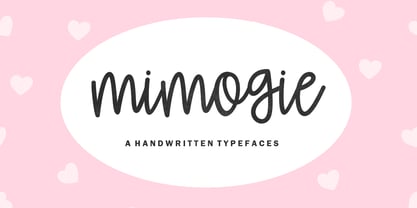 Mimogie - Handwritten Typefaces Contains a complete set of lowercase, uppercase, alternative, ligatures, punctuation marks, numbers and multilingual support. This font is ideal for use in watercolor designs or hand bold styles, such as blog headers, posters, wedding elements, t-shirts, clothing, book covers, business cards, greeting cards, branding, merchandise, invitations and handmade quotes and more. again. again. Thank you :)
 - Reboot NF by Nick's Fonts,
$10.00Fire the retro rockets! Here's a decidedly different take on techno type, patterned after Robert Williamson's Program 32 from the 1970s. Despite its machine-readable pretensions, it renders remarkably warm headlines. Both versions of this font include the complete Latin 1252, Central European 1250 and Turkish 1254 character sets, along with localization for Lithuanian, Moldovan, Romanian and Turkish. - Display Black Serif by Gerald Gallo,
$20.00 Display Black Serif is a display font not intended for text use. It was designed specifically for display, headline, logotype, branding, and similar applications. Display Black Serif has an uppercase alphabet located under the character + shift keys and a complete set of alternate uppercase characters located under the character set keys. It also has numbers and punctuation.
 - Woolwich by Hanoded,
$15.00 Woolwich is a jolly fine display font, named after a district in south-east London. Woolwich, somewhat inspired by Futura condensed, was completely made by hand and comes in a clean and an eroded version. It is highly legible and will certainly make your designs stand out. Woolwich speaks a lot of languages, including the language of doodles.
 - Rio Rita NF by Nick's Fonts,
$10.00Here's another gem from Samuel Welo's perennial classic, The Studio Handbook, originally called Goddard Classic. Welo's inimitable penwork manages to be both worldly and whimsical, and remains as fresh today as when it was first introduced in the 1920s. Both versions of this font include the complete Unicode Latin 1252, Central European 1250 and Turkish 1254 character sets. - PT Nature by ParaType,
$25.00 PT Nature by Paratype is a collection of scripts based on handwriting of real people. Text set in PT Nature looks genuine and human. The fonts are a great fit for advertisement and packaging designs as well as for informal communications. PT Nature was created by Gennady Fridman and Isabella Chaeva with help from the Paratype design team.
 - Joyful Magnolia by Youngtype,
$18.00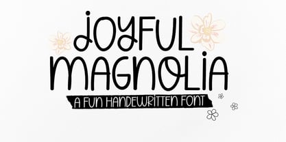 Joyful Magnolia handwritten. Contains a complete set of lowercase, uppercase, alternative, ligatures, punctuation marks, numbers and multilingual support. This font is ideal for use in watercolor designs or monoline styles, such as blog headers, posters, wedding elements, t-shirts, apparel, book covers, business cards, greeting cards, branding, merchandise, invitations and handmade quotes and more. again. Thank You :)
 - Braggadocio by Monotype,
$29.99 Braggadocio is a very black typeface. Braggadocio is a strange hybrid with characteristics of both sans serif and modern faces; and it belongs very much to its time. Like high society in the 1920's, it should not be taken too seriously. Use the Braggadocio font for display lines in advertising, magazines and light hearted communications.
 - Lignette by FaceType,
$30.00 You are looking for a contemporary upright script family? Lignette Script is an elegant monoline font consisting of 535 glyphs, with a wide range of languages covered (including Greek) and 71 beautiful ligatures. Please make sure to use applications that support OpenType features. Moreover Marcus Sterz created Lignette Deco to complete the graceful look with frames and ornaments.
 - San Marcos NF by Nick's Fonts,
$10.00In his book Victorian Display Alphabets, Dan X. Solo called this specimen "Marquette". This unicase version features a complete character set, and is named after a favorite watering hole in Texas on the Guadeloupe River. Both versions of this font contain the Unicode 1252 (Latin) and Unicode 1250 (Central European) character sets, with localization for Romanian and Moldovan. - Rush Funky by HansCo,
$15.00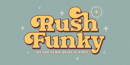 Rush Funky is a serif typeface with vintage and retro look!. Equipped with all complete characters ranging from uppercase letters, lowercase letters, numbers, punctuation marks and multi-lingual support, this font is ready to be used in any project. Uppercase & Lowercase Numbers & Punctuation Multilingual Alternate character & ornament How to access alternate / ornament ? : https://hanscostudio.com/tutorial/ Enjoy!
 - Sabrina Zaftig NF by Nick's Fonts,
$10.00This charming, disarming, roly-poly typeface is based on handlettering discovered on a Sabena Airlines travel brochure of the 1930s. Include it in your next project, and a good time will be had by all. Both versions of this font contain complete Unicode 1252 (Latin) and Unicode 1250 (Central European) character sets, with localization for Romanian and Moldovan. - P22 Salon by IHOF,
$24.95 P22 Salon was originally inspired by Art Nouveau lettering. In the development of the three fonts (P22 Salon Full, P22 Salon Inner and P22 Salon Shadow) they began taking on a slightly more modern feel. All three variations were designed to be completely interchangeable with one another, and can be layered to achieve a variety of effects.
 - Hedley New by moretype,
$25.00 Hedley New is a reconstructed relative of Hedley, originally released in 2004. Building on its clean, original, simple charm, Hedley New has grown to be an elegant, clean, usable sans. Having been completely re-drawn, with new spacing and kerning, Hedley New is now an Opentype font containing small caps, tabular, proportional and old style numerals and ligatures.
 - Carinthia by Scriptorium,
$18.00Carinthia is derived from the style of Roman calligraphy known as Rustica, but with some features of Roman uncial added to form a complete upper and lower case character set, including variant upper case characters with decorative spurs. The result is a rather vertical, but quite stylish font which has an antique calligraphic look and good readability. - Gradl No1 by URW Type Foundry,
$39.99 Gradle Nr. 1 is yet another new art nouveau design in the URW++ library. It was reworked, redesigned, completed and digitally remastered by Ralph M. Unger for URW++, based on hand-drawn upper case characters by M. J. Gradl, about in 1900. Gradl Nr. 1 is a caps-only font perfectly suited for posters and signage.
 - Teletex by The Northern Block,
$16.70 A typewriter style slab serif typeface. The design is influenced by the font Rockwell and uses a combination of precise geometry with subtle elliptical curves. The harmony of these elements creates a distinctive and functional typeface suitable for a variety of graphic design applications. Details include 4 weights, a complete character set, manually edited kerning and Euro symbol.
 - Nerwyn NF by Nick's Fonts,
$10.00This snappy little number was inspired by a PLINC typeface by Murray Fuchs called Erwin, which has been redrawn and improved for the digital age. Use Contextual Alternates to "bounce" the text, and Discretionary Ligatures to enable some interlocking letter combinations. Both versions of this font include the complete Latin 1252 and Central European 1250 character sets. - PiS HansHand Pro by PiS,
$28.00 HansHand started out in 2003 as a simple free font, the adaption of my grimy handwriting. For its 10th anniversary it got a complete overhaul and lots of new characters. Now also available in BOLD for the first time, featuring scribbles, strokes, circles and boxes to underline the fast taking-notes-while-on-the-phone look!
 - Hasta La Pasta NF by Nick's Fonts,
$10.00This loopy offering is patterned after a typeface from the 1888 specimen book from the Central Type Foundry of St. Louis, called simply "Spiral". The ragged contours on the original face have been smoothed out, but it still is an attention-getter. Both versions of this font include the complete Unicode Latin 1252 and Central European 1250 character sets. - Pabean Market by Nasir Udin,
$24.00 Pabean Market is an interpretation of the incription on the oldest market in Surabaya, Indonesia, which was established on 1849. The unique character inspired me to make a complete set of typeface. It’s a retro typeface but has a futuristic aura yet a festive vibes. This font comes in single style and has several Discretional Ligatures. -- Uppercase
 - Hotel District JNL by Jeff Levine,
$29.00 The sans serif type style for the specialty font Nameplate JNL was given a serif treatment and is now Hotel District JNL complete with a full character set. Originally inspired by two Art Deco-era metal door signs saying "Men" and "Ladies", the thin lettering lends itself well to period pieces as well as contemporary design work.
 - Midtown Tessie NF by Nick's Fonts,
$10.00A sign at the 81st Street (Museum of Natural History) New York subway stop provided the pattern for this mosaic tile face. The font features a full-tile background at the bar position (shift-backslash) and left-and-right pointing fists at the brace positions as well as complete Latin 1252 and Central European 1250 character sets. - Iago NF by Nick's Fonts,
$10.00Two classics from American Type Founders specimen catalogs of the 1880s—Othello and ATF Black Caps—inspired this powerful headline face with a decidedly menacing quality. Suitable for creepy, eerie and spooky occasions. Both versions of the font include complete Latin 1252, Central European 1250 and Turkish 1524 character sets, with localization for Moldovan, Romanian and Turkish. - Planscribe NF by Nick's Fonts,
$10.00This family of faces take their inspiration from the standard faces used by the Leroy® Automatic Lettering Machine, a mainstay for architects and draftsmen in Ye Olden Days of t-squares and triangles. Crisp, clean and retro-techno. Both versions of this font include the complete Latin 1252, Central European 1250 and Turkish 1254 character sets. - Junebug Stomp NF by Nick's Fonts,
$10.00A circa-1925 poster for the chanteuse Arlette Montal, signed simply "Bouchard," provided the inspiration for this roly-poly romp through the alphabet. It takes its name from a popular East Texas summertime porch dance...or not. This font contains the complete Latin language character set (Unicode 1252) plus support for Central European (Unicode 1250) languages as well. - Circles JY by JY&A,
$39.00Based on electrical circuitry, David Philpott's Circles typefaces are oddly legible, even though one might think they were destined for display usage only. The circle is the base form, repeated throughout the design. Originally drafted during his time at the Massey University School of Design, subsequent refinements have turned Circles into two complete fonts with a full character set. - AT Move Tremelo by André Toet Design,
$39.95 TREMELO a typeface based on a logotype (Microtel). We designed it as a complete capital alphabet. The original idea for the logotype font came from the products the firm produced. They provided the parts that go into hearing-aids. We thought the type should have some visual tremor in it. Concept/Art Direction/Design: André Toet © 2017
 - Samira by CastleType,
$29.00 I must admit that I am not a big fan of the Art Nouveau style. However, I found this particularly beautiful alphabet and decided to use it as the basis for this new font. Very graceful, elegant, and dare I say, organic. Includes some intertwined ligatures. Complete uppercase, numerals, basic punctuation. Supports most Western European languages.
 - Cielo by Wilton Foundry,
$29.00 Cielo font family consists of Cielo Light, Cielo Light Italic, Cielo Regular, Cielo Italic, Cielo Bold, Cielo Bold Italic, and Cielo Stencil (Regular weight) Cielo is a versatile contemporary typeface family that will serve you well in many design situations like advertising, corporate communications, etc. Buying all seven weights make it an excellent value for money!
 - Mercantile Display NF by Nick's Fonts,
$10.00This older, somewhat funkier relative of the classic face, Engravers Roman, made its last appearance in the 1912 ATF Specimen Book. Here, it has been revived to do yeoman-like duty in a new century. This font contains the complete Latin language character set (Unicode 1252) plus support for Central European (Unicode 1250) languages as well. - Skittles N Beer NF by Nick's Fonts,
$10.00Handlettering on a 1929 brochure for the P&O British-India Steamship Line inspired this tiddly typeface. Art Deco sensibilities combine with a playful attitude to yield a delightful and amusing headline font. The PC PostScript, TrueType and OpenType versions contain the complete Latin language character set (Unicode 1252) plus support for Central European (Unicode 1250) languages as well. - Grimpt by Typesketchbook,
$45.00 Grimpt is a fashion and modern type, made up of three sub-families. Brush (with alternate version), Print (made from beautiful Sans-Serif font “More”), and Script. In these families , you can choose the original and rust styles (offers different feels in different effects). The complete family has 12 individual typefaces that serve your projects every purpose.
 - Paranoid Android by Comicraft,
$29.00Fonts are Inhuman and Human Fonts are IN! Now, the Comicraft Cybernetics Corporation is proud to announce the first in a new line of fonts with GFP... Genuine Font Personalities. Paranoid Android is an outer alloy, inner void, solitary solenoid GFP prototype -- you can tell, can't you? Finally a font that knows its place as a digital servant to the human race. What will Comicraft think of next? No, don't bother to answer that, Comicraftsmen are fifty thousand times more intelligent than you and even they don't know the answer. Warning: Nothing left to be enjoyed, every diode rheumatoid*, terminally Paranoid Android is not so much a font, and more a kind of electronic sulking device. Share and Enjoy! *The moving parts on the left side of this font are in a solid state. It may sit in a corner and rust, or just fall apart where it's standing. - Fantasi Women by Gatype,
$8.00 WOMEN FANTASY - A modern serif font family with a unique and classy style. It looks amazing on any screen size and is easy to read in text size. Fantasi Women is a display font created primarily for headlines, titles and other short text and is perfect for advertising, vintage moodboards, branding, logo types, packaging, titles, editorial designs, and modern and vintage designs. This font will add a fun and friendly touch to any of your projects! This font is PUA encoded which means you can access all the glyphs and sweeps easily and more. Have fun using Fantasy Women. I really hope you enjoy it! Feel free to follow, like and share. Thank you so much for checking out my shop!
 - Lentera Ramadhan by Dumadi,
$25.00 Hi There, Ahead of the month of Ramadan in the Hijri calendar, we have created a very amazing font. We have created the “Lentera Ramadhan” font in Hijaiya-like style and shape which is sure to make Ramadan greetings extraordinary with your best projects. equipped with Stylistic Alternate and SS01 which makes the font feel not monotonous. This font is perfect for those of you who create Ramadan poster projects, titles, banners, Instagram posts, holiday greeting cards, food menus, and other designs.
 - Robinsan by Silverdav,
$20.00 Introducing “Robinsan” is a premium calligraphy font with a very elegant shape, the curves produced by this font are very charming so it will add an elegant impression to your design. Robinsan Font was created to meet your design needs such as logos, branding, wedding invitations, handicraft products, quotes, magazine covers, and many more. Robinson Font has so many alternatives and ligatures that you can use to make your designs look more elegant and multilingual support for approximately 90 languages.