10,000 search results
(0.402 seconds)
- Tecna Dark Right Triangle BNF by Descarflex,
$30.00 The Tecn@ Dark&Light Triangle Background Nomenclature Font family is differentiated by the direction of the triangle tip in the 4 cardinal points. The family were designed to head, enumerate, indicate or highlight writings or design plans, for this reason, the characters are available only in capital letters and some signs or symbols that can serve such purposes. A triangle or empty character is included so that the user can use it overlaying any character of his choice or to be used alone.
 - Tecna Dark Left Triangle BNF by Descarflex,
$30.00 The Tecn@ Dark&Light Triangle Background Nomenclature Font family is differentiated by the direction of the triangle tip in the 4 cardinal points. The family were designed to head, enumerate, indicate or highlight writings or design plans, for this reason, the characters are available only in capital letters and some signs or symbols that can serve such purposes. A triangle or empty character is included so that the user can use it overlaying any character of his choice or to be used alone.
 - Tecna Dark Up Triangle BNF by Descarflex,
$30.00 The Tecn@ Dark&Light Triangle Background Nomenclature Font family is differentiated by the direction of the triangle tip in the 4 cardinal points. The family were designed to head, enumerate, indicate or highlight writings or design plans, for this reason, the characters are available only in capital letters and some signs or symbols that can serve such purposes. A triangle or empty character is included so that the user can use it overlaying any character of his choice or to be used alone. What is Lorem Ipsum? Lorem Ipsum is simply dummy text of the printing and typesetting industry. Lorem Ipsum has been the industry's standard dummy text ever since the 1500s, when an unknown printer took a galley of type and scrambled it to make a type specimen book. It has survived not only five centuries, but also the leap into electronic typesetting, remaining essentially unchanged. It was popularised in the 1960s with the release of Letraset sheets containing Lorem Ipsum passages, and more recently with desktop publishing software like Aldus PageMaker including versions of Lorem Ipsum. Why do we use it? It is a long established fact that a reader will be distracted by the readable content of a page when looking at its layout. The point of using Lorem Ipsum is that it has a more-or-less normal distribution of letters, as opposed to using 'Content here, content here', making it look like readable English. Many desktop publishing packages and web page editors now use Lorem Ipsum as their default model text, and a search for 'lorem ipsum' will uncover many web sites still in their infancy. Various versions have evolved over the years, sometimes by accident, sometimes on purpose (injected humour and the like). Where does it come from? Contrary to popular belief, Lorem Ipsum is not simply random text. It has roots in a piece of classical Latin literature from 45 BC, making it over 2000 years old. Richard McClintock, a Latin professor at Hampden-Sydney College in Virginia, looked up one of the more obscure Latin words, consectetur, from a Lorem Ipsum passage, and going through the cites of the word in classical literature, discovered the undoubtable source. Lorem Ipsum comes from sections 1.10.32 and 1.10.33 of "de Finibus Bonorum et Malorum" (The Extremes of Good and Evil) by Cicero, written in 45 BC. This book is a treatise on the theory of ethics, very popular during the Renaissance. The first line of Lorem Ipsum, "Lorem ipsum dolor sit amet..", comes from a line in section 1.10.32. The standard chunk of Lorem Ipsum used since the 1500s is reproduced below for those interested. Sections 1.10.32 and 1.10.33 from "de Finibus Bonorum et Malorum" by Cicero are also reproduced in their exact original form, accompanied by English versions from the 1914 translation by H. Rackham. Where can I get some? There are many variations of passages of Lorem Ipsum available, but the majority have suffered alteration in some form, by injected humour, or randomised words which don't look even slightly believable. If you are going to use a passage of Lorem Ipsum, you need to be sure there isn't anything embarrassing hidden in the middle of text. All the Lorem Ipsum generators on the Internet tend to repeat predefined chunks as necessary, making this the first true generator on the Internet. It uses a dictionary of over 200 Latin words, combined with a handful of model sentence structures, to generate Lorem Ipsum which looks reasonable. The generated Lorem Ipsum is therefore always free from repetition, injected humour, or non-characteristic words etc.
 - Tecna Dark Square BNF V1.2 by Descarflex,
$30.00 The Tecn@ Square family were designed to head, enumerate, point out or highlight a point in a writing or plan. In this sense and for this reason, the characters are available only in capital letters and some signs or symbols that could serve such purposes. Among other applications, these characters are used in the personalization of plans, highlighting or indicating parts of the design that facilitate the Descriptive Memory of the plan or the development of a Manual or Installation Instructions.
 - Pie charts for maps - Unknown license

- Five And Dime NF by Nick's Fonts,
$10.00A font with a strong architectural feel, inspired by those great commercial emporiums of a bygone era. To cap the crossbars, use [brackets] to enclose uppercase letters, {braces} to enclose lowercase letters, and the upright bar | between upper- and lowercase letters. Both versions of the font include 1252 Latin, 1250 CE (with localization for Romanian and Moldovan). - PF DIN Display Pro by Parachute,
$79.00 While DIN Display seems to retain DIN’s basic characteristics, it shines with its sharper corners and contemporary look. Completed in 2002, it was first released and published in Parachute’s award-winning 2003 catalog and immediately was a hit. It has been used successfully in magazines, corporate applications and packaging in fields such as music, fashion, technology, visual arts. The ‘Pro’ series has been enhanced with more weights, multilingual support and opentype features in all different styles. Specifically, this superfamily supports simultaneously Latin, Greek and Cyrillic, while each one of its 15 weights contains 1197 glyphs and 20 opentype features. Additionally, every font in this superfamily has been completed with 270 copyright-free symbols, some of which have been proposed by several international organizations. This is a set of very useful daily symbols for packaging, branding and advertising. Symbols for public areas, environment, transportation, computers, fabric care and urban life.
 - FF DIN Paneuropean Variable by FontFont,
$629.99 FF DIN: the famous, faithful and first revival of DIN 1451. FF DIN originates in the lettering models from the German standard DIN 1451, and is considered the perfect standard typeface due to methodical and engineered design. FF DIN Variable offers you more FF DIN than ever before. Pushing font technology to its limits, Variable fonts provide creatives a tool to dial in hyper specific variations which thrive in any design space. FF DIN Variable take bold steps in engineering, which the typefaces behaviour which brings in FF DIN’s technical look-and-feel into the smooth and almost organic world of Variable Fonts. Available in both upright and italic styles, there is a lot more FF DIN to discover with new era of type technology. FF DIN Italic is a sloped roman style, however it is optically corrected – slightly thinner, slightly narrower. As a result, FF DIN Italic stands out subtly. FF DIN Variable stays faithful to its parent’s DNA, the utmost care was taken to ensure that the new instances of FF DIN Variable remained consistent with all the well-known weights. Precision is the mantra of FF DIN, the FF DIN Variable is no exception to this design philosophy. Produce exquisitely fine-tuned typography and expressive animated headlines for any design. Infinite styles, intelligent, and powerful.
 - PF DIN Text Universal by Parachute,
$165.00 DIN Text Universal is the most advanced DIN superfamily ever. It combines the powerful DIN Text Pro with DIN Text Arabic bringing the number of glyphs to 3320 per font. In fact, this set of fonts contains the most complete and powerful array of arabic features commercially available. It supports all variations of the Arabic script such as Persian, Urdu and Pashto. It is also enhanced with 30 advanced opentype features and kerning for all languages. The four major scripts Latin, Arabic, Cyrillic and Greek are now matched across the design of the whole family, respecting at the same time each one's modern cultural identity. With its vast array of weights, the extended support for numerous languages, its careful and detailed design, it will prove to be extremely valuable for many complex corporate projects and corporations which operate internationally.
 - FF DIN Slab Variable by FontFont,
$419.99 FF DIN: the famous, faithful and first revival of DIN 1451. FF DIN originates in the lettering models from the German standard DIN 1451, and is considered the perfect standard typeface due to methodical and engineered design. FF DIN Slab is a robust compliment to the FF DIN family. Designed by Antonia Cornelius and Albert-Jan Pool, it offer designers tools to create greater rhythm and design depth. FF DIN Slab’s proportions have been meticulously aligned with its Sans origins, offering the perfect balance between positive and negative space. The serifs are assertive, sturdy and balanced, they are engineered to emphasis a strong horizontal flow through text, a grounded utility and assurance in headlines. The result of this attention to detail is a typeface that harmonizes beautifully with other FF DIN styles. Pushing font technology to its limits, FF DIN Slab is also available as a Variable font. Allowing creatives to design hyper specific variations which thrive in any design space, and even seamlessly animate movement from one state to the next. FF DIN Slab distinctively carries on its parent’s DNA, speaks the same native language — but with a strong peculiar dialect. It expands the DIN family worthily — independent but integrated — and opens totally new possibilities of uses with the whole DIN family.
 - PF DIN Stencil Pro by Parachute,
$65.00 DIN Stencil Pro on Behance. DIN Stencil Pro: Specimen Manual PDF. Despite the fact that over the years several designers have manually created stencil lettering based on DIN for various projects, there had never been a professional digital stencil version of a DIN-based typeface until 2010 when the original DIN Stencil was first released. The Pro version was released in 2014 and adds multiscript support for Cyrillic and Greek. DIN Stencil Pro was based on its original counterpart DIN Text Pro and was particularly designed to address contemporary projects, by incorporating elements and weights which are akin to industries such as fashion, music, video, architecture, sports and communications. Traditionally, stencils have been used extensively for military equipment, goods packaging, transportation, shop signs, seed sacks and prison uniforms. In the old days, stencilled markings of ownership were printed on personal possessions, while stencilled signatures on shirts were typical of 19th century stencilling. Two companies dominated the market in the mid-twentieth century: the Marsh Stencil Machine Company in the United States and the Sächsische Metall Schablonen Fabrik in Germany. Ever since the late 1930s, it was the German Sächsische Metall Schablonen Fabrik which used heavily the new DIN 1451 standard font (introduced in 1936), attempting to overthrow the reign of the Didot-style modern roman which was at the time the most common stencil letter in Germany. These letters were manufactured mainly as individual zinc stencils which could be ordered in sizes between 10 and 100mm. The DIN Stencil family manages to preserve several traditional stencil features, but introduces additional modernities which enhance its pleasing characteristics which make it an ideal choice for a large number of contemporary projects. Furthermore, the spacing attributes of the glyphs were redefined and legibility was improved by revising the shape of the letterforms. The DIN Stencil Pro family is an enhanced version of the popular DIN Stencil. It consists of 8 diverse weights from the elegant Hairline to the muscular Black and supports Latin, Cyrillic, Greek, Eastern European, Turkish and Baltic. The new version 3.0 includes several additions such the recently unicode encoded character of the German uppercase Eszett (ẞ), the Russian currency symbol for Rouble (₽), Ukrainian Hryvnia (₴), Azeri and Kazakh letterforms.
 - White Tie Affair NF by Nick's Fonts,
$10.00Round, firm and fully packed, this unusual yet elegant headline font with its multiline treatment is best used in large sizes. Both versions of this font contain the Unicode 1252 Latin and Unicode 1250 Central European character sets, with localization for Romanian and Moldovan. - La Vie En Flower by Arendxstudio,
$15.00 La vie en Flower is a very feminine and beautiful font with a vintage dressing that is perfect for every project of your design. With "La vie en Flower" you get: Uppercase, lowercase, 2.numeral, punctuation & Symbol multi language support ligatures ss01 ss02 Need help? Please don't hesitate to drop me an email at asep.rendi16@gmail.com if you have any issues. Comments & likes are also very appreciated! :) Enjoy!
 - FF DIN Stencil Variable by FontFont,
$524.99FF DIN: the famous, faithful and first revival of DIN 1451. FF DIN originates in the lettering models from the German standard DIN 1451, and is considered the perfect standard typeface due to the methodical and engineered nature of its design. The FF DIN family breathes an atmosphere of versatility and authority, FF DIN Stencil follows the same design principles with extra flair. The bridges are arranged vertically, which usually replaces the thinnest parts of the strokes — offering depth in your headlines. Go loud and scale up, as the weights get heavier, the width of the bridges skillfully expand and contract, enabling FF DIN Stencil to provide confidence in volume, and in any chosen style. Also made available as a Variable font, creatives can design hyper specific variations to thrive in any design space, and even to animate movement from one state to the next. Get innovative with the entire FF DIN family, FF DIN Stencil’s spacing and kerning is identical to FF DIN, this enables swapping between any FF DIN font without changes in word length or line breaks. For true FF DIN fans, FF DIN Slab and FF DIN Stencil designed by Albert-Jan Pool, Antonia Cornelius and Achaz Reuss, can be seen as harmonious companions to the FF DIN family, rather than alternatives. Bestowed with its parents distinctive DNA, all the FF DIN extensions open up new possibility with their own unique qualities, but stay true to the FF DIN design philosophy of engineered precision. - Dive Gear Stencil JNL by Jeff Levine,
$29.00 Some vintage 1960s-era packaging for dive gear (masks, swim fins, etc.) manufactured by the Voit division of AMF had various merchandise boxes hand-lettered [with some variation of design] in an interesting sans stencil. These packages formed the inspiration of Dive Gear Stencil JNL. Thanks once again to Gene Gable, whom on many occasions has provided Jeff Levine material for type design inspiration.
 - Dip Pen Deco JNL by Jeff Levine,
$29.00 The hand lettered title on the cover of the 1938 sheet music for “If It Rains – Who Cares” featured a condensed Art Deco typeface made with a round nib pen. The square shaped characters with rounded corners were a perfect subject for a digital font revival, and are now available as Dip Pen Deco JNL, in both regular and oblique versions.
 - F2F El Dee Cons by Linotype,
$29.99The Face2Face (F2F) series was inspired by the techno sound of the mid-1990s, personal computers and new font creation software. For years, Thomas Nagel and his friends formed a unique type design collective, which churned out a substantial amount of fresh, new fonts, none of which complied with the traditional rules of typography. Many of these typefaces were used to create layouts for the leading German techno magazine of the 1990s, Frontpage. Nagel and his fellows would even set in type at 6 points, in order to make it nearly unreadable. It was a pleasure for the kids to read and decrypt these messages! F2F EI Dee Cons one of 41 Face2Face fonts included in the Take Type 5 collection from Linotype. Nagel designed nine of these himself." - La Vie Nouveau JNL by Jeff Levine,
$29.00 Early 1900s songwriters had a penchant for devising lengthy titles for their compositions. A perfect example from 1909, "It Is Hard to Kiss Your Sweetheart When the Last Kiss Means 'Good Bye'" is a whopping fourteen words long. The sheet music for this piece has a hand lettered, Art Nouveau sans serif design which became the working model for La Vie Nouveau JNL [which translates to "the new life"], and is available in both regular and oblique versions.
 - PF DIN Stencil B by Parachute,
$43.00 This is a new version of our popular DIN Stencil family designed with a wider cut than the original. This overcomes the diminishing effect of the stencil at smaller sizes where the cuts tend to disappear, whereas it makes a bold statement at display sizes. Traditionally, stencils have been used extensively for military equipment, goods packaging, transportation, shop signs, seed sacks and prison uniforms. In the old days, stencilled markings of ownership were printed on personal possessions, while stencilled signatures on shirts were typical of 19th century stencilling. DIN Stencil B manages to preserve several traditional stencil features, but introduces additional modernities which enhance its pleasing characteristics and make it an ideal choice for a large number of contemporary projects. It consists of 7 diverse weights from Extra Thin to Black. This version supports Latin, Cyrillic, Eastern European, Turkish and Baltic. DIN Stencil B includes several additions such the recently unicode encoded character of the German uppercase Eszett (ẞ), the Russian currency symbol for Rouble (₽), Ukrainian Hryvnia (₴), Azeri and Kazakh letterforms.
 - PF DIN Text Arabic by Parachute,
$145.00 This Arabic typeface is one of Parachute’s most involved text typefaces. For the first time -back in 2010- a contemporary Arabic equivalent to a comprehensive DIN series of fonts was available. In fact, this set of fonts contains the most complete and powerful array of Arabic features commercially today. It comes in eight weights and includes Latin. Based on the DIN Text Pro superfamily, Parachute® released -in collaboration with designer Hasan Abu Afash- 2 new versions. DIN Text Arabic is the basic Arabic version which includes Latin and supports all variations of the Arabic script such as Persian, Urdu and Pashto. The second version DIN Text Universal is the most advanced DIN superfamily ever. It combines the powerful DIN Text Pro with DIN Text Arabic bringing the number of glyphs to 3320 per font. It is also enhanced with 30 advanced opentype features and kerning for all languages. Altogether it supports hundreds of languages, proving to be an essential tool for corporations which operate internationally. The whole family consists of eight weights from extra black to hairline. DIN Text Arabic is featured in the recent book Arabesque 2 by Gestalten.
 - Nifty Script by URW Type Foundry,
$49.99 The “Ultimate Script”? Not yet, but we’re working on it! Just think: Loads of ligatures, contextual variations and stylistic alternates, coupled with easy use…Just what you’ve been looking for all this time? Well, here it is with all of its typographic power. The perfect partner for you: Technically adept, but still good-looking! What more do you want? Die „Ultimative Schreibschrift“? Noch nicht, aber wir arbeiten dran! Man denke nur an: Mengen an Ligaturen, kontextbezogenen Varianten und stilistischen Alternativen, gekoppelt mit leichter Handhabung…Genau das, was Sie die ganze Zeit gesucht haben? Na denn, hier ist es in all seiner typographischen Mächtigkeit. Die perfekte Partnerin für Sie: Technisch versiert, aber auch gut aussehend! Was wollen Sie mehr?
 - Roundabout by URW Type Foundry,
$35.99 Roundabout is a typeface that is extracted from an ellipse shape. Each and every character started at the same geometrical figure. By cutting it up in sections, twist and rotate the separate characters could be build. The ellipse provides this typeface with evident and smooth looking features. The name Roundabout is misleading, an ellipse is not round. But the word Roundabout has a nice ring to it and it seems to fit this typeface perfectly. The Roundabout as we know it is a place where the traffic circles. Sometimes in the greater metropoles it jams like clotting veins. Various exits are presented for those who know which way to go, for those who don’t it seems an eternal treadmill. Unlike my typeface, that seems rather careless, light weighted and knows her way around. A roundabout in a child’s mind is a playful carrousel or a merry go round. Merry go round has the sweetest sound and a match is found. My Roundabout is a joyful, optimistic and open typeface, which can be used over and over and over again for many or any purposes. ----- Roundabout ist eine Schrift die aus der Form einer Ellipse entstand. So teilen alle einzelnen Zeichen denselben geometrischen Ursprung. Durch das zerteilen, verdrehen und verflechten der elliptischen Grundform konnten die separaten Zeichen so geformt werden, dass sie einen klaren und weichen Charakter erhielten. Der Name Roundabout scheint auf den ersten Blick etwas irreleitend - ist eine Ellipse ja nicht wirklich rund. Er hat aber einen schönen Klang und doch eine tiefe Verbindung zu dieser Schrift. In unseren Gedanken ist Roundabout ein Kreisverkehr: Manchmal, in großen Städten, kann er blockieren, so wie eine verstopfte Ader. Verschiedenste Auswege zeigen sich denen, die ihr Ziel kennen; für alle anderen erscheint dieser Ort wie eine endlose Schlaufe. Dieses Bild widerspricht dem Auftreten meiner Schrift, welche eher sorglos und leichtfüßig ist; sie kennt ihren Weg. In dem Kopf eines Kindes jedoch ist ein Roundabout ein verspieltes Karussell, ein „merry go round“. ,,Merry go round“ klingt bezaubernd und so fiel die Entscheidung. Meine Roundabout ist eine fröhliche, optimistische und offene Schrift, die immer und immer wieder genutzt werden kann, zu jedem erdenklichen Zweck.
 - PreussischeIV44Ausgabe3 - 100% free

- Wild West Shadow - Unknown license

- Wild West USA - Unknown license

- Wild West Wind - Unknown license

- KR Wild West - Unknown license

- West Fork JNL by Jeff Levine,
$29.00 West Fork JNL is based on the classic wood type Latin Extended (Hamilton, 1888) and is available in both regular and oblique versions.
 - The West Forest by Hustle Supply Co,
$14.00 The West Forest The West Forest is a strong, bold all-caps Wide Sans Serif Typeface. Included are 8 font files ranging from clean to Textured, Rounded & Rough with Oblique options for each. The West Forest is sure to be a work horse typeface that is continually used within many of your projects. This typeface has the potential to fill many different needs for a range of different aesthetics. What's Included? Regular, Textured, Rough & Rounded Versions Oblique (Italic) Versions of each Western European Characters
 - ND Raster West by NeueDeutsche,
$9.00 A Pixel Font with Wild West Spirit inspired by the daring cowboys and classic MS DOS games. Immerse in the rustic landscapes of Deadwood saloons and tumbleweeds as you evoke the nostalgia of retro gaming graphics. ND Raster West delivers crisp and sharp letterforms, reminiscent of arcade games and early computer screens. Its authentic Western flair and rugged edges capture the essence of the Old West, perfect for titles, headings, or body text in various creative projects.
 - West Byanetta Cyrillic by Ira Dvilyuk,
$20.00 I'm happy to present to you luxurious handwritten script font West Byanetta Cyrillic. It's the best option for your branding, logo designs, invitation designs wedding stationery, social media, product packaging and other projects that require an elegant touch. West Byanetta Cyrillic is an elegant, graceful handwritten script font, as well as a West Byanetta Symbols font with 36 lovely hand-drawn flourishes and illustrations. West Byanetta script font contains the Cyrillic glyphs too. West Byanetta script Latin part contains a full set of uppercase letters and 3 full sets of lowercase letters, (standard, initial and final forms). To make a needed form just type a letter with a number such as a1, b1, c1...after that selecting the word and apply the Open Type Features in programmes such as Adobe Illustrator, Photoshop, and others) And 40 ligatures - which can be used to create a handwritten look. The Cyrillic part of the font contains the uppercase letters and 3 full sets of lowercase letters, (standard, initial and final form. To make a needed form just type a letter with a number such as a1, б1 в1... After that select the word and apply the Open Type Features in programmes such as Adobe Illustrator, Photoshop, and others) Also Cyrillic part of the font contains 31 handwritten Cyrillic ligatures. West Byanetta Symbols is a font with over 36 hand-drawn elements, floral illustrations, and swashes and can help to make your design unique and matchless. Combine and merge swashes and illustrations to create your own designs and make borders, frames, dividers, logos, and more (just use A-Z or a-z and 0-9 keys in the included West Byanetta Symbols font). A different symbol is assigned to each uppercase or lowercase standard character, so you do not need graphics software, just type the letter you need. Language Support for 32 languages: Latin glyphs for Afrikaans, Albanian, Basque, Bosnian, Catalan, Danish, Dutch, English, Estonian, Faroese, Filipino, Finnish, French, Galician, Indonesian, Irish, Italian, Malay, Norwegian Bokmål, Portuguese, Slovenian, Spanish, Swahili, Swedish, Turkish, Welsh, Zulu. And Cyrillic glyphs support for Russian, Belorussian, Bulgarian, Ukrainian and Kazakh languages. Works perfectly on the Canva platform. For Cricut & Silhouette recommended.
 - ITC Wild West by ITC,
$29.99Janet Murphy designed ITC Wild West Pi in 1997. A symbol font containing all of the cowboy-like pictograms one could ever need, ITC Wild West Pi includes such symbols as a ten-gallon hat, horseshoes, revolvers, and steer skulls. - West Of Here by Gringo,
$20.00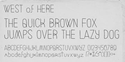
- Modern West JNL by Jeff Levine,
$29.00 Presenting… a Western style alphabet from the 1960 edition of Samuel Welo’s “Studio Handbook for Artists and Advertisers”… Extra bold, featuring slab serifs and concave corners, this type style could easily have been found on building signage in the Old West… but in redrawing it digitally, it’s been named Modern West JNL because at one time, this would have been considered a modern style of lettering. Modern West JNL is available in both regular and oblique versions.
 - Park West JNL by Jeff Levine,
$29.00 The thin, stylish Art Deco slab serif lettering featured on the cover of the 1934 sheet music for “Then I’ll be Tired of You” inspired the digital type face Park West JNL, which is available in both regular and oblique versions. Central Park West has always been the upscale area for affluent New Yorkers, but in the Great Depression years of the 1930s the mystique of the well-to-do held an even stronger significance.
 - West of China by Monotype,
$29.99 - KleinsAmazon - 100% free

- Yiggivoo Unicode - 100% free

- Rostock Kaligraph - 100% free

- PictiFont Symbols - On The Beach by PictiFont,
$12.00 PictiFont’s newest symbol set, intended to be used within any of the PictiFont™ typefaces, features a sampling of the seashore. From seashells to sailboats, surfboards to sunshine, here are the symbols you need to make all things summer a breeze! Sunscreen anyone?


