10,000 search results
(0.04 seconds)
- Overexposed by Cool Fonts,
$24.00 This is a "Grunge" style font that looks as if it was overexposed on film. It is funky yet still very readable. It is best used in sizes over 12 points but really looks cool when used over 16 points. This is a favorite for use in video graphics.
 - Stoehr numbers - Personal use only

- Chrysa by Christie,
$10.00Chrysa can be used to give a handwritten and child-friendly style in a funky way. - What was the inspiration for designing the font? My everyday need to use a typeface that looks handwritten but is also readable, charming and easy to use. - What are its main characteristics and features? Freedom, sketchiness and readability at the same time. - Usage recommendations It can be used in communication materials where the copy needs to look handwritten. - 1883 Fraktur by GLC,
$38.00 This family was inspired by the set of fonts used in the end of 1800s by the famous J. H. Geiger, printer in Lahr (Germany), especially these used to print an almanac for the year 1883. It is a Fraktur pattern, with two styles, as a few others incomplete fonts also used for this work were Blackletters from other patterns. Both were used in two size, for titles, subtitles, main text and notes. This font contains standard ligatures and German historical ligatures (German double s, long s, tz, ch, ck...) and diacritics. 1543 German Deluxe Initials may be used in complement this family.
 - Allay by Twinletter,
$15.00 Allay is a display font with a distinctive and appealing shape that may be used in a wide range of creative design projects. Each letter shape is created using a variety of combinations that provide a one-of-a-kind, innovative, entertaining, and unmistakably aesthetic impression when used. This typeface also comes with typical ligatures and can be used in other languages. This font is perfect for games, sporting events, branding, banners, posters, movie titles, book titles, quotes, logotypes, and more. of course, your various design projects will be perfect and extraordinary if you use this font because this font is equipped with a complimentary font family, both for titles and subtitles and sentence text, start using our fonts for your amazing projects.
 - Legoix by PizzaDude.dk,
$20.00Legoix is a simulates scribbled letters - comes with ligatures to avoid repeating letters. You will need to use OpenType supporting applications to use the autoligatures. - DB Just For U by Illustration Ink,
$3.00DB Just for U is designed to be used just for u! Use this DoodleBat to show someone just how special you know they are. - Mono Orxith by PizzaDude.dk,
$20.00 A wrecked, monospaced font containing 272 ligatures, alternate letters and unique accented characters! You will need to use OpenType supporting applications to use the autoligatures.
 - Mono Litrox by PizzaDude.dk,
$20.00 A wrecked, monospaced font containing 273 ligatures, alternate letters and unique accented characters! You will need to use OpenType supporting applications to use the autoligatures.
 - Mono Exolia by PizzaDude.dk,
$20.00 A wrecked, monospaced font containing 261 ligatures, alternate letters and unique accented characters! You will need to use OpenType supporting applications to use the autoligatures.
 - Sheepdog by Aaron Design,
$9.95Sheepdog is a whimsical handwriting font originally created for use in greeting cards and to combat the propagation of ! Use it to your hearts content. - Araboto by FarahatDesign,
$30.00 Araboto is a simple geometric Arabic typeface, with six weights. You can use it in a variety of uses from printings to web and mobile.
 - Latinka by Jaroslav Zavodny,
$15.00 The Latinka family is a clean modern sans serif font created for website use as for desktop use. It is perfectly suited for graphic design and any display use. It comes with 18 different styles from thin to black. Each weight includes extended language support inclusive Cyrillic and Greek alphabet.
 - Rhinestone by Typehand Studio,
$17.00 Rhinestone is unique expressive handwritten font. This font is made with joy, made using a custom brush so that it looks natural. There are ligatures and alternates for easy use. bonus some illustrations like doodles or circles. This font can be used as a logo, notepad, or packaging design or etc.
 - Scaffo by Funk King,
$15.00 Scaffo is a progression of the Scaffoldini family. These fonts are done in perspective and provided in version with the grid effect and without. Be careful using these fonts – the scaffold effect uses many line segments. Creating outlines using this font is not recommended as it may crash your system.
 - Bastonello by Robert Corseanschi,
$14.99 Bastonello is designed for a wide range of uses. It can be used for logos, business cards, websites, newspapers and many other graphic designs. This font has a nice feel and can be used everywhere, it is just awesome. It is available in light, regular and bold weights with corresponding italics.
 - Digital Biz Bitz by Funk King,
$3.00 Digital Biz Bitz is a family of fonts and fontbats designed for use in business learning. Use these elements to enhance the learning experience you create.
 - Gumbutcha by PizzaDude.dk,
$20.00 A jumpy all caps comic font - has got a good handful of funny ligatures! You will need to use OpenType supporting applications to use the autoligatures.
 - PIXymbols Backstitch by Page Studio Graphics,
$40.00A tool for cross-stitch creators. A highly readable backstitch alphabet font to be used in a word processor, especially useful for long, or centered text. - Glogalex by ZultypeFonter,
$21.00 We designed this Glogalex font inspired by today's rapid digital technology, where the art of typography is very much needed to support various digital needs, both for software and for other print media needs. Glogalex is a display font designed with the main focus aimed at the needs of various brands of digital products or other technology products, but not limited to the use of various kinds of printing, both mass media or for the needs of various titles of books, magazines, newspapers, and various other kinds of tabloids, the wealth of Glyph Alternate and Ligature can add to the creation of typography art, you can be creative in using various letters that we have designed by combining ordinary letters with alternative letters and also ligatures, we have combined several ligatures to make it easier for you to use, but if If you have difficulty using Alternate letters and ligatures, we recommend you to manually combine each Alternate and ligature you want to use. We highly recommend the use of this Glogalex font for the needs of displaying company brands, trademarks, logo designs, use in digital media, such as movie titles, online game names, and for various vehicle brands, if you can maximize its use it will be very interesting. for each display that has been designed, pleasing to the eye and easy to read. we are very happy if you are satisfied in using our products, and if there are problems in using our products you can tell us via email zulfikarzul80@yahoo.co.id, we will respond as soon as possible, thank you.
 - Motorway by K-Type,
$20.00 MOTORWAY is the companion typeface to TRANSPORT, the British road sign lettering. The Motorway alphabet was created for the route numbers on motorway signage, and is taller and narrower than the accompanying place names and distances which are printed in Transport. However, for Motorway Jock Kinneir and Margaret Calvert created only the numbers 0 to 9, the capitals A, B, E, M, N, S and W, ampersand, slash, parentheses and a comma. So, although the lettering made its first appearance on the Preston bypass in 1958, K-Type Motorway is the first complete typeface and contains all upper and lower case letters, plus a full complement of punctuation, symbols and Latin Extended-A accented characters. As with the Transport alphabet the starting point was Akzidenz Grotesk, Motorway taking inspiration from condensed versions. Changes were mainly driven by a quest for legibility, resulting in some reduced contrast between horizontal and vertical strokes, and Gill-esque straight diagonal limbs on the 6 and 9, and high vertex for the M. Kinneir and Calvert designed the limited range of characters in two weights; a SemiBold 'Permanent' weight for use as white letters on blue motorway signs, and a Bold 'Temporary' weight for heavier black letters on yellow non-permanent signage. In addition to creating full fonts in both original weights, the K-Type family adds a new Regular weight, plus a set of italics, completing a highly usable condensed typeface which, while rooted in history, is fully functional for both print and web usage. The K-Type fonts are spaced and kerned normally, simply increase the tracking to recapture the generous spacing of motorway signage.
 - PGF Business by PeGGO Fonts,
$49.90 PGF Business inspired by script used on maps, spencerian aka "Business Script" and manual and confident signature strokes. Organized in 5 individual styles, for making it easier to use, and gathered all at one in a bigger unique file called "PGF Bussiness Full" where you will find way much more options, but requires a more advance editing skill to use. Accompained with a useful set of Dingbats and a set of complementary Ornaments to enhance more versatile typographic compositions.
 - PTT by TYDTYP,
$20.00 PTT typeface has very rounded outlines. They are extremely overlapping each other like packed potatoes. The face will be very strong and give your design extraordinary spice! Basically, main characters are consist of two different shapes, one is initial form which is only used at the beginning of a word, the other is medial form which is used for the rest. To use this function, I highly recommend to use appropriate layout application (e.g. Adobe illustrator, InDesign, QuarkXpress).
 - Cold Army by Typefactory,
$14.00 Cold Army is a stencil display font. Strong and delicate it makes a statement when used. Use this font for your designs and explore its endless possibilities.
 - Rianti by Lone Army,
$15.00 The main purpose of Rianti is to be used as a logo that matches with body text. It can be used in both vintage or modern settings.
 - Magic Forest by Radoselsky,
$11.00 This font is designed by me for the use in my friend´s invitation for her childrens birthday party. I hope you can use it in yours.
 - Invader by Yeahllow,
$20.00 Invader is a display font designed specifically for display, headline, logotype and similar applications. It is not intended for text use or for use at small sizes.
 - Superxoid by PizzaDude.dk,
$20.00Superxoid is super-distorted, super-damaged and super-noisy...summa summarum, Superxoid is super-grungy! You will need to use OpenType supporting applications to use the autoligatures. - Mono Chix by PizzaDude.dk,
$20.00 A wrecked, monospaced font containing ligatures for double letters, alternate letters and unique accented characters! You will need to use OpenType supporting applications to use the autoligatures.
 - Satisfactory by Fauzistudio,
$12.00 Satisfactory Craft retro vintage typeface. It can be used to create almost all types of design projects. Just use your imagination and some graphic design set, your project will become more alive and look great. Implementing alternative Contextual features makes it easier for all people to use. Hope you enjoy. Intuisi Creative
 - Ferrocarbon by Megami Studios,
$7.50 For the angular, blocky look, the future is Ferrocarbon! Designed primarily as a title font, I created it way back in 2013 and promptly forgot about, so I'm releasing it to the world now. it's meant to be used for your tech and sci-fi uses, but don't let us stop you there!
 - Argenta by Sudtipos,
$59.00 Argenta is handwritten and fresh. The casual spirit of this face is evident, but complemented by very specific typographic details. A playful script with an immensely useful array of alternate characters. Released in OpenType format to expand possibilities of use with lots of alternates when used with OpenType-aware applications such as AdobeCS.
 - Hybi10 Metal by Hybi-Types,
$12.50 With its straight and clean face Hybi10 Metal can be a quite normal antique font family. But the alternates with different versions of spikes at the uppercase letters gives it an additional use. Decide for your own, how to use it. The styles with real capitals widens the range of use too.
 - Grinchan by Mvmet,
$12.00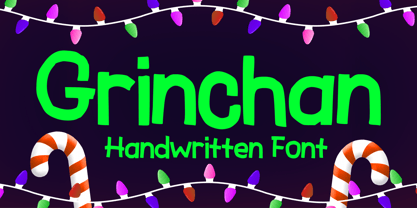 Grinchan is a fun to use Halloween and Christmas font. You can use it for anything ranging from t-shirts, kids’ book designs, and greeting cards to stickers and posters, or anything that needs a casual touch. Fall in love with its incredibly versatile style, and use it to create lovely designs!
 - Zapf Renaissance Antiqua by Linotype,
$29.99The Zapf Renaissance Antiqua type family was designed by Hermann Zapf for the German Scangraphic Dr. Böger GmbH in Hamburg, from 1984–1986. The typefaces were engineered for use in digital CRT phototypesetting. This version was based on Scangraphic SH version (For Display use) and not on the SB version (for text use). - Jugendstil Initials by HiH,
$16.00 Jugendstil Initials were designed by Heinrich Vogeler around 1905, based on the German blackletter tradition. A similar set of initials by Vogeler, but based on roman letters was released by Rudhardsche Geisserei of Offenbach at about this time. I believe the originals were woodcuts. The backgrounds to the letterforms may be seen as examples of Heimatkunst, an art movement within Germany that drew deliberate inspiration from the rural countryside. Like the Arts and Crafts Movement in England a little earlier, Heimatkunst may be seen, in part, as a romantic rejection of urban industrialization, while at the same time representing a back-to-roots nationalism. Like any river, it was fed by many streams. Jugendstil Initials is an experiment with which I am most pleased. It is far and away the most complex font HiH has produced and I was uncertain whether or not it could be done successfully. To oversimplify, a font is produced by creating outlines of each character, using points along the outline to define the contour. A simple sans-serif letter A with crossbar can be created using as few as 10 points. We decided to make a comparison of the number of points we used to define the uppercase A in various fonts. Cori, Gaiety Girl and Page No 508 all use 12 points. Patent Reclame uses 39 and Publicity Headline uses 43. All the rest of the A’s, except the decorative initials, fall somewhere in between. The initial letters run from 48 points for Schnorr Initials to 255 for Morris Initials Two, with 150 being about average. Then there is a jump to 418 points for Morris Initials One and, finally, to 1626 points for Jugendstil Initials. And this was only after we selectively simplified the designs so our font creation software (Fontographer) could render them. The average was 1678, not including X and Y. There was no X and Y in the original design and we have provided simple stand-ins to fill out the alphabet, without trying to imitate the style of the orginal design. We did a lot of looking to find a compatible lower case. We decided that Morris Gothic from the same period was the best match in color, design and historical context. We felt so strongly about the choice that we decided to produce our Morris Gothic font for the purpose of providing a lower case for Jugendstil Initials. The long s, as well as the ligatures ch and ck are provided. at 181, 123 (leftbrace) and 125 (rightbrace) respectively. This font was a lot of work, but I think it was worth it. I hope you agree.
 - BonaVia by Greater Albion Typefounders,
$9.95 BonaVia is an adaptation of Greater Albion's Bonning and Bonnington families. Its purpose made to enable the construction of banners and mastheads in the style of traditional streetsigns, and offered in Regular and 'Blanc' faces. A selection of decorative ends and fleurons are included. BonaVia is splendid on posters, signage, book and CD covers and labels with a period feel.
 - Vantagram by TEKNIKE,
$69.00 Vantagram is a modern display font. The typeface is made from basic square geometry. It is inspired by blackletter typefaces of the medieval period in Europe. The Vantagram name is a combination of two words derived from “vanta” French for boast and “gram” Greek for letter or that which is drawn. Vantagram is great for display work, quotes, titles, headings and posters.
 - Sunshine Delivery by Hanoded,
$15.00 After a long period of wind, rain and cold, summer has finally arrived. It almost felt as if the sunny weather came as a special delivery! Sunshine Delivery is a handmade display font. It comes in a regular, angular version and a rounded one. Need Vietnamese support? Check! Want some Sami? Got it! Feel like a bit of Greek? Dive right in!
 - Printers Impressions JNL by Jeff Levine,
$29.00 Printers Impressions JNL is an assortment of various letterpress ornaments, corner pieces, catch words and other designs, along with some shipping labels with perforated edges; all re-drawn from vintage source material. For the shipping labels, print them in red and you will recreate the standard form of gummed label so popular for years before self-adhesives took over the market.
