10,000 search results
(0.043 seconds)
- Neftali Pro by TipoType,
$25.00 2015 First Prize TipoType award. Neftali is a type family designed for continuous reading in long texts & editorial design, created as an interpretation of Pablo Neruda’s “Poema 20”. This work delivers a subtle experimentation of Baroque and Roman styles, rescuing features from some of the most successful chilean typefaces such as “Australis”, “Berenjena” and “Biblioteca”, along with its particular calligraphic details, medium weights, accentuated strokes, and wide curves that seek to project Pablo Neruda’s particular way of reciting. This typeface contains uppercase, lowercase, small caps, oldstyle, and tabular numbers; in addition to a true italic for every weight; and calligraphic details designed to compose his poems. A typography to talk about everything, except love… (Special thanks to: Francisco Gálvez & Patricio Truenos; without the help of the latter, this project wouldn’t have had an ending)
 - Saratoga Slim AOE by Astigmatic,
$19.95He's rough around the edges, but he's an outlaw from the Old West, what did you expect? He's Saratoga Slim, a playful shaken up dust devil of a typeface. With a shaken appearance and rough hewn letters, he steps onto the scene, yet is clearly legible to read. He's alot like a one of those ruffigans that is crude around the edges, but when he looks at you and says, "Get what I'm saying partner?", you know exactly what he means. Put some rough and tumble type into your designs with Saratoga Slim. He's been through the ringer a few times but keeps coming back for more. Isn't that what you look for when you create a design...durability...? Here it is, Saratoga Slim, looking at you! Get it today! - Electrostatic JNL by Jeff Levine,
$29.00 Electrostatic JNL was inspired by the 1930s lettering for radio station WMCA in New York City. It was found as part of an ad for the station in a 1932 radio broadcasting trade magazine. WMCA went on the air Feb. 6, 1925. According to Wikipedia, the "MCA" call letters stood for the Hotel McAlpin, where the station's original studio and transmitter were located. "W" is the call sign prefix for all broadcast stations East of the Mississippi River; with the exception of KDKA (Pittsburgh), which was the nation's first commercial radio station. This bold novelty typeface with lightning bolds intersecting the characters can be used to represent anything from electricity to stormy days; power generators to brute force and so forth. Electrostatic JNL is available in both regular and oblique versions.
 - Nereida by Latinotype,
$39.00 Nereida is a delicate, luminous and dainty typeface endowed with an expressive and versatile personality. Its high-contrast design positions it as the preferred choice for elegant and creative typographic compositions. Nereida stands out for a generous x-height structure, thus ensuring an exceptional readability in paragraphs of moderate length. It distinguishes itself with delicately crafted terminals and a set of attractive ligatures and initial letters that expand their ranges of use. Nereida is a distinctive typographic experience for magazines, headlines, logos, packaging and beauty products. It offers the unique possibility of transmitting messages with subtlety in short words and with force in longer text compositions. Each stroke and curve of Nereida contributes to creating a unique visual experience, adding a touch of elegance and creativity to any project.
 - Maga by DSType,
$40.00 Maga shares the skeleton with one of our first typefaces (Quaestor, from 2004), but we didn't want to simply expand an existent design, so we took a step forward—not just with improved features and new weights, but also making the italics more usable than its predecessor. The balance between the counters and the space between letters makes this a very space-saving typeface with plenty of legibility, yet stylish enough for contemporary magazine design.
 - Avengars by Mevstory Studio,
$20.00 Avengars is a modern and chic typeface, best used as a display for headings, logos, branding, magazines, product packaging and invitations. Avengarscome with clean lines and smooth curves give any project an extra touch of class. If there's anything else you are unsure of feel free to pop me a message :) That's it! Have fun using Avengars Typeface!!! Feel free to follow, like and share. Thanks so much for checking out my shop!
 - The PUNCHER by PAC Font Corner,
$120.00 ThePuncher typeface is made exactly for the book, poster, flyer or any type of titles, and for customers who wants to have bold and eye-catching final product. It can be used as a single letter for a logo or for numbering of anything you want. It is not made for long sentences. ThePuncher typeface purpose is to make big bang from your short and specific messages you want to share with the world.
 - Georgica by Mevstory Studio,
$25.00 Georgica is a modern and chic typeface, best used as a display for headings, logos, branding, magazines, product packaging and invitations. Georgica come with clean lines and smooth curves give any project an extra touch of class. If there's anything else you are unsure of feel free to pop me a message :) That's it! Have fun using Georgica Typeface!!! Feel free to follow, like and share. Thanks so much for checking out my shop!
 - Secret Ring by Ditatype,
$29.00 Secret Ring is a captivating display font that will unravel the mysteries of the unknown in your designs. Designed in uppercase and bold, this typeface commands attention and exudes an aura of secrecy and horror. Each letter is meticulously crafted with details resembling plant roots with sharp edges, adding an eerie and enigmatic touch to the font. With its bold weight and uppercase design, Secret Ring creates a powerful and impactful presence. The root-like details in each letter of this font bring an organic and otherworldly appearance, as if the font draws its power from ancient and malevolent roots. These haunting details add an element of supernatural energy and create an atmosphere of foreboding and suspense. The combination of bold weight and sharp-edged root details gives this font a sinister and enigmatic look, evoking images of hidden rituals and occult symbols. For the best legibility you can use this font in the bigger text sizes. Enjoy the available features here. Features: Alternates Multilingual Supports PUA Encoded Numerals and Punctuations Secret Ring fits in headlines, logos, movie posters, flyers, invitations, branding materials, print media, editorial layouts, headers, and any horror-themed project. Find out more ways to use this font by taking a look at the font preview. Thanks for purchasing our fonts. Hopefully, you have a great time using our font. Feel free to contact us anytime for further information or when you have trouble with the font. Thanks a lot and happy designing.
 - Spotted Fever - Unknown license

- Darkness Rising by Hanoded,
$15.00 I was in a bit of a gloomy mood just before I created this font. I had no inspiration whatsoever (which always affects me in a bad way). I was trying to create a font using broken satay skewers, as using those gives the letters a unique look. I broke about 25 skewers and they all broke ‘the wrong way’. Yes, it’s pathetic, I know, but that’s how it is. I decided to go to the gym and do a little workout, hoping my dark mood would pass. When I came back, I broke one more skewer and lo and behold, it broke exactly the right way! I made this font in one go, using that fantastic skewer and lots of Chinese ink. Darkness Rising comes with all the diacritics you’ll need, plus double letter ligatures and some cool underlined alternates.
 - Rothena by Haksen,
$14.00 Hand-lettered with style, Rothena Script is a must have for all your design needs. Perfect for greeting cards, branding, stationery design, social media, packaging, magazine layouts, prints and more! Utilize all caps for a completely alternate style, or mix and match lowercase script + all caps for creative designs. Rothena Script has a variety of unique, coded features to create compelling, handmade outcomes: 4 stylistic alternates, 5 initial characters, 4 end characters, 1 discretionary ligature and 25 standard ligatures. Multilingual support is included for Western European languages. PUA Encoded. OTF is included for the full, Rothena Script font. Happy Designing! This is the personal license font that can be used for all personal needs. If you want to use this font on items you are going to sell or on anything promoting your business, please purchase the extended license version.
 - P22 Stickley Pro by IHOF,
$39.95 Stickley Optical Family is an expansion of P22 Stickley Text, a humanist, Oldstyle-rooted design with a contemporary execution and full OpenType abilities. The font contains ten distinct cuts across four optical masters—in addition to Text for page content, the optical family includes Display for titling; Headline for emphasis; and Caption for footnotes and small sizes. Typefaces were originally designed for the physical size at which they were to be printed, with subtle variations in proportion, detail, contrast, and visual weight to ensure they were as clear at 6 pt. as they were elegant at 68 pt. This created a unified design as the various sizes were set together on a page. Text is the foundation of this typeface family and is built for use in extended reading. Its proportions are carefully balanced for visual clarity while retaining its character; designed for use at 9 to 13 pt. Caption is a sturdy, simplified interpretation of the Text letterforms, with ink traps, generous letters and spacing, and hefty proportions to give balance to the smallest content on a page; designed for use at 5 to 8pt. Headline is a complement to the Text master size. It is a gently modified version with larger small caps to add visual strength and has a greater delicacy; designed for use at 14 to 26 pt. Display is an elegant refinement with stylized details. It harmonizes with the smaller optical masters as a more intricate manifestation of the typeface. Designed for use at 34 pt. and above. Opentype features include ligatures, oldstyle and lining figures, alternates, Central European characters and diacritics, and Swash Caps for the Italics. Stickley Optical Family is a feature-rich workhorse with international functionality.
 - Halagar by Letteralle,
$23.00 Meet Halagar! a versatile font family that brings a dash of masculine charm to your creative toolbox. With a diverse range of 8 weights, Halagar offers endless possibilities for your design projects. Whether you're crafting a bold brand identity, designing eye-catching packaging, laying out engaging body text, creating striking titles, composing captivating posters, or sharing vibrant social media posts, 'Halagar' has you covered. Its strong and assertive presence adds a touch of confidence to every piece. With Halagar, you're not just getting a font; you're getting a reliable design companion that elevates your work to the next level. Explore the endless potential and let 'Halagar' be your go-to choice for all things branding, packaging, and beyond. Unleash your creativity with 'Halagar' today and make your designs stand out in style!
 - Chlara Typeface by Krismagraph,
$17.00 Chlara is a Modern Ligature Serif Font. It's soft curves mixed with high contrast glyphs, give it a feminine and masculine quality. It comes with epic ligatures and alternates. Great in layout design for quotes or body copy, best used as a display for headings, logos, branding, magazines, product packaging and invitations. Accessible in the Adobe Illustrator, Adobe Photoshop, Adobe InDesign, even work on Microsoft Word. PUA Encoded Characters – Fully accessible without additional design software. Fonts include multilingual support Image used : All photographs/pictures/vector used in the preview are not included, they are intended for illustration purpose only. Feel free to follow, like and share. Thanks so much for checking out my shop! If you need a custom license or have questions, please email to: krismagraph@gmail.com
 - Ambaghy by Colllab Studio,
$19.00 "Hi there, thank you for passing by. Colllab Studio is here. We crafted best collection of typefaces in a variety of styles to keep you covered for any project that comes your way! Ambaghy is a goofy font that's elevated by its posh, handwritten style. It will spice up your designs and add a unique feel to your design and it just might be the secret ingredient you've been missing. We've spent years honing our craft to create the most unique and original fonts like Ambaghy. We were inspired by the wild creativity that flows from our hands, and we want to share that inspiration with you. Ambaghy works great for logos and headlines, and also works well in text blocks of body copy. A Million Thanks Colllab Studio www.colllabstudio.com
 - JUSTICE LEAGUE - Personal use only

- Faya by Clevus,
$16.00 Proudly present Faya stencil modern ligature. Faya is a font designed with a modern stencil style that blends classic elements with elegant contemporary touches. Featuring ligatures that offer design flexibility, Faya is suitable for various graphic design needs, including posters, banners, logos, and more. Don't forget to use all caps too in your mixing and matching - it adds contrast and impact to your type design. Design tips! : Tighten your letterspacing for larger titles to create a range of looks. Crafted with meticulous attention to detail, Faya's letterforms are bold, sharp, and geometrically-shaped, catching the eye with their visually appealing design. The font boasts high clarity and legibility, offering a range of different letter variations such as elegant uppercase and lowercase letters. With its clean yet stylish appearance, Faya is perfect for modern and minimalist design applications. Font Features : Lettres, numbers, symbols, and punctuation, alternates and ligatures No special software required they may be used even in canva, any basic program /website apps that allows standard fonts That's it folks! Multilingual Support Language Support: Danish, English, Estonian, Filipino, Finnish, French, Friulian, Galician, German, Gusii, Indonesian, Irish, Italian, Luxembourgish, Norwegian Bokmål, Norwegian Nynorsk, Nyankole, Oromo, Portuguese, Romansh, Rombo, Spanish, Swedish, Swiss-German, Uzbek (Latin) Follow My Shop For Upcoming Updates Including Additional Glyphs And Language Support. And Please Message Me If You Want Your Language Included or If There Are Any Features or Glyph Requests, Feel Free to Send me A Message. Kindly check over on Instagram! https://www.instagram.com/clevustudio/ Have a Good Day !
 - BAXAU by Twinletter,
$17.00 Baxau is a superhero-themed display font that brings strength, courage, and modernity to your projects. With a strong, bold, and bold style, this font is the perfect solution for creating an impressive and aggressive look. The Baxau font features letters that combine boldness with a modern twist, creating a fresh and energized look. Each character exudes undeniable power and charisma, delivering compelling and inspiring messages to your audience. With features such as ligature and alternate, Baxau provides unlimited flexibility and creativity. You can combine these font elements to create unique and exciting style variations. Multilingual support also allows you to use Baxau in multiple languages, so your project can reach a global audience. Baxau is the perfect choice if you need a font that is attractive, powerful, modern, and true to the superhero theme. With a strong message and features that give room for creative experimentation, this font will quickly grab the attention of your potential customers and make a memorable impression in no time. What’s Included : File font All glyphs Iso Latin 1 Alternate, Ligature Simple installations We highly recommend using a program that supports OpenType features and Glyphs panels like many Adobe apps and Corel Draw so that you can see and access all Glyph variations. PUA Encoded Characters – Fully accessible without additional design software. Fonts include Multilingual support
 - TT Tsars by TypeType,
$39.00 TT Tsars useful links: Specimen | Graphic presentation | Customization options The TT Tsars font family is a collection of serif display titling fonts that are stylized to resemble the fonts of the beginning, the middle and the end of the XVIII century. The project is based on title fonts, that is, the fonts that were used to design book title pages. The idea for the project TT Tsars was born after a small study of the historical development of the Cyrillic type and is also based on Abram Shchitsgal’s book "Russian Civil Type". At the very beginning of the project, we had developed a basic universal skeleton for the forms of all characters in all subfamilies of the family, and later on, we added styles, visual features, artifacts and other nuances typical of the given period onto the skeleton. Yes, from the historical accuracy point of view it might be that such an approach is not always justified, but we have achieved our goal and as a result, we have created perfectly combinable serifs that can be used to style an inscription for a certain time period. The TT Tsars font family consists of 20 fonts: 5 separate subfamilies, each of which consists of 4 fonts. Each font contains 580 glyphs, except for the TT Tsars E subfamily, in which each font consists of 464 characters. Instead of lowercase characters in the typeface, small capitals are used, which also suggests that the typeface is rather a display than text one. In TT Tsars you can find a large number of ligatures (for Latin and Cyrillic alphabets), arrows and many useful OpenType features, such as: frac, ordn, sinf, sups, numr, dnom, case, onum, tnum, pnum, lnum, salt (ss01), dlig. Time-related characteristics of the subfamilies are distributed as follows: • TT Tsars A—the beginning of the 18th century (Latin and Cyrillic) • TT Tsars B—the beginning of the 18th century (Latin and Cyrillic) • TT Tsars C—the middle of the 18th century (Latin and Cyrillic) • TT Tsars D—the end of the 18th century (Latin and Cyrillic) • TT Tsars E—conditionally the beginning of the 18th century (only Latin) TT Tsars A and TT Tsars B families (both the beginning of the 18th century) have different starting points: for TT Tsars A it is Latin, for TT Tsars B it is Cyrillic. The development of the TT Tsars A family began in Latin, the font is based on the royal serif Romain du Roi. The Cyrillic alphabet is harmoniously matched to the Latin. The development of the TT Tsars B family began in Cyrillic, which is based on a Russian civil type. Characteristic elements are the curved one-sided serifs of triangular characters (A, X, Y), drops appear in the letter ?, the middle strokes ? and P are adjacent to the main stroke. Latin was drawn to pair with Cyrillic. It is still based on the royal serif, but somewhat changed: the letters B and P are closed and the upper bar of the letter A rose. This was done for the visual combination of Cyrillic and Latin and at the same time to make a distinction between TT Tsars A and TT Tsars B. TT Tsars C is now the middle of the 18th century. Cyrillic alphabet itself did not stand still and evolved, and by the middle of the 18th century, its forms have changed and become to look the way they are shown in this font family. Latin forms are following the Cyrillic. The figures are also slightly modified and adapted to the type design. In TT Tsars C, Cyrillic and Latin characters are created in parallel. A distinctive feature of the Cyrillic alphabet in TT Tsars C is the residual influence of the flat pen. This is noticeable in such signs as ?, ?, K. The shape of the letters ?, ?, ?, ? is very characteristic of the period. In the Latin alphabet, a characteristic leg appears at the letter R. For both languages, there is a typical C characterized by an upper serif and the appearance of large, even somewhat bolding serifs on horizontals (T, E, ?, L). TT Tsars D is already the end of the 18th century when with the development of printing, the forms of some Cyrillic characters had changed and turned into new skeletons of letters that we transposed into Latin. The figures were also stylized. In this font, both Cyrillic and Latin are stylistically executed with different serifs and are thus logically separated. The end of the century is characterized by the reduction of decorative elements. Straight, blueprint-like legs of the letters ?, R, K, ?. Serifs are very pronounced and triangular. E and ? are one-sided on the middle horizontal line. A very characteristic C with two serifs appears in the Latin alphabet. TT Tsars E is a steampunk fantasy typeface, its theme is a Latinized Russian ?ivil type (also referred to as Grazhdansky type which emerged after Peter the Great’s language reform), which includes only the Latin alphabet. There is no historical analog to this typeface, it is exclusively our reflections on the topic of what would have happened if the civil font had developed further and received a Latin counterpart. We imagined such a situation in which the civil type was exported to Europe and began to live its own life.
 - Pcast by Jipatype,
$14.00 Start with the basic shapes that almost every design program has. That is, the square is like a finished material. Can be arranged, rotated to get the desired typeface easily.
 - Zubizarreta by Type-Ø-Tones,
$40.00 In contrast to the traditional process, Zubizarreta was created with the technique of emptying ink out to shape the letterforms. Oddly enough, the result is a type reminiscent of Basque.
 - MBF Moonlander by Moonbandit,
$15.00 Moonlander, a modern bold and wide sans serif font.This clean and sharp typeface is inspired from the lively urban lifestyle and can be perfect as a headline, title, logo, branding.
 - Grotley by Owl king project,
$39.00 Grotley is designed with a sweet shape, supported by several weights, making the equipment very supportive for all design needs or projects that look premium. let's start designing. Be happy
 - Pool Deck JNL by Jeff Levine,
$29.00 There's nothing too fancy about Pool Deck JNL, which is based on an older typeface design. It's your basic sans serif condensed type style with a few unconventional letter shapes.
 - Chillight by Zamjump,
$19.00 Chillight is a serif typeface that is unique and has character, having a narrow, sharp width and ends. making it effective when used at large sizes for logotypes or headlines.
 - Ann’s Valentines by Dingbatcave,
$15.00Ann's Valentines are heart-shaped dingbats that are perfect for web design as well as print that you'll use 'til your heart's content. A dingbat to fall in love with. - Gwyner by Typomancer,
$24.00 Gwyner, a strengthened didone with sharp and clean characteristics, comes with thin to bold weights and is suitable in italic for various uses. A condensed family for space-saving design.
 - Genesee JNL by Jeff Levine,
$29.00Genesee JNL is a medium-bold sans serif inspired by the letter shapes of Jeff Levine's Paper Stencil JNL, and named for the river valley that traverses Rochester, New York. - Caeli AT by Arctype,
$18.99 A typeface that invokes the beauty, strength and liberty of nature. Plant life is honoured with curves flowing from strong stems along with subtle references to Art Nouveau letter-shapes.
 - Interlaced Ornaments by Gerald Gallo,
$20.00 Interlaced Ornaments is composed of various geometric shapes appearing to be woven together. There is an assortment of 69 ornaments located under the character set and shift + character set keys.
 - Belda by insigne,
$29.99 Step into the beauty of Belda’s elegant form and discover the richness flowing from both its historic influence and its strong elements. At its heart, Belda's graceful style embodies the classical calligraphy of the Roman capital, best known from such Roman monuments as Trajan's Column. To lessen the possibility for error, the builders of these defining structures brushed their templates onto the marble before taking their first cuts from the expensive stone. These simple strokes now mark a simple but wonderful path full of life and mystery. Beyond a copy of the past, Belda has grown from its roots to offer a brave, new world of potential through its still-simple structure. The new design strongly contrasts thickness and stroke. Its delicate shape, curves and sharp serifs provide a unique style of harmony and beauty. The resulting balance? The lighter weight design remains subtle and elegant, while the combination in its bolder counterparts provides an intense luster and sparkle, pulling the reader’s eye to the font’s captivating features. A quick look beyond its surface of standard forms also reveals Belda has more layers to discover with OpenType small capitals, titling capitals and more. With a wealth of weights and many widths beside, the font is capable of serving as both text and titling. While especially strong as a movie title or poster font, it’s also great for book jackets, advertising, and packaging. So start your journey with Belda. The possibilities to explore on this path are practically endless. Production assistance from Lucas Azevedo and ikern.
 - Genre by Storm Type Foundry,
$26.00The official terseness and grey of Neo-Classical type faces will stand out when we narrow them. The consistently vertical shading of the letters suppresses one's desire for eccentricity, just like tea with bromine. It would, however, be wrong to consider Bodoni as the originator of this - vertically shaded - trend in type face production. In his Manual we can also find type faces with a slanted axis of shade, picturesque italics and a number of normal, more human type faces. It remains a mystery why his name is connected only with one of his many works. Genre's basic design is fairly light in colour, which is why it looks good in illustrated magazines and short texts and directly calls for graphically striking, contrasting headings. It shows off beautifully next to photographs, on diplomas and on printed materials connected with a person's death. - AnoStencil by Alias,
$60.00 Stencil typefaces are popular because they are striking and decorative, and their associations - whether Utility, Travel, Vernacular, etc - are evocative. Anostencil is developed from, but not exactly like, our Ano typeface. Ano’s geometric skeleton, tweaked a bit, allows for a level of abstraction while retaining legibility. Some of Ano’s characters, such as the a, e, f and r, have been amended to make clearer, more graphic shapes when the stencil design has been applied. Different application of the stencil gaps in the letters make functional but decorative and expressive linear forms. This is particularly evident in Anostencil’s extended character set which features codified, semi abstract shapes. So the stencil design in Anostencil has been applied in not necessarily the most logical or immediate way, but in a way that makes each letter a striking and graphic shape.
 - Rikale by Sensatype Studio,
$15.00 A Fashion Modern serif font that we created special for elegant branding needs, with extra alternates in unique shape will be ready to add value of your brand. It so nice to leverage designer or product owner that need solutions to make their design look more classy and modern. And specially for Gingka font, We prepared any alternate characters to help you create unlimited variations for your creative needs. Rikale Condensed Fashion Modern Font ready with: Any options to get creative variations (combination of Alternate characters) Preview as a inspirations that you can do with Rikale font Ready with Lowercase and Uppercase characters Wish you enjoy our font. :)
 - Logotype Style by Sensatype Studio,
$15.00 Logotype is Modern Logo Font is a well-balanced modern font with a minimalist, unique, and iconic sans serif, font that you can combine to get any variations and unique shapes easily just in seconds with choose ligatures of them. It is a sans serif font with minimalist style that perfect for branding projects, logo, poster designs, social media posts, advertisements, product packaging, product designs, label, photography, watermark, invitation, stationery, and any projects, it makes with a high level of legibility. What's Included: Character set A-Z Numerals & Punctuation Accented Characters (West Europe) Works on PC & Mac Recommended using Adobe Illustrator or Adobe Photoshop. Wish you enjoy our font. :)
 - Quning by Sensatype Studio,
$15.00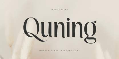 An Elegant serif font that we created special for elegant branding needs, with extra alternates in unique shape will be ready to add value of your brand. It so nice to leverage designer or product owner that need solutions to make their design look more classy and modern. And specially for Quning font, We prepared any alternate characters to help you create unlimited variations for your creative needs. Quning Modern Classy Elegant Serif Font ready with: Any options to get creative variations (combination of Alternate characters) Preview as a inspirations that you can do with Quning font Ready with Lowercase and Uppercase characters Wish you enjoy our font. :)
 - Elegancy Style by Sensatype Studio,
$15.00 Elegancy is Modern Luxury Elegant Font is a well-balanced contemporary font with a fancy, unique, and versatile Luxury serif, font that you can combine to get any variations and unique shapes easily just in seconds with choose alternates of them. It is a serif display font with moderate contrast that perfect for branding projects, logo, wedding designs, social media posts, advertisements, product packaging, product designs, label, photography, watermark, invitation, stationery, and any projects, it makes with a high level of legibility. What's Included: Character set A-Z Numerals & Punctuation Accented Characters (West Europe) Works on PC & Mac Recommended using Adobe Illustrator or Adobe Photoshop. Wish you enjoy our font. :)
 - Royal by Sensatype Studio,
$15.00 Royal is Modern Luxury Unique Serif Font is a well-balanced contemporary font with a fancy, unique, and versatile Luxury serif, font that you can combine to get any variations and unique shapes easily just in seconds with choose alternates of them. It is a serif display font with moderate contrast that perfect for branding projects, logo, wedding designs, social media posts, advertisements, product packaging, product designs, label, photography, watermark, invitation, stationery, and any projects, it makes with a high level of legibility. What's Included: Character set A-Z Numerals & Punctuation Accented Characters (West Europe) Works on PC & Mac Recommended using Adobe Illustrator or Adobe Photoshop. Wish you enjoy our font. :)
 - Carves by Sensatype Studio,
$15.00 CARVES is a Modern Display Font A new Display Serif that we created special for logo and branding needs, with extra unique shape that will add your brand value. It so nice to leverage designer or product owner that need solutions to make their design look more Unique and modern. And specially for Sugar font, We prepared any alternate characters to help you create unlimited variations for your creative needs specially for logotype or wordmark. CARVES Modern Display font ready with: Any options to get creative variations (combination of Alternates) Preview as a inspirations that you can do with Carves font Ready with All Uppercase characters Wish you enjoy our font :)

