10,000 search results
(0.053 seconds)
- Times New Roman Seven by Monotype,
$67.99In 1931, The Times of London commissioned a new text type design from Stanley Morison and the Monotype Corporation, after Morison had written an article criticizing The Times for being badly printed and typographically behind the times. The new design was supervised by Stanley Morison and drawn by Victor Lardent, an artist from the advertising department of The Times. Morison used an older typeface, Plantin, as the basis for his design, but made revisions for legibility and economy of space (always important concerns for newspapers). As the old type used by the newspaper had been called Times Old Roman," Morison's revision became "Times New Roman." The Times of London debuted the new typeface in October 1932, and after one year the design was released for commercial sale. The Linotype version, called simply "Times," was optimized for line-casting technology, though the differences in the basic design are subtle. The typeface was very successful for the Times of London, which used a higher grade of newsprint than most newspapers. The better, whiter paper enhanced the new typeface's high degree of contrast and sharp serifs, and created a sparkling, modern look. In 1972, Walter Tracy designed Times Europa for The Times of London. This was a sturdier version, and it was needed to hold up to the newest demands of newspaper printing: faster presses and cheaper paper. In the United States, the Times font family has enjoyed popularity as a magazine and book type since the 1940s. Times continues to be very popular around the world because of its versatility and readability. And because it is a standard font on most computers and digital printers, it has become universally familiar as the office workhorse. Times?, Times? Europa, and Times New Roman? are sure bets for proposals, annual reports, office correspondence, magazines, and newspapers. Linotype offers many versions of this font: Times? is the universal version of Times, used formerly as the matrices for the Linotype hot metal line-casting machines. The basic four weights of roman, italic, bold and bold italic are standard fonts on most printers. There are also small caps, Old style Figures, phonetic characters, and Central European characters. Times? Ten is the version specially designed for smaller text (12 point and below); its characters are wider and the hairlines are a little stronger. Times Ten has many weights for Latin typography, as well as several weights for Central European, Cyrillic, and Greek typesetting. Times? Eighteen is the headline version, ideal for point sizes of 18 and larger. The characters are subtly condensed and the hairlines are finer." - Times New Roman WGL by Monotype,
$67.99 In 1931, The Times of London commissioned a new text type design from Stanley Morison and the Monotype Corporation, after Morison had written an article criticizing The Times for being badly printed and typographically behind the times. The new design was supervised by Stanley Morison and drawn by Victor Lardent, an artist from the advertising department of The Times. Morison used an older typeface, Plantin, as the basis for his design, but made revisions for legibility and economy of space (always important concerns for newspapers). As the old type used by the newspaper had been called Times Old Roman," Morison's revision became "Times New Roman." The Times of London debuted the new typeface in October 1932, and after one year the design was released for commercial sale. The Linotype version, called simply "Times," was optimized for line-casting technology, though the differences in the basic design are subtle. The typeface was very successful for the Times of London, which used a higher grade of newsprint than most newspapers. The better, whiter paper enhanced the new typeface's high degree of contrast and sharp serifs, and created a sparkling, modern look. In 1972, Walter Tracy designed Times Europa for The Times of London. This was a sturdier version, and it was needed to hold up to the newest demands of newspaper printing: faster presses and cheaper paper. In the United States, the Times font family has enjoyed popularity as a magazine and book type since the 1940s. Times continues to be very popular around the world because of its versatility and readability. And because it is a standard font on most computers and digital printers, it has become universally familiar as the office workhorse. Times?, Times? Europa, and Times New Roman? are sure bets for proposals, annual reports, office correspondence, magazines, and newspapers. Linotype offers many versions of this font: Times? is the universal version of Times, used formerly as the matrices for the Linotype hot metal line-casting machines. The basic four weights of roman, italic, bold and bold italic are standard fonts on most printers. There are also small caps, Old style Figures, phonetic characters, and Central European characters. Times? Ten is the version specially designed for smaller text (12 point and below); its characters are wider and the hairlines are a little stronger. Times Ten has many weights for Latin typography, as well as several weights for Central European, Cyrillic, and Greek typesetting. Times? Eighteen is the headline version, ideal for point sizes of 18 and larger. The characters are subtly condensed and the hairlines are finer."
 - Times New Roman by Monotype,
$67.99 In 1931, The Times of London commissioned a new text type design from Stanley Morison and the Monotype Corporation, after Morison had written an article criticizing The Times for being badly printed and typographically behind the times. The new design was supervised by Stanley Morison and drawn by Victor Lardent, an artist from the advertising department of The Times. Morison used an older typeface, Plantin, as the basis for his design, but made revisions for legibility and economy of space (always important concerns for newspapers). As the old type used by the newspaper had been called Times Old Roman," Morison's revision became "Times New Roman." The Times of London debuted the new typeface in October 1932, and after one year the design was released for commercial sale. The Linotype version, called simply "Times," was optimized for line-casting technology, though the differences in the basic design are subtle. The typeface was very successful for the Times of London, which used a higher grade of newsprint than most newspapers. The better, whiter paper enhanced the new typeface's high degree of contrast and sharp serifs, and created a sparkling, modern look. In 1972, Walter Tracy designed Times Europa for The Times of London. This was a sturdier version, and it was needed to hold up to the newest demands of newspaper printing: faster presses and cheaper paper. In the United States, the Times font family has enjoyed popularity as a magazine and book type since the 1940s. Times continues to be very popular around the world because of its versatility and readability. And because it is a standard font on most computers and digital printers, it has become universally familiar as the office workhorse. Times?, Times? Europa, and Times New Roman? are sure bets for proposals, annual reports, office correspondence, magazines, and newspapers. Linotype offers many versions of this font: Times? is the universal version of Times, used formerly as the matrices for the Linotype hot metal line-casting machines. The basic four weights of roman, italic, bold and bold italic are standard fonts on most printers. There are also small caps, Old style Figures, phonetic characters, and Central European characters. Times? Ten is the version specially designed for smaller text (12 point and below); its characters are wider and the hairlines are a little stronger. Times Ten has many weights for Latin typography, as well as several weights for Central European, Cyrillic, and Greek typesetting. Times? Eighteen is the headline version, ideal for point sizes of 18 and larger. The characters are subtly condensed and the hairlines are finer."
 - Times New Roman Small Text by Monotype,
$67.99In 1931, The Times of London commissioned a new text type design from Stanley Morison and the Monotype Corporation, after Morison had written an article criticizing The Times for being badly printed and typographically behind the times. The new design was supervised by Stanley Morison and drawn by Victor Lardent, an artist from the advertising department of The Times. Morison used an older typeface, Plantin, as the basis for his design, but made revisions for legibility and economy of space (always important concerns for newspapers). As the old type used by the newspaper had been called Times Old Roman," Morison's revision became "Times New Roman." The Times of London debuted the new typeface in October 1932, and after one year the design was released for commercial sale. The Linotype version, called simply "Times," was optimized for line-casting technology, though the differences in the basic design are subtle. The typeface was very successful for the Times of London, which used a higher grade of newsprint than most newspapers. The better, whiter paper enhanced the new typeface's high degree of contrast and sharp serifs, and created a sparkling, modern look. In 1972, Walter Tracy designed Times Europa for The Times of London. This was a sturdier version, and it was needed to hold up to the newest demands of newspaper printing: faster presses and cheaper paper. In the United States, the Times font family has enjoyed popularity as a magazine and book type since the 1940s. Times continues to be very popular around the world because of its versatility and readability. And because it is a standard font on most computers and digital printers, it has become universally familiar as the office workhorse. Times?, Times? Europa, and Times New Roman? are sure bets for proposals, annual reports, office correspondence, magazines, and newspapers. Linotype offers many versions of this font: Times? is the universal version of Times, used formerly as the matrices for the Linotype hot metal line-casting machines. The basic four weights of roman, italic, bold and bold italic are standard fonts on most printers. There are also small caps, Old style Figures, phonetic characters, and Central European characters. Times? Ten is the version specially designed for smaller text (12 point and below); its characters are wider and the hairlines are a little stronger. Times Ten has many weights for Latin typography, as well as several weights for Central European, Cyrillic, and Greek typesetting. Times? Eighteen is the headline version, ideal for point sizes of 18 and larger. The characters are subtly condensed and the hairlines are finer." - Times New Roman PS Greek by Monotype,
$67.99In 1931, The Times of London commissioned a new text type design from Stanley Morison and the Monotype Corporation, after Morison had written an article criticizing The Times for being badly printed and typographically behind the times. The new design was supervised by Stanley Morison and drawn by Victor Lardent, an artist from the advertising department of The Times. Morison used an older typeface, Plantin, as the basis for his design, but made revisions for legibility and economy of space (always important concerns for newspapers). As the old type used by the newspaper had been called Times Old Roman," Morison's revision became "Times New Roman." The Times of London debuted the new typeface in October 1932, and after one year the design was released for commercial sale. The Linotype version, called simply "Times," was optimized for line-casting technology, though the differences in the basic design are subtle. The typeface was very successful for the Times of London, which used a higher grade of newsprint than most newspapers. The better, whiter paper enhanced the new typeface's high degree of contrast and sharp serifs, and created a sparkling, modern look. In 1972, Walter Tracy designed Times Europa for The Times of London. This was a sturdier version, and it was needed to hold up to the newest demands of newspaper printing: faster presses and cheaper paper. In the United States, the Times font family has enjoyed popularity as a magazine and book type since the 1940s. Times continues to be very popular around the world because of its versatility and readability. And because it is a standard font on most computers and digital printers, it has become universally familiar as the office workhorse. Times?, Times? Europa, and Times New Roman? are sure bets for proposals, annual reports, office correspondence, magazines, and newspapers. Linotype offers many versions of this font: Times? is the universal version of Times, used formerly as the matrices for the Linotype hot metal line-casting machines. The basic four weights of roman, italic, bold and bold italic are standard fonts on most printers. There are also small caps, Old style Figures, phonetic characters, and Central European characters. Times? Ten is the version specially designed for smaller text (12 point and below); its characters are wider and the hairlines are a little stronger. Times Ten has many weights for Latin typography, as well as several weights for Central European, Cyrillic, and Greek typesetting. Times? Eighteen is the headline version, ideal for point sizes of 18 and larger. The characters are subtly condensed and the hairlines are finer." - Times New Roman PS by Monotype,
$67.99In 1931, The Times of London commissioned a new text type design from Stanley Morison and the Monotype Corporation, after Morison had written an article criticizing The Times for being badly printed and typographically behind the times. The new design was supervised by Stanley Morison and drawn by Victor Lardent, an artist from the advertising department of The Times. Morison used an older typeface, Plantin, as the basis for his design, but made revisions for legibility and economy of space (always important concerns for newspapers). As the old type used by the newspaper had been called Times Old Roman," Morison's revision became "Times New Roman." The Times of London debuted the new typeface in October 1932, and after one year the design was released for commercial sale. The Linotype version, called simply "Times," was optimized for line-casting technology, though the differences in the basic design are subtle. The typeface was very successful for the Times of London, which used a higher grade of newsprint than most newspapers. The better, whiter paper enhanced the new typeface's high degree of contrast and sharp serifs, and created a sparkling, modern look. In 1972, Walter Tracy designed Times Europa for The Times of London. This was a sturdier version, and it was needed to hold up to the newest demands of newspaper printing: faster presses and cheaper paper. In the United States, the Times font family has enjoyed popularity as a magazine and book type since the 1940s. Times continues to be very popular around the world because of its versatility and readability. And because it is a standard font on most computers and digital printers, it has become universally familiar as the office workhorse. Times?, Times? Europa, and Times New Roman? are sure bets for proposals, annual reports, office correspondence, magazines, and newspapers. Linotype offers many versions of this font: Times? is the universal version of Times, used formerly as the matrices for the Linotype hot metal line-casting machines. The basic four weights of roman, italic, bold and bold italic are standard fonts on most printers. There are also small caps, Old style Figures, phonetic characters, and Central European characters. Times? Ten is the version specially designed for smaller text (12 point and below); its characters are wider and the hairlines are a little stronger. Times Ten has many weights for Latin typography, as well as several weights for Central European, Cyrillic, and Greek typesetting. Times? Eighteen is the headline version, ideal for point sizes of 18 and larger. The characters are subtly condensed and the hairlines are finer." - Engebrechtre - Unknown license

- Rachelle JNL by Jeff Levine,
$29.00One of Jeff Levine's friends kept requesting that he name a font after her, and he finally obliged with Rachelle JNL. The font gets its inspiration from the antique wood type version of the popular font most often known as a Latin typeface - complete with spur serifs and all of the usual quirks of wooden type. - Million Orcids by Four Lines Std,
$15.00 Million Orchids Font: Where Script Meets Blooming Brilliance! Get ready to unleash your creativity and watch your designs blossom with this delightful script font. It's like having a million orchids at your fingertips, adding a touch of elegance and charm to every project. Let your imagination take root and let the million orchids font bring your designs to life!
 - Kithen Mellogia by IM Studio,
$19.00 Kithen Mellogia is a natural handwritten font produced by IM Studio. You'll get a full set of lowercase and uppercase letters, numbers and punctuation, multilingual symbols, alternative lowercase letters, and a binder pack. This font is suitable for branding, signatures, wedding invitations, promotions, product packaging and other needs. This font is natural, simple, yet authentic and very stylish.
 - Riotous by Letterhend,
$19.00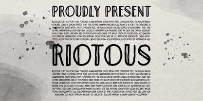 Introducing, Riotous Brush Font! Riotous is a font that features a handwritten style with a free and expressive feel. the rough brush strokes leave a strong effect to make your design looks more natural and unique! What will you get: Including number and symbol. Support Multi Language This font also support PUA Encoded! So, grab your own. Thank You!
 - True South by Crumphand,
$20.00 Introducing True South Authentic Hand brush Fonts. this font made by 100% real brush to get real texture, strong but still calm. good for your product digital ads, thumbnail video, movie poster, book cover. as long you can match your graphic this font should be an option. What's Character Included ? Uppercase Lowercase Symbols Numerals Multilinguals Thank You, Regards!
 - Natube by Dhan Studio,
$14.99 Natube is a font that is scratched with a brush pen, to get a natural texture, so this font will display the characteristics of the hand. This font is very suitable for a variety of places such as clothing, poster, tittle books, stationery designs, quotes, branding, logos, invitations, greeting cards, t-shirts, packaging designs and more.
 - Sabersong Blackmetal by Madhaline Studio,
$34.00 We RECOMMEND that you purchase both of these fonts to get the look like in the font preview image. Tutorials Photoshop: https://youtu.be/qfUNZr0m4n8 Procreate: https://youtu.be/R_5O_pfPBIY Sabersong is a carefully crafted font, which features a very heavy black metal feel. Sabersong suitable for metal band logos, merchandise, clothing, apparel, or anything that needs a black metal feel.
 - Fenggasta by Gatype,
$9.00 Fenggasta is a font that is scratched with a brush pen, to get a natural texture, so this font will display the characteristics of the hand. This font is very suitable for a variety of places such as clothing, poster, tittle books, stationery designs, quotes, branding, logos, invitations, greeting cards, t-shirts, packaging designs and more.
 - Counter Courage by Viaction Type.Co,
$15.00 Counter Courage is a vintage-style sans serif font with an ink effect that’s perfect for industrial and vintage-themed designs. This font is equipped with the opentype feature and supports multilingual. Included in the fonts: Uppercase Lowercase Symbols & Pointing Alternate Characters Multilingual Support Get it now at an affordable price and high value for your needs. Thank You.
 - Maskneyes by Madhaline Studio,
$34.00 We RECOMMEND that you purchase both of these fonts to get the look like in the font preview image. Youtube Tutorials : https://www.youtube.com/@madhalinestudio Mask n eyes is a carefully crafted font, which features a very heavy black metal feel. Mask n eyes suitable for metal band logos, merchandise, clothing, apparel, or anything that needs a black metal feel.
 - Doodleset by Luxfont,
$20.00 Get ready to meet an unusual family of fonts - Doodleset! Here, each typeface is like a hero with a unique story, creating an amazing assortment. From designing inspirational quotes to designing advertisements and events, every font will become a tool for your ideas. Features: - Free Demo font to check it works. - Sans serif & Serif - Calligraphy and Script - Multilingual - Kerning
 - Bellastory by HafisHidayat,
$20.00 Bellastory is a font that is intentionally made with hand strokes using a brush pen, so that it gets a natural texture, and produces beautiful fonts for your various designs, this font is suitable for cover books, magazines, logos, invitations, business cards, screen printing, product packaging, posters, invitations, greeting cards, news, blogs, everything including personal charm.
 - Birhuk Lord by Twinletter,
$17.00 Welcome to the world of courage with Birhuk Lord, a display font with a superhero style that is ready to add tension and strength to your projects. With strong, bold themes and bold looks, Birhuk Lord is the perfect solution for creating memorable messages in movies, games, and designs. In its electrifying light, Birhuk Lord conveys the feel of a superhero that captivates everyone. Each letter exudes courage and strength, taking your project to the next level and creating an extraordinary user experience. In addition to a stunning style, Birhuk Lord is also equipped with excellent features that will enrich your creativity. With ligatures and alternative characters, you can combine typography in unique and interesting ways. Apart from that, this font also supports multiple languages, allowing you to reach an international audience with a strong and bold message. With the presence of the Birhuk Lord, you will experience the magic at every touch. Get unforgettable courage, thrill, and strength with this font. Don’t waste the opportunity to have a Birhuk Lord and create extraordinary works that inspire and captivate each of your potential customers. What’s Included : File font All glyphs Iso Latin 1 Alternate, Ligature Simple installations We highly recommend using a program that supports OpenType features and Glyphs panels like many Adobe apps and Corel Draw so that you can see and access all Glyph variations. PUA Encoded Characters – Fully accessible without additional design software. Fonts include Multilingual support
 - Lementa by Intellecta Design,
$34.95a vintage serif bold font, with tendrils - Lisa's Hand by Matthias Luh,
$15.00 Lisa's Hand is a well-formed handwritten Font. The letters are not connected which combines the style of both handwritten and computer fonts. Lisa's Hand is offered in Regular, Bold, Italic, Bold Italic, Condensed and Condensed Italic.
 - Maxos by Mysterylab,
$17.00 Maxos is a modern hyper-stylized font that is simultaneously sleek & futuristic, yet retro & whimsical. This font package contains two variations: Extra Bold and Extra Bold Oblique. Excellent for posters, album graphics, motorsports, sports, high-tech, etc.
 - Thorowgood by Linotype,
$29.99Thorowgood was originally released by the Stephenson Blake typefoundry in the UK. The types were first cut by the English typefounder Robert Thorne, predecessor of William Thorowgood, and first shown in his specimen books in the early nineteenth century. The fat face was revived in roman (1953) and italic. The S and the C appear to be smaller than the other capitals. Most serifs are flat and thin horizontals. In the italic the main strokes of h, k, m, n, and r are curved inwards at the foot. - Winter Beast by Figuree Studio,
$18.00 Winter Beast is a captivating winter brush font that unleashes the untamed spirit of the season. With its bold, brisk strokes, this font encapsulates the raw beauty and power of winter, making it the perfect choice for projects that demand a rugged, cold, and untamed aesthetic. Whether used in winter-themed designs, holiday graphics, or any project that seeks to embody the frosty allure of the season, Winter Beast adds a chilly and visually striking element to your typography, making your text stand out like fresh snow on a moonlit night.
 - Monoglyceride - Unknown license

- Sujeta - Unknown license

- Traseraha by IbraCreative,
$17.00 Traseraha – A Retro Cartoon Font Traseraha, a captivating retro cartoon font, effortlessly channels the whimsical charm of classic animated aesthetics. Designed by the creative minds at Traseraha Studios, this font pays homage to the golden era of cartoons with its playful curves and vibrant personality. Each letter exudes a nostalgic vibe, reminiscent of vintage comic strips and animated shows, making it an ideal choice for projects seeking a touch of retro flair. The Traseraha font seamlessly blends fun and readability, allowing it to shine in a variety of applications, from logo designs to creative headlines. With its unique character and timeless appeal, Traseraha captures the essence of a bygone era while injecting a dose of lighthearted energy into contemporary design projects. Traseraha is perfect for branding projects, logo, wedding designs, social media posts, advertisements, product packaging, product designs, label, photography, watermark, invitation, stationery, game, fashion and any projects. cartoon font, cute font, traseraha font, retro, vintage, 90s, 80s, 70s, cartoon, cartoon font, comic, comic font, delicious, display, display font, distressed, hand drawn, handwritten font, headline, holiday font, lettering, mexican, mexico, mexico font, packaging, playful, poster, retro, sticker, vintage font Fonts include multilingual support for; Afrikaans, Albanian, Czech, Danish, Dutch, English, Estonian, Finnish, French, German, Hungarian, Italian, Latvian, Lithuanian, Norwegian, Polish, Portuguese, Slovak, Slovenian, Spanish, Swedish.
 - Pink Rock by Epiclinez,
$18.00 Get ready to rock your designs with Pink Rock, a bold and edgy display font This bad boy is perfect for grabbing attention and making a statement. Whether you're designing a punk rock-inspired magazine cover, creating a rebellious brand identity, or adding some oomph to your product packaging, Pink Rock will bring your visuals to life. Unleash your inner rebel with the power of typography – choose Pink Rock today and let your designs rule the world! Pink Rock features : Standard Latin Numbers, symbols, and punctuations Multilingual Support. Fully accessible without additional design software Simple Installations Works on PC & Mac Thank You.
 - Stephen Gillion by Sarid Ezra,
$13.00 Stephen & Gillion is signature script with three style that contain stylistic alternate, swash, etc to create your own customized signature or logo design. Stephen & Gillion is a signature font that you can use to make a logo for branding, beautiful fashion design, suitable for wedding invitation, or handwritten quote. Come with heart-shaped connector! Also already PUA Encoded. Foreign Languages Support: ÀÁÂÃÄÅÇÈÉÊËÌÍÎÏÐÑÒÓÔÕÖØÙÚÛÜÝßàáâãäåæçèéêëìíîïðñòóôõöøùúûüýÿ What Will You Get: Stephen & Gillion Regular (OTF & TTF) Stephen & Gillion Bold (OTF & TTF) Stephen & Gillion Italic (OTF & TTF) Instruction PS: Type underscore + number (from 1 to 5). Or copy Some_5thing in preview bellow..
 - VLNL Breakz by VetteLetters,
$35.00 Donald DBXL Beekman needed a break. And he took it too. While sitting there consuming a sandwich and a half-pint of milk, he took up his ruler and pencil. By the time there was no milk left and only some bread crumbs remained on his plate, VLNL Breakz was finished. That’s DBXL for you. Get your letters during your break. VLNL Breakz was originally designed as the headline and logo font for the breakdance competition Amsterdam Breakz, but turned out to be very versatile. It has 4 variations, Regular and Condensed widths / Bold and Light weights.
 - Verdana Pro by Microsoft,
$40.00 The Verdana typeface family was designed specifically to address the challenges of on-screen display. Verdana was originally designed by world-renowned type designer Matthew Carter, and tuned for screen display by the leading TrueType hinting expert, Tom Rickner. The Verdana fonts are unique examples of type designed specifically for the computer screen.The Verdana family received a major update in 2011 as a collaboration between The Font Bureau, Monotype Imaging and Matthew Carter. The original Verdana family included only four fonts: regular, italic, bold and bold italic. The new and expanded Verdana Pro family contains 20 fonts in total. The Verdana Pro and Verdana Pro Condensed families each contain 10 fonts: Light, Regular, Semibold, Bold and Black (each with matching italic styles).Verdana exhibits characteristics derived from the pixel rather than the pen, the brush or the chisel. The balance between straight, curve and diagonal were meticulously tuned to ensure that the pixel patterns at small sizes are pleasing, clear and legible. Commonly confused characters, such as the lowercase i j l, the uppercase I J L and the number 1, have been carefully drawn for maximum individuality - an important characteristic of fonts designed for on-screen use. Another reason for the legibility of the Verdana fonts on the screen is their generous width and spacing.Designed by David Berlow and David Johnathan Ross of the Font Bureau, with typographic consultation by Matthew Carter, the new Verdana Pro includes a variety of advanced typographic features including true small capitals, ligatures, fractions, old style figures, lining tabular figures and lining proportional figures. An OpenType-savvy application is required to access these typographic features. The expanded weights and completely new condensed range of fonts provide designers with an expanded palette of typographic options for use in print and on-screen, in both small text sizes and headlines.
 - Luckywish by Jafar07,
$12.00 Welcome to the world of Luckywish Sans-Serif Handmade Font, a special offering born from hands full of creativity and love. Combining the art of handwriting with the simplicity of a sans-serif, Luckywish font offers a magical script that fulfills all your wishes. Luckywish is a symbol of hope that shines through every stroke found in each character. Crafted with heartfelt dedication, this font showcases the natural beauty of handwriting, bringing warmth and joy to every design composition. Armed with a pen and imagination, Luckywish exudes a unique charm. Its relaxed and delicately intertwined style brings a friendly and inviting ambiance to every formed sentence. When used, this font will infuse happiness and a fresh spirit into every project you undertake. Luckywish is more than just a font; it's a loyal partner to designers, writers, and creators alike. With its sans-serif characteristics, this font is easy to use and suitable for a variety of creative projects, from logo designs to posters, from wedding invitations to company branding. In the palm of your hand, Luckywish offers a perfect balance between boldness and delightful gentleness. Each character is meticulously crafted to provide unparalleled harmony in every usage. It's time to let your hopes and imagination flourish with Luckywish. Let this font bring joy and inspiration into your design world. Get ready to witness your words and messages transform into mesmerizing works of art that capture hearts. Be part of this magical journey with Luckywish. Get the font now and enjoy limitless creativity with an unmatched personal touch.
 - Hello Mango by Yumna Type,
$12.00 Need that perfect statement fonts for your designs? Hello Mango knows how to make your designs go from good to be ultra good. It is harmonious uppercase display and script font duo. The display font is beautifully designed and add a distinctive touch wherever they are used. On the other hand, the script style expresses elegant and modern look. In this package, you can also get 15 illustrations as special extra. Features: Ligatures Stylistic Sets Swashes Multilingual Supports Uppercase and lowercase PUA Encoded Numerals and Punctuation This font would looks great on your branding, logos, social media quotes, stickers, posters, wall art, merchandise, social media, and many more. Get more inspiration about how to use it by seeing the font preview. Thank you for purchasing our fonts. If you have any further questions, don't hesitate to contact us. Happy Designing.
 - Dessert Menu by My Creative Land,
$22.00 A new 100% handmade brush script font family with lots of swashes, alternates and extras. Caps letters in the script font can also be used as a separate font, so you are getting three, not two, fonts + some extras such as catchwords & design elements. Each letter was carefully traced by hand and have clear edges so both fonts can be safely used on a website (sans serif is 61kB and script is 150kB only!). The font is fully unicode mapped. Most letters in the script typeface have few different swash styles that can be accessed via OpenType panel of your application such as Adobe Illustrator, Adobe InDesign, Adobe Photoshope and even MS Word. If you are working in Sihouette Studio, to get an access to all glyphs you may need an additional software (for example, PopChar or Ultra Character Map).
 - Sweet Pattern by Krafted,
$10.00 Sweet Pattern, just as sweet as flowers, flawless as you! A perfect font for your minimal yet beautiful website, social media branding, Pinterest banners, printed invitations, and more! Sweet Pattern fonts, like a fragrance, speak your heart, your audience’s, clients and guests and people around you! What you’ll get: Multilingual & Ligature Support Full sets of Punctuation and Numerals Compatible with: Adobe Suite Microsoft Office KeyNote Pages Software Requirements: The fonts that you’ll receive in the pack are widely supported by most software. In order to get the full functionality of the selection of standard ligatures (custom created letters) in the script font, any software that can read OpenType fonts will work. We hope you enjoy this font and that it makes your branding sparkle! Feel free to reach out to us if you’d like more information or if you have any concerns.
 - Heavy Heap by Typodermic,
$11.95 Get ready to burn rubber with Heavy Heap—the ultimate typeface for fans of hot-rod culture and high-speed thrills! This groovy psychedelic typeface is on fire, with a scorching look that’s sure to turn heads. With three sizzling weights to choose from, you can customize your typography to match your project’s intensity level. And with blistering mathematical symbols, torrid OpenType fractions, and a range of searing hot currency symbols, Heavy Heap is ready to take on any design challenge. But this headliner is more than just a pretty face—it’s a powerhouse of design options. It looks outstanding when used with warp and envelope effects, allowing you to create dynamic, eye-catching layouts that really pop. And with its bold, energetic style, Heavy Heap is perfect for any project that needs a little extra heat. From posters to flyers, from logos to website headers, this font is the ultimate choice for anyone who wants to make a brave statement. So rev up your engines and get ready to hit the road—with Heavy Heap, you’ll be riding in style! Most Latin-based European writing systems are supported, including the following languages. Afaan Oromo, Afar, Afrikaans, Albanian, Alsatian, Aromanian, Aymara, Bashkir (Latin), Basque, Belarusian (Latin), Bemba, Bikol, Bosnian, Breton, Cape Verdean, Creole, Catalan, Cebuano, Chamorro, Chavacano, Chichewa, Crimean Tatar (Latin), Croatian, Czech, Danish, Dawan, Dholuo, Dutch, English, Estonian, Faroese, Fijian, Filipino, Finnish, French, Frisian, Friulian, Gagauz (Latin), Galician, Ganda, Genoese, German, Greenlandic, Guadeloupean Creole, Haitian Creole, Hawaiian, Hiligaynon, Hungarian, Icelandic, Ilocano, Indonesian, Irish, Italian, Jamaican, Kaqchikel, Karakalpak (Latin), Kashubian, Kikongo, Kinyarwanda, Kirundi, Kurdish (Latin), Latvian, Lithuanian, Lombard, Low Saxon, Luxembourgish, Maasai, Makhuwa, Malay, Maltese, Māori, Moldovan, Montenegrin, Ndebele, Neapolitan, Norwegian, Novial, Occitan, Ossetian (Latin), Papiamento, Piedmontese, Polish, Portuguese, Quechua, Rarotongan, Romanian, Romansh, Sami, Sango, Saramaccan, Sardinian, Scottish Gaelic, Serbian (Latin), Shona, Sicilian, Silesian, Slovak, Slovenian, Somali, Sorbian, Sotho, Spanish, Swahili, Swazi, Swedish, Tagalog, Tahitian, Tetum, Tongan, Tshiluba, Tsonga, Tswana, Tumbuka, Turkish, Turkmen (Latin), Tuvaluan, Uzbek (Latin), Venetian, Vepsian, Võro, Walloon, Waray-Waray, Wayuu, Welsh, Wolof, Xhosa, Yapese, Zapotec Zulu and Zuni.
 - Sweet Mango Italic by Letterafandi Studio,
$18.00 Sweet Mango is a modern sans serif font. This font is perfect for logos, greeting cards, package design, brand identity, craft designs, any DIY projects, book titles, wedding invitations, packaging, and more. Include 4 style font : Sweet Mango Regular Sweet Mango Italic Sweet Mango Bold Sweet Mango Italic Bold
 - Treading by Prioritype,
$19.00 Presents new paired fonts. A minimal and clean feel paired with a handwritten script font makes your designs even more special. This script font also features ligatures, alternatives, and swash or underscore characters that make it more realistic. Great for logo design, branding, quotes and more. Features: Serif: Uppercase, Lowercase, Numeral, Punctuation & Multilingual. Script: Uppercase, Lowercase, Numeral, Punctuation, Multilingual, Ligatures, Alternates & Swash. Multilingual contained: Afrikaans, Albanian, Asu, Basque, Bemba, Bena, Breton, Catalan, Chiga, Cornish, Danish, Dutch, English, Estonian, Filipino, Finnish, French, Friulian, Galician, German, Gusii, Indonesian, Irish, Italian, Kabuverdianu, Kalenjin, Kinyarwanda, Luo, Luxembourgish, Luyia, Machame, Makhuwa-Meetto, Makonde, Malagasy, Manx, Morisyen, North Ndebele, Norwegian Bokmål, Norwegian Nynorsk, Nyankole, Oromo, Portuguese, Quechua, Romansh, Rombo, Rundi, Rwa, Samburu, Sango, Sangu, Scottish Gaelic, Sena, Shambala, Shona, Soga, Somali, Spanish, Swahili, Swedish, Swiss German, Taita, Teso, Uzbek (Latin), Volapük, Vunjo, Zulu. Thanks!
 - Restaglick by Mokatype Studio,
$22.00Hello Introducing, Restaglick - Ligatures Connected Serif is an elegant and unique font that uses ligatures to link letters smoothly. Perfect for adding a unique twist to word-mark logos, monograms, or pull quotes. Restaglick has 28 ligatures as well making it super fantastic. Ligature can be turned off if required for standard writing needs. Any question? Just ask! Language Support: Danish, English, Finnish, French, German, Italian, Luxembourgish, Norwegian Portuguese, Spanish, Swedish, Swiss, German and More + Standard glyphs + Web Font + International Accent + Works on PC and Mac + Simple installations accessible in Adobe Illustrator, Adobe Photoshop, Adobe InDesign, and even works on Microsoft Word. PUA Encoded Characters: Fully accessible without additional design software. Fonts include multilingual support. + Image used: All photographs/pictures/vectors used in the preview are not included, they are intended for illustration only. Thank you


