10,000 search results
(0.076 seconds)
- Megar by Viaction Type.Co,
$20.00 Megar is a display font with a bold retro feel and available in 2 styles, regular & oblique. It is suitable to complement your work with a retro or pop art theme. Megar is sold at affordable prices and you will get lots of bonus background gradient & gradient shapes. Get this font right now! Don't miss this product from us! Also check out our other products. Viaction Type
 - Maidstone by Arendxstudio,
$15.00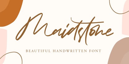 Maidstone - Beautiful Handwritten Font with sharp and beautiful letters that create fonts that are modern, trendy and elegant. Came with opentype features such stylistic alternates, stylistic sets & ligatures good for logotype, poster, badge, book cover, tshirt design, packaging and any more. Features : • Character Set A-Z • Numerals & Punctuations (OpenType Standard) • Accents (Multilingual characters) • Ligature • Alternate There it is! I really hope you enjoy it
 - Delko by Minor Praxis,
$20.00 Inspired by a scrolling banner led lamp display and monospace fonts like OCR-A/B. A modular typeface that come from an arranged octagonal shape module, with 45 degrees sides slope which can gives it a casual digital-look font. Designed for headlines, posters, and medium size body copy. Delko come with 2 styles, regular and lined. Languages support, ligatures, stylistic alternates, and symbols are available.
 - Cut Along by Hanoded,
$15.00 I made Cut Along by stealing some red cardboard from my kids (red, because they didn’t have any black…) and cutting out the glyphs one by one with a pair of scissors. I then pasted the shapes onto white paper, scanned them and turned them into a font. Cut Along is a very nice font for ads, book covers, packaging and children’s books. Enjoy!
 - FI Hover by Furkan İlbay,
$10.00 FI Hover is a great geometric display font for your hi-tech, futuristic and industrial projects. Bold, edgy and geometric characteristics of the glyphs make this font a really god fit for mechnanical equipments, techno-oriented music posters and computer-related designs. Because all of the glyphs made out of a hexagon grid, you can really sync this type with triangles, rectangels and other geometric shapes easily.
 - Geometrisk by Daniel Brokstad,
$29.00 Geometrisk is a modernist futuristic font combining geometrical outer shapes with rounded inner curves, to create an interesting contrast. The funky italics are created through an offset of the regular type, giving it an almost pixelated look. Well fitting within a cyberpunk world, and an interesting pairing with the standard font. Five different weight and italics of each. Multi-language support. Stylistic alternatives. Designed for headline use.
 - ArTarumianTeodik by Tarumian,
$30.00 The font is named after the Armenian writer Theodoros Grigor Lapchinchian (Armenian Թեոդորոս Գրիգորի Լափչինճյան: March 5, 1873, Constantinople — May 24, 1928), who in 1912 published book "Type and Letter" (Armenian: Տիպ ու տառ), dedicated to 1500th anniversary of the creation of the Armenian alphabet and the 400th anniversary of Armenian printing. The letter shapes are influenced by some Armenian fonts of the 18th and 19th centuries.
 - Definety by DEFNST,
$30.00 Definety is a clean and sharp pixel font with lowercase and uppercase glyphs including Basic Latin, Extended Latin A, Cyrillic, numbers, and special symbols. Carefully crafted for a wide range of purposes like branding, logo, posters, print, games, web, and a lot more. Pixel perfect font size starts from 8px/pt and continues by adding another 8 points to the size. Examples: 8px, 16px, 24px, 32px, 40px...
 - Quick Game by Linecreative,
$16.00 Introducing “Quick Game”, the futuristic font that was inspired from a sci-fi movie. Quick Game is a display font that is suitable on your headline to your magazine, flyer, poster or neon installation. Also clearly shaped to be applied in print design like t-shirt, mug, banner or motion graphic. • Uppercase • Lower-caps • Numbers • Punctuations • Supports Multi linguage (Latin Western Europe) • Ligatures Character & Stylistic alternates Character
 - Moon Type by Thomas Käding,
$1.00 This font of Moon Type is modelled after Dr. Moon's original poster. He developed this embossed writing system to help those who have lost their sight later in life, and so are familiar with the shapes of English letters. Moon writing is still used, and you can find books written with it. This font only contains the letters and punctuation that are in the Moon Type system.
 - Tango Western by HansCo,
$15.00 Tango Western is a slab type font with sharp characters on each side. Use this display slab font to add that special retro vintage touch to any design idea you can think of!. Very suitable for logotype, Stickers, Packaging design, Cricut Project, headlines, brand identity, t shirt or apparel industry, posters, magazines, books, YouTube, Instagram, websites, or any of your creative design projects. Enjoy!
 - Zebudabi by Patria Ari,
$15.00 Introducing Zebundabi, a fun handwritten matcha font with unique glyph shapes. Zebundabi has lowercase and uppercase that can be played off easily, so you can get a unique combination to use for your project to make design more beautiful. Zebundabi suitable for book cover, tshirt, tote bags, merchandise, books, poster, title, quotes, and many more! Fonts featured : Uppercase Lowercase Numbers Punctuation & symbols Accented characters
 - Murisa Paula by Murisa Studio,
$10.00 Do you want a unique and attractive display font?. Murisa Paula is the answer. This very attractive font will make you happy and excited. It has a unique shape with the edges of the letters torn to shreds, like torn paper. This type of lettering will make it easier for you to design a display product with a cracked effect or something else. Get it now.
 - Displace 2.0 by Serebryakov,
$35.00 Displace 2.0 is a display sans-serif font family. Displace 2.0 is a humanistic sans-serif based on the calligraphic shapes with a pronounced handwriting contrast and open forms typeface. It has a natural thick-thin swelling and shrinking of the strokes as if it were draw calligraphicaly. Displace font family includes five weights with italics: Light, Regular, Medium, Bold and Black. Try it!
 - Chalk Hand Marker by TypoGraphicDesign,
$19.00 The typeface Chalk Hand Marker is designed from 2019 for the font foundry Typo Graphic Design by Manuel Viergutz. The rough sans-serif display typeface with 4 font styles (Reg, Bold, Caps, Invert) is inspired by handwriting. 634 glyphs included plus 150+ decorative extras like icons, arrows, dingbats, emojis, symbols, geometric shapes, catchwords, decorative ligatures (type the word #LOVE for ❤️or #SMILE for
 - SK Brushwood by Shriftovik,
$10.00 SK Brushwood is an experimental geometric font based on chaotic lines. It is inspired by the Greek stone script, but nevertheless it is modern. The main component of the letter shape is straight and sloping lines ending in straight corners, which makes it look like brushwood. This is why the font gets its name. SK Brushwood is perfect for headlines, posters, print work, and the Internet.
 - Tzur by Hacollective,
$45.00 Tzur is a Hebrew sense-serif font with a nostalgic scent. The shape of the letters has two qualities - Raw and processed - and they are combined without canceling each other out. The resulting product is a font that conveys power, stability, and prominence, and echoes typographic values that correspond with the graphic/visual language that was accepted in The early years of the State of Israel.
 - Heroism Theory by Arendxstudio,
$15.00 Heroism Theory - Cute Handwritten Font with sharp and beautiful letters that create fonts that are modern, trendy and elegant. Came with opentype features such stylistic alternates, stylistic sets & ligatures good for logotype, poster, badge, book cover, tshirt design, packaging and any more. Features : • Character Set A-Z • Numerals & Punctuations (OpenType Standard) • Accents (Multilingual characters) • Ligature • Alternate There it is! I really hope you enjoy it
 - Octangle by RagamKata,
$14.00 Octangle, a well-shaped font that gives a retro power as a display typeface. It’s quirkiness makes it looks funky to enhance your design. The groovy touch to the Octangle font, makes it a fun typeface to explore with! Octangle is very suitable for a variety design, such as posters, Invitations, greeting cards, logo, and many more. Embrace your design with Octangle to make your work pinnacle!
 - Baldufa Paneuropean by Letterjuice,
$139.00 Baldufa is a charming typeface with strong personality, which looks very comfortable in text. There is a search to obtain complicated curves and detailed features, which gives the typeface a touch of beauty and elegance. However, this is also a self-conscious design that claims through the rounded serifs and irregular vertical stems appreciation for quirkiness and human imperfection. The letterforms are inspired by the slight distortions and idiosyncrasies that came with old printing methods. It has distinct, features such as rounded serifs, irregular vertical streams, ink traps and extremely thin junctions. In the Italic, serifs have been removed to enhance movement and expressivity. These experiments in form have not come at the cost of legibility: The typeface remains suitable for both small and display text. Baldufa Paneuropean covers Eastern and Western Latin, Greek and Cyrillic Extended.
 - Baldufa Greek Ltn by Letterjuice,
$78.00 Baldufa is a charming typeface with strong personality, which looks very comfortable in text. There is a search to obtain complicated curves and detailed features, which gives the typeface a touch of beauty and elegance. However, this is also a self-conscious design that claims through the rounded serifs and irregular vertical stems appreciation for quirkiness and human imperfection. The letterforms in the Latin are inspired by the slight distortions and idiosyncrasies that came with old printing methods. It has distinct, features such as rounded serifs, irregular vertical streams, ink traps and extremely thin junctions. In the Italic, serifs have been removed to enhance movement and expressivity. These experiments in form have not come at the cost of legibility: The typeface remains suitable for both small and display text. Baldufa Greek Ltn covers Greek and Latin.
 - Valenteena by Ingrimayne Type,
$9.95 Valenteena is in the spirit of the 19th century, but there are no other typefaces quite like it. It is geometric, using distorted hearts to form the letters. The lower-case letters are smaller versions of the upper-case letters. The overlay variant is derived by breaking ValentinaContour into its parts: the inner letter, the white inner border, and the black outer border. To use them one must have a program that allows layers of letters. Type in and format the inside variant to get the message you want. Also select the color you want this layer to have. Copy this layer twice, formatting one to the medium and and the other to outside. Color each of them in the colors you want and them combine the three layers, placing them so the letters exactly align. You will get letters with three colors.
 - Shell Shock by Characters Font Foundry,
$17.50 Shell Shock was inspired by stencil typefaces used on military tanks and ammunition boxes. It can be enhanced with a separate set of bombs and warning signs for the typographer in power. Shell Shock Cloak is the ultimate add-on for Shell Shock. This 3-layered 'Cloaking Device' enhances the existing Shell Shock. Put the 3 Cloak layers on top of Shell Shock and suddenly it's camouflaged and you will hardly be able to find it. Use only one extra Cloak layer to give Shell Shock that cool distorted look, like those damaged warsigns on military vehicles. If you only use the Cloak layers you can create background patterns and structures. Try using different color combinations and you'll be surprised by the possibilities of Shell Shock Cloak. It's preferably seen on clothing, skateboards, party flyers, posters or other daring design.
 - Zapfino Extra Paneuropean by Linotype,
$103.99ZapfinoExtra is an OpenType format typeface available in two versions. The Contextual version contains a treasure-trove of extra contextual features. When created in 2004, this was the most advanced OpenType font released to date. By purchasing the Contextual version, users of OpenType-supporting applications, such as Adobe InDesign, may access all of the features available in the entire Zapfino family through just two fonts, Zapfino Extra LT Pro (Contextual), and Zapfino Forte LT Pro! Unfortunately, most non-Adobe applications currently do not support the contextual features made possible by recent OpenType developments. Users of Quark XPress and Microsoft Office should instead purchase all of the non-contextual fonts of Zapfino Extra Pro family, in order to access all of the Zapfino family's 1676 glyphs. The Zapfino family's character set supports 48 western and central European languages. More Zapfino History: Today's digital font technology allowed the world-renowned typeface designer/calligrapher Hermann Zapf to finally realize a vision he first had more than fifty years ago: creating a typeface that could capture the freedom and liveliness of beautiful handwriting. The basic Zapfino™ font family, released in 1998, consists of four alphabets with many additional stylistic alternates that can be freely mixed together to emulate the variations in handwritten text. In 2003, Herman Zapf completely reworked the Zapfino design, creating Zapfino™ Extra. This large expansion of the Zapfino family was designed in close collaboration with Akira Kobayashi. Zapfino™ Extra includes a cornucopia of new characters. It features exuberant hyper-flourishes, elegant small caps, dozens of ornaments, more alternates and ligatures, index characters, and a very useful bold version-named Zapfino™ Forte. Use Zapfino to produce unusual and graceful advertisements, packaging, and invitations. Zapfino Extra is so joyously abundant that it's tempting to over-indulge, so be sure to check out the tips for working well with the possibilities!" - MB TyranT - Personal use only

- Milea lover by Mega Type,
$12.00 Milea Lover is a beautiful script font with an irregular baseline. Milea Lover comes with a feminine and trendy style that gives a touch of love to your design projects. Milea Lover looks very beautiful for branding, logo, wedding invitations, greeting cards, fashion, book covers, posters, labels, quotes and other romantic projects. Have fun using Milea Lover!!! I really hope you enjoy it! Feel free to follow, like and share. Thank you so much for checking out my shop!
 - Bravado NF by Nick's Fonts,
$10.00 This growing family of friendly faces is based on the typeface Bravour, designed in 1913 by Martin Jacoby-Boy for the D. Stempel AG foundry in Frankfurt am Main. The wide stance and very large x-height shared by the family members makes them warm and inviting, and equally suitable for use in headlines or text blocks. All versions of this font include the Unicode 1250 Central European character set in addition to the standard Unicode 1252 Latin set.
 - Hurme Geometric Sans No. 3 by Hurme,
$49.00 Hurme Geometric Sans No.3 includes seven weights with true Small Caps and obliques. Please see the specimen PDF for complete overview of the typeface and its features. Alternate characters and other Opentype features make for a versatile family that can be adjusted for specific needs. Hurme Geometric Sans is a series of font families all with distinctive qualities and features but share the same basic construction and proportions. See also the other Hurme Geometric Sans families.
 - Novaletra Sans CF by Connary Fagen,
$25.00 Smooth brushstrokes inform the construction of Novaletra Sans. As Novaletra Serif's sister typeface, Novaletra Sans shares its easy readability and excellent performance in a humanist design. Subtle flares and low stroke contrast provide warmth uncommon in sans-serif font families. Novaletra Sans CF pairs well with simple sans-serifs like Articulat® CF, or with detailed and airy display type like Quiverleaf® CF. All typefaces from Connary Fagen include free updates, including new features, and free technical support.
 - FabFours by Ingrimayne Type,
$5.00 A tessellation is a pattern in which a shape or tile fits together with copies of itself to fill the plane with no gaps or overlaps. One type of tessellation is formed with sides of center-point rotation, that is, one half of an edge is rotated 180 degrees to form the other half. If a square template is made with sides of identical center-point rotation, there are exactly four shapes that are possible. If these shapes or tiles are fit together not edge to edge but vertex to vertex, the result is a checkerboard-like pattern of tiles and voids. However, the voids have four edges formed by the four possible shapes that the tiles can have, so the voids are limited to the same four shapes that that make up the tiles. The FabFours have 22 tile families that allow a wide variety of fascinating patterns. They form one, two, three, and four tile tessellation. Eleven of the seventeen symmetry groups can be formed with these patterns. In each tile family two of the shapes have two possible orientations, one shape has four possible orientations, and one has eight, for a total of 16 tiles. Each font has two families, one on letters A-P the other on a-p. For some of the families there are also other tiles using the same edge but using triangular and hexagonal templates. To get proper results, the leading must be set equal to the point size of the font. I discovered these fabulous families and their decorative possibilities as I was working on a book about tessellations. I have not been able to find anyone else who has written about these families of four and their decorative possibilities when arranged vertex to vertex.
 - Blossomy by kapitza,
$99.00 Blossomy is a pictographic font consisting of 72 plant and flower illustrations, designed by kapitza. The font explores the beauty of shapes and structures in nature. The illustrations are based on photographs which have been traced by hand and are the result of a long term interest in the organic and erratic lines of naturally growing plants. The idea for Blossomy originated several years ago via a series of paintings exploring forms and structures in nature. The outlines for those paintings were traced in Illustrator and then transferred onto canvas. The outcome was so simple and beautiful that the designers decided to keep working on new illustrations and combine them in a font. Blossomy can be used as individual illustrations or to create patterns. The font covers a wide variety of flora and fauna, including pot flowers, a bonsai trees, leaves, blooms and grasses, and gives creatives a wide variety of shapes to get inspired by and use in their work.
 - Lamna by Craft Supply Co,
$20.00 Introduction to Lamna – Wide Serif Font Lamna is a distinct wide serif font, characterized by its upright and bold appearance. Its design combines traditional elegance with modern simplicity, making it versatile for various applications. This font stands out due to its unique wedge-shaped serifs and strong structure. Design Features The key feature of Lamna is its wedge-shaped serifs. These serifs are not just decorative; they add a sense of stability and formality to the text. The wide structure of the font enhances readability, making it ideal for both print and digital media. Moreover, its upright stance contributes to its authoritative tone, suitable for titles and headings. Versatility and Usage Remarkably, Lamna adapts well to different contexts. Its clear, strong lines make it perfect for headlines and logos, where a commanding presence is needed. Additionally, it performs well in body text, offering a comfortable reading experience. Its versatility extends to various industries, including publishing, advertising, and digital design.
 - Axion RX-14 by Type Innovations,
$39.00 Axion RX-14 is an original design by Alex Kaczun. It is but one of several alternate designs based on his original Axion family of fonts. Alternate design elements, specifically on capitals like 'A' , 'V' and terminals of 'C' and 'G', along with contrasting sharp and rounded corners, create a tension within this modern grotesque and add a class of destinction and interest. This display font is not intended for text use. It was designed specifically for display headlines, logotype, branding and similar applications. The entire font has an original look which is strong, dynamic, machine generated and can be widely used in publications and advertising. Axion RX-14 is a futuristic, techno-looking and expressive typeface with an apperance of machined parts with sharp and rounded edges. This attractive display comes in roman with lower case and lining figures. The large Pro font character set supports most Central European and many Eastern European languages.
 - SG Scratter by Studio Gulden,
$30.00 SG Scratter is a dynamic and eye-catching display font that is sure to make any design stand out. With its sharp and crisp edges, this font exudes a sense of boldness and confidence that is perfect for headlines, logos, and branding projects. This font is available in six distinct styles, each with its own unique personality and character. From the sleek and sophisticated SG Scratter Regular to the more daring and adventurous SG Scratter Bold, there is a style to suit any design need. With its clean lines and modern aesthetic, SG Scratter is versatile enough to be used in a variety of design applications, from print to digital media. Its legibility and clarity make it a great choice for everything from posters to websites. So if you're looking for a font that combines elegance and edge, look no further than SG Scratter. With its sharp angles and bold lines, it's sure to make your design pop and stand out from the crowd.
 - Deco Sans by Alan Ronn,
$30.00This font was created while looking at the various shapes my handwriting consistently took, especially in the ways that letters would have breaks in them. Over the course of a few months I continually tweaked the letter forms and shapes, and lo and behold, I developed Deco Sans. This family currently only includes a thin weight, as I'm only one person, and very busy with college. I'm continuing work on a regular, bold, and possibly a future italic weight, but these may not be released for many months to come. As this is a very thin font, it should be used at sizes no smaller than around 16 or 18pt as it tends to get lost in whitespace, and looks best at large sizes. As such, this weight should be considered more of a display font than a text font, however, I predict a regular weight to be very readable and much more useable for the everyday. - Happy Ramadan by Nathatype,
$25.00 Happy Ramadan is a delightful display font that captures the spirit of the sacred month with a touch of playfulness and warmth. Happy Ramadan is not just a font; it's a celebration of the Ramadan spirit with a playful twist. It's a versatile choice to convey cultural richness, joy, and a welcoming atmosphere. The characters in Happy Ramadan are crafted with soft, rounded shapes that evoke a sense of joy and friendliness. The font's letterforms resemble bubbles, creating a unique and whimsical appearance that adds an element of fun to your text. In addition, you can also enjoy the features here. Features: Alternates Multilingual Supports PUA Encoded Numerals and Punctuations Happy Ramadan fits in headlines, logos, posters, flyers, branding materials, greeting cards, print media, editorial layouts, and many more designs. Find out more ways to use this font by taking a look at the font preview. Thanks for purchasing our fonts. Hopefully, you have a great time using our font. Feel free to contact us anytime for further information or when you have trouble with the font. Thanks a lot and happy designing.
 - Featherful by Ditatype,
$29.00 Introducing Featherful, a handwritten brush font that embraces the bold and vibrant strokes of a paintbrush. With Featherful, you have a handwritten brush font that speaks the language of artistry. The characters in Featherful boast generous proportions, ensuring a visually striking impact in any design. The thick weight enhances the font's presence, making it suitable for various creative applications. What sets Featherful apart is its rounded letter shapes, creating a friendly and approachable vibe. The details within each letter mimic the expressive strokes of a paintbrush, adding an authentic and artistic touch. Enjoy the features here. Features: Ligatures Stylistic Sets Multilingual Supports PUA Encoded Numerals and Punctuations Featherful fits in headlines, logos, posters, flyers, branding materials, greeting cards, print media, editorial layouts, and many more designs. Find out more ways to use this font by taking a look at the font preview. Thanks for purchasing our fonts. Hopefully, you have a great time using our font. Feel free to contact us anytime for further information or when you have trouble with the font. Thanks a lot and happy designing.
 - The font Retro Stereo Thin crafted by Thessalos Design captures the essence and nostalgia of a bygone era, while seamlessly blending with modern design aesthetics. This particular typeface is charact...
- Gianduja by Resistenza,
$39.00 This delicious font family takes its name from the tastiest of Piemonte’s specialities. It has been designed in collaboration with Turin-based calligrapher and artisan Andrea Tardivo. Piemonte soil provides the most delectable hazelnuts, which are the key to creating a mouth-watering chocolate spread called Gianduja. This popular delicacy has a rich graphic history, with lavishly designed packaging. We sought to infuse the sweetness and tradition of Turin’s confectionary into a new font family, reinterpreting Italian models from the first quarter of the last century. All fonts were crafted by hand on paper first and then digitised in a way that retains the handmade quality and aesthetic. This family blends the Turinese touch from the old chocolatiers and the beautifully printed foils they use to wrap each exquisite creation. The extensive display family contains; Gianduja Sans a geometric font based on examples found in Italian art deco era artworks. Gianduja Script has been handwritten with a speedball pen following the standards of “Bella Scrittura” and Gianduja Capitals is a decorative font inspired by the “liberty” lettering signs from Piemonte. To complete the suite we developed an inline Capitals version, a set of icons and decorative elements all with the same handmade characters to perfect partner with each character set.
 - Sassoon Sans by Sassoon-Williams,
$48.00 A more mature font retaining the clarity of the Sassoon typefaces that accentuate word shape, while omitting the exit strokes. A more legible alternative to standard Sans serif typefaces - superb on the screen. Many alternative letters are included in each font. A typeface designed with the computer screen in mind. It retains maximum legibility even in the most unusual layout - ideal for multi media uses and giving unimagined clarity to menus and navigational aids. Avoid eyestrain with a typeface that accentuates word shape as well as the identity of individual letters. Legible in print at tiny point sizes so ideal for captions. Ideal for older pupils, perhaps at Secondary school, or adults, who no longer require ‘exit strokes’ to clump the letters together. Free to download resources: How to access Stylistic Sets of alternative letters in these fonts
