10,000 search results
(0.07 seconds)
- Miss Mable by Cory Maylett Design,
$25.00 Miss Mable is a high-quality, well-proportioned contemporary typeface with variations in thick and thin strokes that contains a hint of previous decades. I wanted to create enough weights and widths to make the typeface suitable for a wide range of uses where a soft, stylish, and friendly look is appropriate. The Miss Mable type family consists of 44 fonts. The family encompasses seven weights across three widths in Roman and italics plus variable versions. Each font contains a complete set of characters for Western and Central European languages. In addition, OpenType features include dynamic fractions, alternate glyphs, ligatures, plus proportional, tabular, and old-style numerals. These high-quality fonts are fully compatible with Windows, Macintosh, and Linux. Also for sale are two Miss Mable variable fonts that include all Roman and italic glyphs of every width and weight plus everything in between. For example, if you need something slightly bolder than bold and a little wider than semi-condensed, the variable fonts make that possible without distortion. Variable technology is new, however. All modern web browsers support variable fonts, but support for most desktop software is still spotty.
 - CA Superpilot by Cape Arcona Type Foundry,
$29.00 Introducing the CA Superpilot Sans & Script family pairing - the ultimate package designed specifically for creatives and designers. The CA Superpilot Sans font family, with its contemporary take on Futura, is the perfect choice for those seeking a sleek and modern typeface. With five weights and italics, this font is flexible enough to be used in any project. In addition, it includes an extensive Central European character set and alternate characters, ensuring that your designs will stand out in any language. On the other hand, the CA Superpilot Script font family is a monoline script font that takes inspiration from vintage camera equipment logos and type designations from the 1950s. The result is a unique and retro-inspired typeface that adds personality and charm to any project. With regular and italic styles, you have plenty of options to work with. Despite being a script typeface, its bold strokes and clean lines make it ideal for captivating and impactful headlines in uppercase. Using these two fonts together gives you unmatched flexibility for any project, whether it's branding, website design, or print design. Don't miss out on this essential font pairing - get it today!
 - Rockwell by Monotype,
$40.99 Whether you call them slab serif, square serif, or Egyptian, you know them when you see them – sturdy, nearly monoweight designs with blunt, straight-edged serifs and a no-nonsense attitude. The Rockwell® Nova family is a fine example of this appealing and eminently usable type style. This is a design that is both robust and adaptable. Marked by the flat top-serifs on the cap A, unusual Q tail and high-legibility two-storied lowercase a, Rockwell has a bit of handmade charm that distinguishes it from the cool, more modern interpretations of the slab serif style. The family is excellent for branding, headlines and other display uses. The simple shapes and hearty serifs also make it a good choice for short blocks of textual content in both print and on-screen environments. The light and bold weights are perfect for setting blocks of text copy, while the extra bold and condensed designs bring authority to display copy. Throw in a little color, and you amp up Rockwell’s messaging power. The regular and italic designs perform handsomely, in the most modest of screen resolutions. With four weights of normal proportions, each with a complementary italic, and three condensed designs, two with italics, the family is a commanding and versatile graphic communicator. Rockwell’s large x-height, simple character shapes and open counters, make for an exceptionally legible design. It should not, however, be set so tight that its serifs touch, as this will erode legibility and impair readability. A benefit to Rockwell’s slab serifs, however, is that the design combines beautifully with both sans serif typefaces and a variety of serif designs. Rockwell OpenType® Pro fonts have an extended character set supporting Greek, Cyrillic, most Central European and many Eastern European languages, in addition to providing for the automatic insertion of ligatures and fractions. Looking for its perfect pairing? Look no further than ITC Berkeley Old Style, Between™, ITC Franklin Gothic®, Harmonia Sans™, Metro® Nova or Frutiger® Serif.
 - Romantic SS by Sensatype Studio,
$15.00 Romantic is a Modern Beauty Sans Serif A Sans Serif font that we created special for branding needs with classy shape to add value of your brand. It's so nice to leverage designer or product owner that need solutions to make their design look more classy and fashionable. And specially for Romantic font, We prepared any characters with Elegant shape to help you create classy style of your design. Romantic Modern Beauty sans serif font ready with: Lowercase and Uppercase characters Numbers and Punctuations Preview as a inspirations that you can do with Romantic font Wish you enjoy our font.
 - The "Paulinho Pedra Azul" font draws its inspiration from the essence and artistic flair of Brazilian singer-songwriter Paulinho Pedra Azul, known for his poetic lyrics and melodious tunes that embod...
- Bourton by Kimmy Design,
$10.00 Bourton is the sans-serif cousin to Burford. In addition to a new look, it boasts more layering options, stylistic alternatives, graphic extras and even comes with its own script font! For a hand-drawn look, check out Bourton Hand Okay… so here’s everything you get with Bourton! Bourton Layering Fonts • 6 Base Layer Fonts (Base, Inline, Marquee, Stripes A, Stripes B, Stripes C) • 6 Top Layer Fonts (Base Drop, Dots, Line Light, Outline Light, Outline Medium, Outline Bold) • 6 Extrude Fonts (Extrude, Outline, Shade A, Shade B, Shade C, Shadow) • 5 Drop Shadow Fonts + 5 solo styles (Drop Shadow, Drop Extrude, Drop Line, Drop Stripes A, Drop Stripes B) • 2 Line Fonts for secondary text (Line Medium, Line Bold) Bourton Script • Light • Bold Bourton Extras Ornaments, banners, frames, borders, flags and line break (OTF, EPS, AI with User Guide for OTS) Flourishes (OTF, EPS, AI with User Guide for OTS). Happy Creating!
 - Technical Expertise by Abesede Studio,
$18.00 Technical Expertise is a unique and eye-catching display font that takes inspiration from various shapes and expands them into letters.
 - Kejaxi by Twinletter,
$18.00 Kejaxi font groovy is a psychedelic-inspired typeface. It has a fun and bold shape, perfect for all your creative projects that need a retro style. This Groovy font is a free display font with bold and geometric shapes, perfect for branding and editorial design. This font is also ideal for product packaging or even just to add a little flair to your design work. Kejaxi is a contemporary font with geometric shapes and accuracy that will add a touch of elegance to any design. So stop procrastinating and incorporate it into your designs right away! What’s Included : Standard glyphs Iso Latin 1 Simple installations We highly recommend using a program that supports OpenType features and Glyphs panels like many Adobe apps and Corel Draw, so you can see and access all Glyph variations. PUA Encoded Characters – Fully accessible without additional design software. Fonts include Multilingual support
 - TT Trailers by TypeType,
$39.00 Meet the new TT Trailers! The first version of TT Trailers was conceived as a font suitable for the film industry. The font harmoniously looks in posters, it is ideally suited for setting titles. However, the font has gained wide popularity among designers, and now you can find TT Trailers on the covers of magazines, on restaurant signs and on the main pages of websites. TT Trailers useful links: Specimen | Graphic presentation | Customization options Since 2019 when we released the first version, the TypeType studio team has released dozens of fonts, constantly improving our skills. In 2022, we decided to look at TT Trailers again, improving and expanding the font. In the new TT Trailers, we expanded the character set, corrected the contours, and improved the technical content. We have added extended Latin and Cyrillic characters, new symbols, and additional sets of numbers. The number of glyphs in one style has increased from 1081 to 1242. The inclined styles were long-awaited. The italics in TT Trailers are as eccentric as the upright fonts. The 15-degree tilt looks absolutely harmonious, complementing the character of the font family. We added italics to the variable font, so the new font changes along two axes at once, weight and slant. From the technical point of view, TT Trailers has become more modern and correct, and the number of OpenType features has increased from 29 to 42. We have added new alternative versions of glyphs and created a large number of localized features. The font retained all the qualities thanks to which designers fell in love with it, but became even more convenient. TT Trailers in the new version is suitable for titles and posters, for websites and printed materials. The font will embellish in restaurant and cafe signs and look beautiful in posters. There are 19 styles in TT Trailers: 9 upright, 9 italic and 1 variable font.
 - Marseilazi by Putracetol,
$16.00 Marseilazi – 9 Strong Bold Style Font is an imposing and robust typeface with nine additional versions, all sharing the same bold and powerful character. This font's thickness and strength make it incredibly versatile, as it can be seamlessly integrated into a wide range of designs, alongside various other fonts and themes. The nine available versions include serif, sans-serif, sport, grunge, slab, stencil, display, and more, providing ample choices for your creative needs. Whether you're working on logos, titles, headlines, posters, films, magazines, business materials, personal names, and more, Marseilazi delivers an impactful visual presence. With its versatility and commanding presence, this font is an excellent choice for making a statement in your designs and leaving a lasting impression.
 - Darling Nikki by Chank,
$49.00Goth icon and Saturday Night Live voice-over talent, Nicole Blackman grew up surrounded by design; her dad and her sister are architects, her mom is a retired fashion designer and her grandfather invented clip art. “No lie, Volk Clip Art in NJ,” she says. “Herb Lubalin designed his logo!” Sharing her grandfather’s fondness for fonts, Ms. Blackman created this alphabet. Her creativity sparked this lanky lettering’s theatrical nature in all caps and its supple beauty in upper and lower cases. Final fontification and adjustments were done by Chank Diesel. Blackman drew the original art for the alphabet in 1997; the newest version of the font was completed in 2006. Enjoy this seductive and stylish hand-drawn font. - KT Nirma by Kotivoro Lab,
$14.00 KT Nirma Sans Nirma is a typeface with 9 Weight Sans Serif from thin to Black, inspired by Founders Grotesk, This project start from April 2022 and start from the stretch until shaped the solid character to represent the Dynamic Sans Serif. Nirma has total 462 glyph and 218 Support language. Nirma support Latin Basic, Latin-1 Supplement, Latin Extended A-B, Spacing Modifier Letters, and Combining Diacritical Marks. The Solid Character has multi function Display Sans & Body text based on Display Grotesk. Especially in te Thin to Regular is more legible for body text and the black one good for Display Sans, with dinamyc shape and more wide.
 - Jacky Chan by Asd Studio,
$15.00 Introducing, Jacky Chan - Brush Font Jacky Chan font preserves all the high definition detail of the original handwritten letters. This font it truly looks realistic. Take your design to the up level with a hyper-realistic font that truly looks hand painted. Jacky Chan uses feature Bitmap Trace in Inkscape that makes way for more authentic looking fonts and is sure to grab the attention of customers and designers alike. Jacky Chan installs like any other font, and can be used in any color, on any background. What's Included? :: Uppercase & Lowercase (Regular and Italic Version) :: Numbers & Punctuation : Swashes Ligature :: Multilingual Support Enjoy our font, thank you.
 - Modesto Open by Parkinson,
$20.00 Modesto Open is now a Chromatic Font Family. The old font Modesto Open has been improved, renamed Modesto Open Primary and joined by four new fonts that ornament and augment the Primary font in many different ways. All Caps. Modesto is a loose-knit group of Font Families based on a signpainting lettering style popular in the late-19th and early-20th centuries. It evolved from the lettering I used for the Ringling Bros. and Barnum & Bailey Circus Logo. The Modesto family was not planned. It just happened, a few fonts at a time over about fifteen years. In 2014 seven new Italic fonts and two Chromatic families were added.
 - Homebound by Crumphand,
$19.00 Hello, introducing the new abstract & random fonts. It's called Homebound. Homebound is abstract font. comes with different shape. Good for your graphic, easy to read. What's Included Fonts ? Uppercase Lowercase Numerals Symbols European Multilingual Stylistic Set PUA Encoded Thank You, Regards!
 - Aquatory Vintage by Gleb Guralnyk,
$14.00 Hi, presenting Aquatory Vintage font. It's a thin and tall font with nice classic shape. Aquatory Vintage is an all caps typeface supplemented with decorative elements. Aquatory Vintage font supports most of the european languages and also has ukrainian cyrillic characters.
 - Punchado by MyAnvil,
$20.00 This font titled "Punchado" original was designed in light of its sharp angels and bold impact type. This font would theme in the realm of: engineering, technology, science fiction, science, futures, etc... This font could be described as energetic, and motivational.
 - TessieSpinners by Ingrimayne Type,
$13.95 A tessellation is a shape that can be used to completely fill the plane—simple examples are isosceles triangles, squares, and hexagons. Tessellation patterns are eye-catching and visually appealing, which is the reason that they have long been popular in a variety of decorative situations, such as quilting. Most of the shapes in TessieSpinners suggest a spinning motion. Most do not resemble real world objects. The TessieSpinners fonts contain shapes that can be used to construct tessellation patterns. It has two styles, an outline style and a filled or black style. The black style can be used to construct colored patterns. To see how patterns can be constructed, see the “Samples” file here. Most or all of these shapes were discovered/created by the font designer during the past twenty years in the process of designing maze books, coloring books, and a book about tessellations.(Earlier tessellation fonts from IngrimayneType, the TessieDingies fonts, lack a black or filled version so cannot do colored patterns. Make sure the leading is the same as font size or the rows will not line up.)
 - Grava by Positype,
$35.00 Grava is Neil Summerour’s injection of warmth within the geometric sans font category. Historically, geometric sans families have been based on primal shapes — triangle, circle, square — and the more closely they held to those rigid rules, the more internal inconsistencies they showed. Angles won’t match up correctly, letters will lean, overshoots complicate clean typesetting, and idealized circles become grotesque and unwieldy in some weights. Because of issues like these, geometric sans fonts have a reputation of being cold, austere, even a bit “off”. Grava was made to hold a T-square and triangle in one hand while giving a welcoming handshake with the other. The Grava font family comes in two styles (a normal and a Display), each with 20 weights (Thin to Ultra) and paired with italics. Its design allowed the three scripts of Latin, Cyrillic, and Greek to emerge seamlessly, ensuring Grava will find its home in multilingual publications. Even better, each character in the three scripts is spaced with every other character for a beautifully matched fit, and it’s a buy-one-get-all-three deal since they are all packaged together. The normal style’s large x-height won’t let you down in paragraphs, headings, and any call-out text. And have you seen the angles on those numerals? Pairing Grava’s numerals on a jersey is sure to catch some eyes, just sayin'. Grava Display is purposefully quirky and sharp, and made for poster sizes, book and album covers, and those websites with a well-defined character — somewhere between playfully self-aware and overtly vintage. Flat edges are abandoned to make way for sharp points and conspicuousness, for geometrical attitude and respectful expressiveness. Corporate reports use Grava Display to take on a professional and current look. The optional ligatures (N–T, L–L, G–A, C–O, almost anywhere an ‘A’ is placed, and more) in both the normal and Display styles invoke a midcentury modernist and high art feel. Now that introductions are done, you can let go of Grava’s hand and put it to work for you.
 - Grappa by Sudtipos,
$49.00 Grappa, a traditional Italian spirit with a rich history, shares much in common with typefaces - both embody cultural heritage, craftsmanship, and a sensory experience. Grappa is distilled from the skins, pulp, seeds, and stems left over from winemaking, resulting in a strong and aromatic drink that varies in flavor based on the grape and distillation process. Similarly, typefaces are designed characters that convey a unique style, weight, and form, communicating messages and expressing ideas through text. We are thrilled to introduce Grappa, a stunning new font based on the classic "Invitation" typeface by Morris Fuller Benton, a renowned American designer. Grappa features nine weights and a variable font that offers greater customization, with unique triangle serifs that give it a distinct edge. The font also comes with a variety of alternates and swash characters, including a second version with modified alternate characters for even more design flexibility. Like Grappa, typefaces evoke emotions and cultural associations, often associated with specific historical periods, artistic movements, and contexts. Whether used in stationery, packaging, editorial design, or branding, Grappa is a versatile and timeless font that can add elegance and sophistication to any project. In conclusion, Grappa is an excellent addition to any designer's toolkit, offering a perfect blend of tradition and modernity. The font's distinctive personality and cultural connotations make it a beloved drink in Italy, and a font that can effectively communicate messages and ideas through text.
 - Sagor by Cihangir Öziş,
$15.00 Sagor, designed by Cihangir Öziş in 2019, is a modern font that adds a different flavour to your works with its cool look and unique details. Sagor is suitable for fashion, branding, packaging and editorial uses. It is an excellent choice for short sentences, big hero titles, unique logo fonts, in particular. It can also be used to add a new look to historic design structures. Sagor is particularly elegant and assertive, especially in lowercase letters. Features: Latin Basic Latin Western European South Eastern European Uppercase Lowercase Numbers - Decimal Digits Standart Punctuation Standart Ligatures Alternate for "a" Letter Symbols - Currency, Basic Math, Arrows
 - LTC Archive Ornaments by Lanston Type Co.,
$24.95 Unlike previous dingbat fonts released from Lanston Type Co., Archive Ornaments derives from a unique collection of brass ornament plates that were originally used in creating the matrices for casting metal type. Using the plates as a reference point allowed for a more precise rendering of the ornaments. Letterpress prints were made directly from the brass plates, which were then re-drawn and digitized. Each character has been optimized for the combination of decorative borders and patterns as well as individual accentuation. The completed digitized font contains over 100 glyphs, ranging in style from geometric to organic designs.
 - Futurum Parqez by Parquillian Design,
$19.00 Futurum Parqez is the first collaborative font for Parquillian Design. The idea for this font first came to the creator, Jose V Lopez, almost 40 years ago. A couple years ago he shared his concepts and we were gradually able to collaborate on editing the designs and turn them into a working font. The philosophy behind the font is to use a standardized frame format and the fewest strokes possible, while maintaining legibility, to create an original minimalist and modern style.
 - Ribbonshoe by Curvature Creations,
$10.00 My font Ribbonshoe is created with Power Point shapes Block Arc and Punched Tape and they resemble ribbons and horse shoes. This font is very unique, stylish and very attractive to the eye.
 - PG Gothique by Paulo Goode,
$30.00 This is my addition to a long line of traditional gothic typefaces. As you can probably tell, PG Gothique is inspired by classics such as Trade Gothic, News Gothic, Franklin Gothic, Alternate Gothic, and Gothic Gothic. Well, maybe not the last one... But Paulo, we have all those already, why would we want to add PG Gothique to our collection? This typeface has many subtle design nuances that differentiates itself from its historical influences. Also, this is possibly the most comprehensive Latin gothic font family released to date. It has 99 fonts that cover pretty much every style you could ever need, and if you do require more, this family is available as a single variable font that covers all the weights and widths in between. PG Gothique is designed to handle a multitude of applications, from branding projects, to titles, body text, user interfaces, and film poster credits. This type family has a style that will suit the purpose. There are 99 fonts in this family, ranging from Thin to Ultra weights across six widths in both roman and italic*. Activate Stylistic Set 1 and you will get the alternate slab serif-style capital “I” that offers improved legibility when placed adjacent to a lowercase “l”. PG Gothique has an extensive character set that covers every Latin European language. If you would prefer PG Gothique as a single variable font, please choose PG Gothique Variable. Test drive PG Gothique today – both the Regular and Italic fonts are offered as a free download. See full details and hi-res examples at https://paulogoode.com/pg-gothique Key features: 9 Weights 6 Widths 99 Fonts Small Caps Old Style Figures European Language Support (Latin) 600+ Glyphs per font *Compressed weights do not include italics.
 - Quercus 10 by Storm Type Foundry,
$69.00 Quercus is characterised by open, yet a little bit condensed drawing with sufficient spacing so that the neighbouring letters never touch. It has eight interpolated weights with respective italics. Their fine gradation allows to find an exact valeur for any kind of design, especially on the web. Quercus serif styles took inspiration from classicistic typefaces with vertical shadows, ball terminals and thin serifs. The italics have the same width proportion as upright styles. This “modern” attitude is applied to both families and calls for use on the same page, e g in dictionaries and cultural programmes. Serif styles marked by “10” are dedicated to textual point sizes and long reading. The sans-serif principle is rather minimalistic, with subtle shadows and thinned joints between curved shapes and stems. Quercus family comprises of the usual functionality such as Small Caps, Cyrillics, diacritics, ligatures, scientific and aesthetic variants, swashes, and other bells & whistles. It excels in informational and magazine design, corporate identity and branding, but it’s very well suited for book covers, catalogues and posters as well. When choosing a name for this typeface I've been staring out from my studio window, thinking helplessly without any idea in sight. Suddenly I realised that all I can see is a spectacular alley of oaks (Quercus in Latin) surrounding my house. These oaks were planted by the builders of local ponds under the leadership of Jakub Krčín in the fifteenth century.
 - Quercus Whiteline by Storm Type Foundry,
$69.00 Quercus is characterised by open, yet a little bit condensed drawing with sufficient spacing so that the neighbouring letters never touch. It has eight interpolated weights with respective italics. Their fine gradation allows to find an exact valeur for any kind of design, especially on the web. Quercus serif styles took inspiration from classicistic typefaces with vertical shadows, ball terminals and thin serifs. The italics have the same width proportion as upright styles. This “modern” attitude is applied to both families and calls for use on the same page, e g in dictionaries and cultural programmes. Serif styles marked by “10” are dedicated to textual point sizes and long reading. The sans-serif principle is rather minimalistic, with subtle shadows and thinned joints between curved shapes and stems. Quercus family comprises of the usual functionality such as Small Caps, Cyrillics, diacritics, ligatures, scientific and aesthetic variants, swashes, and other bells & whistles. It excels in informational and magazine design, corporate identity and branding, but it’s very well suited for book covers, catalogues and posters as well. When choosing a name for this typeface I've been staring out from my studio window, thinking helplessly without any idea in sight. Suddenly I realised that all I can see is a spectacular alley of oaks (Quercus in Latin) surrounding my house. These oaks were planted by the builders of local ponds under the leadership of Jakub Krčín in the fifteenth century.
 - Quercus Serif by Storm Type Foundry,
$69.00 Quercus is characterised by open, yet a little bit condensed drawing with sufficient spacing so that the neighbouring letters never touch. It has eight interpolated weights with respective italics. Their fine gradation allows to find an exact valeur for any kind of design, especially on the web. Quercus serif styles took inspiration from classicistic typefaces with vertical shadows, ball terminals and thin serifs. The italics have the same width proportion as upright styles. This “modern” attitude is applied to both families and calls for use on the same page, e g in dictionaries and cultural programmes. Serif styles marked by “10” are dedicated to textual point sizes and long reading. The sans-serif principle is rather minimalistic, with subtle shadows and thinned joints between curved shapes and stems. Quercus family comprises of the usual functionality such as Small Caps, Cyrillics, diacritics, ligatures, scientific and aesthetic variants, swashes, and other bells & whistles. It excels in informational and magazine design, corporate identity and branding, but it’s very well suited for book covers, catalogues and posters as well. When choosing a name for this typeface I've been staring out from my studio window, thinking helplessly without any idea in sight. Suddenly I realised that all I can see is a spectacular alley of oaks (Quercus in Latin) surrounding my house. These oaks were planted by the builders of local ponds under the leadership of Jakub Krčín in the fifteenth century.
 - Quercus Sans by Storm Type Foundry,
$69.00 “Quercus” is characterised by open, yet a little bit condensed drawing with sufficient spacing so that the neighbouring letters never touch. It has eight interpolated weights with respective italics. Their fine gradation allows to find an exact valeur for any kind of design, especially on the web. Quercus serif styles took inspiration from classicistic typefaces with vertical shadows, ball terminals and thin serifs. The italics have the same width proportion as upright styles. This “modern” attitude is applied to both families and calls for use on the same page, e g in dictionaries and cultural programmes. Serif styles marked by “10” are dedicated to textual point sizes and long reading. The sans-serif principle is rather minimalistic, with subtle shadows and thinned joints between curved shapes and stems. Quercus family comprises of the usual functionality such as Small Caps, Cyrillics, diacritics, ligatures, scientific and aesthetic variants, swashes, and other bells & whistles. It excels in informational and magazine design, corporate identity and branding, but it’s very well suited for book covers, catalogues and posters as well. When choosing a name for this typeface I've been staring out from my studio window, thinking helplessly without any idea in sight. Suddenly I realised that all I can see is a spectacular alley of oaks (Quercus in Latin) surrounding my house. These oaks were planted by the builders of local ponds under the leadership of Jakub Krčín in the fifteenth century.
 - Dx Slight by Dirtyline Studio,
$39.00 Dx Slight a new fresh & modern Sans with a Ultra Condensed style. The font it’s look good in posters, it is ideally suited for setting titles. However, the font has gained wide popularity among designers, and now you can find Dx Slight on the covers of magazines, on restaurant signs and on the main pages of websites. Dx Slight Display Typeface is the part of a strong and modern display family. This typeface both impressive at display sizes and easily readable in text size, while the sharp shapes of the triangular sans and the distinctive letter shapes show their strength in logo design and impressive editorial use. Dx Slight comes with elegant style, strength, and contrasts, with features an extended Latin character set of 366 glyphs covering over 88 languages. It has been designed as a variable font to give lots of options and access to unique type looks, however, it also includes nine weights, three axis H-height and Slant to give just as much access to creativity to those without access to variable supporting software. Its distinctive character and many variables make it a versatile, stylish workhorse, great for interfaces and design.
 - Anabella by RNS Fonts,
$33.00 Anabella is a typeface made for the Master’s Degree in Typography at the University of Buenos Aires. It is inspired by the posters of pizzerias located in Naples, Italy; in order to be used in the pizza franchise Giuseppe in Buenos Aires, Argentina. The font preserves and rescues gestural features of these posters, adding a vertical axis and high contrast, typical of the Italian types that arrived in the city product of the immigration. The stroke with brush provides a more organic quality to the sign and provides connotative features. The family has three variables for the different applications that may be required in a pizza place: Italic for bodies greater than 16 pt, Roman for short texts up to 14 pt, and Stencil for use in brands and titles. Anabella was selected to participate in the eighth typography biennial Tipos Latinos.
 - Bartosh by jpFonts,
$19.90 Bartosh is the American short form for Bartholomew. Although I chose this font name because of its sound and its short conciseness, I also liked the fact that Bartholomew had been one of the 12 apostles who had worked in India and Iran and the idea that his spirit could be the inspiration for my work.Bartosh was designed for display on the screen: the large x-height and the clear, open shapes facilitate readability. As a result, it develops a strong expression of character and makes it ideal for headings or highlighting individual text passages – it is ideal for captions of any kind. In each of the six weights, it unfolds its own and special charm. The extra-bold version is particularly noteworthy because fonts in this stroke width are rare and it is precisely these extreme bolds that give them a special graphic appeal.For all fonts there are matching italics in a well-developed set of 677 characters. In addition, it is possible to change the digits and currency characters from proportional to tabular or OldStyle via the OpenType feature, and small caps are also available in all fonts.
 - Algerian Mesa by FontMesa,
$25.00 Inspired by the old Stephenson Blake Caps only font Algerian from 1908, this version, named Algerian Mesa, has been freshened up with a new matching lowercase. The original Algerian, on page 142 of the 1908 Stephenson Blake specimen book, was a small caps to a more decorative lining caps and the plain black version, without the shadow line, was named Gloria. Also on page 142 of the 1908 Stephenson Blake specimen book is a shaded Latin font that gave me the idea for the Alt version of Algerian Mesa. The Alt version works well at smaller point sizes combined with the regular Algerian Mesa font on the same page. New for 2016 were Opentype features including original alternates, oldstyle numerals and case sensitive forms, also new is a fully usable Alt version. New for 2022 are the higher x-height, 90% small caps, 80% small caps and all new italic versions. Also new for 2022 are straight sided accent marks replacing the flared or curved accents. While Algerian Mesa includes some alternates our related Tavern font will still remain the version with more alternates and more weights.
 - Conthey by ROHH,
$29.00 Conthey™ is a highly customisable unicase sans serif family designed for headlines and display use. Its modern, sharp and friendly character will add a fresh, positive vibe to your projects. Conthey customization options include weight variants from hairline to extra bold, width variants from narrow to normal, as well as style variants - possibility to change the mood of the font - from normal unicase, which is already a little cheerful in character, to even more playful, neo-deco proportioned unicase. Conthey feels at home when used for modern branding, magazine layout, headlines and posters. Variable fonts, broad choice of styles and additional alternative stylistic set give the family a great versatility and uniqueness. Conthey consists of 126 fonts in 3 width variants and 3 style variants - 63 uprights and their corresponding italics. Conthey family contains also 2 variable 3-axis fonts, with axes: weight, width and style (that changes internal proportions of some letters, like A H a e g and more). The family has extended language support as well as broad number of OpenType features, such as alternative stylistic set, discretionary ligatures, titling alternates, contextual alternates, slashed zero, fractions, superscript and subscript, ordinals, currencies and symbols.
 - Gina by Tipo Pèpel,
$22.00 Gina is an unbiased humanist sans. The simple skeleton of the characters and the organic strokes are essential features to the design. It is a typeface that looks to the future while keeping an eye on classic letterforms. If we have a closer look, we will notice there is a tendency towards vertical proportions. Ascenders and descenders are long, making for a light texture in small text sizes. The type family includes 8 weights and 8 italics. There is a clear link between styles, both in the structure and shape of the letterforms. The italic counterpart uses a moderate inclination and some letters adopt characteristics of cursive forms. Besides Latin, the character set of Gina includes Cyrillic and essential features for covering current typographic needs. Gina has a wonderful set of ligatures, which indeed will catch the attention of those who love connected letterforms.
 - Okelani Script by Fontop,
$14.00 Tropical temptation with Okelani script. Cute hand lettered font inspired by Hawaii islands’ natural beauty and zest. Stylistic alternates gives an additional handmade mood. Your quotes, wedding items would look sooo cute with this font. Also is perfect for social media texts, blogs and much more. Font is Latin multilingual and have uppercase letters, lowercase letters, numbers and basic punctuations.
 - Roleyfox by Balpirick,
$15.00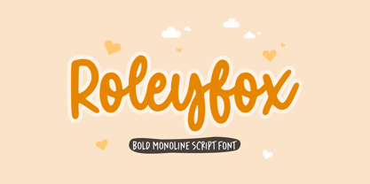 Roleyfox is a Bold Monoline Script Font. Roleyfox is a cute and frail handwritten font, described by an elegant touch, perfect for your favorite projects. Fall in love with its incredibly distinct and timeless style and use it to create spectacular designs! Roleyfox also multilingual support. Enjoy the font, feel free to comment or feedback, send me PM or email. Thank you!
 - Sub Comp by Ech000,
$10.00 SubComp is a carefully constructed font made with over 160+ individual glyphs for English and some Latin based languages. This font is inspired by old fashioned computer and programming fonts with a unique twist to the lettering. Features characters or glyphs for Basic Latin, Some Extended Latin Characters, Some Greek, Some Coptic. Created for web, poster, graphic design, social media and branding.
 - Munchy Funk by Bogstav,
$13.00 Say hello to my munchy and funky font - better known as "Munchy Funk" Munchy Funk has its roots in basic sans fonts, but with a handmade and bouncy approach. I've added 3 different layers, that works well together - either as individual fonts, or as layered graphics. Furthermore, I have added 3 slightly different versions of each lowercase letter and multilingual support!
 - Mimic by Dmitri Moruz,
$19.00 Mimic is a font family of several typefaces, that are based upon the physical structure of the mouth, depicted while speaking of corresponding letters occurred. It is primarily created as an accidental font family, and thus contains the very basic glyph set, which includes: punctuation, numbers, and letters. Mimic font family is made up of: Mimic Regular, Mimic Medium, and Mimic Bold.