10,000 search results
(0.09 seconds)
- Margoth by Asterisk,
$33.00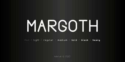 Margot font family, has more than 1000 + glyphs in each font. The font includes advanced language support, fractions, table shapes, ligatures, and more. Perfect for graphic design and any display use. It can easily work for websites, signage, corporate, and editorial design. documents and folders, mobile interface.
 - RBNo2.1 by René Bieder,
$25.00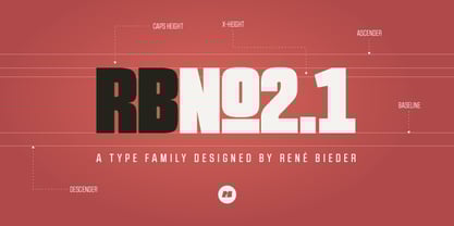 RBNo2.1 is a condensed sans serif typeface with a technical and geometric appearance. The family includes 2 versions (RBNo2.1a and RBNo2.1b) and has 7 weights with matching italics. RBNo2.1 feels comfortable in technical surroundings with short text passages, in brochures, catalogs, magazines, posters, websites headlines and logos.
 - Pinup New by Gleb Guralnyk,
$14.00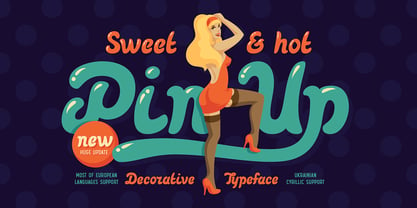 Hi, introducing a smooth vintage font - Pinup New. It has a nice tasty shape with a tiny separate accents. Pinup New font supports most of the european languages and also has ukrainian cyrillic characters. Pinup New consists of three fonts with separate accents for more convenient manipulating and recoloring. Also there are an extra characters with modifyed letters shape, such as ligatures and alternates. Make sure that your app does support an OpenType features to access this extra characters.
 - Lady Rene by Sudtipos,
$59.00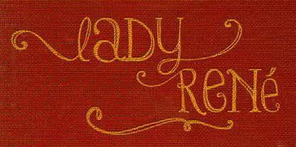 Looking back on my production to date, neither so little nor so large, it does not come as a surprise to find myself now introducing Lady René. A brief review of my career would read as follows: graphic designer graduated from Buenos Aires University, a 10-year professorship in Typography in the same institution, an illustrator in the making. For almost 15 years now my work has focused on the design of editorial pieces, predominantly books and CD sleeves. Typography proper has always been central to my research projects. All my obsessions eventually embodied as much the search for a perfect, spotless text as for a daring and provoking one. In my view, "how-to-say-something" ranks highest amongst a graphic designer’s responsibilities. It was in this vein that I called in the written word to illustrate, to draw, to narrate. Why not reverse the saying and proclaim that “a word is worth a thousand images”? If so, one single word could trigger endless meanings, associations, ideas, and memories in every reader’s mind. Language, we know, has a strong power and is a living expression of a culture. In my illustrations, letters and drawings reunite in one synergy said and unsaid, the finiteness of the message and the freedom of the free reading. And this is how and when, Lady René, my first born type font sees the light of day conceived out of a love of illustration and a reverence for the written word, recalling the whimsicality of the handmade drawing and reflecting its sensitive, warmth and spontaneity. Enabled by the characteristics of Open Type and the hard, outstanding work of designer Ale Paul, Lady René succeeds in composing texts in a simple, organic way by means of its contextual and stylistic alternates, swash characters, ligatures and connecting words. A bundle of decorative miscellanea completes the set of signs, enabling the user considerable freedom to create new typographic landscapes. Lady René is then prepared, very much like a character in a short story, to come to life in the reader’s mind. I expect you will enjoy her as much as I did creating her. Laura Varsky
 - Rail Bum JNL by Jeff Levine,
$29.00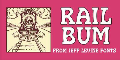 Morris Fuller Benton's Hobo [designed in 1910] is one of a number of fonts which have been so over-used that many designers shy away from it altogether. However, Jeff Levine had often wondered what the design might look like it given a serif treatment. The result is Rail Bum JNL, named for the hobos and transients who hitched along on freight cars to ride the rails across the country during the years when trains were the mainstay of American transportation.
 - Khanza Script by Suamzu Art,
$12.00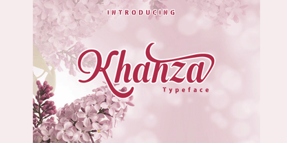 Khanza is a script font that is connected with clear style and dramatic movements. Khanza comes with uppercase, lowercase letters, numbers, punctuation, and so many variations on each character including alternative opentypes, common binders, and also additional cuts to allow you to customize your design. Perfect for use for Logotype, Letterhead, Posters, Clothing Designs, Labels and others. khanza font will help all the design projects that you are working on Khaza script features: Uppercase & lowercase Alternates & swashes Ligatures Standart international characters Punctuation & symbols
 - Fortuna by Linotype,
$29.99Fortuna has some resemblance with handtexted characters based, loosely, on the classic italic. But, like Ad Hoc, Fortuna is drawn on a monitor in every detail. The name is Latin and means fate, luck. The composer Carl Orff was actual at the time when I worked with Fortuna, because he had been born 100 years earlier. Orff's Carmina Burana were being introduced on the radio when I was wondering what to call my most recent creation. The song cycle begins with a song to Fortuna: a fated choice of name. Fortuna was released in 1995. - Callimathy by Anomali Creative,
$15.00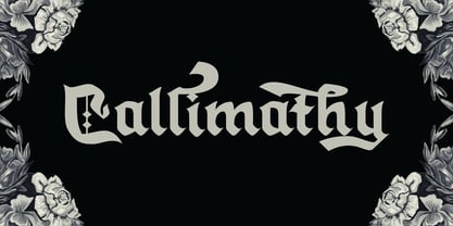 Broken letters or Gothic letters, also known as German letters, are the typeface used in Europe West from the 12th century to the 17th century. Meanwhile, Danish spoke it until 1875 and German, Estonian and Latvian spoke it well into the 20th century. Fracture is one of the broken typefaces that is often considered to represent the entire broken typeface. Broken letters are sometimes also called Old English, but not in the Old English or Anglo-Saxon sense that was born centuries earlier. This group of letters is so named because it contains Latin letters that have breaks in the curvature of the letters, either in part or in whole designs. The fracture arises from a sudden dip when writing certain parts of the letter. In contrast, letters with perfect, unbroken curves, such as Antikua, are created from smooth, flowing writing movements. Callimathy is a font inspired by the Blackletter typeface, made with a modern impression but still looks strong and unique. In addition, Young Best font is also supported with multilingual characters that can be used in several international languages. Callimathy font is very suitable for use in making music album cover designs, tattoo logos, wishkey labels, packaging pomades and so on which are made with dark and strong concepts.
 - Steak by Sudtipos,
$59.00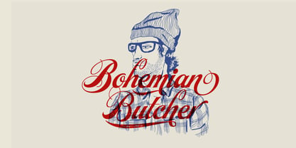 Here I am, once again digging up 60-year sign lettering and trying to reconcile it with the typography of my own time. The truth is I've had this particular Alf Becker alphabet in my sights for a few years now. But in the typical way chaos shuffles the days, Buffet Script and Whomp won the battle for my attentions way back when, then Storefront beat the odds by a nose a couple of years ago. Nevertheless, revisiting Alf Becker’s work is always a breath of fresh air for me, not to mention the ego boost I get from confirming that I can still hack my way through the challenges, which is something I think people ask themselves about more often as they get older. You can never tell what may influence your work, or in this case remind you to dig it out of dust drawers and finally mould it into one of your own experiences. On my recent visits to the States and Canada, I noticed that quite a few high-end steak houses try their best to recreate an urban American 1930s atmosphere. This is quite evident in their menus, wall art, lighting, music, and so on. The ambience says your money is well spent here, because your food was originally choice-cut by a butcher who wears a suit, cooked by a chef who may be your neighbour 20 minutes from downtown, and delivered by a waitress who can do the Charleston when the lights dim and who just wouldn't mind laughing with you over drinks at the bar later. So Steak is just that, a face for menus and wall art in those places that see themselves in the kind of jazzy, noirish world where one-liners rule and exclamation points are part of a foreign language. As is usual with my lettering-inspired faces, there is very little left of the original Alf Becker alphabet. Of course, the challenges present in bringing typographic functionality to what is essentially pure hand lettering gives the spirit of the original art a hell of a rollercoaster ride. But I think that spirit survived the adventure, and may in fact be even somewhat magnified here. This font is over 850 glyphs. It’s loaded with ligatures, swashes, ending forms, alternates, ascender and descender variations, and extended Latin language support. Steak comes in 3 versions. According to your taste you can choose Barbecue, Braised or Smoked. It’s up to you!
 - SCR-N by URW Type Foundry,
$39.99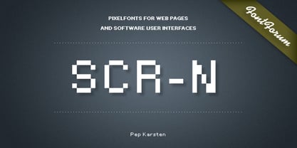 SCR fonts are screen optimized (also called 'pixel fonts'). Unlike standard fonts (and like the few well-hinted fonts like Verdana or Arial), they give a crisp look on screen at very small sizes, thus increasing legibility. The perfect applications for those fonts are web pages and software user interfaces (computer, cellular phones, console games and any other system that uses a screen interface). Unlike most pixel fonts, SCR fonts contain kerning information. Kerning is the adjustment of space between certain pairs of characters (like 'AV') to make text look more fluid, thus increasing legibility and appeal. To benefit from this feature, auto-kerning must be activated in the application. In Photoshop, kerning must be set to 'Metrics'. Although SCR fonts are optimized for screen, they can be used for print (in Illustrator or Indesign for example) for a decorative 'computer text' effect. In this case, there is no constraint: they can be used as any other font. For screen use (in Photoshop, Fireworks, Flash... ), they have to keep aligned with the screen pixel grid not to look blurred or distorted. To achieve this, here are the guidelines to follow: RESOLUTION If the application permits it (Photoshop, Fireworks), document resolution must be set to 72 pixels per inch. SIZE The font size must be set to 10 (or multiples of 10) points. POSITIONING & ALIGNMENT The reference points of text fields and text blocks (upper left corner for left aligned text, upper right for right aligned text) must be positioned at integer values of pixels. In Photoshop, text can be precisely moved with [Edit Free Transform]. In Flash, movie clips containing text fields must also be positioned at integer values on the stage. Text must be aligned to the left or right only. Center alignment can be simulated with left alignment by adding spaces at the begin of each line. To dispense with the positioning and alignment constraints, text anti-aliasing can be turned off if the application permits it (Photoshop, Flash MX 2004). OTHER SETTINGS Leading (line spacing), tracking (letter spacing), manual kerning and baseline shift must be set either to integer values of points or to multiples of 100 units (depending on the application). Vertical and horizontal scaling must be set to 100%. Faux bold or Faux italic must not be used. The document must neither be resized on export, nor allow resizing (Flash Movies).
 - SCR-I by URW Type Foundry,
$39.99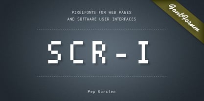 SCR fonts are screen optimized (also called 'pixel fonts'). Unlike standard fonts (and like the few well-hinted fonts like Verdana or Arial), they give a crisp look on screen at very small sizes, thus increasing legibility. The perfect applications for those fonts are web pages and software user interfaces (computer, cellular phones, console games and any other system that uses a screen interface). Unlike most pixel fonts, SCR fonts contain kerning information. Kerning is the adjustment of space between certain pairs of characters (like 'AV') to make text look more fluid, thus increasing legibility and appeal. To benefit from this feature, auto-kerning must be activated in the application. In Photoshop, kerning must be set to 'Metrics'. Although SCR fonts are optimized for screen, they can be used for print (in Illustrator or Indesign for example) for a decorative 'computer text' effect. In this case, there is no constraint: they can be used as any other font. For screen use (in Photoshop, Fireworks, Flash... ), they have to keep aligned with the screen pixel grid not to look blurred or distorted. To achieve this, here are the guidelines to follow: RESOLUTION If the application permits it (Photoshop, Fireworks), document resolution must be set to 72 pixels per inch. SIZE The font size must be set to 10 (or multiples of 10) points. POSITIONING & ALIGNMENT The reference points of text fields and text blocks (upper left corner for left aligned text, upper right for right aligned text) must be positioned at integer values of pixels. In Photoshop, text can be precisely moved with [Edit Free Transform]. In Flash, movie clips containing text fields must also be positioned at integer values on the stage. Text must be aligned to the left or right only. Center alignment can be simulated with left alignment by adding spaces at the begin of each line. To dispense with the positioning and alignment constraints, text anti-aliasing can be turned off if the application permits it (Photoshop, Flash MX 2004). OTHER SETTINGS Leading (line spacing), tracking (letter spacing), manual kerning and baseline shift must be set either to integer values of points or to multiples of 100 units (depending on the application). Vertical and horizontal scaling must be set to 100%. Faux bold or Faux italic must not be used. The document must neither be resized on export, nor allow resizing (Flash Movies).
 - Avonick by Valentino Vergan,
$16.00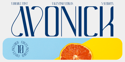 Avonick is a beautiful condensed font family with an elegant touch. Avonick has a sophisticated and professional look, its clean and elegant letters make it perfect for sleek and professional projects. Avonick comes in four weights, Light, Regular, Semibold and Bold. Each font weight has an oblique version. Avonick has a stylish design which makes it very versatile, the font can cover a wide range of projects such as: branding, mastheads, magazines, logos, banners, wedding invitations, websites, blog posts, pull quotes, editorials, packaging, social media posts, advertisements and much more. We hope you enjoy using the Avonick font family.
 - Ollykers by Maulana Creative,
$9.00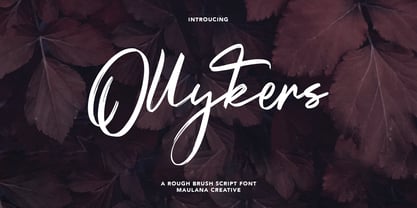 Ollykers is a Brush script font, With a rough stroke brush and fun character. It has Opentype features of ligatures, alternate lowercase, swashes and couple of cursive characters lowercase such as b,d,g,h,k,t. Makes it a perfect choice for branding and digital designs. Use this font for logos, social media, websites, blogs, instagram, social media, business cards, branding, and more! Ollykers brush script font support multilingual more than 100+ language. and good pair for your secondary text font with sans or serif. Make a stunning work with Ollykers brush script font. Cheers, Maulana Creative
 - Bellies by Gatype,
$14.00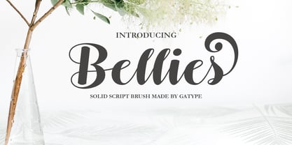 Bellies is a modern calligraphic font. Beautiful bellies for logotypes, website headers, fashion designs, wedding card designs and more. Bellies comes with an elegant style, Bellies It contains a complete set of lowercase & uppercase letters, various kinds of punctuation, numbers and multilingual support. What's Included: Commercial use is fully permitted for this font! Don't worry about license renewal. Everything you might need is included in the standard license. To access alternative glyphs, you'll need a program that supports OpenType features such as Adobe Illustrator CS, Adobe Photoshop CC, Adobe Indesign, and Corel Draw. Thank you Gatype
 - Maves by Prestigetype Studio,
$18.00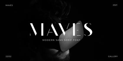 Maves is a modern and elegant font designed with a unique futuristic touch. Perfect use for classy visual brand identities such as logos, headlines, titles, labels, websites, stationery, business cards, or any advertising purposes. Maves includes: Modern all caps fonts Numbers and punctuation Multilingual Opentype features We highly recommend using a program that supports OpenType features and Glyphs panels like many Adobe apps and Corel Draw so you can see and access all Glyph variations. We hope you enjoy our font - please do let us know by emailing us at info@prestigetype.com or prestigetypestudio@gmail.com if you need something!
 - Last Beyond by Reyrey Blue Std,
$12.00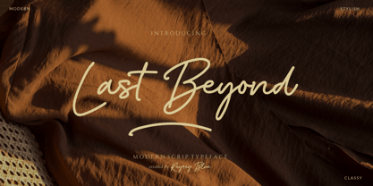 Last Beyond is stylish signature font made with a modern and elegant touch to give your any project to a unique design. This font is perfect for your creative ideas, both formal and informal. It has a modern style with a touch of creative ideas that is very suitable to be applied anywhere that requires creative ideas such as invitation cards, letterheads, website logos, social media, banners, advertisements, brochures, packaging products, leather products, and any product that requires writing. Features : · All Uppercase and Lowercase · Number & Symbol · Supported Languages · Alternates and Ligatures · PUA Encoded Hope you enjoy with our font!
 - Acherone by Runsell Type,
$17.00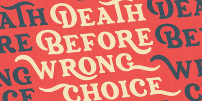 Introducing Acherone - A New Elegant Retro Display Typeface Acherone perfectly represents vintage esthetics in a contemporary serif typeface. It includes allcaps characters with over 500 glyphs with beginning swashes and ending swashes, a full set stylistic alternates ss01 - ss10, some ligatures features that makes the font look more esthetics. The Acherone matches applies in some designs such as the logotype, brand, magazine, website or blog headlines, packaging, branding, quotes, business cards and more custom design. It features uppercase, lowercase, numeral, punctuation & symbol, ligatures, stylistic alternates, multilingual support and is PUA encoded (fully accessible without additional design software).
 - Banuk by Grontype,
$16.00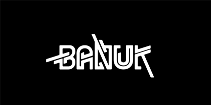 Banuk is a brand new techno font designed with slanted line accent, the fonts is rounded edges and little imminent space between fonts. This font is a regular bold font and all caps with different style between uppercase and lowercase. Banuk is perfectly used font in any project such as logo font, flyer header, name card, invitational header, movie poster, poster, website header and much more. Features: Uppercase and lowercase Numeral and punctuation More Alternates and Ligatures Multilingual Support What inside Main Files Banuk .ttf Banuk .otf webfont Thankyou for choosing this font, i hope you enjoy it. Regard, Grontype
 - Giga Sans by Locomotype,
$19.00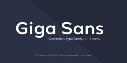 Giga Sans is a modern sans serif font with a clean and elegant geometric touch. Consists of 9 uprights and 9 matching italics ranging from Thin to Black. Besides being suitable for strong headlines, Giga Sans can also be used for long paragraphs such as news content, magazines, brochures, catalogs, logotypes and more. Giga Sans also has OpenType features such as stylistic alternates, old style figures, tabular figures, fractions, localized forms, superscripts, subscripts and also supports Cyrillic alphabets. There is no doubt that Giga Sans will make it easier for you to mix and match typography in graphic design, website, motion graphics etc. It would be more interesting if you pair this font with our script fonts like Hokyaa, Windtalker or Garris.
 - Darrel Allura by Piece of Cake Typework,
$19.00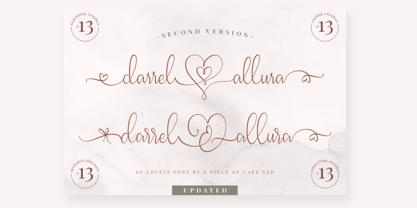 Hello World, Introducing, Darrel Allura is a beauty script font suitable for your design project needs, such as; wedding themes, social media posts, quotes, overlays on images, tagline logos, posters, print needs, website banners, and more. Features A set of uppercase and lowercase glyphs Number, symbol, and punctuation Multilingual Support Some Swashes and Ligatures So Easy to Use Access Swashes by keyboard key bracket left ' [ ' to feature beginning swash 1 key brace left ' { ' to feature beginning swash 2 key plus ' + ' to feature middle swash 1 key equal ' = ' to feature middle swash 2 key bracket right ' ] ' to feature ending swash 1 key brace right ' } ' to feature ending swash 2 For Example type [darrel+allura] Thank you a million times for downloading and using this font for your projects. Enjoy this font and happy creating!
 - Hi Maria by Piece of Cake Typework,
$17.00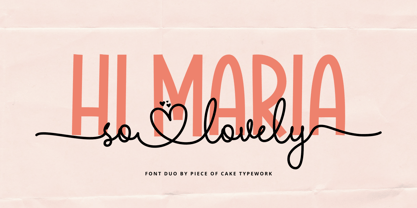 Hello World, Introducing, Hi Maria is a beauty script font suitable for your design project needs, such as; wedding themes, Christmas themes, social media posts, quotes, overlays on images, tagline logos, posters, print needs, website banners, and more. Features A set of uppercase and lowercase glyphs Number, symbol, and punctuation Multilingual Support Some Swashes and Ligatures So Easy to Use Access Swashes by keyboard key parenleft ' ( ' to feature beginning swash 1 key bracketleft ' [ ' to feature beginning swash 2 key plus ' + ' to feature middle swash 1 key equal ' = ' to feature middle swash 2 key parenright ' ) ' to feature ending swash 1 key bracketright ' ] ' to feature ending swash 2 For Example: type [love+you] Thank you a million times for downloading and using this font for your projects. Enjoy this font and happy creating!
 - Enchante Script by Designova,
$20.00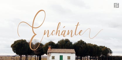 Enchante is the handwritten masterpiece typeface for luxury / branding / logotype / wedding invites / greeting cards / promotional graphics. Enchante typeface is completely handmade with more than 300 hours of artistic craftsmanship bringing perfection and aesthetics at its level best. The typeface comes with the following features: OpenType Features & Stylistic Sets The typeface contains 400 glyphs beautifully handcrafted with perfection. 122 stylistic alternatives with 70 lowercase and 52 uppercase letters. 61 unique Swashes & Lines arranged in separate font file to enhance ease of use and efficiency. Powerful OpenType features including multi-set stylistic alternatives and ornaments. Includes extended language support including Western European & Central European sets. What You Get The typeface comes with 2 fonts (Normal, Swashes) so you can easily add decorative elements by simply choosing the Swashes version of the font. The stylistic alternatives and ornaments can be selected via character options within any editing software such as Illustrator, Photoshop, Inkscape etc. The pack contains Desktop fonts (OTF, TTF) and Web Fonts (all EOT, SVG, WOFF, WOFF2) as licensing options. Advanced Kerning & Essential Ligatures: We have performed advanced, in-depth kerning to make sure the font looks amazing on all possible letter combinations.
 - Elegancy by Intellecta Design,
$14.95Note: only the regular style in this font family is currently available due the complexity and the resulting memory and performance issues associated with the other styles. - Ogden by Intellecta Design,
$19.90Note: Only the regular style in this font family is currently available due the complexity and the resulting memory and performance issues associated with the other styles. - Yanna by Intellecta Design,
$9.00Note: Only the regular style in this font family is currently available due the complexity and the resulting memory and performance issues associated with the other styles. - Questy by Intellecta Design,
$17.90Note: Only the regular style in this font family is currently available due the complexity and the resulting memory and performance issues associated with the other styles. - Paola Decorative by Intellecta Design,
$9.00Note: Only the regular style in this font family is currently available due the complexity and the resulting memory and performance issues associated with the other styles. - Palermo by Intellecta Design,
$19.90Note: Only the regular style in this font family is currently available due the complexity and the resulting memory and performance issues associated with the other styles. - Selena by Intellecta Design,
$21.90Note: Only the regular style in this font family is longer available due the complexity and the resulting memory and performance issues associated with the other styles. - Fleischmann Gotisch PT by preussTYPE,
$29.00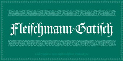 Johann Michael Fleischmann was born June 15th, 1707 in Wöhrd near Nuremberg. After attending Latinschool he started an apprenticeship as punchcutter in the crafts enterprise of Konstantin Hartwig in Nuremberg, which ought to last six years. For his extraordinary talent Fleischmann completed his apprenticeship after four and a half years, which was very unusual. 1727 his years of travel (very common in these days) began, during which he perfected his handcraft by working in different enterprises as journeyman. First location was Frankfurt/Main where he worked for nearly a year at the renowned type foundery of Luther and Egenolff. Passing Mainz he continued to Holland, where he arrived in November 1728 and stayed till he died in 1768. In Amsterdam he worked for several type founderies, among others some weeks for Izaak van der Putte; in The Hague for Hermanus Uytwerf. Between 1729 and 1732 he created several exquisite alphabets for Uytwerf, which were published under his own name (after his move to Holland Fleischmann abandoned the second n in his name), apparently following the stream of the time. After the two years with Uytwerf, Fleischmann returned to Amsterdam, where he established his own buiseness as punchcutter; following an advice of the bookkeeper and printer from Basel Rudolf Wetstein he opened his own type foundery 1732, which he sold in 1735 to Wetstein for financial reasons. In the following Fleischmann created several types and matrices exclusively for Wetstein. In 1743 after the type foundery was sold by Wetstein’s son Hendrik Floris to the upcoming enterprise of Izaak and Johannes Enschedé, Fleischmann worked as independent punchcutter mostly for this house in Haarlem. Recognizing his exceptional skills soon Fleischmann was consigned to cutting the difficult small-sized font types. The corresponding titling alphabets were mostly done by Jaques-Francois Rosart, who also cut the main part of the ornaments and borders used in the font examples of Enschedé. Fleischmann created for Enschedé numerous fonts. The font example published 1768 by Enschedé contains 3 titling alphabets, 16 antiquacuts, 14 italic cuts, 13 textura- and 2 scriptcuts, 2 greek typesets (upper cases and ligatures), 1 arabic, 1 malayan and 7 armenian font systems, 5 sets of musicnotes and the poliphonian musicnotesystem by Fleischmann. In total he brought into being about 100 alphabets - the fruits of fourty years of creative work as a punchcutter. Fleischmann died May 27th, 1768 at the age of 61. For a long time he was thought one of the leading punchcutters in Europe. A tragedy, that his creating fell into the turning of baroque to classicism. The following generations could not take much pleasure in his imaginative fonts, which were more connected to the sensuous baroque than to the bare rationalism of the upcoming industrialisation. Unfortunately therefore his masterpieces did not survive the 19th century and person and work of Fleischmann sank into oblivion. The impressive re-interpretation of the Fleischmann Antiqua and the corresponding italics by Erhard Kaiser from Leipzig, which were done for the Dutch Type Library from 1993 to 1997, snatched Fleischmann away from being forgotten by history. Therefore we want to place strong emphasis on this beautiful font. Fleischman Gotisch The other fonts by Fleischmann are only known to a small circle of connoisseurs and enthusiasts. So far they are not available in adequat quality for modern systems. Same applies the "Fleischman Gotisch", which has been made available cross platform to modern typeset-systems as CFF Open Type font through the presented sample. The Fleischman Gotisch has been proved to be one of the fonts, on which Fleischmann spent a good deal of his best effort; this font simply was near to his heart. Between 1744 and 1762 he created 13 different sizes of this font. All follow the same principles of forms, but their richness of details has been adapted to the particular sizes. In later times the font was modified more or less sensitive by various type founderies; letters were added, changed to current taste or replaced by others; so that nowadays a unique and binding mastercopy of this font is missing. Likewise the name of the font underwent several changes. Fleischmann himself probably never named his font, as he did with none of his fonts. By Enschedé this textura was named Nederduits, later on Nederduitsch. When the font was offered by the german type foundery Flinsch in Frankfurt/Main, the more convenient name of Fleischmann-Gotisch was chosen. In his "Masterbook of the font" and his "Abstract about the Et-character" Jan Tschichold refered to it as "Duyts" again. To honour the genious of Johann Michael Fleischmann we decided to name the writing "Fleischmann Gotisch PT" (unhyphenated). Developing the digital Fleischman Gotisch I decided not to use one of the thirteen sizes as binding mastercopy, but corresponding to the typical ductus of the font to re-create an independent use of forms strongly based on Fleischmann´s language of forms. All ascenders and descenders were standardised. Some characters, identified as added later on, were eliminated (especially the round lower case-R and several versions of longs- respectively f-ligatures) and others were adjusted to the principles of Fleischmann. Where indicated the diverse characters were integrated as alternative. They can be selected in the corresponding menu. All for the correct german black letter necessary longs and other ligatures were generated. Through the according integration into the feature-code about 85% of all ligatures in the type can be generated automatically. Problematic combinations (Fl, Fk, Fh, ll, lh, lk, lb) were created as ligatures and are likewise constructed automatically. A historically interesting letter is the "round r", which was already designated by Fleischmann; it is used after preceding round letters. Likewise interesting is the inventive form of the &-character, which is mentioned by Tschichold in his corresponding abstract. Nevertheless despite all interpretation it was very important to me to maintain the utmost fidelity to the original. With this digital version of a phantastic texturfont of the late baroque I hope to contribute to a blossoming of interest for this genious master of his kind: Johann Michel Fleischmann. OpenType features: - Unicode (ISO 10646-2) - contains 520 glyphes - Basic Latin - Latin-1 Supplement - Latin Extended-A - Latin Extended-B - Central European Glyhps - Ornaments - Fractions - Standard ligatures - Discretionary ligatures - Historical ligatures - Kerning-Table
 - Bilya Layered by Cerri Antonio,
$30.00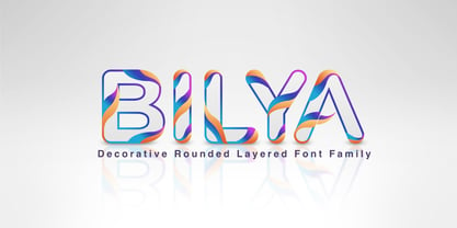 Since 2010 I started my research and experimentation in layered fonts, and I immediately understood that the future of creative graphic fonts is precisely the exploration of it. Over the years I have tried different expressions on the use of the layered system ... but I realized that my propensity to use colors in the font led me to the creation of BILYA. The real creative cue of BILYA is the wonderful childhood memories where nostalgia for them generated the creation of it, which I dedicate to all lovers of glass marbles classic game and beyond. BILYA Base, Outline, Color One, Two, Three, Four, Five and Color Six is a 8 font system that can be layered in different ways to create infinite title effects used commonly in poster and logo design, in flat gradient color style for spectacular 3D emboss styles or realistic 3D logos design projects. BILYA’s layer combinations give you complete control in producing styles like, modern, 3D, beveled. It can be used alone and/or in layered and allows you adjust leading and kerning. Each font contains the similar metrics, so when your title is set, copy and paste in same position to create different layers styles combinations to build out your desired effect. BILYA works great in any graphics application that allows you to utilize layers or 3D graphics effects.
 - BD Alm - 100% free

- Zomnk - Unknown license

- New Horizon by Aboutype,
$24.99Inscriptional capital titling face drawn for a magazine. Suitable for a variety of media if used at 30 point and above. New Horizon requires subjective display kerning and compensation. - Everett Mill by Aboutype,
$24.99Outline brush script originally designed for embroidery application. Everett was designed for all media and works best at 24 point and above. Everett requires subjective display kerning and compensation. - Notebook BH by BluHead Studio,
$20.00Notebook BH Black was inspired by the block lettering we used to draw on our school binders. Notebook is a unicase design, with the lowercase drawn to the cap height, and each "case" having a distinctly different flavor. The fun and seemingly unlimited combinations of the upper and lowercase forms make it difficult to stop typing innocuous phrases and, if you're mobile, can even make boring lectures tolerable! - Munchkin Land NF by Nick's Fonts,
$10.00This typeface bears a superficial resemblance to Belwe Extrabold, but is based on a work called Thor, issued by Frederic Wesselhoeft Ltd of London in the 1930s. The characters in this font are loosely spaced for use in attention-getting subheads, but you can tighten the tracking to get spectacular headlines, should you wish. Both versions of the font include 1252 Latin, 1250 CE (with localization for Romanian and Moldovan). - LTC Goudy Text by Lanston Type Co.,
$39.95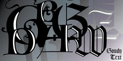 Frederic Goudy designed this blackletter face based on Gutenberg's 42-line Bible. The Lombardic Caps were designed as an accompaniment to Goudy Text and are offered paired with the lower case as an alternate option. The Goudy Text Shaded is an inline variant that was added later by Lanston Monotype. Both varieties of capitals, as well as an expanded Central European character set, are offered in the Opentype set versions.
 - Impacta by Linotype,
$29.99Linotype Impacta is part of the Take Type Library, which features the winners of Linotype’s International Digital Type Design Contest from 1994 to 1997. Dutch artist Marc Lubbers designed Impacta with little contrast between strokes, rather, he depended on the slope of the strokes to give his font character. Impacta can be used in small or large point sizes and its constructed forms bring a modern feel to graphic design. - Buntisland by Greater Albion Typefounders,
$20.00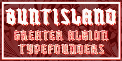 Buntisland (we wonder where we came up with that name from... another subconscious whim), is Greater Albion Typefounders blackletter release for Christmas 2016. The family consists of four typefaces- regular, weathered, shaded and shadowed, and has it's origin in a design challenge which came up in conversation, as all the best ones do. In this case it was 'design a legible all capitals black letter...' Challenge accepted and completed!

