10,000 search results
(0.055 seconds)
- Rolide by Craft Supply Co,
$20.00 Introducing Rolide – Expanded Sans Serif Contemporary Charm Rolide – Expanded Sans Serif presents a unique blend of contemporary charm with its wide and boxy shape. Versatile Design Solution This font is your versatile design solution, ideal for titles and body text. Its non-bold style strikes a harmonious balance between subtlety and impact. Wide & Expanded Rolide’s wide and expanded characters add a touch of modernity to your projects. They stand out without overwhelming the content. Perfect for Titles and Body Text Whether for titles or body text, Rolide is the perfect choice. It maintains clarity and readability, making your content engaging. Elegance in Simplicity In the world of fonts, Rolide embodies elegance through simplicity. Its clean lines and non-bold form offer a contemporary feel. In Conclusion In conclusion, Rolide – Expanded Sans Serif is the font that marries wide, expanded, and non-bold characters to create a contemporary and versatile design solution. It ensures your titles and body text are engaging, clear, and subtly impactful, appealing to a broad range of readers.
 - Blacker Pro by Zetafonts,
$39.00 Blacker Pro is the revised and extended version of the original wedge serif type family designed by Cosimo Lorenzo Pancini and Andrea Tartarelli in 2017. Blacker was developed as a take on the style that Jeremiah Shoaf has defined as the "evil serif" genre: typefaces with high contrast, oldstyle or modern serif proportions and sharp, blade-like triangular serifs. Due to the high contrast in the design - slightly reminescent of didone typefaces - Blacker has been developed in two optical subfamilies. The display version offers tighter tracking, higher contrast and sharper corners for maximum effect at big sizes, while the text variant offers better readability and screen rendering at smaller sizes, with lower contrast and looser spacing. In the pro version, two additional condensed variant families have been added (condensed display and condensed text) allowing for more freedom and versatility in typesetting where space constraints are present. Also, three titling uppercase-only variants have been added, with a slightly extended feel, and two decorative subfamilies (inline and diamond). Each of these seven variants has been developed in six weights from light to heavy, with matching italics, for a total of 69 styles covering a wide range of editorial and advertising uses. All Blacker Pro feature a revised and extended character set covering over two hundred languages using the latin, cyrillic and greek alphabets. Open type features include small caps, positional numerals, fractions, superior & inferior figures, alternate forms, and an extended set of standard and discretionary ligatures. With its bold personality, Blacker aims to be a modern classic used for bold statements and self-conscious brands, making your text look great both on paper and on the screens.
 - Forgotten Futurist by Typodermic,
$11.95 Are you ready to travel back in time? To a world of neon lights, high-tech logos, and a retro-futuristic style that defined an era? Then you’re ready for Forgotten Futurist. This industrial typeface is the perfect blend of old and new, with a vintage feel that still looks cutting-edge. Its letterforms are inspired by the 1960s and 1970s, when technology was just starting to take off and the world was full of possibilities. But Forgotten Futurist is more than just a tribute to the past. Its rounded technical corners and sleek lines are timeless classics, just as relevant today as they were decades ago. And with ten different styles to choose from, including Ultra-Light, Extra-Light, Light, Book, Regular, Semi-Bold, Bold, Heavy, Black, and italics, you’ll have all the flexibility you need to create a truly unique design. So if you want to add some retro-futuristic flair to your next project, look no further than Forgotten Futurist. It’s the typeface of the future, inspired by the past. Most Latin-based European writing systems are supported, including the following languages. Afaan Oromo, Afar, Afrikaans, Albanian, Alsatian, Aromanian, Aymara, Bashkir (Latin), Basque, Belarusian (Latin), Bemba, Bikol, Bosnian, Breton, Cape Verdean, Creole, Catalan, Cebuano, Chamorro, Chavacano, Chichewa, Crimean Tatar (Latin), Croatian, Czech, Danish, Dawan, Dholuo, Dutch, English, Estonian, Faroese, Fijian, Filipino, Finnish, French, Frisian, Friulian, Gagauz (Latin), Galician, Ganda, Genoese, German, Greenlandic, Guadeloupean Creole, Haitian Creole, Hawaiian, Hiligaynon, Hungarian, Icelandic, Ilocano, Indonesian, Irish, Italian, Jamaican, Kaqchikel, Karakalpak (Latin), Kashubian, Kikongo, Kinyarwanda, Kirundi, Kurdish (Latin), Latvian, Lithuanian, Lombard, Low Saxon, Luxembourgish, Maasai, Makhuwa, Malay, Maltese, Māori, Moldovan, Montenegrin, Ndebele, Neapolitan, Norwegian, Novial, Occitan, Ossetian (Latin), Papiamento, Piedmontese, Polish, Portuguese, Quechua, Rarotongan, Romanian, Romansh, Sami, Sango, Saramaccan, Sardinian, Scottish Gaelic, Serbian (Latin), Shona, Sicilian, Silesian, Slovak, Slovenian, Somali, Sorbian, Sotho, Spanish, Swahili, Swazi, Swedish, Tagalog, Tahitian, Tetum, Tongan, Tshiluba, Tsonga, Tswana, Tumbuka, Turkish, Turkmen (Latin), Tuvaluan, Uzbek (Latin), Venetian, Vepsian, Võro, Walloon, Waray-Waray, Wayuu, Welsh, Wolof, Xhosa, Yapese, Zapotec Zulu and Zuni.
 - Nahid by Naghi Naghachian,
$128.00 Nahid is a sans-serif font family designed by Naghi Naghashian in 3 weights: Nahid Light, Nahid Medium and Nahid Bold. It is extremely legible even in very small size. This font family is a contribution to modernisation the Arabic typography, gives the font design of Arabic letters real typographic arrangement und provides more typographic flexibility. Nahid supports Arabic, Persian ( Farsi ) and Urdu. It also includes proportional and tabular numerals for the supported languages. Nahid fulfils the following needs: 1. Explicitly crafted for use in electronic media fulfils the demands of electronic communication. 2. Suitability for multiple applications. Gives the widest potential acceptability. 3. Extreme legibility not only in small sizes, but also when the type is filtered or skewed, e.g., in Photoshop or Illustrator. Bauhaus Arabic’s simplified forms may be artificial obliqued in InDesign or Illustrator, without any loss in quality for the effected text. 4. An attractive typographic image. Nahid was developed for multiple languages and writing conventions. Nahid supports Arabic, Persian and Urdu. It also includes proportional and tabular numerals for the supported languages. 5. The highest degree of calligraphic grace and the clarity of geometric typography.
 - Behtab by Naghi Naghachian,
$108.00 Behtab is a sans-serif font family designed by Naghi Naghashian in tree weights. Behtab Light, Behtab Regular and Behtab Bold. It is extremely legible even in very small size. This font family is a contribution to modernisation the Arabic typography, gives the font design of Arabic letters real typographic arrangement und provides more typographic flexibility. Behtab supports Arabic, Persian ( Farsi ) and Urdu. It also includes proportional and tabular numerals for the supported languages. Behtab design fulfills the following needs: A Explicitly crafted for use in electronic media fulfills the demands of electronic communication. B Suitability for multiple applications. Gives the widest potential acceptability. C Extreme legibility not only in small sizes, but also when the type is filtered or skewed, e.g., in Photoshop or Illustrator. Bauhaus Arabic’s simplified forms may be artificial obliqued in InDesign or Illustrator, without any loss in quality for the effected text. D An attractive typographic image. Behtab was developed for multiple languages and writing conventions. Behtab Arabic supports Arabic, Persian and Urdu. It also includes proportional and tabular numerals for the supported languages. E The highest degree of calligraphic grace and the clarity of geometric typography.
 - Gilan by Naghi Naghachian,
$105.00 Gilan is a sans-serif font family designed by Naghi Naghashian in tree weights, Gilan Light, Gilan Medium and Gilan Bold. It is extremely legible even in very small size. This font family is a contribution to modernisation the Arabic typography, gives the font design of Arabic letters real typographic arrangement und provides more typographic flexibility. Gilan supports Arabic, Persian ( Farsi ) and Urdu. It also includes proportional and tabular numerals for the supported languages. Gilan design fulfills the following needs: A Explicitly crafted for use in electronic media fulfills the demands of electronic communication. B Suitability for multiple applications. Gives the widest potential acceptability. C Extreme legibility not only in small sizes, but also when the type is filtered or skewed, e.g., in Photoshop or Illustrator. Gilan’s simplified forms may be artificial obliqued in InDesign or Illustrator, without any loss in quality for the effected text. D An attractive typographic image. Gilan was developed for multiple languages and writing conventions. Jaleh supports Arabic, Persian and Urdu. It also includes proportional and tabular numerals for the supported languages. E The highest degree of calligraphic grace and the clarity of geometric typography.
 - Afshid by Naghi Naghachian,
$88.00 Afshid is a sans-serif font family in three weights and tow width. Afshid Regular and Afshid ExpandedRegular, Afshid Bold and Afshid ExpandedBold, Afshid Heavy and Afshid ExpandedHeavy. This font family is a contribution to modernisation of Arabic typography, gives the font design of Arabic letters real typographic arrangement and provides more typographic flexibility. Afshid supports Arabic, Persian and Urdu. It also includes proportional and tabular numerals for the supported languages. Afshid design fulfills the following needs: A Explicitly crafted for use in electronic media fulfills the demands of electronic communication. B Suitability for multiple applications. Gives the widest potential acceptability. C Extreme legibility not only in small sizes, but also when the type is filtered or skewed, e.g., in Photoshop or Illustrator. Afshid’s simplified forms may be artificial obliqued in InDesign or Illustrator, without any loss in quality for the effected text. D An attractive typographic image. Afshid was developed for multiple languages and writing conventions. Afshid supports Arabic, Persian and Urdu. It also includes proportional and tabular numerals for the supported languages. E The highest degree of calligraphic grace and the clarity of geometric typography.
 - Kamane by Naghi Naghachian,
$108.00 Kamane is a new font family, designed by Naghi Naghashian. It is based on classic calligraphic “Naskh” with the modern typographic metric. It is a Font family, in 3 weights, Light, Regular and Bold. This font is a contribution to modernisation of Arabic typography, gives the font design of Arabic letters real typographic arrangement und provides more typographic flexibility. Kamane supports Arabic, Persian and Urdu. It also includes proportional and tabular numerals for the supported languages. Kamane design fulfils the following needs: A Explicitly crafted for use in electronic media fulfills the demands of electronic communication. B Suitability for multiple applications. Gives the widest potential acceptability. C Extreme legibility not only in small sizes, but also when the type is filtered or skewed, e.g., in Photoshop or Illustrator. Nima’s simplified forms may be artificial obliqued in InDesign or Illustrator, without any loss in quality for the effected text. D An attractive typographic image. Kamane was developed for multiple languages and writing conventions. Kamane supports Arabic, Persian and Urdu. It also includes proportional and tabular numerals for the supported languages. E The highest degree of calligraphic grace and the clarity of geometric typography.
 - Iron Lung - Personal use only

- Spicy Rice Pro by Stiggy & Sands,
$29.00 Our Spicy Rice Pro has a festive flair to it that works through winter holidays to summertime jams. Casual and exciting, the extra heavy letterforms are imbued with a little exotic flair and flavor to spice up the party. The SmallCaps and extensive figure sets only offer Spicy Rice Pro an even wider range of creative options. Opentype features include: - SmallCaps. - Full set of Inferiors and Superiors for limitless fractions. - Tabular, Proportional, and Oldstyle figure sets (along with SmallCaps versions of the figures). - Stylistic Alternates for Caps to SmallCaps conversion.
 - Boondock by Canada Type,
$24.95Boondock is another Imre Reiner design resurrected from the ashes of hot metal type for digital use. This wild paint font is a revival of the fascinating Bazaar brush type from 1956. Boondock has some very unique characters that combine to form a statement of casual but loud strength, seriousness and raw primal emotion. Great for short sudden-impact spurts, like book cover titles, single sentence headers, movie posters and music sleeves. Redrawn from original specimen by Patrick Griffin, and expanded with some built-in extras too add to the convenience of this digital version. - Rawkner by Trustha,
$18.00 Rawkner is a sans serif font. Inspired by ink trap. The first concept is the letter "W" and "K", then the other letters refer to both. Come with four styles, regular, oblique, round, and round oblique. Rawkner is perfect for the headline, and subheadline. There are alternative glyphs that you can choose according to your project. Also, the ligature of the uppercase and lowercase will make it more perfect. Rawkner is an option that you should try for your creative project.
 - Archopada by Wildan Type,
$17.00 Archopada is a modern, humanist, strong statement typeface with clean lines. Inspired by classic geometric and fun typefaces. This font perfect for adding a title to your portfolio or website, magazine, branding, id card or you can use for body text in long paragraph. This set includes 6 weight humanist with oblique. If you need fun taste, We also prepared rounded style plus 6 weight and oblique style. Archopada consists of upper and lowercase, numerals, ligatures plus some stylistic alternative characters.
 - Rolade by Akufadhl,
$25.00 Rolade is a Rounded Condensed Sans. Designed for Display purpose. Firstly designed on late 2015 as an All Caps typeface based on a personal project. Rolade has a Rounded and cute character with condensed proportion. It also come with some alternates to give more flavour and variation. Supports a wide range of latin based language.
 - Original Taste by Arttype7,
$12.00 I hope you are very happy today. we want to introduce our newest font, which we named `` Original Taste font ''. This font is a very bold bold cript font and has cool alternets and swashes. original taste font. This font has a taste, old, modern and unique.
 - Gambling Resort JNL by Jeff Levine,
$29.00 Sheet music for the song "Beyond the Blue Horizon" from the motion picture "Monte Carlo" had the movie title in hand-lettering reminiscent of the Futura Black style, but with an inline stripe through each character. These few letter examples were the basis for Gambling Resort JNL and conjure up the Nouveau Riche spending their nights in Monte Carlo packing the roulette wheels, blackjack tables and slot machines.
 - Unicore by Halbfett,
$30.00 Unicore is a large family of geometric sans serif fonts. Design wise, it is inspired by classic 20th-century typefaces like Futura, Gill Sans, and Avenir. It fuses their aura with contemporary elements, like a unique harmonisation of width and height. You can see this in the lowercase letters especially and it helps support the fonts’ legibility. The regular weights in the family are optimised for body text.
 - Dinky Rink NF by Nick's Fonts,
$10.00Handlettering on a 1934 WPA poster promoting skating in Central Park provided the pattern for the uppercase letters of this typeface, while the lowercase letters take their inspiration from Paul Renner’s Steile Futura. The result is a warm, friendly face that is both quaint and modern. Available in Roman and Italic versions. Both versions of the font include 1252 Latin, 1250 CE (with localization for Romanian and Moldovan). - Air Factory by Khaito Gengo,
$22.00 Air Factory was originally designed for a merchandise company, and ordered to design iconic but plain forms. Air Factory is a very simple and modern sans-serif font inspired by early 1900’s typefaces, like Futura, and consisting of 5 weights and stencil type(free). This contemporary typeface would be good used for restaurant, retail, book, poster etc. Air Factory also features various ligatures, stylistic alternates, fractions, and languages as well.
 - MC Monndy by Maulana Creative,
$16.00 Monndy is a rough stamp style fun sans serif font. With semi bold stroke and slant, fun character with a bit of ligatures and alternates. To give you an extra creative work. Monndy font support multilingual more than 100+ language. This font is good for logo design, Social media, Movie Titles, Books Titles, a short text even a long text letter and good for your secondary text font with script or serif. Make a stunning work with Monndy font. Cheers, Maulana Creative
 - El Guapo by A New Machine,
$19.00 El Guapo is a hand drawn font available in sans serif and script faces. It is suitable for headlines and call outs of all kinds where a hand made look is desired. The letters were drawn by Prissy Pots owner Erin Solomon and include regular and bold versions. Each face also includes an entirely separate set of lowercase letters accessible in your glyphs palette. These extra letter will automatically show up with contextual alternates turned on for a more natural, random look.
 - Half Blvd by Maulana Creative,
$15.00 Half Blvd is an industrial genre display sans serif font. With bold soft round edge stroke, fun character with a bit of ligatures. To give you an extra creative work. Half Blvd font support multilingual more than 100+ language. This font is good for logo design, Social media, Movie Titles, Books Titles, a short text even a long text letter and good for your secondary text font with sans or serif. Make a stunning work with Half Blvd font. Cheers, Maulana Creative
 - MC Bigzo Hams by Maulana Creative,
$23.00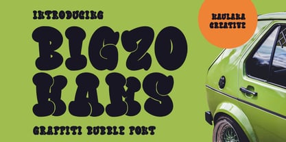 Bigzo Hams graffiti bubble display font. Bold stroke, fun character with a bit of ligatures and alternates. To give you an extra creative work. Bigzo Hams graffiti display font support multilingual more than 100+ language. This font is good for logo design, Social media, Movie Titles, Books Titles, a short text even a long text letter and good for your secondary text font with script or serif. Make a stunning work with Bigzo Hams graffiti bubble display font. Cheers, Maulana Creative
 - Le Greg by Maulana Creative,
$15.00 Le Greg is a modern soft sans display font. With bold stroke, fun character with a bit of ligatures and ton of stylistic alternates. To give you an extra creative work. Le Greg font support multilingual more than 100+ language. This font is good for logo design, Social media, Movie Titles, Books Titles, a short text even a long text letter and good for your secondary text font with sans or serif. Make a stunning work with Le Greg font. Cheers, Maulana Creative
 - Marvaloha by Fontforecast,
$14.99 Marvaloha is based on the handwriting of an Advertising creative director. The casual but powerful strokes he uses for sketching are also visible in his writing. The Marvaloha font family consists of the original Marvaloha Regular and a Bold version. Both have matching Italics. All four styles have double letter ligatures and a set of symbols and catchwords to give your design some extra power. You will need an Open Type Savvy Application to get the most out of Marvaloha.
 - Melvio Play by Maulana Creative,
$15.00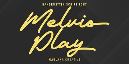 Melvio Play is a fancy handwritten script font. With bold consist mono-line stroke, fun character with a bit of ligatures and alternates. To give you an extra creative work. Melvio Play font support multilingual more than 100+ language. This font is good for logo design, Social media, Movie Titles, Books Titles, a short text even a long text letter and good for your secondary text font with sans or serif. Make a stunning work with Melvio Play font. Cheers, Maulana Creative
 - Cottsmic by Maulana Creative,
$15.00 Cottsmic Sans Serif Font is a contemporary sans serif font. With bold weight, unique and fun character with a bit of ligatures. To give you an extra creative work. Cottsmic Sans Serif support multilingual more than 100+ language. This font is good for logo design, Social media, Movie Titles, Books Titles, a short text even a long text letter and good for your secondary text font with script. Make a stunning work with Cottsmic Sans Serif Font. Cheers, Maulana Creative
 - MC Marfig by Maulana Creative,
$17.00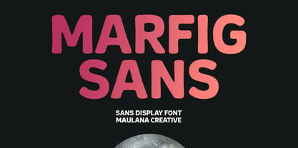 Marfig is a modern fun sans serif font. With a bold stamp effect stroke, fun character with a bit of ligatures and alternates. To give you an extra creative work. Marfig font support multilingual more than 100+ language. This font is good for logo design, Social media, Movie Titles, Books Titles, a short text even a long text letter and good for your secondary text font with script or serif. Make a stunning work with Marfig font. Cheers, Maulana Creative
 - Halley Parades by Maulana Creative,
$13.00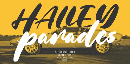 Halley Parades is a Handwritten & Script font duo mix small caps & lowercase. With Bold Contrast stroke, fun character with a bit of ligatures. To give you an extra creative work. Halley Parades font support multilingual more than 100+ language. This font is good for logo design, Social media, Movie Titles, Books Titles, a short text even a long text letter and good for your secondary text font with sans or serif. Make a stunning work with Halley Parades font. Cheers, MaulanaCreative
 - MC Goshco by Maulana Creative,
$17.00 Goshco is a strong look modern display sans serif font. With all caps and bold stroke, fun character with a bit of ligatures and alternates. To give you an extra creative work. Goshco font support multilingual more than 100+ language. This font is good for logo design, Social media, Movie Titles, Books Titles, a short text even a long text letter and good for your secondary text font with script or serif. Make a stunning work with Goshco font. Cheers, Maulana Creative
 - Hardcore Hipsta by Arterfak Project,
$18.00 Hardcore Hipsta is a vintage display font. Comes in regular and rough styles which are perfect for your next project. It's strong, bold, tough, and has confident looks. Designed with block-based, curveless, and sharp edges that give a brave approach. A great choice to apply to many purposes such as sports, posters, jerseys, labels, storefronts, coffee, sticker, logos, badges, headlines, and many more! Hardcore Hipsta is an all-caps font that consists of uppercase, extra alternate characters, and multilingual support.
 - Manor Smiths by Maulana Creative,
$14.00 Manor Smiths is a decorative display font. With bold sharp edges stroke, fun character with a bit of ligatures and alternates. To give you an extra creative work. Manor Smiths font support multilingual more than 100+ language. This font is good for logo design, Social media, Movie Titles, Books Titles, a short text even a long text letter and good for your secondary text font with sans or serif. Make a stunning work with Manor Smiths display font. Cheers, Maulana Creative
 - Bagefi by Maulana Creative,
$22.00 Bagefi is a modern sans serif display font. With semi rectangle shape edge and bold stroke, fun character with a bit of ligatures. To give you an extra creative work. Bagefi font support multilingual more than 100+ language. This font is good for logo design, Social media, Movie Titles, Books Titles, a short text even a long text letter and good for your secondary text font with script or serif. Make a stunning work with Bagefi font. Cheers, Maulana Creative
 - Triple Shots by Maulana Creative,
$14.00 Triple Shots is a casual handwritten display font. With slanted bold felt tip stroke, fun character with a bit of ligatures and alternates. To give you an extra creative work. Triple Shots font support multilingual more than 100+ language. This font is good for logo design, Social media, Movie Titles, Books Titles, a short text even a long text letter and good for your secondary text font with sans or serif. Make a stunning work with Triple Shots font. Cheers, MaulanaCreative
 - The Junos by Maulana Creative,
$14.00 The Junos is a handwritten display sans font. With a bold stroke, rough and fun character with a bit of ligatures. To give you an extra creative work. The Junos font support multilingual more than 100+ language. This font is good for logo design, Social media, Movie Titles, Books Titles, a short text even a long text letter and good for your secondary text font with script or signature font. Make a stunning work with The Junos font. Cheers, MaulanaCreative
 - MC Omnys by Maulana Creative,
$17.00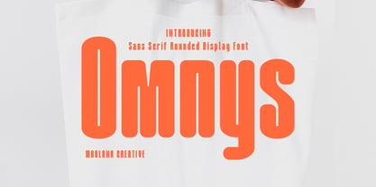 Omnys is a common sans serif with round soft edges stroke font. Bold stroke, fun character with a bit of ligatures and alternates. To give you an extra creative work. Omnys font support multilingual more than 100+ language. This font is good for logo design, Social media, Movie Titles, Books Titles, a short text even a long text letter and good for your secondary text font with script or serif. Make a stunning work with Omnys font. Cheers, Maulana Creative
 - Adamslor by Maulana Creative,
$13.00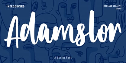 Adamslor is a handwritten script font. With high contrast bold stroke, fun character with a bit of ligatures and has a two files lowercase alternates. To give you an extra creative work. Adamslor font support multilingual more than 100+ language. This font is good for logo design, Social media, Movie Titles, Books Titles, a short text even a long text letter and good for your secondary text font with sans or serif. Make a stunning work with Adamslor font. Cheers, Maulana Creative
 - Chillphils by Maulana Creative,
$12.00 Chillphils is a casual handwritten font. With bold stroke, slant and fun character inspired by the authentic handwriting on the comic paper with a bit of ligatures. To give you an extra creative work. Chillphils font support multilingual more than 100+ language. This font is good for logo design, Social media, Movie Titles, Books Titles, a short text even a long text letter and good for your secondary text font with sans or serif. Make a stunning work with Chillphils font. Cheers, MaulanaCreativexqxd
 - Greastly by Maulana Creative,
$12.00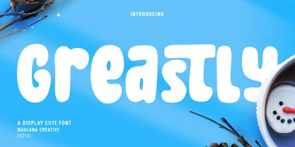 Greastly is a cute handwritten display font. With bold stroke, fun character with a bit of ligatures and has a two files lowercase alternates. To give you an extra creative work. Greastly font support multilingual more than 100+ language. This font is good for logo design, Social media, Movie Titles, Books Titles, a short text even a long text letter and good for your secondary text font with sans or serif. Make a stunning work with Greastly font. Cheers, Maulana Creative
 - Boostart by Maulana Creative,
$13.00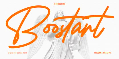 Boostart West is an expressive slanted modern signature script font. With bold consist stroke, fun character with a bit of ligatures and alternates. To give you an extra creative work. Boostart font support multilingual more than 100+ language. This font is good for logo design, Social media, Movie Titles, Books Titles, a short text even a long text letter and good for your secondary text font with sans or serif. Make a stunning work with Boostart font. Cheers, Maulana Creative
